It’s been a while since we last released a new block. In case you missed it, we’ve been busy upgrading Stackable’s performance so you can have a seamless experience building websites. You can read this article to learn more. Now, we’re excited to present to you our new blocks: the Progress Bar and the Progress Circle.
Visual content is easier to consume compared to text, especially when it comes to data! If you update Stackable to version 3.6.0, you can now present data in a bar or a circle. These are usually used to track progress, whether for projects, goals, or even skill mastery!
These blocks have very flexible controls and styling options! You can set the maximum limit of your progress bar or circle so you have control over what values you can use for it.
Additionally, you get to customize the sizing of the bars. The Progress Bar’s width and the Progress Circle’s size and thickness are responsive, so you can set different values for different viewports.
Make your graphs stand out with colorful hues. When you add a Progress Bar or Progress Circle, you can use single or gradient colors and even change the color of the bar’s background.
You can also choose to animate the Progress Bar or Progress Circle so that when a website visitor scrolls to the section of the page where you added it, the bar will fill up! See how that looks here:
Lastly, you can add text to your progress bar to label it. And you can also add a prefix or a suffix, which will be added before or after the progress value; this could be a unit of measurement, like a percentage.
The Progress Bar and Progress Circle blocks are a great way to make content on your website easier to consume for your audience. To get these blocks, update Stackable to version 3.6.0 now and let us know what you think!
Adding website animations is the latest trend in web design that you could use to your advantage. It creates a dynamic and flowing user experience for your website visitors and at the same time, it adds to your website’s aesthetics.
There are different ways to set up website animations. It could be as simple as elements moving as the cursor moves, or it could be objects appearing as the website loads. However, it’s easy to get excited with adding this feature into your website and unknowingly make the experience of your audience overwhelming. Before learning how to add animations, we must first understand how to use animations strategically.
What Are the Dos and Don’ts in Using Website Animations?
Adding animations to your website carelessly can pull you away from your goals. Here are some tips to make the most out of website animations:
Do test for responsiveness
Checking whether your animations are working properly from different viewports is an essential step that most people overlook. Sure it looks great when accessed from a PC or a laptop, but does it look good from a tablet or mobile device? We can’t completely disregard people who use mobile devices because, in fact, about 92.1% of internet users accessed the internet through a mobile phone!
Don’t go overboard
Use website animations in moderation. Don’t just add them for the sake of it. Remember, adding website animations should improve functionality on your website. When you add too much, it might be bothersome for your website’s audience. This could cause them to exit your website without spending enough time on it.
Do use animations for a specific purpose
Only use animations when you can justify it with a defined purpose. As an example, you could use it to trigger behavior, like clicking a button or call to action; or you could shift your website visitors’ attention to an element on your website!
So how can I add website animations on WordPress?
Now that you know how to use website animations strategically, let’s move on to how to add website animations on WordPress!
By using Stackable, you won’t need to know how to code to add animations to your WordPress website. You could wow your website visitors with simple to complex animations with just a few clicks.
One of the ways you can create animations with Stackable is through Motion Effects. Here, we have a simple hero section for a website (This is actually from our Speck UI Kit). What we can do is create an animation that might make loading your website more interesting. This is called an Entrance Animation. What we did is we selected the right column, and navigated to the Advanced Tab of the Inspector. In the Motion Effects panel, we selected the Entrance Animation option and put in these values:
Note that we added the vertical position, this will give an effect like it’s entering from the sides of the screen. Now we’ll do the other column, but instead of adding the same value for horizontal position, we’ll put -50. These are just simple changes to the settings, but it elevates the design on the frontend by a lot. See how it looks:
We could also add Scroll Animations which are simple effects that you can add to elements of your website so that they could appear or move as the user scrolls through your website. Here’s an example:
To achieve this, all you will have to do is select the element that you want to blur and in the Motion Effects panel, instead of selecting Entrance Animation, select Scroll Animation. We achieved the above result by making the Blur setting 10 for the Entrance Animation and left everything as is.
You could experiment with these Motion Effects controls so you could achieve a truly unique motion effect on your website!
Next, we could use Stackable’s Transform & Transition to improve user experience. Here, we have three columns. What we’d like to do is to transform each column when the cursor is hovering over it. This will give your audience a visual motion of where they are navigating on your website.
What we want to do is select one column at a time. Navigate to the Advanced tab of the Inspector, and there you will see the Transform & Transition panel. Just select this and you will see these design settings:
Select the Hover State icon beside Transform, and select the Hover State option. In the Translate Y setting, input -20. Do that for the rest of the columns so that when you’re done, you get something like this:
There you have it! That’s how you could create website animations using Stackable. These are very simple and minute details but definitely elevate the design from just static elements on your website.
Creating dynamic websites just got easier: Stackable is now integrated with JetEngine!
Stackable now has support for JetEngine–this means that you can use data stored through JetEngine’s meta boxes in Stackable blocks. Update to the latest version of Stackable and the integration will be automatic!
How to Use JetEngine Meta Boxes with Stackable
To use data from meta boxes you’ve created using JetEngine, click on the Stackable block that you want to insert it to. Then click on the Dynamic Fields icon on the toolbar and select the Dynamic Source. Here, you have four options: Current post, Other posts, Site, and Latest post.
Next, in the Field menu, select the field that you want to fetch data from. You can scroll to look for the specific custom field which will be grouped under “JetEngineâ€. You can also just type the label you’ve used to name it! Once you click Apply, the text will be replaced with a placeholder. But not to worry, when you preview the page or reload the editor, it should display the data itself!
How to Use JetEngine Taxonomies with Stackable
You will also find the metadata you store for taxonomies made with JetEngine!
To do this, click on the Stackable block you want to insert it to. Click on the Dynamic Fields icon on the toolbar and in the Fields, select Post Taxonomy. There, you can select the Taxonomy you’ve created with JetEngine.
Next, choose the Field you want to fetch data from. Here, since we only have one field, it’s the only one that’s available. We’re going to apply that and then that should be updated in the page or post.
Using JetEngine with Stackable and Query Loops
You could use JetEngine meta boxes wherever dynamic content is available. One example is the core Query Loop block. This is helpful because you can create archives or lists of pages, posts, or just about any post type.
When you add the Query Loop block, just add a Stackable block and click on the Dynamic Fields icon. Select which field you want to display, in this case, we’ll be using the Availability field to display which rental the website visitors can get.
Once you’re finished making your website dynamic, you may then customize the blocks as you usually would using Stackable’s extensive design controls and features! You could even use Stackable’s ready-made UI kits and have a dynamic website ready in no time.
To learn more about this integration, you may go through our documentation.
Build with Stackable and JetEngine
This integration is available for Stackable Premium users. If you’re not a Stackable Premium user yet, check out our plans and upgrade now!
Our latest release includes the newest addition to our block library: the Map block! Display locations on your website and customize it however you like! The Map block is available to use for all Stackable users, whether Free or Premium. All you have to do is update to Stackable 3.4.0.
Adding Maps are perfect for business, corporate, event, or non-profit websites! Especially if you want to increase foot traffic to your physical location, and with the Map block, it’s no sweat!
How to Display Locations Using the Map Block
Once you’ve updated to the latest version of Stackable, all you have to do is add the Map block to the post or page you want the location to be displayed in and navigate to the Style tab under the General panel. You will see the Location field that you can just fill up with coordinates or the exact address of the location you want to show. The block will then automatically fetch the data from Google Maps and reflect it on your page.
What Features Does the Map Block Include?
The Map block by itself is limited to the custom height and zoom controls. You will see these in the General panel of the Style tab.
You can adjust these using the slider or simply inputting the size or zoom you want in the input text field.
If you want additional features for the Map block, you may use a Google API key. It’s a general purpose key that allows access to Google services. You can head over to our documentation to learn more about this.
Here are features that come with the Map block if you add your own API key:
Location Auto-Suggest
As we’ve mentioned you will have to know the exact coordinates or address of the area of the spot you want to show on your map. However, if you have an API key, the block will give suggestions on possible locations when you type the name or address of a place in the location field.
Google Maps buttons display toggles
You have the power to control what buttons from Google Maps will be displayed on the map you’re adding to your page. You will see these in the General panel of the Style tab.
Just toggle which buttons you want to be visible on your map. Here’s an example of the Map block with only the zoom buttons displayed:
Map Style
You may also customize the style of your map. The Map Style panel features the basic map styles from Google, but you can take it to the next level with your own design and customizations using your own custom map code (JSON). You may learn more about creating your own custom map style here.
Custom Map Marker
Lastly, Stackable users can add their custom markers! Just toggle on the Map Marker panel and select which icon you want to use. This also includes FontAwesome icons if you added your own FontAwesome kit code. All icon settings will be available to you to have complete control over your map marker’s design!
Thanks for your continuous support of Stackable! We hope that you enjoy the latest addition to our block library. Head over to our documentation to learn more about the Map block or subscribe to our newsletter for the latest updates on Stackable.
Stackable users have been requesting an integration with Meta Box for the longest time, and it’s finally here!
You can now populate your websites built with Stackable using Meta Box custom fields. All you have to do is update Stackable to the latest version and it will automatically pick up Meta Box custom fields and their data! And don’t worry–all custom field types are supported, be it the basic or advanced field types.
To use data from Meta Box custom fields on text, you will have to click on the Stackable block that you want to insert it to. This could be the Stackable Text block, Heading block, Subtitle block, or any Stackable block that has text!
Then click on the Dynamic Fields icon on the toolbar and select the Dynamic Source. Here, you have four options: Current post, Other posts, Site, and Latest post.
Next, in the Field menu, select the field that you want to fetch data from. You can scroll to look for the specific custom field or you can type the label you’ve used to name it! Once you press Apply, a placeholder will appear where the dynamic content should be displayed.
Once you preview the page, the placeholder will then be replaced with the value stored in that custom field!
You could use Meta Box custom fields wherever dynamic content is available, like say, for example, when you use Stackable blocks in the WordPress core Query Loop block. You can use dynamic content from Meta Box fields. See how we applied it to this Query Loop using Meta Box fields:
Once you’ve added the dynamic content from Meta Box, you may then customize the blocks as you usually would using Stackable’s extensive design controls and features! You could even use Stackable’s ready-made UI kits and have a dynamic website ready in no time.
This integration has been a long time coming so we’re very excited to see what you can build using Stackable and Meta Box! To learn more about this integration, you may go through our documentation.
Build with Stackable and Meta Box
This integration is available for Stackable Premium users. If you’re not a Stackable Premium user yet, check out our plans and upgrade now!
WordPress 5.9 was released in January 2022 and served as the stepping stone to what looks to be the future of WordPress. Just four months later, we got WordPress 6.0 which is jam packed with new features.
New Blocks
Here’s a list of all the newly introduced blocks in WordPress 6.0:
Comments Query Loop
Read More block
Post Author Biography block
Avatar block
Let’s start with the new core blocks. One of the new core blocks is the Comments Query Loop which will display the comments in a post. It’s composed of different blocks that you can edit. You can also add blocks to further customize how the comments on a post appear.
Another new block would be the Read More block. This will give you more control over the appearance of the Read More link on your content, like adding borders, colors, typography, and more!
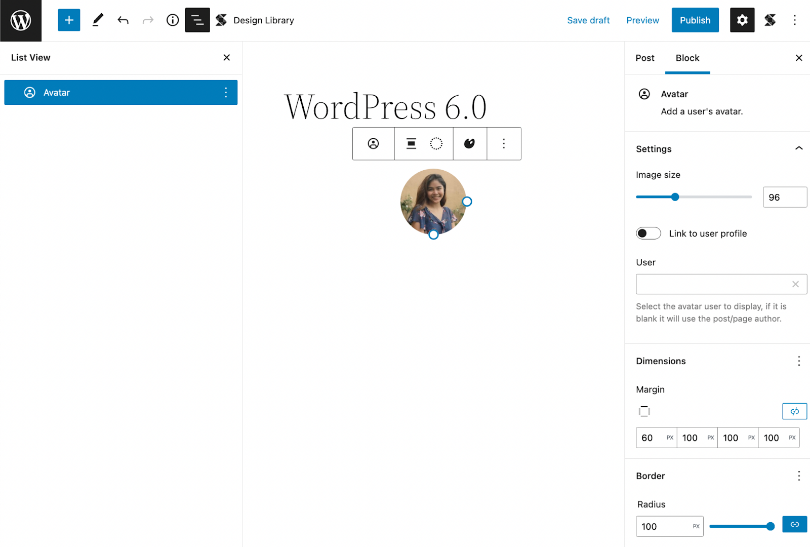
A new block that we’d find really useful is the Avatar and Post Author Biography blocks which we can now use separately in content. The Post Author Biography block gives us the ability to use the author’s description in our content. This has the usual typography design controls like changing the font color and adding a background color. You also have the option to change the font size using the size presets or by setting a custom value.
The new WordPress block, Post Author Biography
On the other hand, the Avatar block will display the avatar of the user that you select. This has various block settings where you can link the image to the user’s profile (and even open it in a new tab when clicked). You can adjust its size, margins, and border radius to customize it to your liking.
The new WordPress block, Avatar block, in the block editor
Global Styles
A new feature we’re particularly excited about is the Global Style switcher. This gives users the ability to change the look and feel of a website in just one click.
Global Styles are dependent on what theme you’re using, like in Twenty Twenty-two, it includes three style variations. You can see what available styles are in your theme by going to the Browse Styles section of the Global Styles sidebar.
You can also add a preset of your own by adding a JSON file to the styles folder of the theme you’re using. To learn more about how to create your own style presets, you can check out this article by the WordPress core team.
Theme Exporting
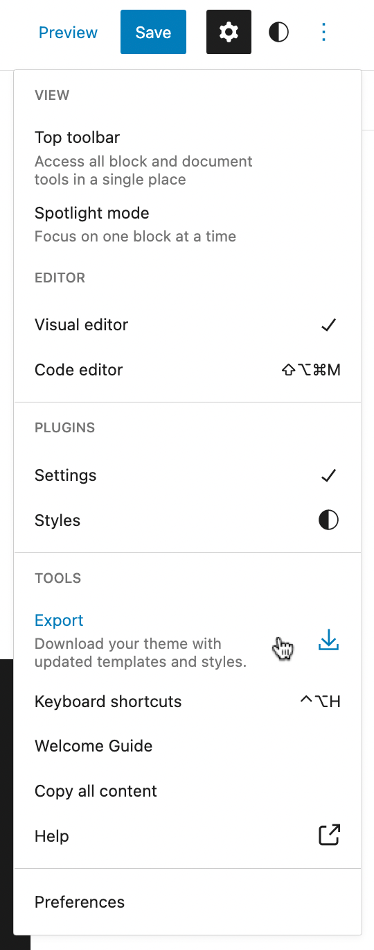
Another feature we’d like to talk about is the theme exporter which will allow you to download the theme with all the customizations you’ve added to it.
Demonstrating where the Export tool is located in the Options menu
You can find this by clicking the Options button in the top toolbar where you will see the Export option in the Tools section. This will download a zip file to your computer with all your custom styles and settings.
This brings a lot of possibilities because you can unleash your creativity and start creating your very own unique theme right from the WordPress site editor and export them to use for other websites!
Templates
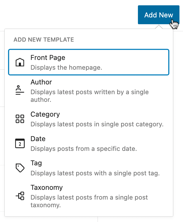
The templates that came with WordPress 5.9 were very limited (although you were given the ability to create your own) but in the latest release, you get more core templates such as Author, Category, Date, Tag, and Taxonomy.
You can customize these templates when you open the Site Editor, click the WordPress icon on the toolbar, and select Templates in the sidebar that opens. Just click the Add New button at the top, and click the template you want to customize.
The additional preset templates included in WordPress 6.0
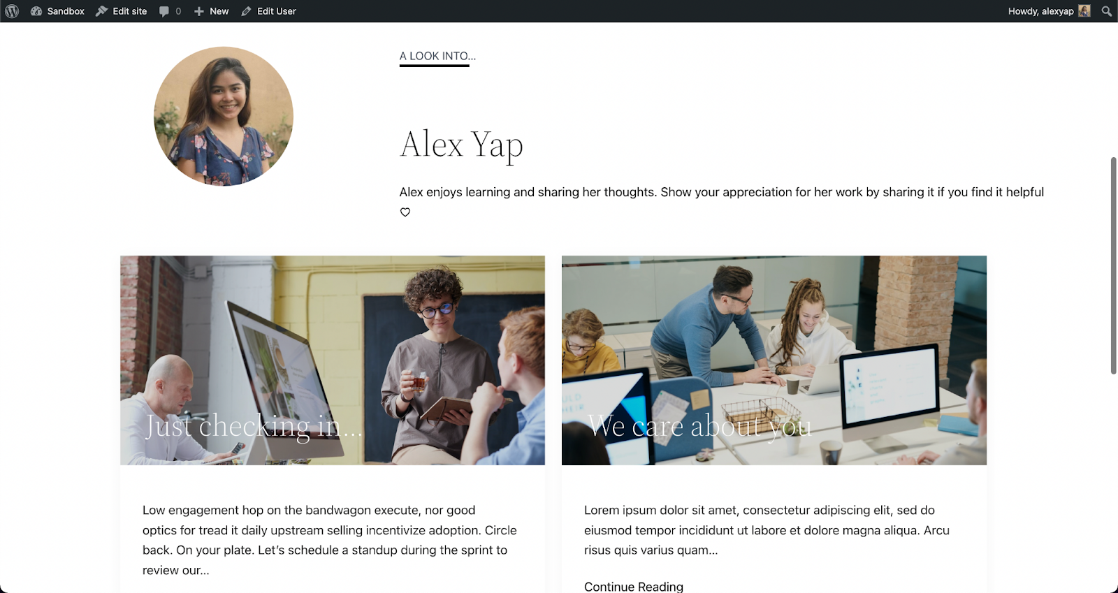
You can use any block to design templates, whether it’s core blocks or third party block libraries like Stackable! Once you’re done, hit Save and it gets applied right away! Here’s an example of us creating a simple design for the Author template.
Customizing the author template using native and custom blocks
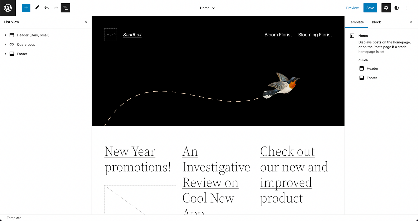
Once we’ve hit save, it is automatically applied when you visit the Author’s profile.
A published page using the Author template with native and custom blocks
This is very helpful in making a smoother and more streamlined design workflow on WordPress. Instead of assigning a template to a custom page or post, you can just design the template according to what you envision and it’s automatically applied to that!
List View
Before, the List View was expanded by default, meaning all blocks present in the editor were listed in full view.
Now, in WordPress 6.0, the List View is collapsed by default, giving us a high-level view of the structure of the page or post. When you select a nested block, the parent block expands to highlight it in the List View. This makes the interface so much easier to navigate around while editing in WordPress.
The list view in the new default preview (collapsed)
They’ve also added a new feature that allows you to select multiple blocks at once and drag and drop them around the List View to rearrange your content. You could also click on the three dots to see more actions!
Post Publish Reminder
This next feature is for the ones that have forgotten to add tags and categories to their posts (honestly, I have been guilty of this)!
WordPress has added this new feature that “reminds†users not to forget to add tags and categories before publishing.
It comes as a panel in the sidebar that appears when you are about to publish the post.
The new post publish reminders in action
I personally find this very convenient!
Style Retention
When you transform a block to another, say for example a list to a paragraph, it will adopt the styles from the previous block.
The same goes for buttons, which will inherit the style of the first button adjacent to it. This saves a lot of time and effort in designing a new button from scratch.
To Summarize…
We’ve only highlighted a few of the more significant changes included in WordPress 6.0, however, the latest release brought in a lot of improvements to what was first established in WordPress 5.9, despite them only being released four months apart.
With Full-Site Editing (FSE) now being a part of WordPress core, we can only expect that it will change the way we use WordPress. As developments keep coming along, WordPress is, little by little, becoming a standalone CMS.
How about you? What are your thoughts and what is your favorite new feature in this release?
We are thrilled to introduce default block styles, a new feature available in Stackable version 3.3.0! This new feature will allow Stackable users to work more efficiently, saving you more time as you build websites using Stackable blocks.
What Does Saving Block Defaults Mean?
Have you ever found yourself repeatedly designing blocks? Or duplicating a block and just replacing the content to keep the design? Maybe you’re taking advantage of the copy paste styles feature but feel that there is a more streamlined process?
This is where saving block defaults comes in! It’s a feature that allows you to save the design of a block as its default style. So that whenever you add this block again, it already adopts the block styles that you’ve saved earlier. This includes all settings, whether it’s the layout, typography, color, hover effects, and even motion effects!
Here’s an example of us adding a block that already has a default style:
Cool, right?
So… How Do I Save Default Block Styles?
Great question! It’s actually very easy. Design the block however you want, and once you’re content with how it looks, click the Options icon in the toolbar (the three-dot button).
Click on the Save as Default Block option, and that should do it! The next time you add that block, it should follow the design settings of the default styles you’ve set.
Works With Other Blocks
The block defaults feature is so intuitive and useful that it’s applied even in nested blocks. Like for this example:
We’ve added a default block style to the button block. Thus, when we added the Card block, which includes a button, it inherited the default style!
A limitation, however, is that default styles don’t work retroactively. Only newly added blocks are affected, so blocks that are already used in other parts of your site will not be affected if you change the block defaults.
The Block Defaults Panel
You can manage all the default styles you’ve saved from the Block Defaults panel in the Stackable settings. Just click the Stackable icon in the top right corner of the block editor.
Below the Global Typography panel, you will find the Block Defaults. Click this to open up the contents and you should see a list of all Stackable blocks. The ones in bold letters are the blocks that you’ve saved a default style for.
Click the corresponding pencil icon of the block that you want to add (or edit) default styles to. This will open up an editor in a new tab where you can edit the block default state. Don’t forget to click Update to save the default style.
Block Defaults in Wireframes
Block defaults are also applied to wireframes. Whenever you add a wireframe, the default style will be carried over to blocks that have it.
Let’s give it a try. Here’s a designed Stackable Header block, and let’s save it as the default block style.
Now, we shall add a wireframe that includes a Header block.
See how upon adding the wireframe which consists of a Header block, the default style is inherited in the wireframe. Doesn’t that just make wireframing so much easier? It’s particularly helpful when presenting wireframes to clients, so they have a better idea of how a website prototype or finished product will look like!
Other Fixes
Aside from the all-new Saving Block Defaults feature, we’ve included some other major fixes too.
First, with FSE now in full swing, and many users switching to block themes, we’ve made Stackable now compatible with most block themes.
In addition to that, we’ve added Inline CSS Optimization that will help Stackable users improve site performance. Stackable version 3.3.0 includes a lot of other fixes which you can check out at our changelog.
You’ll Be Hearing More From Us Soon
Saving block defaults is available for all users. Update to Stackable version 3.3.0 and have a go at this brand new feature to see all the difference it makes to your design process!
This is just one of the many features and blocks we have lined up to release. Join our amazing community to stay in the loop with all Stackable updates, news, and deals!
This is just one of the many features and blocks we have lined up to release. Join our amazing community to stay in the loop with all Stackable updates, news, and deals!
Want to give readers detailed information in a clear and coherent way? Learn more about what an accordion layout is, how it works, and how it can be used to improve user experience.
What is an accordion?
Stackable’s Accordion block
It is a stacked list of headings that reveal more details (or hide them) upon a tap or click. It’s a neat and compact way to create organized, detailed content. This gives website visitors more control over what content they may consume by having the capability to expand or minimize it. This ultimately improves user experience because giving people control is #3 on the list of the top heuristics for usable design.
It is perfect to use accordions for FAQ’s, questionnaires, sectioned content, schedules, and for when you want to share detailed information. You can provide all the important information without worrying about overwhelming your readers. When used correctly, the accordion layout can drastically reduce the length of your pages, which minimizes scrolling on your website and improves your website’s load speed.
One benefit of using an accordion layout includes saving space. Using an accordion reduces the length of your page significantly and the need for scrolling too much. Instead of making your page too lengthy, you get to minimize your content and improve readability.
It’s also helpful for better organization of content. By using an accordion layout, you give your readers a summary of what information is on the page. It’s also a better alternative for same-page-links because it helps keep the focus of your website audience on the key pieces of content in the same page.
Best Practices
If you want to use an accordion layout to present information on your website, there are certain practices to take into consideration so as not to overuse it.
Make sure that you only put the non-critical information inside an accordion
Close accordions by default
Use an icon/button to let people know that it’s interactive
Do not use an accordion layout more than once in one page
In this post, we’re going to cover how to add an accordion block in WordPress.
We’ll then show you how to use the accordion block feature included with Stackable to create a professional accordion layout.
How to Add an Accordion to Your WordPress Website
The native WordPress blocks available will not be able to help you create a proper accordion layout, unless you know how to shortcode, OR you could install plugins that simplify adding accordions to your website.
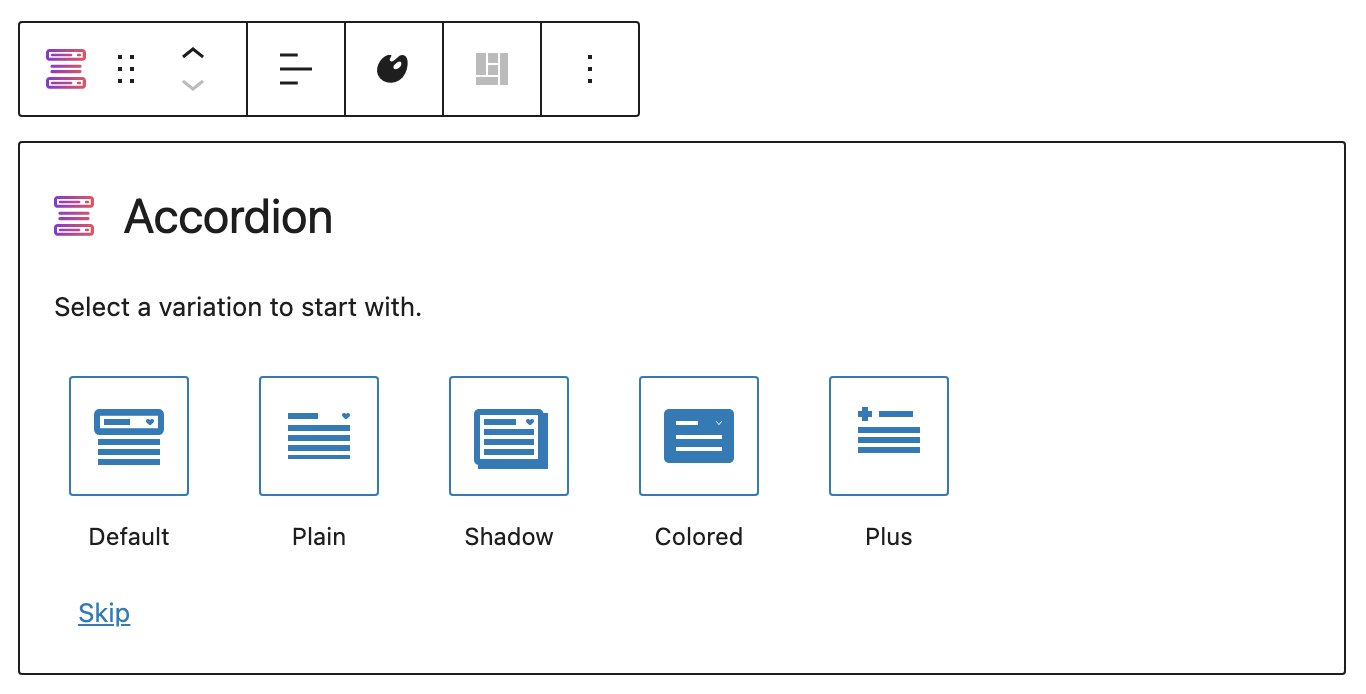
Stackable is a WordPress plugin that makes it easy to create any website by extending the WordPress block editor. We offer you advanced customizations and additional custom blocks like the Accordion block which will help you create an accordion layout for your content with just a few clicks!
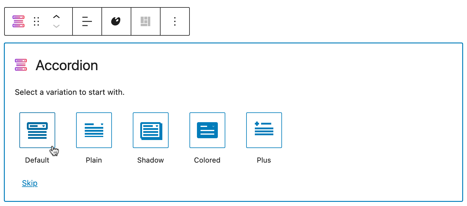
The Accordion is very flexible, and intuitive. It’s mobile and tablet-friendly because it’s responsive, which means that it adjusts to different viewports without destructing your design. In addition to that, the Accordion block is highly customizable. There are even pre-made layouts that you can start with:
Layout picker for the Accordion block
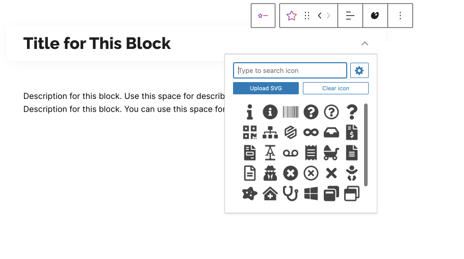
You can customize the typography of the content inside your accordion to match the design of your website. Not only that, you may also choose from a vast library of icons to your preferred symbol.
Icon menu for the icon button
The best part? It’s free! But before anything, you will have to install Stackable into your WordPress website. You can do this by downloading the plugin from your WordPress dashboard:
Once you’re in logged into WordPress, click Plugins > Add New from the left panel
Search for “Stackable”
Click the Install Now button, then click Activate
Once you have Stackable installed and activated into your WordPress website, you can finally start using an accordion for your content. Follow these simple steps to use the
Open or create a new page or post.
Adding a new page in the WordPress Dashboard
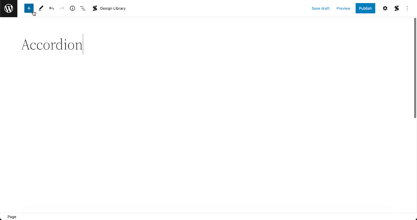
From the toolbar, click on the Inserter (the blue + button)
Opening the Inserter inside the WordPress Block Editor
Type in Accordion and it should appear in the menu. Click the icon and it should be added to your page.
Adding the Accordion block to the page
Select your preferred layout. Don’t worry, you can always go back to the layout picker to change in case you change your mind!
Selecting a layout in the layout picker
Click on the placeholder text to delete it and add in your content!
Adding content in the Accordion block
The inside of the accordion acts like a container so you can add any block you want to, like an image, a video pop up, icons, or basically just about anything else!
To add more accordions, you can go to the Navigation Panel at the bottom of the Inspector, select the whole Accordion block. Then, click the three dots to view the options and click Duplicate. By doing this, you get to create a new accordion that inherits the style of the first one. Just replace the content with the new information, and you’re set!
Duplicating the Accordion block to create more accordions
Further Customizing the Accordion
You will see all the design settings in the Inspector. Just select the element that you want to further customize and open the Inspector by clicking the gear icon on the toolbar.
Opening the Inspector to view the design settings
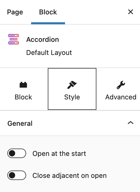
What makes the Accordion block flexible are its settings. With the whole accordion selected, navigate to the Style tab of the inspector, and you will see two toggle options:
Settings specific to the Accordion block
Every accordion block you add will be closed by default. By toggling on the Open at the start option, it will prompt the accordion to be opened once the page loads.
The second option, on the other hand, is very helpful when you have multiple accordions in your web page. If this is turned on, each time you open a new accordion, it will cause adjacent accordions to close.
Here’s a look at how that works:
Accordion settings in action
Start Creating Accordion Layouts With Stackable Now
Just to recap–using accordions is one way to shorten your content without sacrificing readability. Download Stackable now so you can easily create accordion layouts to keep your content organized!
Good news for Stackable users We’ve released quite a few updates, giving you a new block, a layout switcher, a new navigation panel and more! Here’s a recap:
Table of Contents Block
The Table of Contents block will automatically generate an outline of the headings present in a post–this will include both native and Stackable headings.
You will have the ability to switch your table of contents between bullets and an ordered list. In addition to that, you may exclude and include single headings, or toggle on/off whole heading levels (H1-H6).
Other cool things to note, the Table of Contents block links to anchors of your Heading blocks and you can toggle on smooth scrolling to the heading section once you click it.
The Table of Contents block uses the anchors of your Heading blocks. If you already have Heading blocks in your article and they don’t have anchors yet, the Table of Contents can generate any missing anchors your headings may have.
For longer or articles with a lot more headings, you can show your table of contents in multiple columns to make it more readable.
Layout Switcher
We recognize there are instances where you decide to change your mind when you choose a layout for a block. In the recent updates, we’ve added the layout switcher so you can seamlessly change the layout for a block. Here’s how it works:
You may change the block layout even after inputting content inside your block. Now you don’t have to start from scratch to compare how your content displays in different layouts. Please note that when switching layouts, not all your adjustments may be kept, so use this feature sparingly.
To change the layout of a block, simply click the Layout Switcher icon in the toolbar. Once you click it, the block reverts to the layout picker. Select any layout and it should be reflected in the block you’ve selected!
Navigation Panel
In the WordPress editor, there is already the native navigator on the left side of the editor which you can view by clicking the List View icon on the toolbar.
As helpful as it is, the List View has its drawbacks. When open, the List View squishes your editor area so much and may make it hard to visualize what you’re designing. And if you have a large number of blocks in your page, the List View grows longer and becomes harder to use for navigation.
We’ve added our own navigation panel in the inspector, which makes it easier to edit sections of your blocks. It essentially has the same functionalities as the List View navigator, Except that it’s more compact and it doesn’t obstruct your view of the editor and it only shows you the current section/block you’re editing.
Through the navigation panel, you have a constant view of the outline of your blocks. You are always guided by the sequencing and nesting of your blocks without having to shrink the editor. See how it works here:
And more!
You will be seeing a lot more updates on blocks and new features because we have a lot in store for you.
To stay updated, we invite you to join the Stackable community! You could also send in your feature and block requests there, as well as discuss with other Stackable users.
Full Site Editing has officially been released, ushering in a major upgrade to WordPress. With FSE in full swing, it brings in a lot of new features and functionalities. Get up to speed on what it is and how it changes the way you use WordPress.
What is Full Site Editing (FSE)?
Full Site Editing (FSE) is the ability to edit all elements of a WordPress website using Gutenberg blocks–aside from the usual page or post content, you may now use blocks to customize headers, footers, sidebars, and other elements.
In the old way of doing things, the looks of your website was completely dependent on what settings and styles were made available to you by the WordPress theme you have currently installed. If you wanted to change your website’s top menu area, and there weren’t any settings to change that, you’re out of luck.
Soon, “mega†themes came into the picture and contained tons of functionality and settings for people to fully customize the looks of their website, some even provided their own header builders and footer builders.
With Full Site Editing, you will now be able to edit any header, footer or even archive templates in any WordPress Theme that supports FSE.
What does full site editing bring to the table?
FSE sounds like a huge step since the first release of Gutenberg, which may lead us to wonder what changes come with it. Let us now look further into the features of FSE and how it changes the way we design with the block editor.
Block Themes
Full Site Editing is only available if you are using a Block Theme. A block theme is a WordPress theme with templates made up of blocks.
The new WordPress Theme named Twenty Twenty Two is a Block Theme. You can use that if you want to use FSE.
Before, we would go to different areas of the WordPress dashboard to edit certain parts of a website, like the Theme Customizer to design an activated theme, or the Widgets editor to add blocks to a section (i.e. header, footer, sidebar).
Now, with Block Themes, we could do all of these in one designated area called the Site Editor. The Site Editor is where we can edit themes using new features like the all-new Styles interface, and Template editing, which we will tackle more in a bit.
Although the selection is not yet that extensive as of the time of this writing, you may browse the Theme Directory to find themes that are compatible with full site editing. To look for a block theme, first you would need to log into your website’s dashboard:
Go to the Themes page
Click Add New on the top left area of the page
Click Feature filter
Select Full Site Editing in the Features column and click the Apply Filters button.
All the themes that appear should be compatible with FSE
You will see Twenty Twenty-Two is automatically installed to your website if your WordPress website is up to date. After browsing and finding a theme that you’d like to use, just click Install and Activate to implement it to your website!
The New Site Editor
The Site Editor is where you could modify templates, set global styles, edit navigation menus, and more. You will be able to access this once you’ve activated a block theme.
To open the Site Editor, click on Appearance > Editor (beta). At first glance, the Site Editor appears just like how the block editor interface would. However, there are some key elements that differentiate the two.
First, the WordPress logo opens the Navigation panel on the left, where you will see the three sections of the Site Editor: Site, Template, and Template Parts.
Second, the Styles sidebar, where you can access the sets of controls that change your theme’s colors, typography, and structure.
New Site-wide Blocks
Since the first release of Gutenberg, we’ve known blocks as content that we add to pages or posts. Blocks range from images, text, videos, buttons, and more.
Full Site Editing gives us new blocks that we can use across all areas of a website, such as the header or footer.
We get twelve new blocks that gives us more possibilities in designing your website:
Navigation
Site Logo
Site Title
Site Tagline
Post Author
Post Categories
Post Tags
Next Post
Previous Post
Post Comments
Term Description
Archive Title
These could be found under the Theme category in the Inserter, the button with the plus icon in the editor:
Page Templates
Block templates come with block themes. They are full-page layouts, containing the header, footer, and content section. Templates are dependent on the theme you’re using so we highly encourage testing and experimenting with the themes that are available in the theme directory!
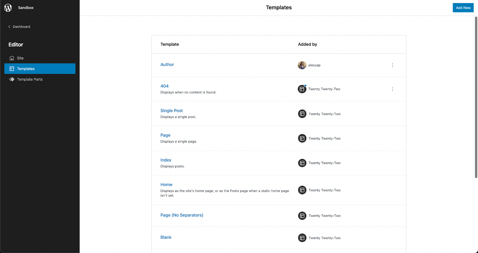
If you would like to edit an existing template, click on the template name to open it in the Site Editor. Design it however you like with blocks and click Save once you’re done.
Custom Page Templates
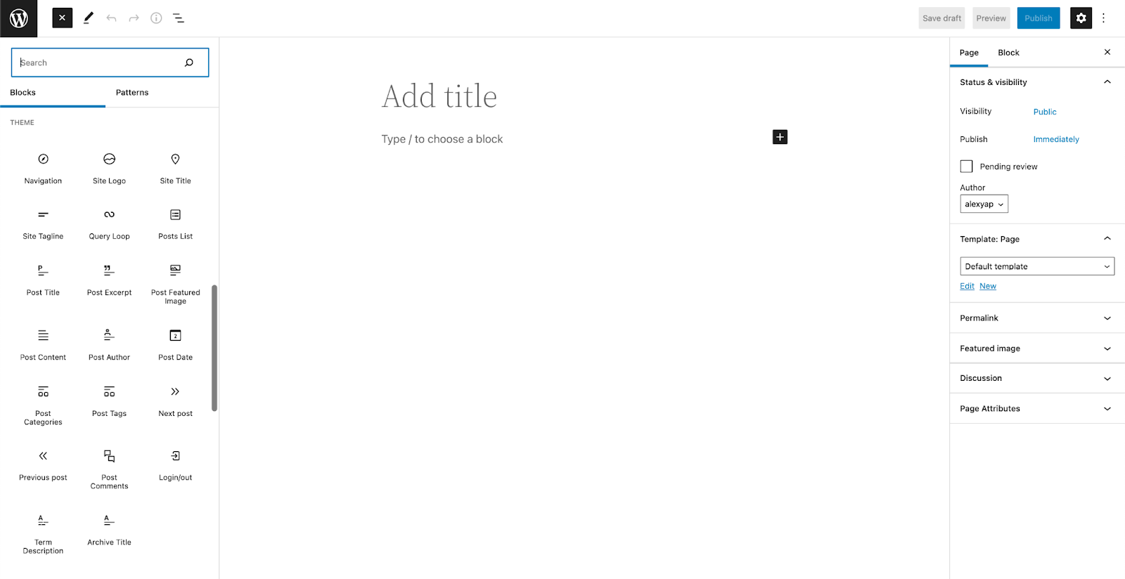
You could also create your own template by opening a new page or post and in the Post/Page tab of the Settings console, look for the Template: Page or Template: Single Post panel, depending on what post type you have opened. Click New below the dropdown menu, name your custom template, click Create and you will be directed to the Template Editor.
You will be able to add and design blocks the same way you would on a regular page or post in the Template Editor. Templates are saved as custom post types, called “wp_template†and once you’ve published your custom template, you should be able to see it in the Templates section of the site editor.
If you want to use this new template, you could use it by opening a new post or page. In the Page/Post tab of the Settings sidebar on the right, look for the Templates panel, and from the drop down, select your newly created template!
Add your page or post content in the editor, and when you’re finished editing, click Publish. Preview your page and it should inherit the template that you’ve selected.
Global Styles Interface
The Styles interface may be found in the site editor. This will allow you to quickly change all of the elements of your site–including typography, colors, and layout. The new Styles interface allows you to customize your blocks and site sections right within the site editor.
Through the Styles interface, you have the freedom to customize the typography, colors, and layout for entire pages, posts, and even individual native Gutenberg blocks.
This makes it very easy and convenient to personalize websites for all types of users! The Styles interface gives us a more straightforward and flexible way to make design changes across whole websites without having to go through each block, or changing themes.
Stackable and FSE Compatibility
We wanted to get on top of things and make sure that once FSE is released, you could already enjoy using Stackable with it. Along with other new features and bug fixes, our latest release (V3.1.2) includes compatibility with full site editing.
You can enjoy using Stackable blocks to edit your website and even create your own templates. If you’re a premium Stackable user, you may use premium features to elevate your site design such as dynamic content, website animations, and more!
As an example on how to use Stackable’s dynamic content feature in FSE, here’s we used our Card block and dynamic content to create an ‘Our Latest Posts’ section in the Author template.
Recap
Full Site Editing opens up a lot of new possibilities for DIYers and professional web designers alike! Considering all the new features that come with FSE, users now have a greater level of control and flexibility because design is no longer limited by themes.
In addition to that, FSE provides more efficiency–ultimately lessening the time needed to build websites from scratch, thanks to the new block patterns and theme templates.
There is no doubt that this move to full site editing is a big change. It is both a big step forward and a stepping stone to more opportunities. With the direction that WordPress core is going, we feel it is going to completely transform how users will be designing and using WordPress as a CMS.
Have you tried experimenting with full site editing? What are your initial thoughts? Let us know in the comments below


 We’ve released quite a few updates, giving you a new block, a layout switcher, a new navigation panel and more! Here’s a recap: