EDITS.WS

Author: Anika Huddleston

  • Divi Product Highlight: Gravity Forms Styler Module for Divi

    Gravity Forms Styler Module for Divi is a plugin available in the Divi Marketplace that makes it easy to completely customize the styling of your Gravity Forms right within the familiar Divi Builder interface. With this plugin, you can add Gravity Forms to your Divi layouts just like you would any other module. Using the options in the design tab, you have full control over each form aspect.

    One unique feature of this plugin is that you can preview the entire form, the form with validation errors, and the confirmation message page right within the Divi Builder. In this product highlight, we’ll take a closer look at the Gravity Forms Styler Module for Divi and help you decide if it’s the right product for you.

    Let’s get started!

    Installing the Gravity Forms Styler Module for Divi

    First, ensure the Gravity Forms plugin is installed and activated on your site. Additionally, purchase the Gravity Forms Styler Module for Divi plugin from the Divi Marketplace and download the plugin file.

    Install Gravity Forms Gravity Forms Styler Module for Divi

    To install the plugin, open the Add New page under the Plugins heading in the WordPress dashboard. Click the Upload Plugins button, then click Choose File to select the plugin file from your computer. Finally, click Install Now, and the plugin will be added to your website.

    Install Gravity Forms Styler Module for Divi

    Once the plugin is installed, click Activate Plugin.

    Activate Gravity Forms Styler Module for Divi

    Gravity Forms Styler Module for Divi

    The Gravity Forms Styler Module for Divi is a module that is added to the Divi Builder, which means that you can add Gravity Forms anywhere you could add any other Divi module, giving you the ultimate flexibility in your layouts and designs. Start by adding a new page to your site and select the Divi Builder option.

    Add new page with Divi

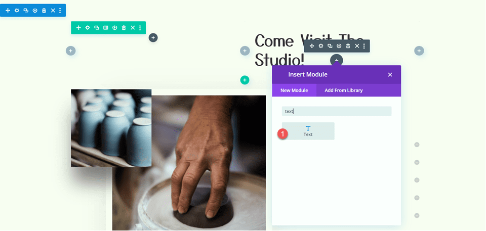
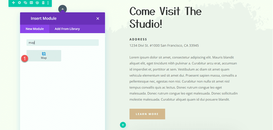
    On the new page, click the grey plus icon to insert a module. Select the Gravity Form module from the list.
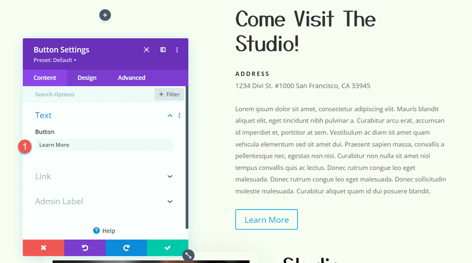
    Insert Gravity Forms Styler Module for Divi

    Content Settings

    Open the options for the Gravity Form module. The first option, titled “Form” allows you to select the Gravity Form you want to display.

    Gravity Forms Styler Module for Divi Choose Form

    You can also customize the title and description shown on the form. You can hide each of these elements, set a custom title or description, or display the title or description set in the Gravity Forms settings.

    Gravity Forms Styler Module for Divi Title Description

    Next, you can enable Ajax for form submissions. If enabled, the page will not reload after form submission. You can specify the starting tab index for the form fields and default field values in the content settings.
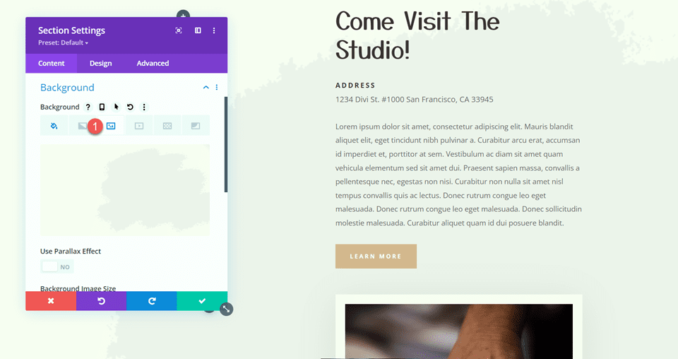
    Gravity Forms Styler Module for Divi Ajax Index Field Values

    Background

    In the content tab, you can also add a background to the Gravity Forms module. Using Divi’s extensive background options, you can add a background color, gradient, image, video, pattern, or mask to create unique layouts for your form.
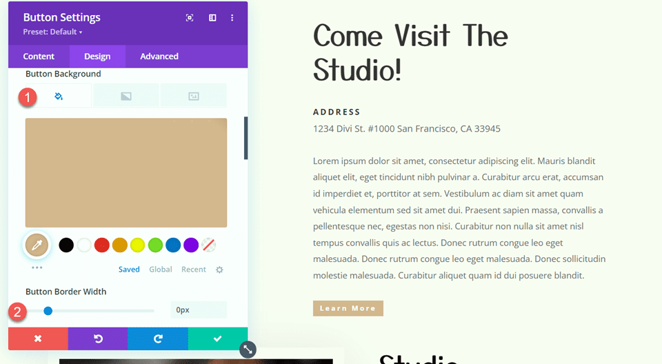
    Gravity Forms Styler Module for Divi Background

    Design Settings

    Now, let’s move over to the design tab. Here is where you can fully customize the design of every element in the form.

    Font

    Under the font tab, you can set the styles for the text in the form. In this section, you can set the font, font weight, style, alignment, color, text size, letter spacing, line height, and text shadow. Here, I set the font and font color.

    Gravity Forms Styler Module for Divi Font

    Form Heading

    In the form heading settings, you can customize the styling of the form heading font, title font, padding and margin, border, and background. With these options, you can fully customize the heading section separate from the rest of the form. For this example, I increased the size of the form title text.

    Gravity Forms Styler Module for Divi Form Title

    Fields

    The fields setting section is where you can set the styling of the form fields, including the background color, text color, focus styling, margin and padding, font styling, and border styling. In this section, I set the field color to white.

    Gravity Forms Styler Module for Divi Fields

    I also enabled focus borders. This applies unique styling to the border of the active field, as you can see in the screenshot.

    Gravity Forms Styler Module for Divi Fields Focus

    Fields Error

    Next, the fields error section is where you can style the text, background, and border colors for the form fields error.

    Gravity Forms Styler Module for Divi Fields Error

    Labels

    In the labels section, you can style the label text, set the padding and margin, style the border, and add a background or box shadow. For this example, I increased the label text size and changed the color. I also removed the bottom padding.

    Gravity Forms Styler Module for Divi Labels

    Required Text

    The next section is where you can style the required text. The options allow you to style the asterisk that appears next to the required fields.

    Gravity Forms Styler Module for Divi Required Text

    Sub Labels

    Next is the sub labels settings. Here, you can customize the styling of the sub label text, padding and margin, border styles, background, and box shadow. I set the sub label text color to grey and adjusted the top margin.

    Gravity Forms Styler Module for Divi Sub Labels

    Fields Description

    The fields description settings are similar to the last, where you can customize the text styling, padding and margin, border styles, background, and box shadow. I adjusted the margins in this example to bring the description and title closer together.

    Gravity Forms Styler Module for Divi Fields Description

    Next, you can set the field validation font styling in the fields validation setting. Additionally, you can customize the padding and margin, border styles, background, and box shadow.

    Gravity Forms Styler Module for Divi Fields Validation

    Error Notification

    The error notification settings are very similar, with options to customize the font, spacing, border, background, and box shadow.

    Gravity Forms Styler Module for Divi Error Notification

    Confirmation Message

    The next section is for customizing the confirmation message. You can use the preview option at the top to view the confirmation message layout.

    Gravity Forms Styler Module for Divi Confirmation Message

    Radio Buttons

    In the radio buttons settings, you can set the radio colors, text styling, and list spacing. Here, I modified the checked background color.

    Gravity Forms Styler Module for Divi Radio Buttons

    Checkboxes

    Similarly, you can change the checkbox colors, text styling, and list spacing in this section.

    Gravity Forms Styler Module for Divi Checkboxes

    File Uploads

    The file uploads section can be customized here. You can customize the font styling, spacing, border, background, and box shadow.

    Gravity Forms Styler Module for Divi File Uploads

    Section Break

    Here you can customize the font styling for the section break description and heading and customize the spacing, border, background, and box shadow.

    Gravity Forms Styler Module for Divi Section

    Pricing Fields

    You can also customize the Gravity Forms pricing fields using this module. You can style the product price, shipping price, and total price fields.

    Gravity Forms Styler Module for Divi Pricing Fields

    Progress Bar

    Next is the progress bar option. The progress bar appears in the form if there are multiple pages and provides a visual indicator for how far along in the form you are. In the design settings, you can customize the styling of the progress bar. You can set the colors, the bar height, customize the font options, add a border, and adjust the spacing.

    Gravity Forms Styler Module for Divi Progress Bar

    Form Footer

    In the form footer options, you can set the button alignment, spacing, border styles, background, and box shadow styles.
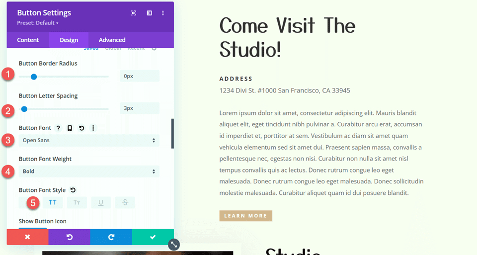
    Gravity Forms Styler Module for Divi Form Footer

    Button Styling

    Next are four sections where you can customize the buttons in the form: Submit Button, Page Navigation Buttons, Save and Continue Button, and Select All Button. In each of these sections, you can enable custom button styles to modify the styling to match the design of your form.

    Gravity Forms Styler Module for Divi Buttons

    Sizing

    In the sizing settings, you can adjust the form width, height, and alignment. Here, I set the width to 75% and the alignment to center.
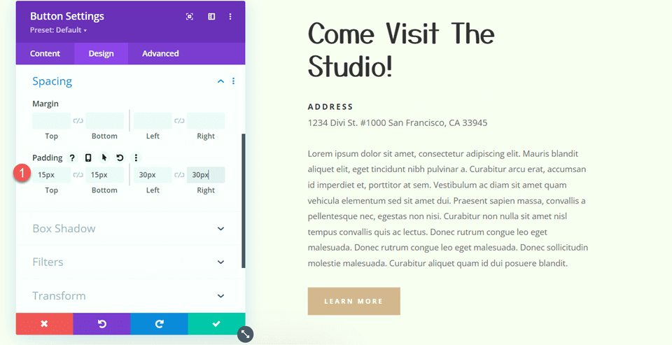
    Gravity Forms Styler Module for Divi Sizing

    Spacing

    Next, you can modify the margin and padding for the form. I added some padding to each side for this example.

    Gravity Forms Styler Module for Divi Spacing

    Border

    In the border settings, you can add a border around the form. Here, I added a blue border.

    Gravity Forms Styler Module for Divi Border

    Box Shadow

    Next, you can add a box shadow to the form.

    Gravity Forms Styler Module for Divi Box Shadow

    Filters

    Here, you can use different filters to modify how the form is displayed.

    Gravity Forms Styler Module for Divi Filters

    Transform

    In the transform settings, you can adjust how the form appears using scale, translation, rotation, skew, and transform-origin settings.

    Gravity Forms Styler Module for Divi Transform

    Animation

    Finally, you can apply an animation effect to the form in this section. You can select from seven different animation styles and customize the animation duration, delay, intensity, and more.

    Gravity Forms Styler Module for Divi Animation

    Predesigned Layouts

    Gravity Forms Styler Module for Divi also comes with access to some predesigned layouts for fully-styled forms. You can download the layouts from the plugin author’s website. These layouts are a great way to get a head start on the styling process.

    Gravity Forms Styler Module for Divi Premade Templates

    Gravity Forms Styler Module for Divi Layout Example

    Here is one example of how to style your Gravity Form using the Gravity Forms Styler Module for Divi.

    First Page

    Gravity Forms Styler Module for Divi Example 1

    Second Page

    Gravity Forms Styler Module for Divi Example 2

    Validation Error

    Gravity Forms Styler Module for Divi Example Validation Errors

    Confirmation Page

    Gravity Forms Styler Module for Divi Example Confirmation Page

    Purchase Gravity Forms Styler Module for Divi

    Gravity Forms Styler Module for Divi is available in the Divi Marketplace. It costs $39 for unlimited website usage and 1 year of support and updates. The price also includes a 30-day money-back guarantee.

    Purchase Gravity Forms Styler Module for Divi

    Final Thoughts

    Gravity Forms Styler Module for Divi brings all of the function and design flexibility of Divi to your forms built with Gravity Forms. With so many ways to customize the styling of each element, the design options are practically endless. If you’re tired of using Custom CSS to achieve your form styling and want an easy way to customize Gravity Forms using the Divi Builder, this may be a great product for you. We would love to hear from you! Have you tried the Gravity Forms Styler Module for Divi? Let us know what you think about it in the comments!

    The post Divi Product Highlight: Gravity Forms Styler Module for Divi appeared first on Elegant Themes Blog.

  • Divi Product Highlight: Divi Essential

    Divi Essential is a plugin that adds over 60 new modules to the Divi Builder, expanding the possibilities for the designs you can build. With this plugin, you can add advanced tabs, content toggles, dynamic sliders, unique image and content modules, team sections, social modules, and much more. Each module comes with powerful functionality and extensive design options that make designing complex layouts a breeze.

    Divi Essential also comes with access to 600+ premade section layouts that utilize the modules, 30 starter layouts, and 6 full templates with multiple pages. These layouts can all be downloaded from the Divi Essential website and can help you speed up the design process. In this post, we’ll take a closer look at Divi Essential to help you decide if it’s the right product for you.

    Let’s get started!

    Installing Divi Essential

    Divi Essential comes as a .ZIP plugin file. To install the plugin, open the plugin page in your WordPress dashboard and click Add New. Click Choose File and select the plugin file from your computer, then click Install Now.

    Install Divi Essential

    Once the plugin is installed, activate the plugin.

    Activate Divi Essential

    Divi Essential adds 65 new modules to the Divi Builder. You can access the added modules by clicking the Divi Essential module button in the Insert Module menu, or by searching “next”, which will bring up all of the Divi Essential modules.

    Divi Essential Insert Module

    Divi Essential Modules

    The 60+ new modules add lots of functionality to the Divi Builder. Each of the modules comes with content, design, and advanced options to fully customize the look and function. Let’s take a closer look at some of these modules using the premade layouts from Divi Essential.

    Creative Modules

    There are 10 different creative modules you can add to your page. Each module adds some unique functionality or design to your layout. In addition to the modules I’ll highlight below, Divi Essential comes with modules to add a floating element, a unique divider, a promo box, a Lottie animation, and a step flow section to demonstrate a process.

    Divi Essential Creative Modules

    Next Advanced Tab

    The advanced tab module allows you to create horizontal and vertical tabbed content sections. You can set the title, subtitle, and icon/image for each tab. This example is advanced tab layout 1.

    Divi Essential Advanced Tab

    Within the body of each tab, you can select a Divi Library layout to display, or you can add content by editing the title, description, image/icon, and button.

    Divi Essential Advanced Tab Body Content

    The module comes with extensive design settings for the entire module as well as the individual tabs. You can customize every aspect of the design, select different hover effects for the elements, set active styles for the selected tab, and much more.Divi Essential Advanced Tab Settings

    Next Business Hour

    This module makes it easy to display your business hours on your website. The example pictured is design layout 2. You can add each day of the week as an item within the module. Each item can be customized on its own, or you can use the module design options to apply styling to each item.

    Divi Essential Business Hours

    Next Content Toggle

    The content toggle module adds a toggle to your page which you can use to switch between content. In this example (layout 2), the toggle is used to switch between displaying details of a single or lifetime license.

    Divi Essential Content Toggle

    You can choose to add a Divi Library item to the toggle section, or you can add your content within the module settings. You can customize the design of each section as well as the design for the toggle.

    Divi Essential Content Toggle Settings

    Next Image Hotspot

    With this module, you can add hotspots to an image that reveals content on hover. You can add text and an image that will be revealed, and you can customize each element with design options. The hotspot icon and color can be easily changed, and the hotspot position can be set by changing the horizontal and vertical positions in the design settings. The example below is layout 1.

    Divi Essential Image Hotspot

    Next Timeline

    The timeline module can be used to visually represent events, the history of an organization, processes, and much more. Within the timeline module you can add individual timeline elements, which comprise each timeline section. You can add text, an image, a button, and an icon to each timeline element. Each element can be customized in the design tab, allowing you to create unique timeline designs. Pictured below is timeline layout 11.

    Divi Essential Timeline Item

    Slider Modules

    There are six different slider modules you can add to your site with Divi Essential. You can add a logo carousel, an image and text carousel, a 3D cube slider, a gallery slider, a testimonial carousel, and a post carousel. Let’s take a closer look at a couple of the slider modules.

    Divi Essential Slider Modules

    3D Cube Slider

    The 3D cube slider module adds a slider that flips with a 3d cube effect. You can customize each slide with an image, text, and background. Within the slider settings you can change the autoplay, navigation, and effect settings, as well as any of the design options. The example pictured is layout 4.

    Divi Essential 3D Cube Slider

    Next Divi Carousel

    This is carousel layout 17. There are four layouts you can select: image, text, text inside image, or text below image. This allows for many versatile layouts.

    Divi Essential Carousel

    You have full control over the layout and design of each carousel item as well as the carousel module itself. You can change the carousel autoplay settings, change the navigation settings, modify the effect, add a lightbox function, and more.

    Divi Essential Carousel Settings

    Image Modules

    With 12 different image modules, Divi Essential gives you many ways to creatively display images on your website. You can add an image magnifier, a masonry layout, modules that add different loading and hover effects to the images, an image hover box, a before and after slider, and more. Let’s take a look at a couple of the image modules.

    Divi Essential Image Modules

    Next Before After

    The Before and After module allows you to display a before and after photo that is revealed with a slider that you can drag. This layout is before after layout 4.

    Divi Essential Before After Slider

    You can set the before and after images, modify the labels, change the slider direction and function, and customize the design.

    Divi Essential Before After Settings

    Next Circular Image Hover

    With the circular image hover module you can create a circular image that reveals content with a hover effect.

    Divi Essential Circular Image Hover

    There are 19 different hover effects and 4 different hover directions you can choose from, giving you lots of flexibility in the design.

    Divi Essential Circular Image Hover Effects

    Next Image Accordion

    The image accordion module adds an interactive image accordion to your design. When you hover over one of the images in the accordion, it will expand and reveal content. You can choose to add an icon, title, description, and button to each image. In this example, the third image is set to open when the page loads. If you hover on another image, it expands and stays expanded.

    Divi Essential Image Accordion Settings

    You can set the accordion to move on hover or on click, and you can set it to open vertically or horizontally.

    Divi Essential Image Accordion

    Content Modules

    There are 19 modules in the content category. All of these can be used to dynamically display your content and create captivating layouts. You can add boxes and blurbs, modules with different text effects, buttons, blog post sliders, and more. Let’s take a look at some of the modules.

    Divi Essential Content Modules

    Next 3D Flip Box

    The 3D Flip Box module allows you to have a dynamic box that flips with a 3D effect on hover. You can have a different design on the back side of the box. This example is layout 7.

    Divi Essential 3D Flip Box

    In the module settings, you can customize the elements that are on the front and back. You can add an icon, an image, heading text, body text, and buttons. In the design tab, you can customize the look of every element.

    Divi Essential 3D Flip Box Settings

    Next Blurb

    The blurb module is very versatile and offers many content and design options you can use to create unique layouts. The example blurb used here is layout 11. It features a tilt effect on hover that moves with your mouse.

    Divi Essential Blurb

    In the module settings you can enable a pre-heading, set the heading text and heading tag, enable a post-heading text, add a description, add an image and icon, and add a button. You can add an image mask, unique hover effects to the blurb or buttons, and so much more with the extensive design options available.

    Divi Essential Blurb Hover

    Next Button

    The button module includes many options to add engaging effects to your button. You can add background transitions, hover effects, icon hover effects, stroke effects, 2d effects, set a background image, add a background gif, and more. In this example, I am using a collection of buttons with 2d effects. You can see how the Grow Rotate button has increased in size and rotated slightly on hover.

    Divi Essential Button

    Next Text Animation

    With the text animation module, you can add all kinds of animation effects to your text. This is example layout 10, and it features a typing effect. You can set the before and after text, add the text that gets animated, and select the animation effect. The text styling can be further customized in the design tab.

    Divi Essential Text Animation

    Next Text Color Motion

    The text color motion module allows you to animate the text color. This example is layout 9.

    Divi Essential Text Color Motion

    You can select from several different animation styles and select four different text colors that create an eye-catching gradient effect.

    Divi Essential Text Color Motion Color Settings

    Team Modules

    There are 5 different team modules that come with Divi Essential, allowing you to show off your team members with unique sections and effects.

    Divi Essential Team Modules

    Next Team Overlay Card

    With the team overlay card module, you can show off your team members with an overlay that appears on hover and reveals additional content, such as a description or social media icons. The example shown is layout 1, which features a curved border that adds a unique touch.

    Divi Essential Team Overlay Card

    Next Team Social Reveal

    With this module, social media icons are revealed beneath the team member description section on hover. This example is layout 1.

    Divi Essential Team Social Reveal

    Social Modules

    Divi Essential adds ways to connect social media to your website. For Facebook, you can add the following modules: share, like, embedded video, comment, embedded comment, embedded post, and embedded page. For Twitter, you can add a timeline, tweet, Twitter button, or follow button.

    Divi Essential Social Modules

    Next FB Comment

    Here is the Facebook Comment module. You can use this module to allow users to comment on your site content with their Facebook account. The design can be customized with options in the design tab.

    Divi Essential FB Comment

    Next Twitter Timeline

    This module allows you to add a Twitter timeline to your page. All you need to set is the Twitter account username, and the timeline will appear. You can customize the timeline with the design settings.

    Divi Essential Twitter Timeline

    Review Modules

    There are three review modules you can use to display customer reviews and testimonials on your website.

    Next Divi Review

    The review module allows you to add customer reviews to your page. You can add a name, position, and description, and you can set the star review for each module. This is layout example 1.

    Divi Essential Review

    Next Testimonial Slider

    With this module, you can add a slider to show off your customer testimonials and reviews. This is layout 11. Each testimonial slide is added as an item to the module, meaning you can customize the design of each slide individually and you can customize the slide design as a whole. You can add a rating, text, and image to each slide. In the slider settings, you can choose to have the slider auto-play, adjust the slider transition settings, and change the navigation settings. The options in the design tab allow you to customize the look of the slider to your liking.

    Divi Essential Testimonial Slider

    Divi Essential Starter Layouts

    In addition to the modules and the module layouts we explored above, Divi Essential also comes with 30 starter one-page layouts that you can use. Let’s take a closer look at one.

    Divi Essential Starter Templates

    Tour Layout

    This is the tour layout. The design is full of animations and interactive elements. The heading uses the multi-heading module and comes in with a reveal effect. Below is a logo carousel, three blurbs, and a carousel displaying destinations. Next is a section with a floating image and some content and number counters on the right. The map section utilizes the hotspot module to pinpoint destinations and reveal information on hover. Finally, there is a testimonial slider, a newsletter sign-up, and a footer.

    Divi Essential Tour Website Starter Layout

    Divi Essential Prebuilt Websites

    Divi Essential also comes with access to 6 full website templates that include multiple pages.

    Gardener Template

    Let’s take a look at the home page for the gardener template. In addition to this page, the template includes the following pages: about us, services, gallery, project, project details, and contact.

    Divi Essential Garden Prebuilt Website

    The page opens with a hero section with multiple headings, a large image, a floating element, buttons, and several background graphics. The next section features four blurb modules that highlight services. Following this is another section with some text and images that have a floating effect. The heading content has a reveal animation. The services section below also utilizes the Divi Essential blurb modules and is followed by a floating element with a rotating animation and an image accordion that expands and reveals content on hover.

    Divi Essential Garden Website Layout Home Page

    Next is another section that has blurb modules, followed by a section with a fullwidth background image and a floating graphic. There is a pricing table section below this,

    Divi Essential Garden Website Layout Home Page 2

    Continuing with the home page, there is a logo slider and a before/after slider, followed by a testimonial slider. Finally, the page ends with a newsletter sign-up form.

    Divi Essential Garden Website Layout Home Page 3

    Where to Purchase Divi Essential

    Divi Essential is available in the Divi Marketplace. It costs $79 for unlimited website usage and 1 year of support and updates. The price also includes a 30-day money-back guarantee.

    Final Thoughts

    Divi Essential is packed with modules that add new features and dynamic layouts to your website. I was impressed with the customizability and the extensive options that come with each module. The demo layouts, the starter one-page layouts, and the prebuilt website templates that come with Divi Essential all seem to be high-quality designs that you can easily use and modify for your own design purposes. If you are looking for an all-in-one plugin that will expand the possibilities of what you can design with Divi, Divi Essential is a great option.

    We would love to hear from you! Have you tried Divi Essential? Let us know what you think about it in the comments!

    The post Divi Product Highlight: Divi Essential appeared first on Elegant Themes Blog.

  • Divi Product Highlight: Divi Masonry Gallery

    Divi Masonry Gallery adds a new gallery module to the Divi Builder. With this plugin, you can build and customize masonry gallery layouts to display images on your website. You can filter images by categories, enable pagination, open images in lightbox displays, and more. The plugin also comes with design options allowing you to fully customize the design of the masonry gallery module. In this product highlight, we’ll take a look at Divi Masonry Gallery to help you decide if it’s the right product for you.

    Let’s get started!

    Installing Divi Masonry Gallery

    To install Divi Masonry Gallery, navigate to the Plugin page in the WordPress dashboard and Click Add New. Click Choose File, select the .ZIP plugin file from your computer, then click Install Now.

    Once the plugin is installed, click activate.

    Divi Masonry Gallery

    Once the plugin is activated, you will see the Divi Masonry Gallery module appear in the Divi Builder. Let’s take a look at the module settings.

    Content Settings

    Most of the key options are under the Gallery Settings section of the content tab. Here you can add your images and choose how they are displayed in the masonry gallery.

    Gallery Settings

    This is the masonry gallery in the normal gallery mode.

    Divi Masonry Gallery Normal Gallery

    You can also select minimized gallery mode, where you can set a limit to how many images are displayed. The text shown on the last image can be customized, and you can choose whether the last image opens a lightbox or opens a link.

    Divi Masonry Gallery Minimized Gallery

    The number of columns and the spacing between images can be adjusted. In the example pictured here, I set the gallery to 4 columns and increased the spacing.

    Divi Masonry Gallery Columns Spacing

    Here you can also choose to have images zoom in on hover, load in random order each time, and adjust the image size.

    Divi Masonry Gallery Image Zoom Random Order

    Image Onclick Actions

    You can set images to open in a lightbox, open a specified URL, or do nothing on click. If the lightbox option is selected, you can set the background color and choose how the title is displayed.

    Divi Masonry Gallery Lightbox Gallery

    Here is the lightbox on the front end.

    Divi Masonry Gallery Lightbox

    Links must be added in order of the images and separated by {{link}}. You can also set the link target.

    Divi Masonry Gallery Image Links

    Categories

    Divi Masonry Gallery adds a category field to each image in the media library. You can enable these categories to filter the gallery images.

    Divi Masonry Gallery Media Categories

    With the categories filter enabled, you can choose the included categories, show or hide the all categories button, and change the all categories button text.

    Divi Masonry Gallery Show Categories

    Pagination

    There are several types of pagination to choose from. Here is the numbers and next/prev pagination option. You can also select a load more option, or disable pagination altogether.

    Divi Masonry Gallery Pagination

    You can also specify the number of images displayed on each page, modify the button text, scroll to the top after pagination, and set a scroll to top offset.

    Divi Masonry Gallery Pagination

    Background

    Here you can set the background color for the masonry gallery module.

    Divi Masonry Gallery Background

    Design Settings

    In the design tab, you can further customize the look of the masonry gallery module.

    Overlay

    Here you can set an icon or the image title/caption to appear over the image on hover and set the overlay background color. With the overlay icon option selected, you can choose the icon and icon color.

    Divi Masonry Gallery Overlay Icon

    You can customize the font and colors if the overlay title/caption is selected. Additionally, you can select the overlay content animation, set the text alignment, letter spacing, and text shadow.

    Divi Masonry Gallery Overlay Content

    Image

    In the image settings, you can add a rounded corner and border to your gallery images.

    Divi Masonry Gallery Image

    Gallery Filter

    Here you can customize the design of the gallery filter. You can change the alignment, background, margin and padding, font, spacing, rounded corners, borders, and box shadows. You can also change each of these settings for the active filter button.

    Divi Masonry Gallery Gallery Filter

    Gallery Pagination

    The gallery pagination design options allow you to fully customize the look of the pagination. Much like the gallery filter settings, you can customize the alignment, background, margin and padding, font, spacing, border, and shadow styles for the active and regular pagination buttons.

    Divi Masonry Gallery Gallery Pagination

    Minimized Gallery Options

    The minimized gallery type displays an overlay over the last image. Here, you can customize the styling of the overlay. You can change the background color, font, alignment, text size, and text shadow.

    Divi Masonry Gallery Minimized Gallery Options

    Other Design Settings

    In addition to these module-specific design options, you can also customize all of the sizing, spacing, border, box shadow, filters, transform, and animation options.

    Divi Masonry Gallery Design Settings

    Divi Masonry Gallery Examples

    Example 1

    The first example gallery layout features four columns of images. The filters at the top can be used to sort images by category, and the pagination buttons can be used to view the next page of images.

    Divi Masonry Gallery Example 1

    Example 2

    This layout uses the minimized gallery layout. The last image can be set to open a lightbox or a new page where the rest of the gallery images are shown.

    Divi Masonry Gallery Example 2

    Example 3

    Finally, the third example features a normal gallery layout with 3 columns. On hover, an overlay appears, displaying the image title.

    Divi Masonry Gallery Example 3

    Purchase Divi Masonry Gallery

    Divi Masonry Gallery is available in the Divi Marketplace. It costs $25 for unlimited website usage and 1 year of support and updates. The price also includes a 30-day money-back guarantee.

    Purchase Divi Masonry Gallery

    Final Thoughts

    With the Divi Masonry Gallery plugin, you can easily create galleries to display images of all sizes in a beautiful, interactive, and fully-customizable masonry layout. The plugin is feature-rich. You can enable category filters, pagination, minimized galleries, image links, and lightbox popups. With extensive design options, you can customize each part of the masonry gallery module to your liking. If you are looking for a creative way to display images on your site with design options you can customize with Divi, Divi Masonry Gallery is a great option.

    We would love to hear from you! Have you tried Divi Masonry Gallery? Let us know what you think about it in the comments!

    The post Divi Product Highlight: Divi Masonry Gallery appeared first on Elegant Themes Blog.

  • Divi Product Highlight: Kali Multi-Purpose Divi Child Theme

    Kali is a multi-purpose Divi child theme that comes with over 18 beautifully designed pages. It is fully customizable with built-in Divi options and can be used for many different types of websites, with many page layouts that are ideal for service-based businesses in particular. The child theme is modern and colorful and utilizes motion and interactivity in an engaging way throughout the site. In this post, we’ll take a look at the Kali multi-purpose Divi child theme to help you decide if it’s the right Divi child theme for you.

    Let’s get started!

    Installing Kali Multi-Purpose Divi Child Theme

    Before installing the Kali multi-purpose Divi child theme, make sure you have Divi installed on your WordPress site. The theme author recommends installing Kali on a fresh WordPress installation since the child theme will overwrite the existing website. Once you are ready to install, navigate to the Themes page under Appearance in your WordPress dashboard and click Add New.

    Kali Multi-Purpose Divi Child Theme Installation Add New

    From the Add Themes page, click the Upload Theme button at the top. Select kali-divi-child-theme.zip from your files, then click Install Now.

    Kali Multi-Purpose Divi Child Theme Installation Upload

    Once installed, activate the theme.

    Kali Multi-Purpose Divi Child Theme Installation Theme Activated

    When the child theme is activated, you will see the Kali Demo Import tab appear in the Dashboard menu. This page allows you to easily import all child theme content and settings with one click. Select Import Demo Content to begin.

    Kali Multi-Purpose Divi Child Theme Installation Import

    Once the import is successful, you will see a completion message.

    Kali Multi-Purpose Divi Child Theme Installation Import Complete

    Now open up your home page, and you will see that the child theme has been fully installed and set up for you to use – all you need to do is replace the content! Now let’s explore the page layouts that come with the Kali multi-purpose Divi child theme.

    Kali Multi-Purpose Divi Child Theme Pages

    Kali comes with 18+ pages that are fully designed and customizable with your content. The overall design is clean, modern, and colorful. Each page is full of graphic elements that are animated as you load the page or move as you scroll, creating an enjoyable and engaging user experience throughout the site. Each section is designed well and is fully responsive. Let’s take a look at each of the page layouts that you get with the Kali multi-purpose Divi child theme.

    Kali Home Page

    The home page opens with a large hero section. Loading animations are applied to the text and graphic elements, creating an eye-catching visual right as you open the page. Below is a services section followed by a call-to-action section, another section to highlight services, and a “featured on” section where you can feature logos. Next is a dynamic section with a large central image, two blurbs on either side, and a couple of smaller images around the title that move on scroll.

    Kali Multi-Purpose Divi Child Theme Home 1

    Next is the about us section, then a section where you can outline steps of a process. There is a portfolio section, a testimonial section, and a pricing plan section with a toggle that you can use to switch between pricing plans. Following this is another section with text, an image, and a button where you can talk about your services, then a section with eight blurbs you can use to show off features. The blog post section has a large single post highlighted on the left and 4 posts on the right. At the end of the page is the contact section, which has text and some blurbs on the left, and the contact form on the right.

    Kali Multi-Purpose Divi Child Theme Home 2

    Kali About Us Page

    The About Us page has a header section with a button, an about us section with “featured on” logos, a team section that reveals social media icons on hover, values, and a contact section.

    Kali Multi-Purpose Divi Child Theme About Us Page

    Kali Services Page V1

    Services page version 1 starts with a header section that has a free estimate contact form. Following this is a services section with 3 blurbs, values, and a contact form.

    Kali Services Page V2

    Services page version 2 also opens with a header with a free estimate contact form. This page features 8 service blurbs that fill with color on hover. Next is a values section, followed by the contact section.

    Kali Single Service Page

    The single service page also opens with a header that has a free estimate form. There is a services section with text and a CTA on the right side, a testimonial section with a section for logos, a CTA, team members, values, and a contact section with a form.

    Kali Projects Page

    The projects page is where you can highlight your portfolio items and recent projects. The header features an image section where you can show off screenshots. Next is the projects section, a CTA, a section for logos, values, and a contact section.

    Kali Multi-Purpose Divi Child Theme Projects

    Kali Single Projects Page

    The single project page is where you can share about your project in-depth. The header features space for screenshots. There is a section with some project information, including blurbs on the right that highlight some project features. Next are two sections where the challenge and the solution are highlighted. Below is an about section, values, and a contact section.

    Kali Pricing Page

    The pricing page features a header with a button, an image, and several graphic elements. Below this is the pricing table, which features toggle buttons at the top to switch between pricing plans, followed by values and a contact section.

    Kali Multi-Purpose Divi Child Theme Pricing Plans

    Kali Testimonials Page

    The testimonials page has a header section, four large testimonial blurbs, values, and a contact section.

    Kali Multi-Purpose Divi Child Theme Testimonials


    Kali Blog Page V1

    Blog page version 1 opens with a header section that has a search bar. A featured post is highlighted below this, with the latest articles to the right. Next is a newsletter sign-up form, followed by 3 columns of blog posts sorted by category and a contact section.

    Kali Multi-Purpose Divi Child Theme Blog V1

    Kali Blog Page V2

    Blog page version 2 also has a header with a search bar. The blog posts on this page are organized in a grid-style layout. At the bottom of the page is the contact section.

    Kali Multi-Purpose Divi Child Theme Blog 2


    Kali Contact Us Page

    The contact us page features a graphic header section, blurbs with contact information, and a contact section.

    Kali Multi-Purpose Divi Child Theme Contact Us

    Kali Thank You Page

    After completing the contact form, users will be redirected to the thank you page. It features a header, a section with text and an image, blurbs with contact information, recent articles from the blog, and a contact section.

    Kali Multi-Purpose Divi Child Theme Thank You

    Kali Multi-Purpose Divi Child Theme Divi Theme Builder Templates

    Now let’s take a look at the theme builder templates that are included with Kali.

    Kali Blog Post Layout

    The blog post layout features a header section with the blog title, meta information, and a large featured image. The post is below, followed by a newsletter sign-up box and a contact section.

    Kali Multi-Purpose Divi Child Theme Blog Post

    Kali Blog Category Layout

    The blog category layout has a header with the category title. The blog posts are below, in a grid layout with read more buttons. At the bottom is a contact section.

    Kali Multi-Purpose Divi Child Theme Blog Category Page

    Kali 404 Page Layout

    The 404 page features a centered image, some text, and a button leading users back to the home page.

    Kali Multi-Purpose Divi Child Theme 404 Page

    Kali Multi-Purpose Divi Child Theme Header and Menu Layouts

    There are three different header and menu layouts that come with the Kali multi-purpose Divi child theme.

    Kali Header and Menu Layout V1

    The first header layout features a blue secondary menu at the top with social media icons, contact information, and a CTA button. The primary menu section has a logo on the left, right-aligned menu items, and a hamburger menu that opens the custom slide-in.

    Kali Multi-Purpose Divi Child Theme Header Menu Layout 1

    Kali Header and Menu Layout V2

    Header layout 2 is a simpler design and doesn’t have a secondary menu. It has a logo, a right-aligned menu, a CTA button, and a hamburger menu icon to open the custom slide-in.

    Kali Multi-Purpose Divi Child Theme Header Menu Layout 2

    Kali Header and Menu Layout V3

    Header layout 3 features a simpler design for the secondary menu with some centered text and a CTA button. Like the other layouts, the primary menu features a logo on the left, right-aligned menu items, and a hamburger icon to open the custom slide-in.

    Kali Multi-Purpose Divi Child Theme Header Menu Layout 3

    Kali Multi-Purpose Divi Child Theme Additional Layouts

    Finally, there are some additional layouts included with the Kali child theme, including a custom slide-in and some header layouts.

    Kali Custom Slide-In

    The custom slide-in is a section that can be opened by the hamburger menu icon in the header. It features information about services and includes a CTA button. You can add your own modules to the slide-in to customize it to your site.

    Kali Multi-Purpose Divi Child Theme Custom Slide-In

    Kali Hero Header Layouts

    Kali Hero Header V1

    The first hero header layout features text that slides in, a CTA button, a large image that has a bounce effect as it loads, and some smaller graphics around the section.

    Kali Multi-Purpose Divi Child Theme Hero Header 1

    Kali Hero Header V2

    The second hero header layout features some text and a CTA button that slide in. On the right side is a free estimate contact form with some images around it.

    Kali Multi-Purpose Divi Child Theme Hero Header 2

    Kali Hero Header V3

    Hero header version 3 features text that slides in, a CTA button, and an image where you can showcase some mobile screenshots.

    Kali Multi-Purpose Divi Child Theme Hero Header 3

    Kali Hero Header V4

    Hero header version 4 has text and a CTA button that slide in, and a large image that has a bounce effect on load.

    Kali Multi-Purpose Divi Child Theme Hero Header 4

    Kali Sub Hero Header Layouts

    Kali Sub Hero Header V1

    The first sub hero header layout features the page title and CTA button on the left and an image on the right.

    Kali Multi-Purpose Divi Child Theme Sub Hero Header 1

    Kali Sub Hero Header V2

    Sub hero header version 2 has the text on the left and a free estimate form on the right.

    Kali Multi-Purpose Divi Child Theme Sub Hero Header 2

    Kali Sub Hero Header V3

    Sub hero header version 3 features text on the left and a placeholder for screenshots on the right.

    Kali Multi-Purpose Divi Child Theme Sub Hero Header 3

    Kali Sub Hero Header V4

    Finally, sub hero header 4 features a centered title text and a CTA button.

    Kali Multi-Purpose Divi Child Theme Sub Hero Header 4

    Where to Purchase the Kali Multi-Purpose Divi Child Theme

    The Kali multi-purpose Divi child theme is available in the Divi Marketplace. It costs $35 for unlimited website usage and 1 year of support and updates. The price also includes a 30-day money-back guarantee.

    Kali Multi-Purpose Divi Child Theme

    Final Thoughts

    The Kali multi-purpose Divi child theme has a high-quality design, and I love the use of motion and interactivity throughout each page. With service pages, project pages, eye-catching CTA sections, pricing tables, testimonials, a custom slide-in section, and so much more, this child theme is feature-packed and provides a great foundation for your next web design project. If you are looking for a child theme for your next web design project, the Kali multi-purpose Divi child theme is a great option.

    We would love to hear from you! Have you tried the Kali multi-purpose Divi child theme? Let us know what you think about it in the comments!

    The post Divi Product Highlight: Kali Multi-Purpose Divi Child Theme appeared first on Elegant Themes Blog.

  • Divi Product Highlight: Clara Divi Child Theme

    Clara is a Divi child theme with a modern and feminine design. It comes with over 16 fully customizable pages and several design variations for the header and hero sections. The Clara Divi child theme is perfect for service-based businesses and includes layouts for your portfolio, service pages, testimonials, and more. In this post, we’ll take a close look at the Clara Divi child theme to help you decide if it’s the right Divi child theme for you.

    Let’s get started!

    Installing Clara Divi Child Theme

    Before installing the Clara Divi child theme, make sure you have Divi installed on your WordPress site. The theme author recommends installing Clara on a fresh WordPress installation since the child theme will overwrite the existing website. Once you are ready to install, navigate to the Themes page under Appearance in your WordPress dashboard and click Add New.

    Clara Divi Child Theme Install 1

    From the Add Themes page, click the Upload Theme button at the top. Select clara-divi-child-theme.zip from your files, then click Install Now.

    Clara Divi Child Theme Install 2

    Once installed, activate the theme.

    Clara Divi Child Theme Install 3

    When the child theme is activated, the Clara Demo Import tab will appear in the Dashboard menu. This page allows you to easily import all child theme content and settings with one click. Select Import Demo Content to begin.

    Clara Divi Child Theme Install 4

    Once the installation is successful, you will see a completion message.

    Clara Divi Child Theme Install 5

    Now the child theme has been fully installed and set up for you to use – all you need to do is replace the content! Let’s explore the page layouts that come with the Clara Divi child theme.

    Clara Divi Child Theme Pages

    The Clara Divi child theme comes with 16 different page layouts, including blog and project pages. Some of the layouts are set up as pages, and some are set up as Divi Theme Builder layouts. The child theme is editable with the Divi Builder, so you can easily change the content or modify the design and colors as you like.

    The design of the Clara Divi child theme is simple, elegant, and feminine, with a muted pink and orange color scheme. I like the primary serif font that was selected for the headings, and the script font used as an accent adds a nice touch to the design. Loading animations are used on images throughout the design, adding some subtle but effective movement to the layouts.

    Let’s take a closer look at each layout.

    Clara Home Page

    The home page opens with a hero header section with an image that slides in from the side and a call-to-action button. The page also features a services section, a call-to-action section, a testimonial section, a how we work section where you can highlight steps of a process, recent blog posts, and a newsletter sign-up form. I really like the home page layout, especially the how we work section with the overlaying text and arrows.

    Clara Divi Child Theme Home

    Clara About Us Page

    The About Us page has a header with two images, followed by a How it all started section that has three number counters. The Our story so far section has an image on the right and a toggle section. Following this is a testimonial section, a CTA section, and a newsletter sign-up form.

    Clara Divi Child Theme About Us

    Clara Services Page

    The services page features a header, some description text, and 6 blocks to show off each of your services. This is followed by the testimonial, CTA, and newsletter sign-up sections.

    Clara Divi Child Theme Services

    Clara Single Service Page

    This page layout is where you can share information about your service in-depth. Like the other pages, this page begins with a header section with two images that slide in from the side. The main section on this page features a long section of text with an image on the right. Below this are three number counters followed by a CTA section, testimonials, and a newsletter sign-up.

    Clara Divi Child Theme Single Service

    Clara Projects Page

    The projects page can serve as a portfolio to show your past work. The layout has a header, followed by the portfolio section with large images to show off your work. An orange overlay appears on hover. Like many of the other pages, this page ends with a testimonial section, a CTA section, and a newsletter sign-up.

    Projects

    Clara Single Project Page

    The single project page is where you can highlight a single project or portfolio item you would like to showcase. The layout uses a simple heading section with the title, followed by a project summary section where you can write about the client, the challenge, and the solution. There are four images in this layout, which you can use to show images of your work. Below these are two subheadings for the challenge and the solution with a toggle section that can open to reveal more information about the work. This is followed by the testimonial section, the CTA section, and the newsletter sign-up section.

    Clara Divi Child Theme Single Project

    Clara Testimonials Page

    The testimonials page features a header, followed by the testimonials section. Each testimonial is in a box with a quote icon at the top right corner. There are two rows of these testimonial sections, with one full-width testimonial featured in between. The page ends with a CTA and a newsletter sign-up section.

    Clara Divi Child Theme Testimonials

    Clara Pricing Page

    The pricing page opens with a header section. The pricing section is below and features the pricing and a button on the left, with the pricing tier title and a description on the right. This section also has three number counters, which are followed by the testimonial, CTA, and newsletter sign-up sections.

    Clara Divi Child Theme Pricing

    Clara FAQ Page

    The FAQ page layout also begins with a header section with two images. The FAQ section below is split into three sub-sections, which I think is a nice touch to help customers navigate the page easily. FAQ questions are formatted in toggle modules that expand on click. This is followed by the testimonial, CTA, and newsletter sign-up sections.

    Clara Divi Child Theme FAQ

    Clara Blog with Sidebar

    The Clara Divi child theme comes with two different blog page layouts. The first layout is the blog with a sidebar layout. This layout begins with a large header, followed by a blog section split with the blog content on the left and a sidebar on the right. The blog content is centered and has a large featured image. The sidebar features an introduction section, a search module, recent posts, and links to blog categories. At the bottom of the page is a newsletter sign-up section.

    Clara Divi Child Theme Blog Sidebar

    Clara Blog Grid

    The alternative blog layout is the blog grid layout, which does not come with a sidebar. The page begins with a large header, and the blog posts below are organized in a grid. Below is a newsletter sign-up section.

    Clara Divi Child Theme Blog Grid

    Clara Contact Us Page

    The contact page features a header section with two images. The address, email, and opening hours are highlighted below with icons. Following this is the contact section which has some text and a contact form. Below this is a newsletter sign-up form.

    Clara Divi Child Theme Contact Us

    Clara Thank You Page

    The thank you page is displayed after the contact form is completed. This layout features a header, three blurbs for the address, email, opening hour information, and recent blog posts, followed by a newsletter sign-up form.

    Clara Divi Child Theme Thank You

    Clara Divi Child Theme Divi Theme Builder Templates

    Clara Category Layout

    The blog category layout opens with a simple header and features blog posts in a grid layout, followed by a newsletter sign-up section.

    Clara Divi Child Theme Blog Category

    Clara Single Post Layout

    The single post layout features the blog post content on the left with the sidebar on the right. The content is followed by a newsletter sign-up section.

    Clara Divi Child Theme Blog Single Post

    Clara 404 Page Layout

    The 404 page features a placeholder for an image, text, and a button to lead users back to the home page.

    Clara Divi Child Theme 404

    Clara Header & Menu Layouts

    The Clara Divi child theme comes with four header and menu layouts you can choose from.

    Clara Header & Menu Layout V1

    The first layout features a large, centered logo at the top, a search field on the left, and social media icons on the right. The menu is centered below.

    Clara Divi Child Theme Header Menu 1

    Clara Header & Menu Layout V2

    Header and menu layout 2 feature the logo on the left, a right-aligned menu in the center, and social media icons on the right.

    Clara Divi Child Theme Header Menu 2

    Clara Header & Menu Layout V3

    The third layout has a centered menu with an inline logo. There is a search bar on the left and social media icons to the right.

    Clara Divi Child Theme Header Menu 3

    Clara Header & Menu Layout V4

    The fourth layout uses an orange submenu at the top to display the social media icons and a CTA button. Below this, the logo is centered with the menu below.

    Clara Divi Child Theme Header Menu 4

    Clara Divi Child Theme Additional Layouts

    The Clara Divi child theme also includes alternative hero header and sub header layouts. Let’s take a look.

    Clara Hero Header Layouts

    Clara Hero Header V1

    This header layout features a large image that slides in from the side.

    Clara Divi Child Theme Hero 1

    Clara Hero Header V2

    This header features text and a button on a large image with a dark overlay.

    Clara Divi Child Theme Hero 2

    Clara Hero Header V3

    This header also features a large image background with a dark overlay. The header text is centered.

    Clara Divi Child Theme Hero 3

    Clara Hero Header V4

    The fourth hero header features three images side-by-side with large heading text.

    Clara Divi Child Theme Hero 4

    Clara Sub Header Layouts

    Clara Sub Header V1

    The first sub header layout features two images that slide in from opposite sides and overlap. The subheader content is on the right, with a CTA button.

    Clara Divi Child Theme Subheader 1

    Clara Sub Header V2

    Sub header v2 is on a large image background. The text is left-aligned.

    Clara Sub Header V3

    Finally, the third subheader is also on a large image background and has a dark overlay. The text is centered in the section.

    Clara Divi Child Theme Subheader 3

    Where to Purchase the Clara Divi Child Theme

    The Clara Divi child theme is available in the Divi Marketplace. It costs $35 for unlimited website usage and one year of support and updates. The price also includes a 30-day money-back guarantee.

    Clara Divi Child Theme Purchase

    Final Thoughts

    This concludes our look at the Clara Divi child theme. Clara is straightforward to install and can help you jumpstart the web design process. I really like the overall design of the child theme, and I appreciate the variations of some of the design elements that the theme author included. Because it’s a Divi child theme, you can easily use Divi’s design options to customize the design. Or, you can simply replace the content and have a website ready to go with minimal effort. If you are looking for a modern, well-designed Divi child theme to promote your services, the Clara Divi child theme is a great option.

    We would love to hear from you! Have you tried the Clara Divi child theme? Let us know what you think about it in the comments!

    The post Divi Product Highlight: Clara Divi Child Theme appeared first on Elegant Themes Blog.

  • Divi Product Highlight: Divi Social Plus

    Are you looking for an easy way to display your Instagram and Twitter posts on your website? Divi Social Plus is a plugin that adds 5 new social media modules to the Divi Builder. With this plugin, you can connect your Instagram and Twitter accounts to display fully customizable social media feeds and carousels. The plugin also comes with a social media share module that can also be fully customized and added to your layouts. In this plugin highlight, we’ll take a look at Divi Social Plus to help you decide if it’s the right social media plugin for you.

    Let’s get started!

    Installing Divi Social Plus

    To install Divi Social Plus, navigate to the Plugin page in the WordPress dashboard and click Add New. Click Choose File and select the .ZIP plugin file, then click Install Now.

    Divi Social Plus Install

    Once the plugin is installed, click activate.

    Divi Social Plus Activate

    Get Instagram Access Token

    In order to connect an account and display images with the Instagram modules, you need to generate an Instagram Access Token. The plugin author has some documentation you can follow to set up everything and get the App ID and App Secret you need to generate the Instagram Access Token.

    Divi Social Plus Instagram Access Token

    Divi Social Plus

    The plugin adds 5 new social media modules to the Divi Builder: Instagram Feed, Instagram Carousel, Social Share, Twitter Feed, and Twitter Carousel. Let’s take a look at each module.

    Divi Social Plus Modules

    Instagram Feed

    With this module, you can display your Instagram posts in a feed anywhere on your website. Let’s take a look at the settings.

    Divi Social Plus Instagram Feed

    Content Settings

    Under the Instagram Feed settings, you can add your generated Access Token. Once added, your Instagram photos will appear in the Visual Builder and on your website.

    Divi Social Plus Instagram Feed Access Token

    Instagram Settings

    In the Instagram Settings section, you can set the data cache time and cache timeout time. You can also choose to show the icon and caption on hover and set the number of Instagram posts to display.

    Divi Social Plus Instagram Feed Instagram Settings

    Additionally, you can enable the image link, show the post caption, set a custom item height, and enable RTL support.

    Divi Social Plus Instagram Feed Instagram Settings

    Other Content Settings

    You can also set a link, background color, and admin label in the content tab settings.

    Divi Social Plus Instagram Feed Background

    Design Settings

    Let’s take a look at the design settings.

    Instagram

    Under the Instagram tab, you can select the layout, the number of columns, and the gap between items. In addition to the grid layout pictured above, you can also choose the masonry layout or the highlight layout. This is the masonry layout.

    Divi Social Plus Instagram Feed Masonry Layout

    This is the highlight layout. When this layout is selected, you can choose to highlight every few images, making them appear larger in the grid.

    Divi Social Plus Instagram Feed Instagram Settings

    Overlay

    In the overlay settings, you can set the Instagram icon color and icon size, the overlay background color, and fully customize the caption text styles.

    Divi Social Plus Instagram Feed Overlay

    Caption

    Here you can change the styling of the caption, if enabled. You can set the padding and caption background, and customize the caption text styles.

    Divi Social Plus Instagram Feed Caption

    Other Design Settings

    In addition to these unique design settings, you can also customize the sizing, spacing, border, box shadow, filters, transform, and animation options for the Instagram feed module.

    Divi Social Plus Instagram Feed Design Settings

    Instagram Carousel

    With the Instagram carousel module, you can showcase Instagram photos on your website in an engaging carousel format. Let’s take a closer look.

    Divi Social Plus Instagram Carousel

    Content Settings

    First, you need to add the Access Token you generated to the field in the Instagram Feed settings. Then your images will appear in the carousel.

    Divi Social Plus Instagram Carousel Access Token

    Instagram Settings

    Here you can set the data cache time and cache timeout type, show or hide the icon and caption on hover, set the number of Instagram posts to show, enable the image link, and show or hide the caption below the image.

    Divi Social Plus Instagram Carousel Instagram Settings

    Carousel Settings

    There are two tabs in the carousel settings – general and advanced. First, let’s take a look at the general tab. Here you can set the animation speed, enable autoplay and set the autoplay speed, enable navigation, and enable pagination. You can also enable fixed width slide and set a width for each image.

    Divi Social Plus Instagram Carousel Carousel Settings

    If fixed width slide is not enabled, you can specify the number of slides to show. In this section, you can also set the spacing between slides, choose whether to apply spacing on the first and last item, and enable infinite looping.

    Divi Social Plus Instagram Carousel Carousel Settings

    In the advanced tab of the carousel settings, you can set the sliding CSS transition type. You can choose from linear, ease-in, or ease-in-out. You can also enable swipe navigation and set the number of items to scroll. Here, you can also enable vertical mode to display your Instagram photos in a vertical carousel.

    Divi Social Plus Instagram Carousel Vertical Mode

    You can also enable center mode for the carousel. With this mode enabled, you can select from classic or highlighted. Here is what the highlighted center mode layout looks like, it features the center image larger than the surrounding images.

    Divi Social Plus Instagram Carousel Center Mode

    Also in this section, you can enable the wait for animate setting, which ignores requests to advance the slide during animation, and you can enable a custom cursor that appears over the slider.

    Divi Social Plus Instagram Carousel Custom Cursor

    Here is the grab cursor style.

    Divi Social Plus Instagram Carousel Custom Cursor Example

    Finally, you can adjust the top and bottom wrapper spacing and enable RTL support.

    Divi Social Plus Instagram Carousel Wrapper RTL Settings

    Other Content Settings

    You can also customize the module link, background styles, and admin label within the content tab.

    Divi Social Plus Instagram Carousel Background

    Design Settings

    Many of the design settings for the Instagram Carousel module are similar to the settings for the Instagram Feed module. Let’s take a look.

    Instagram

    In this section, you can set the image height.

    Divi Social Plus Instagram Carousel Image Height

    Overlay

    In the overlay section, you can customize the Instagram icon color and icon size, as well as the overlay background color and caption font styles. Here I have set a solid overlay color that appears on hover.

    Divi Social Plus Instagram Carousel Overlay

    Caption

    Here is where you can customize the styling of the caption shown below the image, if enabled. You can set the padding, caption background, and font styles.

    Divi Social Plus Instagram Carousel Caption

    Navigation

    There are three tabs of settings in the navigation section: Common, Prev, and Next. First, let’s take a look at the common tab. Here you can choose from navigation types A or B. Type A features an arrow on either side of the carousel. Type B features both arrows closer together, as pictured here. You can adjust the vertical and horizontal placement, the height and width, and icon size.

    Divi Social Plus Instagram Carousel Navigation

    In this section, you can also set the icon color and background, skew the icons, adjust the spacing between icons, set the vertical position, enable horizontal position center, and adjust the border.

    Divi Social Plus Instagram Carousel Navigation

    In the prev and next tabs, you can set the navigation icons and set the border radius.

    Divi Social Plus Instagram Carousel Navigation

    Pagination

    In the pagination settings you can select from the dot type or number type of navigation. You can also select the alignment, the pagination background color, height and width, border width, vertical position, and spacing. Under the active tab you can set the active pagination background, text color, and width.

    Divi Social Plus Instagram Carousel Pagination

    Other Design Settings

    Also in the design tab you can customize the sizing, spacing, border, box shadow, filters, transform, and animation options.

    Social Share

    The social share module adds a social network share button to your page. Each social share item is added to the module individually under the content tab.

    Divi Social Plus Social Share

    Sharing Item Settings

    Each individual sharing item can be added under the Content tab and has its own settings page.

    Divi Social Plus Social Share Settings

    Under the content tab of the settings window for the sharing item you can set the network type, specify the share text, change the background, and set the admin label. You can choose to display buttons for Twitter, Facebook, Messenger, Pinterest, LinkedIn, WhatsApp, Viber, Tumblr, Reddit, Email, VK, and Telegram.

    Divi Social Plus Social Share Networks

    Under the design tab you can customize the icon, text, border, box shadow, spacing, filters, and transform styles.

    Divi Social Plus Social Share Design Settings

    Content Settings

    Now let’s take a look at the settings in the content tab of the social share module. Most settings are under the settings section, aside from the background styles and admin label.

    Under the settings section you can choose from a horizontal or vertical placement. Here is the vertical layout.

    Divi Social Plus Social Share Placement

    You can also choose from the classic layout (pictured above) or the modern layout, pictured here. With the display type option you can choose from the block layout, which spans the length of your block, or an inline block layout like this. If the modern layout is selected, you can also show an icon arrow and change the icon placement.

    Divi Social Plus Social Share Layout

    If the classic layout is selected you can set the content alignment. You can also show or enable the share text, set the button alignment, the button spacing gap, and enable RTL support.

    Divi Social Plus Social Share Layout Classic

    Design Settings

    In the design tab, you can customize the design of all social share buttons.

    General

    Here you can set the button padding, button background, and button border styles.

    Divi Social Plus Social Share Button Background

    Icon

    In the icon settings, you can change the icon spacing gap, arrow color, icon color, size, wrapper height and width, background color, padding, rounded corners, and border styles.

    Divi Social Plus Social Share Icon

    Text

    In the text settings, you can style the button text.

    Divi Social Plus Social Share Text

    Other Design Settings

    Also in the design tab, you can customize the border, box shadow, sizing, spacing, filters, transform, and animation styles for the social share buttons.

    Divi Social Plus Social Share Other Design Settings

    Twitter Feed

    With this module, you can add a Twitter feed to your website layout. Let’s take a closer look at the settings.

    Content Settings

    Twitter Feed

    Under the Twitter Feed options, add the username for the Twitter account you would like to display Tweets from.

    Divi Social Plus Twitter Feed Username

    Elements

    Here you can set how the feed is sorted: by recent posts, old posts, favorites, or retweets. You can also set the number of Tweets to show, and enable or disable the following elements: Twitter logo, user image, name, user name, date, favorite, retweet, and read more. You can also change the read more text.

    Divi Social Plus Twitter Feed Elements

    Grid Settings

    In the grid settings, you can set the number of columns, change the column gaps, and enable RTL support.

    Divi Social Plus Twitter Feed Grid Settings

    Other Content Settings

    In addition to these options, you can also set the module link, background, and admin label in the content tab.

    Divi Social Plus Twitter Feed Background

    Design Settings

    In the design tab, you can customize how the Twitter feed looks.

    Tweets Box

    Here, you can set the Tweet box alignment, Twitter icon alignment, padding, background, and border styles.

    Divi Social Plus Twitter Feed Tweets Background

    User Avatar

    In the user avatar settings you can change the profile image size, set the avatar spacing, add rounded corners, and modify the border styles.

    Divi Social Plus Twitter Feed User Avatar

    User Text

    The user text settings are separated by the Name tab and the Username tab, so you can set different styles for each.

    Divi Social Plus Twitter Feed User Text

    Content

    This is where you can customize the styling of the Tweet content. These options are also separated into three tabs for different styling: Description, Read More, and Date. You can customize the font styles and colors for each of these elements. You can also adjust the bottom spacing in the description settings.

    Divi Social Plus Twitter Feed Content

    Footer

    Here you can set the footer alignment and padding as well as the text and icon colors and sizes for the favorite and retweet indicators.

    Divi Social Plus Twitter Feed Footer

    Other Design Settings

    Additionally, you can customize the sizing, spacing, filters, transform, and animation styles for the Twitter feed module.

    Divi Social Plus Twitter Feed Design Settings

    Twitter Carousel

    This module allows you to add a carousel of Tweets to your website.

    Content Settings

    Twitter Feed

    Here you can add the username for the Twitter account you would like to display Tweets from.

    Divi Social Plus Twitter Feed Username

    Twitter Settings

    Under the Twitter settings, you can select the sort type, the number of Tweets to show, and enable or disable the following: Twitter logo, user image, name, user name, date, favorite, retweet, and read more. You can customize the read more text here as well.

    Divi Social Plus Twitter Carousel Twitter Settings

    Carousel Settings

    In the general tab you can set the animation speed, enable autoplay, set the autoplay speed, enable pagination, enable fixed width slides, select the number of slides to show, adjust the slide spacing, apply spacing on the first and last item, enable infinite looping, and equalize column heights.

    Divi Social Plus Twitter Carousel Settings

    In the advanced tab, you can select the CSS transition type, enable swipe, set the number of items to scroll, enable vertical mode, enable center mode, wait for animate, enable custom cursor, adjust the wrapper spacing, and enable RTL support.

    Divi Social Plus Twitter Carousel Advanced Carousel Settings

    Here is the carousel with center mode enabled and the highlight layout type selected.

    Divi Social Plus Twitter Carousel Center Mode

    Other Content Settings

    You can also set a module link, change the background styles, and set an admin label in the content tab.

    Divi Social Plus Twitter Carousel Content Settings

    Design Settings

    In the design tab, you can completely customize the styling of the Twitter carousel. Let’s take a closer look.

    Tweets Box

    Here you can set the content alignment, Twitter icon alignment, Twitter icon size, padding, background, and border styles for each Tweet.

    Divi Social Plus Twitter Carousel Tweets Box

    User Avatar

    In the user avatar settings you can set the profile image size, avatar spacing, rounded corners, and border styles.

    Divi Social Plus Twitter Carousel User Avatar

    User Text

    In the user text settings, you can customize the font styles for the name and username.

    Divi Social Plus Twitter Carousel User Text

    Content

    Here you can customize the font styles for the Tweet content, the read more link, and the date.

    Divi Social Plus Twitter Carousel Content

    Footer

    In the footer settings, you can set footer alignment and padding. You can also customize the text and icon colors and sizes for the favorite and retweet indicators.

    Divi Social Plus Twitter Carousel Footer

    Navigation

    You can enable two types of navigation: Type A and Type B. This is type A, with the navigation on each side of the carousel module. Here you can also set the height and width of the navigation icons, set the icon size, color, and background, enable a skew effect, set the vertical and horizontal position, and set the border styles. In the Prev and Next tabs, you can set the icons and border radius for each button.

    Divi Social Plus Twitter Carousel Navigation

    Pagination

    In the pagination settings, you can choose between number or dot style navigation. This is the number navigation style. You can customize the alignment, text color, text size, background, height, width, border radius, vertical position, and spacing.

    Divi Social Plus Twitter Carousel Pagination

    In the active tab, you can set the styles for the active pagination item.

    Divi Social Plus Twitter Carousel Active Pagination

    Other Design Settings

    You can also customize the sizing, spacing, filters, transform, and animation options in the design tab.

    Purchase Divi Social Plus

    Divi Social Plus is available in the Divi Marketplace. It costs $49 for unlimited website usage and 1 year of support and updates. The price also includes a 30-day money-back guarantee.

    Purchase Divi Social Plus

    Final Thoughts

    Divi Social Plus adds five new social media modules to the Divi Builder, allowing you to integrate your social media content on your website. With Divi Social Plus, you can add Instagram and Twitter feeds and carousels as well as social sharing buttons to your website. Each module comes with many different configuration options and design settings that allow you to have full control over the design of the social media modules. If you’re looking for a way to integrate a social media feed on your Divi website, this plugin may be a great solution for you.

    We would love to hear from you! Have you tried Divi Social Plus? Let us know what you think about it in the comments!

    The post Divi Product Highlight: Divi Social Plus appeared first on Elegant Themes Blog.

  • Divi Product Highlight: Divi Mega Menu

    Divi Mega Menu is a plugin for the Divi Builder that allows you to build Mega Menus for your website. With this tool, you can create complex mega menus with menu items, dynamic tabs, and any other Divi modules you desire. Divi Mega Menu harnesses the power of the Divi Builder, giving you complete control over the design of every element in your menu. In this plugin highlight, we will take a closer look at the Divi Mega Menu plugin to help you decide if it’s the right solution for your needs.

    Let’s get started!

    Installing Divi Mega Menu

    Divi Mega Menu comes as a .ZIP plugin file. To install the plugin, open the plugin page in your WordPress dashboard and click Add New. Click Choose File, select the plugin file from your computer, then click Install Now.

    Divi Mega Menu Mega Drop-Down Module Layout Install

    Once the plugin is installed, click activate.

    Divi Mega Menu Activate Plugin

    Before working with the Divi Mega Menu plugin, there are a few additional steps to take to ensure that the plugin works correctly on your website. First, the plugin author recommends disabling all other plugins, especially caching plugins, on your site during development. Additionally, you should remove any custom CSS that may conflict with the mega menu.

    Divi Mega Menu Deactivate Plugins

    Next, navigate to Divi > Theme Options > Builder > Advanced and disable the Static CSS File Generation option.

    Divi Mega Menu Static CSS File Generation

    Move over to the General tab, then select the Performance section. Disable the options related to dynamic JQuery, CSS, and Javascript.

    Divi Mega Menu Dynamic CSS JS

    Finally, flush your permalink structure by navigating to Settings > Permalinks and saving the settings twice.

    Divi Mega Menu Permalink Settings

    With all of the setup out of the way, let’s take a look at the Mega Menu plugin.

    Divi Mega Menu

    Divi Mega Menu adds two new modules to the Divi Builder, the Mega Drop-Down module and the Mega Tabs module. It also adds two new pages to the WordPress dashboard – Mega Menu Settings, where you can modify the plugin options, and Mega Menu, where you can add and edit all your mega menus. Additionally, there are three layout packs that you can download from the plugin website to jumpstart your design.

    Divi Mega Menu Builder

    Add a New Mega Menu

    The Mega Menu page, located under the Divi Engine section, is where you can create and modify your Mega Menus. Click Add New to get started.

    Divi Mega Menu Add New

    Set a title for your mega menu, enter a custom identifier, and click Use The Divi Builder.

    Divi Mega Menu Title and Custom Identifier

    Now you can use the Divi Builder to create a unique layout for the mega menu. With the full capabilities of the Divi Builder at hand, you can create complex designs that include the Divi Mega Menu modules as well as the default Divi Builder modules.

    Mega Menu Options

    Below the Divi Builder, there are three sections with options to style and modify the Mega Menu.

    Mega Menu Style

    In the general style options, you can set the position to default or tooltip, change the tooltip direction, and choose if the menu is activated on hover or click. You can set the open and close hover delay time, enable close on scroll, and set the entrance animation and duration.

    Divi Mega Menu Style Settings

    You can also set the menu to display full width or set a custom width. The menu relative position option allows you to set the menu dropdown relative to the menu item, and you can fine-tune the menu position from the left, the top, the top on scroll, and the top on mobile. Finally, you can disable the menu on mobile.

    Divi Mega Menu Style Settings

    Mega Menu Triangle Style

    In the Mega Menu Triangle Style settings, you can enable a triangle or underline above the mega menu and set the location, color, height, and positioning.

    Divi Mega Menu Triangle Style

    Mega Menu Close Icon Style

    Here you can enable or disable the close icon, choose the icon that appears, set the icon color, and modify sizing and positioning options.

    Divi Mega Menu Close Icon Style

    Mega Drop-Down Module

    Let’s take a closer look at the Mega Drop-Down module. This module allows you to add a vertical menu module to your mega menu. In the content tab, you can select the menu you want to display, set the maximum menu width, and choose the direction from which the menu appears. You can also set the parent and back menu icons, set a module link, and change the background.

    Divi Mega Menu Mega Drop-Down Module Layout Select Menu

    In the design tab, you can modify the icon colors and sizes, set the background color, border color, and padding for the parent menu and sub-menu items, customize the parent menu and sub-menu item text, and adjust the sizing, spacing, border, box-shadow, and other default design options.

    Divi Mega Menu Mega Drop-Down Module Design Settings

    The advanced tab features all of the typical options you would expect to find in a Divi module.

    Designing a Mega Menu with the Mega Drop-Down Module

    Now let’s design a mega menu section using the Mega Drop-Down module. This design will feature content from Divi’s City layout pack and will drop down under a “Services” menu item to feature some city services.

    Section and Row Setup

    First, open the section settings and change the following options:

    • Background: #000000
    • Width: 100%
    • Max-Width: 100%
    • Padding-Top: 0px
    • Padding-Bottom: 0px

    Divi Mega Menu Mega Drop-Down Module Layout Section Settings

    Next, add a row with five columns. Open the row settings and navigate to the Design tab, then change the spacing settings as follows:

    • Equalize Column Heights: Yes
    • Width: 100%
    • Max Width: 100%

    Divi Mega Menu Mega Drop-Down Module Layout Row Sizing

    Modify the padding:

    • Padding-Top: 0px
    • Padding-Bottom: 0px
    • Padding-Left: 30px

    Divi Mega Menu Mega Drop-Down Module Layout Row Spacing

    Finally, move to the Advanced tab and add the following custom CSS to the main element:


    align-items:center;


    Divi Mega Menu Mega Drop-Down Module Layout Row Custom CSS

    Menu Title and Divider

    Add a text module to the first column and add the text “City Services” in H3. This will be the heading text for the menu.

    Customize the styling as follows:

    • H3 Font: Roboto Condensed
    • H3 Font Weight: Bold
    • H3 Text Color: #FFFFFF
    • H3 Text Size: 27px
    • Margin-Bottom: 0px

    Divi Mega Menu Mega Drop-Down Module Layout Heading Text

    Add a divider module below the header text and modify the styles:

    • Line Color: #b1040e
    • Divider Weight: 3px
    • Width: 40%
    • Module Alignment: Left
    • Margin-Bottom: 0px

    Divi Mega Menu Mega Drop-Down Module Layout Divider Sizing

    Mega Drop-Down Module

    Add the Mega Drop-Down Module to the first column, below the divider. In the content tab, select the menu you would like to display. Additionally, set the module background to transparent.

    Divi Mega Menu Mega Drop-Down Module Options

    Move over to the design tab and open the parent menu items section. Modify the padding and border settings.

    • Parent Menu Padding Top: 6px
    • Parent Menu Padding Bottom: 6px
    • Parent Menu Padding Left: 0px
    • Parent Menu Border Color: Transparent

    Divi Mega Menu Mega Drop-Down Module Layout Parent Menu Items

    Next, modify the parent menu item text options.

    • Parent Menu Item Font: Poppins
    • Parent Menu Item Text Color: #FFFFFF
    • Parent Menu item Text Size: 18px

    Divi Mega Menu Mega Drop-Down Module Layout Parent Menu Item Text

    Finally, add some bottom padding in the spacing settings.

    • Padding-Bottom: 30px

    Divi Mega Menu Mega Drop-Down Module Layout Padding

    Blurb Modules

    Add six blurb modules to the layout, two in each of the middle columns. Add a title and an image to each blurb and customize the styling in the design tab.

    Divi Mega Menu Mega Drop-Down Module Layout Add Blurbs

    In the image and icon section, modify the following:

    • Image/Icon Background Color: #FFFFFF
    • Image/Icon Placement: Top
    • Image/Icon Width: 60px
    • Image/Icon Alignment: Center
    • Image/Icon Rounded Corners: 100px
    • Image/Icon Padding: 8px 8px 8px 8px

    Divi Mega Menu Mega Drop-Down Module Layout Blurb Icon

    Next, modify the title text options.

    • Title Font: Poppins
    • Title Font Weight: Bold
    • Title Text Alignment: Center
    • Title Text Color: #FFFFFF
    • Title Text Size: 20px

    Divi Mega Menu Mega Drop-Down Module Layout Blurb Text

    Finally, set the bottom margin to 30px.

    Divi Mega Menu Mega Drop-Down Module Layout Blurb Spacing

    Image Module

    In the last column, add an image module and set the image.

    Divi Mega Menu Mega Drop-Down Module Layout Image

    In the design tab, modify the following settings:

    • Show Space Below the Image: No

    Divi Mega Menu Mega Drop-Down Module Layout Image Spacing

    Modify the Mega Menu Style Settings

    Now our layout is complete. Scroll down to the Mega Menu Style options and modify the following options:

    • Full Width: Yes
    • Entrance Menu Animation: Slide Down
    • Adjust from Top: 30px

    Divi Mega Menu Mega Drop-Down Module Layout Style Settings

    Final Result

    Here is the final result of the mega menu with the Mega Drop-Down module.

    Divi Mega Menu Mega Drop-Down Module Layout Final Result

    Mega Tabs Module

    Now let’s take a closer look at the Mega Tabs module. This module allows you to add tabbed content to your page, either in a dropdown mega menu or elsewhere in your design. The Mega Tabs module cannot be viewed in the visual builder, but you can use the wireframe view to build the section and preview the design on the live site.

    In the content section of the module settings, you can add each of your tabs. Each tab has its own settings page where you can modify the styling for that tab, or you can modify the styles of all tabs together in the general module settings. Under the Tab Extras section, you can add links and images to each of your tabs.

    In the design tab, you can modify the body and tab text styles as well as the sizing, spacing, border, box shadow, filter, transform, and animation options.

    Divi Mega Menu Mega Tabs Design Settings

    The advanced tab also contains the typical elements to further customize the design.

    Designing a Mega Menu with the Mega Tabs Module

    For this example, we are going to design a dropdown mega tab menu to go along with the City layout pack we are using. Add a row with a single column to the Mega Menu page, then add the Mega Tabs module.

    Divi Mega Menu Mega Tabs Add Row Add Tabs

    Content Settings

    In the Mega Tabs settings, add four new tabs. Add a title to each tab, then add a left-aligned image and some text to the body.

    Divi Mega Menu Mega Tabs Tab Content

    Back in the general module settings, open the Tab Extras section and add the tab images for each tab. Rearrange the images so that the order corresponds with the tab order above.

    Divi Mega Menu Mega Tabs Tab Extras

    Next, set the module background to black.

    Design Settings

    Open the Body Text settings and modify the following:

    • Body Font: Poppins
    • Body Text Color: #FFFFFF
    • Body Text Size: 16px

    In the Tab Text options, change the following options:

    • Active Tab Background Color: #FFFFFF
    • Inactive Tab Background Color: #000000
    • Active Tab Text Color: #000000
    • Tab Text Color: #FFFFFF
    • Tab Font: Poppins
    • Tab Font Weight: Bold
    • Tab Text Size: 20px

    Divi Mega Menu Mega Tabs Text Styles

    Modify the Mega Menu Style Settings

    Now the layout is complete, scroll down to the Mega Menu Style options and change the following:

    • Entrance Menu Animation: Slide Down
    • Adjust from Top: 30px

    Divi Mega Menu Mega Tabs Style Settings

    Final Result

    Here is the completed design of the Mega Tabs menu.

    Divi Mega Menu Mega Tabs Final Result

    Divi Mega Menu Settings

    The Mega Menu settings page is where you can control some of the options relating to the plugin. Here you can select the type of navigation you are using, set the header to be fixed, stop parent menu item click through, enable a background overlay, and change the plugin removal settings.

    Divi Mega Menu Settings

    In the Mobile Settings tab, you can enable or disable the plugin on mobile, specify the mobile menu breakpoint, enable a fixed mobile menu, stop parent menu item click through, and specify a mobile menu ID.

    Divi Mega Menu Settings

    Adding the Divi Mega Menu

    There are many ways to add a mega menu layout to your site. You can set it to appear in a menu, or you can assign it to a module in your layout, such as a button or icon, where it can appear on hover or click. Additionally, you can add the Mega Drop-Down module and the Mega Tabs module to any layout you build with Divi just like any other module, so you are not limited to creating drop-down menus – you can add them throughout your layout as you like.

    Before adding the mega menu to your site, make sure the mega menu has a custom identifier set. Go ahead and copy the custom identifier as you will need this to add the mega menu to the site. Additionally, make sure the mega menu is set to published so that it appears on the front end of your site.

    Divi Mega Menu Custom Identifier

    Adding a Mega Menu to a Menu Item

    To add a mega menu layout to your menu, navigate to the Menus page under Appearance. Expand the item you want to set as the parent item for the mega menu, then paste the custom identifier you copied to the CSS Classes field. Here, I am adding the Mega Dropdown layout to the Services menu item and the Mega Tabs layout to the About menu item.

    Divi Mega Menu Add Custom Identifier to Menu

    If you don’t see the CSS Classes field, click Screen Options at the top of the page and enable CSS Classes.

    Divi Mega Menu Enable CSS Classes

    Here is what the Mega Dropdown layout looks like in the menu.

    Divi Mega Menu Services Mega Menu

    And here is the Mega Tab layout.

    Divi Mega Menu Mega Tabs Menu

    Adding a Mega Menu to a Module

    To add a mega menu to a module, simply paste the custom identifier into the CSS Class field in the Advanced tab of the module. The mega menu layout will appear on hover or on click, depending on the settings you set. Here, I am adding the mega tabs layout to the “Plan a Visit” button.

    Divi Mega Menu Button Add CSS Class

    On the front end, the mega menu appears on hover.

    Divi Mega Menu Button Hover

    Using Divi Mega Menu Modules in a Layout

    To add the Mega Drop-Down or Mega Tabs module directly to any layout, simply add a new module to the page and select the desired module.

    Divi Mega Menu Add Mega Tabs to Layout

    Here is what it looks like on the front end.

    Divi Mega Menu Mega Tabs Layout On Page

    Divi MegaMenu Examples

    Divi MegaMenu comes with access to three layout examples that have several interesting mega menu designs that you can use to jumpstart your design. Let’s take a look at the mega menu layouts that come with the Business layout pack.

    The 4 columns layout features two columns with an image, text, and a button, an empty column, and a large menu on the right.

    Divi Mega Menu Business Layout Example

    The products layout is a simple, colorful menu layout that highlights different products.

    Divi Mega Menu Business Layout Example

    This is the vertical tabs layout, which utilizes the Mega Tabs module.

    Divi Mega Menu Business Layout Example

    The Mega Drop-Down layout features four columns of drop-down menu modules with sub-menu items.

    Divi Mega Menu Business Layout Example

    The list layout features four columns with titles, dividers, and blurb modules that feature an icon.

    Divi Mega Menu Business Layout Example

    The blog menu layout displays the latest post and a post slider.

    Divi Mega Menu Business Layout Example

    The media layout has two gallery modules, an image, two video sliders, and two video modules.

    Divi Mega Menu Business Layout Example

    Finally, the contact menu layout has some blurbs with contact information, a contact form, and a map module.

    Divi Mega Menu Business Layout Example

    Purchase Divi Mega Menu

    Divi Mega Menu is available in the Divi Marketplace. It costs $46 for unlimited website usage and one year of support and updates. The price also includes a 30-day money-back guarantee.

    Divi Mega Menu Purchas

    Final Thoughts

    Divi Mega Menu adds some great functionality to the Divi Builder, allowing you to build creative and unique Mega Menu layouts with the full range of design options available in Divi. One of its advantages is the ability to incorporate native Divi modules into the Mega Menu layouts, resulting in drop-down menus that offer more than just menu items. Divi Mega Menu also makes it easy to add mega menus to the header, to a module, or directly to a layout, giving you lots of flexibility in the design and placement. If you are looking for a plugin that will allow you to easily build mega menus with complex features and layouts, Divi Mega Menu might be a great option for you.

    We would love to hear from you! Have you tried Divi Mega Menu? Let us know what you think about it in the comments!

    The post Divi Product Highlight: Divi Mega Menu appeared first on Elegant Themes Blog.

  • How to Add a Sticky Map Module to Your Divi Page

    Divi’s built-in sticky settings allow you to keep an element “sticky” or fixed on the screen while you scroll down the page. When combined with other non-sticky elements, you can achieve an eye-catching and engaging layout to bring your website design to the next level. In this tutorial, we will show you how to add a sticky map module to your Divi page. We’ll keep the map module sticky and add relevant information to scroll alongside the map.

    Without further ado, let’s get started!

    Sneak Peek

    Here is a preview of what we will design

    Divi Add Sticky Map Module Final Result Mobile

    What You Need to Get Started

    Before we begin, install and activate the Divi Theme and make sure you have the latest version of Divi on your website.

    Now, you are ready to start!

    How to Add a Sticky Map Module to Your Divi Page

    Create a New Page with a Premade Layout

    Let’s start by using a premade layout from the Divi library. For this design, we will use the Craft School Landing Page from the Craft School Layout Pack.

    Add a new page to your website and give it a title, then select the option to Use Divi Builder.

    Divi Add Sticky Map Module Use Builder

    We will use a premade layout from the Divi library for this example, so select Browse Layouts.

    Divi Add Sticky Map Module Browse Layouts

    Search for and select the Craft School Landing Page.

    Divi Add Sticky Map Module Find Layout

    Select Use This Layout to add the layout to your page.

    Divi Add Sticky Map Module Use Layout

    Now we are ready to build our design.

    Modifying the Layout for the Sticky Map Module

    Sign Up CTA

    Scroll to the “Studio Memberships” section of the page. Then, add a new section below.

    Divi Add Sticky Map Module Insert Section

    Open the section settings and add a background color.

    • Background: #fcf8f3

    Divi Add Sticky Map Module Background

    Next, move the “Call or Join Online” row to this new section.

    Divi Add Sticky Map Module Move Row

    Open the row settings and navigate to the Advanced tab. Under the Position settings, change the position from Absolute to Default.

    • Position: Default

    Divi Add Sticky Map Module Position

    “Come Visit the Studio” Section

    Add a new row with two columns below the Studio Memberships section.

    Divi Add Sticky Map Module Insert Row

    Then, move that row above the Studio Memberships section.

    Divi Add Sticky Map Module Move Row

    Heading Settings

    Add a text module to the right column.

    Divi Add Sticky Map Module Insert Text

    Add the text.

    • H2: Come Visit The Studio!

    Divi Add Sticky Map Module Add Text

    Next, navigate to the Design tab and open the heading text settings. Customize the font as follows:

    • Heading 2 Font: Yusei Magic

    Divi Add Sticky Map Module Font

    Then, customize the font size and line height. Use the built-in responsive options to add different text sizes for tablet and mobile devices.

    • Heading 2 Text Size Desktop: 50px
    • Heading 2 Text Size Tablet: 30px
    • Heading 2 Text Size Mobile: 24px
    • Heading 2 Line Height: 1.2 em

    Divi Add Sticky Map Module Heading Size

    Text Settings

    Add another text module below the “Come Visit The Studio” text.

    Divi Add Sticky Map Module Add Text

    Insert the following text.

    • H3: Address
    • Paragraph: 1234 Divi St. #1000 San Francisco, CA 33945

    Divi Add Sticky Map Module Address Text

    Under the Design tab, modify the text styles.

    • Text Font: Open Sans
    • Text Size Desktop: 16px
    • Text Size Tablet: 15px
    • Text Size Mobile: 13px

    Divi Add Sticky Map Module Text Font

    Then, modify the heading styles.

    • Heading 3 Font: Open Sans
    • Heading 3 Font Weight: Bold
    • Heading 3 Font Style: Capitalized (TT)

    Divi Add Sticky Map Module H3 Font

    Next, modify the text size and letter spacing. Once again, use the responsive settings to set different text sizes for different screen sizes.

    • Heading 3 Text Size Desktop: 14px
    • Heading 3 Text Size Tablet: 13px
    • Heading 3 Text Size Mobile: 12px
    • Heading 3 Letter Spacing: 3px

    Divi Add Sticky Map Module H3 Size

    Add another text module below the address module.

    Then, add the following content to the body:

    • Body: Lorem ipsum dolor sit amet, consectetur adipiscing elit. Mauris blandit aliquet elit, eget tincidunt nibh pulvinar a. Curabitur arcu erat, accumsan id imperdiet et, porttitor at sem. Vestibulum ac diam sit amet quam vehicula elementum sed sit amet dui. Praesent sapien massa, convallis a pellentesque nec, egestas non nisi. Curabitur non nulla sit amet nisl tempus convallis quis ac lectus. Donec rutrum congue leo eget malesuada. Donec rutrum congue leo eget malesuada. Donec sollicitudin molestie malesuada. Curabitur aliquet quam id dui posuere blandit.

    Divi Add Sticky Map Module Add Text

    Move over to the design tab and customize the font.

    • Text Font: Open Sans

    Divi Add Sticky Map Module Font Settings

    Then, customize the text size and line height.

    • Text Size Desktop: 15px
    • Text Size Mobile: 13px
    • Text Line Height: 1.9em

    Divi Add Sticky Map Module Text Size

    Button Settings

    Add a button module to the section, below the text we added.

    Divi Add Sticky Map Module Add Button

    Set the button text to “learn more”.

    • Button: Learn More

    Divi Add Sticky Map Module Buttons Text

    Next, move to the design tab and open the button settings. Enable custom styles.

    • Use Custom Styles For Button: Yes
    • Button Text Size: 12px
    • Button Text Color: #FFFFFF

    Divi Add Sticky Map Module Custom Styles

    Customize the button background and border width.

    • Button Background: #d5b38e
    • Button Border Width: 0px

    Divi Add Sticky Map Module Button Background

    Modify the button border radius, letter spacing, and font.

    • Button Border Radius: 0px
    • Button Letter Spacing: 3px
    • Button Font: Open Sans
    • Button Font Weight: Bold
    • Button Font Style: Capitalized (TT)

    Divi Add Sticky Map Module Button Font

    Finally, add padding to the button.

    • Padding-Top: 15px
    • Padding-Bottom: 15px
    • Padding-Left: 30px
    • Padding-Right: 30px

    Divi Add Sticky Map Module Button Padding

    Studio Memberships Section

    Now we are going to modify the Studio Memberships section. First, change the row layout to two equal columns.

    Divi Add Sticky Map Module Row Layout

    Then, move the large image to the right column, above the “Studio Memberships” text module.

    Divi Add Sticky Map Module Move Image

    Scrolling Image Settings

    Move the small scrolling image of the pottery to the right column, above the large image we moved.

    Divi Add Sticky Map Module Move Image

    Open the module settings for the small image. Under the Sizing settings, use the responsive settings to set a different width for mobile devices.

    • Width-Mobile: 35%

    Under the Advanced tab, open the Position settings and add some horizontal offset. This allows the small image to hang over the side of the larger image, adding dimension and creating a more unique layout.

    • Horizontal Offset: -30px

    Divi Add Sticky Map Module Horizontal Offset

    Finally, open the scroll effects and adjust the ending offset for the vertical motion.

    • Ending Offset: -1

    Divi Add Sticky Map Module Ending Offset

    Studio Memberships Text

    Open the Studio Memberships text module settings. Remove the background from the module.

    Divi Add Sticky Map Module Remove Background

    Then, open the row settings and open the column 2 settings.

    Divi Add Sticky Map Module Column 2 Settings

    Under the Spacing settings in the Design tab, remove the existing bottom padding.

    Divi Add Sticky Map Module Remove Padding

    Section Background

    Open the section settings. Under the background settings, add a background image. Select craft-school-24.png from your media library.

    Divi Add Sticky Map Module Add Background Image

    Add the Sticky Map Module

    Now that our layout has been modified, we can add the sticky map module. The map module will be in the left column and stay in place as you scroll through the content on the right. Let’s get started.

    First, add a map module to the left column of the “Come Visit The Studio” row.

    Divi Add Sticky Map Module Add Map Module

    Open the map settings and add a map center address. For this tutorial, we will center the map on San Fransisco, CA.

    Divi Add Sticky Map Module Map Center Address

    Then, add a pin to the map. We will also set this to San Fransisco, CA.

    Divi Add Sticky Map Module Map Pin

    Map Design

    Under the design tab, open the map settings. You can use these settings to completely customize the way your map appears. For this tutorial, we want the map to match the muted colors of this page, so we will modify the map saturation.

    • Map Saturation: 56%

    Divi Add Sticky Map Module Map Saturation

    Next, open the border settings and customize the border as follows:

    • Border Width: 20px
    • Border Color: #fcf8f3

    Divi Add Sticky Map Module Border Settings


    Open the Box Shadow settings and add a shadow to the map module.

    • Box Shadow: Below

    Divi Add Sticky Map Module Box Shadow

    Sticky Settings

    Now let’s add the sticky settings so the map sticks in place while you scroll. Move over to the Advanced tab and open the Scroll Effects Settings. Use responsive options to modify the sticky position settings, as the map will not be sticky on mobile devices.

    • Sticky Position Desktop: Stick to Top
    • Sticky Position Tablet and Mobile: Do Not Stick
    • Sticky Top Offset: 20px
    • Bottom Sticky Limit: Section

    Divi Add Sticky Map Module Scroll Effects

    Now go back to the Design tab and open the sizing settings. We want the map height to increase when it is in the sticky state. Use the sticky settings to set a different height.

    • Height when Sticky: 600px

    Divi Add Sticky Map Module Height

    Finally, use the responsive settings to change the map size on tablet and mobile.

    • Height Tablet and Mobile: 350px

    Divi Add Sticky Map Module Mobile Height

    Final Result

    Now let’s take a look at our sticky map module in action.

    Divi Add Sticky Map Module Final Result Mobile

    Final Thoughts

    Divi’s sticky settings allow you to create dynamic website layouts that draw your eye with the movement. With all of the customization options available, you can make any element on your website sticky and modify the design exactly to your liking. By making the map module sticky in this design, we highlight the location information for the website and add a unique design element to the page. For more tutorials on Divi’s sticky settings, check out this article on adding a sticky contact form to your page. Do you use sticky elements on your website? We would love to hear from you in the comments!

    The post How to Add a Sticky Map Module to Your Divi Page appeared first on Elegant Themes Blog.

  • How to Expand Your Map Module on Scroll with Divi’s Scroll Effects

    Adding a map to your website is a great way to show your visitors where you or your business is located. With Divi‘s built-in settings, you have full creative control over the design of your map module and any surrounding design elements. Take your designs to another level by applying scroll effects to your module. With several different types of effects to choose from and settings to fine-tune the effect until you achieve exactly what you want, using scroll effects can help you add eye-catching movement to your website modules. In this post, we will show you how to enlarge your map module on scroll with Divi’s scroll effects.

    Let’s get started!

    Sneak Peek

    Here is a preview of what we will design.

    Layout 1

    Divi Enlarge Map On Scroll With Scroll Effects Layout 1 Final Design Mobile

    Layout 2

    Divi Enlarge Map On Scroll With Scroll Effects Layout 2 Final Design Mobile

    What You Need to Get Started

    Before we begin, install and activate the Divi Theme and make sure you have the latest version of Divi on your website.

    Now, you are ready to start!

    How to Enlarge Your Map Module on Scroll with Divi’s Scroll Effects

    Layout 1

    Create a New Page with a Premade Layout

    Let’s start by using a premade layout from the Divi library. For this design, we will use the Acai Bowl Landing Page from the Acai Bowl Layout Pack.

    Add a new page to your website and give it a title, then select the option to Use Divi Builder.

    Divi Enlarge Map On Scroll With Scroll Effects Use Builder

    We will use a premade layout from the Divi library for this example, so select Browse Layouts.

    Divi Enlarge Map On Scroll With Scroll Effects Find Layout

    Search for and select the Acai Bowl Landing Page.

    Divi Enlarge Map On Scroll With Scroll Effects Select Layout

    Select Use This Layout to add the layout to your page.

    Divi Enlarge Map On Scroll With Scroll Effects Use Layout

    Now we are ready to build our design.

    Add the Map Module

    We are going to add the map module to the “Come Visit Us” section on the landing page. Start by adding a new row with a single column.

    Divi Enlarge Map On Scroll With Scroll Effects Row

    Add the map module to the new row.

    Divi Enlarge Map On Scroll With Scroll Effects Add Map

    Add your Google API Key to enable the map if you haven’t already. Then, add a center address to the map. For this tutorial, the address will be San Fransisco, California.

    Divi Enlarge Map On Scroll With Scroll Effects Map API Address

    Next, add a new pin.

    Divi Enlarge Map On Scroll With Scroll Effects Add Pin

    Set the map pin address. Once again, we will set this to San Fransisco, California for this tutorial.

    Divi Enlarge Map On Scroll With Scroll Effects Address

    Design Settings

    Move to the Design tab and open the sizing settings. Set the Height.

    • Height: 300px

    Divi Enlarge Map On Scroll With Scroll Effects Height

    Next, open the border settings and add rounded corners to the map.

    • Rounded Corners: 22px

    Divi Enlarge Map On Scroll With Scroll Effects Rounded Corners

    Add the Scroll Effects

    Now the design of our map module is complete so that we can add the scroll effects. Move to the Advanced tab, then navigate to the Scroll Effects. Under Scroll Transform Effects, select the scaling up and down tab.

    Divi Enlarge Map On Scroll With Scroll Effects Scroll Effects

    Enable Scaling Up and Down. This will allow our map module to increase in size as you scroll down the page.

    Divi Enlarge Map On Scroll With Scroll Effects Enable Scaling

    Let’s fine-tune the scaling settings. Adjust the starting, mid, and ending scale. You can achieve a more subtle scale effect by keeping the numbers relatively close together. If there is a big difference between the numbers, you will achieve a more drastic scale effect.

    • Starting Scale: 80%
    • Mid Scale: 90%
    • Ending Scale: 100%

    Divi Enlarge Map On Scroll With Scroll Effects Scaling

    Finally, set the motion effect to trigger in the middle of the element.

    • Motion Effect Trigger: Middle of Element

    Divi Enlarge Map On Scroll With Scroll Effects Effect Trigger

    Final Design

    Here is the final design for our first layout.

    Divi Enlarge Map On Scroll With Scroll Effects Layout 1 Final Design Mobile

    Layout 2

    Create a New Page with a Premade Layout

    For the second layout, we will use the contact page layout from the same Acai Bowl Layout Pack. Let’s get started.

    Add a new page to your website and give it a title, then select the option to Use Divi Builder.

    Divi Enlarge Map On Scroll With Scroll Effects Layout 2 Use Builder

    We will use a premade layout from the Divi library for this example, so select Browse Layouts.

    Divi Enlarge Map On Scroll With Scroll Effects Layout 2 Use Builder

    Search for and select the Acai Bowl Contact Page.

    Divi Enlarge Map On Scroll With Scroll Effects Layout 2 Find Layout

    Select Use This Layout to add the layout to your page.

    Divi Enlarge Map On Scroll With Scroll Effects Layout 2 Use Layout

    Now we are ready to build our design.

    Modify Row Settings

    First, move the row containing the map module to the section above, below the addresses.

    Divi Enlarge Map On Scroll With Scroll Effects Layout 2 Move Map

    Then, modify the row layout to two columns.

    Divi Enlarge Map On Scroll With Scroll Effects Layout 2 Row

    Open the row settings, then open the column 1 settings.

    Divi Enlarge Map On Scroll With Scroll Effects Layout 2 Column Settings

    Add a background color.

    • Background: #442854

    Divi Enlarge Map On Scroll With Scroll Effects Layout 2 Background

    Finally, navigate to the design tab and open the border settings. Add rounded corners to the bottom left and right corners.

    • Rounded Corners – bottom left: 300px
    • Rounded Corners – bottom right: 300px

    Divi Enlarge Map On Scroll With Scroll Effects Layout 2 Rounded Corners

    Modify Section Settings

    Open the section settings for the section containing the map module. Navigate to the background settings, then add a background mask.

    • Background Mask: Corner Blob
    • Mask Color: #FFFFFF
    • Mask Transform: Vertical and Invert

    Divi Enlarge Map On Scroll With Scroll Effects Layout 2 Background Mask

    Add Image

    First, add an image module to the column next to the map module.
    Divi Enlarge Map On Scroll With Scroll Effects Layout 2 Image

    Then, add the transparent image of the acai bowl to the module. You should have this in your media library labeled as acai-bowl-34.png if you used the Acai Bowl landing page layout for Layout 1.

    Divi Enlarge Map On Scroll With Scroll Effects Layout 2 Add Image

    We want the image of the acai bowl to rotate as you scroll down the page. Move over to the Advanced tab, then open the Scroll Effects section. Select the Rotating tab and enable rotating.

    Divi Enlarge Map On Scroll With Scroll Effects Layout 2 Rotating

    Next, set the rotation.

    • Starting Rotation: 180
    • Mid Rotation: 90
    • Ending Rotation: 0

    Divi Enlarge Map On Scroll With Scroll Effects Layout 2 Set Rotating

    Map Design

    Now move over to the map module settings. Under the design tab, open the map settings. Enable the grayscale filter.

    • Use Greyscale Filter: Yes
    • Greyscale Filter Amount (%): 100

    Divi Enlarge Map On Scroll With Scroll Effects Layout 2 Greyscale

    Next, modify the height under the Sizing tab.

    • Height: 600px

    Divi Enlarge Map On Scroll With Scroll Effects Layout 2 Height

    Under the Spacing settings, add some margins.

    • Margin-Top: 5px
    • Margin-Bottom: 5px
    • Margin–Left: 5px
    • Margin-Right: 5px

    Divi Enlarge Map On Scroll With Scroll Effects Layout 2 Margin

    Then add rounded corners to the bottom left and right corners.

    • Rounded Corners – Bottom Left: 300px
    • Rounded Corners – Bottom Right: 300px

    Divi Enlarge Map On Scroll With Scroll Effects Layout 2 Border Rounded Corners
    Add Scroll Effects

    Now we can finally add the scroll effects to the map so that it enlarges on scroll. Open the Scroll Effects section under the Advanced tab. Then, select the scaling up and down tab and enable scaling up and down.

    Divi Enlarge Map On Scroll With Scroll Effects Layout 2 Scroll Effects

    Finally, customize the scales.

    • Starting Scale: 90%
    • Mid Scale: 95%
    • Ending Scale: 100%

    Divi Enlarge Map On Scroll With Scroll Effects Layout 2 Scaling

    Final Design

    Here is the final design for layout 2.

    Divi Enlarge Map On Scroll With Scroll Effects Layout 2 Final Design Mobile

    Final Result

    Now let’s take a look at both of our layouts in action.

    Layout 1

    Divi Enlarge Map On Scroll With Scroll Effects Layout 1 Final Design Mobile

    Layout 2

    Divi Enlarge Map On Scroll With Scroll Effects Layout 2 Final Design Mobile

    Final Thoughts

    By applying Divi’s scroll effects to the map module, you can achieve a unique effect as you scroll down the page and help your map stand out to website visitors. These effects can be applied to any other module on your website as well, so there is no limit to what you can achieve with some creativity! If you are interested in more tutorials related to the map module, check out this article for how to add a fixed map toggle to your Divi page template. And if you want some more design ideas using scroll effects, check out this tutorial for how to add scroll-animated icons to your section backgrounds. How have you applied Divi’s scroll effects to your website? Let us know in the comments!

    The post How to Expand Your Map Module on Scroll with Divi’s Scroll Effects appeared first on Elegant Themes Blog.

  • Using the Divi Fullwidth Map vs Map Module

    Adding a map to your website can make it easy for your website visitors to see where your business is located or to see where an event might be taking place. Divi comes with two built-in options to embed Google Maps to your page design: the fullwidth map module and the regular map module. With the fullwidth map module, you can add a big, eye-catching map that spans the width of your page. You can customize the look of the fullwidth map module using the fullwidth module settings, and it can be a great design element to add to your layout. You can add Divi’s regular map module to any regular section. The design options are endless as you can combine module, row, and section options to create unique layouts for your website.

    In this tutorial, we will show you how to create two different layouts using the fullwidth map module and the regular map module.

    Let’s get started!

    Sneak Peek

    Here is a preview of what we will design.

    Layout 1 – Fullwidth Map Module

    Divi Fullwidth Map VS Map Module Fullwidth Final Design


    Divi Fullwidth Map VS Map Module Fullwidth Final Design Mobile

    Layout 2 – Regular Map Module

    Divi Fullwidth Map VS Map Module Regular Final Design

    Divi Fullwidth Map VS Map Module Regular Final Design Mobile


    What You Need to Get Started

    Before we begin, install and activate the Divi Theme and make sure you have the latest version of Divi on your website.

    Now, you are ready to start!

    Using the Divi Fullwidth Map vs Map Module

    Create a New Page with a Premade Layout

    Let’s start by using a premade layout from the Divi library. For this design, we will use the Conference About Page from the Conference layout pack.

    Add a new page to your website and give it a title, then select the option to Use Divi Builder.

    Divi Fullwidth Map VS Map Module Use Builder

    We will use a premade layout from the Divi library for this example, so select Browse Layouts.

    Divi Fullwidth Map VS Map Module Browse Layouts

    Search for and select the Conference About Page layout.

    Divi Fullwidth Map VS Map Module Search

    Select Use This Layout to add the layout to your page.

    Divi Fullwidth Map VS Map Module Use Layout

    Now we are ready to build our design.

    Layout 1 – Fullwidth Map Module

    For our first layout, we will add the fullwidth map module to the footer, right above the black footer section with all of the links. Instead of adding this element to the page, we will use the theme builder in Divi’s settings to create a footer section for this page, then add the map. Let’s get started.

    First, right-click on the footer section or click the three dots in the section toolbar, then copy the section.

    Divi Fullwidth Map VS Map Module Copy Footer Section

    Then, delete the section from this page.

    Design the Footer Layout with the Theme Builder

    From the WordPress dashboard, navigate to the theme builder section within Divi’s settings. Click Add a New Template.

    Divi Fullwidth Map VS Map Module Add New Template

    For this design, I am only enabling the template for the page with our Conference About Page template.

    Divi Fullwidth Map VS Map Module Template Settings

    Next, click Add Custom Footer and select Build Custom Footer.

    Divi Fullwidth Map VS Map Module Build Custom Footer

    Now that your custom footer settings are open in the theme builder, paste the footer section you copied from the original layout.

    Divi Fullwidth Map VS Map Module Paste Section

    Add a new fullwidth section above the footer layout you pasted.

    Divi Fullwidth Map VS Map Module Insert Fullwidth

    Then, add the fullwidth map module.

    Divi Fullwidth Map VS Map Module Fullwidth Menu Module

    Fullwidth Map Module Settings

    Open the map module settings. If you haven’t already, add your Google API Key so that the map can be displayed. (Learn more about the Google Maps API Key requirement here.)

    Divi Fullwidth Map VS Map Module Google API Key

    We need to add a Map Center Address under the Map settings on the Content tab so that our map is positioned to display a specific location. We will center our map on San Fransisco, California for this layout.

    Divi Fullwidth Map VS Map Module Map Center Address

    We also want to add a pin to the map. Under the Content tab, click Add New Pin.

    Divi Fullwidth Map VS Map Module Add New Pin

    Enter the pin address.

    Divi Fullwidth Map VS Map Module Map Pin Address

    Finally, delete the empty section from the footer layout.

    Divi Fullwidth Map VS Map Module Delete Section

    Fullwidth Map Module Final Design

    Here is the final design with the fullwidth map module.

    Divi Fullwidth Map VS Map Module Fullwidth Final Design

    Divi Fullwidth Map VS Map Module Fullwidth Final Design Mobile


    Layout 2 – Regular Map Module

    For our second layout, we will be using the regular map module. Similar to the last design, we will incorporate it into the footer design using the theme builder settings. For this design, we will add a map to the “Where to Stay” section.

    Design the Footer Layout with the Theme Builder

    We’ll follow the same steps as the fullwidth map module layout to create a custom footer design in the theme builder. In a new tab, open the WordPress Dashboard and navigate to the theme builder section within Divi’s settings. You should have the original layout design open in another tab.

    Click Add a New Template.

    Divi Fullwidth Map VS Map Module Add New Template

    Once again, I am only enabling the template for the page with our Conference About Page template.

    Divi Fullwidth Map VS Map Module Template Settings

    Next, click Add Custom Footer and select Build Custom Footer.

    Divi Fullwidth Map VS Map Module Build Custom Footer

    Now that your custom footer settings are open in the theme builder, go back to the tab with the original layout and copy the “Where to Stay” section.

    Divi Fullwidth Map VS Map Module Copy Section

    Paste the “Where to Stay” section in the custom footer layout.

    Divi Fullwidth Map VS Map Module Paste Section

    Go back to the original layout and copy the footer section.

    Divi Fullwidth Map VS Map Module Copy Footer

    Then, paste the footer section below the “Where to Stay” section in the custom footer layout.

    Divi Fullwidth Map VS Map Module Regular Paste Footer

    Delete the “Where to Stay” section and the footer section from the original layout.

    Finally, delete the empty section from the custom footer layout.

    Divi Fullwidth Map VS Map Module Regular Delete Section

    Fullwidth Map Module Settings

    Add a map module below the “Where to Stay” body text.

    Divi Fullwidth Map VS Map Module Regular Map Module

    Then, open the map module settings. Once again, ensure you have added your Google API Key to the Map settings so the map can be displayed.

    Add a Map Center Address so that the map is positioned to a location. For this example, we will set it to San Fransisco, California.

    Divi Fullwidth Map VS Map Module Regular API Map Address

    Next, add a pin to the map.

    Divi Fullwidth Map VS Map Module Regular Add Pin

    Enter the pin address.

    Divi Fullwidth Map VS Map Module Regular Map Pin Address

    Regular Map Module Final Design

    Here is the final design with the regular map module.

    Divi Fullwidth Map VS Map Module Regular Final Design

    Divi Fullwidth Map VS Map Module Regular Final Design Mobile

    Final Result

    Now let’s take another look at our final designs together.

    Layout 1 – Fullwidth Map Module

    Divi Fullwidth Map VS Map Module Fullwidth Final Design


    Divi Fullwidth Map VS Map Module Fullwidth Final Design Mobile

    Layout 2 – Regular Map Module

    Divi Fullwidth Map VS Map Module Regular Final Design


    Divi Fullwidth Map VS Map Module Regular Final Design Mobile

    Final Thoughts

    The fullwidth map module and the regular map module are an easy way to add an eye-catching design element to your page, not to mention it provides valuable information to your website visitors. You can easily customize these sections using the various module, row, and section settings, and they can be combined with other design elements on the page to create dynamic layouts for your website. If you want to learn more about what the map modules can do, check out this tutorial to add a fixed map toggle to a page template.

    Do you use a fullwidth menu module or a regular menu module on your website? Or both? We’d love to hear from you in the comments!

    The post Using the Divi Fullwidth Map vs Map Module appeared first on Elegant Themes Blog.