EDITS.WS

Author: Christina Gwira

  • How to Create a Scroll Container for Your Divi Comments Module

    The comments section of a blog post allows readers to engage with others. It also allows users to be able to create conversations with people who are ingesting your comment. For those special posts that drum up a lot of noise, the comments section can get pretty hectic! You may want to find a way to make a long comments section easier to navigate. Consider creating scrollable comments in Divi!

    By creating a scroll container for your Divi Comments Module, you can minimize the amount of scrolling readers of your blog need to undergo. Thus, they have a better experience with your site. It’s important to consider factors of user experience when you are building your site, and by adding a scrollable comment in Divi you’re making your readers have an easier time enjoying your site which is always a good thing.

    Why Comments Are a Good Thing

    Before we head into the tutorial, let’s take a quick look at comments in general. In Divi, we have a Comments Module. This module allows users of your site to leave a comment on a page or post. The module also allows people to read past comments that have been left behind on a post by other readers of your site. When a post is engaging, it can encourage people to want to leave their thoughts, opinions, and questions with the author (a.k.a you) under the post. This is an example of what that looks like from the Elegant Themes blog:

    A sample of the Elegant Themes comments section

    This is the comments section on the 3 Best Voice Search Plugins for WordPress post on our blog. In it, you can see that several readers have left feedback, thanks, and more. The post’s author has also taken the time to respond to readers. This kind of engagement is good for your blog and website because it shows that you are providing value to you readers. In addition, it helps you build a stronger bond with those who use and visit your site. Now that we’ve seen comments in the wild, let’s see how we can manage the comments section in our own blog posts using Divi’s Comments Module.

    Scrollable Comments in Divi: An Overview

    For this tutorial, we’ll be using the Blog Post Template from Divi’s Software Layout Pack. Here’s a quick overview of the template:

    The Software Blog Post Template... Very long!

    Notice how there are a few comments on this post? We can make this part of our blog page easier to navigate by adding a vertical scrollbar. For this tutorial, we’ll be adding a vertical scrollbar to the row that is holding the Comment Module. Then, we’ll use a little bit of CSS to style said scrollbar so it looks different than the main scrollbar for the page. Ready? Let’s get into it!

    Scrollable Comments in Divi: The Tutorial

    Before we get started on creating scrollable comments in Divi with the Comments Module, you’re going to need to install the Software Blog Post Template. Follow the instructions within that blog post to install your Blog Post Template.

    Enter the Comments Row Settings

    Once your template is installed and edited to your satisfaction, we’re going to enter into the row that is holding the Comments Module. Scroll down to the section that contains the Comments Module. Hover over the row (green outline), and click on the gear icon. This will open up the settings module for the row.

    Enter the row settings

    Set Row Max Height

    Before we begin styling or activating the scrolling, we need to adjust the max height for the row. To do this, we click on the Design tab. Next, we click on the Sizing tab. We then enter a Max Height of 550px to the Max Height option.

    Adding max height to row

    Enter Row Advanced Settings

    After setting the max height of the row, we’re going to click on the Advanced tab within the modal box. It is here that the scrolling magic happens! Take note of the Vertical Overflow option which is further down the Advanced tab. We’ll be coming back to that soon.

    Enter the Advanced tab within the row settings modal box

    Activate the Vertical Scrollbar with Vertical Overflow

    Scroll down util you arrive at Vertical Overflow. Click on the dropdown and select Scroll.

    Activate vertical scrollbars by setting the Vertical Overflow to Scroll

    While we have our vertical scrollbar, we can spruce it up a bit with some almighty CSS and padding.

    Adding Padding to Prevent Overlap

    To prevent our newly added scrollbar from overlapping with our buttons within our comments section, we’re going to add some padding to the right and left-hand sides of our row. To do this, navigate to the Design tab of the Row Settings modal. Next, scroll down to Spacing. Click the link icon between the Left and Right Padding text boxes. We’re going to add a padding of 55px to each side of the row.

    Adding padding to row to prevent scrollbar from overlapping over Comments Module

    Since we’ve added some breathing space to our scrollbar, let’s now make it pretty with some custom CSS.

    Add a CSS ID to the Row

    Moving back to the Advanced tab of the row, scroll to the top. Add your CSS ID – for this tutorial, we’ll be using scrollie – that we’ll be calling within the Custom CSS section in the Body Template Settings.

    Add CSS ID to row to prepare for styling scrollable comments in Divi

    Add Custom CSS to Style Scrollbars

    Now, we’ll be entering into the Custom CSS for our Blog Post Template. This will ensure that our CSS will be active on each blog post within our website as this template is applied to All Blog Posts within the Divi Theme Builder. To enter the Custom CSS setting for our body template, click on the three dots within the purple button in the bottom center of the builder. Next, select the gear icon.

    Entering page settings for Custom CSS

    Add Custom CSS to Style Scrollable Comments in Divi

    We want to style the scrollbar for our scroll container to differentiate it’s use from the main scrollbars of our browsers window. To do this, we’ll be using some CSS. Once you are within the Body Template Settings, select the Advanced Tab. Next, scroll down to the Custom CSS tab.

    Entering the Advanced section of the Body Page Template

    Once we’re in the Custom CSS section of the Body Page Template, copy and paste the following CSS code:

    /* Custom Scrollbar CSS */
    /* Firefox */
    #scrollie {
    scrollbar-width: auto;
    scrollbar-color: #000000 #ffffff;
    }
    
    /* Chrome, Edge, and Safari */
    #scrollie::-webkit-scrollbar {
    width: 16px;
    }
    
    #scrollie::-webkit-scrollbar-track {
    background: #ffffff;
    }
    
    #scrollie::-webkit-scrollbar-thumb {
    background-color: #000000;
    border-radius: 0px;
    border: 3px solid #ffffff;
    }
    

    Custom CSS for scrollable comments in Divi

    If you used a different CSS ID, ensure that you’ve updated the code snippet within your website to reflect this. You can edit the CSS or add to it to style your borders in a way that matches your brand and website. In our case, we went with a flat design to match the styling of the Divi Software Layout Pack.

    Save Your Blog Post Template

    Once you’re happy with your CSS edits, remember to save your Blog Page Template. Click on the green Save button on the bottom right-hand side of the bottom menu within the Divi Theme Builder.

    Save your work!

    Once your settings are saved, visit your newly updated comments section on your blog!

    Styled scrollable comments in Divi

    Scrollable Comments in Divi: The Conclusion

    Creating a scroll container for Your Divi Comments Module helps your users to have a better experience with your comments section. User engagement is an important factor to nurture within your blog. By making your Comments Module scrollable, you are providing ease of use for your readers when they come to enjoy your various blog posts.

    The post How to Create a Scroll Container for Your Divi Comments Module appeared first on Elegant Themes Blog.

  • Introducing the NEW Divi Cyber Monday Blog Booster Bundle

    The Divi Cyber Monday Sale is going on right now! We’ve got a slew of new bundles, prizes, and discounts for you to take advantage of! 25% off Divi, 44% off Divi Cloud and Divi Teams, and up to 60% off individual Marketplace items. We’ve also put together three new bundles just for Cyber Monday. So even if you bought all of our Black Friday Marketplace Bundles you can still save big. In this post we’ll explore our third and final Divi Cyber Monday Bundle–The Divi Blog Booster!

    TAKE ME TO THE SALE!

    The Massive Cyber Monday Blog Booster!

    Elevate your Divi Blog with this Blog Booster Bundle! This bundle is packed with brand-new blog modules, blog-centered child themes, completely new blog page templates, and the latest in blog post template designs. Everything you need to start–or supercharge–your blog in 2022 and beyond is in this bundle!

    Buy this bundle before the time runs out! When you purchase today, you receive 60% off 15 of the Divi Marketplace’s best-selling, blog-boosting extensions, layouts, and child themes. We only make bundles like this during our Black Friday and Cyber Monday sales once a year. When the sale is over, you won’t see these deals again! Now you have the chance to stock up on thousands of pre-made designs while saving hundreds of dollars!

    TAKE ME TO THE SALE!

    Divi Blog Extras

    Divi Blog Extras

    Say goodbye to boring blog post layouts! With Divi Blog Extras, you can build feature-rich, beautiful, and eye-catching blog designs for your website. Boosting more than 35,000 active installs across the web, this mainstay of the Divi Marketplace provides you with more than 10 different layouts for your blog. In addition to that, with custom post type support, you don’t just need to use this plugin on your blog posts. Your custom post types can get a feature boost as well!

    Blog 45 – Divi Blog Module Bundle

    Blog 45 – Divi Blog Module Bundle

    As the name implies, this pack comes with 45 different ways to style Divi’s Blog Module. Bringing clean and modern design, a deep library of hover effects, and full mobile responsiveness, branch out your blog post designs with this toolkit. A breeze to set up and supported with good documentation, you never have to worry about creating boring blog pages again, you’ll be in good hands with Blog 45 in your design arsenal.

    Divi Blog Pro

    Divi Blog Pro

    Touted as the most powerful Divi Blog plugin on the Divi Marketplace, Divi Blog Pro helps you build beautiful, responsive blog posts for your sites–no coding experience required! Packed with more than 8 different layouts, 4 unique grids and 3 pagination types. With Divi Blog Pro you have the power to build thoroughly custom blog pages for your next website project. In addition to its beautiful designs, it comes built-in with advanced filter options and comes translation ready for your multilingual website builds. Divi Blog Pro will add both beauty and brains to your blog pages in 2022 and beyond.

    Blogy – Blog and Post Layouts

    Blogy – Blog and Post Layouts

    With more than 60 blog page designs and 20 blog post designs, Blogy boasts 80 blog-related design templates for Divi. It also comes packed with 2 search result page templates. All of these items can be deeply customized and also include subtle animations with hover effects that can be customized to your needs. Blogy’s layouts work tightly with the Divi Theme Builder, meaning you can use them on any blog page, archive post or posts on your site. You won’t run out of blog page and post ideas when you use Blogy on your Divi website today.

    Divi Social Plus

    Divi Social Plus

    Divi Social Plus brings you 5 social media modules to your Divi website. Embed Twitter feeds, showcase Instagram grids and add social sharing websites to your Divi website with ease. Items like the social media icon color, shape, size and more are customizable, allowing you to fully integrate this plugin into your website’s current branding. Divi Social Plus gives your Divi website an Instagram carousel, an Instagram grid, social share buttons, a Twitter feed plus a Twitter carousel.

    DiviSwift Ajax Search

    DiviSwift Ajax Search

    A good companion to any Divi online store, DiviSwift Ajax Search empowers your search with real-time search results. This plugin comes with an easy installation process and simple–yet powerful–customizations for your Divi shop. Optimize your eCommerce website to increase website traffic and conversions. Here is a modern-day, Divi-centric tool that factors in the importance of conversion rate optimization for your online shop.

    Divi Post Extended

    Divi Post Extended

    Improve your blog layouts and designs with Divi Post Extended. Experiment with Divi’s default blog look with a myriad of post templates, and other customization options. Divi Post Extended comes packed with 5 Divi blog post layouts: Stellar, Prime, Classic, Valliant, and Lush. It also supports Standard, Gallery, Audio, Video, Link, and Quote post formats for your Divi WordPress website.

    Blog Layouts

    Blog Layouts

    53 blog post and blog page layouts are at your fingertips with the Blog Layouts kit! A deep library of blog layouts, post layouts, and more. The Blog Layouts design kit will become an essential part of your Divi design process. Overflowing with 20 blog page layouts, 20 blog post layouts, 7 blog layouts and 6 blog carousels complement the power of Divi’s Theme Builder with these layouts.

    The Complete Divi Blog Kit!

    The Complete Divi Blog Kit!

    Jumpstart your Divi blog with The Complete Divi Blog Kit. If you’re looking to start a blog in the new year, this kit is for you. With all the essential pages that you need to start a blog covered, you can be confident that you’re starting your blogging journey on the right foot. The Complete Divi Blog Kit comes with 3 homepage layouts, 3 blog page layouts and 14 blog post templates, all ready for you to use on your or your client’s blog websites. In addition to more than 20 blog design elements, The Complete Divi Blog Kit also has 4 custom header designs in both light and dark themes.

    Blogs and Posts layouts for Divi

    Blogs and Posts layouts for Divi

    Loaded with over 65 blog designs this product allows you to mix and match post headers, post templates, and sidebars to create your perfect blog post design. Blogs and Posts Layouts for Divi gives you elegant, minimal, and mobile responsive designs for your latest blog website. From grids to sliders, carousels to list templates, you won’t have to worry about styling your next blog website with this pack in your back pocket.

    Divi Table Of Contents Maker

    Divi Table Of Contents Maker

    Enhance the user experience of your website with a table of contents. Use Divi Table of Contents Maker to make it easier to add this valuable piece of UX. Improve your website usability, readability, and SEO with Divi Marketplace’s premier-rated table of contents plugin. Customize and style this module with your own branding, thanks to easy-to-understand documentation.

    Divi Blog Module Pack

    Divi Blog Module Pack

    50 grid styles and 50 list styles for your blog await you with the Divi Blog Module Pack. Made with Divi in mind, there is no need for external XML or JS files when using the layouts within this pack. Each layout also comes with its own hover effects that can be tailored to your site design as you see fit! Add to this the fact that you can use the designs with this site on an unlimited number of Divi sites, you’ll never lack inspiration when building your blog sites moving forward!

    iJOO – Advanced Blog/Magazine Module

    iJOO – Advanced Blog/Magazine Module

    The iJOO blog module gives you a number of options, tools, and styles to build your perfect magazine or blog site with Divi. You can also use this plugin with custom post types, further expanding the level of transformation that you can bring to grid and list-based elements on your Divi website.

    Neoblogger-Blog Child Theme

    Neoblogger-Blog Child Theme

    The Neoblogger-Blog Child Theme is a multipurpose theme for Divi that can help you build your very own blog, news, or magazine website with all the tools and features necessary to make an impact. You won’t need to start building your blog completely from scratch when you use this child theme. In fact, with this easy-to-use child theme, you can even import the demo data to your website, saving yourself a lot of time in constructing your Divi blog.

    Divi Breadcrumbs Ultimate

    Divi Breadcrumbs Ultimate

    Proclaimed as Divi’s most powerful Divi Breadcrumbs module, Divi Breadcrumbs Ultimate not only helps your Divi site with SEO, it also provides a better user experience for users of your website. There are over 380 separator options available for your breadcrumbs, which are also fully supported by the Divi Visual Builder. Any page that has the Divi Builder activated can use the Divi Breadcrumbs Ultimate module, amping up your hierarchy signals, which is always a good thing when it comes to ranking well with Google!

    Get the Divi Module Booster Bundle for 60% Off Right Now! $435.96 $174.40 🤯

    You don’t want to miss out on your chance to save 60% on these amazing Divi Blog Boosting tools. And to sweeten the deal even more, when you purchase any of our bundles during the Cyber Monday Sale you will get an additional FREE prize from the marketplace! In some cases adding an additional $100 or more to the total value of your purchase. But time is running out on our Cyber Monday Sale so head over to elegantthemes.com/cybermonday right now!

    TAKE ME TO THE SALE!

    The post Introducing the NEW Divi Cyber Monday Blog Booster Bundle appeared first on Elegant Themes Blog.

  • Introducing the NEW Divi Cyber Monday Module Booster Bundle

    The Divi Cyber Monday Sale is happening right now! We have tons of amazing deals across our entire ecosystem: 25% off Divi and Divi account upgrades, 44% off Divi Cloud and Divi Teams, and some killer deals on our best Divi Marketplace items–many of which are conveniently bundled together and heavily discounted by 60%. In this post we’ll be going over one of these bundles, product by product, so you can see just how amazing this deal really is!

    TAKE ME TO THE SALE!

    The Massive Cyber Monday Module Booster!

    We’ve bundled a massive collection of new Divi modules that will take your Divi website to new and impressive heights. In order to capitalize on these stellar savings, you’ll need to act now before the timer counts down to zero. Get 60% off of the most popular modules in the Divi Marketplace. Sales like this only come around once a year, so don’t miss out! This is your chance to load up on thousands of pre-made layouts, and save a ton of cash at the same time!

    TAKE ME TO THE SALE!

    Divi Carousel Module 2.0

    Divi Carousel Module 2.0

    This plugin is the single most powerful Divi Carousel Module you can get. Create stunning image, person, testimonial, content, and logo carousels with unlimited design possibilities to make your content stand out. Use Divi’s powerful Visual Builder to style your carousels, or choose from beautiful premade layouts to get your carousel up and running in minutes.

    Divi Events Calendar

    Divi Events Calendar

    If you’ve been looking for a way to make the Events Calendar plugin integrate better with Divi, then look no further than Divi Events Calendar. This plugin works as a bridge between the two so that you can display your events in grand fashion. When the plugin is active, you’ll be able to use Divi’s Visual Builder to style your events as you would any other post or page. Divi Events Calendar comes with 6 handy modules including Events Feed, Events Filter, Events Calendar, Events Carousel, Events Page, and Events Ticket.

    Table Maker

    Table Maker

    Create beautiful tables in Divi with the help of Table Maker. Using the Visual Builder, you can style every part of the table from content to columns, headers to footers, and right down to individual cells without the need for any shortcodes. As an added bonus, you can control the width and height, the scrolling behavior, and the responsiveness of your table for all screen sizes.

    Divi Image Hover

    Divi Image Hover

    Divi Image Hover is the most advanced, most popular image plugin on the Divi Marketplace. With over 250 animation options and 6 categories of effects, you can design your image hovers just about any way you’d like. Additionally, you’ll have access to 4 amazing demo design layouts to kickstart your creative side.

    Divi Masonry Gallery

    Divi Masonry Gallery

    Breathe new life into your image galleries with Divi Masonry Gallery. Create new and interesting masonry galleries in just a few steps with category filters, pagination, popup control, and more. Divi Masonry Gallery gives you ultimate control over the number of categories based on screen size, and adjusts the space between images. Plus, you’ll have advanced categorization and filtering options, as well as custom hover effects, custom links, popups and lightboxes, and more.

    Divi Gallery Extended

    Divi Gallery Extended

    With the Divi Gallery Extended plugin, you’ll get 2 masonry gallery modules, along with pagination and category filtering, custom links and lightbox controls, as well as bulk image editing for your galleries. There are nearly limitless ways to create stunning image galleries with tons of customization options using Divi’s Visual Builder.

    Divi Social Sharing Buttons

    Divi Social Sharing Buttons

    Give your site’s users the ability to share your content with the masses with the Divi Social Sharing Buttons plugin. You’ll get tons of customization options using the Visual Builder, as well as the ability to add buttons to any page or post type. In addition to color, position, and link options, you can choose between 6 different layout options for your social buttons.

    Divi MadMenu – Header and Menu Creation Tool

    Divi MadMenu – Header and Menu Creation Tool

    Make your Divi headers a thing of beauty with Divi MadMenu–Header and Menu Creation Tool. Choose from demo header layouts, or create your own with 2 different menu modules to choose from, as well as 7 header elements. Completely customizable and 100% responsive, menus can slide in, fly out, have popups, go completely full screen, and more. As an added bonus, you can create vertical menus, as well as style your mobile menus too.

    Divi Image Effect Lite

    Divi Image Effect Lite

    With Divi Image Effect Lite, you get 43 amazing hover effects for your images. Plus, you can add and customize text, images, icons, both solid and gradient color backgrounds, as well as customize buttons for the image effects. With nearly unlimited customization options, you can turn your images into a work of art using this plugin.

    Divi Content Toggle

    Divi Content Toggle

    Showcase your website’s content in a beautiful and effective way with the Divi Content Toggle plugin. With a content switch on your posts or pages, you can provide your site’s visitors with an opportunity to explore interesting information in an easy-to-interact way. The Divi Content Toggle plugin pairs nicely with pricing tables, text modules, and even Divi library items to display your content in a fun and exciting way.

    Divi Timer Pro

    Divi Timer Pro

    Divi Timer Pro is the essential Divi marketing tool for your website. If you’re looking to increase sales and drive conversion on your site, adding this countdown timer module is a good way to do it. With this plugin, you can create a sense of urgency for sales promotions including adding limited availability and shipping deadlines to encourage shoppers to buy your products quickly. With three types of timers, multiple expiry actions, and custom timer durations, you’ll have everything you need to create beautiful, functional timers for your website.

    Divi Login Module Pro

    Divi Login Module Pro

    Create custom login pages for your site’s visitors with Divi Login Module Pro. You’ll have access to 15 different login templates for use in your projects, or you can create your own using Divi’s proprietary Visual Builder. In addition to templates, you’ll have full control over the login flow by being able to redirect users to a custom page upon login or logout.

    Divigrid

    Divigrid

    Easily create stunning content, list, or custom grids with the Divigrid plugin. You’ll get over 100 pre-made grid styles to choose from, or you can create your own stunning designs to display your content in a beautiful, effective way. With over 9 modules to choose from including an inline popup grid, content grid, and list grid, you won’t run out of options to make your content stand out.

    Supreme Maps Pro

    Supreme Maps Pro

    Easily add custom, interactive maps to your Divi websites with help from this powerful feature-packed plugin. This amazing plugin integrates seamlessly with OpenStreetMap & Leaflet Maps (Google & Bing coming soon), and has unlimited customization options to make your site’s style and wow your site’s visitors. You’ll be able to have unlimited pins, custom coordinates, popup styling, auto-load markers, and more.

    Divi Pro Gallery

    Divi Pro Gallery

    Create a gorgeous image gallery on your website in a snap with Divi Pro Gallery. Style your gallery just about any way you want with 4 different gallery types to choose from including filterable masonry, carousel, grid, and highlight. Plus, you can organize your photos by tags, enjoy advanced and fully customizable lightboxes, and more.

    Advanced Divi Tabs Module

    Advanced Divi Tabs Module

    With the Advanced Divi Tabs module, tabs can be created vertically or horizontally to showcase any type of content you want. Plus, they are fully responsive, fully customizable, and can display all types of content including pricing tables, image galleries, videos, and more. As an added bonus, you can set navigation on hover or click, customize spacing, title, descriptions, icons, and images, or embed full layouts into a single tab.

    Inline Popup Grid

    Inline Popup Grid

    With the Inline Popup Grid plugin, you can create any type of popup you want with over 30 unique popup shapes, fast & smooth launch action, and custom overlay colors or images. With well over 100 different design settings, no two popups will ever look the same.

    Grab the Divi Module Booster Bundle for 60% Off Right Now! $467.99 $187.20 🤯

    Now is the time to secure the Divi Module Booster Bundle and take your Divi websites to the next level in 2023. This collection of tools is only available at 60% off for a limited time. Plus, when you purchase any of our bundles during our Cyber Monday Sale you will get an additional FREE prize from the marketplace! In some cases adding an additional $100 or more to the total value of your purchase! We only do deals and giveaways this good one time a year. And you may never see this specific bundle again, let alone at this price. Head over to www.elegantthemes.com/cybermonday to purchase this bundle before time runs out!

    TAKE ME TO THE SALE!

    The post Introducing the NEW Divi Cyber Monday Module Booster Bundle appeared first on Elegant Themes Blog.

  • Today is Your Last Chance to Get in on the Divi Black Friday Sale

    The Divi Black Friday Sale is almost over, but you have just enough time left to cash in on all the amazing deals that we’ve put together for you! 25% off Divi, 44% off Divi Cloud and Divi Teams, and up to 60% off on Divi Marketplace bundles and products. But the sale ends today, so don’t delay! Now is the time to take advantage of these huge savings!

    TAKE ME TO THE SALE!

    Last Chance to Save 25% on Divi During the Black Friday Sale

    It really doesn’t get better than this! Save 25% on Divi or Divi Account Upgrades and join the 800,000+ members of the Divi family! Experience the best no-code WordPress website-building experience by having Divi in your arsenal. Divi comes jam-packed with 200+ native design elements, 2,000+ layouts, advanced theme builder functionality, excellent support, and so much more. Join the Divi family today and take your web-building expertise to the next level for 2023. If you’re already a part of the Divi family, save BIG on our lifetime plan by upgrading TODAY.

    TAKE ME TO THE SALE!

    Last Chance to Save 44% on Divi Cloud and Divi Teams During Black Friday Sale

    Our newest services, Divi Teams, and Divi Cloud will enhance your design and development processes as a freelancer or agency. Gone are the days of importing and exporting files between sites. Stop sharing passwords over email and Slack. Experience the Divi Ecosystem like never before by adding Divi Teams and Divi Cloud to your arsenal.

    TAKE ME TO THE SALE!

    Divi Cloud

    Divi Cloud brings the power of the cloud to Divi. Similar to OneDrive, Dropbox, and Google Drive, Divi Cloud allows you to save and share your favorite designs to the cloud. A new member of the Divi ecosystem, Divi Cloud lets you save your best rows, sections, layouts, and now code snippets to your cloud. No longer will you need to import and export JSON files from one Divi site to another. By adding Divi Cloud to your process, you can simply save your work to the cloud, and access them on any Divi site that you’re connected to. Divi Cloud helps you streamline your design system so you can spend less time worrying about backing up your Divi assets, and spend more time designing beautiful websites.

    Divi Teams

    Step aside LastPass, Divi Teams is here! Assign various roles and responsibilities within your Elegant Themes account to members of your organization. Keep your Elegant Themes account secure by adding seats for people who work with you, without having to give them your credentials. By having Divi Teams in your business’s organizational structure, you can save money because you don’t need to sign up and purchase additional licenses for multiple users in your team. Your accountant can access the invoices without knowing what Monarch is. The designer you hired from UpWork will be able to create API keys, without seeing your business address. Grow your agency and secure your company’s information by making Divi Teams a part of your business’s growth strategy for 2023.

    Last Chance to Save 60% on These Divi Marketplace Bundles During Black Friday Sale

    We’ve packed some of the biggest and best plugins, modules, and child themes from our Divi Marketplace into three exciting bundles for you to enjoy this Black Friday. Take your next Divi project to higher heights and deeper depths with tools, layouts, and more, only found bundled together like this during our Black Friday sale.

    The Black Friday Module Booster Bundle

    Act now to save 60% off of Divi Marketplace’s most popular module plugins! The Black Friday Module Booster Bundle adds 250+ NEW Divi modules to your Divi toolkit. Experience the power of limitless no-code design possibilities on your next Divi project. Plus, you WILL save hundreds of dollars by adding this bundle to your Black Friday cart. Included in this bundle are Divi Supreme Pro, Divi Plus, Divi Essential, Divi ConKit Pro, WooEssential, DiviFlash, and Graphina-Divi Dynamic Charts and Graphs. This set of tools is ONLY available THIS Black Friday! Once the timer expires, you’ll have to pay $483 for all of these plugins! Buying The Black Friday Module Booster Bundle will get you ALL of these plugins – with one year of support! – for only $193.20! Time is running out though! Add this bundle to your cart now and get started on building exquisite Divi sites today!

    The Black Friday Layout Booster Bundle

    If you’ve ever been stuck for design inspiration, then this bundle is for you! Packed with over 10,600 new Divi layouts, kiss creative block goodbye with The Black Friday Layout Booster Bundle. Design and experience: page layouts, product layouts, blog templates, header templates, and footer templates like never before. This bundle comes with 12 of Divi Marketplace’s best layout packs, all for the low price of $195.84! After the Black Friday sale, you won’t see this collection of plugins AGAIN! The clock is ticking and the sale is almost ending! You have to add this bundle to your cart TODAY if you want to save time, energy, and money on your next Divi project. Once Black Friday is over, this deal will disappear forever. Don’t forget! You all get a FREE GIFT when you purchase this or any one of our Black Friday bundles! There is no time to waste, grab this bundle and build your best Divi site yet with more than 10,600 layouts at your disposal!

    The Black Friday Feature Booster Bundle

    The most featured-packed Divi Marketplace Bundle we’ve ever offered… and it’s only available THIS Black Friday! Supercharge your Divi site with the modules and plugins offered in this bundle! Further extend Divi to build amazing mega menus, beautiful popups, and login forms… trust us, that’s not all that’s included in this bundle! Each of these plugins is touted as being the best of the best on Divi Marketplace. You’re going to get them ALL at a STEAL when you buy them together in this bundle! Regular price, buying these plugins individually will cost you a massive $481.50. That’s not something to sneeze at! But with our Black Friday sale, you’ll be able to get: DiviMenus, Divi Modal Popup, Divi Responsive Helper, Divi Toolbox, Divi Contact Form Helper, DiviPasswords, Hide & Show Pro, Divi Ajax Search, Login and Registration Addon for Divi, DiviSwift Ajax WooCommerce Mini Cart, Divi Tabs Maker, Divi Dynamic Helper, Divi Ajax Filter, AND Divi Taxonomy Helperfor $198.00! Each of these plugins will come with one year of support, enabling you to build powerful Divi sites with all the help you could ever need. But you can’t delay, the timer is running out, and soon, the Black Friday sale will be over! So, grab your bundle – and free gift! – today and start upping the ante with your Divi design skills.

    TAKE ME TO THE SALE!

    Get Exclusive FREE Black Friday Layouts & Theme Templates

    As a special thank you to all Black Friday customers and existing Lifetime Members, we’ve put together an incredible set of free Divi design resources.

    These designs will be disappearing tomorrow! Grab them today by buying anything – yes, ANYTHING from Elegant Themes TODAY! When you pick up a plugin from the Marketplace or add Divi Cloud to your account, you’ll get access to these never-before-seen designs for your eyes only. When the clock strikes midnight, these packs will be gone… forever! So save on your faves and get access to these new designs for your Divi Theme Builder Library.

    TAKE ME TO THE SALE!

    Unlock Additional Deals on Marketplace Items for Just One More Day

    For this Black Friday, we’re bringing you even more perks and offers… for your eyes only! To begin, we’ve partnered with 24 of Divi Marketplace’s best creators to bring you huge discounts on some of the best that Divi Marketplace has to offer. There is over $1.1 million in FREE PRIZES available for you to get your hands on! Bought a bundle? You get a free prize! Upgraded your account? You get a bundle! There is no way that you can lose with Divi this Black Friday! Not only that, but you can also receive extra discounts on select Marketplace vendors’ ENTIRE library of products! Do not wait! Time is running out quickly and once the timer is done, these deals will go with them!

    TAKE ME TO THE SALE!

    Plus, Win a Free Prize With Every Qualifying Purchase

    The deals keep coming this Black Friday! Each qualifying purchase gives you the chance to win a FREE prize! When you buy Divi, upgrade your Divi plan, add a Divi Teams seat, purchase Divi Cloud, or a Marketplace Bundle you can win a free prize for each of these purchases! If you do all of the above, you stand to win FIVE FREE PRIZES! So, don’t miss out on this incredible Black Friday offer! Once it’s gone, it’s gone for good!

    These Deals Come Just Once a Year–Don’t Miss Out!

    Black Friday is the only time of the year when you can get Divi at this price. Save 25% on Divi as a new member or by upgrading your existing account. Either way, you’ll get a free prize on top of getting access to an amazing tool for your web design business! Add Divi Teams and Divi Cloud to your design process and save 44% in the process! Save time by being able to save your best Divi work to the cloud and share it among team members with Divi Teams. You can save up to 60% of the top Divi Marketplace plugins, modules, and child themes by adding one of our unique Marketplace Bundles to your cart. These deals are only here for a little while longer! This is it, folks! The biggest Divi sale of the year is coming to a close. If you miss these deals they won’t be back for another year!

    The post Today is Your Last Chance to Get in on the Divi Black Friday Sale appeared first on Elegant Themes Blog.

  • Download a FREE Blog Post Template for Divi’s Poke Restaurant Layout Pack

    Hey Divi Creators! Thanks for joining us for the next installment of our weekly Divi Design Initiative where each week, we give away brand new freebies. This time around we’re building upon the Poke Restaurant Layout Pack with a brand new blog post template that matches the rest of the pack perfectly. Hope you enjoy it!

    divi layout

    Check Out The Poke Restaurant
    Blog Post Template Below

    Get it for free today!

    Desktop View

    Divi Poke Restaurant Blog Post Template for Desktop

    Tablet and Mobile View

    Divi Poke Restaurant Blog Post Template for Tablet and Mobile

    Download The Blog Post Template For The Poke Restaurant Layout Pack

    To lay your hands on the free Poke Restaurant Blog Post Template, you will first need to download it using the button below. To gain access to the download you will need to subscribe to our newsletter by using the form below. As a new subscriber, you will receive even more Divi goodness and a free Divi Layout pack every Monday! If you’re already on the list, simply enter your email address below and click download. You will not be “resubscribed” or receive extra emails.

    How to Upload The Divi Poke Restaurant Blog Template

    Go to Divi Theme Builder

    To upload the template, navigate to the Divi Theme Builder in the backend of your WordPress website.

    Getting started with the Divi Conference Layout Pack

    Upload Website Template

    Then, in the top right corner, you’ll see an icon with two arrows. Click on the icon.

    Opening the import export functionality of the Divi Theme Builder

    Navigate to the import tab, upload the JSON file that you could download in this post, and click on ‘Import Divi Theme Builder Templates’.

    Import settings for the header and footer layout pack

    Save Divi Theme Builder Changes

    Once you’ve uploaded the file, you’ll notice a new template with a new body area that has been assigned to All Posts. Save the Divi Theme Builder changes as soon as you want the template to be activated.

    Save the imported blog post layout within the Divi Theme Builder

    How to Modify The Template

    Open the Poke Restaurant Blog Template

    To modify the template’s elements, start by opening the template.

    Begin editing the blog post body template within the Divi Builder

    Inside the Body Layout Editor, you can edit the design on the front end using the Divi Builder just like you would with a normal Divi page.

    Since this is a template that has been assigned to all posts for the site, there is a post content module that is necessary for displaying the post content. You will need to keep that module in place, but you can adjust the post content module’s design elements, which will design the post content that is displayed dynamically.

    Edit post content settings for the Divi Poke Restaurant Blog Post Template if you so choose

    About the Layout

    This blog post template has a lot of dynamic elements that will work with your blog posts immediately. For example, the entire post header is made up of dynamic elements including a featured image, the post title, and the post metadata (date, categories, author, and comment count). This content won’t need updating, but you can tweak the design of each of those elements if needed.

    Other dynamic elements include the following:

    • Post Content Module: Displays the post content added when editing the post on the backend of WordPress.
    • Comments: A functional comment area for the post.
    • Post Navigation: Provides the ability to navigate between previous and next buttons within the post category.
    • Post Slider: Displays the most recent posts that share the same category in a slider format.

    Here is a quick illustration that identifies the elements of the Poke Restaurant blog post template.

    Divi Poke Restaurant Blog Post Layout Breakdown Illustration

    New Freebies Every Week!

    We hope you’ve enjoyed the Poke Restaurant Layout Pack and the blog post template freebie that goes along with it. We look forward to hearing your opinions in the comment section below. Make sure you check back next week for more freebies!

    The post Download a FREE Blog Post Template for Divi’s Poke Restaurant Layout Pack appeared first on Elegant Themes Blog.

  • How to Change the Column Count in Divi’s Filterable Portfolio Module

    As a designer or creative, it’s always a good idea to have a portfolio to show your work online. In the digital era that we’re living in, building a personal brand is a great way to set yourself apart from the competition. Bearing this in mind, using Divi to create your portfolio website is a great idea. Divi has two native modules that can help you build your portfolio. We have the Portfolio Module, as well as the Filterable Portfolio Module. Both allow you to showcase your portfolio in two ways. While the Portfolio Module is a good way to show your work, the Filterable Portfolio Module allows you to showcase more of your work and comes with a filter that will enable you to better present your work in a more organized way. By default, our portfolio modules showcase your work in either one or four columns, depending on the layout you choose. However, in this tutorial, we’ll be using CSS to change columns in Divi’s portfolio module.

    In this tutorial, we’ll be using Divi’s Filterable Portfolio Module within the FREE Print Designer Layout Pack. Specifically, we’ll be using the Print Designer Gallery Page Template from the layout pack. There are two layout styles within Divi’s portfolio Modules. The Grid Layout comes with four columns. The Full Width Layout comes in one column. We’ll be using the Grid Layout and CSS to change columns in Divi’s portfolio module. With CSS, we’ll change the columns within the module to 2, 3, 5, and 6 columns. The module will also be mobile responsive for both tablet and mobile devices.

    Examples of Different Columns in the Filterable Portfolio Module

    Here’s the end result of the work that we’ll be doing in this tutorial:

    Change Divi’s Filterable Portfolio Module to 2 Columns

    Change columns in Divi's portfolio module to 2 columns

    Modify Divi’s Filterable Portfolio Module to 3 Columns

    Change columns in Divi's portfolio module to 3 columns

    Update Divi’s Filterable Portfolio Module to 5 Columns

    Change columns in Divi's portfolio module to 5 columns

    Edit Divi’s Filterable Portfolio Module to 6 Columns

    Change columns in Divi's portfolio module to 6 columns

    Styling the Filterable Portfolio Module

    Before we apply CSS to change the number of columns within our Filterable Portfolio Module, we must first style it to match our template.

    Changing the Layout

    To start, we must change our module layout. To do this, we click on the gear icon to enter the module settings for our Filterable Portfolio Module.

    Edit the layout of the Filterable Portfolio Module

    Next, we click on the Design tab. When we enter this tab, we will now click on the Layout tab. Then, we will change the layout of the module from Fullwidth to Grid.

    Change the layout of the module from Fullwidth to Grid.

    Here, we can see the default Grid Layout contains four columns.

    The default Grid Layout contains four columns

    Style Portfolio Image Thumbnail

    Now that we have our Grid Layout in place, let’s style the portfolio image.

    Styling the Image Overlay

    First, we begin by styling the Overlay. Scroll down and click on the Overlay tab. Use the following settings to add a white, translucent overlay to the Image:

    Overlay Settings:

    • Zoom Icon Color: #000000
    • Hover Overlay Color: RGB(255,255,255,0.9)
    • Hover Icon Picker: Refer to the screenshot below

    Styling the Image Overlay

    Adding Image Border

    After styling the Overlay, we will add a border. To do this, scroll down to the Image tab. Use the following settings to style the border:

    Image Settings:

    • Image Border Width: 8px
    • Image Border Color: #ffffff
    • Image Border Style: Solid

    Let's style the portfolio image border

    Styling Title Text

    Next, we will style the Title Text within the module. Let’s scroll down to the Title Text tab. Next, we’ll use the following settings to style the title:

    Title Text Settings:

    • Title Font: Inter
    • Title Font Weight: Light
    • Title Text Color: #000000
    • Title Text Size: 28px

    Styling Title Text

    Notice that we are using the same font that is used through the Print Designer Layout Pack.

    Styling and Adding CSS for the Filter Criteria Text

    For the Filter Criteria Text, we’ll be using a few lines of custom CSS within the Advanced tab of the module settings. Before we add the CSS, let’s style the setting. First, we’ll apply the same font family and color to the Filter Criteria Text.

    Filter Criteria Text Settings:

    • Filter Criteria Font: Inter
    • Filter Criteria Font Weight: Light
    • Filter Criteria Font Size: 14px

    Styling for the Filter Criteria Text

    For now, we’re going to save our changes by clicking on the green checkmark of the Filterable Portfolio Module’s modal box. However, we’re not finished with the Filter Criteria Text just yet. We’re going to navigate to the Page Settings to start building the custom CSS for our project. To do this, we click on the purple circle with the meatball menu in the center of our screen.

    Entering the Page Settings

    Once we have clicked this button, we’ll be able to click on the gear icon. The gear icon will take us into the Page Settings modal box.

    Into the Page Settings modal box

    Once in the Page Settings modal, click on the Advanced tab. Next, paste the following CSS into the Custom CSS box:

    /* Change background color of filters */
    .et_pb_filterable_portfolio .et_pb_portfolio_filters li a {
    background: none;
    border: none
    }
    
    .et_pb_filterable_portfolio .et_pb_portfolio_filters li a:hover {
    background: #ffffff;
    color: #323741 !important;
    }
    

    Notice that we are commenting our CSS! Don’t forget to do so as we’ll be coming back to add to our CSS as we progress through this tutorial. Save your changes by clicking on the green tick button at the bottom of the modal box. Now, let’s move back into editing the Filterable Portfolio Module.

    Styling Meta Text

    We’ll now be styling the meta text that appears below the portfolio item’s title. We want to make it stand out a bit more from the title. To do this, we’ll navigate to the Design tab of the Filterable Portfolio module and scroll down to the Meta Text tab. As with the other text components of our module, we’ll be using the font family Inter. We’ll follow this up with the supporting design selections listed below:

    Meta Text Setting:

    • Meta Font: Inter
    • Meta Font Weight: Regular
    • Meta Font Color: #0102fa

    Style Pagination Text

    Next on the styling block will be the Pagination Text of our module. We’re going to call back our Printer Designer Layout Pack by using the same font. However, we’re going to add a hint of our blue to the hover of this aspect of the module. Also, we’re going to create some interest by making the pagination text significantly larger than its current size.

    To do this, firstly, we’re going to scroll down to the Pagination Text tab and click on it. Next, we’re going to use the following styling settings:

    Pagination Text Settings:

    • Pagination Font: Inter
    • Pagination Font Weight: Light
    • Pagination Text Alignment: Right
    • Pagination Text Color: #000000
    • Pagination Text Color (Hover): #0102fa
    • Pagination Text Size: 28px

    Style Pagination Text

    We’re going to go a step further with our Pagination Text. We want to remove the default border that appears on top of the Pagination Text. To do that, we’re going to click on the Advanced tab within our modal box. Then, we’re going to add the following line of CSS:

    Portfolio Pagiation CSS:

    border: none;
    

    Portfolio Pagiation CSS

    Once you’ve done this, we can now move on to adding some custom CSS to add the finishing touches to our module. Click on the green checkmark button to save your changes. You can go ahead and also save the page as well, just in case you weren’t saving your work along with the tutorial (don’t forget to do so!).

    Customizing the Filterable Portfolio Module with CSS

    Now that we’ve finished designing our Filterable Portfolio Module in Divi, we’ll now be using CSS to change the number of columns that we’ll have in our module. But first, we’re going to make one minor tweak. We’re going to use CSS to remove the initial transition that comes default with the module.

    To do this, we’re going to move into the Page Settings to access the Custom CSS tab.

    Entering the page settings

    Then, we’re going to add the following CSS to our Custom CSS:

    /* Remove transition */
    .et_pb_filterable_portfolio .et_pb_portfolio_item.active {
    transition: none;
    }
    
    .et_pb_portfolio_item {
    animation: none!important;
    transition: none !important;
    }
    

    We add this underneath the previous CSS that we added for the styling of the filters. This is what our Filterable Portfolio now looks like, with all our styling edits.

    Four column filterable portfolio, styled

    Now, let’s change the column number from 4 to 2.

    CSS Design Changes for Our Filterable Portfolio Module

    Firstly, one important fact to remember when using this module, is to take note of the number of posts that you want to showcase on each page. For our CSS to work correctly, remember to showcase a number of posts that is divisible by the number of columns that you have. For example, if you want to show your portfolio in 6 columns, it would be best to show a minimum of 6 posts in your post count. If you would like to show more posts, it would be best to do 12, 18, 24, etc. posts within the module.

    You can find the post count within the Content tab of the Filterable Portfolio and Portfolio Modules.

    Post Count and the portfolio modules

    Before we add our CSS, we need to attach a CSS class to our module. To do this, we’ll re-enter the module settings, click on the Advanced tab and add our CSS class to our module. We’ll use the class column-portfolio. So that we don’t get confused as we move through this tutorial, we’ll prefix this class with the number of columns that we’ll be creating.

    Add our CSS class to our module

    Changing the Filterable Portfolio Module to Two Columns

    To change the number of columns in our module from 4 columns to 2 columns, we’ll once again, go to the Page Settings. Then, we’ll add the following CSS:

    Custom CSS for a Two Column Filterable Portfolio:

    /* 2 Column Portfolio */
    @media (min-width: 981px) {
    .two-column-portfolio .et_pb_grid_item {
    width: 47.25%!important;
    margin-right: 5.5%!important;
    }
    
    .two-column-portfolio .et_pb_grid_item:nth-child(3n) {
    margin-right: 5.5%!important;
    }
    
    .two-column-portfolio .et_pb_grid_item:nth-child(2n) {
    margin-right: 0!important;
    }
    
    .two-column-portfolio .et_pb_grid_item.et_pb_portfolio_item:nth-child(4n+1) {
    clear: none!important;
    }
    
    .two-column-portfolio .et_pb_grid_item.first_in_row {
    clear: unset;
    }
    }
    

    The width of our first selector (.two-column-portfolio .et_pb_grid_item) determines the width of the column. The margin-right property that we use throughout this CSS snippet adds some padding (or gutter) around our portfolio items. Here’s what our new, two-column module looks like.

    Two column filterable portfolio

    Using CSS to Change the Filterable Portfolio Module to Three Columns

    Now, we’re going to change our module from 2 columns to 3 columns. Here’s a new CSS snippet to do this:

    /* 3 Column Portfolio */
    @media (min-width: 981px) {
        .three-column-portfolio .et_pb_grid_item {
            width: 29.66%!important;
            margin-right: 5.5%!important;  
        }
     
        .three-column-portfolio .et_pb_grid_item:nth-child(3n) {
            margin-right: 0!important;
        }
     
        .three-column-portfolio.et_pb_grid_item:nth-child(4n) {
            margin-right: 5.5%!important;
        }
     
        .three-column-portfolio .et_pb_grid_item.et_pb_portfolio_item:nth-child(4n+1) {
            clear: none!important;
        }
        .three-column-portfolio .et_pb_grid_item.first_in_row {
            clear: unset;
        }
    }
    

    Remember, after adding this CSS, we’re going to have to change the post count to a number that is divisible by 3. Let’s go with 9.

    Change the post count for 3 columns

    Change the Number of Columns within the Filterable Portfolio Module to Five Columns

    Here is the snippet for making our module have 5 columns.

    /* 5 Column Portfolio */
    @media (min-width: 981px) {
        .five-column-portfolio .et_pb_grid_item {
            width: 15.6%!important;
            margin-right: 5.5%!important;        
        }
     
        .five-column-portfolio .et_pb_grid_item:nth-child(3n) {
            margin-right: 5.5%!important;
        }
     
        .five-column-portfolio .et_pb_grid_item:nth-child(5n) {
            margin-right: 0!important;
        }
     
        .five-column-portfolio .et_pb_grid_item.et_pb_portfolio_item:nth-child(4n+1) {
            clear: none!important;
        }
     
        .five-column-portfolio .et_pb_grid_item.first_in_row {
            clear: unset;
        }
    }


    Again, remember to change the post count! We’re going to go with a higher number here… we’re going all the way up to 15!

    Change the post count for 5 columns

    Edit the Number of Columns in the Filterable Portfolio Module to Six Columns

    Finally, we’re going to change our portfolio to six columns. However, we need to make a small tweak when using the following CSS snippet. We’re going to go into the module settings one final time and add a line of CSS. This CSS will change the size of the Portfolio Image. The reason we do this is to ensure that we can fit in our padding (gutter) and border within the six column layout.

    To do this, we’re going to navigate to the Advanced tab of our Filterable Portfolio module, and add the following line of CSS to the Portfolio Image option:

    Portfolio Image Custom CSS:

    • Portfolio Image CSS: width: 90%;

    Portfolio Image Custom CSS

    Now that we have this CSS in place, we can go back to the Page Settings and add this CSS snippet to make the module have six columns:

    /* 6 Column Portfolio */
    @media (min-width: 981px) {
        .six-column-portfolio .et_pb_grid_item {
            width:16%!important;
            margin-right: 5px!important;        
        }
     
        .six-column-portfolio .et_pb_grid_item:nth-child(3n) {
            margin-right: 5px!important;
        }
     
        .six-column-portfolio .et_pb_grid_item:nth-child(6n) {
            margin-right: 0!important;
        }
     
        .six-column-portfolio .et_pb_grid_item.et_pb_portfolio_item:nth-child(4n+1) {
            clear: none!important;
        }
     
        .six-column-portfolio .et_pb_grid_item.first_in_row {
            clear: unset;
        }
    }
    

    For this snippet, you’ll notice that we’ve changed the measurement of our right margin. The reason we do this is so that we can still maintain the thick white borders that we implemented in the design phase of this tutorial. So, we reduced our margin to 5px. We also used 18 posts within our post count.

    Post count for 6 columns

    Let’s Wrap it All Up!

    As we have come to the end of your tutorial, I hope that you have been able to see how we can customize the default modules that come with Divi by using CSS. As we are living in an ever-growing digital age, it’s always a good idea to invest time in building an online presence. That could look like adding your work online in the form of a digital portfolio! We hope this tutorial will help you make your portfolio unique.

    The post How to Change the Column Count in Divi’s Filterable Portfolio Module appeared first on Elegant Themes Blog.

  • Download a FREE Header & Footer for Divi’s Chocolatier Layout Pack

    Hey Divi Nation! Thanks for joining us for the next installment of our weekly Divi Design Initiative where each week, we give away brand new freebies. We recently shared a brand new Chocolatier Layout Pack. To help you get your website up and running as soon as possible, we’re sharing a global header & footer template that matches this layout pack perfectly as well! Hope you enjoy it.

    divi layout

    Check Out The Chocolatier
    Global Header & Footer Template Below

    Get it for free today!

    Header Design

    Desktop View

    Divi Chocolatier Header Layout in desktop view

    Tablet and Mobile View

    Divi Chocolatier Header Layout Pack in tablet and mobile view

    Footer Design

    Desktop View

    Divi Chocolatier Footer Layout in desktop view

    Tablet and Mobile View

    Divi Chocolatier Footer Layout in tablet and mobile view

    Download The Global Header & Footer Template For The Chocolatier Layout Pack

    To lay your hands on the free global header & footer template, you will first need to download it using the button below. To gain access to the download you will need to subscribe to our newsletter by using the form below. As a new subscriber, you will receive even more Divi goodness and a free Divi Layout pack every Monday! If you’re already on the list, simply enter your email address below and click download. You will not be “resubscribed” or receive extra emails.

    How to Upload The Template

    Go to Divi Theme Builder

    To upload the template, navigate to the Divi Theme Builder in the backend of your WordPress website.

    Getting started with the Divi Conference Layout Pack

    Upload Divi Chocolatier Layout’s Global Default Website Template

    Then, in the top right corner, you’ll see an icon with two arrows. Click on the icon.

    Importing the Header and Footer Layout into the Divi Theme Buidler

    Navigate to the import tab, upload the JSON file which you were able to download in this post, and click on ‘Import Divi Theme Builder Templates’.

    Import settings for the header and footer layout pack

    Save Divi Theme Builder Changes

    Once you’ve uploaded the file, you’ll notice a new global header and footer in your default website template. Save the Divi Theme Builder changes as soon as you want the template to be activated.

    Save global header theme builder

    How to Modify The Template

    Open Divi Chocolatier Layout Header Template

    To modify the global header template’s elements, start by opening the template.

    Editing the global header within the Divi Theme Builder

    Select Menu of Choice

    Select a menu of your choice in the Menu Module.

    Select the menu you'll be using as your main menu within the Divi Chocolatier Header Layout

    Add CTA Link URLs

    This header has a button on the top right. Open the settings of the button and update the link URL to the destination of your choice.

    Update the header CTA to a URL of your choice

    Update Social Media Accounts and URLs

    The desktop view of the Divi Chocolatier Header Layout uses a number of blurbs to showcase social media icons and names. Click within each Blurb Module to update the Title field with the name of the social media network. Next, choose the icon that represents that social media network from within the Image and Icon tab.

    Update Social Media Accounts and URLs for Tablet/Mobile

    For this header template, we use different modules to showcase the social media icons. We do this so that we have accurate mobile responsiveness as we switch from mobile to desktop and tablet. As such, we’ll need to switch to the tablet view within the Divi Theme Builder, to update the social media accounts for tablet and mobile.

    Press the letter ‘t’ on the keyboard to toggle the mobile responsive menu on the bottom left hand side.

    Keyboard shortcuts within Divi allow you to switch views from desktop, tablet and mobile

    After that, you’ll want to edit the Social Media Follow Module within the tablet view with the correct social media networks. Don’t forget to link to your correct accounts, check those URLs!

    Modifying the Social Media Follow Module for the Divi Chocolatier Layout Header template

    Once you have made all your changes to the Header freebie of the Divi Chocolatier Layout, we’ll now move onto editing the footer template.

    Open Divi Chocolatier Layout Footer Template

    Continue by opening the global footer inside the default website template.

    Editing the footer template within the Divi Theme Builder

    Connect Email Marketing Solution

    The footer template of the Divi Chocolatier Layout has a full width section with an Email Optin Module. We need to connect this module to our chosen email marketing solution.

    Connect your email marketing solution of choice to the Email Optin Module

    Also ensure that you edit the Title, Body and Button text of the module. No dummy text allowed 🙂

    Edit the Email Optin Module with your own text

    Update Static Footer Content

    You will need to go through and update the static content of the footer, including adding your logo, contact information, social media networks and their respective link URLs. Don’t forget about the copyright text at the bottom of the footer as well. Here’s a quick diagram of the modules within the second part of the footer that you’ll need to modify.

    Edit static content within the second part of the footer

    New Freebies Every Week!

    We hope you’ve enjoyed the Chocolatier Layout Pack and the Header & Footer freebie that goes along with it. We look forward to hearing your opinions in the comment section below. Make sure you check back next week for more freebies!

    The post Download a FREE Header & Footer for Divi’s Chocolatier Layout Pack appeared first on Elegant Themes Blog.

  • Download a FREE Category Page Template for Divi’s Conference Layout Pack

    Hey Divi Creators! Thanks for joining us for the next installment of our weekly Divi Design Initiative where each week, we give away brand new freebies. This time around we’re building upon the Divi Conference Layout Pack with a brand new Category Page Template that matches the rest of the pack perfectly. Hope you enjoy it!

    divi layout

    Check Out The Divi Conference
    Category Page Template Below

    Get it for free today!

    Divi Conference Category Page Layout for Desktop


    Divi Conference Category Page Layout for Tablet and Mobile


    Download The Category Page Template For The Divi Conference Layout Pack

    To lay your hands on the free Divi Conference Category Page Template, you will first need to download it using the button below. To gain access to the download you will need to subscribe to our newsletter by using the form below. As a new subscriber, you will receive even more Divi goodness and a free Divi Layout pack every Monday! If you’re already on the list, simply enter your email address below and click download. You will not be “resubscribed” or receive extra emails.

    How to Upload The Template

    Go to Divi Theme Builder

    To upload the template, navigate to the Divi Theme Builder in the backend of your WordPress website.

    Opening the Divi Theme Builder to Import the Divi Conference Category Layout

    Upload Website Template

    Then, in the top right corner, you’ll see an icon with two arrows. Click on the icon.

    Opening the import export functionality of the Divi Theme Builder

    Navigate to the import tab, upload the JSON file that you could download in this post, and click on ‘Import Divi Theme Builder Templates’.

    Save Divi Theme Builder Changes

    Once you’ve uploaded the file, you’ll notice a new template with a new body area that has been assigned to All Category Pages. Save the Divi Theme Builder changes as soon as you want the template to be activated.

    Save the imported category page layout within the Divi Theme Builder

    How to Modify The Template

    Open Category Page Template Body Layout

    To modify the template’s elements, start by opening the template’s body layout.

    Start the process for editing the Divi Conference Category Page Layout

    Inside the Body Layout Editor, you can edit the design on the front end using the Divi Builder just like you would with a normal Divi page.

    About the Template

    This category page template has a few dynamic elements that will work automatically including:

    • Category Page Post/Archive Title
    • Blog Module 1: Displays the most recent post within the selected category. This module has the admin label of Featured Blog Post
    • Blog Module 2: Displays the next six most recent posts within the select category. Includes a 1 post offset (it doesn’t include the most recent post in this module since it is showcased within the featured blog post module.

    Here is a quick illustration that identifies the dynamic elements of the Divi Conference Category Page Template.

    Showing the modules that automatically populate with content within the Divi Conference Category Layout

    Updating the Template’s Dynamic Elements

    Category Page Title

    The Page title is added using a text module that displays the post/archive title as dynamic content. By default, the category page title is going to be the name of the current category.

    Dynamic category title within the page title section

    Blog Module(s)

    Posts for Current Page

    Since this is a template that has been assigned to all category pages for the site, there are going to be one or more blog modules that are set to display posts for the current page. This is how the template displays the posts dynamically for each category page.

    How the featured post section is updated dynamically with Divi's dynamic fields feature

    You can update the rest of the settings (like post count) to adjust the module elements and design. However, make sure to keep the option Posts for Current Page set to YES.

    Post Offsets

    If more than one blog module is used on the template, the post offset option is used in conjunction with the previous blog module to preserve the order of dynamic posts by picking up where the previous blog module left off. For example, if the previous blog module had a post count of 1, the next blog module will have a post offset of 1 to display posts starting at #2.

    Editing the second blog post module with the category's latest posts

    Keep this in mind when making updates to blog modules’ post count and offsets.

    New Freebies Every Week!

    We hope you’ve enjoyed the Divi Conference Layout Pack and the Category Page Template freebie that goes along with it. We look forward to hearing your opinions in the comment section below. Make sure you check back next week for more freebies!

    The post Download a FREE Category Page Template for Divi’s Conference Layout Pack appeared first on Elegant Themes Blog.

  • Download a FREE Header & Footer for Divi’s Conference Layout Pack

    Hey Divi Nation! Thanks for joining us for the next installment of our weekly Divi Design Initiative where each week, we give away brand new freebies. We recently shared a brand new Conference Layout Pack. To help you get your website up and running as soon as possible, we’re sharing a global header & footer template that matches this layout pack perfectly as well! Hope you enjoy it.

    divi layout

    Check Out The Divi Conference Header and Footer Template Below

    Get it for free today!

    Header Design

    Header Layout for Desktop in the Divi Conference Header and Footer Freebie
    Header Layout for Tablet and Mobile in the Divi Conference Header and Footer Freebie

    Footer Design

    Footer Layout for Desktop in the Divi Conference Header and Footer Freebie

    Footer Layout for Tablet and Mobile in the Divi Conference Header and Footer Freebie

    Download The Header & Footer Template For The Conference Layout Pack

    To lay your hands on the free global header & footer template, you will first need to download it using the button below. To gain access to the download you will need to subscribe to our newsletter by using the form below. As a new subscriber, you will receive even more Divi goodness and a free Divi Layout pack every Monday! If you’re already on the list, simply enter your email address below and click download. You will not be “resubscribed” or receive extra emails.

    How to Upload The Template

    Go to Divi Theme Builder

    To upload the template, navigate to the Divi Theme Builder in the backend of your WordPress website.

    Navigating to the Divi Theme Builder

    Upload Default Website Template

    Then, in the top right corner, you’ll see an icon with two arrows. Click on the icon.

    Opening the import export functionality of the Divi Theme Builder

    Navigate to the import tab, upload the JSON file which you were able to download in this post, and click on ‘Import Divi Theme Builder Templates’.

    Import settings for the header and footer layout pack

    Save Divi Theme Builder Changes

    Once you’ve uploaded the file, you’ll notice a new header and footer in your default website template. Save the Divi Theme Builder changes as soon as you want the template to be activated.

    Saving changes with newly imported Header and Footer Layout

    How to Modify The Divi Conference Header and Footer Templates

    Open the Divi Conference Header Template

    To modify the header template’s elements, start by opening the template.

    Editing the Divi Conference Header Layout

    Select Menu of Choice

    Select a menu of your choice in the Menu Module for the desktop and tablet view.

    Selecting menu for the desktop menu

    Choose Menu for Mobile

    Switch to the mobile view

    Switch from desktop to mobile view within the Divi Theme Builder

    Select a menu of your choice in the Menu Module for the mobile view.

    Select a menu for the mobile version of your Header Layout

    Edit Social Media Links

    This header has social media icons on the top left. Open the settings for this module and add/edit the social media accounts as needed.

    Editing social media icon links with the Header Layout

    Adjust the social media icons for mobile

    Switch to the phone view, and also edit the social media icons for the mobile view.

    Editing social media icons for mobile

    Change the Button CTA

    Switch back to desktop view and edit the button module to link to your destination of choice.

    Edit the button CTA in the Header Layout

    Edit the Text CTA

    Edit the text module with content of your choice.

    Edit the text CTA within the top right header

    Modify the Text CTA for Mobile

    Switch to mobile view, and edit the text CTA within.

    Edit the text module for mobile

    Save Header Template Changes

    Once you have made all necessary changes to your satisfaction, exit out of all modules and save your header template. Next, navigate back to the main Divi Theme Builder landing page.

    Save edits to the Divi Conference Header Layout

    Open Footer Template

    Continue by opening the footer of the Divi Conference Layout Pack.

    Editing the Divi Conference Layout Footer

    Update Footer Content

    You will need to go through and update the content of the footer, including adding your own text, link URLs, and connecting your email marketing tool of choice to the email optin module. Don’t forget about the copyright text at the bottom of the footer as well.

    Edit footer content links, logos, and email marketing integrations.

    New Freebies Every Week!

    We hope you’ve enjoyed the Divi Conference Layout Pack and the Header & Footer freebie that goes along with it. We look forward to hearing your opinions in the comment section below. Make sure you check back next week for more freebies!

    The post Download a FREE Header & Footer for Divi’s Conference Layout Pack appeared first on Elegant Themes Blog.

  • How to Style a Grid Item in Divi’s Filterable Portfolio Module

    Having an area on your website to showcase your work is important. If you’re a stylist, you could create multiple projects within your WordPress website to show your concepts. If you’re a brand designer, you can use a portfolio to showcase your past work. Furthermore, we can even go a step further and add in various categories for our projects. This is where Divi’s Filterable Portfolio Module comes into play.

    With this module, we are able to display our hard work in a way that is easy and organized. In today’s tutorial, we’ll be styling the Filterable Portfolio Module’s individual grid items. We’ll be using layouts from the Divi Conference and Divi Online Yoga Instructor free layout packs that come with every purchase of Divi. As with all things Divi, we have the ability to style this module to make it match our needs and wants. However, before we get into styling, let’s learn a bit more about the module.

    What is Divi’s Filterable Portfolio Module?

    Projects are part of a custom post type that works similarly to posts. You can find these inside your WordPress dashboard.

    The Projects custom post type that comes with every Divi install

    This is where you’ll create your individual projects that will populate your Filterable Portfolio Module. The module gives us two ways of showing our projects: in a grid format, or in a fullwidth format. For us, we’ll be using and styling the grid format. With the Filterable Portfolio Module, we will be able to showcase our most recent projects. Users of our site will be shown a filter bar on top of our portfolio grid. From there, they can cycle through the various portfolio categories that we allow to be displayed within the module.

    Here’s an example of a vanilla setup of the module with some sample projects:

    The Divi Filterable Portfolio Module with sample projects

    Areas to Consider When Styling Divi’s Filterable Portfolio

    Like all Divi modules, the Filterable Portfolio Module comes with a number of features that we can style to our needs and wants. As such, most of the features that accompany the module we are able to edit within the Design tab of the modules settings modal box. We can edit the follow areas and more:

    • Project Title
    • Project Category
    • Thumbnail
    • Filter Text
    • Thumbnail Hover
    • Pagination

    This isn’t a full list, and we haven’t even begun to talk about how CSS has add deeper customizations to this module!

    How We’ll Be Styling Divi’s Filterable Portfolio Module

    As mentioned earlier, for this tutorial we’ll be using two layouts from the Divi Conference and Divi Online Yoga Instructor. Below, you can catch a glimpse of the work that we’ll be doing during this tutorial.

    Divi Conference Event Layout

    The Divi Conference Event Layout with the Filterable Portfolio Module

    Divi Online Yoga Instructor Landing Page Layout

    The Divi Online Yoga Instructor Layout with the Filterable Portfolio Module

    You can easily download both layouts from within the Divi Builder. Now, let’s get started!

    Styling Divi’s Filterable Portfolio Module: Divi Conference Edition

    First things first, we’ll need to install the event page template from the Divi Conference Layout Pack. After you have created your new page in WordPress and activated the Divi Builder, we’re going to enter into the Divi Library.

    Enter the Divi Layout Library

    Click on the Load from Library icon to enter into the Divi Layout Library

    Load the Divi Layout Library

    Locate Layout Within the Divi Layout Library

    Using the search feature within Divi’s Layout Library, search for the Divi Conference Event Page layout.

    Search for the Divi Conference event page layout within the Divi Layout Library

    Install the Layout

    Once you have selected the layout, click the Use This Layout button to install the layout into your page.

    Install selected layout

    Remove and Replace Image Module

    We’re going to remove the Image Module pictured below to make room for the Filterable Portfolio Module that we’ll be styling. Click on the Delete icon after hovering over the image to remove the photo.

    Remove Image Module

    Insert the Divi Filterable Portfolio Module

    With the Image Module removed, we can now make space for our Filterable Portfolio Module. We will click on the Add Module Icon (the grey plus sign) and then select the module from the module modal box that pops up.

    Insert the Filterable Portfolio Module

    Setting the Post Count and Portfolio Layout

    By default, this module will showcase your work in a one column. However, we’ll be using the Grid layout which comes by default with 4 columns. As such, we recommend choosing a number that is a multiple of 4 (4, 8, 12, 16 etc.) as the Post Count for your portfolio. For this tutorial, we’ll be using 12 projects in our grid.

    Setting the Post Count and Portfolio Layout

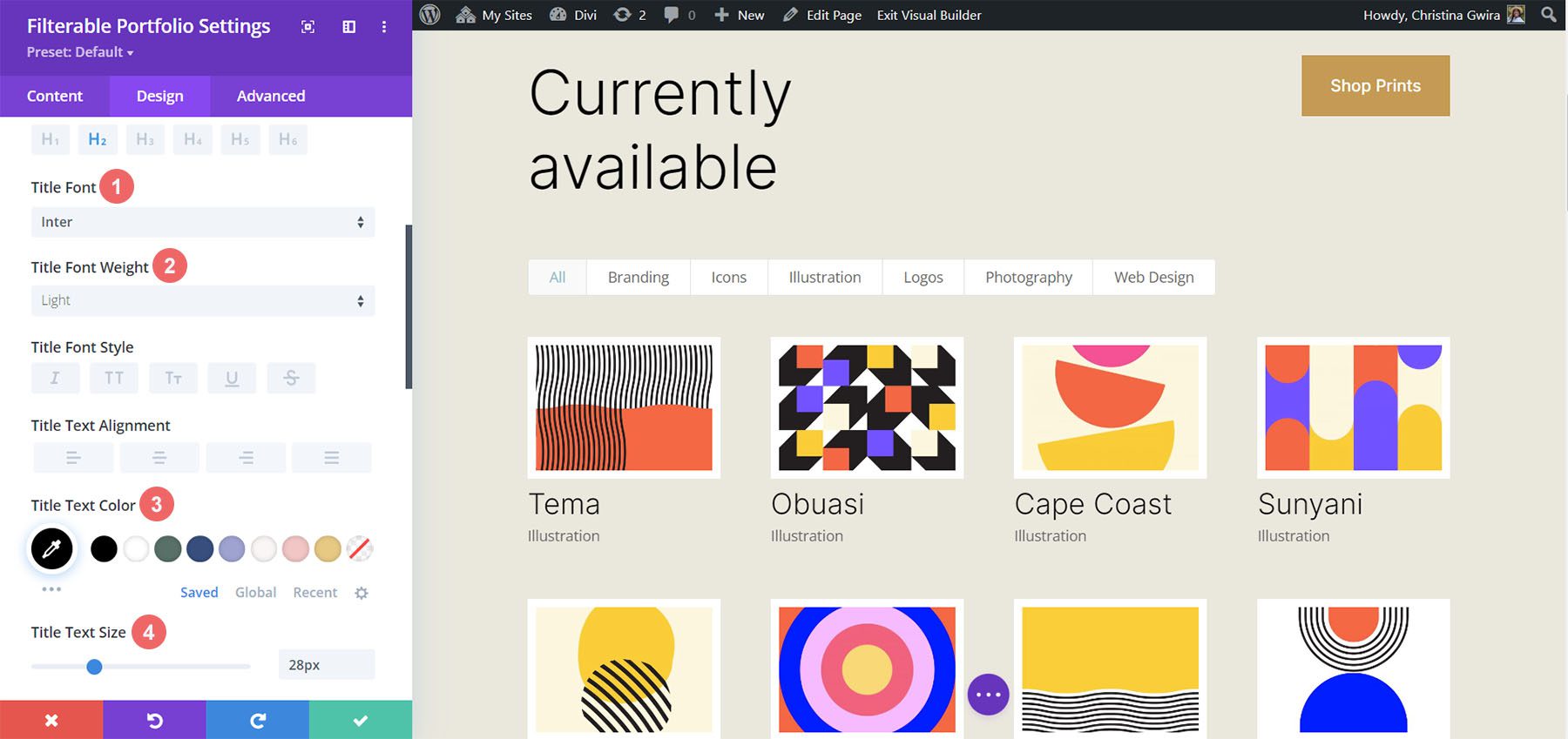
    Begin Styling Divi’s Filterable Portfolio: Title and Meta Text

    Now that we have our projects showing up as a grid, let’s tie in some of the design elements from our selected template. In this case, we’ll be using the styling that comes with the Divi Conference Layout Pack within our new module.

    Text Styling

    • Text Alignment: Center
    • Text Color: Dark

    Title Text Styling

    • Title Heading Level:H2
    • Title Font: Krona One
    • Title Text Color: #000000

    Meta Text Styling

    • Meta Font: Default (Open Sans)
    • Meta Text Color: #ff6651

    Text styling edits for your newly added module

    Styled titles within the Filterable Portfolio Module

    Now that we have our styling in place for the titles within the portfolio grid, let’s make some edits to the actual shape of the project thumbnails themselves.

    Modify Border and Rounded Corners of Project Thumbnail

    Within our Divi Conference Layout Pack, we are using a unique combination of rounded corners to give a unique shape to some of the key images within the pack. Let’s apply this styling to the thumbnails of our module.

    Image

    • Image Rounded Corners: 50px 50px 50px 0px
    • Image Border Styles: All
    • Image Border Width: 3px
    • Image Border Color: #000000
    • Image Border Style: Solid

    Adding the corners and borders to the featured image

    Rounded corners and border styling added to portfolio list items

    This will cause our thumbnails to have a shape that matches the rest of the other images throughout the layout pack.

    Customizing the Hover Overlay

    Let’s go a step further with our styling and make a slight edit to the overlay that comes by default with this module. We’re going to change the color as well as the icon that’s used right out of the box.

    Overlay

    • Zoom Icon Color: #bcf5fd
    • Hover Overlay Color: #ff6651
    • Hover Icon Picker: Zoom

    Setting for the hover overlay effect

    As you can now see, we’ve added the brand colors of this layout into the overlay, as well as changed the icon that Divi provides by default for this module’s hover overlay feature.

    Hover styling from in effect within the Divi Conference Event Page Layout

    Styling the Pagination

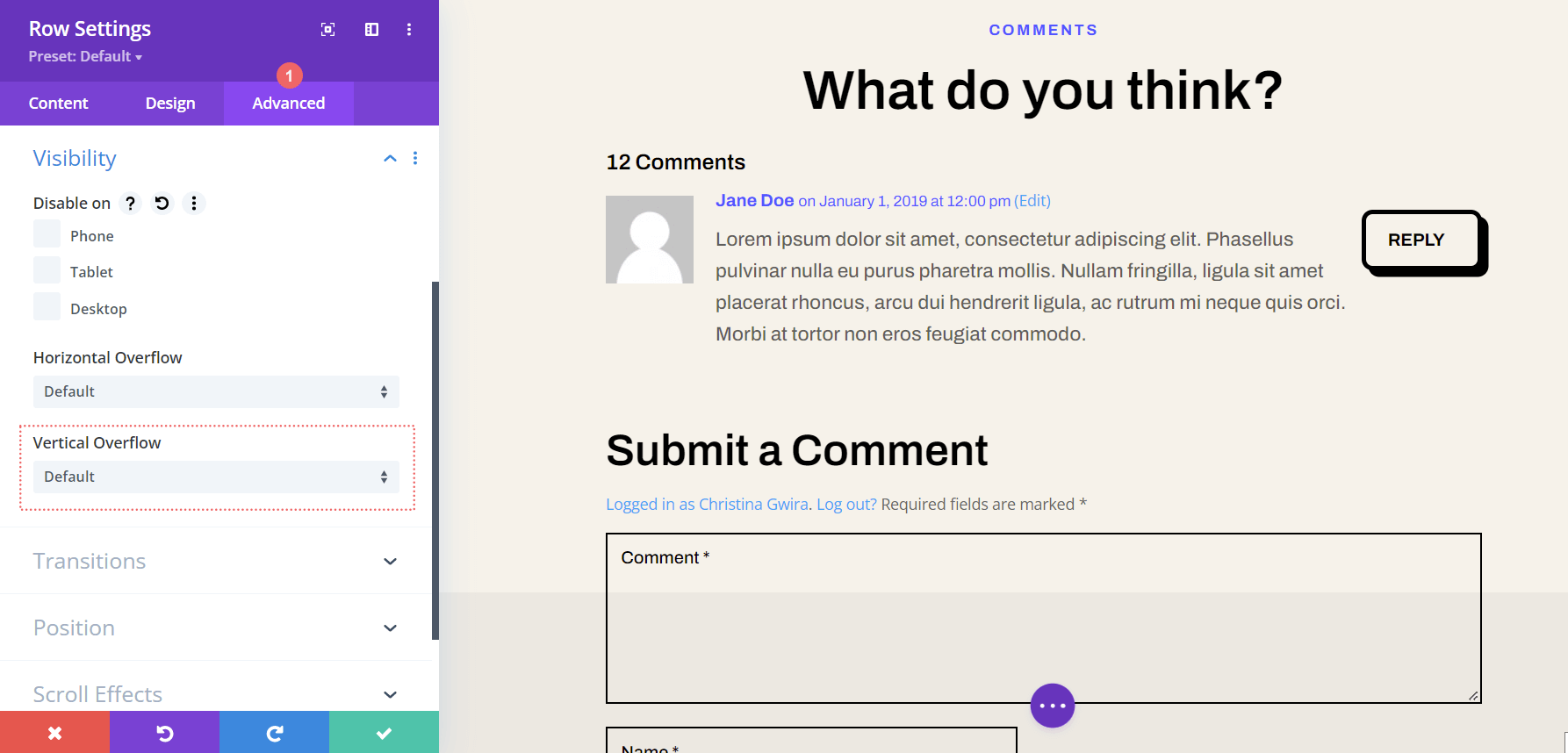
    We’re now going to start using small snippets of CSS to add some further customization to our Filterable Portfolio Module. Firstly, we’re going to style the pagination of this module. Next, we’re going to remove the border that appears above with a single line of CSS

    Pagination Text

    • Pagination Font: Krona One
    • Pagination Text Alignment: Center
    • Pagination Text Color: #ff6651
    • Pagination Text Color (Hover): #000000

    Styling the pagination of the Divi Filterable Module

    For our CSS, we will be moving to the Advanced tab of our module. Secondly, we will click on the Custom CSS tab. Next, we will enter in the following code snippet to remove he border on top of our pagination, giving it a cleaner look.

    Portfolio Pagination

    border-top: 0px;

    Portfolio Pagination CSS

    Using Custom CSS & Divi Settings to Style the Filter Text

    For the Filter Text, we’ll be taking things up a notch. We are going to use CSS to change the background as well as the hover effects. We want to have a close seamlessness between the newly added module and the styling of the layout pack. First, let’s enter in our Divi settings for the font.

    Filter Criteria Text

    • Filter Criteria Font: Krona One
    • Filter Criteria Text Color: #ffffff
    • Filter Criteria Text Color (Hover): #000000

    Filter criteria text styling

    As it currently stands, our filter appears to have disappeared. This is because in its default state, it is white text on a white background. However, we’re going to change that with some custom CSS in two places. Firstly, we’re going to add a snippet of CSS within the Page Settings that’ll add a background to the filter text. Secondly, we’ll style the Active Portfolio Filter using the Advanced tab of the module.

    Access page settings

    To access the Page Settings, click on the three dots on the middle of the screen. Then, select the gear icon which will open up the Page Settings. Next, you will navigate to the Custom CSS tab, and enter in the following to add a background to the Filter Text.

    Access and enter into the page settings for adding additional CSS

    Custom CSS

    In this CSS snippet, we are targeting the background color of the filter. We are also targeting and styling its hover state. Next on the agenda, let’s add a bit more CSS to the module and showcase our Active Filter tab more prominently.

    /* Change background color of filters */
    .et_pb_filterable_portfolio .et_pb_portfolio_filters li a {
    background: #000000;
    }
    .et_pb_filterable_portfolio .et_pb_portfolio_filters li a:hover {
    background: #ffffff;
    }

    Using Page Settings to set the color of the background of the module's filters

    Styling the Active Portfolio Filter Tab

    The Active Portfolio Filter Tab draws our user’s attention to the current portfolio category that they’re visiting. Right now, this filter has white text and a light background. We’re going to go into the Advanced tab of the Filterable Portfolio Module and add some text to the default and hover states of this feature. These are the CSS properties we’ll add in a default state:

    background: #ff6651;
    color: #ffffff !important;

    Active Portfolio Filter styling

    Hover State

    On hover, we’ll change the background to black.

    color: #000000!important;

    Background styling of hover for Active Portfolio Filter

    Final Look Styling Divi’s Filterable Portfolio with Divi Conference

    Here’s the final look!

    Finished Styling Divi's Filterable Portfolio Module for Divi Conference

    And now, here’s what it looks like when we hover!

    Finished Styling Divi's Filterable Portfolio Module for Divi Conference

    Styling Divi’s Filterable Portfolio Module: Divi Online Yoga Instructor Edition

    Similarly to the Divi Conference edition, find your layout within the Online Yoga Instructor Layout Pack inside the Divi Builder. We’ll be using the Landing Page Layout for this tutorial. Scroll down to the section Classes section with the title All Upcoming Classes Section.

    Updating the Online Yoga Instructor layout

    Inserting Filterable Portfolio Module

    From here, we’re going to delete the rows with the classes. Click the purple icon with three dots on it. Next, select the Wireframe view. Lastly, you’re going to delete the two rows that have three columns within them.

    Rearranging the layout in preparation for our new module

    Next, we’ll replace them with a single column within the row within which. Then, we’ll add our Filterable Portfolio Module.

    Inserting Filterable Portfolio Module into newly created row

    Like the previous example, we will be using the Grid Layout for this module with a multiple of 4 for the Post Count. Now, let’s do something a bit different with the information that we showcase on the card. In the Content tab, let’s navigate to Elements and unselect the Show Categories. This will mean that the Portfolio Module will only show the name of the project without the name of the category that it’s in.

    Disable show categories for the module

    Style Filter Criteria Text, Project Title and Pagination Text

    Let’s set the style foundation for the text portions of our module. The body text for this layout is Open Sans and the font used for the main headings is Cinzel. Therefore we’ll be using a combination of these two fonts throughout out styling process.

    Text

    • Text Alignment: Center
    • Text Color: Light

    Title Text

    • Title Font: Cinzel
    • Title Text Color: #ffffff

    Title and Text Styling - Part One

    Filter Criteria Text

    • Filter Criteria Font Weight: Bold
    • Filter Criteria Text Color: #ffffff

    Pagination Text

    • Pagination Text Color: #ffffff

    Title and Text Styling - Part One

    This is what our Filterable Portfolio Module is looking like right now. It’s not much, but we’re slowly getting there!

    New text styling implemented into the portfolio module

    Creating a Translucent Hover Overlay

    Let’s pull some inspiration from the various modules and beautiful gradients within this layout. For this, we’re going to create a translucent hover overlay and style the icon that shows up on hover as well.

    • Zoom Icon Color: #323741
    • Hover Overlay Color: rgba(255,201,165,0.85)
    • Hover Icon Picker: Search leaf and see icon above

    Styling the hover overlay

    Adding a Border to the Portfolio Grid Items with Custom CSS

    Similar to our first tutorial, we’re now going to use some CSS to add more interest to our Filterable Portfolio Module. Now, we are going to add a border around each individual portfolio grid item. Use the CSS snippet below within the Custom CSS portion of the Page Settings to add our border. We’ll also be assigning the CSS Class border to this module.

    • CSS Class: border

    Custom CSS

    /* Border */
    .border .et_pb_grid_item {
    border: 2px solid #ffffff;
    padding: 5px;
    }

    Adding a CSS class to our module in addition to custom CSS

    Here we now have our Filterable Portfolio Module with a nice border – and soe padding – around each grid item.

    Some padding and a border for the portfolio module

    Adding CSS to Style Pagination Border

    Unlike our previous example, let’s add some color to the border for our pagination with some CSS. This will also go within the Page Settings > Custom CSS area.

    /* Pagination Styling */
    .et_pb_filterable_portfolio .et_pb_portofolio_pagination {
    border-top: 2px solid #adc6d9;
    }

    Styling the Filter Criteria Text

    Similar to our Divi Conference Portfolio Module styling, we want to add some jazz to our category filters. Again, we want to pull from the styling that is already present within the template provided to us. Here’s the CSS that we’ll be adding into our Custom CSS section to target the background and hover of our Filter bar.

    /* Change background color of filters */
    .et_pb_filterable_portfolio .et_pb_portfolio_filters li a {
    background: none;
    }
    
    .et_pb_filterable_portfolio .et_pb_portfolio_filters li a:hover {
    background: #ffffff;
    color: #323741 !important;
    }

    With these two new additions to our Custom CSS, this is what our Filterable Portfolio Module is shaping up to be.

    Filter text and border styling added to Divi's Filterable Portfolio Module

    However, notice how the Active Portfolio Filter is lost. It still has a light background with white text on top of it. Let’s go into the module’s settings and add some CSS to change this.

    Custom CSS

    Active Portfolio Filter:

    background: #ffffff;
    color: #323741 !important;

    Styling the Active Filter setting with Custom CSS

    Removing Animation From Module

    To provide a cleaner experience, we’ll be removing the default animation that comes with the Filterable Portfolio Module. For this, we’ll first need to go back into our Page Settings and add some CSS that will target the portfolio grid items and remove the slide-in transition that occurs out of the box with Divi.

    Custom CSS

    /* Remove transition */
    .et_pb_filterable_portfolio .et_pb_portfolio_item.active {
    transition: none;
    }
    </code><code>
    .et_pb_portfolio_item {
    animation: none!important;
    transition: none !important;
    }
    

    Change Portfolio Grid from Four Columns to Three

    Our final CSS addition will be to transform our Portfolio module from four columns to three. This will allow us more room to see our projects. Also, we’ll be adding an additional row to our module. Here’s the final CSS snippet that you’ll be able to use to convert your columns.

    Custom CSS

    For this last snippet, we’ll be adding the CSS ID #three-column-grid to our module. We will still be keeping our CSS class from before intact.

    /* 4 to 3 Columns */
    @media only screen and ( min-width: 768px ) {
    #three-column-grid .et_pb_grid_item {
    width: 28.333%;
    margin: 0 7.5% 7.5% 0;
    }
    
    #three-column-grid .et_pb_grid_item:nth-child(3n) {
    margin-right: 0;
    }
    
    #three-column-grid .et_pb_grid_item:nth-child(3n+1) {
    clear: left;
    }
    
    #three-column-grid .et_pb_grid_item:nth-child(4n+1) {
    clear: unset;
    }
    }

    Adding CSS ID

    Styling Divi’s Filterable Portfolio: In Conclusion

    As with most of Divi’s modules, the settings that come with Divi can be further expanded upon with CSS. Showcasing your work is an important part of running a business, blog or brand online. As such, having an organized manner in which to display your work is key. Glean from the tips that were shared today to partake in your own journey of styling Divi’s Filterable Portfolio module and show us your work in the comments or on social media!

    The post How to Style a Grid Item in Divi’s Filterable Portfolio Module appeared first on Elegant Themes Blog.