EDITS.WS

Author: Randy A. Brown

  • An Overview of Line Styles in Divi’s Divider Module & How to Style Them

    The divider line in Divi’s Divider Module is a great way to separate elements or add some visual flair to your Divi layouts. The module is easy to use and surprisingly versatile. In this post, we’ll see an overview of the line styles in Divi’s Divider Module and see how to style them. We’ll create six examples to help spark your imagination to style your Divi Divider Module.

    Let’s get started.

    Preview

    Desktop Divider Module Line Style Example One

    Desktop Divider Module Line Style Example One

    Phone Divider Module Line Style Example One

    Phone Divider Module Line Style Example One

    Desktop Divider Module Line Example Two

    Desktop Divider Module Line Example Two

    Phone Divider Module Line Example Two

    Phone Divider Module Line Example Two

    Desktop Divider Module Line Example Three

    Desktop Divider Module Line Example Three

    Phone Divider Module Line Example Three

    Phone Divider Module Line Example Three

    Desktop Divider Module Line Example Four

    Desktop Divider Module Line Example Four

    Phone Divider Module Line Example Four

    Phone Divider Module Line Example Four

    Desktop Divider Module Line Example Five

    Desktop Divider Module Line Example Five

    Phone Divider Module Line Example Five

    Phone Divider Module Line Example Five

    Desktop Divider Module Line Example Six

    Desktop Divider Module Line Example Six

    Phone Divider Module Line Example Six

    Phone Divider Module Line Example Six

    Divider Module Features

    To give the screenshots some color and reference, I’ve added the Text Modules and a colored background from the Portfolio page of the free Photography Studio Layout Pack that’s available within Divi.

    Divi Module Content Tab

    The Divider Module’s Content tab includes the option to display the divider line or not and to give the divider a background color.

    Divi Module Content Tab

    The Background options are the standard options for other Divi modules. It includes a background color, gradient, image, video, pattern, or mask. For this example, I’ve added a pink background color to make it easy to see the space the divider uses. The divider is placed at the top of this space by default.

    Divi Module Content Tab

    Divider Module Design Tab

    The Divider Module Design tab options include Line Color which also includes the Line Style options. Other options include Sizing, Spacing, Border, Box Shadow, Filters, Transform, and Animation.

    Divider Module Design Tab

    Line Color

    The Line Color setting includes the standard color picker, allowing Divi users to fully customize the color of the divider line.

    Divider Module Design Tab

    Line Style

    The Line Style setting determines the shape of the line. It has 9 options.

    Divider Module Design Tab

    Line Position

    Line Position places the line at the top, middle, or bottom of the divider’s space.

    Divider Module Design Tab

    Divider Module Line Style Options

    The Line Style options work with Sizing (Weight, Width, etc.) to create some interesting dividers. Here’s a look at each Style with a Weight of 20px so they stand out in my images.  After this, we’ll style the divider with various Color, Style, and Size combinations.

    Solid

    Solid displays the divider as a solid line.

    Divider Module Line Style Options

    Dashed

    Dashed cuts the divider line into small dashes.

    Divider Module Line Style Options

    Dotted

    Dotted displays the divider line as dots.

    Divider Module Line Style Options

    Double

    Double displays two divider lines in parallel.

    Divider Module Line Style Options

    Groove

    Groove cuts into the top of the line and makes the top a darker shade of the color we selected.

    Divider Module Line Style Options

    Ridge

    Ridge cuts into the bottom of the line and makes the bottom a darker shade of the color we selected.

    Divider Module Line Style Options

    Inset

    Inset cuts into the top and bottom of the line, making the entire line a darker shade of the color we selected.

    Divider Module Line Style Options

    Outset

    Outset doesn’t cut into the line, essentially giving the same look as Solid.

    Divider Module Line Style Options

    None

    None makes the divider line invisible, showing only its background color.

    Divider Module Line Style Options

    Divider Module Line Sizing Settings

    The Sizing options determine the divider’s weight, height, width, and alignment. Here’s a look at the main settings.

    Divider Weight

    Divider Weight specifies the thickness of the divider line.

    Divider Module Line Sizing Settings

    Width

    Width specifies the width of the divider line. It can be used in combination with Module Alignment to place the line on the left, center, or right of its area.

    Divider Module Line Sizing Settings

    Module Alignment

    Module Alignment places the line on the left, in the center, or on the right of the module’s area.

    Divider Module Line Sizing Settings

    Height

    Height determines the height of the module’s area. The line remains the same size, but the background fills in to take up the space.

    Divider Module Line Sizing Settings

    Divider Module Line Style Examples

    Now, let’s see some examples of these settings working together. For our examples, I’ve added the Divider Module to various locations within the Portfolio page and the Landing page of the free Photography Studio Layout Pack. I’ll use the colors from the layout pack and style the module to fit the area.

    Divider Module Line Style Example One

    For our first example, we’ll place a solid divider line under the page title of the portfolio page. Add the Divider Module under the Text Module.

    Change the Line Color to #ff5a17 and leave the Line Style at the default setting (Solid). Set the Divider Weight to 4px for desktops and tablets and change it to 2px for phones. Set the Width to 30% and the Module Alignment to Center.

    • Line Color: #ff5a17
    • Line Style: Solid
    • Divider Weight: 4px desktop, 2px phone
    • Width: 30%
    • Module Alignment: Center

    Divider Module Line Style Example One

    Divider Module Line Style Example Two

    We’ll place the second divider between portfolio projects under Featured Work. This requires adding a new Row for the Divider Module. The divider will be offset, just to make it look different.

    Change the Line Color to #ff5a17 and the Line Style to Ridge. Set the Divider Weight to 24px for desktops and tablets and to 20px for phones. Change the Width to 76%.

    • Line Color: #ff5a17
    • Line Style: Ridge
    • Divider Weight: 24px desktop and tablet, 20px phone
    • Width: 76%

    Divider Module Line Style Example Two

    Set the Height to 40px to add more space between the next Row.

    • Height: 40px

    Divider Module Line Style Example Two

    Divider Module Line Style Example Three

    We’ll place the third divider line next to the Call-to-Action button for a section labeled Let’s Work Together. This one changes the Row to three columns with a ½ column on the left and two ¼ columns on the right. The Divider Module is placed between the Text Modules and the Button Module. The divider line connects to the button, following design cues from other sections of this layout.

    This one uses the Solid Line Style. Change the Line Color to black and set the Divider Weight to 2px. Set the Width to 128% for desktops, 112% for tablets, and Auto for phones.

    • Line Color: #000000
    • Line Style: Solid
    • Divider Weight: 2px
    • Width: 128% desktop, 112% tablet, Auto phone

    Divider Module Line Style Example Three

    Divider Module Line Style Example Four

    The next three examples use the Photography Studio Landing Page. Our fourth example places a Divider Module under the Button Module in a CTA called Turning Moments Into Art. This one will use the module’s settings to add dots to the area to draw attention.

    Change the Line Color to #ff5a17 and choose Dotted for the Line Style. Set the Divider Weight to 30px. Change the Width to 45% for desktops, 30% for tablets, and 28% for phones.

    • Line Color: #ff5a17
    • Line Style: Dotted
    • Divider Weight: 30px
    • Width: 45% desktop, 30% tablet, 28% phone

    Divider Module Line Style Example Four

    Scroll down to Spacing and add 42px of Left Padding for phones. Leave the Padding for desktops and tablets at the default.

    • Left Padding: 42px phone

    Divider Module Line Style Example Four

    Divider Module Line Style Example Five

    Our fifth example will add a dashed line to a section called Recent Work. Add the Divider Module to the empty column in the top Row.

    Change the Line Color to black and the Line Style to Dashed. Set the Divider Weight to 24px.

    • Line Color: #000000
    • Line Style: Dashed
    • Divider Weight: 24px

    Divider Module Line Style Example Five

    Change the Height to 45px for tablets and phones. Alternatively, you can set the Height to 45px for all devices. Desktops will look the same either way.

    • Height: 45px

    Divider Module Line Style Example Five

    Divider Module Line Style Example Six

    For our last example, we’ll add a Divider Module with a double line under the description in a section called Case Study.

    Change the Line Color to white and the Line Style to Double.

    • Line Color: #ffffff
    • Line Style: Double

    Divider Module Line Style Example Six

    Set the Divider Weight to 6px. Change the Width to 48% for desktops, 22% for tablets, and 36% for phones. Change the Module Alignment to Center.

    • Divider Weight: 6px
    • Width: 48% desktop, 22% tablet, 36% phone
    • Module Alignment: Center

    Divider Module Line Style Example Six

    Results

    Desktop Divider Module Line Style Example One

    Desktop Divider Module Line Style Example One

    Phone Divider Module Line Style Example One

    Phone Divider Module Line Style Example One

    Desktop Divider Module Line Example Two

    Desktop Divider Module Line Example Two

    Phone Divider Module Line Example Two

    Phone Divider Module Line Example Two

    Desktop Divider Module Line Example Three

    Desktop Divider Module Line Example Three

    Phone Divider Module Line Example Three

    Phone Divider Module Line Example Three

    Desktop Divider Module Line Example Four

    Desktop Divider Module Line Example Four

    Phone Divider Module Line Example Four

    Phone Divider Module Line Example Four

    Desktop Divider Module Line Example Five

    Desktop Divider Module Line Example Five

    Phone Divider Module Line Example Five

    Phone Divider Module Line Example Five

    Desktop Divider Module Line Example Six

    Desktop Divider Module Line Example Six

    Phone Divider Module Line Example Six

    Phone Divider Module Line Example Six

    Ending Thoughts

    That’s our overview of line styles in Divi’s Divider Module and how to style them. The various line styles and options provide lots of design possibilities. With just a few settings, Divi users can create small or large dividing lines, add shapes, and lots more. Divi’s Divider Module is a great way to add some visual flair to any Divi website.

    We want to hear from you. Do you style the divider line in your Divi Divider Module? Let us know in the comments.

    The post An Overview of Line Styles in Divi’s Divider Module & How to Style Them appeared first on Elegant Themes Blog.

  • Divi Product Highlight: Divi Den Pro – Layout Library

    Divi Den Pro – Layout Library is a third-party plugin with a massive library of predesigned Divi elements to help you build websites faster. It includes a unique user interface that’s searchable and sortable, making the layouts easy to find. In this post, we’ll take a look at Divi Den Pro – Layout Library to help you decide if it’s the right product for your Divi design toolbox.

    Installing Divi Den Pro – Layout Library

    Installing Divi Den Pro – Layout Library was simple. It works the same as uploading any plugin, but you’ll need to be signed in to your Divi Marketplace Account for it to be available within Divi. First, to install, go to:

    1. Plugins
    2. Add New
    3. Upload Plugins
    4. Choose File
    5. Install Now

    Installing Divi Den Pro – Layout Library

    Next, once the plugin is installed, activate it as usual, and you’ll see a new menu added to your dashboard.

    1. Activate Plugin

    Installing Divi Den Pro – Layout Library

    Layout Library Content

    The Divi Den Pro – Layout Library comes with 2615 library items. This includes 1988 sections and modules, 631 layouts, 39 menus, and 18 complete website designs. All of the items are pre-styled. The layouts are labeled, tested, and optimized for different screen sizes.

    There are several ways to use them in your Divi layouts. You’ll find the layouts in the Divi Den Pro DM menu and in the Divi Theme Builder. The Divi Den Pro DM menu is the easiest way to use them. You can search them by keyword and category and import them to your Divi Library.

    Divi Den Pro DM Menu

    You’ll find a new menu item in your WordPress dashboard called Divi Den Pro DM. The menu includes lots of links, which you’ll also find as tabs within the menu itself.

    Divi Den Pro DM Menu

    Layout Finder

    The first tab is the Layout Finder. This includes a search box with filters on the left and the results on the right. It also includes tabs so you can view all layouts, only the free layouts, or just the pro layouts. The filters show the number of layouts in that type. They’re divided into layouts, sections, modules, categories, collections, Divi Theme Builder, and Plugin Theme Builder.

    The results area shows a thumbnail of the layout. The thumbnail will scroll on hover if the layout is larger than the container. You can view the layout in another tab, save the layout to your Divi Library, or download the layout to your computer as a JSON file.

    Divi Den Pro DM Menu

    Selecting a filter opens it to show the options. I’ve opened Collections, which shows the names of layouts from Divi Den. Selecting one shows the layouts within that collection in the area on the right.

    Divi Den Pro DM Menu

    I clicked to view a layout and it opened the demo on the Divi Den page in another tab. The page shows multiple layouts, sections, etc. I’m hovering over the image in the top center to show its hover effects.

    Divi Den Pro DM Menu

    Latest

    The Latest tab shows the latest posts from the Divi Den blog. This is a good way to learn what’s new in the Layout Library.

    Divi Den Pro DM Menu

    Tutorials

    The Tutorials tab includes all of the tutorials that teach how to use Divi Den Pro – Layout Library. They include embedded videos that show when you click on a tutorial, so you can learn directly from the Divi Den dashboard without leaving WordPress. This helps with usability, so if there’s something you need help with, you’ll find it here.

    Divi Den Pro DM Menu

    Theme Builder

    The Theme Builder tab divides the layouts into Divi Theme Builder and Plugin Theme Builder. It shows the collections, page types, etc. These are also added to the Divi Theme Builder. You can also launch the Theme Builder from here.

    Divi Den Pro DM Menu

    The Plugin Theme Builder has a link to open the Theme Customizer.

    Divi Den Pro DM Menu

    The Theme Customizer adds three new customizer tabs for page, blog, and global settings. This includes added features such as a popup customizer, a sticky bar, more icons, the back-to-top button, a coming soon page, template customizations, and lots more.

    Divi Den Pro DM Menu

    Custom CSS Files

    The Custom CSS Files tab provides the custom CSS from the Divi Den layouts that you can copy and modify. Clicking one opens the CSS in another tab. An embedded video shows how to use the custom CSS.

    Divi Den Pro DM Menu

    Advanced

    The Advanced tab includes the White Label tab and the More Options tab. White Label lets you rebrand the plugin to match your brand.

    Divi Den Pro DM Menu

    The More Options tab lets you move the Divi Den Pro tab within the Divi Builder elements. This is enabled by default.

    Divi Den Pro DM Menu

    Divi Den Pro Layout Library in the Divi Builder

    A tab for the Divi Den Pro – Layout Library is added to the Modules modal.

    Divi Den Pro Layout Library in the Divi Builder

    Selecting the tab opens the menu where you can choose the layout you want. The layouts are downloaded as JSON files, so you’ll need to upload them to pages and posts if you want to use them.

    Divi Den Pro Layout Library in the Divi Builder

    Divi Den Pro Layout Library in the Divi Theme Builder

    The Divi Den Pro – Layout Library interface is also added to the bottom of the Divi Theme Builder screen. It works the same as it does in the WordPress dashboard.

    Divi Den Pro Layout Library in the Divi Theme Builder

    It works the same way in the Theme Builder as it does on pages and posts.

    Divi Den Pro Layout Library in the Divi Theme Builder

    Divi Den Pro Layout Library Examples

    Now that we’ve seen how to use the Divi Den Pro – Layout Library interface, let’s look at a few examples. We’ll look at a few of each type.

    Layouts

    Next, we’ll look at a few layouts. I’ll load them into the Divi Theme Builder. Once you’ve saved the layouts to your Divi Library, they’re available in your layouts. Search them and select categories on the left.

    Divi Den Pro Layout Library in the Divi Theme Builder

    Shop Landing Page V3 Ragnar

    This is the top portion of Shop Landing Page V3 Ragnar. It includes a hero section with an email CTA. A shop section shows featured products and includes an animated overlay that scrolls a message in large text on hover.

    Divi Den Pro Layout Library in the Divi Theme Builder

    Here’s the bottom portion of Shop Landing Page V3 Ragnar. Extra-large images create shop CTAs and include animated buttons. A unique blog section displays the featured image behind the text that appears on one side.

    Divi Den Pro Layout Library in the Divi Theme Builder

    Careers Page V1 Tina

    This is the top portion of Careers Page V1 Tina. It includes a hero image with an overlapping title, an introduction with a callout, and two columns of text. Following this is a section of open positions displayed as cards.

    Divi Den Pro Layout Library in the Divi Theme Builder

    This is the bottom portion of Careers Page V1 Tina. Blurbs with hover animations provide information followed by a CTA to send a CV and a section of company perks.

    Divi Den Pro Layout Library in the Divi Theme Builder

    Old Times Blog Page

    This example is the top portion of the Old Times Blog Page. It includes a hero section with a message over a background image and a button with a hover animation. A blog section shows a blog post with a large, featured image on the left and posts with a smaller featured image as a sidebar on the right. A yellow line separates the blog section from the hero section. All of the blog cards include tilt animations.

    Divi Den Pro Layout Library in the Divi Theme Builder

    This is the bottom portion of the Old Times Blog Page. It also uses yellow lines for separation and includes two three-column blog sections, a large email form, and a footer.

    Divi Den Pro Layout Library in the Divi Theme Builder

    Menu Page Layout Jamie

    Here’s the top portion of the Menu Page Layout Jamie. It includes a hero section with icons that link to the various food menu categories. They include hover animations. A two-column food menu follows this with an image on the left and a description on the right. The food is divided into categories.

    Divi Den Pro Layout Library in the Divi Theme Builder

    Menu Page Layout Jamie

    This is the bottom half of the Menu Page Layout Jamie. It continues the food menu and includes contact information with a full-width map.

    Divi Den Pro Layout Library in the Divi Theme Builder

    Showreel Home Page Layout

    This is the top portion of the Showreel Home Page Layout. The hero section includes a button that plays an embedded video and several blurbs over a full-screen background image. Following this is a set of tabs to display information. Large images with animated overlays link to the services.

    Divi Den Pro Layout Library in the Divi Theme Builder

    This is the bottom portion of the Showreel Home Page Layout. It continues the large images and includes another section of images for services with tilted overlay animations. It also includes styled number counters, an email form, and a footer.

    Divi Den Pro Layout Library in the Divi Theme Builder

    Visual Progress Bar Page Freddie

    This one is Visual Progress Bar Page Freddie. It has an elegant layout, but the main element I want to show is the progress bar. This is the hero section of the layout. A menu sits at the bottom of the screen. When you scroll, the menu attaches to the top of the screen and shows the progress through the layout.

    Divi Den Pro Layout Library in the Divi Theme Builder

    The section in this example is case studies. The progress bar shows yellow for every section that I’ve scrolled past. The images for this section include tilt effects.

    Divi Den Pro Layout Library in the Divi Theme Builder

    Sections

    If you have Divi Den Pro – Layout Library sections saved to your Divi Library, a Divi Den Pro DM tab is added to your Section modal.

    Divi Den Pro Layout Library in the Divi Theme Builder

    Greatest Hits Music Module Freddie

    Greatest Hits Music Module Freddie provides a styled audio player section with a black background and yellow hover effects.

    Divi Den Pro Layout Library in the Divi Theme Builder

    Styling Gallery Demo

    Styling Gallery Demo provides an interesting image gallery with different border shapes and a block of color to separate the images.

    Divi Den Pro Layout Library in the Divi Theme Builder

    Lintang Process Grace

    Styling Gallery Demo provides a list of steps. They’re placed horizontally and include shaped images or colors, and hover effects.

    Divi Den Pro Layout Library in the Divi Theme Builder

    Thunderbolt Product Freddie

    Thunderbolt Product Freddie is a product section that displays a product slider on one side and styled information on the other.

    Divi Den Pro Layout Library in the Divi Theme Builder

    Alula Timeline Grace

    Alula Timeline Grace creates an alternative vertical timeline with images on one side and information on the other.

    Divi Den Pro Layout Library in the Divi Theme Builder

    Modules

    The Modules option in the dashboard shows buttons. Here are a few that I downloaded.

    Divi Den Pro Layout Library in the Divi Theme Builder

    I’ve added all the buttons I downloaded to a single page. Each of the buttons includes engaging hover animations.

    Divi Den Pro Layout Library in the Divi Theme Builder

    Where to Purchase Divi Den Pro Layout Library

    Divi Den Pro – Layout Library is available in the Divi Marketplace for $189. It includes unlimited website usage, one year of support and updates, and a 30-day money-back guarantee.

    Where to Purchase Divi Den Pro Layout Library

    Ending Thoughts on Divi Den Pro Layout Library

    That’s our look at Divi Den Pro – Layout Library. There are a lot of layouts in this library. The user interface is simple. Searching, sorting, importing, and downloading the layouts is intuitive. I found the link on the sections and modules to be limited more than the dashboard, once the layouts are in the library, they’re available by selecting the Add from Library options. If you’re interested in adding several thousand professionally designed layouts to your Divi Library, Divi Den Pro – Layout Library is worth a look.

    We want to hear from you. Have you tried Divi Den Pro – Layout Library? Let us know what you think about it in the comments.

    The post Divi Product Highlight: Divi Den Pro – Layout Library appeared first on Elegant Themes Blog.

  • Divi Product Highlight: Avanti – Divi Multi-Purpose Child Theme

    Avanti is a third-party child theme for Divi with over 60 pages in 9 niches to help you build just about any type of website you need. Using Avanti helps you build your website quicker. There are also WooCommerce-focused designs that’ll help you easily set up your online store. In this post, we’ll go through some of the layouts this Divi child theme provides to help you decide if it’s the right product for you!

    Let’s get to it.

    Installing Avanti

    Installing Avanti is simple. It works the same way as installing a regular WordPress theme, but it has a couple more steps. It’s recommended to install Avanti on a fresh WordPress site. Since this is a Divi child theme, Divi is required. I found the installation process to be intuitive.

    1. Go to Appearance
    2. Select Themes
    3. Select Add New

    Installing Avanti

    1. Click Upload Theme
    2. Click Choose File
    3. Navigate to the zipped file on your computer, choose it, and click Install Now

    Installing Avanti

    1. Click Activate

    Installing Avanti

    1. Go to Avanti Demo Import
    2. Click Easy Demo Import
    3. Choose Import Demo Content

    Installing Avanti

    1. Click Remove Demo Content and Import Functions

    Installing Avanti

    Avanti Pages, Layouts, and Templates

    With a combination of pages and templates, Avanti provides over 60 pages with over 30 elements in 9 niches. This includes complete websites, multiple header and footer designs, shop pages, etc. I’ll show the layout with the placeholder images for some of the layouts and screenshots with the images from the sales demo to get a better look at the finished product. Here are some of the pages.

    Avanti Pages, Layouts, and Templates

    Here are some of the layouts added to the Divi Library.

    Avanti Pages, Layouts, and Templates

    It also includes 11 premade and preassigned templates.

    Avanti Pages, Layouts, and Templates

    Avanti Home Pages

    Avanti includes 11 home pages for different types of businesses. They include:

    1. Business
    2. Restaurant
    3. Photography
    4. Consultation
    5. Web Design
    6. Dental
    7. Renovation
    8. Plumber
    9. Shop V1
    10. Shop V2
    11. Shop V3

    Avanti Pages, Layouts, and Templates

    Each includes lots of styled elements, hover animations, scroll animations, and even the Ken Burns effect for background images. They include dummy images with their image size. The Business homepage is the default. This Divi child theme receives regular updates. We’ll look at the two newest home pages, Restaurant and Photography, and we’ll also look at its latest WooCommerce update.

    Avanti Restaurant Home Page

    The Restaurant layout has 5 pages, including the home page, about, food menu, testimonials, and contact page. Here’s the hero section of the home page with the dummy images.

    Avanti Restaurant Home Page

    Here’s a look at the home page with images from the child theme’s demo page. This includes a custom header.

    Avanti Restaurant Home Page

    Here’s part of the demo page. As you can see, this is a large page with many elements. All of the full-screen images are stationary. It includes a full-screen hero section with a link to the menu, an about section with image hover effects, images with hover effects that link to the food categories, a CTA to the food menu, a CTA to make a reservation, a two-column food menu created with blurbs, custom testimonial cards, a contact form, and more.

    Avanti Restaurant Home Page

    Avanti Photography Home Page

    Photography includes 10 pages, including home, about, services, single service, photo gallery, single gallery, testimonials, pricing, FAQ, and contact. Here’s the Photography home page. It also includes a transparent header. This is the hero section with images from the child theme’s demo page.

    Avanti Photography Home Page

    Here’s the demo home page. This image was taken with parallax scroll effects. It includes a full-screen hero section with a link to the galleries, images that link to the categories, an about section with a link to the full story, styled testimonials with a custom design, a blog with custom blog cards, a contact form with images on both sides and a custom footer with contact information and an email form.

    Avanti Photography Home Page

    Other Avanti Pages

    Aside from home pages, Avanti includes 3 WooCommerce shop home pages, 5 About Us, 3 Services, 3 Service pages, 5 Contact Us, 4 Portfolio pages, and many more. Other pages include blogs, Thank You, Testimonials, FAQ, Pricing, 404, etc. Many of these also include multiple versions.

    Home Page Shop V1

    Home Page Shop V1 displays a full-width slider with a CTA to the shop. This is the page with placeholder images. This is one of the original layouts, but I wanted to include it to see how the new layouts compare.

    Other Avanti Pages

    Here’s the page from the demo. It includes a section for the shop with categories, best sellers, CTAs, and products on sale. Following this is a full-screen CTA in parallax with text scrolling effects, a blog section for the latest news, and an email subscription CTA.

    Other Avanti Pages

    Home Page Shop V3

    Home Page Shop V3 is a new shop design. Here’s the hero section with the placeholder images.

    Home Page Shop V3

    Here’s the page from the demo. It includes a slider with CTA, blurbs with information, a shop section with the featured and latest products, a full-screen CTA in true parallax, products on sale with a styled image, a deal of the day section with a countdown timer, CTAs, new products, the latest news, and brand logos.

    Home Page Shop V3

    Cart V2

    Cart V2 is a new cart page that displays navigation icons at the top of the page to show the user knows where they are in the shopping process. It also displays a styled cart, a sale CTA, and cart totals.

    Cart V2

    Cart V3

    Cart V3 is also new. It includes the same style as Cart V2 but moves the cart totals next to the cart and does not include the sale CTA.

    Cart V3

    Checkout V3

    Checkout V3 is a new checkout page. It includes the navigation icons at the top of the page and a two-column section with a checkout form on the left and a smaller column on the right with information and testimonials.

    Checkout V3

    About Us V4

    About Us V4 is a new page that’s designed for the new Restaurant layout.

    About Us V4

    Here’s part of the page from the demo. It includes a full-width CTA in parallax, an about section with zoom effects, a menu CTA, and styled testimonials.

    About Us V4

    About Us V5

    About Us V5 was designed for the new Photography layout.

    About Us V5

    The page includes a hero section in parallax with a CTA, an about section with a link to the contact page, blurbs that show information, testimonials, a blog, and a styled contact form. Most of these are included on the home page.

    About Us V5

    Services V3

    Services V3 is a new page designed for the Photography layout. It includes a section with images for the services with an interesting hover effect. The image swings upward, and the text swings downward inside the card to reveal a photo and a button to see more. It also includes styled pricing tables.

    Services V3

    Single Service V3

    Single Service V3 is a new page for the Photography layout. It includes a large section for text and an image to describe a single service. It also includes testimonials, a contact form, etc.

    Single Service V3

    Contact Us V4

    Contact Us V4 is a contact page for the new Restaurant layout. It includes a two-column section with contact information, opening hours, and a form on the left side. The right side includes a map in monochrome.

    Contact Us V4

    Contact Us V5

    Contact Us V5 is the contact page for the Photography layout. It includes a section of blurbs with contact information. The main part of the page contains a large contact form.

    Contact Us V5

    Testimonials V2

    Testimonials V2 is a testimonials page for the new Restaurant layout. It displays testimonials within a styled card with an image background.

    Testimonials V2

    Pricing V2

    Pricing V2 is a new page for the Photography layout. It includes the same hero section, testimonials, and contact section from the other pages and adds a styled pricing table. The table displays cards with varying heights and background colors for the titles.

    Pricing V2

    Avanti Elements

    Avanti includes several pages with just the elements so you can easily access them. They include headers, footers, slide-ins, flip boxes, service boxes, pricing tables, opt-ins, team members, and testimonials. Three of them include new elements. We’ll look at those three.

    Headers

    Avanti includes 5 headers to choose from. They include dropdown menus with backgrounds that match elements within the header. The first header is the default. It’s set up in the Divi Theme Builder as the global header. All the headers are added to the Divi Library, so you can easily change to a different header if you want.

    Headers

    Service Boxes

    Avanti’s service boxes include six different ways to showcase your services. Most include hover effects that add text, change the images, zoom, etc., to create interesting cards.

    Service Boxes

    Testimonials

    Avanti includes 5 testimonial designs. These present your testimonials in styled cards. They include the new designs for the Restaurant and Photography layouts. The first testimonial includes hover effects.

    Testimonials

    Avanti Documentation

    The documentation steps through setting up the child theme and performing specific tasks such as disabling the Ken Burns effect, changing the content of the flip boxes, redirecting the contact form, changing the slide-in, adding a menu badge, and more.

    Where to Purchase Avanti

    Avanti is available in the Divi Marketplace for $35. It includes unlimited usage, a 30-day money-back guarantee, and one year of support and updates.

    Where to Purchase Avanti

    Ending Thoughts

    That’s our look at the Avanti Divi child theme. I found it easy to use, and the number of pages makes it highly versatile. The new pages and elements look great. I especially liked the new Restaurant, Photography, and shop home pages. Avanti has a lot of pages in many niches, making it a great choice for just about any type of website. I felt that its value far outweighed its price.

    We want to hear from you. Have you tried the Avanti Divi child theme? Let us know what you think about it in the comments.

    The post Divi Product Highlight: Avanti – Divi Multi-Purpose Child Theme appeared first on Elegant Themes Blog.

  • How to Redirect After Filling Out the Divi Contact Form

    Redirecting after filling out a contact form is one of those interactions that’s often overlooked. However, it’s an important interaction. It informs the user that you’ve received their message and what to expect next. Fortunately, redirecting is easy to do with Divi’s Contact Form Module. In this post, we’ll see how to redirect after filling out the Divi Contact Form. We’ll also see an example redirect page to help you build your own.

    Let’s get started.

    Preview

    Desktop Redirect Contact Form Page with a Custom Message

    Desktop Redirect Contact Form Page with a Custom Message

    Phone Redirect Contact Form Page with a Custom Message

    Phone Redirect Contact Form Page with a Custom Message

    How to Redirect After Filling Out the Divi Contact Form

    You’ll find a redirect option in the General tab of the Divi Contact form Module. For these examples, I’m using the Contact page from the free Device Repair Layout Pack that’s available within Divi.

    To access the setting, open the module by clicking the dark gray icon that appears on hover.

    How to Redirect After Filling Out the Divi Contact Form

    Next, scroll down to the section called Redirect and enable the redirect option.

    • Enable Redirect URL: Yes

    How to Redirect After Filling Out the Divi Contact Form

    Enter the URL you want to redirect to. Close the module and save your settings. As you can see, enabling the redirect is simple. The hard part is knowing where to send them.

    • Redirect URL: the URL of your redirect page

    How to Redirect After Filling Out the Divi Contact Form

    How to Choose Where to Redirect the Divi contact Form

    You can enter any URL you want into the Redirect URL field, but the page you redirect them should make sense to them. It needs to be a part of the contact process and include information they’ll find useful. It should communicate to them, feel like a natural progression, and look like your website.

    Rather than redirecting to the home page, blog, or similar pages, it’s best to redirect the user to a custom page with information that you received their message. You could include information on what happens next and provide a few links they can use. It could include a link to a download, FAQs, etc.

    I recommend creating a custom page using the styling from your layout.

    Create a Redirect Contact Form Page with a Custom Message

    Let’s create a page for the custom message. I’ll use the styling cues from the Device Repair Layout Pack Contact page. This will ensure the custom message page is styled to match the layout.

    First Redirect Contact Form Page Section

    Create a page and open the Section’s settings by clicking the blue gear icon.

    Create a Page with a Custom Message

    Next, scroll down to Background and select the Gradient tab. Create four Gradient Stops. Select white for the first and set it to 20%. Select #edbf48 for the second and set it on top of the first. Choose #edbf48 for the third and set it to 33%. Choose white for the fourth and set it on top of the third. Change the Gradient Direction to 115deg. This creates a stripe for the background. Close the settings.

    • First Gradient Stop: 20%, #ffffff
    • Second Gradient Stop: 20%, #edbf48
    • Third Gradient Stop: 33%, #edbf48
    • Fourth Gradient Stop: 33%, #ffffff
    • Gradient Direction: 115deg

    Create a Page with a Custom Message

    First Row

    Next, add a single-column Row. We’ll use its default settings.

    Create a Page with a Custom Message

    Title

    Next, add a Text Module.

    Create a Page with a Custom Message

    Set the Content Type to Heading 1 and enter the message into the Content Editor.

    • Content Type: Heading 1
    • Body Text: Thank you for contacting us. We’ll get in touch soon.

    Create a Page with a Custom Message

    Text

    Next, select the Design tab. Scroll down and change the Text Alignment to Centered.

    • Text Alignment: Centered

    Create a Page with a Custom Message

    Heading Text

    Scroll down to Heading Text. Choose Inter for the Font. Set the Weight to Bold and the Color to black.

    • Font: Inter
    • Weight: Bold
    • Color: #000000

    Create a Page with a Custom Message

    Change the Font Size to 75px for desktops, 40px for tablets, and 24px for phones. Change the Line Height to 1.2em. Close the module.

    • Size: 75px desktop, 40px tablet, 24px phone
    • Line Height: 1.2em

    Create a Page with a Custom Message

    Second Redirect Contact Form Page Section and Row

    Next, add a new Section under the first one and add a single-column Row. We’ll use their default settings.

    Create a Page with a Custom Message

    Redirect Contact Form Page Description Text Title

    Add a Text Module in the second Row and open its settings.

    Create a Page with a Custom Message

    Change the Content to Heading 4 and enter the title into the Content Editor. I’m using the title What’s Next, so they’ll know at a glance what this content is about.

    • Content Type: Heading 4
    • Content Body: What’s Next

    Create a Page with a Custom Message

    Text

    Select the Design tab and set the Text Alignment to Centered.

    • Text Alignment: Centered

    Create a Page with a Custom Message

    Heading Text

    Scroll down to Heading Text and select the H4 tab. Choose Inter for the Font and set the Weight to Bold and the Color to black.

    • Font: Inter
    • Weight: Bold
    • Color: #000000

    Create a Page with a Custom Message

    Change the Size to 19ps for desktops, 16px for tablets, and 14px for phones. Set the Line Height to 1.6em.

    • Size: 19px desktop, 16px tablet, 14px phone
    • Line Height: 1.6em

    Create a Page with a Custom Message

    Spacing

    Next, scroll down to Spacing and add 0px to the Bottom Margin. Close the module.

    • Bottom Margin: 0px

    Create a Page with a Custom Message

    Redirect Contact Form Page Description Text Body

    Next, add a Text Module under the description title.

    Create a Page with a Custom Message

    Add the description text to the body Content Editor. This text will inform the user of when to expect a response. I’m also adding a note that I’ve received their message.

    • Content Body: We’ve received your message and we’ll send you an email within 2 business days.

    Create a Page with a Custom Message

    Text

    Go to the Design tab and select Open Sans for the Font and change the Color to black.

    • Font: Open Sans
    • Color: #000000

    Create a Page with a Custom Message

    Change the Size to 16px for desktops, 15ps for tablets, and 14px for phones. Set the Line Height to 1.8em.

    • Size: 16px desktop, 15px tablet, 14px phone
    • Line Height: 1.8em

    Create a Page with a Custom Message

    Scroll down to Text Alignment and select Centered. Close the module.

    • Text Alignment: Centered

    Create a Page with a Custom Message

    FAQ Text Title

    Next, we’ll add information and a link to the FAQ page. First, copy the description’s title Text Module and drag it under the description Text Module.

    Create a Page with a Custom Message

    Leave the Content Type at Heading 4 and change the Body Content to FAQ. All the other settings are already present, so you can close the module.

    • Content Type: Heading 4
    • Content Body: FAQ

    Create a Page with a Custom Message

    FAQ Text Body

    Next, copy the description’s Text Module and drag it under the FAQ title Text Module.

    Create a Page with a Custom Message

    We will make one change to this module, but first, add your text. Add spaces as needed to create the layout you want. As you’ll see in the example, I’m adding spaces to place the FAQ link on its own line. I’ve added a link to the FAQ Page text, so it now links to the FAQ page. We’ll need to change its color.

    • Content Body: While you wait, take a look at our frequently asked questions. This should answer any preliminary questions you may have. To see our FAQs, follow this link: FAQ Page

    Create a Page with a Custom Message

    Text Link

    Now, go to the Design tab to the Text section and select the Link tab and change the Color to #f26440. Leave the rest of the settings at their defaults so they’ll follow the regular Text settings. Close the module.

    • Link Text Color: #f26440

    Create a Page with a Custom Message

    Redirect Contact Form Page Button

    Lastly, let’s add a button that leads the user back to the homepage. Add the Button Module under the last Text Module.

    Create a Page with a Custom Message

    Open the Button Module’s settings and change the Button Text to Home Page.

    • Text: Home Page

    Create a Page with a Custom Message

    Link

    Next, enter the URL for your home page into the URL field. Leave the Link Target at its default setting so the link opens in the same window.

    • Button Link URL: your home page URL

    Create a Page with a Custom Message

    Alignment

    Next, select the Design tab. Under Alignment, select Center for the Button Alignment.

    • Button Alignment: Center

    Create a Page with a Custom Message

    Button

    Scroll down to Button and enable Use Custom Styles for Button. Change the Font Size to 14px. Set the Font Color to white and the Background Color to #286f6c.

    • Use Custom Styles for Button: Yes
    • Text Size: 14px
    • Text Color: #ffffff
    • Background Color: #286f6c

    Create a Page with a Custom Message

    Change the Border Color to #286f6c and set the Radius to 0px. Choose Inter for the Font and set the Weight to Bold and the Style to TT.

    • Border Color: #286f6c
    • Border Radius: 0px
    • Font: Inter
    • Weight: Bold
    • Style: TT

    Create a Page with a Custom Message

    Spacing

    Finally, scroll down to Spacing. Change the Top and Bottom Padding to 14ps and the Left and Right Padding to 20px. Close the module and save your settings.

    • Padding: 14px Top and Bottom, 20px Left and Right

    Create a Page with a Custom Message

    Results

    Desktop Redirect Contact Form Page with a Custom Message

    Desktop Redirect Contact Form Page with a Custom Message

    Phone Redirect Contact Form Page with a Custom Message

    Phone Redirect Contact Form Page with a Custom Message

    Ending Thoughts

    That’s our look at how to redirect after filling out the Divi Contact Form. Setting up the redirect is easy to do in Divi’s Contact Form Module. I recommend creating a page just for the redirect and using the page to provide specific information and links. Your visitors will appreciate the extra effort, and it will make the contact process more understandable and fulfilling.

    We want to hear from you. Do you use a custom page to redirect after filling out your contact form? Let us know about your experience in the comments.

    The post How to Redirect After Filling Out the Divi Contact Form appeared first on Elegant Themes Blog.

  • How to Create a Message Pattern in Your Divi Contact Form Module

    Email Message Patterns are an excellent way to view messages sent through your Divi Contact Forms. You have full control over the layout design and content, so you get the exact information you want in the way you want it. In this post, we’ll see how to create a Message Pattern in your Divi Contact Form Module and explain how to use it.

    What is a Message Pattern?

    The Message Pattern is a template for the email message. It specifies how the message looks and what information it includes when you receive it in email. It can include text that you specify and the content of any of the fields in the form. The Message Pattern is not required, but it is helpful. Simply leave it blank for the default pattern.

    Why Use a Message Pattern?

    Utilizing a message pattern is a great way to streamline your workflow. You’ll have the exact information you want in the layout you want.

    Where to Find the Email Message Pattern

    To find the email Message Pattern field, open the Contact form Module by clicking the dark gray gear icon that appears on hover. For this example, I’m using the Contact page from the free Home Baker Layout Pack that’s available within Divi.

    Where to Find the Email Message Pattern

    Next, scroll down to the section labeled Email. Here, you’ll find two fields. The first is Email Address. This is the address of the message that will be sent. The second field is called Message Pattern. Enter your pattern into this field.

    Where to Find the Email Message Pattern

    When a message is sent to the email address that you’ve imputed into the Email Address field, it normally includes only the content in the Message field. For example, I’ll send this message:

    Where to Find the Email Message Pattern

    The result is an email with who it’s from, as normal, but the body of the content only shows the message itself.

    Where to Find the Email Message Pattern

    How to Create a Message Pattern

    We can adjust the content of the email by creating a Message Pattern. You can add text and specify the fields you want to include. To include a field, add two percent symbols to both sides of the field’s ID. For example, to include the field with the ID-name, use %%name%%. We’ll see how to find the Field ID in the next section.

    You can create a template with text, spaces, and the form content. Add your text around the field names and include spaces for the fields. For example, I am %%name%% and my message is %%message%%.

    When I add this Message Pattern to the example from above, we get a different email. This pattern includes text, field IDs, and extra spaces.

    Here is the message from %%name%%, email %%email%%.

    Message: %%message%%

    How to Create a Message Pattern

    The result is an email with more information and a layout that makes more sense. It’s the same information that was submitted in the form in the section above, but now it shows more of the information and places it in a layout that’s easy to read, which is the layout I created with the Message Pattern.

    How to Create a Message Pattern

    How to Add New Fields

    Each field in the Contact Form Module is a submodule with its own settings. To create a new field, go to the Contact Form Module’s content tab and click Add New Field under all the form’s submodules.

    How to Add New Fields

    Text

    Under Text, enter the Field ID and the Title. The Field ID is the label you’ll use to create the Message Pattern. This is a unique ID and should only use English characters with no special characters or spaces. The Title field can be used to define the content. It doesn’t have to be a unique title or match the Field ID, but it is best if it’s unique to make it easier to understand.

    How to Add New Fields

    Next, scroll down to options and select the Field Type. Choose any settings you want for the field. Click the green check at the bottom or return arrow at the top to return to the regular Contact Form Module settings.

    How to Add New Fields

    Finally, add the new field to the Message Pattern with any text you want to include. Close the module and save your settings.

    How to Add New Fields

    How to Test the Message Pattern

    Finally, test your Message Pattern to ensure it works how you want. Simply fill out the form yourself and go to the email address you used for the email field to view the Message Pattern.

    How to Test the Message Pattern

    You’ll receive the message in your email inbox so you can know if you like the design or not.

    How to Test the Message Pattern

    Creating a Well-Designed Message Pattern

    The Message Pattern should be constructed in a way that you get the most out of it. This is for your use, so design it the way you need to see it.

    Be sure to use whitespace to make the email easier to read and use. The Message Pattern includes all spaces that you add to the pattern. You can use spaces to create the exact layout you want.

    Restaurant Reservation Message Pattern Example

    Let’s see an example of a Message Pattern for a restaurant reservation. For this example, I’m using the landing page from the free Poke Restaurant Layout Pack that’s available within Divi. I’ll replace the reservation button with a new Contact Form Module. We’ll keep the form simple for this example.

    Here’s how the layout looks before adding the Contact Form Module.

    Restaurant Reservation Message Pattern Example

    Change the Title Text

    First, edit the Title Text to show “Make a Reservation.” Highlight the portion of text you don’t want and click the Delete key.

    Restaurant Reservation Message Pattern Example

    Delete Row

    Next, delete the Row with the buttons. We’ll use the style of the left button, but we don’t need these buttons.

    Restaurant Reservation Message Pattern Example

    Add a Contact Form Module

    Next, add a Contact Form Module under the phone number Text Module.

    Restaurant Reservation Message Pattern Example

    Add New Fields

    Now, remove the Message Field and add a new Field by clicking Add New Field.

    Restaurant Reservation Message Pattern Example

    Change the Field ID to Phone, the Title to Phone Number, and use Input Field as the Type. For Allowed Symbols, select Numbers Only. Close the submodule.

    • Field ID: Phone
    • Title: Phone Number
    • Type: Input Field
    • Allowed Symbols: Numbers Only

    Restaurant Reservation Message Pattern Example

    Add another Field, change the Field ID to Guests, the Title to Number of Guests, and use Input Field as the Type. For Allowed Symbols, select Numbers Only. Close the submodule.

    • Field ID: Guests
    • Title: Number of Guests
    • Type: Input Field
    • Allowed Symbols: Numbers Only

    Restaurant Reservation Message Pattern Example

    Add another Field and change the Field ID to Day, the Title to Day of Visit, and use Select Dropdown as the Type. Enter the name of each day for the options. Close the submodule.

    • Field ID: Day
    • Title: Day of Visit
    • Type: Select Dropdown
    • Options: add days

    Restaurant Reservation Message Pattern Example

    Add another Field and change the Field ID to Time and the Title to Time of Visit. Select Radio Buttons for the Type. For the Options, add the possible times. Close the submodule.

    • Field ID: Time
    • Title: Time of Visit
    • Type: Radio Buttons
    • Options: possible times

    Restaurant Reservation Message Pattern Example

    Text

    Now, we’ll adjust the form. Under Text in the Content tab, change the Submit Button text to Book a Table.

    • Submit Button: Book a Table

    Restaurant Reservation Message Pattern Example

    Email

    Next, scroll down to Email and enter the address where you want to receive the email in the Email Address field. Also, create the Message Pattern. I’ll create a pattern that provides the name first, skip a line, and then show the day, time, and number of guests. After this, it will skip a line, show a heading for the contact information and then list the information.

    The Message Pattern looks like this (complete with spaces):

    Reservation for %%name%%


    Day: %%day%%

    Time: %%time%%

    Number of Guests: %%guests%%


    Contact Information

    %%email%%

    %%phone%%

    Restaurant Reservation Message Pattern Example

    Spam Protection

    Scroll down to Spam Protection and disable it.

    • Use Basic Captcha: No

    Restaurant Reservation Message Pattern Example

    Fields

    Now, let’s style the module. First, go to Fields in the Design tab. Change the Background color to rgba(255,255,255,0) and the Text Color to black.

    • Background Color: rgba(255,255,255,0)
    • Text Color: #000000

    Restaurant Reservation Message Pattern Example

    For the Fields Padding, add 13px for the Top and Bottom and 30px to the Left and Right. Change the Font to Darker Grotesque and set the Weight to Medium.

    • Fields Padding: 13px Top and Bottom, 30px Left and Right
    • Font: Darker Grotesque
    • Weight: Medium

    Restaurant Reservation Message Pattern Example

    Change the Size to 24px for desktops, 18px for tablets, and 14px for phones. Set the Line Height to 1.4em.

    • Size: 24px desktop, 18px tablet, 14px phone
    • Line Height: 1.4em

    Restaurant Reservation Message Pattern Example

    Button

    Next, scroll down to Button and select Enable Custom Styles for Button. Change the Text Size to 17px, the Text Color to black, and the Background to #f6c85d.

    • Enable Custom Styles for Button
    • Text Size: 17px
    • Text Color: #000000
    • Background: #f6c85d

    Restaurant Reservation Message Pattern Example

    Set the Border Color to #f6c85d and the Button Letter Spacing to 0.16em. Change the Font to Darker Grotesque, the Weight to Ultra Bold, and the Style to TT.

    • Border Color: #f6c85d
    • Button Letter Spacing: 0.16em
    • Font: Darker Grotesque
    • Weight: Ultra Bold
    • Style: TT

    Restaurant Reservation Message Pattern Example

    Change the Button Padding to 12px for the Top and Bottom and 20px for the Left and Right.

    • Button Padding: 12px Top and Bottom, 20px Left and Right

    Restaurant Reservation Message Pattern Example

    Sizing

    Next, scroll down to Sizing, change the Width to 60%, and set the Module Alignment to Center.

    • Width: 60%
    • Module Alignment: Center

    Restaurant Reservation Message Pattern Example

    Border

    Finally, scroll down to Border. Add 5px to the Rounded Corners, 2px to the Border Width, and make the Border black. Close the module, save your settings, and test your form.

    • Inputs Rounded Corners: 5px
    • Border Width: 2px
    • Color: #000000

    Restaurant Reservation Message Pattern Example

    Message Pattern Results

    Here’s how our message looks in the form and in the email that I received.

    Message in the Form

    Message in the Form

    Message in the Email

    Message in the Email

    Ending Thoughts

    That’s our look at how to create a message pattern in your Divi Contact Form Module. Creating Message Patterns is easy to do with Divi’s Contact Form Module, and they’re great for organizing the information within the emails themselves. Following a few simple steps is all you need to create your own email Message Patterns.

    We want to hear from you. Have you created a message pattern in your Divi Contact Form Module? Let us know about your experience in the comments.

    The post How to Create a Message Pattern in Your Divi Contact Form Module appeared first on Elegant Themes Blog.

  • Divi Plugin Highlight: DiviFlash

    DiviFlash is a third-party plugin for Divi that adds 40+ new modules to the Divi Builder. It also adds several extensions and includes WooCommerce and Advanced Custom Fields integration, as well as several other features. In this post, we’ll look at DiviFlash and see its features to help you decide if it’s the right product for your needs.

    DiviFlash Modules

    DiviFlash adds 40+ new modules to the Divi Builder. Some of those modules are disabled by default. You can enable and disable the modules in the DiviFlash Modules menu in the WordPress dashboard.

    DiviFlash Modules

    The modules are mixed within the regular Divi Modules in alphabetical order. They include a graphic in the module’s background, and their icons and text are purple, making them easier to find.

    DiviFlash Modules

    We’ll look at a few of the modules to see what they can do.

    Advanced Blurb

    The DiviFlash Advanced Blurb lets you display an icon or image, title, subtitle, content, button, a badge with two lines, and an item order option. Each element has independent Z-Index options for placements, styles, borders, box shadow, spacing, etc.

    DiviFlash Modules: Advanced Blurb

    Advanced Carousel

    The DiviFlash Advanced Carousel creates a carousel that works much like the Advanced Blurb. Add blurbs as cards and include an image or icon, title, subtitle, body content, a button, and item order. Style each element independently and change their order with sliders. Slider animation options control how the carousel works.

    DiviFlash Modules: Advanced Carousel

    Advanced Divider

    The Advanced Divider Module includes 10 divider types to choose from. One of the divider types is a custom divider. Display multiple lines and specify the number of lines and the line gap. The separator settings let you display an icon, text, Lottie, or no separator. The design settings include all the adjustments for the divider.
    Advanced Divider

    Advanced Heading

    The DiviFlash Advanced Heading gives you three heading elements, a divider with an optional icon, a divider line background, an infix background, and a suffix background. You can adjust the size of the divider and give it a rounded border. Choose the icon and its position. Style each element independently.

    DiviFlash Modules: Advanced Heading

    Advanced List

    The Advanced List Module lets you add list items as submodules. Add a title, description, and icon to each list item. Display them as a list or in a grid. For the icon type, choose between icons, images, text, Lottie’s, or none. You can always show the icons or have them show on hover. You can add an icon for the title.

    Advanced List

    Advanced Person

    The DiviFlash Advanced Person Module includes an image, name, title, description, and social icons. Adjust each element for color, spacing, border, fonts, etc. You can also adjust the social media buttons’ background color and icon color individually. This module includes 3 layout styles and adjustment options for all of the module’s elements.

    DiviFlash Modules: People

    Advanced Tabs

    The DiviFlash Advanced Tabs Module lets you create unique tabs and style them. You can add as many tabs as you want and style each element of every tab or use a standard styling for all the tabs. You can also style the active tab separately. Add images or icons and add a button. The tab settings include an animation for how the tabs are revealed.

    DiviFlash Modules: Advanced Tabs

    Before and After Slider

    The DiviFlash Before and After Slider lets you show two images in the same location and slide between them. Set the slide to horizontal or vertical and have the slider move on click or hover. You can also style the slider, change the icon and color, and add a blur to the icon where the two images meet. The images include individual filter adjustments.

    DiviFlash Modules: Before and After

    Breadcrumbs

    The Breadcrumbs Module adds breadcrumb navigation to your page. Specify the home page text, add an icon, choose a separator, and style the text with the design settings. Place the home icon on the right or left of the text. Choose between text or an icon for the separator. You can also include a custom page link, a search title, a 404 title, enable schema, and more.

    Business Hours

    The Business Hours Module gives you many ways to set up and style business hours. Each day is a separate submodule. Style them together or independently. Set the hours as a single time, or use the individual open, close, and divider options.

    DiviFlash Modules: Business Hours

    Data Table

    The DiviFlash Data Table lets you upload a file to create a searchable table. You can then style it like any other DiviFlash module. Upload a CSV, import a table, Google Sheet, Database Table, or import from Table Press. Show or disable pagination, search, information, order, allow multiple languages, etc.

    DiviFlash Modules: Data Tables

    Image Accordion

    The DiviFlash Image Accordion displays images in an accordion container and reveals the image in full when the user clicks or hovers. The first image takes the most space in the container, and all the others are shown as a slice of the image. Choose between a horizontal or vertical accordion, choose how it responds, animate the text, and more.

    DiviFlash Modules: Image Accordion

    Image Carousel

    The DiviFlash Image Carousel gives you lots of image options. Display images as a slide, cube, Coverflow, or flip. Add dot navigation, arrow navigation, image captions, image buttons, and choose hover effects. Like the other modules, every element can be styled individually.

    DiviFlash Modules: Image Carousel

    Image Mask

    DiviFlash Image Mask places a shaped mask over the image. It has 30 masks to choose from, and you can adjust the image position, mask size, and rotate every mask to create a unique design.

    DiviFlash Modules: Image Mask

    Packery Gallery

    The DiviFlash Packery Gallery displays your gallery in one of 10 different layouts. It resizes and rearranges the images for each layout to create different sizes and styles for the gallery. Some are uniform, while others are not. This creates lots of interesting galleries. Create a different gallery for desktops, tablets, and phones. Change the space between the images, add a load more button, choose hover effects, use a lightbox, and more.

    DiviFlash Modules: Packery Gallery

    Post Carousel

    The DiviFlash Post Element Module is a blog post card builder that displays posts in a grid. It includes 11 elements from the blog posts you can choose to display. You can add the elements you want to display in any order you want to display them. Display for the posts include the image, title, excerpt, author’s name, date, read more button, comments, a divider, and more. It also has overflow options and works like a regular carousel with slider options.

    DiviFlash Modules: Blog Post Carousel

    Post Grid

    The DiviFlash Post Grid Module works similarly to the Post Carousel in that it’s a blog card builder. It uses the same elements but displays the card in a grid or a masonry layout rather than a slider.

    DiviFlash Modules: Post Grid

    Scroll Image

    The Scroll Image Module adds a scrolling effect to any image when the visitor hovers over the image. You have control over the scroll direction, alignment, size, speed, etc. Add a frame, an overlay, a badge, and a caption, and enable a lightbox. You have control over the badge, including the text, icon, position, and hover options.

    Scroll Image

    Star Rating

    The Star Rating Module lets you place star ratings anywhere on your page. Choose between 5-star and 10-star ratings and set the rating value with a slider. Add a custom icon, show the rating number, enable a single rating, enable the title, add content, and enable schema. If you enable the rating number, you can show the number with or without a bracket, or show the number with or without the upper possible score. You can also choose the placement on the right or left of the icons. If you choose a single rating, it will display only one icon along with your number options.

    Star Rating

    Table

    DiviFlash’s Table Module lets you create tables by hand. Add multiple rows and then add your content to the row in an HTML editor. It even takes HTML as input so that you can add icons and other types of content. Style the odd and even backgrounds independently, and choose the type for the rows to make a row the header, footer, body, etc. It also includes row merge and column merge options.

    DiviFlash Modules: Table

    Testimonial Carousel

    DiviFlash’s Testimonial Carousel Module creates testimonials as cards and displays them in a slider. Add as many as you want and choose between slides and Coverflow for the carousel type. You can add star ratings, a company logo, and a quote icon.

    DiviFlash Modules: Testimonial Carousel

    DiviFlash Plugin Settings

    The extensions are enabled or disabled in the DiviFlash Dashboard menu found in the WordPress Dashboard.

    DiviFlash Extensions

    DiviFlash has four extensions. They include SVG and JSON file uploads, a Divi Library shortcode, and ACF support. All these are excellent extensions. The Divi Library shortcode lets you place a complete Divi layout anywhere you can place a shortcode. This opens a lot of design possibilities. ACF support integrates Advanced Custom Fields.

    DiviFlash Modules

    Menu Extension Settings

    DiviFlash also includes Menu Extension settings. These enable a bottom-line effect, hide the bottom border, and add space between the menu items.

    DiviFlash Modules

    Import/Export Settings

    DiviFlash has an Import/Export feature, so you can easily reuse your designs and settings.

    DiviFlash Modules

    DiviFlash Layout Packs

    The publisher has created 12 free layout packs that include the DiviFlash modules. They include multiple pages to help you get started on your website design. They are free to download.

    DiviFlash Modules

    Where to Purchase DiviFlash

    DiviFlash is available in the Divi Marketplace for $89. It includes unlimited website usage, a 30-day money-back guarantee, and one year of support and updates.

    DiviFlash Product Highlight

    Ending Thoughts

    That’s our look at DiviFlash. There are a lot of well-designed modules in this plugin. All are useful, and they’re fully customizable. I especially liked the blog and product card builders. It’s compatible with WooCommerce and Advanced Custom Fields and includes several extensions that add even more functionality to Divi. If you’re interested in expanding your Divi toolbox and adding more features to your Divi website, DiviFlash is an excellent choice.

    We want to hear from you. Have you tried DiviFlash? Let us know what you think about it in the comments.

    The post Divi Plugin Highlight: DiviFlash appeared first on Elegant Themes Blog.

  • How to Use reCAPTCHA for Your Divi Contact Form Module

    Contact forms are one of the most popular forms that bots use to send you spam. Google’s reCAPTCHA is one of the best tools available to reduce that spam. Fortunately, Divi’s Contact Form Module integrates perfectly with reCAPTCHA. In this post, we’ll see how to use reCAPTCHA for your Divi Contact Form Module. We’ll see how to set up the reCAPTCHA account and how to use it with the Contact Form Module.

    Let’s get started.

    Enable ReCAPTCHA for Your Divi Contact Form Module

    First, let’s see how to enable reCAPTCHA for your Divi Contact Form Module. The option is built-in, but you’ll need to enable it and then set it up. Fortunately, this isn’t difficult. For our examples, I’m using the Contact page from the free Poke Restaurant Layout Pack that’s available within Divi.

    Open the Contact Form Module’s settings by clicking the dark gray gear icon that appears on hover.

    Enable ReCAPTCHA for Your Divi Contact Form Module

    In the first tab, General settings, scroll down to Spam Protection. You’ll see two options that you can enable:

    • Use a Spam Protection Service
    • Use Basic Captcha

    The spam protection service requires setup, while the Basic Captcha works out of the box. Even though it requires set-up, the spam protection service is the one I’d recommend for most Divi users. Let’s take a closer look to see why.

    Enable ReCAPTCHA for Your Divi Contact Form Module

    reCAPTCHA vs Basic Captcha

    While both options provide spam protection, they are very different in how they work and interact with users. Let’s see what each does and how they compare.

    Basic Captcha

    Basic Captcha provides a simple math equation and a box to enter the answer. This adds an extra step that users have to contend with before submitting a message. Some users will skip the form and move on. Also, while it does help reduce spam, it’s not 100% bot-proof and you’ll probably still get a lot of spam.

    It is simple to set up and use, and it’s commonly used across the web, so users know how to use it. It’s a good option, especially if you don’t have a lot of users. If you want better protection and a better user experience, reCAPTCHA is a better option.

    reCAPTCHA vs Basic Captcha

    reCAPTCHA

    reCAPTCHA is Google’s service. It’s been refined for over a decade to spot spam bots. It doesn’t require users to interact with a separate element within the form to prove they’re human. Instead, it uses data from adaptive risk-based algorithms to determine whether or not a visitor is a real person or a bot.

    The visitor is scored based on that data. If they have a passing score, their form is submitted. If they don’t have a passing score, they’ll see a message that a bot has been detected. The score can be adjusted to increase or reduce the sensitivity.

    Users won’t have to do anything to interact with the spam protection, so they won’t be affected by it. The form itself looks normal, but you’ll see an icon in the lower right corner of the screen to show the form is protected by reCAPTCHA. The icon expands on hover to show more information and provide links.

    Google’s reCAPTCHA service is available to use for free for up to 1 million assessments per month. Google also has an enterprise version available with higher precision and customization options.

    reCAPTCHA vs Basic Captcha

    Use a Spam Protection Service

    Now, let’s see how to use reCAPTCHA with your Divi Contact Form Module. First, enable Use a Spam Protection Service.

    Use a Spam Protection Service

    This opens a new set of options where you can select the service provider, choose the account, and set the minimum score. Let’s take a closer look at each setting.

    Service Provider

    This lists all the service providers you’ve integrated. Simply select the provider you want. If you haven’t integrated any providers, it will only show the default, reCAPTCHA. In our case, reCAPTCHA is the provider we want, so we don’t have to make any changes to the service provider.

    Use a Spam Protection Service

    reCAPTCHA v3 Account

    reCAPTCHA v3 Account lets you choose which account you want to use for this captcha. If you don’t have any accounts already set up, you’ll see a large ADD button where you can add the account. We’ll step through this process in the next section.

    Use a Spam Protection Service

    Minimum Score

    The Minimum Score lets you specify the score for good interaction. A score of 0 is usually a bad interaction, such as a bot. Bad interactions see a visual challenge to prove they’re not a bot. A score of 1 is probably a real person, so it’s considered a good interaction. You can finetune the score in increments of .1.

    The default setting is 0.5. This is a good place to start. If you’re getting a lot of bots, then adjust the score by .1 until they’re no longer an issue. If you’re hearing complaints that your visitors are seeing a message that says they’re a bot, then lower the score.

    Use a Spam Protection Service

    How to Setup reCAPTCHA

    Let’s step through the process of setting up a reCAPTCHA account and integrating it with your Divi Contact Form Module.

    Create Your Account

    To create your reCAPTCHA v3 account, go to the reCAPTCHA About page and select the link in the header labeled v3 Admin Console.

    How to Setup reCAPTCHA

    Next, you’ll see the screen to create the reCAPTCHA. Add a title, select reCAPTCHA v3, enter your domain, accept the terms of service, and click Submit.

    • Label: the title
    • reCAPTCHA Type: reCAPTCHA v3
    • Domains: your domain
    • Accept the terms of service

    How to Setup reCAPTCHA

    Adding reCAPTCHA to Your Site

    Your reCAPTCHA account will now show your Site Key and Secret Key. You’ll need to copy them and add them to the Contact Form Module one at a time. You’ll also need to paste the name of your reCAPTCHA.

    Adding reCAPTCHA to Your Site

    To add your reCAPTCHA account, click the large ADD button under the account selection dropdown box.

    Adding reCAPTCHA to Your Site

    Next, paste your Site Name, Site Key, and Secret Key into the fields. Click Submit. If you haven’t already, you can now close the Google reCAPTCHA page. Your reCAPTCHA account is now integrated with your Divi Contact Form Module.

    • Site Name: the name of your reCAPTCHA
    • Site Key: the key provided by reCAPTCHA
    • Secret Key: the key provided by reCAPTCHA

    Adding reCAPTCHA to Your Site

    Choose Your Account

    Next, select your new account from the reCAPTCHA v3 Account dropdown box.

    Adding reCAPTCHA to Your Site

    Minimum Score

    If you’ve used reCAPTCHA before and have gotten a lot of spam comments, consider adjusting your Minimum Score. I recommend starting with the default setting and adjusting as needed. Close your Divi Contact Form Module’s settings and save your work. Be sure to test your contact form.

    • Minimum Score: 0.5

    Adding reCAPTCHA to Your Site

    Test Your Contact Form

    Next, test your contact form to make sure it’s working correctly. You’ll see an icon in the bottom right corner that informs the user the form is protected by reCAPTCHA. A visitor with a good score will be able to submit their message as normal.

    Adding reCAPTCHA to Your Site

    For this example, I’ve set the score too high, and it sees everyone as a bot. I’ve set this one to a Minimum Score of 1. I then adjusted the score down to 0.8 and I was able to submit the contact form. Here’s how the form looks with the score set too high.

    Adding reCAPTCHA to Your Site

    Ending Thoughts

    That’s our look at how to use reCAPTCHA for your Divi Contact Form Module. reCAPTCHA v3 is a better option than Basic Captcha. Both provide good spam protection, and the Contact Form Module gives you the option to use either one, but reCAPTCHA is the best option for improved UX and it’s more thorough. It’s not perfect, so you still might see some spam comments, or your visitors might become blocked from using your contact form. Fortunately, the Contact Form Module does have an adjustment that gives you control over reCAPTCHA’s sensitivity.

    We want to hear from you. Do you use reCAPTCHA with your Divi Contact Form Module? Let us know about your experience in the comments.

    The post How to Use reCAPTCHA for Your Divi Contact Form Module appeared first on Elegant Themes Blog.

  • Divi Plugin Highlight: Divi MadMenu

    Divi MadMenu is a header and menu creation plugin that expands the possibilities of your Divi headers and menus. Divi MadMenu comes with a horizontal menu module and a vertical menu module. You can fully customize every aspect of your menu with extensive design options, allowing you to create unique menu layouts. Divi MadMenu also adds some great functionality to the menu such as the ability to create custom popups, add buttons that change depending on the user authentication state, add WooCommerce-connected cart icons, and more.

    In this plugin highlight we’ll take a close look at all the features you get with Divi MadMenu and help you decide if it’s the right plugin for you.

    Let’s get started!

    Installing Divi MadMenu

    Divi MadMenu comes as a .ZIP plugin file. To install the plugin, open the plugin page in your WordPress dashboard and click Add New. Click Choose File and select the plugin file from your computer, then click Install Now. Once the plugin is installed, activate the plugin.

    Divi MadMenu Install

    The plugin adds two new modules to the Divi Builder: MadMenu and MadMenu Vertical Menu. You can add these modules to your page or to your site header through the Divi Theme Builder.

    Divi MadMenu Module

    The MadMenu module adds a horizontal menu module to your page. For this example, I’m using Demo Layout 1 which comes with the plugin. Let’s take a closer look at the MadMenu module settings.

    Divi MadMenu Module Content Settings

    The content tab of the MadMenu settings is where you can control the general menu elements and functions.

    Elements

    Here you can choose to enable or disable the desktop and mobile menus, and you can enable menu elements such as the logo, search, cart, button one, and button two. Each of these elements can be customized with specific settings below in the content tab and in the design tab.

    Divi MadMenu Elements Settings

    Desktop Menu

    Here you can choose the menu to display on desktop devices, set the breakpoint where the desktop menu will start showing, choose the submenu animation style, and set the animation duration. The desktop menu can be changed with responsive options, so you can set different menus to appear on different screen sizes.

    Divi MadMenu Desktop Menu Settings

    Mobile Menu

    The mobile menu settings allow you to select the displayed menu, set the mobile menu breakpoint, and choose between collapsed or expanded submenus. Just like the desktop menu option, you can use responsive styles to display different menus on different screen sizes.

    Divi MadMenu Mobile Menu Settings

    Mobile Submenu Styles

    If you select collapsed submenus, you can select from 3 different reveal styles – expand, slide right, and slide left. You can also choose if parent item links are clickable. The expand style reveals submenu items vertically. You can choose to enable accordion mode, which only allows one open submenu at a time and will collapse all other opened submenus of the same level.

    Divi MadMenu Mobile Menu Settings

    The slide right or slide left reveal style keeps your menu compact as the submenu items slide in from left or right, and replace the main menu. At the top of the menu, you can find a button to go back one level and a button to go back to the main menu. You can choose between displaying the parent item text, custom text, or no text in the submenu header.

    Divi MadMenu Mobile Menu Settings

    Mobile Menu Options

    Continuing with the mobile menu options, you can enable close on outside click, which closes the menu when the user clicks outside of the menu section as opposed to having to click the menu button at the top to close. The default dropdown menu placement option makes the dropdown menu and the mobile menu toggle independent from each other. The dropdown menu will be aligned with the main module container. The Attached to Menu Toggle option “attaches” the dropdown menu to the menu toggle. If the menu toggle order is changed, the dropdown menu placement will also change, aligned with the toggle.

    Divi MadMenu Mobile Menu Settings

    Mobile Menu Animations

    If you’re looking for a plethora of menu animation options, MadMenu has you covered. There are 20 different opening animation options to choose from and you can change the animation duration.

    Divi MadMenu Mobile Menu Settings

    There are 20 closing animation options that correspond with the opening animations and you can change the duration of the animation.

    Divi MadMenu Mobile Menu Settings

    Mobile Menu Toggle

    Here you can change the appearance of the menu toggle that appears in the mobile header. You can select between the icon and label format, just the icon, or just the label. You can also change the toggle label that appears in the closed and open states, as you can see pictured here. The toggle label can also be customized in the hover state, leading to many interesting design possibilities. The toggle label position setting allows you to put the label above, below, on the right, or on the left side of the icon.

    Divi MadMenu Mobile Menu Toggle Settings

    Logo

    Here you can upload your logo to add to the menu. The logo can be customized with hover effects and can be changed for tablet and mobile views. You can also add a logo link URL and change the logo link target.

    Divi MadMenu Logo Settings

    Search

    In the search settings, you can choose between the search icon or your own image. Here I’ve customized the search element in the design tab to match the demo 1 header layout I’m using here.

    Divi MadMenu Search Settings

    You can also change the placeholder text that appears when you click on the search icon.

    Divi MadMenu Search Bar

    Cart

    The cart element is compatible with WooCommerce. You can choose between displaying the cart icon, the cart contents, or the icon and contents.

    Divi MadMenu Cart Settings

    When the cart content option is selected, you can change what cart contents are shown. Here I’ve selected the Count + Text + Price option. You can also change the cart content layout and show or hide empty cart contents.

    Divi MadMenu Cart Settings

    With the icon displayed, you can also switch between an icon and an image, change the icon placement, and enable or disable the icon.

    Divi MadMenu Cart Settings

    Button One and Button Two

    Divi MadMenu comes with two buttons that add powerful functionality to your menu. From the content tab, you can change the button text, enable the button icon, and change the type between URL and popup.

    Divi MadMenu Button Settings

    Authenticated User Content Button

    Under the Auth tab, you can enable authenticated user content. This allows you to display different content in the header button depending on whether the user is logged in or out of your site. Enabling authenticated user content also allows you to change and set up a functional Login/Logout button.

    Divi MadMenu Button Authenticated Content Settings

    Popup Button

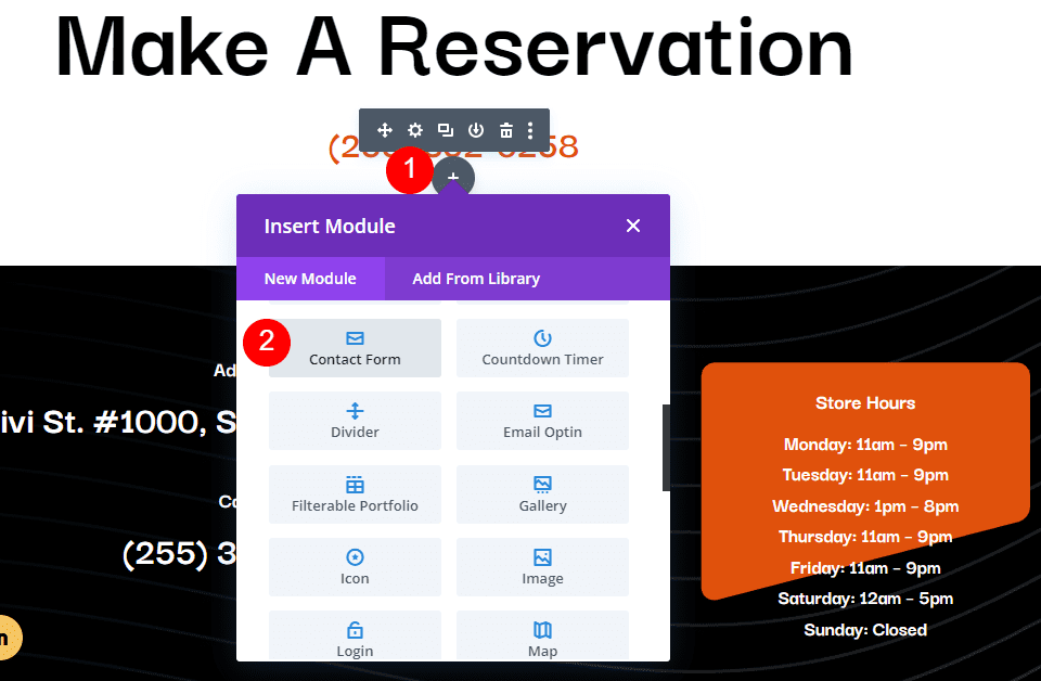
    The popup button type allows you to create slide-in menus, full-screen menus, fly-in contact forms, and all sorts of unique popups that display when the button is clicked. This opens up all sorts of possibilities for your menu design. Here is an example of a slide-in popup with some service items displayed in blurbs. Because the popups are created with regular Divi sections, you can add any module you want and have complete control over the design of your popup. Within the buttons settings, you can change the button pop ID, change the toggle type between primary and secondary, change the popup location, and adjust the opening and closing animations for the popup. You can also add a popup close button, add a popup overlay, enable the close on outside click function, and adjust the popup Z index.

    Divi MadMenu Button Popup Settings

    Builder Settings

    The MadMenu module also comes with some settings to change how the Builder functions. You can show outlines and change the outline color, allowing you to see and adjust the layout. The outlines are only shown in the Visual Builder. You can also enable logged-in mode, which will show authenticated button content in the Visual Builder.

    Divi MadMenu Builder Settings

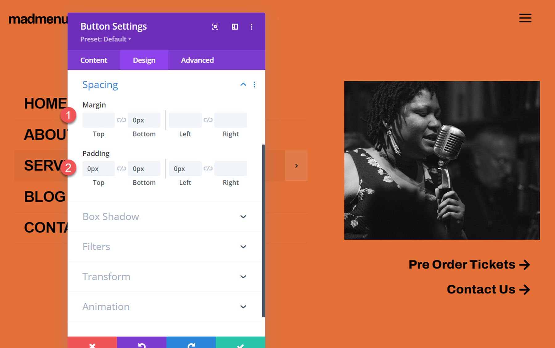
    Divi MadMenu Module Design Settings

    The design tab is full of customization possibilities for every aspect of your MadMenu.

    Layout: General

    Here you can change the basic layout of the menu. You can change the element’s alignment, the dropdown direction, and reorder the menu items.

    Divi MadMenu Layout General Settings

    Layout: Elements

    The layout: elements section is where you can change the layout of the individual elements in the menu. You can change the vertical and horizontal alignment, the column width, and the column max width for the desktop menu, mobile menu, logo, search, cart, and button elements.

    Divi MadMenu Layout Elements Settings

    Style Options

    The rest of the design tab is full of options to customize every single element on your menu. You can set up a different design for the normal and fixed menu, and of course, many of the design settings are further customizable with hover and responsive design settings.

    Divi MadMenu Design Options

    With this level of customizability available for the menu section, you can easily create just about any type of menu you would like to, all without having to touch any custom code.

    Divi MadMenu Design Options

    Divi MadMenu Module Advanced Settings

    The Advanced tab features many of the typical advanced options, but there are a couple of new settings for the MadMenu module.

    Visibility

    In the visibility settings, you can control what elements are visible or hidden when the search is opened. Additionally, you can choose to hide the different menu elements here.

    Divi MadMenu Visibility Settings

    Position

    Here you can enable the fixed header and change the fixed header position. When the fixed header is enabled, you can use the fixed tab in all of the design settings to create a unique design for when the header is fixed.

    Divi MadMenu Position Settings

    Divi MadMenu Vertical Menu Module

    The vertical menu module allows you to add vertical navigation to your page, header, or footer. For this example, I’m adding the MadMenu vertical menu module to the popup I created earlier that is enabled by clicking Button 1 in the header. The vertical menu module does not include logo, cart, search, or button elements, however, you can use the menu module along with other Divi modules to create a layout with many different elements.

    Divi MadMenu Vertical Menu Module Content Settings

    In the menu section, you can select the menu that is shown and choose to collapse or expand submenus. When collapse submenus is selected, you can choose a submenu style and choose if parent links are clickable, just like the regular MadMenu module. With the Expanded style selected, you can enable accordion mode, change the parent item icon, and animate the parent item icon.

    Divi MadMenu Vertical Menu Settings

    With either of the slide styles selected you can change the submenu header text, the parent item icon, the submenu header “home” icon, and the submenu header “back” icon.

    Divi MadMenu Vertical Menu Settings

    Divi MadMenu Vertical Menu Module Design Settings

    Of course, the vertical MadMenu is just as customizable as the horizontal menu. You have full control over the look of the menu with lots of options to change each element. Many of the settings have hover and mobile styles enabled, giving you even more flexibility with your design.

    Divi MadMenu Design Options

    Divi MadMenu Vertical Menu Module Advanced Settings

    The advanced section has most of the standard advanced options you would expect in a Divi module. MadMenu makes it easy to add Custom CSS by adding sections that target specific menu elements, making it that much easier to customize your menu styles.

    Divi MadMenu Custom CSS

    Divi MadMenu Layout Example

    Now that we’ve taken a look at the MadMenu modules and customization options, let’s build our own menu section. Here is a preview of what we’ll design. It’s a minimal-style header with a logo and hamburger menu button.

    Divi MadMenu Tutorial Desktop

    When the menu icon is clicked, a fullwidth menu section is revealed.

    Divi MadMenu Tutorial Desktop Popup

    Divi MadMenu Setup

    To get started, open the Divi Theme Builder and add a new header.

    Divi Theme Builder

    Add a row with a single column to the header section and add the MadMenu module.

    Divi MadMenu Tutorial Add MadMenu

    Because we want the menu to take up the full width of the page, we’ll need to adjust the section and row spacing settings.

    First, set the section top and bottom padding to 0.

    Divi MadMenu Tutorial Section Padding

    Next, set the row width and max width to 100%.

    Divi MadMenu Tutorial Row Width

    Finally, set the row top and bottom padding to 0.

    Divi MadMenu Tutorial Row Padding

    Divi MadMenu Content Settings

    Now that our row and section settings are set, we can move on to the MadMenu module settings. Under elements, enable the logo and button one.

    Divi MadMenu Tutorial Elements

    Button one is going to be our menu toggle. In the button settings, change the icon to the three-line menu icon.

    Divi MadMenu Tutorial Button

    Change the following button options to enable the popup functionality.

    • Button one type: Popup
    • Popup ID: popup1 (you can set this to whatever you want, it just needs to be the same as the ID you set later in the popup section.
    • Popup Location: Center
    • Popup Opening Animation: Slide In Top
    • Popup Closing Animation: Slide Out Top

    Divi MadMenu Tutorial Button 2

    Finally, change the background color to #E47138.

    Divi MadMenu Tutorial Background

    Divi MadMenu Design Settings

    Now let’s move over to the design tab. In the general layout settings, set the element’s alignment.

    • Elements Alignment: Space-Between

    Divi MadMenu Tutorial Layout

    Next, open up the button one settings and customize the styles.

    • Button One Padding: 5px, 5px, 5px, 5px
    • Button One Icon Size: 40px
    • Button One Icon Color: #000000
    • Button One Border Width: 0px

    Divi MadMenu Tutorial Button Design

    DiviMadMenu Popup

    To create the fullscreen popup section, first, add a regular section to the header.

    Divi MadMenu Tutorial Add Section

    Add a row with two columns.

    Divi MadMenu Tutorial Add Row

    Set the section background color to #E47138

    Divi MadMenu Tutorial Section Background Color

    In the section sizing settings, set the width to 100% and the height to 100vh to make the section fullscreen.

    Divi MadMenu Tutorial Popup Sizing

    Vertical MadMenu Module

    In the left column, add the Vertical MadMenu module.

    Divi MadMenu Tutorial Add Vertical Menu

    In the menu settings, select your menu, enable collapsed submenus, and set the submenu style to slide right.

    Divi MadMenu Tutorial Menu

    Next, change the menu background to transparent.

    Divi MadMenu Tutorial Transparent Background

    Move over to the design tab and modify the text item styles as follows:

    • Menu Items Text Color: #000000
    • Menu Items Text Font: Ariel
    • Menu Items Font Weight: Bold
    • Menu Items Font Style: TT (Capitalized)

    Divi MadMenu Tutorial Menu Items Styles

    • Menu Items Font Size Desktop: 30px
    • Menu Items Font Size Mobile: 25px
    • Menu Items Letter Spacing: -0.02em
    • Menu Items Line Height: 1.4em

    Divi MadMenu Tutorial Menu Items Styles

    In the spacing settings, set the mobile top, bottom, and left padding to 0.

    Divi MadMenu Tutorial Mobile Padding

    Next, set the border width to 0 to remove the border around the menu.

    Divi MadMenu Tutorial Border Width

    Column 2 Contents

    Add an image to the right column. Set the mobile height to 180px.

    Divi MadMenu Tutorial Mobile Image Height

    Next, add two buttons below the image. Set the button alignment for desktop and mobile.

    • Button alignment desktop: right
    • Button alignment mobile: left

    Divi MadMenu Tutorial Button Alignment

    Next, customize button styles:

    • Button Text Size: 25px
    • Button Text Color: #000000

    Divi MadMenu Tutorial Button Styles

    • Button Border Width: 0px
    • Button Text Font: Archivo
    • Button Font Weight: Ultra Bold

    Divi MadMenu Tutorial Button Styles

    • Button Icon: Arrow
    • Disable only show button on hover

    Divi MadMenu Tutorial Button Icon

    Finally, set the button spacing:

    • Button Margin Bottom: 0px
    • Button Padding Top Bottom, and Left: 0px

    Divi MadMenu Tutorial Button Spacing

    Close Popup Button

    The final element we need to add to our popup is a close button. You can enable the default close button in the MadMenu settings, or you can add another MadMenu module with a button that functions as a close button so that you can fully customize the styling. That’s what we’ll do for this tutorial. Start by adding a new row with one column to the popup and move it above the existing row. Then add a MadMenu module.

    Divi MadMenu Tutorial Add MadMenu Module

    Disable all of the MadMenu elements except for button one, which will function as our close button.

    Divi MadMenu Tutorial Enable Button

    In the button one settings, set the text to “close”. Enable the button one icon, then select the close icon.

    Divi MadMenu Tutorial Button Settings

    Set the button one type to popup, then enter the popup ID you used for the popup section – in my case, it’s ‘popup1’. Set the popup toggle type to secondary, which enables the closing function.

    Divi MadMenu Tutorial Button Type

    Next, set the menu background to transparent.

    Divi MadMenu Tutorial Menu Background

    Now move over to the design tab. In the general layout settings, set the element’s alignment to right.

    Divi MadMenu Tutorial Elements Alignment

    In the button one text settings, customize the button styling:

    • Button One Font: Arial
    • Button One Font Weight: Bold
    • Button One Font Style: TT (Capitalized)
    • Button One Text Color: #000000
    • Button One Letter Spacing: -0.02em

    Divi MadMenu Tutorial Button Text

    In the button one settings, customize the spacing and icon styling.

    • Button One Text Margin: 5px
    • Button One Icon Size: 35px
    • Button One Icon Color: #000000
    • Button One Border Width: 0px

    Divi MadMenu Tutorial Button Icon Size

    Finally, set the menu top and bottom padding to 10px.

    Divi MadMenu Tutorial Menu Padding

    Enable Popup Function

    The last thing we need to do is to enable the popup functionality. Open the popup section settings and navigate to the advanced tab, then add the CSS ID popup1. This will activate the popup functionality and you can reveal the popup section by clicking the hamburger menu icon in the header. Now the design is complete!

    Divi MadMenu Tutorial CSS ID

    Final Result

    Here is the final design displayed with Divi’s Music Venue landing page layout.

    Divi MadMenu Tutorial Desktop

    The fullscreen popup menu section is revealed when the menu icon is clicked.

    Divi MadMenu Tutorial Desktop Popup

    Here is the mobile version of the layout.

    Divi MadMenu Tutorial Mobile

    And this is what the fullscreen popup section looks like on mobile.

    Divi MadMenu Tutorial Mobile Popup

    Divi MadMenu Demo Layouts

    Divi MadMenu also comes with 19 demo layouts that you can use to jumpstart your design. Let’s take a look at some.
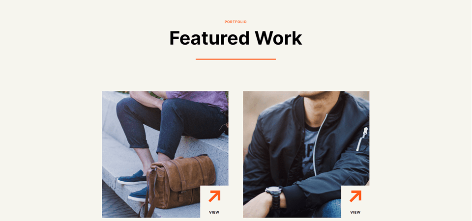
    Demo Layout 4

    Demo layout 4 features a left-aligned logo and menu section. On the right side, you have a search icon, a sign in/out button, and a profile button.

    Divi MadMenu Demo 4 Desktop

    The search bar replaces the menu when selected.

    Divi MadMenu Demo 4 Search

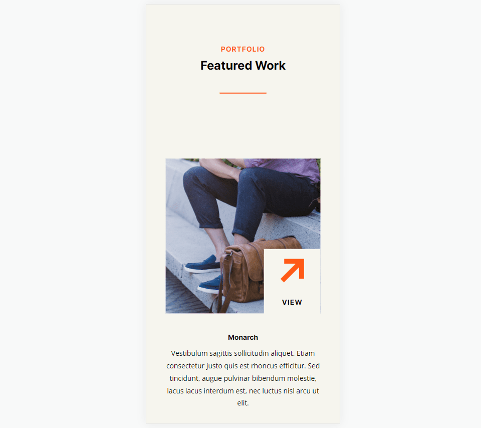
    Here is how layout 4 looks on mobile. The menu slides in when selected.

    Divi MadMenu Demo 4 Mobile

    Demo Layout 11

    Demo layout 11 is a simple layout with the logo on the left and a menu icon on the right. When the menu icon is clicked, the menu section is revealed on a red background.

    Divi MadMenu Demo 11 Desktop

    On mobile, layout 11 has a similar layout with the logo and menu icon. When the menu is opened it reveals below.

    Divi MadMenu Demo 11 Mobile

    Demo Layout 13

    Demo layout 13 is an interesting menu with lots of interactive elements. The menu icon to the right of the logo opens up a menu bar right below the primary menu bar.

    Divi MadMenu Demo 13 Desktop

    The account button in the menu also opens up a slide-in menu with a login/out button and several other navigation items.

    Divi MadMenu Demo 13 Account

    The social menu button on the left opens on the side to reveal social media icons.

    Divi MadMenu Demo 13 Social Icon Bar

    And the search icon opens a search bar that appears below the menu.

    Divi MadMenu Demo 13 Search

    Finally, here is how the menu looks on mobile with the menu selected.

    Divi MadMenu Demo 13 Mobile

    Purchase Divi MadMenu

    Divi MadMenu is available to purchase in the Divi Marketplace. It costs $39 for unlimited website usage and lifetime support and updates. The price also includes a 30-day money-back guarantee.

    Final Thoughts

    Divi MadMenu adds some great customization options and flexibility to the headers and menus you can create with Divi. I particularly love the ability to create your own popup sections using Divi sections, allowing you to add any modules you would like. If you’re looking for a plugin to expand the possibilities of the header and menu sections you can build, Divi MadMenu is a great option.

    We would love to hear from you! Have you tried Divi MadMenu? Let us know what you think about it in the comments!

    The post Divi Plugin Highlight: Divi MadMenu appeared first on Elegant Themes Blog.

  • 8 Best Advertising Plugins for WordPress in 2023

    Ads are a great way to make money with your WordPress website. There are lots of ad platforms available, and ads can be placed just about anywhere on a website. The number of options can become overwhelming as there is a lot to manage when handling ads. In this article, we’ll look at the 8 best advertising plugins for WordPress to help you choose which is best for your needs.

    What is a WordPress Advertising Plugin?

    A WordPress advertising plugin is a tool that allows website owners to manage and display ads on their WordPress site. These plugins provide a range of features, including ad placement, ad tracking, ad targeting, and ad customization options, to help businesses effectively monetize their site through advertising. With the help of a WordPress advertising plugin, website owners can easily display and manage ads on their sites.

    In addition to providing features for managing and displaying ads, WordPress advertising plugins can also offer a range of customization options to help businesses optimize their ad strategy. By tailoring their ad strategy to the specific needs of their business and audience, website owners can maximize their ad revenue and ensure a positive user experience for their visitors.

    Top 8 WordPress Advertising Plugins

    If you’re looking to monetize your WordPress site or boost your revenue through advertising, you’re in luck. There are a plethora of advertising plugins available for WordPress that can help you effectively manage, track, and display ads on your site.

    So without further ado, let’s dive in and explore the top WordPress advertising plugins!

    1. Advanced Ads

    Advanced Ads

    Advanced Ads is a Google AdSense Partner that works will all ad types and networks, including Google AdSense, Google Ad Manager, media.net, Amazon ads, and more. It includes Gutenberg blocks and lets you create unlimited ads. It can automatically inject the ads into the most optimal locations on your website. This plugin checks for Google AdSense violations and integrates with Ad Health. You can schedule ads and display them based on conditions.

    Advnaced Ads integration

    The settings screen gives you lots of options to create and display your ads. Create the ad, see an overview of your ads, see groups and rotation, and see the placements.

    Advanced Ads settings

    The widget lets you choose the ad to display.

    Key Features for Advanced Ads:

    • Unlimited ads
    • Works with all ad platforms
    • Includes Gutenberg blocks
    • Checks for violations
    • Schedule ads
    • Inject ads automatically
    • Rotate ads
    • Inject HTML, CSS, and JS
    • Display based on visitor conditions
    • Display based on device or browser
    • Prevent ad blocking
    • Pro version adds new placements, conditions, lazy loading, fraud protection, grids, refresh without reloading, and more.

    Price: Free, pro version starts at €89.00 per year.

    Get Advanced Ads

    2. Ads by WPQUADS

    Ads by WPQUADS

    Ads by WPQUADS is one of the most feature-rich ad inserter and AdSense advertising plugins for WordPress. It supports 9 ad platforms and allows you to insert custom code. Insert ads into 12 positions across your website. It also has 10 conditional positions and 9 targeting positions to give you more control over how and where the ads appear. Adblocker detection provides 4 different types of notices.

    Ads by WPQUADS

    When creating ads, you’ll get to choose the type of ad integration you want to use.

    Ads by WPQUADS

    For custom code, add the code into the field, choose the alignment, add margin space, a label, etc.

    Key Features for Ads by WPQUADS:

    • Integrates with 9 platforms
    • Insert custom code
    • Full website background ad
    • Insert into 12 positions
    • 10 conditional positions
    • 9 targeting conditions
    • Lazy loading
    • Sidebar widgets
    • Adblocker detection
    • The pro version adds geolocation, group insertion, global excluder, auto ads, rotator, reports, AMP, Google Analytics, and more.

    Price: Free; the pro version starts at $89

    Get Ads by WPQUADS

    3. AdSanity

    AdSanity

    AdSanity is one of the most advanced premium advertising plugins for WordPress. It’s a lightweight ad rotator that makes it easy to create and manage your ads. Expand it with extensive add-ons. It also provides statistics on views and clicks. You can schedule the ads to display based on the date. Display ads within widgets and template tags, or place them anywhere on your website.

    Key Features for AdSanity:

    • Basic add-ons included
    • More expensive plans include advanced addons
    • Schedule ads
    • Widgets
    • Statistics

    Price: Starting at $59 per year.

    Get AdSanity

    4. Ad Inserter

    Ad Inserter

    Ad Inserter is one of the most popular advertising plugins for WordPress. This plugin makes it easy to place ad codes into the most optimal locations on your website. It supports lots of ad platforms, including Google AdSense, Google Ad Manager, Infolinks, Amazon native Shopping, and more. You can also display fixed or rotating ads. It also allows you to insert opt-in forms, scripts, CSS, JavaScript, PHP, and tracking code.

    Ad Inserter

    The settings screen lets you add the code into a field. You can choose the pages, post types, and taxonomies that can display the ad. The Insertion dropdown box includes all the locations where the ad can be placed. You can also select the alignment, which also includes floating options and custom CSS.

    Key Features for Ad Inserter:

    • Insert code into 17 locations
    • Integrates with multiple ad platforms
    • Disable on specific pages or posts
    • AdSense code generator
    • Timed ad rotation
    • Sticky widgets
    • Code generator for banners
    • Visual editor
    • Custom CSS
    • Pro version adds click detection, geolocation, reports, click fraud protection, and impression and click limits.

    Price: Free, pro version starts at €20.00

    Get Ad Inserter

    5. AdRotate

    Adroate banner manager logo

    AdRotate lets you insert ads from many ad servers and set up your own ads with HTML or JavaScript. You can place random ads or select them yourself. It provides lots of management options. Ads can be disguised so adblockers can’t see them. Schedule the ads with a date range. The dynamic mode rotates the ads every few seconds. Post them in an ad grid. Inject them into pages and posts.

    Create and manage the ads from the management screen. You can also manage groups, schedules, and media.

    adrotate manager page

    View statistics and your monthly overview of clicks and impressions.

    Adrotate stats page

    The widget lets you select the type. Choose between advertisement and group.

    Key Features for AdRotate:

    • Insert ads from multiple ad servers
    • Insert HTML or JavaScript
    • Disguises ads from blockers
    • Inject into pages and posts
    • Display in a grid
    • Rotate every few seconds
    • Manage ads, groups, schedules, and media
    • View statistics
    • The pro version adds banners, a live preview, mobile ads, a fallback group, post and page injection for widgets, and more options for scheduling, geo-targeting, statistics, advertisers, etc.

    Price: Free, pro version starts at €39.00

    Get AdRotate

    6. Wp-Insert

    Wp-Insert

    Wp-Insert is one of the most powerful free advertising plugins for WordPress. This plugin makes it easy to insert and manage ads for WordPress. Insert ads into multiple locations, including after a set number of paragraphs. Insert ads into sidebars with the included widgets. You can manually override the positioning on a per-post basis. Hide the ads for users that are logged in or using mobile devices. Perform a/b testing that complies with AdSense policies. The a/b testing can include ad rotation. Amp support is built in.

    Wp-Insert

    The settings screen provides tools for in-post ads, widgets, in-theme ads, shortcodes, AdSense auto ads, a/b testing, and more. It also includes templates for your legal pages, tracking codes, and a generator for your ads.txt.

    Key Features for Wp-Insert:

    • Insert into multiple locations
    • Optimized for AdSense
    • Supports Google Page-Level Ads
    • A/b testing
    • Supports AMP
    • Hide ads on specific pages
    • Hide ads for logged-in users
    • Style ads
    • Hide ads on mobile
    • Geo-targeting
    • Widgets

    Price: Free

    Get Wp-Insert

    7. Easy Google AdSense

    Easy Google AdSense

    Easy Google AdSense is the easiest to use of all the advertising plugins for WordPress. Just connect it to your AdSense account and then choose which auto ads you want to display. It automatically displays ads on your site without you having to paste the code. It’s designed with the user experience in mind. It uses machine learning to determine the best locations to place ads. Google will only show ads during optimal performance times. It doesn’t conflict with any ad code you already have on your website.

    Easy Google AdSense

    All you have to do is enter your Google AdSense Publisher ID and then go you’re your AdSense account to choose which types of auto ads you want to display. You don’t have to make any other choices, paste any code, etc. It’s all handled for you.

    Key Features for Easy Google AdSense:

    • Easiest to use
    • Displays ads automatically
    • Displays in the most optimal locations
    • Only displays ads at optimal times

    Price: Free

    Get Easy Google AdSense

    8. WP Simple Adsense Insertion

    WP Simple Adsense Insertion

    WP Simple Adsense Insertion is one of the easiest to use of all advertising plugins for WordPress. Easily insert your ad code anywhere within your website using shortcodes or your theme’s template files. It provides fields where you’ll enter the code. You can also have it automatically place the ads within your articles or above your articles. This is ideal for beginning WordPress users that want to have some control over where the ads will appear.

    WP Simple Adsense Insertion

    The ad code fields give you lots of options for where the ads will display. You just need to paste the code and then copy the shortcode for that field. This limits the number of ads you can use and their locations, but it is ideal for those that want to keep it simple and retain some control.

    Key Features for WP Simple Adsense Insertion:

    • Display ads anywhere using shortcodes
    • Add the shortcode to your PHP template files
    • Automatically place ads in articles or before articles
    • Works with other types of ad platforms

    Price: Free

    Get WP Simple Adsense Insertion

    Which One is The Best Advertising Plugin for WordPress?

    Plugin Price Free Option
    🥇 Advanced Ads €89.00 per year ✔️ Visit
    🥈 Ads by WPQUADS $89.00 per year ✔️ Visit
    🥉 AdSanity $59.00 per year ❌ Visit
    4 Ad Inserter €20.00 lifetime ✔️ Visit
    5 AdRotate €39.00 lifetime ✔️ Visit
    6 Wp-Insert Free ✔️ Visit
    7 Easy Google AdSense Free ✔️ Visit
    8 WP Simple Adsense Insertion Free ✔️ Visit

    That’s our look at the 8 best advertising plugins for WordPress. There are a lot of ad management plugins available with a range of prices and features to choose from. We recommend starting with Advanced Ads or Ads by WPQUADS; Advanced Ads is a powerful, user-friendly plugin that provides advanced features for managing ads, while Ads by WPQUADS is a lightweight, straightforward plugin that is perfect for beginners.

    By using these recommended advertising plugins, you can monetize your WordPress site effectively, improve your revenue, and provide a better user experience for your visitors. Just remember to test any plugin thoroughly before implementing it on your live site to ensure optimal performance.

    We want to hear from you. Have you tried any of these 8 best advertising plugins for WordPress? Let us know what you think about them in the comments.

    Featured image illustration via Nicescene / shutterstock.com

    The post 8 Best Advertising Plugins for WordPress in 2023 appeared first on Elegant Themes Blog.

  • 10 Best WordPress Recipe Plugins in 2023

    Food blogs and instructional cooking sites are some of the most popular websites on the net. Since there are so many websites dedicated to preparing food, it can be difficult for them to stand out from the crowd. Like the food itself, recipes need great presentation. This is where a WordPress recipe plugin is crucial.

    Fortunately, there are lots of recipe plugins available to help you present your recipes in the best way possible. They even provide special features and improve your SEO. In this article, we’ll look at the best WordPress recipe plugins and help you decide which is best for your needs.

    Subscribe To Our Youtube Channel

    What is a WordPress Recipe Plugin and Why do You Need One?

    WordPress recipe plugins add recipe cards to your posts and pages to display images, videos, ingredients, and instructions for making the food. They also include information about the food and recipe such as cooking time, number of servings, nutritional information, etc.

    Recipes can be created by hand, but a plugin provides lots of advantages. For example, they improve your SEO for Google and Pinterest searches and pins using JSON-LD and schema.org structured data. They also provide other features such as printing, scaling the serving size, social sharing, styling, and lots more. Many include templates designed for publishing recipes.

    There are many WordPress recipe plugins to choose from. Most have both a free and a premium version. We’ll look at both types.

    10 Best WordPress Recipe Plugins

    When considering which plugins to feature, we considered several factors. First, how popular are they? Secondly, we took ease of use, support, security, and reviews into consideration. After extensive research, we’ve settled on the following list. So without any further delay, let’s dive into our list.

    1. Delicious Recipes

    Delicious Recipes best WordPress recipe plugin

    Delicious Recipes uses the REST API to manage recipes. This WordPress recipe plugin includes image and video galleries, nutritional charts, rich text instructions, printable recipes, advanced search, star ratings, adjustable servings, author profiles, social sharing, and more. Social features include Pinterest Rich Pin support and Pinterest and Instagram sharing. Create recipes in a custom WordPress dashboard.

    Plus, you can display recipes with Gutenberg and sidebar widgets. It adds 9 Gutenberg blocks, 6 widgets, and color and layout settings. It’s SEO optimized with Google Structured Data and it supports schema.

    Key Features for Delicious Recipes:

    • 9 Gutenberg blocks
    • 6 widgets
    • Color and layout settings
    • Social sharing
    • Galleries
    • Star ratings
    • Nutritional facts
    • Print template
    • Advanced search
    • Adjustable servings

    Price: Free, with pro licenses starting at $49 per year.

    Get Delicious Recipes

    2. WP Tasty Recipes

    Tasty Recipes plugin

    WP Tasty Recipes is a premium WordPress recipe plugin that includes everything in one package. It was designed for food bloggers and includes nutritional information, embedded videos, and flexible formatting so you can create your recipes according to your writing style. Visitors can scale the recipes automatically to any size they want.

    It’s style-able and includes 5 premade themes to get you started quickly. Convert recipes from other plugins. It uses JSON-LD for the best Google and Pinterest SEO.

    Key Features for WP Tasty Recipes:

    • Flexible formatting
    • Import from other plugins
    • Convert in bulk
    • Recipe scaling
    • Videos
    • Nutritional information
    • Stylable
    • 5 premade styles

    Price: $49 per year.

    Get WP Tasty Recipes

    3. Recipe Card Blocks

    Recipe Card Blocks

    Recipe Card Blocks by WPZoom works with Gutenberg to create recipe cards. It adds several blocks including a recipe card with schema markup for SEO. Other blocks include details, ingredients, directions, and nutritional facts. Plus, you can integrate video into your recipes as well as add ingredients and instructions in bulk. It includes multiple designs, supports AMP, and it’s GDPR compliant.

    The pro version adds galleries, start ratings, adjustable servings, ingredients quantity, a gallery, custom Pinterest image, comments rating, social CTA, and more.

    Key Features for Recipe Card Blocks:

    • 5 Gutenberg blocks
    • Schema markup
    • Integrate video
    • Add ingredients in bulk
    • Add instructions in bulk
    • Supports AMP
    • GDRP compliant
    • Pro version available

    Price: Free, pro version starts at $59 per year.

    Get Recipe Card Blocks

    4. Zip Recipes

    Recipe Maker For Your Food Blog plugin

    Zip Recipes is a simple, yet powerful recipe plugin made by the folks who created Really Simple SSL. It includes a template editor so your recipes will have a professional design on any device. Plus, you can create your templates with a WYSIWYG editor, if you wish. Recipes can be inserted by copying and pasting from Microsoft Word or other sources. Plus, you can add recipes to posts, pages, and custom post types. It can use the featured image from the post or page. Recipes include nutritional information, cook and prep time, notes, etc. It’s SEO optimized with JSON-LD metadata.

    The pro version adds author settings, recipe card themes, visitor ratings, social media, recipe grid, automatic nutrition, serving adjustments, metric imperial converter, and search by ingredients.

    Key Features for Zip Recipes:

    • WYSIWYG editor
    • Display recipes in multiple post types
    • Cook and prep time
    • Nutritional information
    • Notes
    • JSON-LD for SEO
    • Pinterest Rich Recipe pins
    • AMP compatible
    • Pro version available

    Price: Free, pro version starts at $39 per year.

    Get Zip Recipes

    5. WP Recipe Maker

    WP Recipe Maker

    WP Recipe Maker makes it easy to add recipes to any post or page. It uses JSON-LD metadata, which will improve your SEO for Google’s recipe search. It works with Gutenberg and the classic editor. Add photos and videos to any step of the recipe. Structure the ingredients into groups. Shortcodes include printing the recipe and jumping to the recipe. The print page is interactive and includes space for ads. The template editor lets you customize the design.

    The pro version adds adjustable servings, ratings, ingredient links, nutritional labels, and more. To learn more about WP Recipe Maker, check out our extensive overview.

    Key Features for WP Recipe Maker:

    • Gutenberg or classic editor
    • JSON-LD metadata for improved SEO
    • Print recipe page
    • Group ingredients
    • Add photos and videos
    • Customize the template
    • Pro version and addons available

    Price: Free, the pro version starts at $49 per year.

    Get WP Recipe Maker

    6. Cooked

    Cooked recipe plugin

    Cooked comes with lots of premium features in the free version. Features include galleries, cooking timers, nutritional facts, printable recipes, a drag-and-drop recipe builder, SEO, etc. Recipes are displayed in an attractive grid, and the servings switcher adjusts the ingredient amounts. You can add prep and cooking times, difficulty levels, timers, and more. It also has powerful search and sorting features including the full-screen mode, which shows everything you need on the screen at once.

    The pro version adds ratings, favorites, recipe submissions, user profiles, social sharing, additional taxonomies, and more.

    Key Features for Cooked:

    • Prep and cooling times
    • Galleries
    • Nutritional facts
    • Difficulty level
    • Search and sorting options
    • Servings switcher
    • Author templates
    • Drag-and-drop builder
    • Printing
    • Full-screen mode
    • SEO features
    • Pro version available

    Price: Free, pro version starts at $39 per year.

    Get Cooked

    7. Create

    Create recipe plugin

    Create works for any type of instructions including recipes, lists and roundups, and how-to guides. It automatically calculates nutritional data and allows you to embed videos into your recipes. Multiple importers are included, so if you’re using one of 11 different recipe plugins, you can import your content. It has multiple themes to choose from so it will fit your site’s design. Plus, it’s ad-ready so you can monetize your content.

    Content is marked for mobile search carousels with Google Rich Snippet support with one-button schema validation. This plugin was designed to be fast and lightweight.

    Key Features for Create:

    • Calculates nutritional data automatically
    • Embed video
    • Multiple themes to choose from
    • Import from other recipe plugins
    • SEO optimized

    Price: Free

    Get Create

    8. Blossom Recipe Maker

    Blossom Recipe Maker plugin

    With Blossom Recipe Maker, you can effortlessly add recipes to your pages and posts using a shortcode. The plugin enables you to include photos for each step, group instructions with headings, and even add galleries, YouTube, or Vimeo videos. Additionally, you can conveniently sort and list the ingredients and instructions, making it easy for your visitors to follow along. The plugin also offers templates categorized by cuisine, cooking methods, and tags, with advanced searching capabilities. Furthermore, visitors can print recipes without images, and the plugin is translation-ready for a global audience.

    Visitors can interact with the recipes. For example, they can adjust the serving size and mark the ingredients and instructions as they prepare the food. This allows them to adjust it to their needs and keep track of their progress.

    Key Features for Blossom Recipe Maker:

    • Group with headings
    • Photos
    • Gallery
    • YouTube and Vimeo videos
    • Adjust servings size
    • Mark progress
    • Add to pages and posts with shortcodes
    • Category templates
    • Author templates
    • Advanced searching
    • Print without images
    • Translation ready

    Price: Free

    Get Blossom Recipe Maker

    9. Cookbook

    Cookbook recipe plugin

    Cookbook is a premium plugin that was designed with food bloggers in mind. Recipes include nutritional data and ratings. Visitors can jump to the recipe at the bottom of the page with an embedded shortcode. Recipes are printable. Style the recipe with rich formatting. It was designed for the classic editor and is the sister plugin to WP Recipe Maker, which was designed for Gutenberg.

    It includes JSON-LD recipe markup and schema to give you the best SEO for your recipes and makes them easy to share. You can override the schema output and create custom labels. It’s translation-ready and can import from other plugins.

    Key Features for Cookbook:

    • Nutritional data
    • Rating system
    • Jump to recipe feature
    • Printable
    • Rich formatting
    • Translation ready
    • SEO includes schema and JSON-LD
    • Imports from other plugins
    • Designed for the classic editor

    Price: $59.99 per year.

    Get Cookbook

    10. Food Recipes For Divi

    Food Recipes for Divi

    Food Recipes for Divi is a cool little plugin that adds a touch of elegance and functionality to your food blog. As a user of Divi, you can leverage over 20 modules to create stunning designs using the Visual Builder, the ultimate front-end WordPress page builder. With the plugin’s impressive features, you can embed videos and images into your recipes, making it easier for your audience to follow along as they prepare your delicious creations.

    Furthermore, the plugin’s LD+JSON schema allows for increased visibility in search engines, giving you a chance at higher SERPs. With Food Recipes for Divi, you can create a visually appealing, user-friendly blog that will keep your readers coming back for more.

    Key Features for Food Recipes For Divi:

    • 20+ Divi modules for flexible layouts
    • Include videos and images in your recipes
    • Pre-built Divi recipe layouts
    • LD+JSON schema support
    • Optimized for SEO

    Price: $69.99 per year.

    Get Food Recipes For Divi

    Choosing a WordPress Recipe Plugin

    When searching for a recipe card plugin, it’s important to look for specific features that will meet your needs. Take the time to consider what extras you require, such as the ability to add images, videos, or links. Additionally, consider whether you need to import content from another plugin or if you prefer to work with a specific editor, such as Gutenberg blocks or the classic editor with shortcodes.

    WordPress Recipe Plugin Ending Thoughts

    A food blog can be one of the most enjoyable and helpful blogs you can create. A WordPress recipe plugin such as Delicious Recipes or WP Tasty Recipes can improve the design of your food blog, provide extra tools to attract and help your audience, and even make it easy for them to find you and share your content.

    Plugin Price Free Option
    🥇 Delicious Recipes Free, $49 per year ✔️ Visit
    🥈 WP Tasty Recipes $49 per year ❌ Visit
    🥉 Recipe Card Blocks Free, $59 per year ✔️ Visit
    4 Zip Recipes Free, $39 per year ✔️ Visit
    5 WP Recipe Maker Free, $49 per year ✔️ Visit
    6 Cooked Free, $39 per year ✔️ Visit
    7 Create Free ✔️ Visit
    8 Blossom Recipe Maker Free ✔️ Visit
    9 Cookbook $59.99 per year ❌ Visit
    10 Food Recipes For Divi $69.99 per year ❌ Visit

    Whatever your needs are, you’re sure to find the right plugin on this list.

    We want to hear from you. Have you tried any of these 9 best WordPress recipe plugins? Let us know what you think about them.

    Featured image illustration via VectorMine / shutterstock.com

    The post 10 Best WordPress Recipe Plugins in 2023 appeared first on Elegant Themes Blog.