EDITS.WS

Author: Randy A. Brown

  • 10 Best WordPress Chat Plugins in 2023

    A WordPress chat plugin is a great way to communicate with customers through your website. Live chats are ideal for answering presales questions and providing live support. Customers can get answers quickly, which increases confidence. Fortunately, there are lots of chat plugins to choose from. In this article, we’ll look at the 10 best WordPress chat plugins to help you decide which is best for your needs.

    Why Use a WordPress Chat Plugin?

    Customers that have questions need an easy way to get answers. Many of those questions may be answered in an FAQ, but there’s always a question that isn’t answered on the website. Email communication is often a slow process.

    Plugins allow you to automate the communication between you and your customers. Chatbots can manage the communication and hand it off to you when needed. This is a great way to capture leads and increase customer satisfaction.

    A live chat feels more personal than an email. It’s easier than communicating over the phone. With phone conversations, it can be difficult to know when the other person has stopped talking, so you don’t talk over each other. Also, it can be difficult to understand someone. Customer support often needs a screenshot, a file, a link, etc., so the conversation needs to revert to a text-based conversation anyway.

    A WordPress chat plugin solves these issues by bringing a live chat feature to your website. Let’s take a look at some of the best live chat plugins available.

    1. HubSpot

    HubSpot logo

    HubSpot is a marketing behemoth; they provide live chat, CRM, and a ton of other content management system (CMS) functions.

    Live chat, help ticketing, automated bots, and much more are all included in the Service Hub package, which is available in the free HubSpot WordPress plugin. They have garnered 4.5/5 stars with over two hundred thousand active users.

    Hubspot's customizable chatbox

    This plugin is reliable and adaptable, and with its no-cost live chat plugin for WordPress, it’s a great choice, especially if you’re familiar with the Hubspot platform. HubSpot only has a downside if they offer more than you need in its entire feature set. Of course, sticking with HubSpot’s ecosystem make sense if you currently utilize its other services.

    Features:

    • Multiple services, including chat
    • Popups
    • Live chat
    • Lead generation
    • Lead capture
    • Chatbots
    • Lead management
    • Live support

    Price: Free | More Information

    2. Tidio

    Tidio logo

    Tidio is a WordPress chat plugin that includes email marketing tools to help grow your business. The customizable widget works with your branding. It includes templates and an editor. A mobile app lets you use iOS or Android to respond to customers. Notifications show you when customers come to your website. It notifies you when customers visit your site and provides a live typing preview. You can see the page your visitors are looking at to give them specific help. Email marketing tools help you stay in touch with your visitors.

    Tidio's customizable chat widget

    This plugin gives you all the tools you need to create aesthetically pleasing and functional chat boxes; it’s a lightweight and customizable solution and is 100% mobile-friendly. Additionally, a variety of third-party connectors are readily available for you to take advantage of.

    Features:

    • Customizable widget
    • Notifications
    • Live typing preview
    • See a list of viewed pages
    • Email marketing tools
    • Free mobile app
    • Templates

    Price: Free | More Information

    3. JivoChat

    Jivochat banner

    JivoChat is an all-in-one business messenger plugin that handles live chat, phone, email, and social media chatting platforms. Make and receive calls through the live chat widget. An offline message lets customers know when you’re available. Provide options to call the customer back. You can have multi-agent and team chats. A live typing indicator shows when someone is typing. The live chat will automatically translate into the language of the visitors and back into yours. It supports 25 languages.

    The pro version adds canned responses that can handle the chat automatically. You can transfer the chat between agents. Monitor the site in real time. It includes smart triggers and lots more.

    Features:

    • All-in-one business messenger
    • Live chat widget
    • Connects to social media chat apps
    • Make and receive calls
    • Offline message
    • Callback options
    • Multiple agents
    • Team chats
    • Reminders
    • Premade responses
    • Live typing indications
    • Automatic translator
    • Pro version available

    Price: Free, the pro version starts at $13 per month | More Information

    4. LiveChat

    LiveChat banner

    The LiveChat plugin is a flexible and effective solution for adding live chat to your WordPress website. It is simple and easy to implement because it is compatible with almost all WordPress site builders and themes. Additionally, LiveChat has agreements in place with important e-commerce programs like WooCommerce, BigCommerce, and others, making this an ideal solution for those working with e-commerce.

    The plugin welcomes users with a pleasant chat window at the bottom of the page on the customer side. That box is constantly visible and easily accessible. Plus, canned auto-responses save you time by responding to your visitors in an instant.

    Features:

    • Ticketing system
    • Customizable
    • Connects with multiple websites
    • Canned responses
    • File upload
    • Ratings
    • Tracking
    • Transcripts
    • Reports
    • Translation ready

    Price: $20 per month and up | More Information

    5. Live Chat by Formilla

    Formilla live chat logo

    Live Chat by Formilla is a free and premium plugin that adds lots of services. Most of the features are available in the premium edition. Chat is done through a customizable mobile-ready widget. Real-time visitor monitoring lets you see the number of visitors on your website. Pro-active chat lets you trigger automatic chats. It has marketing automation for email and in-app messaging. You can add private comments, offline chats, custom attributes, etc. It also adds desktop and mobile apps, canned messages, blocking, file sharing, multiple live agents, and more. It integrates with hundreds of apps and it’s multilingual.

    Features:

    • Premium plugin
    • Mobile-ready widget
    • Real-time monitoring
    • AI chatbots
    • File sharing
    • Chat transfer
    • Customizable
    • Offline chat
    • Integration
    • Multilingual
    • Pro version available

    Live Chat example chat box


    Formilla is great if you’re looking for a solution that can easily integrate with the style of your website but is ideal for those with more modest site traffic. Chatting is made simple with tools like preset responses, smart responses, and bots.

    Price: Free, pro version starts at $15 per month | More Information

    6. Chaty

    Floating Chat Widget

    Chaty adds a floating chatbox and call-to-action messages to your website. Set the display trigger to determine when the chatbox displays. Choose from 8 different effects. Customize the icons, choose different buttons, and change the size of the widget. A pending messages icon works as a CTA. It connects to different channels so your visitors can use the chat apps of their favorite social networks and platforms. It also includes a contact form.

    The pro edition adds 25 different social channels and apps, widget customization, Google Analytics, page targeting, traffic source targeting, location targeting, and lots more.

    Features:

    • Floating widget
    • Custom CTA
    • Display trigger
    • Multiple visual effects
    • Customize icons
    • Pending messages icon
    • Contact Us form
    • Connect to multiple channels
    • Too many features to list
    • Pro version available

    Price: Free, the pro version starts at $49 per year | More Information

    7. Tawk.To Live Chat

    Tawk.To Live Chat

    Tawk.To Live Chat is a free WordPress chat plugin that lets you manage multiple websites and agents from a single dashboard. Agents can monitor and chat with visitors through computers and mobile devices using the free apps. The apps work with iOS, Android, Windows, and Mac OS; you can log in through any browser.

    tawk.to plugin settings

    With this WordPress plugin, you can control numerous websites and agents from a single dashboard making this an incredibly simple and easy plugin to use. Plus, you can customize where chat boxes are available on specific pages on your site.

    Features:

    • Use it on your computer and mobile devices.
    • Monitor visitors in real time.
    • Multiple agents and websites from one dashboard.
    • Apps for the most popular operating systems.

    Price: Free | More Information

    8. 3CX Live Chat

    3CX Live chat banner

    3CX Live Chat is a free plugin that works on its own, but you can also integrate it with the 3CX Communications Suite to add voice and video. This WordPress chat plugin has unlimited agents, and they can transfer the customer to another agent. You can set up departments to guide traffic to the right agent. Create offline messages to keep the customers informed.

    Options for Live chat

    You can customize the style of your chatboxes along with a ton of other features via the dashboard; this plugin is definitely a contender for the top free chat plugin available.

    It keeps records of chats so you can refer to them. You can set the chatbox to automatically pop up. Add photos and logos to the chats. Chats can also include surveys and polls. This one has more features than can be covered in a description.

    Features:

    • Unlimited agents
    • Transfer to another agent
    • Set up departments
    • Offline messages
    • Retains records
    • Automatic popup
    • Surveys and polls
    • Enterprise-level reports
    • Integrates with Communications Suite

    Price: Free | More Information

    9. Crisp

    Crisp banner logo

    Crisp is a WordPress chat plugin that was designed to grow your email list and generate leads. It includes desktop and mobile apps, real-time notifications, and an availability schedule. You can tag the conversation to build a contact list. It shows what your visitors are typing in real-time, so you don’t have to wait for them to finish and hit Send. The chatbot builder lets you create an automated chatbot.

    An example of the shared inbox from crisp

    You can also expand it with integrations that connect with other platforms. Integrate with Slack, Messenger, Twitter, Telegram, SMS, and your email. The pro version also adds triggers, blocking, canned responses, audio, customization, and lots more.

    Features:

    • Tag conversations
    • Mobile and desktop apps
    • Real-time notifications
    • Availability schedule
    • Real-time typing
    • Team inbox
    • Expandable with the pro version
    • Integrates with other platforms

    Price: Free, the pro version starts at $25 per month | More Information

    10. Olark

    Olark banner

    Olark is a less-known but equally strong live chat solution. It boasts one of the sleeker looks and functionalities of any live chat plugin currently available.

    You can use data gained from your encounters to improve your customer service moving forward. You can implement target support by creating comprehensive user profiles for more precise customer assistance, potential future sales, and other things.

    It enables you to organize the data you’ve collected from your users either within Olark or your preferred CRM.

    Olark settings

    This plugin is a fantastic solution for companies that depend on customer service interactions to support their sales plan. More so, you can translate information given in your chatbox to the language of your choice.

    Features

    • Customizable alerts
    • Easy automation configuration
    • Route chate to the right agents

    Price: Free. Pro features start at $29/month | More Information

    WordPress Chat Plugin Ending Thoughts

    Live chat usage is growing for a variety of reasons. It’s a terrific method to attract assistance-seeking clients, provide a way for them to self-resolve problems, and allow access to your support funnel in a way that you can manage. Looking for the best solution will be a unique journey for every website.

    We suggest trying one of the solutions with free trial runs, like HubSpot or JivoChat, and seeing if those work out before shelling out any money for a premium service.

    We want to hear from you. What’s your favorite WordPress chat plugin? Let us know in the comments.

    Featured Image Illustration via Yuliia Konakhovska / shutterstock.com

    The post 10 Best WordPress Chat Plugins in 2023 appeared first on Elegant Themes Blog.

  • 13 Best Affiliate Marketing Plugins for WordPress in 2023

    Affiliate marketing is one of the best ways to make money on your WordPress website. You can join companies’ affiliate programs and share links on your website or create your own affiliate program. Many WordPress plugins can help with affiliate marketing.

    Are you looking for ways to increase your income through affiliate marketing on your WordPress website? Look no further! In this post, we have rounded up the top 2023 WordPress plugins for affiliate marketing.

    What is Affiliate Marketing?

    Affiliate marketing is a mutually beneficial partnership between companies and affiliates. Companies offer affiliate programs that allow individuals to promote their products and earn commission on sales made through their unique links. This way, companies can expand their marketing efforts without increasing their own team.

    Best WordPress Affiliate Marketing Plugins for Affiliate Marketers

    There are numerous WordPress plugins available to support both affiliate vendors and marketers. However, they differ in the features they offer. To make your choice easier, we’ve chosen the top plugins specifically designed for affiliate marketers. These plugins will provide you with the tools you need to effectively promote products and boost your income.

    1. Pretty Links

    Pretty Links

    Do you struggle with overly long and complicated affiliate links? Not anymore! Pretty Links provides an easy solution to this problem and takes it a step further by helping you manage all your affiliate links. Say goodbye to those ugly and difficult links and say hello to a sleek and organized affiliate marketing strategy with Pretty Links.

    Key Features for Pretty Links:

    • Easy to use, even for beginners.
    • Integrates with Google Analytics and includes a dashboard for tracking.
    • Automatically links certain keywords.
    • Tests different links to see which performs better on the same website.

    Pretty Link UI Screen Shot

    As an added bonus, Pretty Links can turn your ugliest URLs into beautiful and trackable links.

    Pretty Links is for you if you…

    • Have a lot of affiliate links to manage
    • Want an easy way to update your website content with new or updated links
    • Need a way to track link clicks in your content with minimal setup

    Pretty Links Pricing: Free Lite version or $99.50/year for Beginner Pro | Learn More About Pretty Links

    2. Thirsty Affiliates

    Thirsty Affiliates Homepage Jan. 2023

    Thirsty Affiliates is an advanced Affiliate Link manager for the serious blogger. They take ugly and confusing affiliate links and create cloaked links that are easier to use.

    Key Features for Thirsty Affiliates:

    • Link management with location-based switching and categorization
    • Add images to affiliate links
    • Analytics report on the dashboard
    • Easy import of affiliate products using Amazon API

    Thirsty Affiliate UI Screen Shot

    Plus, Thirsty Affiliates provides advanced features for better link management, making it easier for marketers to increase their income. Whether you’re a pro at affiliate marketing or just starting out, Thirsty Affiliates is a good solution for a more successful monetization strategy.

    Thirsty Affiliates is for you if you…

    • Need advanced link rendering based on geo-location
    • Want a more flexible way to manage and add linked banner images
    • Have links that need to be imported via API or CSV import (bulk and automatic)

    Thirsty Affiliates Pricing: Free to starting at $79.50/yr | Learn More About Thirsty Affiliates

    3. AdSanity

    AdSanity Homepage Jan. 2023

    Our next product, AdSanity, employs a different method to assist website owners in generating monthly revenue from their affiliate marketing endeavors. As an Advertisement plugin, AdSanity is ideally suited for the display of banner images for your affiliate products.

    Moving on, we have AdSanity – a unique plugin that helps website owners generate consistent monthly income from their affiliate marketing efforts. AdSanity serves as an advertisement display plugin, specifically designed to display banner images for your affiliate products. With its ease of use and targeted approach, AdSanity is the perfect addition to your affiliate marketing strategy.

    Key Features for AdSanity:

    • Can easily group and deploy self-hosted banner ads
    • Deploy ads via shortcodes, widgets, and template tags
    • Light-weight plugin that doesn’t compromise on ability

    AdSanity UI Screen Shot

    Furthermore, AdSanity makes perfect sense for website owners who treat their affiliate banner images like ads with special placement throughout their site. Not only does it allow for the display of affiliate images, but AdSanity can also be utilized to showcase traditional ads for products that you are not affiliated with. Its versatility makes it a valuable asset for any website looking to effectively display ads.

    AdSanity is for you if you…

    • Want to show images and videos as your affiliate links
    • Want help while building your affiliate website
    • Want to add and remove ads on a schedule

    AdSanity Pricing: $59/year with a Lifetime offering as well | Learn More About AdSanity

    4. AffiliateWP

    AffiliateWP

    AffiliateWP is a popular WordPress plugin that makes it easy to create and run an affiliate program on your website. With a user-friendly interface, you can track referrals, manage commissions, and pay affiliates easily. It also offers features like custom coupon codes, an affiliate portal to monitor all referrals, and personalized landing pages to increase conversions.

    AffiliateWP is a good WordPress plugin for anyone looking to set up and manage an affiliate program on their website. With a user-friendly interface, tracking referrals, managing commissions, and paying affiliates have never been simpler.

    Additionally, there are convenient features such as custom coupon codes, an affiliate portal to keep an eye on all referrals, and personalized landing pages to boost conversions. AffiliateWP makes running an affiliate program a breeze.

    Key Features for AffiliateWP:

    • 14-day money-back guarantee
    • 17 free add-ons
    • Multiple payment gateway options
    • Works with popular plugins like WooCommerce and Gravity Forms.

    In addition, AffiliateWP is a great fit for those using WooCommerce, membership plugins, and payment gateways. You have the option to either automatically approve affiliates or manually set them up, and the plugin tracks referrals from payment forms.

    AffiliateWP is for you if you…

    • Want to set up multiple affiliates
    • Need an advanced portal to track referrals
    • Want to have the ability to design custom landing pages

    AffiliateWP Pricing: Starting at $149.50/yr | Learn More About AffiliateWP

    5. EasyAffiliate

    EasyAffiliate Homepage Jan. 2023

    Moving forward, we have EasyAffiliate – a WordPress plugin that turns your website into a powerhouse for affiliate marketing. Developed by the team behind popular plugins such as MemberPress, Pretty Links, and Thirsty Affiliates, EasyAffiliate helps you recruit marketers to promote your products with ease. Plus, beginners or professionals will benefit from all the features EasyAffiliate has to offer.

    Key Features for EasyAffiliate:

    • An affiliate dashboard to manage links and reports
    • Tracking for all affiliate traffic
    • Tax help for US-based affiliates

    Easy Affiliate UI

    Balancing technology and process can be a challenge when it comes to managing an affiliate program, but EasyAffiliates makes it easy. With its rich features and simple program management, you can ensure your affiliate program runs like a top.

    EasyAffiliate is for you if you…

    • Need a stable platform that has durability on its side
    • All the features of a complete affiliate management platform
    • Competitive pricing for the WordPress market

    EasyAffiliate Pricing: Starting at $99.50/year | Learn More About EasyAffiliate

    6. MonsterInsights

    Monster Insights Homepage Jan. 2023

    MonsterInsights is a top analytics tool for WordPress that aims to be the best. It’s widely recognized as one of the best analytics plugins for WordPress and provides valuable insights to help affiliate marketers keep track of their website’s traffic and performance. Whether you’re looking to fine-tune your website or boost your affiliate marketing efforts, MonsterInsights is a must-have tool.

    Key Features for MonsterInsights:

    • Instant information on what’s happening on your website
    • Track success and areas for improvement
    • Use the benefits of Google Analytics
    • Track how affiliate content is performing

    MonsterInsights UI

    Additionally, Affiliate Marketing shares many similar traits with traditional digital marketing—the only difference being that the products being marketed belong to someone else. Given these similarities, MonsterInsights is a good tool for monitoring all of your inbound traffic data to assess its performance.

    Similar to traditional digital marketing, affiliate marketing involves promoting someone else’s products. To ensure the success of your efforts, it’s crucial to monitor your inbound traffic data. That’s where MonsterInsights comes in – as an important tool for monitoring all your affiliate marketing performance. With its advanced features, you can get the insights you need to optimize and improve your results.

    MonsterInsights is for you if you…

    • Need better tracking for your affiliate website
    • Have complex affiliate campaigns with multiple elements
    • Want a solution that works with Pretty Links or Thirst Affiliates

    MonsterInsights Pricing: Free for Lite Version and $99.50/year for Plus | Learn More About MonsterInsights

    7. SliceWP

    SliceWP Homepage Jan. 2023

    SliceWP is a new Affiliate Manager plugin for WordPress that has become popular because of its real-time reports, easy affiliate addition, and one-click Paypal payouts. Despite being new, it has become notable in a competitive market.

    Key Features for SliceWP:

    • Affiliate links and coupons for promotion
    • Reports and integration with WordPress WooCommerce
    • Customizable commissions and easy PayPal payments

    SliceWP UI Screen Shot

    With SliceWP, you can get started quickly and easily. It automatically tracks visits, commissions, and revenue growth, so you can focus on other aspects of your business. Plus, with its 30-day money-back guarantee, you can try it to see for yourself if it’s the right fit for you.

    SliceWP is for you if you…

    • Unhappy with other solutions
    • Prefer a modern look for your dashboard
    • Want a complete affiliate management tool
    • Like the idea of paying once for the software and never again

    SliceWP Pricing: $259/year with Lifetime plans available | Learn More About SliceWP

    8. YITH WooCommerce Affiliates

    YITH WooCommerce Affiliates Homepage Jan. 2023

    With YITH WooCommerce Affiliates, you can effortlessly transform your WooCommerce store into a thriving affiliate hub. This plugin is an excellent choice, especially for those who already use other YITH products.

    Moreover, it offers a free-to-premium pricing model, giving beginner affiliate managers the opportunity to try it out before fully investing. With the option to try it risk-free, it’s an excellent way to test the waters and see if it’s the right fit for your business.

    Key Features for YITH WooCommerce Affiliates:

    • Pay affiliates automatically based on set limits
    • Get updates on store progress
    • Easily manage affiliates with a simple dashboard

    YITH WooCommerce Affiliates UI Screen Shot

    For those using other YITH products, YITH WooCommerce is a great way to get your affiliate program off the ground.

    Additionally, it works with other YITH products, providing a streamlined and smart solution for managing your affiliate program. Whether you’re just starting out or an experienced affiliate marketer, YITH WooCommerce Affiliates is an ideal choice for those looking to take their affiliate marketing to the next level. With its user-friendly interface and flexible pricing options, it offers a way to manage your affiliates and increase your revenue.

    YITH WooCommerce Affiliates is for you if you…

    • Use WooCommerce for store and affiliate programs only
    • Satisfied with other YITH products for store operations
    • Need a free solution before paying for a premium one

    YITH WooCommerce Affiliates Pricing: Free for the Lite version and $139.99/year for Pro | Learn More About YITH WooCommerce Affiliates

    9. Affiliates

    iThinks affliliates

    Affiliates provides a dashboard for affiliates to share their links. It’s easy to navigate, and you can customize the dashboard to match your website. It also works with WooCommerce using an additional plugin. There are many free extensions available.

    Moreover, the pro version features a more easy-to-use dashboard with benefits such as referral rates, banner management, and notifications. Additionally, it offers advanced commission rates, exporting capabilities, integrations, and a ton of other useful features.

    Key Features for Affiliates

    :

    • Strong affiliate control panel
    • Easy-to-use interface
    • Personalizable designs
    • Manage affiliate marketing
    • Friend referral program
    • Available extra features for free
    • Upgrade option available

    Pricing: Free, pro version starts at $49 | Learn More About Affiliates

    10. Post Affiliate Pro

    Post Affiliate Pro

    Post Affiliate Pro is a tool for building and growing your affiliate programs. It has many features including tracking methods, commission types, promotional materials, and reports. It also works with many CMS and payment systems. The interface is detailed and can be customized.

    Plus, it includes themes, mass payments, Ajax, multiple affiliate styles, and fraud protection. Also, performance rewards, multiple pricing options, training, mobile apps, and lots more.

    Key Features for Post Affiliate Pro:

    • 9 tracking methods
    • 7 commission types
    • 13 promotional materials
    • 8 reports
    • 170 CMS and payment gateways
    • Customizable interface
    • Mass payments
    • Mobile apps
    • Training
    • Multilingual

    Pricing: $97 per month | Learn More About Post Affiliate Pro

    11. Auto Amazon Links

    Auto Amazon Links Homepage Jan. 2023

    Getting new products for your affiliate marketing campaigns can take up a lot of time. The Auto Amazon Links plugin can help by bringing fresh Amazon products to your product galleries.

    Key Features for Auto Amazon Links:

    • Choose product categories on Amazon to create your Auto Amazon Links galleries on your WordPress website.
    • Embed single products or galleries anywhere on your site using shortcodes, widgets, or auto-insert.
    • Set it and leave it function.

    In addition, Auto Amazon Links automatically grabs the newest products from Amazon categories and shows them on your site. This way, repeat visitors will see new products as they are updated on Amazon.

    Auto Amazon Links is for you if you…

    • Run a niche category site but don’t want the extra work of writing content for particular products
    • Have high-trafficked content that Ad-like affiliate links would work well with
    • Need a low-maintenance solution

    Auto Amazon Pricing: Free Lite version or $47.98/year | Learn More About Auto Amazon Links

    12. Affiliate Booster Blocks

    Affiliate Booster Homepage Jan. 2023

    Affiliate Booster Blocks is another block editor plugin that adds custom blocks specially curated for affiliate marketers.

    Key Features for Affiliate Booster Blocks:

    • Easily add in star ratings for product reviews
    • Optimized button and CTA blocks
    • Blocks that reduce the need for many standard blocks used together

    Add affiliate product

    Affiliate Booster works with the block editor and comes at a great yearly price. It isn’t quite as easy to use as AffiliateX but also comes at a lower cost.

    Affiliate Booster Blocks is for you if you…

    • Work with the native Block Editor and not a page builder plugin or theme
    • Need a way to make content creation easy
    • Are slower with page design than content creation

    Affiliate Booster Blocks Pricing: Free Lite version and $39/year for Pro | Learn More About Affiliate Booster Blocks

    13. WP Affiliate Manager

    WP Affiliate Manager Homepage Jan. 2023

    WP Affiliate Manager is a great plugin for managing affiliate programs on your website, and, it offers full customization so you can create the affiliate program that fits your needs and goals.

    Key Features for WP Affiliate Manager:

    • Host as many affiliates for your store
    • Create custom payout commissions
    • Customize the signup process to collect the data you need to
    • Lowest cost pro option in our list

    WP Affiliate Manager UI Screen Shot

    Of the plugins in our list, WP Affiliate Manager might have the most simple feature set for affiliate management—but that comes with its upsides as well.

    WP Affiliate Manager is for you if you…

    • Are starting out or have a smaller store but want to offer an affiliate program
    • Need all the basics while you learn and grow your site
    • Want a plugin that works with your WooCommerce store

    Pricing: $39 one time | Learn More About WP Affiliate Manager

    Ending Thoughts

    For the best results, we think Pretty Links is the top choice for WordPress affiliate plugins. This is mainly due to its simple design, helpful dashboard, and ability to link keywords automatically. With Pretty Links, you can make your less attractive URLs into attractive, trackable links that you can share.

    That’s our list of the top 10 plugins for affiliate marketing on WordPress. These plugins make the process of adding affiliate links to your website or creating your own program easier. They provide helpful tools to boost traffic and sales. Whatever type of affiliate plugin you’re looking for, you’re bound to find one that fits your needs and budget on this list.

    The post 13 Best Affiliate Marketing Plugins for WordPress in 2023 appeared first on Elegant Themes Blog.

  • How to Reveal a Hover Background Image in Your Divi Fullwidth Header Module

    Divi’s Fullwidth Header Module has lots of features that add interesting design elements to any Divi website. One example is the ability to reveal a background image when the user hovers over the module. This adds an extra level of detail that most users would not expect. This is easy to do with Divi.

    In this post, we’ll see how to reveal a hover background image in your Divi Fullwidth Header Module. We’ll also create a fullwidth header from scratch based on one of Divi’s free Layout Packs.

    Let’s get started.

    Preview

    First, let’s see a preview of what we’ll build in this post. Since hovering with a mouse isn’t an option for phones, I’ve included the design for phones when the user touches the background.

    Desktop Without Hover

    Desktop Without Hover

    Desktop With Hover

    Desktop With Hover

    Phone Without Hover

    Phone Without Hover

    Phone With Screen Tap

    Phone With Screen Tap

    Build the Hover Background Image Fullwidth Header

    First, let’s build the fullwidth header that we’ll use in the example. Open the Divi Theme Builder and click Add Global Header to build a new template. Choose Build a Global Header to build it from scratch.

    Build the Hover Background Image Fullwidth Header

    Next, add a Fullwidth Section and delete the Regular Section.

    Build the Hover Background Image Fullwidth Header

    Finally, add a Fullwidth Header Module to your new section.

    Build the Hover Background Image Fullwidth Header

    Now, we can create our hover revealed background and style the module. For this example, I’m using design cues from the hero section from the free Financial Services Landing Page that’s available within Divi.

    Create the Hover Background Image

    Before we style the module, let’s start with creating the hover reveal feature for the Fullwidth Header Module. Once we see how to create it and how it works, we’ll style the rest of the module to match our preview example.

    Hover Reveal Background Image

    The hover revealed background has two elements. The first is the background color that shows as normal. We could also use a gradient or image if we wanted. The second is the element that shows when the user hovers over the Fullwidth Header Module. In our case, this is an image, but we could just as easily use a background color or gradient.

    First, scroll down to Background. On the Background Color tab, change the Color to #f0f3fb.

    • Background Color: #f0f3fb

    Hover Reveal Background Imag

    Next, select the Hover State icon. This is a mouse cursor icon. Clicking it opens a set of tabs that allow us to choose between the regular and hover state settings. Select the Hover State tab to change to the hover options. Next, choose the Background Image tab and choose your background image. I’m using the background image from the Financial Services Layout Pack called financial-services-9.

    • Hover State Background Image: financial-services-9

    Hover Reveal Background Imag

    We now have an image that will reveal when the user hovers over the Fullwidth Header Module. All hover state options work in this way.

    Style the Hover Background Image Fullwidth Header Module

    Now that we have our hover background image in place, let’s style the rest of the module.

    Hover Background Image Content

    Let’s start with the content for the fields, body, and buttons. Add your Title, Subtitle, Button One, Button Two, and Body content.

    • Title: Plan Your Financial Future
    • Subtitle: Welcome to Divi
    • Button One: Get Started
    • Button Two: Get a Free Quote
    • Body Content: your content

    Hover Background Image Content

    Hover Background Image Layout

    Next, select the Design tab. Change Logo & Text Alignment to Centered.

    • Logo & Text Alignment: Centered

    Hover Background Image Layout

    Hover Background Image Scroll Down Icon

    Select Show Scroll Down Button. Select the third icon and change the Color to #1d4eff. Leave the Size at its default setting.

    • Show Scroll Down Button: Yes
    • Icon: 3rd
    • Color: #1d4eff

    Hover Background Image Scroll Down Icon

    Hover Background Image Title Text

    Next, scroll down to Title Text. Select H1 for the Heading Level. Choose Montserrat for the Font, set the Weight to bold, and change the Color to #0f1154.

    • Heading Level: H1
    • Font: Montserrat
    • Weight: Bold
    • Color: #0f1154

    Hover Background Image Title Text

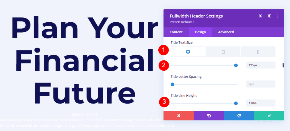
    Change the Font Size to 125px for desktops, 40px for tablets, and 24px for phones. Set the Line Height to 110%. This gives us an oversized title that looks great on any screen size.

    • Size: 125px desktop, 40px tablet, 24px phone
    • Line Height: 110%

    Hover Background Image Title Text

    Hover Background Image Body Text

    Next, scroll to Body Text. Change the Font to Roboto, set the Weight to medium, and change the Color to #0f1154.

    • Font: Roboto
    • Weight: Medium
    • Color: #0f1154

    Hover Background Image Body Text

    Change the Font Size to 18px for desktops and tablets, and 14px for phones. Set the Line Height to 180%. This gives the body text plenty of breathing room.

    • Size: 18px desktop and tablet, 14px phone
    • Line Height: 180%

    Hover Background Image Body Text

    Hover Background Image Subtitle Text

    Next, scroll to Subtitle Text. Change the Font to Montserrat. Set the Weight to bold, change the Style to TT, and change the Color to #1d4eff.

    • Font: Montserrat
    • Weight: Bold
    • Style: TT
    • Color: #1d4eff

    Hover Background Image Subtitle Text

    Change the Font Size to 16px for desktops, 14px for tablets, and 12px for phones. Change the Line Spacing to 0.3em and the Line Height to 1.6em. This sets the subtitle apart from both the title and content without taking up much room.

    • Size: 16px desktop, 14px tablet, 12px phone
    • Letter Spacing: 0.3em
    • Line Height: 1.6em

    Hover Background Image Subtitle Text

    Hover Background Image Button One

    Next, scroll down to Button One and enable Use Custom Styles for Button One. Change the Text Size to 18px. Change the Text Color to white and the Background Color to #1d4eff.

    • Use Custom Styles for Button One: Yes
    • Text Size: 18px
    • Text Color: #ffffff
    • Background Color: #1d4eff

    Hover Background Image Button One

    Next, change the Border Width and Radius to 0px. Choose Roboto for the Font and set the Weight to Medium.

    • Width: 0px
    • Radius: 0px
    • Font: Roboto
    • Weight: Medium

    Hover Background Image Button One

    Scroll down to Button One Padding. Add 14px for the Top and Bottom Padding, and 24px for the Right and Left Padding.

    • Padding: 14px Top and Bottom, 24px Left and Right

    Hover Background Image Button One

    Hover Background Image Button Two

    Next, scroll down to Button Two and enable Use Custom Styles for Button Two. Most of these settings are the same as Button One. Change the Text Size to 18px, the Text Color to white, and the Background Color to #00c9c9.

    • Use Custom Styles for Button Two: Yes
    • Text Size: 18px
    • Text Color: #ffffff
    • Background Color: #00c9c9

    Hover Background Image Button Two

    Next, change the Border Width and Radius to 0px. Choose Roboto for the Font and set the Weight to Medium.

    • Width: 0px
    • Radius: 0px
    • Font: Roboto
    • Weight: Medium

    Hover Background Image Button Two

    Scroll down to Button Two Padding. Add 14px for the Top and Bottom Padding, and 24px for the Right and Left Padding.

    • Padding: 14px Top and Bottom, 24px Left and Right

    Hover Background Image Button Two

    Hover Background Image Spacing

    Next, scroll down to Spacing and add 100px Padding to the Top and Bottom. This increases the size of the fullwidth header without using the Fullscreen option in the Layout settings. In my examples, the fullwidth header leaves a little bit of space at the bottom of the screen where the next section shows. Of course, you could use the full-screen setting in place of the padding if you wanted.

    • Padding: 100px Top and Bottom

    Hover Background Image Spacing

    Hover Background Image Box Shadow

    Lastly, scroll down to Box Shadow and choose the 6th Box Shadow option. This gives the header a more unique look. Close the Fullwidth Header Module and save your settings.

    • Box Shadow: 6th

    Hover Background Image Box Shadow

    Results

    Desktop Without Hover

    Desktop Without Hover

    Desktop With Hover

    Desktop With Hover

    Phone Without Hover

    Phone Without Hover

    Phone With Screen Tap

    Phone With Screen Tap

    Ending Thoughts

    That’s our look at how to reveal a hover background image in your Divi Fullwidth Header Module. The hover state for background images is a simple setting, but it can have a huge impact on the site’s design. It’s a great way to get attention. You can take the design even further if you wanted to add Gradient Stops, overlays, change images, and more. I recommend playing around with the Divi Fullwidth Header Module’s hover background settings to see what you can create.

    We want to hear from you. Do you use a hover background image in your Divi Fullwidth Header Module? Let us know about it in the comments.

    The post How to Reveal a Hover Background Image in Your Divi Fullwidth Header Module appeared first on Elegant Themes Blog.

  • Divi Product Highlight: Header Layout Pack

    The header is one of the first elements to load for any Divi website you create. This means the header often makes the first impression anyone sees for a website, making header design a crucial part of every website. Fortunately, you don’t have to create your header from scratch. There are lots of header layouts in the Divi Marketplace to give you a head start. Header Layout Pack is one example. This is a set of over 80 custom headers that work for just about any type of website. In this post, we’ll look at Header Layout Pack to help you decide if it’s the right product for your needs.

    Upload Header Layout Pack

    Header Layout Pack includes two zipped files. The first is a single file that contains all 81 layouts. These layouts are uploaded together. The second is a supplementary file and includes six files. These are the categories of the header layouts. This allows you to upload just the layouts in a particular category, such as WooCommerce. This is also helpful if you have a file-size upload limit and can’t upload all the files at the same time.

    The process to upload the layouts is the same for all the files:

    1. Go to Divi
    2. Select Divi Library
    3. Click Import & Export
    4. Select the Import tab
    5. Click Choose File and navigate to the unzipped JSON files on your computer
    6. Click Import Divi Builder Layouts

    Upload Header Layout Pack

    Once the import completes, you’ll have 81 new items in your Divi Library (if you chose the main JSON file). They’re labeled and named according to their categories, so they’re easy to identify. These layouts are standard Divi Library layouts, so they can be used with any Divi layout for a page, post, or any layout in the Divi Theme Builder, and stored in Divi Cloud for use on any Divi website. We recommend using them in the Divi Theme Builder and assigning them to global or individual categories.

    Upload Header Layout Pack

    Header Layout Pack Examples

    Let’s look at a few header layouts from each of the six categories. In my examples, I’ll load each layout into the Divi Theme Builder. New layouts are often added to the Header Layout Pack. I’m selecting them at random, but I’ll focus on a mix of older and newer layouts. When viewing them in the Your Saved Layouts tab, you can select the categories or view all the layouts.

    Header Layout Pack Examples

    For my screenshots, I’m using the home page from the free Home Remodeling Layout Pack that’s available within Divi. We’ll look at the wireframe, desktop, and phone versions of the headers.

    Advanced Headers

    Firstly, here’s a look at Advanced Headers, which contains 30 layouts.

    Advanced Header V1

    The first Advanced Header includes a Menu Module, Button Module, and two Text Modules. It also includes a Code Module with CSS.

    Advanced Headers

    The header includes styled dropdown submenus. A quote CTA button stretches on hover.

    Advanced Headers

    While the menus in the desktop version open on hover, the CSS creates a custom mobile menu toggle with buttons that include arrows showing if the menu can be opened or collapsed.

    Advanced Header v1 - Mobile View

    Advanced Header V20

    The Advanced Header version 20 includes four Image Modules, three Blurb Modules, a Menu Module, and a Code Module.

    Advanced Headers

    The Image Modules can be used for logos. All Blurb Modules are clickable buttons for contact information, services, and a CTA to get a quote.

    Advanced Headers

    Mobile menu toggles are added to the phone version with CSS.

    Advanced Header v20 - Mobile View

    Advanced Header V30

    Advanced Header V30 includes three Text Modules, and Menu Module, and a Code Module.

    Advanced Headers

    The Desktop version displays a red top menu bar with a short message and a phone number in large text. A logo and menu are placed under this and include a dropdown submenu styled to match the top menu bar.

    Advanced Headers

    While the desktop version includes red highlights, the Phone Version removes the red background of the submenus and includes the CSS toggles.

    Advanced Header v30 - Mobile

    Fullscreen Overlay Headers

    Secondly, we’ll see Header Layout Pack’s Fullscreen Overlay Headers, which includes 3 layouts.

    Fullscreen Overlay Header V2

    Fullscreen Overlay V2 comes with lots of elements including text, images, buttons, blurbs, code, social media, a menu, etc.

    Fullscreen Overlay Headers

    It includes a hamburger menu icon with a hover animation. The CTA button widens on hover.

    Fullscreen Overlay Header v2 - Desktop

    The menu opens full screen when clicked and includes clickable submenus.

    Fullscreen Overlay Header v2 - Desktop, Open

    Here’s the phone version, which follows the same design.

    Fullscreen Overlay Header v2 - Mobile

    Fullscreen Overlay Header V3

    Fullscreen Overlay Header V3 utilizes similar modules as the previous layout but creates a different design for the full-screen overlay.

    Fullscreen Overlay Headers

    The desktop header includes the CTA and hamburger icon with hover animation.

    Fullscreen Overlay Header v3

    Its menu covers half the screen while an image takes the other half of the screen.

    Fullscreen Overlay Header v3 - Open

    The phone version follows the same design for the menu, but doesn’t include the image.

    Fullscreen Overlay Header v3 - Mobile

    Header with Slide-ins

    Thirdly, we’ll look at Header Layout Pack’s Header with Slide-ins, which includes three layouts.

    Header with Slide-ins V2

    Version 2 creates the slide-in with a Blurb Module, several Text Modules, a Menu Module, a Button Module, and code.

    Header with Slide-ins

    The slide-in menu displays the submenus under a message. At the bottom of the menu, you can find a CTA and an image.

    Slide In v2

    The phone version removes the image while keeping the menu design.

    Slide In v2 - Mobile

    Header with Slide-ins V3

    Version 3 includes Blurb Modules to create the slide-ins.

    Header with Slide-ins

    The desktop slide-in includes hover animation and displays text and icons. Each of the elements is clickable.

    Slide In v3 - Desktop

    The clickable elements for the phone slide-in menu are much larger than the desktop version, making them easy to use on mobile.

    Header with Slide-ins

    Simple Headers

    Fourthly, Simple Headers includes 30 layouts.

    Simple Headers V15

    Simple Headers version 15 has two Rows and includes a Social Media Module and several Blurb Modules.

    Simple Headers

    The desktop version includes a top bar with contact information. A logo is centered, and the menu includes submenus.

    Simple Headers

    The phone version adds the toggle buttons for the submenus.

    Simple Menu 15 - Mobile

    Simple Headers V22

    This one includes two Rows to create the header.

    Simple Headers

    The top bar displays a CTA with a hover animation, the logo in the center, and a phone number. Its menu includes styled submenus.

    Simple Headers

    The phone version displays the submenus with toggles created in the Code Module.

    Simple Menu 22 - Mobile

    Square Logos Headers

    Fifthly, the Square Logos Headers includes five layouts. They’re ideal if you have a logo that’s taller than most logos.

    Square Logos Headers V3

    This one was built with a Specialty Section to include a multi-column layout. The square logo is created with an Image Module in its own column.

    Square Logos Headers

    The desktop version includes a top bar with a search box and contact information. All menus are styled to match the top bar’s background.

    Square Logos Headers

    The phone version includes the submenu toggles created with CSS.

    Square Logo Menu v3 - Mobile

    Square Logos Headers V4

    Version 4 includes three columns to create the logo, menu, and CTAs.

    Square Logos Headers

    The desktop version displays the logo and phone number in the two outer columns. A center column includes two Rows. The top Row shows contact information and a CTA, while the bottom Row displays the menu with a background styled to match the icons and the button of the top Row.

    Square Logos Headers

    The phone version includes a large logo area. The submenus include the toggles created with CSS.

    Square Logo Menu v4 - Mobile

    Woo Headers

    Lastly, we’ll look at Header Layout Pack, which includes 10 WooCommerce headers.

    Woo Headers V3

    Our first Woo Header includes two Rows. The top Row includes a Text Module, while the second Row displays a Menu Module and several Icon Modules.

    Woo Headers

    The Text Module for the top Row creates a sales banner. Graphics include Person, Heart, and Cart icons that can link to the person’s account login, their favorites list, and their shopping cart.

    Woo Headers

    The phone version moves the icons above the hamburger menu. Like the others we’ve seen, this submenu includes toggles created with CSS.

    Woo Header v3 - Mobile

    Woo Headers V7

    Woo header version 7 was built with three Rows that include Blurb Modules to create interesting WooCommerce links.

    Woo Headers

    The desktop version shows a message and the Woo links in the top bar. A middle bar displays a logo and a WooCommerce product search. The menu bar includes social media buttons.

    Woo Headers

    This is the phone version, which places the social media icons under the hamburger menu icon. Everything is spaced well on the phone screen, and it even includes the WooCommerce links and the product search box.

    Woo Header v7 - Mobile

    Woo Headers V10

    Woo Header version 10 also includes three Rows. It includes a product search and uses a Text Module to create a banner.

    Woo Headers

    The desktop version displays a green sales banner at the top. The icons, button, and highlights match the green bar. The middle bar includes the WooCommerce icons, while the menu and search at placed at the bottom.

    Woo Headers

    Here’s the phone version, which places the search box under the hamburger menu. This one also includes the submenu toggles created with CSS.

    Woo Headers v10 - Mobile

    Purchase the Header Layout Pack

    Header Layout Pack is available in the Divi Marketplace for $15. It includes lifetime updates, unlimited website usage, and a 30-day money-back guarantee.

    Purchase Header Layout Pack

    Ending Thoughts

    That’s our look at Header Layout Pack. There are a lot of layouts in this header pack. They look elegant, have lots of design options, and they’re easy to use. Since the layouts were created by the same person, they share a commonality that I find makes them easier to use. The methods are standardized, so if you know how to customize one of the layouts you can customize the rest. If you’re interested in an extensive set of headers, Header Layout Pack is work considering.

    We want to hear from you. Have you tried Header Layout Pack for your Divi website? Let us know about your experience in the comments.

    The post Divi Product Highlight: Header Layout Pack appeared first on Elegant Themes Blog.

  • Divi Plugin Highlight: Divi Accordions Plus

    Divi Accordions Plus is a third-party module for the Divi Builder that adds a new accordion builder. Use multiple Divi Accordions Plus Modules together on a single page and they work as a single accordion, so when one opens another one closes. Style the accordions together or individually, display icons and images, and lots more. In this post, we’ll look at Divi Accordions Plus, see what it can do, and see how easy it is to use to help you decide if it’s the right product for your needs. We’ll use the Poke Restaurant About Page Layout as a backdrop for this tutorial. So if you haven’t downloaded it already, you can grab it now with your Divi membership.

    Divi Accordions Plus Module

    Divi Accordions Plus adds a new module to the Divi Builder. Simply add the module anywhere you want within your Divi layouts.

    Adding Accordions Plus to layout

    Accordion Submodules

    The submodules create individual accordions. Add as many as you want by clicking Add New Item. You can also clone them, rearrange them, and delete them. They follow the settings in the main module, but they have specific content and design settings you’ll need to use.

    Add new item

    Content

    Add a title, subtitle (which you can disable if you want), and body content. These are the main elements of the accordions.

    Accordion content

    Item State

    Item State sets the open or closed state of the accordions when the page loads. It’s off by default, so the accordions are closed. I didn’t open the accordion in this example. It opened automatically when I enabled Item State.

    Accordion active state

    Divi Accordions Plus Accordion Submodules Design Settings

    The Design tab for the submodules controls the settings for that one accordion. You can customize them in the main module’s settings if you want them to look the same, but you’ll still need to use these settings to choose the images and icons. Let’s look at the settings that are unique to the submodule.

    Left Icon

    Left Icon controls the graphical element that appears on the left of the accordion. Enable or disable it, have it rotate on open, choose an icon or an image, and style it with the standard Divi tools. An image or icon such as a logo works great on the left. In this example, I selected an image and enabled Rotate Left Icon (Open Toggle), so the image rotated when I opened the accordion.

    Activating the left icon

    For this example, I’ve adjusted the background and icon color.

    Left icon styling

    Right Icon

    Right Icon controls the graphical element that appears on the right of the accordion. Enable or disable it, have it rotate on open, choose an icon or an image, and style it with the standard Divi tools. An icon that indicates the open or closed state of the accordion works great on the right.

    Adding the right icon

    In this example, I’ve selected a different icon, changed the icon color, the background color, and added a styled border.

    Right icon styling

    Divi Accordions Plus Content Settings

    The Content tab includes the basic Divi settings and a couple of settings that are specific to Divi Accordions Plus.

    Speed

    Speed controls how fast the toggles open and close. It’s set in milliseconds.

    Setting the accordion's toggle speed

    Mode

    Mode changes the way the accordions work.

    Accordion Mode

    Accordion Mode lets you choose between multiple active toggles and a single active toggle. Multiple Active Toggles leave all the toggles open until the user closes them. The example below shows Multiple Active Toggles.

    An example of multiple active toggles

    Single Active Toggles only allows for one open toggle at a time. It closes the open toggle when the user selects a new toggle. This example shows Single Active Toggles.

    Single active toggle mode, the standard mode of how accordions function

    Global Accordion Mode

    Global Accordion Mode is a new interesting feature. It allows for a single open toggle regardless of the number of Divi Accordion Plus Modules on the page. Enable Global Accordion Mode within every Divi Accordions Plus module on the page where you want to use the Global Accordion Mode. Any modules that do not have this mode enabled will not be affected by the mode. This is especially great for creating multi-column accordions in the same Row.

    In the example below, I’ve added another Divi Accordions Plus module and enabled Global Accordion Mode for both. When I open an accordion in one of the modules, the open accordion in the other module closes.

    Global toggle

    Divi Accordions Plus Design Settings

    The Design settings control the default styles for all the accordions. These settings are overwritten by the individual submodule settings.

    Header

    Header controls the background color, the open toggle background color, spacing, borders, and box shadow. In this example, I’ve changed the background colors for the open and closed toggle.

    Item header background colors

    Left Icon

    Left Icon controls the icon color, icon open toggle color, background color, open toggle background color, spacing, border, and box shadow for the entire accordion module. If you want to have uniformity in styling, it’s best to set up the colors of the icon here, and then individually select your icon for each toggle in the accordion. In this example, I’ve added and styled a border around the icons to make it more seamless with the background color.

    Styling the left icon

    Right Icon

    Right Icon controls the icon color, icon open toggle color, background color, open toggle background color, spacing, border, and box shadow. In the example, I’ve adjusted the open toggle colors, the border, and changed the icon color on open toggle.

    Styling the right icon

    Title

    Title controls the title background color, open toggle background color, spacing, border, and box shadow.

    Setting the title background color

    Body

    Body controls the item body, spacing, border, and box shadow. I’ve adjusted the border in this example.

    Accordion body styling

    Header Text

    Header Text controls the open toggle text and allows you to control the title and subtitle independently from the same menu. It includes all the standard text controls. I’ve adjusted the colors of the titles and subtitles, changed the title font size, and set it to bold in the example below.

    Header text styling

    Body Headings

    Body Headings includes all the standard text controls for the body headings that you’ve specified in the content area. In the example below, I’ve added both an H2 and H3 heading tag to the body content. I changed the font weights and color for both the headings within the body content.

    Body headings styling

    Body Text

    Body Text includes all the standard text controls for the body text in the content area. In this example, I’ve changed the font, made it italic, changed the color, and changed the font size.

    Body text styling

    Final Demo with Divi Poke Restaurant

    This is what the final accordion looks like within the About Us Page Layout for the Divi Poke Restaurant Layout Pack.

    Final result with header, footer and page layout

    Divi Accordions Plus Demos

    Divi Accordions Plus comes with seven demos to get you started.

    Demo 1

    The first demo includes a multi-column accordion with multi-colored icons. The accordions have a single border, and the content is bordered on all sides.

    Divi Accordions Plus Demos

    Demo 2

    Our second demo presents the accordion in a single column with blue highlights and box shadows. The icons have blue backgrounds.

    Divi Accordions Plus Demos

    Demo 3

    Our third demo uses a two-column layout and utilizes different colors for each of the accordions.

    Divi Accordions Plus Demos

    Demo 4

    The fourth demo uses a single-column accordion with warm colors and light borders.

    Divi Accordions Plus Demos

    Demo 5

    Demo five uses red titles and icons and includes tan backgrounds for the body and green backgrounds for the headers. The accordions are placed in two columns.

    Divi Accordions Plus Demos

    Demo 6

    The sixth demo uses light blue header backgrounds with a darker blue for the title text and icon background for the open accordion.

    Divi Accordions Plus Demos

    Demo 7

    Demo seven displays each of the accordion’s elements independently with box shadows for each element.

    Divi Accordions Plus Demos

    Purchase Divi Accordions Plus

    Divi Accordions Plus is available in the Divi Marketplace for $19. It includes unlimited usage, a 30-day money-back guarantee, and one year of support and updates.

    Ending Thoughts

    That’s our look at Divi Accordions Plus. This is a simple module, but it includes a lot of features for accordions. I especially like that it works with multiple modules on the same page. I found the settings intuitive and every setting I wanted to adjust was there. If you’re interested in a powerful accordion builder that’s easy to use, Divi Accordions Plus is worth a look.

    We want to hear from you. Have you tried Divi Accordions Plus? Let us know what you think about it in the comments.

    The post Divi Plugin Highlight: Divi Accordions Plus appeared first on Elegant Themes Blog.

  • How to Use Invisible Dividers to Create Space Between Divi Modules

    Divi’s Divider Module is unique among the modules available within the Divi Builder. It works to serve multiple purposes. Not only does it provide a styled line to add an interesting division between modules, but it’s also used to add whitespace. Many Divi layouts use invisible Divider Modules to create space within the layout. In this post, we’ll see how to use invisible Dividers to create space between Divi modules.

    Why Create Space with Invisible Dividers?

    Invisible dividers are a great way to add whitespace to your layouts. Without whitespace, a layout can become cluttered and visually unappealing. Elements can be easily ignored if they’re too close to other elements. They won’t stand apart, making CTAs go unnoticed.

    Whitespace can help focus attention on certain areas of the screen. When an element has lots of whitespace around it, it stands out. This is especially important for buttons, descriptions, blurbs, or anything you want your visitors to interact with. Whitespace even improves readability, so content is easier to consume.

    Divider Module Settings

    Divider Modules can create vertical and horizontal space in several ways. The amount of space the module takes can be adjusted with Sizing, Margin, and Padding. The result is essentially the same and each of the methods can be used in combination if you need to fine-tune the spacing.

    Divider Module Show Visibility

    The module can show or not show the divider. This allows us to use the module just of space if we want. The size of the space the module takes is different from the visible and invisible divider.

    To make the divider invisible, go to its Content tab. The first section is Visibility. This is enabled by default. Here’s the setting with Visibility enabled. I’ve given the Row a tan background to help visualize the Divider Module.

    Divider Module Show Visibility

    Simply disable it. The divider won’t show, and you can now use the module to add spacing within the Divi layout. All that shows now is the tan background for the Row.

    Divider Module Show Visibility

    Invisible Divider Combined with Sizing

    Like many Divi modules, the Divider Module includes several adjustments to control the size of the module. The first is the Sizing settings. When the Divi Module is set to not show the divider, the Sizing settings Only show:

    • Width
    • Max Width
    • Min Height
    • Height
    • Max Height

    The example below shows the invisible Divider Module. I’ve added a blue background to the module, so it stands out.

    Invisible Divider Combined with Sizing

    Adjusting Height is a great way to control the spacing for the invisible Divider Module. The example below shows a Divider Module with 220px of Height.

    Invisible Divider Combined with Sizing

    Invisible Divider Module Combined with Spacing

    Margin and Padding can also be used to add spacing for the invisible Divider Module. They work the same as with any Divi module.

    This example shows the invisible Divider module with no Height adjustment. I’ve added 50px Top and Bottom Margin. The module still shows the blue background as its normal size, but there’s more margin around the module, as you can tell by the tan background of the Row.

    Invisible Divider Module Combined with Spacing

    This example adds 50px Top and Bottom Padding. The Row is the same size, but the module now takes up more of the Row. The result is essentially the same, so you can try both and see which works best for each situation.

    Invisible Divider Module Combined with Spacing

    This example shows both with 50px Top and Bottom Margin and Padding. The module now takes more of the area. You can use one or the other, but this does help you fine-tune the spacing if there are any issues.

    Invisible Divider Module Combined with Spacing

    Invisble Dividers Examples

    We’ll create two examples from the same layout pack. our examples will add whitespace to give the content some focus or help with alignment. For the examples, I’ll use the landing page and the home page from the free Flower Farm Layout Pack that’s available within Divi. We’ll use a variety of adjustments to see how they work.

    Invisible Dividers Example One

    For our first example, we’ll add space between two Text Modules and a Button Module just so they take up more space in their area. We’ll use two invisible Divider Modules.

    This example uses the Landing Page from the Flower Farm Layout Pack. I’ll add whitespace to the CTA in the Service Section. For reference, here’s a look at this section before adding the invisible Divider Modules.

    Invisible Divider Example One

    First Divider

    Place a Divider Module under the first Text Module.

    Invisible Divider Example One

    Set the module’s Visibility to not show the divider.

    • Show Divider: No

    Invisible Divider Example One

    Select the Design Tab and change the Height to 120px for desktops. Set the Height for tablets and phones to Auto. Close the module’s settings.

    • Height: 120px (desktop), Auto (tablet and phone)

    Invisible Divider Example One

    Second Divider

    Next, place the second Divider Module above the Button Module.

    Invisible Divider Example One

    Set the module’s Visibility to not show the divider.

    • Show Divider: No

    Invisible Divider Example One

    Select the Design tab and scroll down to Spacing. Enter 10% for the Top and Bottom Margin for desktops. Set tablets and phones to Auto. Close the module and save your settings.

    • Margin: 10% Top and Bottom, Auto tablet and phone

    Invisible Divider Example One

    Invisible Dividers Example Two

    For our second example, we’ll use the Call-to-Action section from the layout. This section has a three-column row with a title and button on the left, an image in the middle, and a description on the right. The content for the left and right columns starts at the top of the Row. We’ll use three Divider Modules to add whitespace and center the content. The difference will be minor, but it will have a visual impact on the layout.

    This one uses the Home Page from the Flower Farm Layout Pack. For reference, here’s a look at this section before adding the invisible Divider Modules.

    Invisible Divider Example Two

    First Divider

    Place a Divider Module above the first Text Module in the left column. You might need to drag the Divider Module above the first Text Module after it’s added.

    Invisible Divider Example Two

    Set the module’s Visibility to not show the divider. Close the module’s settings.

    • Show Divider: No

    Invisible Divider Example Two

    Select the Design tab and change the Height to 102px for desktops. Set the Height for tablets and phones to auto. Close the module’s settings.

    • Height (desktop): 102px
    • Height (tablet, phone): Auto

    Invisible Divider Example Two

    Second Divider

    Place the second Divider Module under the Button Module in the left column. At first, it will seem that this one isn’t needed since won’t affect the desktop version, but it will have an impact on tablets and phones.

    Invisible Divider Example Two

    Set the module’s Visibility to not show the divider.

    • Show Divider: No

    Invisible Divider Example Two

    Select the Design Tab. Scroll down to Spacing and add 5px to the Top and Bottom Padding. Close the module’s settings.

    • Padding: 5px Top, 5px Bottom

    Invisible Divider Example Two

    Third Divider

    Finally, place the third Divider Module over the first Text Module in the right column. You might need to drag it into place.

    Invisible Divider Example Two

    Set the module’s Visibility to not show the divider.

    • Show Divider: No

    Invisible Divider Example Two

    Select the Design Tab and change the Height to 194px. Set the Height for tablets to 50px and phones to 40px. Close the module’s settings.

    • Height: 194px (desktop), 50px (tablet), 40px (phone)

    Invisible Divider Example Two

    Invisible Dividers Results

    Desktop Invisible Dividers Example One

    Desktop Invisible Divider Example One

    Phone Invisible Dividers Example One

    Phone Invisible Divider Example One

    Desktop Invisible Dividers Example Two

    Desktop Invisible Divider Example Two

    Phone Invisible Dividers Example Two

    Phone Invisible Divider Example Two

    Ending Thoughts

    That’s or look at how to use invisible dividers to create space between Divi modules. Whitespace is great for highlighting certain elements and improving the readability of a website. The Divider Module provides several options for adding space including Sizing and Spacing, and you can adjust Margin, Padding, or both. You can use any or all of the settings in any combination you want to get the results you need.

    We want to hear from you. Do you use invisible Divider Modules to add whitespace to your Divi layouts? Let us know about your experience in the comments.

    The post How to Use Invisible Dividers to Create Space Between Divi Modules appeared first on Elegant Themes Blog.

  • Divi Plugin Highlight: Divi Carousel Module

    Divi Carousel Module is a third-party module for Divi that creates interesting carousels. They’re great for images, products, testimonials, team members, and more. The module includes lots of design elements that make it stand out. Fortunately, it’s not difficult to use. In this post, we’ll look at Divi Carousel Module, see what it can do, and see how easy it is to use to help you decide if this is the right product for your needs. The Divi Architect Layout Pack will be the backdrop of our tutorial.

    New Divi Carousel Module

    Divi Carousel Module adds a new module to the Divi Builder. Add the module to any Divi layout the same way as any Divi Module.

    New Divi Carousel Module

    Divi Carousel Module Slides

    Each slide in the Divi Carousel Module displays slides as submodules that are added within the main module. The slides can be styled independently, or they can use the main module’s styling. To add a new slide, click Add New Item.

    Divi Carousel Module Slides

    Add as many as you want. You can set the number the carousel will display on the screen for each device type in the module’s settings, so the number you add won’t affect the design. The submodules include all the standard Divi settings and a few unique settings. Here’s a look at the unique settings for the submodule.

    Main Content

    When you add a slide, it opens to show the settings. The main content area includes the title, subtitle, and body content. Use any or all of this content you want. You can style these elements individually in the Design tab.

    Divi Carousel Module Slides

    Title & Image Link

    Add the URL and choose if it opens in a new window. This link applies to both the title and image, so it still works even if you only use one of the two elements.

    Divi Carousel Module Slides

    Button Settings

    This adds a button to the slide. Add the text, the URL, and choose how it opens. You can style the button in the Design tab.

    Divi Carousel Module Slides

    Image Settings

    Here, you can choose to use an image or an icon. An image is the default setting. It includes the image picker, alt text, and if it opens in a lightbox. The image is placed above the title by default, but you can easily change this if you want.

    Divi Carousel Module Slides

    Selecting Use Icon provides an icon selector. The icon replaces the image. It can also be styled in the Design settings.

    Divi Carousel Module Slides

    Meta

    This includes two options you can select between. You can only choose one of the two options. The first option is Use Social Media. Enabling this opens the fields to enter your URLs for four social media networks and your email address.

    Carousel Meta: Use Social Media Icons

    The second option is Use Rating. This opens a dropdown box where you can choose a rating from one to five. It displays the rating as stars.

    Carousel Meta: Use Ratings

    Submodule Design Settings

    The submodule’s Design settings include the image styles, image filter, and styles for the title, subtitle, content, button, social media, and rating. If you’ve selected an icon in place of the image, you’ll see icon settings to change its color, add a circle, change its size, and adjust its alignment. In the example below, I moved the image to the center of the slide by selecting Inside Content in the Image Position dropdown box.

    Images Styling with Image Position Settings

    Main Module Settings

    The main module settings include the slider details as well as the standard Divi settings. Let’s look closer at the slider’s settings.

    Main Module Settings

    Slider Settings

    The slider settings include width control, the number of slides to show on each of the device types, multislide, duration, loop, autoplay, arrow and dot navigation, spacing, lazy loading, hash navigation, and lots more. It’s interesting to see the number of items for different devices. One point about the number, you enter into these fields is they don’t have to be whole numbers. You can show a half slide if you want. Just enter the number as a decimal and experiment until the slides display the way you want.

    Slider Settings

    This example shows that I’ve added some arrow navigation. I also changed the way the individual carousel items appear on desktop, tablet, and mobile. In addition to the above, I’ve also added a loop feature to the module.

    An example of slider settings

    Advanced Slider Settings

    The advanced settings let you choose the slider effect. Choose between Default and Coverflow. The default setting displays the slides as normal with each card facing the user.

    Advanced Slider Settings Default

    Coverflow displays the cards tilted in 3D. Choosing Coverflow adds Rotate, which adjusts the amount each card is rotated in 3D, and Shadow, which adds to the 3D effect through shadowing. The cards show an animation as they scroll into place within the carousel.

    Advanced Slider Settings Coverflow Style

    Main Module Design Settings

    The main module’s Design settings include the image overlay, alignment, width, border, and box shadow. It also includes settings for the title text, subtitle text, body text, next and previous buttons, navigation color, z-index for the image, custom spacing for every element, and the standard Divi settings. I’ve adjusted many of the settings in the example below.

    Updated Carousel Design

    The Next and Previous arrows include several position options. You can adjust the color of the icons and backgrounds and choose custom icons for the previous and next links independently. You can also adjust the dot navigation’s colors.

    Styling for next, previous buttons and dot navigation

    The Divi Carousel Module has an impressive amount of custom spacing options. Add margin and padding to every element for both the container and the content independently. I’ve added padding to several of the elements in the example below.

    Deep spacing settings available

    Using Divi Carousel Module

    Divi Carousel Module is great for displaying lots of things including products, team members, custom blog posts and pages, services, images, testimonials, a portfolio, company logos, and lots more. The publisher’s website includes lots of downloadable templates to get you started. They’re available as JSON files. Upload them to your Divi Library and use them on any template, page, or post. Let’s look at a few of them. I’ll describe their main settings as we go.

    Divi Carousel Module Content Carousel 02_05

    Content Carousel 02_05 includes large images and styles the cards independently to create an alternating design with the image on the top or the bottom. It shows three slides at a time on desktops, 2 on tablets, and 1 on phones. It slides them automatically every second and loops.

    Using Divi Carousel Module

    Divi Carousel Module Testimonial Carousel 01_07

    Testimonial Carousel 01_07 displays two slides on desktops and one slide on tablets and phones. It includes centered arrows and dot navigation. The slides place the images to the left and include a gradient behind the text. The quote icons are images added to the background.

    Using Divi Carousel Module

    Divi Carousel Module Team Carousel 01_05

    Team Carousel 01_05 displays three slides on desktops, two on tablets, and one on phones. The slides have a unique design with social icons placed at the bottom. The backgrounds of the main content area alternate between black and white. The arrows and dots are green. Images use rounded corners and include a 4px border to make them circled.

    Using Divi Carousel Module

    Divi Carousel Module Image Carousel 01_02

    Image Carousel 01_02 displays 3.5 items on desktops and centers the slides to create the design that partially shows images on the sides of the screen. Tablets display 3 and phones display 1. It includes arrow navigation, and the slides are set to loop, so the user never has to change directions to see all the slides. The rounded corners give the images an elegant design.

    Using Divi Carousel Module

    Purchase Divi Carousel Module

    Divi Carousel Module is available in the Divi Marketplace for $29. It includes unlimited usage, a 30-day money-back guarantee, and one year of support and updates.

    Purchase Divi Carousel Module

    Ending Thoughts

    That’s our look at Divi Carousel Module. The module has a lot of features. Each element can be styled and adjusted independently, giving you lots of design possibilities. I found all the settings to be intuitive, so it felt at home in the Divi Builder. If you’re interested in a carousel module with lots of features, Divi Carousel Module is worth a look.

    We want to hear from you. Have you tried Divi Carousel Module? Let us know what you think about it in the comments.

    The post Divi Plugin Highlight: Divi Carousel Module appeared first on Elegant Themes Blog.

  • How to Add Google Maps to Your Divi Website

    Google Maps is a software service that allows users to present maps to their audience. It’s faster than embedded maps and, if you’ve integrated it with Divi, it’s easier to use. The Divi Builder includes two Map Modules that make presenting Google Maps a simple process. In this post, we’ll see how to add Google Maps to your website using the Google Maps API Key and the Divi Map Module.

    Let’s get started!

    Preview

    First, let’s look at what we’ll build in this post. I’ll add a Map Module to a current Divi layout and style it with elements from the layout.

    Google Maps Desktop

    Google Maps Desktop

    Google Maps Phone

    Google Maps Phone

    How Google Maps and APIs Work

    While it’s possible to simply embed a Google Map into a Divi page or template, the Google Maps API gives developers more control. Maps that use the Google Maps API load faster and you can apply custom colors, create custom markers, and more.

    To prevent unauthorized access, the Google Maps Platform utilizes API keys. Obtaining and using a Google Maps API is simple. To create a key, go to the Google Maps Platform Credentials page and select or create a project. This project will be used to contain your Google Maps API, so be sure to give it a name that’s easy to understand.

    How Google Maps and APIs Work

    Next, click Create Credentials at the top of the page and select API Key from the menu. The Credentials link won’t appear until you have a project selected.

    How Google Maps and APIs Work

    Next, you’ll see a modal with your API Key. You can copy your API Key and close the modal. You can also restrict the key. This keeps others from using it. I recommend restricting the API Key to prevent unauthorized use. Click Edit API Key.

    How Google Maps and APIs Work

    Under API Restrictions, click Restrict Key, choose which key to restrict, and save it. Copy the key in the upper right corner of the page. You can now paste the API key into Divi.

    How Google Maps and APIs Work

    How to Integrate Google Maps in Divi

    To integrate your Google Maps API Key into Divi, go to Divi > Theme Options in the WordPress dashboard. In the General tab, you’ll see a field labeled Google API Key. Paste the key into the field and save the settings.

    How to Integrate Google Maps in Divi

    Google Maps is now integrated into Divi, and you can add a Google Map to your Divi page or template. Your Map Modules automatically access the key, so you won’t need to add it again. You will be able to replace the key for each module if you want.

    How to Add a Google Map to Your Page or Template

    You can add the Google Map to your Divi pages and templates in several ways. The best option with the most features is to use the Map Modules. Divi has two Map Modules to choose from and the process of adding the map is the same. Both include map pins and styling features.

    Since we’ve added the API to Divi’s Theme Options, the Map Modules already contain your Google Maps API. All we need to do is add an address and the pins we want.

    How to Add a Google Map to Your Page or Template

    The process is simple. Enter the address you want to show in the center of the map and select Find. The map will fill in.

    How to Add a Google Map to Your Page or Template

    Let’s add a map to a page to see how it works.

    Regular Map Module vs the Fullwidth Map Module

    We can use the regular Map Module or the Fullwidth Map Module. The work is the same. Both look amazing and the one you choose just depends on the design you want. The regular Map Module lets you style the background and easily add other modules to the Row.

    The Fullwidth Map Module uses the entire width. It’s shown here with regular sections above and below it.

    How to Add Google Maps to Your Divi Page

    Now, let’s see how to add a Google Map to a page or template. The work is the same for both pages and templates. I’ll create a page using the Contact page from the free Photography Studio Layout Pack that’s available within Divi.

    For reference, here’s the original page. I’ll add a new section for the map between the two sections using design cues from the layout pack.

    How to Add Google Maps to Your Divi Page

    Add a Regular Section and Row

    First, add a Regular Section between the two sections. This is where we’ll add the map.

    Add a Regular Section and Row

    Open the Section’s settings, go to Background, and change the Background Color to #f6f5ee. Close the settings.

    • Background Color: #f6f5ee

    Add a Regular Section and Row

    Next, add a single-column Row to the Section.

    Add a Regular Section and Row

    Add a Text Module

    Next, we’ll add a Text Module to create a title for the map.

    Add a Text Module

    Content

    Change the Content-type to Heading 4 and add the title to the body content area.

    • Content-Type: Heading 4
    • Body: Location

    Add a Text Module

    Heading Text

    Next, click on the Design tab and scroll down to Heading Text. Choose Heading Level 4 and select Inter for the Font. Set the Weight to Bold and the Style to TT.

    • Heading Level: H4
    • Font: Inter
    • Weight: Bold
    • Style: TT

    Add a Text Module

    Change the Font Color to #ff5a17, the Size to 14px, the Letter Spacing to 1px, and the Line Height to 1.4em. This is it for the title. We can now close this module.

    • Color: #ff5a17
    • Size: 14px
    • Letter Spacing: 1px
    • Line Height: 1.4em

    Add a Text Module

    Add a Map Module

    Now it’s time to add a Map Module to our layout. Add the module in the Row under the Text Module. In my case, the icon to add a module appears under the Row icon. There’s an easy way around this. Simply right-click (for Windows users, control-click for Mac) and select Go To Layer. This opens a Layers View that’s easy to navigate and use.

    Add a Map Module

    Open the Section, Row, and Column to see the Text Module. Click the plus icon next to the Text Module to add a new module.

    Add a Map Module

    This opens the standard module modal where you can select your modules. Add the Map Module as normal and close the Layers view. The Map Module appears under the Text Module just as we wanted.

    Add a Map Module

    You’ll see the Google Maps API Key already entered and ready to use. Next, enter the address you want to show in the Map Center Address field. Click the Find button to tell the module to search the map for this address. If you do need to use a different API Key than what you’ve entered as the default key in the Divi Theme Options, select Change API Key.

    • Map Center Address: the address of the location you want to display

    Add a Map Module

    The module will search for the location and display it on the map. If there’s an error, return to the Google Maps Platform to see any issues with your API Key.

    Add a Map Module

    Border

    Next, go to the Design tab and scroll down to Border. Change the Width to 2px and set the Color to black. Close the module and save your settings.

    • Width: 2px
    • Color: #000000

    Add a Map Module

    Results

    This was a simple design, but it works well with the layout.

    Google Maps Desktop

    Google Maps Desktop

    Google Maps Phone

    Google Maps Phone

    Ending Thoughts

    That’s our look at how to add Google Maps to your Divi website. The Google Maps API Key is easy to add to Divi. Once the API Key is added to Divi, every Map Module automatically accesses the key. You can even change the API Key on a per-module basis if you want. All you’ll ever need to do is add the address you want your Map Module to display. It loads faster than embedding, provides lots of styling options, and you can show any number of maps in your Divi pages and templates.

    We want to hear from you. Have you added the Google Maps API to your Divi website? Let us know about your experience in the comments.

    The post How to Add Google Maps to Your Divi Website appeared first on Elegant Themes Blog.

  • Divi Plugin Highlight: Divi Ajax Filter

    Divi Ajax Filter is a third-party plugin that adds several new modules to the Divi Builder. These modules work together to create simple or complex filters. Divi Ajax Filter works with pages, posts, projects, and custom post types such as WooCommerce products and Advanced Custom Fields. In this post, we’ll look at Divi Ajax Filter and see how it works to help you decide if this is the right product for your needs. We’ll be using the Divi Whiskey Layout Pack to showcase how you can use this plugin in the wild.

    Divi Ajax Filter Modules

    Divi Ajax Filter adds a block to the Divi Builder. Clicking this opens a submenu with the Ajax Filter Modules. The modules work together to a list of posts with a filter. You can use them to create layouts or display layouts you’ve created.

    The Divi Ajax Filter Modules

    Archive Loop – Divi Ajax Filter

    The Archive Loop Module displays any loop layout that you choose to display products or posts. In other words, it displays a list of the custom post type you choose. If you choose the product post type, it will display a list of your products. It can’t be used in the Custom Loop Layout. It’s designed to be used with archives, category pages, and general pages.

    Until you create and specify a loop layout, you’ll see a message to create one. The loop layout should be created with the Divi Ajax Modules such as the Post Title and Thumbnail. You can also choose the default WooCommerce loop.

    Module Options

    Archive Loop – Divi Ajax Filter

    You can also choose the post type such as posts, pages, media, projects, and products. Have it auto-detect your post type or set variable products as single products.

    Archive Loop – Divi Ajax Filter Post Type

    For the loop style, choose between a WooCommerce layout or a custom layout. If you choose Custom Layout, you’ll see another dropdown box where you can choose a layout from your Divi Library.

    Archive Loop – Divi Ajax Filter Loop Style

    Choose the number of posts to display. This gives you control over the number that’s displayed within the module’s area, but you can show more posts with pagination a Load More button. Setting it as the main loop makes it the list of posts the filter controls. You can also add an order by sorting option and show the number of results.

    Archive Loop – Divi Ajax Filter Show Results and Order by Menu

    The number of results still shows 1-9 results in the Divi Builder, but it will show the correct number of results on the front end as shown in the example below.

    Archive Loop – Divi Ajax Filter

    There are several options for how pagination is displayed. Choose from Load More, standard pagination, an infinite scroll, or none.

    Archive Loop – Divi Ajax Filter - Pagiation

    Have it scroll to the top after the ajax update or disable the feature. You can also fine-tune the pagination’s position.

    Archive Loop – Divi Ajax Filter - Pagination

    Disable, exclude, or include lots of elements such as products when the category has child categories, specific categories, and products. You can also set certain items to be included on load only. Enter them into the fields with commas.

    Archive Loop – Divi Ajax Filter - Pagination

    Choose the animation for the filter and the infinite scroll option. It has six animations to choose from including three lines vertical, three lines horizontal, three dots bouncing, donut, donut multiple, and ripple. The animations are smooth and give it an extra sparkle.

    Archive Loop – Divi Ajax Filter - Pagination, Scrolling

    Custom Layout Options

    The Custom Layout Options let you choose a layout that you’ve created to use as your custom taxonomy. You can also specify the custom taxonomies to include.

    Archive Loop – Divi Ajax Filter - Custom Layout Options

    Default Layout Options

    The default layout options let you choose between a grid or a classic blog layout. For the grid, choose the number of columns to display. You can also show the rating, excerpt, price, and the add to cart button.

    Archive Loop – Divi Ajax Filter - Default Layout Options

    Here’s how it looks on the front end. I’ve set it to display a grid with 4 columns. I’ve also disabled the excerpt option.

    Archive Loop – Divi Ajax Filter - Default Layout Options

    This one also includes color and padding options. Change the color of the sale badge, star ratings, and the product’s background. Use the slider to add padding to all four sides of the product. I’ve added some padding, colored the stars, and changed the color of the Sale Badge color.

    Color and Padding Options

    Here’s how it looks on the front end.

    Color and Padding Options

    Design Settings

    Design settings include detailed options for every element including fonts, colors, spacing, and the rest of the standard Divi settings.

    Pagination Color and Styling

    Filter Posts – Divi Ajax Filter

    The Filter Posts Module works with the Archive Loop Module to filter the posts it displays. It shouldn’t be used in the custom loop layout. The filter items are submodules. You can add as many as you want to create the filter.

    Filter Posts – Divi Ajax Filter

    New Filter Item

    Adding a new filter item opens its submodule. This includes lots of settings. The Main Settings let you choose what to filter between categories, tags, prices, ratings, attributes, and custom taxonomies. You can also create a search box. Choose the post types, values, exclude options, etc.

    Filter Posts – Divi Ajax Filter

    Layout lets you choose to show the filter parameters, show the label, and select the filter width.

    Filter Posts – Divi Ajax Filter

    The Select options let you enable Select2 and change the option text.

    Select Options

    Category, Tags, and Taxonomy lets you choose how the terms are ordered in the list, the display mode, the prefix, and the collapse options.

    Filter Posts – Divi Ajax Filter

    Range gives you full control over the filter’s range settings. Hide the labels, choose the value type, set the range, choose the step levels, adjust the appearance, choose before and after text, and more.

    Filter Posts – Divi Ajax Filter

    Conditional Logic lets you create logic rules for the filter. This means you can fine-tune the filter to control the filter and make it as smart as possible.

    Filter Posts – Divi Ajax Filter

    Add multiple filter items to create the exact filter you want. I’ve created a filter with a search option, categories, tags, and prices. Users can select one of the filter tools or use them together.

    Filter Posts – Divi Ajax Filter

    Main Filter Post Settings

    The Main Options include the filter update type (choose from a button click or a field change), choosing where it scrolls, adding text for the search and reset buttons, and enabling Select2.

    Filter Posts – Divi Ajax Filter

    The Layout Options determine the layout of the filter elements. Choose a side Colome or full-width column, set the sizes, the filter style between toggle and slide, and hide or show the buttons.

    Filter Posts – Divi Ajax Filter

    Mobile Options add toggles, let you choose the toggle style, change the button text, and toggle the filters individually.

    Filter Posts – Divi Ajax Filter

    Post Title – Archive Pages

    The Post Title Module displays the title and lets you choose the heading level, link to a single page, open a new tab, and enter the URL.

    Filter Posts – Divi Ajax Filter

    The Design tab includes separate settings for post titles and product titles. All the standard settings are included.

    Filter Posts – Divi Ajax Filter

    Thumbnail – Divi Ajax Filter

    The Thumbnail Module lets you choose the image size, link the image to a single page, use placeholder images with Advanced Custom Fields, open in a new tab, enable a title tag, and choose the image style.

    Filter Posts – Divi Ajax Filter

    The Thumbnail Image Sizes include lots of options.

    Filter Posts – Divi Ajax Filter

    Building a Product Filter

    Firstly, I’ll build a product filter using the Archive Loop Module and the Filter Posts Module.

    Building a Product Filter

    Next, for the Archive Loop Module, I’ve set it to Products and selected the default WooCommerce layout. This gives us the image, title, and price by default. I’ve set it as the main loop and enabled the Order By Menu and the Results Count. I selected Load More for the loading option. The Layout is set to a grid with 3 columns. I’ve also selected to show the rating, price, excerpt, and Add to Cart Button. The Sale Badge and Star Ratings have custom colors, and I’ve added some padding to the product.

    Filter Posts – Divi Ajax Filter

    Next are the design settings. I’ve adjusted the colors and styles of the individual text elements as well as the Add to Cart button.

    Filter Posts – Divi Ajax Filter

    Lastly, for the filter, I’ve added search, categories, price, and rating.  For the category filter, I selected Radio Buttons. The Price is set between $5 and $100.

    Filter Posts – Divi Ajax Filter

    For the Filter’s design settings, I’ve adjusted the font colors, button colors, etc.

    Filter Posts – Divi Ajax Filter

    Product Filter Results

    Here’s how it looks on the front end with the stylings of the Divi Whiskey Layout Pack.

    Filter Posts – Divi Ajax Filter

    Here’s the sorting feature. User’s can select the default sorting, sort by popularity, average rating, latest, price low to high, or price high to low.

    Filter Posts – Divi Ajax Filter

    Here are the results for the search option. I’m using the WooCommerce demo products. I searched for “pink” and found two results.

    Filter Posts – Divi Ajax Filter

    For the categories, I selected the “Kitchen” category radio button and found the four results.

    Filter Posts – Divi Ajax Filter

    In this example, I’ve filtered the products by price range. I’ve selected 5-30 and sorted by price from low to high.

    Filter Posts – Divi Ajax Filter

    You can also use the filters together. For this example, I’ve selected the “Kitchen” category and set the price range from $30 to $50. It shows the products in my inventory in that category and price range.

    Filter Posts – Divi Ajax Filter

    Where to Purchase Divi Ajax Filter

    Divi Ajax Filter is available in the Divi Marketplace for $97. It includes one year of support and updates and a 30-day money-back guarantee.

    Where to Purchase Divi Ajax Filter

    Ending Thoughts

    That’s our look at Divi Ajax Filter. This is a powerful set of modules for the Divi Builder that creates amazing filters for lots of WordPress post types. Divi Ajax Filter is complex. It does take some time to learn, but it’s not too difficult to understand and use once you get started. Following the demos will save you some time and reduce the learning curve considerably. If you’re interested in an advanced filter for your post types, Divi Ajax Filter is a great choice.

    We want to hear from you. Have you tried Divi Ajax Filter? Let us know what you think about it in the comments.

    The post Divi Plugin Highlight: Divi Ajax Filter appeared first on Elegant Themes Blog.

  • How to Set up WordPress Projects for Divi’s Filterable Portfolio Module

    The Filterable Portfolio Module for Divi is a great module to display your WordPress projects. Projects are easy to create and manage within WordPress. Once you’ve created them, Divi’s Filterable Portfolio Module displays any number of projects based on your selections. Your website’s visitors can easily sort them by category to see the work that interests them.

    In this post, we’ll see how to set up WordPress projects for Divi’s Filterable Portfolio module.

    Let’s get started!

    Filterable Portfoliio Module Preview

    First, let’s see what we’ll build in this tutorial.

    Desktop

    Portfoliio Preview

    Phone

    Portfoliio Preview

    Setting Up WordPress Projects

    Projects is a custom post type that’s built into WordPress. It works like any post type, but it has its own editor, list, categories, tags, etc. The Projects post type is great for creating portfolios to showcase your work. To use them properly, it’s important to know how to set them up with proper categories and tags.

    To view or create projects, go to Projects in the WordPress dashboard. You’ll see a menu with All Project, Add New, Categories, and Tags. Let’s look at each one.

    All Projects

    The Projects menu includes several options. All Projects opens when you select the Projects link. This screen lists all your projects with the title, author, categories, tags, comments, and date. You can perform edits on each project individually, do bulk edits, and create a new project.

    Setting Up WordPress Projects

    Add New

    To create a new project, select Add New in either the All Projects screen or the Projects dashboard menu. This opens the project editor. It works the same as a regular post type and includes the title, body content, categories, tags, featured image, excerpt, and the discussion options.

    Setting Up WordPress Projects

    Categories

    Categories work the same as regular post categories, except they are specific to projects. The Projects post type is the only post type that will use these categories. Existing categories for other post types are not available to the project post type. You’ll need to create them specifically for the Projects post type.

    When creating categories, be sure to use categories that are relevant to the project and provide a good overall description. Think of them as the broad topic the project would fall under. Don’t go too broad, though.

    For example, if you were creating categories for home repair, you might have separate categories for electrical, plumbing, construction, etc. Home Repair wouldn’t be the category in this case, since it’s the topic of the website. Home Repair might be a topic for a larger company that did new construction, repaired old construction, worked with both industrial and residential construction, etc. So, the categories need to fit the website.

    For my examples, I’ve created the categories to describe the types of photography this website would offer. They answer the question “what type of photography?”

    For my examples, I’ve created the categories:

    • Weddings
    • Proposals
    • Anniversary
    • Proms
    • Graduation

    Each of these categories describes the specific type of photography the client might look for. Ideally, each project would fit into one category.

    To create a category, simply fill in the fields and click Add New Category. Category fields include the name, slug, parent category, and description. You can also view and edit categories from the list.

    Setting Up WordPress Projects

    Tags

    Like categories, tags work the same way as regular post categories, but they’re created specifically for the Projects post type. Create tags that help describe the item within the category. They can help narrow down the topic.

    For our Home Repair example, you might use Appliances as a category and Gas and Electric as the tags. Use as many tags as you need.

    For my examples, I created six tags:

    • Inside
    • Outside
    • High School
    • Company
    • Church
    • Family

    These tell the client a little more about each photo shoot. We could go even further if we wanted to describe the type of crowd as large or small, the type of photos as color or black and white, and lots more.

    The tag editor includes the name, slug, and description. You can edit them from the list.

    Setting Up WordPress Projects

    Projects Example

    In this example, I’ve added a title, some body content including a description and photos, a category, a tag, and a featured image. I’ve selected Weddings as the category and Outside as the tag. I’m using the tag as a description of the wedding. I could add more tags if needed.

    Setting Up WordPress Projects

    Divi’s Filterable Portfolio Module

    Once you’ve created your projects, Divi’s Filterable Portfolio Module can display them. Users can filter the projects by categories to see the specific projects they’re interested in. You can select the categories, the number to display, and lots more. The module displays projects in fullwidth and grid layouts, so there are several designs to choose from.

    For this example, I’ve selected the grid layout, so all the projects are visible at once. It displays the filter with categories. Each project shows the featured image, title, and category.

    Divi’s Filterable Portfolio Module

    The Filterable Portfolio Module displays the filter at the top. The filter displays the categories and they’re clickable. Your visitors can view all categories or select a specific category. This example shows the Wedding category.

    Divi’s Filterable Portfolio Module

    Styling Divi’s Filterable Portfolio Module

    Next, let’s see how to style the Filterable Portfolio Module. For my examples, I’m adding a projects section to the landing page in the free Photography Studio Layout Pack that’s available within Divi.

    Alternatively, you could style your project pages as a Divi Theme Builder template that you could assign to any project you wanted. For more information, see the post How to Create a Dynamic Portfolio Project Template with Divi & ACF.

    Here are the first few sections of the layout. I’ll add the portfolio after the hero section. I’ll use design cues from the layout itself.

    Divi’s Filterable Portfolio Module

    Add a Section

    First, add a new Section under the hero section.

    Divi’s Filterable Portfolio Module

    Open the Section’s settings, scroll down to Background, and change the Background Color to black. Close the Section’s settings.

    • Background Color: #000000

    Divi’s Filterable Portfolio Module

    Add a Row

    Next, add a single-column Row.

    Divi’s Filterable Portfolio Module

    Add a Filterable Portfolio Module

    Finally, add the Filterable Portfolio Module from the list of modules.

    Divi’s Filterable Portfolio Module

    Filterable Portfolio Module Content

    For the Post Count, enter 4 into the field. Next, select the Categories you want to display in the Filterable Portfolio Module. By default, the module shows the Title, Categories, and Pagination. I’m leaving these at their default settings.

    • Post Count: 4
    • Categories: desired categories

    Divi’s Filterable Portfolio Module

    Filterable Portfolio Module Layout

    Next, go to the Design tab. The first section is Layout. The module displays in fullwidth by default, but I want to show the projects in a grid. Change the Layout to Grid. We’ll leave the image and overlay at their defaults.

    • Layout: Grid

    Divi’s Filterable Portfolio Module

    Filterable Portfolio Module Title Text

    Scroll down to Title Text. Use H2 for the Heading Level and change the Font to Inter, the Style to Bold, and the Color to #ff5a17.

    • Heading Level: H2
    • Font: Inter
    • Style: Bold
    • Color: #ff5a17

    Divi’s Filterable Portfolio Module

    Change the Size to 14px, the Letter Spacing to 1px, and the Line Height to 1.4em.

    • Size: 14px
    • Letter Spacing 1px
    • Line Height: 1.4em

    Divi’s Filterable Portfolio Module

    Filterable Portfolio Module Filter Criteria Text

    Next, scroll down to Filter Criteria Text. Change the Font to Inter, the Style to bold, and change the Color to black. This gives the filter a style that matches the layout and stands out from the portfolio.

    • Font: Inter
    • Style: Bold
    • Color: #000000

    Divi’s Filterable Portfolio Module

    Leave the Font Size at 14, which is the default setting. Change the Line Height to 1.4em.

    • Size: 14px
    • Line Height: 1.4em

    Divi’s Filterable Portfolio Module

    Filterable Portfolio Module Meta Text

    Next, scroll down to Meta Text. Change the Font to Inter and change the Color to white.

    • Font: Inter
    • Color: #ffffff

    Divi’s Filterable Portfolio Module

    Change the Line Height to 1.4em.

    • Line Height: 1.4em

    Divi’s Filterable Portfolio Module

    Filterable Portfolio Module Pagination

    Finally, scroll down to Pagination. Change the Font to Inter and the Color to white. Close the module and save your settings.

    • Font: Inter
    • Color: #ffffff

    Divi’s Filterable Portfolio Module

    Filterable Portfolio Module Results

    We now have a filterable portfolio that looks great within the layout. Here’s a look at how it looks filtered to show one category. Following this, we’ll see how it looks within the larger image of the layout.
    Divi’s Filterable Portfolio Module

    Desktop

    Portfoliio Preview

    Phone

    Portfoliio Preview

    Ending Thoughts on Setting up Divi’s Filterable Portfolio Module

    That’s our look at how to set up WordPress projects for Divi’s Filterable Portfolio Module. Creating projects is as simple as creating any content in WordPress. Once you’ve created your projects, add Divi’s Filterable Portfolio Module to any page or template to showcase your work anywhere on your website. The filter provides an extra layer of usability for your visitors as they can quickly see the types of work they’re looking for.

    We want to hear from you. Have you set up WordPress projects for your Divi Filterable Portfolio? Let us know about it in the comments.

    The post How to Set up WordPress Projects for Divi’s Filterable Portfolio Module appeared first on Elegant Themes Blog.