EDITS.WS

Author: Randy A. Brown

  • Divi Plugin Highlight: Divi Mega Pro

    Divi Mega Pro is a third-party plugin for Divi that adds the ability to create mega menus and tooltips with the Divi Builder. Since the mega menus and tooltips are created with the Divi Builder, you can use any modules you want, including third-party modules, shortcodes, and code, and style them with Divi’s tools. In this post, we’ll take a look at Divi Mega Pro to help you decide if Divi Mega Pro is the right product for your needs.

    Divi Mega Pro Builder

    Rather than adding modules to the Divi Builder, Divi Mega Pro adds a new post type created with Divi layouts that WordPress menus and Divi Modules can display. Create and add as many as you want to any page and menu. A new menu item is added to the WordPress dashboard called Divi Mega Pro. This includes the Divi Mega Pro list, editor, and settings. Here, you can create and manage your mega menus and tooltips. We’ll look at each menu item in reverse order.

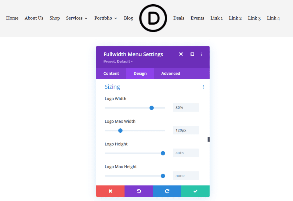
    Divi Mega Pro Settings

    The settings allow you to add a slide transition to the header, content, and footer. You can enable them independently. They’re disabled by default. The transition will change the content within the menu or tooltip while keeping its container visible. This forces the mega menu and tooltips into hover mode. I recommend enabling them unless you need to use the click mode.

    Divi Mega Pro Builder

    Add New

    To create a mega menu item or a tooltip, click Add New. This opens an editor where you can create the menu or tooltip. It includes the TinyMCE editor, and you can enable the Divi Builder to create it with Divi Modules. You’ll need to create a new item for every mega menu element you want to display. For example, if you want four different links in your header to show a different mega menu layout, you’ll need to create four different items.

    The editor includes lots of tools in the right sidebar and at the bottom including the standard publishing tools and custom fields options. Let’s take a close look at each of the custom tools.

    Divi Mega Pro Builder

    Display Locations

    Choose where the mega menu can display. Select between all posts and pages, all posts, all pages, or specific pages. You can add exceptions for all posts or pages to the field. If you choose specific locations, then you can enter them into the field. You can also select to show the menu on author pages and archive pages, and force render.

    Divi Mega Pro Builder

    Mega Pro Animation

    Choose the animation the menu or tooltip will use when it’s opened. Choose Shift Away, Shift Toward, Perspective, Fade, or Scale. These give the mega menus an elegant look and feel when they’re opening and closing.

    Divi Mega Pro Builder

    Mega Pro Triggers

    Enter the CSS selector trigger into the field. It also shows the Mega Pro Unique Class that you’d enter into the CSS Class fields to display the layouts.

    Divi Mega Pro Builder

    Mega Pro Display Settings

    The settings include a lot of options. Choose the display direction, add top and bottom margin, choose the width, enter the maximum height, choose the CSS position from absolute or fixed, and enable an arrow.

    Divi Mega Pro Builder

    If you enable the arrow, you’ll see some styling tools to choose the type, color, width, and height. It shows a preview, so you’ll know how it looks on the front end.

    Divi Mega Pro Builder

    Custom Close Button Customizations

    The close button customizations allow you to enable the close button on desktops and phones independently.

    Divi Mega Pro Builder

    If you choose to customize the close button, you’ll see another set of options to adjust the colors, font size, border radius, and padding. It also includes a preview so you can see how it will look on the front end.

    Divi Mega Pro Builder

    Mega Pro Additional Settings

    The additional settings allow you to disable the menu on phones, tablets, and desktops individually. Chose the trigger type between hover and click, the exit type between hover and click, and enter the exit delay in the field.

    Divi Mega Pro Builder

    Mega Pro Background

    This one is placed under the editor. It has a color picker where you can specify the background color of the menu.

    Divi Mega Pro Builder

    Divi Mega Pro List

    This shows the list of Divi Mega Pro items that you’ve created. Each one includes the Unique Mega Pro Class. This is what you’ll copy to paste where you want the mega menu or tooltip to display. You’ll need to create and copy each menu item individually to build your mega menu.

    Divi Mega Pro Builder

    Adding the Mega Menu

    To add the mega menu to your WordPress header and footer menus, you’ll need to have CSS Classes enabled. First, go to Appearance > Menus in the WordPress dashboard. Select Screen Options in the upper right corner of the screen and make sure CSS Classes is checked.

    Adding the Mega Menu

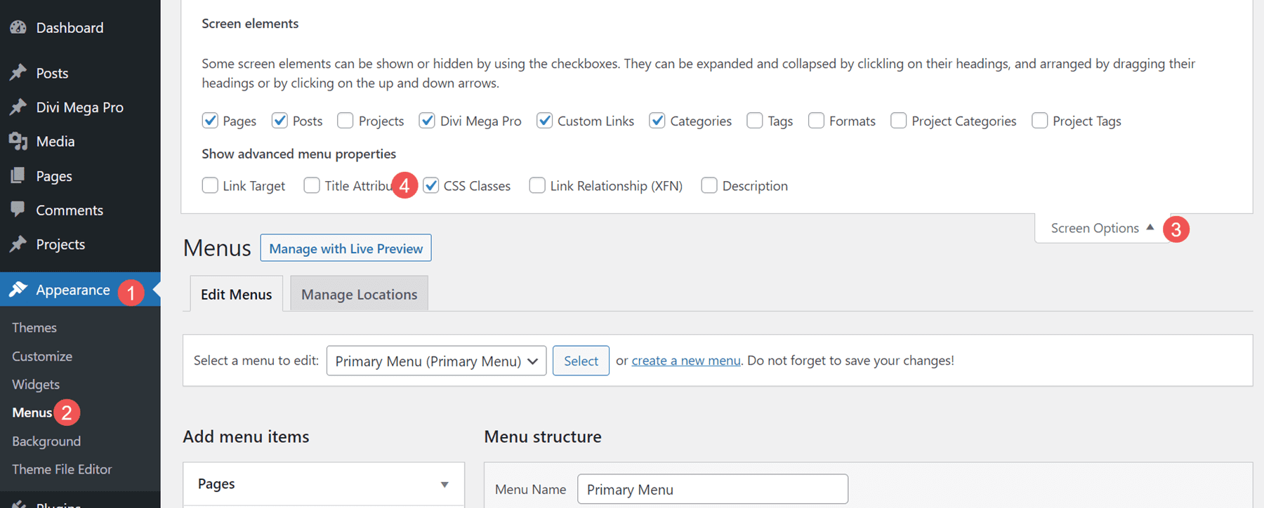
    Next, open the menu item that you want to display the mega menu item. Paste the Unique Mega Pro Class for the mega menu into the CSS Classes field.

    Adding the Mega Menu

    Repeat this process for every mega menu item you want to display.

    Adding the Mega Menu

    Here’s a look at this mega menu on the front end. I’ve used one of the demos that’s included, as we’ll see later.

    Adding the Mega Menu

    Adding Tooltips

    You can also use Divi Mega Pro to create mega tooltips. Simply add the CSS class to the element you want to show the tooltip. You can set the tooltip to open on hover or click. Any Divi Module can show a tooltip. Style the module as normal with the Divi tools.

    To add the tooltip, open the Divi Module you want to show the tooltip. Go to the Advanced tab and paste the Unique Mega Pro Class into the CSS Class field. Save your settings and you’re ready to display tooltips.

    Adding Tooltips

    Now when someone hovers over the element you’ve added the class to, the tooltip appears.

    Adding Tooltips

    The tooltips also work to create mega menus for headers in the Divi Theme Builder. Create the menu items with Divi Modules such as Text Modules, Button Modules, Image Modules, etc. I only recommend using Menu Modules to display standard menus as each link will either open a submenu or the page the menu points to.

    Add the Unique Mega Pro Class to the CSS Class field in each element you want to have a mega menu item. You can use this method to create custom headers and footers. In the example below, I’ve created a menu using standard Text Modules as the menu links. I’ll add a mega menu layout to each one.

    Adding Tooltips

    The menu items will work as a normal menu and display the mega menu items on hover or click, depending on your settings. In the example below, I’ve hovered over the first menu link and the mega menu for that Text Module has opened.

    Adding Tooltips

    Divi Mega Pro Templates

    Divi Mega Pro includes 15 templates to get you started. They’re provided as JSON files. Upload them to your Divi Mega Pro editor and use them to create your Divi Mega Pro layouts. They include eCommerce banners, tabs, CTA’s, contact information, a login form, blog posts, and lots more. The layouts are well-designed and work great with any style of the website.

    Divi Mega Pro Templates

    The templates are fully customizable, so you can adjust them to include your branded fonts and colors. This is template number 9, which creates eCommerce menus for featured brands. This shows the wireframe view within the back-end editor. You can also view the layouts on the front end. Mine displayed the layout with the sidebar by default, although I’m sure that can easily be disabled to show the layout in full width.

    Divi Mega Pro Templates

    Here’s how it would look on the front end. This is the back-end editor showing the desktop view.

    Divi Mega Pro Templates

    Where to Purchase Divi Mega Pro

    Divi Mega Pro is available in the Divi Marketplace for $79. It includes unlimited website usage, one year of support and updates, and a 30-day money-back guarantee.

    Where to Purchase Divi Mega Pro

    Ending Thoughts

    That’s our look at Divi Mega Pro. I found creating and using the mega menus to be intuitive. Since it uses any Divi Builder module, creating the menus and tooltips works the same as building any Divi layout. The extra features, such as animations, buttons, etc., provide even more control over the design and specify how the menus and tooltips work. It works well with pages, posts, WooCommerce products, and more. The added templates are a great way to get started. If you’re interested in creating mega menus and tooltips for your Divi websites, Divi Mega Pro is worth a look.

    We want to hear from you. Have you tried Divi Mega Pro? Let us know what you think about it in the comments.

    The post Divi Plugin Highlight: Divi Mega Pro appeared first on Elegant Themes Blog.

  • Divi Plugin Highlight: WP and Divi Icons Pro

    WP and Divi Icons Pro is a third-party plugin that adds over 3900 icons with 11 different styles to the Divi Builder. Icons include Font Awesome, Material Design, and custom icons. You can also upload your own and use them with all the others. In this post, we’ll take a close look at WP and Divi Icons Pro to help you decide if it’s the right Divi plugin for your icon needs.

    Let’s get to it!

    About WP and Divi Icons Pro

    WP and Divi Icons Pro include over 3400 single-color icons and 500 multicolor icons. It works with the classic editor, Gutenberg, and it integrates into Divi modules so it’s always available regardless of the editor you’re using. The multicolor icons include an editor so you can specify the colors. This makes them work well with your branding.

    For Divi, it’s available within any Divi Module that includes icons or a content editor such as the Icon Module, Blurb Module, Accordion Module, Button Module, Toggle Module, Text Module, Call to Action Module, etc. We’ll see both options in this post.

    WP and Divi Icons Pro Divi Module Settings

    All the Divi modules that display icons have a new option to choose the icon type, more icons to choose from, and more options in the filter. It also includes a link to the WP and Divi Icons Pro plugin settings page (more on this later). An example of a Divi module that contains an icon is the Blurb Module. As soon as you install and activate the WP and Divi Icons Pro plugin, an entire new range of icons will appear in the icons area.

    WP and Divi Icons Pro Tutorial

    Icon Type

    The Icon Type lets you select between Single Color Icons and Multicolor Icons. With Single Color Icon selected, you’ll see the standard icon picker with search and a filter (as seen in the image above). With Multicolor Icon selected, you’ll see a new selection window called Icon Style. This has 9 options to choose from. These options divide the icons by design style.

    WP and Divi Icons Pro Tutorial

    Selecting a design style shows only that type of icon in the icon selection window. This window still includes the search and filter options. The filter has already been applied, so it only shows the options that pertain to that design style.

    WP and Divi Icons Pro Tutorial

    Colors are adjusted in the Design tab. Settings include the primary, secondary, and tertiary icon colors. The icon I’ve selected shows two colors.

    WP and Divi Icons Pro Tutorial

    If the icon has three colors, you can adjust all three. This example uses three colors. Some icons, like the one in this example, add a fourth color that’s a shade of the third color.

    WP and Divi Icons Pro Tutorial

    Icon Filter

    The icon selector includes search and filter options. The filter includes Outline, Hand Drawn, Sketch, Filled, Multicolor, and more. The filter option allows you to quickly find the icon you want in the style you like.

    WP and Divi Icons Pro Tutorial

    To search, just enter the keyword of the type of icon you’re looking for. For example, enter “tool” to find all the tool icons. You can filter these even further if you want.

    WP and Divi Icons Pro Tutorial

    Style the WP and Divi Icons Pro Icons

    The icons integrate with Divi and work the same as all Divi icons. Styling the WP and Divi Icons Pro icons is the same as styling any icon with Divi modules. In the example below, we’ve added a white background color and a 1 pixel border.

    WP and Divi Icons Pro Tutorial

    WP and Divi Icons Pro Content Editor

    All Divi modules with a content editor, such as the one found in the Text Module, Call to Action Module, Accordion Module, Blurb Module, etc., include an option in the toolbar to add an icon to your content.

    WP and Divi Icons Pro Tutorial

    This opens an icon insertion window that allows you to add an icon in-line with the content where you’ve placed your cursor. Selecting this opens the icon selector modal where you can select single or multicolor icons, choose the icon type, search, choose a color, change the icon size, see the icon title, and add a CSS class. Of course, it also includes a window with the icons you can select. You can add as many icons as you want to your content.

    WP and Divi Icons Pro Tutorial

    Multicolor icons add more color options to the editor. It will add either two or three color pickers depending on the icon you choose.

    WP and Divi Icons Pro Tutorial

    You can double-click the icon in the content to open the window again to choose a different icon or make adjustments.

    WP and Divi Icons Pro Tutorial

    WP and Divi Icons Pro Plugin Settings

    WP and Divi Icons Pro includes a settings screen with several tabs where you can make adjustments, upload icons, choose the icons you want to use, and see instructions on using the plugin.

    Performance Tab

    The Performance tab lets you disable the icons you don’t want to use. Uncheck them and they won’t appear in the icon selectors. This helps improve Divi’s performance because you’re not loading unused icons. In this example, I’ve unchecked the Font Awesome and Material Design icons.

    Multicolor Icons Tab

    Multicolor Icons let you specify color schemes for your icons. The colors you specify here appear at the end of the icon lists. At first, the multicolor icons didn’t appear in the Divi icon selector until I defined a color scheme in the WP and Divi Icons Pro plugin settings. Fortunately, this is easy to do.

    WP and Divi Icons Pro Plugin Settings

    Go to Divi > WP and Divi Icons in the dashboard menu. Select the Multicolor Icons tab. Click Add Color Scheme and select the colors to specify your own or click Save to use the default colors. You can adjust three different colors. You can add multiple color schemes and you can also remove any color scheme you don’t want to keep.

    WP and Divi Icons Pro Plugin Settings

    Custom Icons Tab

    The Custom Icons tab allows you to upload custom SVG icon sets. Once they’re added, they’re available within the Divi modules just like the others. To upload them, click Upload New Icon Set, select Choose File in the modal that opens, and select your icons. The zip file for the custom icon font must be generated with Fontello or Icomoon.

    WP and Divi Icons Pro Plugin Settings

    It does take a couple of steps, but it is simple and easy. Go to Fontello or Icomoon and upload your fonts to their platforms. Then, download the icons as a zipped file in their format. Once you have your zipped file, upload it in the Custom Icons tab. Your icons integrate with all the other icons.

    WP and Divi Icons Pro Plugin Settings

    Where to Purchase WP and Divi Icons Pro

    WP and Divi Icons Pro is available in the Divi Marketplace for $79. It includes unlimited website usage, 1 year of support and updates, and a 30-day money-back guarantee.

    Where to Purchase WP and Divi Icons Pro

    Ending Thoughts

    That’s our look at WP and Divi Icons Pro. It integrates well into the Divi Builder and provides several ways to add icons to your layouts and content. The features and settings are intuitive. I like the option to disable any icons I’m not using to save web resources. I also like the ability to upload my icons. They do have to be in a certain format, but fortunately, it isn’t difficult to create them in that format. If you’re interested in adding lots of new icons to your website, WP and Divi Icons Pro is worth a look.

    We want to hear from you. Have you tried WP and Divi Icons Pro? Let us know what you think about it in the comments.

    The post Divi Plugin Highlight: WP and Divi Icons Pro appeared first on Elegant Themes Blog.

  • Divi Photography Portfolio – Divi Child Theme Overview

    Divi Photography Portfolio is a third-party Divi child theme designed with photographers and videographers. It comes with lots of pages in both a light and dark design and throws in extra features with premium plugins. In this post, we’ll look at the Divi Photography Portfolio child theme to help you decide if it’s the right child theme for your needs.

    Installing Divi Photography Portfolio

    The Divi Photography Portfolio child theme is easy to install. With Divi activated, go to Appearance > Themes > Add New.

    Installing Divi Photography Portfolio

    Click Upload Theme, Choose File, and navigate to your zipped file. Click Install Now.

    Installing Divi Photography Portfolio

    Activate the child theme.

    Installing Divi Photography Portfolio

    Next, you’ll need to import the demo content. Select Import Demo Content > Easy Demo Import. Chose all the files you want to import. I recommend leaving this in the default settings. Click Import Demo Content.

    Installing Divi Photography Portfolio

    Once the import completes, click Remove Demo Content & Import Functions to remove the files you no longer need. Your website will now look like the demo.

    Installing Divi Photography Portfolio

    Divi Photography Portfolio Features

    Divi Photography Portfolio has both a light and a dark version with 9 home pages, 3 portfolio layouts, 8 project layouts, 2 video galleries, 2 About Me pages, 2 Contact pages, and 2 blog designs. Overall, it adds 36 layouts to the Divi Library, 7 templates to the Divi Theme Builder, and 26 pages. I’m using the light version in my examples.

    It also includes the plugins Divi Masonry Gallery, Divi Video Gallery, Destaca Fullpage Slider, Recent Posts Widget Extended, Simple Share Buttons Adder, and Smash Balloon Instagram Feed. Many of the elements include animations or scroll effects.

    Divi Photography Portfolio — Home Pages

    Let’s take a look at the home pages and see how they’re different.

    Home 6 — the Default Home Page

    Here’s the main home page in light. This is Home Page 6. It includes a fullscreen slider, a welcome message with the number of years of experience, images that link to types of photography, blurbs that link to services, a mosaic portfolio, number counters, a testimonial slider, client logos, email form, and contact information.

    Divi Photography Portfolio- Home Pages

    Home 1

    Homepage 1 is short. It has a top section with a welcome message on one side that includes a link to the portfolio and social follow buttons. The other side contains an image slider.

    Divi Photography Portfolio- Home Pages

    Home 2

    The second home page is especially interesting. It includes a slider that moves from side to side with your mouse’s scroll wheel. Hovering over an image shows the title and category. It also includes the Instagram feed. It displays the categories at the bottom of the screen until you scroll to that point.

    Divi Photography Portfolio- Home Pages

    Home 3

    The third home page displays a full-screen slider with the title in the lower left corner of the image and a button that links to the portfolio page in the bottom right corner.

    Divi Photography Portfolio- Home Pages

    Home 4

    The fourth home page displays images in a mosaic. The title appears on hover.

    Divi Photography Portfolio- Home Pages

    Home 5

    The fifth home page is a unique full-screen slider. The displays a slider with navigation to slide down or to the side. When you scroll, it changes to the next slide, which is sticky. You can click the arrows to the sides, and it slides to the side where you’ll see the next two slides. Dots indicate which slide you’re viewing. This is one of the most interesting home pages I’ve seen for photography websites.

    Divi Photography Portfolio- Home Pages

    Home 7

    The seventh home page is another large home page. It includes a large slider in the hero section, a unique section of images that scroll at different rates that link to services, a blog, and a mosaic portfolio.

    Divi Photography Portfolio- Home Pages

    Home 8

    The eigth home page 8 includes several video backgrounds. The hero section displays a full-width background video. Several images link to other pages. Another video draws attention to your services.

    Divi Photography Portfolio- Home Pages

    Home 9

    Home 9 also includes videos, and it uses a stacked About section. The Services section displays a few images of different sizes along with the blurbs that link to the services.

    Divi Photography Portfolio- Home Pages

    Divi Photography Portfolio — About Me Pages

    Divi Photography Portfolio includes two About Me pages. The first About Me page shows text on one side and overlapping images on the other side for the hero section, followed by text.

    Divi Photography Portfolio- About Me Pages

    The second About Me page places text on the left and a larger image on the right for the hero section. It removes the text section.

    Divi Photography Portfolio- About Me Pages

    Divi Photography Portfolio — Contact Pages

    The first Contact page displays a large contact form in the hero section.

    Divi Photography Portfolio- Contact Pages

    The second adds a full-width map to the top of the page.

    Divi Photography Portfolio- Contact Pages

    Divi Photography Portfolio — Portfolio Pages

    It includes three portfolio pages.

    Portfolio Grid

    The first portfolio page displays projects in a grid. The categories appear at the bottom of the page until you scroll to that point.

    Divi Photography Portfolio- Portfolio Pages

    Portfolio Horizontal

    The horizontal portfolio includes a slider that slides horizontally as you scroll. Categories are placed under the slider.

    Divi Photography Portfolio- Portfolio Pages

    Portfolio Vertical

    The vertical portfolio presents the projects in a two-column mosaic. The categories remain at the bottom of the screen until you scroll past the portfolio.

    Divi Photography Portfolio- Portfolio Pages

    Divi Photography Portfolio — Video Gallery Pages

    It includes two video gallery pages. These use the Video Gallery module included with the child theme.

    Video Gallery Landscape

    Video Gallery Landscape provides a large video hero section that displays a title in the bottom left corner and the categories in the bottom right corner.

    Divi Photography Portfolio Video Gallery Pages

    This is followed by the video gallery. It displays the video’s featured images in a grid with the category. Hovering removes the category and shows the play button. I’m hovering over the second video in this example.

    Divi Photography Portfolio Video Gallery Pages

    Video Gallery Square

    The square version places the video in the left half of the hero section. The right half shows the title, description, and categories.

    Divi Photography Portfolio Video Gallery Pages

    This page also includes the video grid. This grid shows the play icon and replaces it with the word View on hover. I’m hovering over the first video in this example.

    Divi Photography Portfolio Video Gallery Pages

    Divi Photography Portfolio — Blog Pages

    It includes two blog page designs that look very different from each other.

    Blog

    The first blog layout places blog posts in a two-column grid. It shows the featured image with the title, author, date, and overlay over the image. On hover, the image zooms and removes the overlay and text. It also includes pagination.

    Divi Photography Portfolio Blog Pages

    Blog 2

    The second blog layout displays blog posts in a single column in an alternating layout. It shows the featured image and the title, meta, and excerpt in a box overlapping the image. The text box slides, and the image displays an arrow icon on hover. It also includes pagination.

    Divi Photography Portfolio — Blog Posts

    Two blog post layouts are included. The first includes a sidebar while the second does not. Both show the featured image with a floating title and meta, share buttons, navigation, more posts in the same category, and a subscription form.

    Divi Photography Portfolio Blog Posts

    Divi Photography Portfolio — Contact Pages

    It includes two contact pages. Both include a contact form and a clean design.

    Contact

    The standard contact page includes contact information on one side and the contact form on the other. The fields are gray, but they darken when you hover over them.

    Divi Photography Portfolio Contact Pages

    Contact Map

    The contact map page displays the same form as the standard contact page but adds a full-width map to the top of the page. It’s monochrome and doesn’t zoom on scroll.

    Divi Photography Portfolio Contact Pages

    Divi Photography Portfolio — Header

    The global header includes two Image Modules and two Code Modules. The first Image Module displays an email icon while the other displays the logo. The first Code Module includes the code for the hamburger icon and the second includes the shortcode for the menu.

    Divi Photography Portfolio Header

    The menu opens full-screen and displays the menu items with arrows. Clicking a menu item shows its submenu. Clicking a different menu item closes the first one. The hamburger icon changes to an X. Click the X icon to close the menu.

    Divi Photography Portfolio Header

    Divi Photography Portfolio — Footer

    The global footer contains 6 Divi Modules for the Instagram feed, legal notices, and social media follow buttons.

    Divi Photography Portfolio Footer

    Here’s how it looks on the front end (the photos are mine, from East Tennessee).

    Divi Photography Portfolio Footer

    Where to Purchase Divi Photography Portfolio

    Divi Photography Portfolio is available in the Divi Marketplace for $65. It includes unlimited website usage, 1 year of updates and support, and a 30-day money-back guarantee.

    Where to Purchase Divi Photography Portfolio

    Ending Thoughts

    That’s our look at the Divi Photography Portfolio child theme. This is an interesting child theme with lots of page options. Extra features are added with free and premium plugins. It also includes a dark version of all the pages so you can easily get started with either design. Divi Photography Portfolio is an excellent Divi child theme for any photographer or videographer.

    We want to hear from you. Have you tried the Divi Photography Portfolio child theme? Let us know what you think about it in the comments.

    The post Divi Photography Portfolio – Divi Child Theme Overview appeared first on Elegant Themes Blog.

  • Divi Plugin Highlight: Divi WooCommerce Extended

    Divi WooCommerce Extended is a third-party plugin for Divi with the goal of being the only tool you’ll need to build eCommerce websites with Divi. It includes five modules with lots of features and options. In this post, we’ll look at Divi WooCommerce Extended to help you decide if it’s the right product to design your WooCommerce shop.

    Divi WooCommerce Extended Modules

    Divi WooCommerce Extended adds 5 modules to the Divi Builder. The modules can be used together, independently, on product pages, shop pages, and regular pages.

    Features include:

    1. Mini Cart
    2. Quick View
    3. Product Carousel
    4. Categories
    5. Ajax Search
    6. Tab Manager
    7. Checkout Manager and
    8. Divi Library Shortcode Extension

    We’ll take a closer look at each module, through the eyes of our Perfumery Layout Pack.

    Divi WooCommerce Extended Modules

    Divi WooCommerce Extended Mini Cart

    The Mini Cart Module provides lots of display options for the cart icon. For the icon type, choose from Divi’s native icons or a custom icon. The native icons include an icon picker.

    Divi WooCommerce Extended Mini Cart

    The custom option lets you choose an icon or image from your Media Library.

    Divi WooCommerce Extended Mini Cart

    The mini cart can display as a dropdown, overlay, off canvas, or modal. Trigger options include click or hover. Placement options include the top or bottom and on the right or left. You can also add a title and choose the elements that display from a list.

    Divi WooCommerce Extended Mini Cart

    Text options include the view cart button, checkout button, and empty cart text. It also includes a separate option for the cart background.

    Divi WooCommerce Extended Mini Cart

    Design Settings

    The Design settings let you customize the icon color, size, line height, text shadow, fonts, etc. It includes options for all the text including the product count, mini cart title, product name, quantity, and price, subtotal. It also includes settings for the view cart button, checkout button, empty cart, cart sizing, and standard settings. For this example, I’ve changed the icon color and size and added a text shadow. The text options don’t show in the Visual Builder, so you’ll have to see them on the front end.

    Divi WooCommerce Extended Mini Cart

    Mini Cart Examples

    This example shows Dropdown. I’ve added a DWE Products Module and added a few products to my shopping cart. The number of items in the cart appears above the cart icon. When I click on the cart, a dropdown opens to show the contents of my cart. All the elements can be styled. I’ve changed the color and size of the cart, added a shadow, changed the font and increased the size of the fonts. I’ve also styled the buttons to match the buttons within the layout pack.

    Divi WooCommerce Extended Mini Cart

    This example shows Overlay. You can place it in any of the four corners of the screen.

    Divi WooCommerce Extended Mini Cart

    This example shows Off Canvas. The screen is pushed to one side as the contents are locked into place. Clicking anywhere on the screen closes the window. It can be placed on the right or left side of the screen.

    Divi WooCommerce Extended Mini Cart

    This example shows Modal. It displays the cart content over the screen and includes adjustments to show the close button, the close button position, chose close or esc, and close on background click.

    Divi WooCommerce Extended Mini Cart

    Divi WooCommerce Extended Product Ajax Search

    Divi WooCommerce Extended Product Ajax Search adds a fully customizable product search. The Configuration customizations include the search field placeholder, number of search results, order by, order, and the text for no results.

    Divi WooCommerce Extended Product Ajax Search

    Search Area

    For the search area, you can choose where the module will perform the search. You can use these settings to make the search as wide or as narrow as you want.

    Divi WooCommerce Extended Product Ajax Search

    Display

    The display options let you choose what to show. You can show the search icon, choose the fields, select the number of columns, and choose the column spacing. You can also show or hide the scrollbar.

    Divi WooCommerce Extended Product Ajax Search

    Background

    It includes lots of background options that include the search result box background, search result item background, and regular background settings.

    Divi WooCommerce Extended Product Ajax Search

    Design Settings

    The Design settings include all the font adjustments, borders, backgrounds, etc. Adjust the fields, search icon, loader, and more. In this example, I’ve changed the fonts and styled the search icon. I’ve also rounded the corners and changed the colors.

    Divi WooCommerce Extended Product Ajax Search

    Product Ajax Search Examples

    Here’s how the search results look with the default settings of 1 column using my design settings from the example above.

    Divi WooCommerce Extended Product Ajax Search

    This example shows 2 columns.

    Divi WooCommerce Extended Product Ajax Search

    Divi WooCommerce Extended Products

    Divi WooCommerce Extended Products displays the WooCommerce products as cards within a grid. It’s fully adjustable with several view types and layouts. This example uses the default view type and layout 1. You can choose the number of products to display, add an offset number in case a product is already being displayed in another module and set the order options.

    Divi WooCommerce Extended Products

    For the view type, choose the default option or select to show featured products, sale products, best-selling products, or top-rated products.

    Divi WooCommerce Extended Products

    It includes 3 layout options. They place the elements in different locations within the cards. Layout 1 places the price above the add-to-cart button. This example shows layout 2, which places them side-by-side.

    Divi WooCommerce Extended Products

    Layout 3 places the add to cart button above the title.

    Divi WooCommerce Extended Products

    You can show or hide the out-of-stock products. If you hide them, you can label them as out-of-stock if you want or add any label you want to use. You can also choose the categories and tags to include and choose the taxonomy relation for some logic control.

    Divi WooCommerce Extended Products

    Display

    The display options let you choose the number of columns, the space between the columns, show masonry, show a sorting dropdown, display a quick view link, add quick view text and an icon, choose which elements to show, add zoom effects, choose the thumbnail size, and lots more. You can enable any of the elements individually, so you can disable the images, sale badge, etc. I’ve changed this example to 2 columns, styled the Sale label and customized the button.

    Divi WooCommerce Extended Products

    Pagination

    Pagination adds page numbers. You can also enable the previous and next links and add the text you want them to display.

    Divi WooCommerce Extended Products

    Product Background

    The product background settings control the background for the text area of the card.

    Divi WooCommerce Extended Products

    Design Settings

    The Design settings let you adjust every element independently. You have full control over the sizes, colors, fonts, backgrounds, borders, etc. I’ve adjusted many of the settings in this example.

    Divi WooCommerce Extended Products

    Divi WooCommerce Extended Products Carousel

    Divi WooCommerce Extended Products Carousel presents the WooCommerce products within a slider. It includes the same settings as the WCE Products Module and adds those for the carousel. You can select the product type, layout, number to display, the sorting order, hide products out of stock, choose categories, etc.

    Divi WooCommerce Extended Products

    Display

    All the display options are also the same. Show a quick view button, choose the elements to show or hide, add text, and show the sale badge.

    Divi WooCommerce Extended Products

    Slider

    It doesn’t include pagination. Instead, it has slider options. Choose the slide effect between Slide, Cube, Coverflow, and Flip. Each of the options has different settings. Select the number of products to display within a slide, adjust the space between the slides, equalize the heights, enable loop, enable autoplay, adjust the speed, etc. This example shows Coverflow.

    Divi WooCommerce Extended Products

    The slider also includes the standard types of navigation. You can show them or disable them. You can also choose the arrows from the list of icons, show them only on hover, and choose their position from 8 options. This shows the default option inside the slider. This example shows Arrows in their default position.

    This example shows the arrows in the top center.

    Divi WooCommerce Extended Products

    It also includes dot pagination with 6 styles to choose from. This example shows Solid Dot.

    Divi WooCommerce Extended Products

    This example shows Rounded Line.

    Divi WooCommerce Extended Products

    It also has an option called Dynamic Dots. This changes the sizes of the dots to show those closest to the current slide are larger than those that are further away.

    Divi WooCommerce Extended Products

    Design Settings

    The Design settings include options for every element of the slider. I’ve adjusted font colors, background colors, borders, arrows, and dots in this example.

    Divi WooCommerce Extended Products

    Divi WooCommerce Extended Products Categories

    Divi WooCommerce Extended Products Categories creates cards that represent each of the categories in your WooCommerce shop. It includes 2 layouts, and you can select the categories you want to display. This is layout 1. It places the title and number of items in that category under the featured image for the category.

    Divi WooCommerce Extended Products Categories

    This is layout 2. It places the title and number of items over the image and displays the card as an outlined square.

    Divi WooCommerce Extended Products Categories

    Display

    The display options include the number of columns, column spacing, masonry, thumbnail, zoom effect, thumbnail size, and product count.

    Background

    The background settings place a background color behind the title and product counts.

    Divi WooCommerce Extended Products Categories

    Here’s how the background looks with layout 2.

    Divi WooCommerce Extended Products Categories

    Design Settings

    The design settings include options for all the elements. In this example, I’ve adjusted the text colors, sizes, weights, spacing to match the styling we’ve used across the page template and from the Perfumery Layout Pack.

    Divi WooCommerce Extended Products Categories

    Where to Purchase Divi WooCommerce Extended

    Divi WooCommerce Extended is available in the Divi Marketplace for $59. It includes unlimited usage, 1 year of support and updates, and a 20-day money-back guarantee.

    Where to Purchase Divi WooCommerce Extended

    Ending Thoughts

    That’s our quick look at Divi WooCommerce Extended. These five modules add a lot of features to Divi for building shop pages for your WooCommerce products. I’ve only touched on the main features and it’s easy to see how powerful it is. If you’re interested in adding new features to your WooCommerce shop, Divi WooCommerce Extended is worth a look.

    We want to hear from you. Have you tried Divi WooCommerce Extended? Let us know what you think about it in the comments.

    The post Divi Plugin Highlight: Divi WooCommerce Extended appeared first on Elegant Themes Blog.

  • Divi Plugin Highlight: Divi Elastic Gallery

    Divi Elastic Gallery is a third-party plugin for Divi that adds a new gallery module to the Divi Builder. Display images with several layout options, choose how the images react when clicked, adjust the captions, titles, filter, pagination, and more. In this post, we’ll take a close look at Divi Elastic Gallery to help you decide if it’s the right Divi Module for your needs.

    Divi Elastic Gallery Module

    Divi Elastic Gallery adds a new module to the Divi Builder called Elastic Gallery.

    Divi Elastic Gallery Module

    The module’s Content tab includes Gallery Settings, Background, and Admin Label. Gallery Settings includes the image selector and lots of image adjustments. To add images to the gallery, select Add Gallery Images. The Media Library will open, and you can choose the images you want to display.

    Gallery Settings

    Adding images automatically display them in the gallery. You can add as many as you want and it doesn’t matter what size they are.

    Divi Elastic Gallery Module

    I’ve selected images of various sizes for the example below. The images have automatically adjusted in size to fit the space. This created a mosaic with various columns. We can adjust the number of images per row, the height of the images, the space between them, the image size, etc. We’ll look at a few of the settings.

    Divi Elastic Gallery Module

    Row Height and Space Between the Images

    A couple of these settings took me a minute to understand. Here’s my explanation of each setting based on the documentation and my tests.

    The Minimum Row Height adds images to each row until the size is higher than the minimum. Using a lower number displays more images in the gallery. In the example below, I’ve set the Minimum Row Height to 145.

    Minimum Row Images determines the number of images that will appear in as many rows as possible, starting with the bottom row. In the example below, I’ve set the Minimum Row Images to 6. The bottom row displays 6 images, and the top row displays 3. If I set it to 4, the top row displays one image and the second and third rows display 4 images.

    Space Between Images determines the number of pixels between each image on the top, bottom, and sides. I’ve set the example below to 21 pixels and there are 21 pixels on all sides between every image.

    Divi Elastic Gallery Module

    Image Onclick Action

    The Image Onclick Action determines what happens when the user clicks an image in the gallery. It can open the image in a lightbox, link to other pages, or do nothing. If you have it open in a lightbox, you’ll see options for the lightbox. If you have it to link to other pages, you’ll see a field where you can enter each URL with instructions on how to add the links.

    Here’s a look at the lightbox options. You can adjust the lightbox color and choose between five options for the image title and caption in the popup. Show nothing, the title outside the image, the title and caption outside the image, the title inside the image, or the title and caption inside the image. Showing the title adds an option for the legend color.

    Here’s the default lightbox. It has a dark background, arrow navigation, a close icon, and a title under the image.

    For this example, I’ve added the title inside the image and changed the background color.

    Categories Filter

    The Categories Filter lets you choose the categories to display and change the text for the All Categories button.

    Divi Elastic Gallery Module

    Pagination

    The Pagination option adds pagination under the gallery. You can also choose the page size, which determines the number of images that displays on each page. in this example, I’ve selected a Page Size of 4. This shows 4 images per page and creates 3 pages to show my images.

    Divi Elastic Gallery Module

    Divi Elastic Gallery Design Options

    The Elastic Gallery Module includes all the standard Divi settings, allowing you full control over the styling of each element. Here’s a look at the main settings.

    Overlay

    The Overlay settings let you choose between showing an icon, the image title to display in the overlay, or only showing the overlay. Change the colors and fonts with the standard Divi settings. in the example below, I’ve selected to show the title and changed the overlay color, font color, font size, style, and added a shadow to the font.

    Divi Elastic Gallery Module

    Hover Animations

    The hover animations determine how the overlay appears when the user hovers over the image. Choose from 7 animations or disable animations.

    Divi Elastic Gallery Module

    You can also choose an animation for the image that takes place at the same time as the overlay animation. Choose from 5 animations or disable the image animation. I’ve selected Grayscale to Color in the example below. This changes the images to grayscale and shows the image in color when you hover over it.

    Divi Elastic Gallery Module

    Images

    The Image settings control the rounded corners and border. Adjust the border’s styles, width, and color. In the example below, I’ve made the rounded corners 30px, added a 1-pixel border, and changed the color to purple.

    Divi Elastic Gallery Module

    Gallery Filter

    The Gallery Filter has an amazing number of options. Adjust the alignment, color, fonts, borders, etc., for the category buttons, and then adjust the current category independently. The currently active category will use the regular filter settings if you don’t adjust it separately.

    In the example below, I’ve set the filter to display on the right. I’ve also increased the size of the fonts, font style, and weight, added line length, changed the background color, added a border, rounded two of the corners, and added right and left padding. I customized the active category independently.

    Divi Elastic Gallery Module

    Gallery Pagination

    The Gallery Pagination also has an amazing number of options. Adjust the alignment, colors, fonts, borders, spacing, shadows, and more. In this example, I’ve adjusted the size of the fonts, changed their weight, rounded the corners, changed the colors of the fonts and backgrounds, and given them a box shadow. I’ve also added a border to the active page, squared the corners, reversed the colors, and increased the size of its font.

    Divi Elastic Gallery Module

    Divi Elastic Gallery Example

    Here’s how Divi Elastic Gallery looks within a layout. I’m using the free Leather Goods Layout Pack that’s available within Divi. I’ve made the gallery full width changed the colors to match the layout and changed the images to grayscale and have them change to color on hover. The space between the images is zero. The font is Inter, with bold for the weight, and TT for the style. I’ve added 20px Padding to the top and bottom and 30px Padding to the left and right.

    Divi Elastic Gallery Example

    This example shows the Elastic Gallery with one of the images showing the hover effect. It was easy to make the gallery match the layout.

    Divi Elastic Gallery Example

    Purchase Divi Elastic Gallery

    Divi Elastic Gallery is available in the Divi Marketplace for $25. It includes unlimited website usage, a 30-day money-back guarantee, and one year of support and updates.

    Purchase Divi Elastic Gallery

    Ending Thoughts

    That’s our look at Divi Elastic Gallery. This is a simple module, but it has a lot of display and styling options to create just about any type of gallery you need. A couple of the Min settings take some tweaking to get the design you want, but I was impressed with the layouts I was able to get from it. If you’re interested in a feature-rich gallery module for Divi, Elastic Gallery is worth a look.

    We want to hear from you. Have you tried Elastic Gallery for Divi? Let us know what you think about it in the comments.

    The post Divi Plugin Highlight: Divi Elastic Gallery appeared first on Elegant Themes Blog.

  • How to Include a Scroll Down Button in Your Divi Fullwidth Header Module

    Divi’s Fullwidth Header Module includes a button that indicates to the user they can scroll down. Once they click it, they automatically get redirected to the next section. This is a simple button with several icons to choose from and its color and size are fully customizable. In this post, we’ll look at how to customize it and see four Scroll Down Buttons you can include in your Divi Fullwidth Header Module. We’ll also see how to style it with CSS for even more design options.

    Let’s get started!

    Scroll Down Buttons Preview

    First, let’s look at the designs we’ll create in this post.

    Desktop Scroll Down Buttons Example One

    Desktop Scroll Down Button Example One

    Phone Scroll Down Buttons Example One

    Desktop Scroll Down Button Example One

    Desktop Scroll Down Buttons Example Two

    Phone Scroll Down Buttons Example Two

    Desktop Scroll Down Buttons Example Three

    Phone Scroll Down Buttons Example Three

    Desktop Scroll Down Buttons Example Four

    Phone Scroll Down Buttons Example Four

    Scroll Down Buttons Fullwidth Header Design

    First, we’ll create our Fullwidth Header design. I’m building it from scratch using designs from the free Therapy Layout Pack that’s available within Divi. Create a new page and add a Fullwidth Header Module to a new fullwidth section.

    Fullwidth Header Design

    Fullwidth Section Divider

    We’ll add a Divider for this fullwidth header. Open the settings for the Fullwidth Section.

    Divi Scroll Down Button Fullwidth Header Module

    Next, scroll to Dividers. Click the Bottom tab and choose the 8th Divider Style. Set the Color to #e5e8f0 and enter 10vw for the Height. Close the section’s settings.

    • Dividers: Bottom
    • Divider Style: 8th style
    • Color: #e5e8f0
    • Height: 10vw

    Divi Scroll Down Button Fullwidth Header Module

    Fullwidth Header Text

    Next, open the Fullwidth Header Module and add your Title, Subtitle, and Button Text. Delete the dummy text for the Body Content and leave it empty.

    • Title: Start Your Journey to Feeling Better Today.
    • Subtitle: Name, licensed therapist
    • Button One Text: make an Appointment
    • Body Content: None

    Fullwidth Header Text

    Fullwidth Header Images

    Scroll down to Images and choose a wide Header Image. I’m choosing an image that comes with the Therapy Layout Pack. You can find the image by scrolling down that post and downloading the image assets.

    Fullwidth Header Images

    Fullwidth Header Background

    Scroll down to Background. Delete the Background Color and select the Gradient tab. Change the first Gradient Stop’s Color to #2e5b61 and set the position to 25%. Leave the second Gradient Stop at 100% and change the Color to rgba(46,91,97,0.5).

    • Gradient Stop One: #2e5b61, 25%
    • Gradient Stop Two: rgba(46,91,97,0.5), 100%

    Fullwidth Header Background

    Enable Place Gradient Above Background Image.

    • Place Gradient Above Background Image: Yes

    Fullwidth Header Background

    Fullwidth Header Background Image

    Next, select the Background Image tab and choose a full-screen image. I’m using another image from the Therapy Layout Pack.

    • Position: Top Center

    Fullwidth Header Background Image

    Fullwidth Header Layout

    Next, select the Design tab and enable Make Fullscreen.

    • Make Fullscreen: Yes

    Divi Scroll Down Button Fullwidth Header Module

    Fullwidth Header Scroll Down Icon

    Next, enable Show Scroll Down Button. We’ll style this button in our examples, so we’ll leave it in the default settings for now.

    • Show Scroll Down Button: Yes

    Fullwidth Header Scroll Down Icon

    Fullwidth Header Image

    Next, scroll to Image and change the Top Left Rounded Corners to 200px for desktops. Set the rest of the Rounded Corners to 0px. Change the Rounded Corners to 100px for tablets and phones.

    • Rounded Corners desktops: 200px Top Left, 0px all others
    • Rounded Corners tablets and phones: 200px Top Left, 0px all others

    Fullwidth Header Image

    Fullwidth Header Title Text

    Next, scroll to Title Text. Use H1 for the Heading Level. Choose Cormorant Garamond for the Title Font, set the Weight to Bold, and the Color to #e1ecea.

    • Heading Level: H1
    • Font: Cormorant Garamond
    • Weight: Bold
    • Color: #e1ecea

    Fullwidth Header Title Text

    Next, set the Size for all three screen sizes. Use 90px for desktops, 40px for tablets, and 24px for phones. Change the Line Height to 1.1em.

    • Size: 90px, 40px, 24px
    • Line Height: 1.1em

    Fullwidth Header Title Text

    Fullwidth Header Subtitle Text

    Next, scroll to Subtitle Text. Change the Font to Inter, the Weight to Bold, and the Color to #e1ecea.

    • Font: Inter
    • Weight: Bold
    • Color: #e1ecea

    Fullwidth Header Subtitle Text

    Set the Size to 22px for desktops, 20px for tablets, and 16px for phones. Change the Line Height to 1.6em.

    • Size: 22px, 20px, 16px
    • Line Height: 1.6em

    Fullwidth Header Subtitle Text

    Fullwidth Header Button

    Scroll down to the settings for Button One and enable Use Custom Styles for Button One. Change the Size to 14px, the Text Color to #2e5b61, and the Background Color to #e1ecea.

    • Use Custom Styles for Button One: Yes
    • Text Size: 14px
    • Text Color: #2e5b61
    • Button Background: #e1ecea

    Fullwidth Header Button

    Change the Border Width to 0px and the Border Radius to 50px. Use Inter for the Font and change the Weight to Semi Bold.

    • Border Width: 0px
    • Border Radius: 50px
    • Font: Inter
    • Weight: Semi Bold

    Fullwidth Header Button

    For the Button Padding, use 20px for the Top and Bottom and 40px for the Left and Right.

    • Padding: 20px Top and Bottom, 40px Left and Right

    Fullwidth Header Button

    Fullwidth Header Scroll Down Buttons Examples

    Now that we have our Fullwidth Header, let’s see how to style the Scroll Down Buttons. We’ll look at four examples with various combinations of icons, colors, and sizes.

    The Scroll Down Buttons include three settings. Each setting can be adjusted for each screen size independently. Settings include:

    • Icon selection – choose from 11 icons. They include various arrow designs with or without background including non-circled, circled, and solid.
    • Color – the standard Divi color selector.
    • Size – the standard Divi size adjustment.

    Fullwidth Header Scroll Down Button Examples

    It also includes a CSS field in the Advanced tab. We’ll use all these settings.

    Scroll Down Button Example One

    For our first example, we’ll use a non-circled icon without a background. Select the first icon, change the Color to #e1ecea, and change the Size to 66px for desktops, 60px for tablets, and 50px for phones.

    • Icon: 1st icon
    • Color: #e1ecea
    • Size: 66px for desktops, 60px for tablets, 50px for phones

    This creates a light green down arrow that works well with the rest of the design and stands out enough to inform the user.

    Scroll Down Button Example One

    Scroll Down Button Example Two

    For our second example, we’ll use a circled icon. Select the seventh icon and change the Color to #e8c553. We’ll set the icon larger for this one. Change the Size to 78px for desktops, 70px for tablets, and 60px for phones.

    • Icon: 7th icon
    • Color: #e8c553
    • Size: 78px for desktops, 70px for tablets, 60px for phones

    This color is a variation of the yellow in the layout pack, but it’s lighter which works better over the green background. The icon has sharp corners, but the circle matches the rounded design of the layout.

    Scroll Down Button Example Two

    Scroll Down Button Example Three

    For our third example, we’ll use an icon that’s circled and has a background. This colors the background and creates the icon with an opening that allows the background image of the website to show through. For the best results, we’ll need to pay close attention to the icon’s size and the color of the button’s background.

    Select the eighth icon and change its Color to #0e4951. Set the Size to 60px for desktops, 56pc for tablets, and 50px for phones.

    • Icon: 8th icon
    • Color: #0e4951
    • Size: 60px for desktops, 56px for tablets, 50px for phones

    The green is a darker shade of the green in the background. The darker shade stands out over the green and still matches the rest of the layout.

    Scroll Down Button Example Three

    Scroll Down Button Example Four

    What if you want to combine colors, so you have a background color behind the cutout icon? We can do this with CSS. For this example, we’ll use CSS to create a background shape behind the icon that will show through the cutout icon. The icon itself will use the standard settings.

    Select the eleventh icon and change the Color to #e1ecea. We’ll set the icon smaller for this one and create a large background shape. Change the Size to 50px for desktops, 40px for tablets, and 30px for phones.

    • Icon: 11th
    • Icon Color: #e1ecea
    • Size: 50px for desktops, 40px for tablets, 30px for phones

    Scroll Down Button Example Four

    Next, go to the Advanced tab and scroll down to the Scroll Down Button’s CSS field and enter this CSS:

    border-radius: 45%;
    padding:12px 40px 14px 40px;
    background-color:#2e5b61

    This CSS format adds padding to the Top, Right, Bottom, and Left. I’ve used this padding to create a background oval that goes well with the design of the header using design cues from the layout.

    Scroll Down Button Example Four

    Scroll Down Buttons Results

    Desktop Scroll Down Button Example One

    Desktop Scroll Down Button Example One

    Phone Scroll Down Button Example One

    Phone Scroll Down Button Example One

    Desktop Scroll Down Button Example Two

    Phone Scroll Down Button Example Two

    Desktop Scroll Down Button Example Three

    Phone Scroll Down Button Example Three

    Desktop Scroll Down Button Example Four

    Phone Scroll Down Button Example Four

    Ending Thoughts

    That’s our look at four Scroll Down Buttons you can include in your Divi Fullwidth Header Module. The scroll button includes several icons to choose from and you can style its color and size. Using the CSS field, you can style the button even further. The combinations of the button’s styling options and CSS give you lots of design possibilities with your Scroll Down Buttons.

    We want to hear from you. Do you style the Scroll Down Buttons in your Divi Fullwidth Header Module? Let us know in the comments.

    The post How to Include a Scroll Down Button in Your Divi Fullwidth Header Module appeared first on Elegant Themes Blog.

  • Divi Product Highlight: Ultimate Divi Modules UI Bundle

    Ultimate Divi Modules UI Bundle is a third-party layout bundle for Divi. This bundle includes lots of pre-styled layouts, modules, and extras. This bundle is always growing and currently includes over 3600 styles and 35 layout packs. They’re Divi Library layouts, so they can be customized and used the same as any Divi layout — including being added to your Divi Cloud! In this post, we’ll look at some of the new additions to the Ultimate Divi Modules UI Bundle to help you decide if this Divi product is right for you.

    Let’s get started.

    Uploading Ultimate Divi Modules UI Bundle Layouts

    Ultimate Divi Modules UI Bundle Layouts are provided as JSON files with 10 layouts per file. Upload them to your Divi Library as normal by going to Divi > Divi Library in the WordPress dashboard. Select Import & Export, choose the Import tab of the modal that opens, navigate to and select your JSON file, and click Import Divi Builder Layouts. You can then use the layouts the same way as any Divi layout including the Divi Theme Builder and Divi Cloud.

    Uploading Ultimate Divi Modules UI Bundle Layouts

    Ultimate Divi Modules UI Bundle Page Layouts

    Ultimate Divi Modules UI Bundle now has over 82 modules, 3600 styles, and 35 complete website layout packs. The bundle has added over 1600 styles and 24 layouts since last October. In the following sections, we’ll look at some of the new additions.

    Blog Layouts

    Ultimate Divi Modules UI Bundle has 50 blog layouts. They include the blog and code modules for CSS and JS code. The example below shows layouts 41 and 42. Both add the publish date over the blog image. Layout 41 places the title and author name over the image while layout 42 places them under the image. A line separates the title and author name.

    Ultimate Divi Modules UI Bundle Page Layouts

    Blog layout 47 includes an interesting design with the meta and content overlapping the image.

    Ultimate Divi Modules UI Bundle Page Layouts

    Blog layout 50 places the blog posts in a single column. The date sits over the featured image and the content includes a dark blue background.

    Ultimate Divi Modules UI Bundle Page Layouts

    Content Ticker

    The bundle includes 15 content tickers created with text modules, content sliders, and styled with CSS. The example below shows styles 11 through 13. The title sits on one side and includes a darker background. The sliders create the tickers and include a lighter background and navigation styled to match the title.

    Ultimate Divi Modules UI Bundle Page Layouts

    Portfolio Modules

    The bundle includes 50 portfolio modules. They add interesting overlays with animations to the featured images. This example shows Portfolio Module 41. Its overlay has a dark blue background with white text and a light blue divider line.

    Ultimate Divi Modules UI Bundle Page Layouts

    This example shows style 43. Its overlay includes a white background with a parallelogram shape. The text is dark and light blue.

    Ultimate Divi Modules UI Bundle Page Layouts

    Ultimate Divi Modules UI Bundle WooCommerce

    The bundle adds lots of WooCommerce layouts including footers, widgets, tickers, and more. This is the Woo Category Block style 8. It includes multiple Woo Product Modules in a unique layout. It has a gray overlay that changes the text to white.

    Ultimate Divi Modules UI Bundle Page Layouts

    Style 10 adds text to the product’s image. An overlay with a blue background and white text.

    Ultimate Divi Modules UI Bundle Page Layouts

    Ultimate Divi Modules UI Bundle Layout Packs

    Ultimate Divi Modules UI Bundle also includes layout packs to build complete websites. Import a single page or the enter layout pack at once. Most have between 13-15 page layouts. We’ll look at the home page for a few of the new layouts as this will show many of the styled modules.

    Content Writer Layout Pack

    The Content Writer Layout Pack includes 13 pages. The layouts include lots of styled modules, icons, animations, and more. It includes all the standard pages and adds a History page for information about the company and how they work.

    Ultimate Divi Modules UI Bundle Layout Packs

    This example shows the design of the Content Writer home page layout. It includes red highlights throughout. The unique Person Modules reveal the social icons on hover. The style of the Blog Module includes text that overlaps the featured image.

    Ultimate Divi Modules UI Bundle Layout Packs

    Divi Agency Layout Pack

    The Divi Agency Layout Pack also includes 13-page layouts. It includes the standard pages and adds a Careers page.

    Ultimate Divi Modules UI Bundle Layout Packs

    The home page includes lots of styled modules with animations for the buttons, sliding backgrounds for the services, social media icons and image color changes for the Person Modules, and overlays for the Portfolio Module.

    Ultimate Divi Modules UI Bundle Layout Packs

    Music Concert Layout Pack

    The Music Concert bundle was designed to create a website where bands can showcase their concerts. The layout pack includes 15 layouts. Several of the layouts are designed specifically for bands including a page to apply to be an artist. This also includes a blog layout page and a page with code.

    Ultimate Divi Modules UI Bundle Layout Packs

    The home page includes a slider for the latest events. The Person Modules display social icons on hover. Top events show in another slider. Blurbs display a faint number in the background.

    Ultimate Divi Modules UI Bundle Layout Packs

    Fashion Shop Layout Pack

    The Ultimate Divi Modules UI Bundle Fashion Shop layout bundle is one of several that was designed for use with WooCommerce. It comes with 44 layouts with a combination of pages and modules. They include sliders, shop grids, carousels, widgets, etc. Many of them include multiple module designs, making them ideal for creating unique shop and product pages.

    Layout Packs

    The home page displays a slider to several shop pages, numbered blurbs, shop CTAs with custom overlays, multiple product grids, a styled newsletter form, and lots more.

    Layout Packs

    Promotion Block Style V1 to V3

    Here’s a look at the promotion blocks. It includes three different designs. The first design places images in a grid with text and buttons over the images. It includes a styled overlay animation.

    Layout Packs

    The second design has a grid without space between the images. It doesn’t include an overlay, but it does add a CTA.

    Layout Packs

    The third layout adds another column to the grid with taller images on the outside and wider images in the middle.

    Ultimate Divi Modules UI Bundle Layout Packs

    Promotion Banner V1 to V3

    The layout pack also includes three full-width banners to promote sales and work as CTAs that point to the shop. The image below shows all three banners.

    Layout Packs

    Product Showcase

    The product showcase displays the WooCommerce product element on one side and a custom product element on the other in an alternating layout.

    Layout Packs

    Purchase Ultimate Divi Modules UI Bundle

    Ultimate Divi Modules UI Bundle is available in the Divi Marketplace. The regular price is $149 but might be discounted. It includes unlimited usage and lifetime updates.

    Purchase Ultimate Divi Modules UI Bundle

    Ending Thoughts

    That’s our look at the Ultimate Divi Modules UI Bundle. This bundle has lots of layouts and modules to help you get started on any type of website. This bundle includes many layouts, modules, and elements to give you a head start on your Divi website. We’ve only scratched the surface of what’s included in this layout bundle. There is a lot here for the money.

    We want to hear from you. Have you tried the Ultimate Divi Modules UI Bundle? Let us know what you think about it in the comments.

    The post Divi Product Highlight: Ultimate Divi Modules UI Bundle appeared first on Elegant Themes Blog.

  • How to Use a Dynamic Logo in Divi’s Fullwidth Menu Module

    Changing website logos can be a time-consuming process. This is especially true if the website uses different headers for different templates. If you use an image for each one of those headers, you’ll have to manually get in there and change each one of them. Fortunately, Divi can display your website’s logo dynamically, saving you time! In this post, we’ll see how to use a dynamic logo inside Divi’s Fullwidth Menu Module.

    Let’s get started!

    Why Use a Dynamic Logo?

    The dynamic logo option lets Divi users change their website logos in a single location. That change is then reflected in every module that uses the dynamic logo. This simplifies the process.

    It’s especially helpful in headers, and even more helpful when there are several menu modules in use since it reduces the time it takes to make the changes. It also keeps the Divi user from making a mistake by forgetting to change one of the headers.

    Why would Divi users need more than one menu module? The Divi Theme Builder allows Divi users to create multiple headers to use on various pages across their websites. This opens up lots of design possibilities for headers across the Divi website.

    It’s not uncommon to have a header for the homepage, one for the blog, one for a services page, one for a CTA landing page, and lots more. It’s also not uncommon for these headers to use the same logo. This would require the Divi user to open every header template and change the logo in every menu module. Even using the copy and paste features requires the Divi user to open each template.

    Theme Builder Example

    In my example below, I’ve built 10 custom headers and assigned them to various pages on my website. Each header has a custom design, with different colors, CTAs, and layouts, but they all use the same logo. If I want to change the logo for my website, and I wasn’t using a dynamic logo, I’d have to open each Divi Fullwidth Menu Module and make the change manually.

    Theme Builder Example

    If I had the dynamic logo option set up in each module, the logo would change in every module automatically. Let’s see how to select the logo dynamically.

    How to Use a Dynamic Logo in the Fullwidth Menu Module

    To get started, open the Fullwidth Menu Module that you want to use a dynamic logo. I’m adjusting the header template in the Divi Theme Builder. For this example, I’ll assume you have a Fullwidth Menu Module already set up with a logo selected.

    Open the Divi Theme Builder

    To use a dynamic logo, go to Divi > Theme Builder in the WordPress dashboard.

    • Divi
    • Theme Builder

    Open the Divi Theme Builder

    Select the edit icon for the header you want to modify. Wait for the editor to open.

    • Edit

    Open the Divi Theme Builder

    Change the Logo to Dynamic Content

    Next, open the settings for the Fullwidth Menu Module by selecting its gear icon.

    • Fullwidth Menu Module settings

    Change the Logo to Dynamic Content

    In the Content tab, scroll down to the section called Logo. Hover over the logo image and click the trash can icon. You can also click the circular reset icon if you prefer.

    • Trash can

    Change the Logo to Dynamic Content

    Next, hover over the image area to reveal the Dynamic Content icon. Click the icon to open the Dynamic Content choices.

    • Dynamic Content

    Change the Logo to Dynamic Content

    A modal opens with lots of options to choose from. Select Site Logo in the top section.

    • Site Logo

    Change the Logo to Dynamic Content

    You’ll see the new logo appear in your header’s menu that’s specified in the Divi Theme Options (more on that in a minute). Under the logo in the Logo selection settings, you’ll see the message “Site Logo”. This indicates that the module is now displaying the dynamic logo. Click the green button to close the module.

    • Close

    Change the Logo to Dynamic Content

    Next, save the layout by clicking the green Save button in the lower right corner and clicking the X in the upper right corner to close the editor.

    • Save
    • Exit

    Change the Logo to Dynamic Content

    Finally, click Save Changes in the upper left corner of the Theme Builder screen.

    • Save Changes

    Change the Logo to Dynamic Content

    The new logo automatically changes on the front end for every Fullwidth Menu Module that you’ve set up to use a dynamic logo. We don’t have to change it on this page because it’s pulling the logo dynamically. For more information about using dynamic content with Divi, search the Elegant Themes blog for “dynamic content“.  

    Perform this set of steps for every Fullwidth Menu Module you want to use the dynamic logo. We recommend performing this task as you copy or create the headers.

    Now, let’s see how to edit the Divi logo so that it changes in the Fullwidth Menu Module.

    How to Change the Logo in Divi

    Next, let’s see how to tell Divi which logo to use. Every time you want to change the logo, perform the following set of steps. The logo changes dynamically, so Divi users never need to open the Fullwidth Menu Module to change the logo.

    Divi Logo Before

    To help understand what’s happening, let’s look at the logo on the front end of the site before and after the change. First, here’s a look at the current logo on my test site. This is set up in the Divi Theme Options.

    Divi Logo Before

    Change the Divi Logo

    To change the Divi logo, go to Divi > Theme Options in the WordPress dashboard. The first tab, General, has a field called Logo. It includes a field with the logo’s URL, a button to reset the logo to the default, and a button to upload a logo to the Media Library. I currently have a logo set, which is the logo seen in the Before image above. Upload or select the image you want to use. Select the Upload button.

    • Divi
    • Theme Options
    • 1st General tab
    • 2nd General tab
    • Upload

    Change the Divi Logo

    This opens the media folder where you can choose an image from the Media Library or upload a new image. Choose your logo and click Set As Logo in the lower right corner of the Media Library screen.

    • Select image
    • Set As Logo

    Change the Divi Logo

    Click Save Changes in the upper left corner of the screen above the Divi Theme Options. Now, every template that includes the Fullwidth Menu Module with the dynamic logo setting has automatically changed the logo to show your new logo.

    • Save Changes

    Change the Divi Logo

    Divi Logo After

    The front end of my site now shows the new logo, even though I didn’t open the Theme Builder and make changes there. This change was automatically reflected in every Fullwidth Menu Module that uses the dynamic logo.

    Divi Logo After

    As another example, when we open any of the templates in the Theme Builder, we’ll see the new logo. This example shows the Homepage Header Layout with the logo already updated with no further input from me.

    Divi Logo After

    Ending Thoughts

    That’s our look at how to use a dynamic logo in Divi’s Fullwidth Menu Module. The dynamic logo is easy to set up in the module. Using a dynamic logo can save a lot of time when changing the logo on a Divi website. Even if you only use one Fullwidth Menu Module, the dynamic logo simplifies the process. When using multiple modules, dynamic logos make an even larger impact on time savings and reduce mistakes.

    We want to hear from you. Do you use dynamic logos with your Fullwidth Menu Module? Let us know in the comments.

    The post How to Use a Dynamic Logo in Divi’s Fullwidth Menu Module appeared first on Elegant Themes Blog.