EDITS.WS

Category: elegantthemes.com

  • How to Create Anchor Links in WordPress: A Complete Guide

    Running a website is a big responsibility and knowing how to create anchor links in WordPress will be an important skill as you create content your visitors love to read. Anchor links will help you direct your readers to the exact place they need to be on your website. Using anchor links can also improve user experience and even give you a slight SEO advantage.

    In this article, we’ll show you how to easily create anchor links in WordPress and in what situations you might want to use them.

    Here’s what we’ll cover:

    Technically speaking, an anchor link is a link (or hyperlink). In fact, in HTML, the anchor element (represented as the a tag) is common for all links that make the web as we know it possible. That said, the term “anchor link” is commonly synonymous with the term “jump link”, a link that jumps to a specific element on a page. So the main difference between anchor links (or jump links) and regular links is the destination. Traditional hyperlinks send users to a page while anchor links send users to a specific section of a page. Anchor links can link to a section on the same page or to a section of a different page. But it seems the former is more prevalent.

    Anchor links are often useful for long-form articles. But, they can also be used for single-page navigation menus or for creating a table of contents on posts or pages.

    WordPress Anchor Link IDs

    Image Elements by Vector Stock Pro and Paul Craft / shutterstock.com

    Similiar to any hyperlink in HTML, there are two major components that make an anchor link work.

    • An element with a specific anchor ID (the anchor). This is the element you wish to jump to on the page.
    • A Link to the element with the corresponding anchor ID (the anchor link). This link will “jump” to the anchor element wherever it is on the page.

    To link to a specific piece of content (the anchor), you’re going to have to give that anchor element a unique ID so that the anchor link has a location to jump to.

    This is an example HTML snippet for a heading (h2 element) with an anchor ID that we can use for an anchor link (ID in blue):

    <h2 id="your-anchor-link-id">Example Heading</h2>

    With this, we can create an anchor link that jumps to this heading element. The key to an anchor link is the unique href attribute value. Instead of a normal URL, you must include a pound sign “#” before the corresponding anchor ID. In HTML, that would look like this:

    <a href="#your-anchor-link-id">Click Here to Jump to Heading</a>

    Notice that when linking to the anchor ID you are must include a “#” at the beginning. But when naming the anchor element with an anchor ID you do not include the “#”. Furthermore, the anchor ID name should be exactly the same for both the link and the heading (besides the “#” of course). If it’s not, the link won’t work.

    Also, if you wanted to add an anchor link to a specific section of an external page, you would need to include the URL of the page before the anchor ID as follows:

    <a href="https://website.com/page/#your-anchor-link-id">Anchor Link</a>

    That’s the basics of it.

    There are various ways of accomplishing this same effect in WordPress and will depend on the configuration of your site. Before we look into how to create these anchor links (our favorite way being anchor links in the Divi Builder), let’s look at why you’d want to consider using them.

    We’ll take a closer look at a few major reasons for using Anchor Links in WordPress including:

    When creating a website, it’s important to think about the user experience (UX). One way to improve UX is by using anchor links.

    Anchor links help improve user experience (UX) because they allow users to navigate the page more easily. They help users find specific information on a page with very little effort. When used properly, anchor links can make your website more user-friendly and improve the overall experience for visitors.

    Anchor links are commonly used on one-page websites and stand-alone landing pages. There are a few reasons why using anchor links can be beneficial in these instances.

    First of all, it can be a little jarring for a visitor to visit a website with no menu navigation. Even on one-page sites. Since people are so used to seeing this element it is a great idea to still include one even though there are no other pages to link to.

    Anchor links to the navigation menu are also helpful for getting people down the page to the appropriate content very quickly. Landing pages often employ this to take potential customers to the exact information they believe they are missing.

    Anchor links are used as a navigational tool on websites and can improve your website’s click-through rate. CTR is an important metric for website optimization and conversion rate optimization (CRO). By adding anchor links to your website, you can improve the user experience and make it easier for users to find the content they are looking for. This will ultimately lead to improved CTR and ROI for your website.

    Anchor links are used to quickly jump to specific sections within a long document or web page. By clicking on an anchor link, the reader is automatically brought to the section of the page that the link corresponds to. This can be extremely useful when navigating through a table of contents (TOC) with many chapters and subsections.

    A table of contents without anchor links is helpful in allowing the site visitor to scan the content quickly. But using anchor links on the TOC itself allows them to quickly summarize themselves and dip into the content that they need most.

    Overall, anchor links are a helpful tool for organizing and navigating long-form content. By providing quick and easy access to specific sections of a document, anchor links can help make complex information more accessible and user-friendly.

    Anything we can do to help out visitors and customers!

    Anchor links can also play a role in your SEO linking strategy. They are important for SEO content because they provide context for users and search engines and help with understanding the content of a page at a glance.

    By using anchor links, you can help users find the content they are looking for quicker. This may have a positive impact on bounce rate which may improve your website’s overall ranking. The better a page is at capturing the attention of real users, the more SEO-friendly your content becomes. For best results, make sure those anchor links have optimized anchor text so Google will know how to index it properly.

    Anchor links may also be used by Google and other search engines to create a more interesting and useful rich snippet for SERPs.

    Google SEO Benefits of Anchor Links - Enriched SERP Item

    When Google finds that an internal anchor link is helpful to display to searchers, they may include popular anchor links in the search snippet. This lets the visitor have more information to make the decision to look at your article or web page.

    The more useful Google finds your website, the better it can rank — which is good news for you.

    Plus, equipping your page with anchor links gives other sites the option to link to a specific piece of content on your page that is more relevant to their readers. This is perhaps more useful for third parties than providing a link to a long-form blog post that users have to scroll through to find the relevant information. So, in a way, anchor links could aid in your link building strategy for more backlinks.

    The main consideration in using anchor links is knowing if they’d be helpful to your visitors within a particular piece of content. If it isn’t helpful then the pros and cons of using anchor links do not matter. But, if they would help site visitors navigate your article or page then it is worth knowing the pluses and minuses.

    Pros:

    • Using Anchor Links makes it easy for visitors to navigate your content
    • Using Anchor Links adds more detail for Search Engines to use in understanding your content
    • Using Anchor Links makes your content more skimmable

    Cons:

    • Anchor Links take more time to set up after you are finished writing your content
    • Users may get lost in the content if they jumped to a section but did not find what they were looking for
    • Displaying Anchor Links without context could confuse site visitors who expected to see a different web page

    There are different ways of creating anchor links in WordPress.

    Below, we’ll explore 5 different ways that you can set up anchor links no matter how your website is configured. We’ll show you how to create them on single pages, across pages, in your navigation, with plugins, and very easily using Divi Builder.

    An anchor link is a link that allows you to jump to a specific section on a page. To create an anchor link in the WordPress block editor, you will need to do the following:

    In the WordPress block editor, add a heading block and type in your heading text.

    In the heading block settings (found on the Advanced tab of the Headings Block), add an HTML ID to the Heading field. This will be used as the anchor link target.

    Create Anchor Link in the WordPress Block Editor 1-3

    Once the ID for the heading element is set, we can select some text and add a hyperlink. Instead of a web address, we can add a pound sign (#) plus our element ID. Press enter and the link will apply to that text.

    Create Anchor Link in the WordPress Block Editor 4-6

    Save your changes and preview your page to test out your new anchor link.

    2. Create Anchor Links Manually in HTML in the WordPress Classic Editor

    If you want to create an anchor link in the WordPress classic editor, you’ll need to add a bit of HTML. But don’t worry, it’s not difficult. First, you’ll need to find the heading you want to link to. In the code for your post or page (text tab next to the visual editor tab), look for the heading tag around the text you want to link to.

    For example, if you want to create an anchor link to a header that says “Learn About Me”, you would look for an H2 tag (heading two) around that text.

    Look for:

    <h2>About Me</h2>

    Create Anchor Link in the WordPress Classic Editor 1

    Once you’ve found the heading tag, add an id attribute to it. The value of the id attribute should be unique, so choose something that won’t be used anywhere else on the page. For our example, we’ll use “about-me”.

    Change the heading tag to:

    <h2 id="about-me">About Me</h2>

    Create Anchor Link in the WordPress Classic Editor 2

    Next, you’ll want to find the text that you want your visitors to click on that will take them to your anchored section. You have the option of typing out the HTML for the new anchor link or you can use the Classic Editor’s add a link function. We’ll use the WYSIWYG editor found on the Visual tab to quickly create the link.

    Select the text (or image) that you wish to add the link to. Click on the chain-link icon in the editor’s toolbar. Add “#about-me” to the link input field and press enter to finish creating the link.

    Create Anchor Link in the WordPress Classic Editor 3-5

    Click “Publish” or “Preview” to see your anchor link in action.

    There are quite a few plugins in the WordPress repository that may help you quickly create a Table of Contents with automatically created anchor links. You can find Table of Contents plugins in the repository.

    Automatic Table of Contents from Headers - WordPress Plugins

    Though you can choose from a few different options, we’ll work through how to use Easy Table of Contents by Magazine3.

    Installing Easy Table of Contents right off the bat gives you a Table of Contents based on Page and Post headings. No need to configure any settings to see how it will look. Load up the plugin and then take a look at your most recent post.

    After looking at what it can do, it’s smart to jump back into its settings to tailor them to your needs. For most people, only enabling the TOC to show up on Posts is probably all you’ll need. You’ll see that Easy Table of Contents recognizes all your custom post types and various templates which you can toggle on/off for.

    Easy Table of Contents from Headers - 1-3

    There is a score of other options for you to try out, but that is all dependent on your website and needs. We’d suggest starting out by creating TOCs using only H2 through H3 or maybe H4 headings. If there are too many items in the TOC then it won’t be as helpful as you had hoped for.

    They offer a pro version with more features. It also works perfectly with Divi!

    Again, there is other “Table of Contents” plugins that could serve you well. Do your research and test a few out to get the best features that fit your needs.

    One-page websites and landing pages with limited navigation menus can pack a lot of punch. Oftentimes, site masters use anchor links in the navigation menu to jump visitors down the page.

    This is very useful when a website doesn’t have a need for many pages but still wants to give the visitor a chance to look at exactly the information they need.

    Creating anchor links for navigations is exactly the same as we’ve already worked through except for the actual link. The link will go into your navigation.

    Before adding anchor links to your navigation, you will still need to add the anchor ID on the heading (or anchor element) you want to jump to. Reference the how-tos above for inserting an Anchor ID in the WordPress editor.

    Create Anchor Link in the WordPress Block Editor 1-3

    Once you have that set, you are ready to add your link to the menu navigation.

    Open Appearances > Menus to see your site menus. Make sure you are editing the correct menu, then select “Custom Links”. In the URL field, add your first HTML anchor ID preceded by the “#” (#example-anchor-link). Give your menu item a name by filling in the Link Text field. This will be displayed in the menu itself. Click Add to Menu and Save Menu.

    Create Anchor Link in the WordPress Nav Menu 1-4

    Repeat the process of adding additional unique anchor IDs to headings and anchor links to your menu as needed.

    You can see your changes on the front end of your website to see how it looks.

    If you want to add an anchor link to a specific section of an external page you would need to include the entire URL of the page followed by the “#” and the anchor ID.

    An anchor link to a specific heading on an external page would need to be structured like this:

    <a href="https://website.com/page/#your-anchor-link-id">Anchor Link</a>

    This would redirect the user to the page and also to the specific heading on that page.

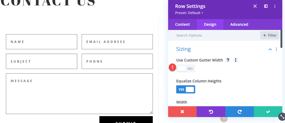
    Divi is an incredible theme and page builder that makes it easy to design a website in WordPress. In Divi, you can create anchor links to any element with ease and without having to worry about HTML.

    To add anchor links in Divi, open your page editor and Divi’s visual builder. The first thing that we’ll do is assign a section an anchor ID. We do this by opening the section settings, navigating to the Advanced tab, and clicking on “CSS ID & Class”. You can add an anchor ID to any Divi element, but linking to a section can be a better user experience than linking to a header tag.

    We’ll add our ID to the CSS ID field and save our changes. For this example, we’ve given our section the ID of “offer”.

    Divi Theme - Create Anchor Link - Step 1-4

    Once we have set up our section with an ID we can link to create our link. In this example, we’re using our main CTA in the hero section. This button will scroll the user down to the “Subscribe for Special Offer” section.

    Edit the button and click into the section labeled “Link”. For our link, instead of a URL, we are adding an anchor link. Do this by typing in the pound sign (#) and our wanted CSS ID. For this example, the link will be “#offer”.

    Divi Theme - Create Anchor Link - Step 5-7

    Publish the page changes and then navigate to the page on the front end. You can click your button and watch as it scrolls down to the desired section. Here is our example in action:

    As you can see, it is very easy to manage multiple anchor links on a single page with Divi. Assigning sections and individual modules an ID is a snap.

    Sometimes the scroll-to position may be inaccurate. Divi has a Theme Option that you can toggle for Divi to use an alternate method. Open up the Theme Options, go to the Navigation Tab, and Toggle the “Alternative Scroll-to-Anchor Method”.

    Divi Theme Alternative Scroll to Anchor Option

    To learn more about what Divi can do with Anchor links, check out these cool things you can do with Anchor Links!

    Conclusion

    Every second a visitor spends on your website is precious. People have short and demanding attention spans. The competition for all the same attention is constantly growing. You only have but a mere few seconds to hook readers and get them the content they were looking for. Otherwise, you are delivering a forgettable website experience and bouncing traffic.

    As we’ve learned, anchor links are a great way to direct your readers to specific parts of your content. You can keep your site visitors’ attention with the content that they want most want to see. These anchor links may even link to other parts of your site, or to external sources that have specified HTML IDs.

    You can now create better user experiences for your customers and improve how search engines understand and rank your web pages. And anchor links in WordPress help you do this!

    Have you had experience using anchor links in WordPress or have some helpful tips? Let us know in the comments below!

    Featured Image via BestForBest / shutterstock.com

    The post How to Create Anchor Links in WordPress: A Complete Guide appeared first on Elegant Themes Blog.

  • How to Style a Grid Item in Divi’s Filterable Portfolio Module

    Having an area on your website to showcase your work is important. If you’re a stylist, you could create multiple projects within your WordPress website to show your concepts. If you’re a brand designer, you can use a portfolio to showcase your past work. Furthermore, we can even go a step further and add in various categories for our projects. This is where Divi’s Filterable Portfolio Module comes into play.

    With this module, we are able to display our hard work in a way that is easy and organized. In today’s tutorial, we’ll be styling the Filterable Portfolio Module’s individual grid items. We’ll be using layouts from the Divi Conference and Divi Online Yoga Instructor free layout packs that come with every purchase of Divi. As with all things Divi, we have the ability to style this module to make it match our needs and wants. However, before we get into styling, let’s learn a bit more about the module.

    What is Divi’s Filterable Portfolio Module?

    Projects are part of a custom post type that works similarly to posts. You can find these inside your WordPress dashboard.

    The Projects custom post type that comes with every Divi install

    This is where you’ll create your individual projects that will populate your Filterable Portfolio Module. The module gives us two ways of showing our projects: in a grid format, or in a fullwidth format. For us, we’ll be using and styling the grid format. With the Filterable Portfolio Module, we will be able to showcase our most recent projects. Users of our site will be shown a filter bar on top of our portfolio grid. From there, they can cycle through the various portfolio categories that we allow to be displayed within the module.

    Here’s an example of a vanilla setup of the module with some sample projects:

    The Divi Filterable Portfolio Module with sample projects

    Areas to Consider When Styling Divi’s Filterable Portfolio

    Like all Divi modules, the Filterable Portfolio Module comes with a number of features that we can style to our needs and wants. As such, most of the features that accompany the module we are able to edit within the Design tab of the modules settings modal box. We can edit the follow areas and more:

    • Project Title
    • Project Category
    • Thumbnail
    • Filter Text
    • Thumbnail Hover
    • Pagination

    This isn’t a full list, and we haven’t even begun to talk about how CSS has add deeper customizations to this module!

    How We’ll Be Styling Divi’s Filterable Portfolio Module

    As mentioned earlier, for this tutorial we’ll be using two layouts from the Divi Conference and Divi Online Yoga Instructor. Below, you can catch a glimpse of the work that we’ll be doing during this tutorial.

    Divi Conference Event Layout

    The Divi Conference Event Layout with the Filterable Portfolio Module

    Divi Online Yoga Instructor Landing Page Layout

    The Divi Online Yoga Instructor Layout with the Filterable Portfolio Module

    You can easily download both layouts from within the Divi Builder. Now, let’s get started!

    Styling Divi’s Filterable Portfolio Module: Divi Conference Edition

    First things first, we’ll need to install the event page template from the Divi Conference Layout Pack. After you have created your new page in WordPress and activated the Divi Builder, we’re going to enter into the Divi Library.

    Enter the Divi Layout Library

    Click on the Load from Library icon to enter into the Divi Layout Library

    Load the Divi Layout Library

    Locate Layout Within the Divi Layout Library

    Using the search feature within Divi’s Layout Library, search for the Divi Conference Event Page layout.

    Search for the Divi Conference event page layout within the Divi Layout Library

    Install the Layout

    Once you have selected the layout, click the Use This Layout button to install the layout into your page.

    Install selected layout

    Remove and Replace Image Module

    We’re going to remove the Image Module pictured below to make room for the Filterable Portfolio Module that we’ll be styling. Click on the Delete icon after hovering over the image to remove the photo.

    Remove Image Module

    Insert the Divi Filterable Portfolio Module

    With the Image Module removed, we can now make space for our Filterable Portfolio Module. We will click on the Add Module Icon (the grey plus sign) and then select the module from the module modal box that pops up.

    Insert the Filterable Portfolio Module

    Setting the Post Count and Portfolio Layout

    By default, this module will showcase your work in a one column. However, we’ll be using the Grid layout which comes by default with 4 columns. As such, we recommend choosing a number that is a multiple of 4 (4, 8, 12, 16 etc.) as the Post Count for your portfolio. For this tutorial, we’ll be using 12 projects in our grid.

    Setting the Post Count and Portfolio Layout

    Begin Styling Divi’s Filterable Portfolio: Title and Meta Text

    Now that we have our projects showing up as a grid, let’s tie in some of the design elements from our selected template. In this case, we’ll be using the styling that comes with the Divi Conference Layout Pack within our new module.

    Text Styling

    • Text Alignment: Center
    • Text Color: Dark

    Title Text Styling

    • Title Heading Level:H2
    • Title Font: Krona One
    • Title Text Color: #000000

    Meta Text Styling

    • Meta Font: Default (Open Sans)
    • Meta Text Color: #ff6651

    Text styling edits for your newly added module

    Styled titles within the Filterable Portfolio Module

    Now that we have our styling in place for the titles within the portfolio grid, let’s make some edits to the actual shape of the project thumbnails themselves.

    Modify Border and Rounded Corners of Project Thumbnail

    Within our Divi Conference Layout Pack, we are using a unique combination of rounded corners to give a unique shape to some of the key images within the pack. Let’s apply this styling to the thumbnails of our module.

    Image

    • Image Rounded Corners: 50px 50px 50px 0px
    • Image Border Styles: All
    • Image Border Width: 3px
    • Image Border Color: #000000
    • Image Border Style: Solid

    Adding the corners and borders to the featured image

    Rounded corners and border styling added to portfolio list items

    This will cause our thumbnails to have a shape that matches the rest of the other images throughout the layout pack.

    Customizing the Hover Overlay

    Let’s go a step further with our styling and make a slight edit to the overlay that comes by default with this module. We’re going to change the color as well as the icon that’s used right out of the box.

    Overlay

    • Zoom Icon Color: #bcf5fd
    • Hover Overlay Color: #ff6651
    • Hover Icon Picker: Zoom

    Setting for the hover overlay effect

    As you can now see, we’ve added the brand colors of this layout into the overlay, as well as changed the icon that Divi provides by default for this module’s hover overlay feature.

    Hover styling from in effect within the Divi Conference Event Page Layout

    Styling the Pagination

    We’re now going to start using small snippets of CSS to add some further customization to our Filterable Portfolio Module. Firstly, we’re going to style the pagination of this module. Next, we’re going to remove the border that appears above with a single line of CSS

    Pagination Text

    • Pagination Font: Krona One
    • Pagination Text Alignment: Center
    • Pagination Text Color: #ff6651
    • Pagination Text Color (Hover): #000000

    Styling the pagination of the Divi Filterable Module

    For our CSS, we will be moving to the Advanced tab of our module. Secondly, we will click on the Custom CSS tab. Next, we will enter in the following code snippet to remove he border on top of our pagination, giving it a cleaner look.

    Portfolio Pagination

    border-top: 0px;

    Portfolio Pagination CSS

    Using Custom CSS & Divi Settings to Style the Filter Text

    For the Filter Text, we’ll be taking things up a notch. We are going to use CSS to change the background as well as the hover effects. We want to have a close seamlessness between the newly added module and the styling of the layout pack. First, let’s enter in our Divi settings for the font.

    Filter Criteria Text

    • Filter Criteria Font: Krona One
    • Filter Criteria Text Color: #ffffff
    • Filter Criteria Text Color (Hover): #000000

    Filter criteria text styling

    As it currently stands, our filter appears to have disappeared. This is because in its default state, it is white text on a white background. However, we’re going to change that with some custom CSS in two places. Firstly, we’re going to add a snippet of CSS within the Page Settings that’ll add a background to the filter text. Secondly, we’ll style the Active Portfolio Filter using the Advanced tab of the module.

    Access page settings

    To access the Page Settings, click on the three dots on the middle of the screen. Then, select the gear icon which will open up the Page Settings. Next, you will navigate to the Custom CSS tab, and enter in the following to add a background to the Filter Text.

    Access and enter into the page settings for adding additional CSS

    Custom CSS

    In this CSS snippet, we are targeting the background color of the filter. We are also targeting and styling its hover state. Next on the agenda, let’s add a bit more CSS to the module and showcase our Active Filter tab more prominently.

    /* Change background color of filters */
    .et_pb_filterable_portfolio .et_pb_portfolio_filters li a {
    background: #000000;
    }
    .et_pb_filterable_portfolio .et_pb_portfolio_filters li a:hover {
    background: #ffffff;
    }

    Using Page Settings to set the color of the background of the module's filters

    Styling the Active Portfolio Filter Tab

    The Active Portfolio Filter Tab draws our user’s attention to the current portfolio category that they’re visiting. Right now, this filter has white text and a light background. We’re going to go into the Advanced tab of the Filterable Portfolio Module and add some text to the default and hover states of this feature. These are the CSS properties we’ll add in a default state:

    background: #ff6651;
    color: #ffffff !important;

    Active Portfolio Filter styling

    Hover State

    On hover, we’ll change the background to black.

    color: #000000!important;

    Background styling of hover for Active Portfolio Filter

    Final Look Styling Divi’s Filterable Portfolio with Divi Conference

    Here’s the final look!

    Finished Styling Divi's Filterable Portfolio Module for Divi Conference

    And now, here’s what it looks like when we hover!

    Finished Styling Divi's Filterable Portfolio Module for Divi Conference

    Styling Divi’s Filterable Portfolio Module: Divi Online Yoga Instructor Edition

    Similarly to the Divi Conference edition, find your layout within the Online Yoga Instructor Layout Pack inside the Divi Builder. We’ll be using the Landing Page Layout for this tutorial. Scroll down to the section Classes section with the title All Upcoming Classes Section.

    Updating the Online Yoga Instructor layout

    Inserting Filterable Portfolio Module

    From here, we’re going to delete the rows with the classes. Click the purple icon with three dots on it. Next, select the Wireframe view. Lastly, you’re going to delete the two rows that have three columns within them.

    Rearranging the layout in preparation for our new module

    Next, we’ll replace them with a single column within the row within which. Then, we’ll add our Filterable Portfolio Module.

    Inserting Filterable Portfolio Module into newly created row

    Like the previous example, we will be using the Grid Layout for this module with a multiple of 4 for the Post Count. Now, let’s do something a bit different with the information that we showcase on the card. In the Content tab, let’s navigate to Elements and unselect the Show Categories. This will mean that the Portfolio Module will only show the name of the project without the name of the category that it’s in.

    Disable show categories for the module

    Style Filter Criteria Text, Project Title and Pagination Text

    Let’s set the style foundation for the text portions of our module. The body text for this layout is Open Sans and the font used for the main headings is Cinzel. Therefore we’ll be using a combination of these two fonts throughout out styling process.

    Text

    • Text Alignment: Center
    • Text Color: Light

    Title Text

    • Title Font: Cinzel
    • Title Text Color: #ffffff

    Title and Text Styling - Part One

    Filter Criteria Text

    • Filter Criteria Font Weight: Bold
    • Filter Criteria Text Color: #ffffff

    Pagination Text

    • Pagination Text Color: #ffffff

    Title and Text Styling - Part One

    This is what our Filterable Portfolio Module is looking like right now. It’s not much, but we’re slowly getting there!

    New text styling implemented into the portfolio module

    Creating a Translucent Hover Overlay

    Let’s pull some inspiration from the various modules and beautiful gradients within this layout. For this, we’re going to create a translucent hover overlay and style the icon that shows up on hover as well.

    • Zoom Icon Color: #323741
    • Hover Overlay Color: rgba(255,201,165,0.85)
    • Hover Icon Picker: Search leaf and see icon above

    Styling the hover overlay

    Adding a Border to the Portfolio Grid Items with Custom CSS

    Similar to our first tutorial, we’re now going to use some CSS to add more interest to our Filterable Portfolio Module. Now, we are going to add a border around each individual portfolio grid item. Use the CSS snippet below within the Custom CSS portion of the Page Settings to add our border. We’ll also be assigning the CSS Class border to this module.

    • CSS Class: border

    Custom CSS

    /* Border */
    .border .et_pb_grid_item {
    border: 2px solid #ffffff;
    padding: 5px;
    }

    Adding a CSS class to our module in addition to custom CSS

    Here we now have our Filterable Portfolio Module with a nice border – and soe padding – around each grid item.

    Some padding and a border for the portfolio module

    Adding CSS to Style Pagination Border

    Unlike our previous example, let’s add some color to the border for our pagination with some CSS. This will also go within the Page Settings > Custom CSS area.

    /* Pagination Styling */
    .et_pb_filterable_portfolio .et_pb_portofolio_pagination {
    border-top: 2px solid #adc6d9;
    }

    Styling the Filter Criteria Text

    Similar to our Divi Conference Portfolio Module styling, we want to add some jazz to our category filters. Again, we want to pull from the styling that is already present within the template provided to us. Here’s the CSS that we’ll be adding into our Custom CSS section to target the background and hover of our Filter bar.

    /* Change background color of filters */
    .et_pb_filterable_portfolio .et_pb_portfolio_filters li a {
    background: none;
    }
    
    .et_pb_filterable_portfolio .et_pb_portfolio_filters li a:hover {
    background: #ffffff;
    color: #323741 !important;
    }

    With these two new additions to our Custom CSS, this is what our Filterable Portfolio Module is shaping up to be.

    Filter text and border styling added to Divi's Filterable Portfolio Module

    However, notice how the Active Portfolio Filter is lost. It still has a light background with white text on top of it. Let’s go into the module’s settings and add some CSS to change this.

    Custom CSS

    Active Portfolio Filter:

    background: #ffffff;
    color: #323741 !important;

    Styling the Active Filter setting with Custom CSS

    Removing Animation From Module

    To provide a cleaner experience, we’ll be removing the default animation that comes with the Filterable Portfolio Module. For this, we’ll first need to go back into our Page Settings and add some CSS that will target the portfolio grid items and remove the slide-in transition that occurs out of the box with Divi.

    Custom CSS

    /* Remove transition */
    .et_pb_filterable_portfolio .et_pb_portfolio_item.active {
    transition: none;
    }
    </code><code>
    .et_pb_portfolio_item {
    animation: none!important;
    transition: none !important;
    }
    

    Change Portfolio Grid from Four Columns to Three

    Our final CSS addition will be to transform our Portfolio module from four columns to three. This will allow us more room to see our projects. Also, we’ll be adding an additional row to our module. Here’s the final CSS snippet that you’ll be able to use to convert your columns.

    Custom CSS

    For this last snippet, we’ll be adding the CSS ID #three-column-grid to our module. We will still be keeping our CSS class from before intact.

    /* 4 to 3 Columns */
    @media only screen and ( min-width: 768px ) {
    #three-column-grid .et_pb_grid_item {
    width: 28.333%;
    margin: 0 7.5% 7.5% 0;
    }
    
    #three-column-grid .et_pb_grid_item:nth-child(3n) {
    margin-right: 0;
    }
    
    #three-column-grid .et_pb_grid_item:nth-child(3n+1) {
    clear: left;
    }
    
    #three-column-grid .et_pb_grid_item:nth-child(4n+1) {
    clear: unset;
    }
    }

    Adding CSS ID

    Styling Divi’s Filterable Portfolio: In Conclusion

    As with most of Divi’s modules, the settings that come with Divi can be further expanded upon with CSS. Showcasing your work is an important part of running a business, blog or brand online. As such, having an organized manner in which to display your work is key. Glean from the tips that were shared today to partake in your own journey of styling Divi’s Filterable Portfolio module and show us your work in the comments or on social media!

    The post How to Style a Grid Item in Divi’s Filterable Portfolio Module appeared first on Elegant Themes Blog.

  • Get a Free Handmade Soap Layout Pack for Divi

    Hey Divi Nation! Thanks for joining us for the next installment of our weekly Divi Design Initiative; where each week, we give away a brand new Layout Pack for Divi.

    This time around, the design team has created a beautiful Handmade Soap Layout Pack that’ll help you get your next Handmade Soap website up and running in no time!

    This layout pack includes:

    7 Premade page layouts strategically designed for any Handmade Soap website (including a footer design)
    – Original, royalty-free photos and graphics + customizable source file (see below)
    – Plus, a large collection of pre-designed website elements that are customizable and reusable anywhere.

    This layout pack is available right inside Divi for all Divi customers for FREE as the latest addition to our growing Divi library of hundreds of premade layout packs, thousands of page designs, and countless web design elements and resources.

    divi layout

    Check Out The Divi Handmade Soap
    Layout Pack Below

    Get it for free today!

    Handmade Soap layout pack for Divi

    Landing Page Design

    Handmade Soap Layout Pack for Divi

    View The Live Layout Demo

    Home Page Design

    Handmade Soap Layout Pack for Divi

    View The Live Layout Demo

    Shop Page Design

    Handmade Soap Layout Pack for Divi

    View The Live Layout Demo

    Product Page Design

    Handmade Soap Layout Pack for Divi

    View The Live Layout Demo

    Blog Page Design

    Handmade Soap Layout Pack for Divi

    View The Live Layout Demo

    About Page Design

    Handmade Soap Layout Pack for Divi

    View The Live Layout Demo

    Contact Page Design

    Handmade Soap Layout Pack for Divi

    View The Live Layout Demo

    Key Features

    If you’re looking to get a new Handmade Soap website, you don’t want to miss out on the Handmade Soap Layout Pack for Divi! Each page layout is built to impress your visitors with world-class web design. And it has everything you need to promote Handmade Soap services, and much more. Use it to get your next Handmade Soap website up and running today!

    Live Demos

    Click the links below to see a live demo for each of the layouts included in the pack.

    1. Handmade Soap Landing Page (live demo)
    2. Handmade Soap Homepage (live demo)
    3. Handmade Soap Shop Page (live demo)
    4. Handmade Soap Product Page (live demo)
    5. Handmade Soap Blog Page (live demo)
    6. Handmade Soap About Page (live demo)
    7. Handmade Soap Contact Page (live demo)

    Access This Layout Right Now
    Directly from Your Divi Builder

    Since Version 3.0.99 of Divi, you can find and import any of the layouts included in this pack (along with ALL of Divi’s Premade Layout packs) directly from the Divi Builder. They are already waiting for you.

    To access your new layout, simply activate the Visual Builder when editing a page and look for the “Load From Library” icon in the page settings bar (it looks like a plus symbol). Click this icon to launch the Load From Library popup. Under the Premade Layouts tab, you can easily find the new layout by scrolling through the list of layout packs. Once you find the Handmade Soap Layout Pack, click on it. You will see all the individual layouts included in the pack. Select the layout you want to use and then click the “Use This Layout” button.

    Handmade Soap Layout Pack for Divi

    For more, check out this video to learn how you can get this layout pack up and running today.

    Subscribe To Our Youtube Channel

    Authentication Required

    Before you can download Premade Layouts from the Divi Library you must authenticate your Elegant Themes Subscription. You can do this by navigating to Divi > Theme Options > Updates. There you can enter your username and API key and save changes.

    Handmade Soap Layout Pack for Divi

    You can find your API Key under your members area on the Elegant Themes site. After you enter the Username and API Key, you will gain immediate access to our library of hundreds of free layouts (including this one). If you haven’t done this, when you click to import a layout to your page, you will be prompted to enter your Elegant Themes Membership Username and API Key.

    Use Layout Images for FREE with No Licensing Restrictions

    Divi Handmade Soap Layout Pack for Divi

    The image assets included with these layouts (icons, illustrations, photos, etc.) have no licensing restrictions. This means you can use them in all of your commercial projects without having to worry about paying licensing fees or attributing the photographer. Use them in your commercial websites, sell them within your Divi child themes, include them in your own Divi layout packs or just use them on your blog. We know how challenging it can be to find good photos and how confusing and scary the licensing that governs those photos can be. We want to fix that problem for our users.

    Download the Full Res Image Assets

    New Layout Pack Every Week!

    We hope you enjoy this layout pack. We look forward to hearing your opinions in the comment section below. Make sure you check out next week’s layout pack as well!

    The post Get a Free Handmade Soap Layout Pack for Divi appeared first on Elegant Themes Blog.

  • Divi Product Highlight: Ultimate Divi Modules UI Bundle

    Ultimate Divi Modules UI Bundle is a third-party layout bundle for Divi. This bundle includes lots of pre-styled layouts, modules, and extras. This bundle is always growing and currently includes over 3600 styles and 35 layout packs. They’re Divi Library layouts, so they can be customized and used the same as any Divi layout — including being added to your Divi Cloud! In this post, we’ll look at some of the new additions to the Ultimate Divi Modules UI Bundle to help you decide if this Divi product is right for you.

    Let’s get started.

    Uploading Ultimate Divi Modules UI Bundle Layouts

    Ultimate Divi Modules UI Bundle Layouts are provided as JSON files with 10 layouts per file. Upload them to your Divi Library as normal by going to Divi > Divi Library in the WordPress dashboard. Select Import & Export, choose the Import tab of the modal that opens, navigate to and select your JSON file, and click Import Divi Builder Layouts. You can then use the layouts the same way as any Divi layout including the Divi Theme Builder and Divi Cloud.

    Uploading Ultimate Divi Modules UI Bundle Layouts

    Ultimate Divi Modules UI Bundle Page Layouts

    Ultimate Divi Modules UI Bundle now has over 82 modules, 3600 styles, and 35 complete website layout packs. The bundle has added over 1600 styles and 24 layouts since last October. In the following sections, we’ll look at some of the new additions.

    Blog Layouts

    Ultimate Divi Modules UI Bundle has 50 blog layouts. They include the blog and code modules for CSS and JS code. The example below shows layouts 41 and 42. Both add the publish date over the blog image. Layout 41 places the title and author name over the image while layout 42 places them under the image. A line separates the title and author name.

    Ultimate Divi Modules UI Bundle Page Layouts

    Blog layout 47 includes an interesting design with the meta and content overlapping the image.

    Ultimate Divi Modules UI Bundle Page Layouts

    Blog layout 50 places the blog posts in a single column. The date sits over the featured image and the content includes a dark blue background.

    Ultimate Divi Modules UI Bundle Page Layouts

    Content Ticker

    The bundle includes 15 content tickers created with text modules, content sliders, and styled with CSS. The example below shows styles 11 through 13. The title sits on one side and includes a darker background. The sliders create the tickers and include a lighter background and navigation styled to match the title.

    Ultimate Divi Modules UI Bundle Page Layouts

    Portfolio Modules

    The bundle includes 50 portfolio modules. They add interesting overlays with animations to the featured images. This example shows Portfolio Module 41. Its overlay has a dark blue background with white text and a light blue divider line.

    Ultimate Divi Modules UI Bundle Page Layouts

    This example shows style 43. Its overlay includes a white background with a parallelogram shape. The text is dark and light blue.

    Ultimate Divi Modules UI Bundle Page Layouts

    Ultimate Divi Modules UI Bundle WooCommerce

    The bundle adds lots of WooCommerce layouts including footers, widgets, tickers, and more. This is the Woo Category Block style 8. It includes multiple Woo Product Modules in a unique layout. It has a gray overlay that changes the text to white.

    Ultimate Divi Modules UI Bundle Page Layouts

    Style 10 adds text to the product’s image. An overlay with a blue background and white text.

    Ultimate Divi Modules UI Bundle Page Layouts

    Ultimate Divi Modules UI Bundle Layout Packs

    Ultimate Divi Modules UI Bundle also includes layout packs to build complete websites. Import a single page or the enter layout pack at once. Most have between 13-15 page layouts. We’ll look at the home page for a few of the new layouts as this will show many of the styled modules.

    Content Writer Layout Pack

    The Content Writer Layout Pack includes 13 pages. The layouts include lots of styled modules, icons, animations, and more. It includes all the standard pages and adds a History page for information about the company and how they work.

    Ultimate Divi Modules UI Bundle Layout Packs

    This example shows the design of the Content Writer home page layout. It includes red highlights throughout. The unique Person Modules reveal the social icons on hover. The style of the Blog Module includes text that overlaps the featured image.

    Ultimate Divi Modules UI Bundle Layout Packs

    Divi Agency Layout Pack

    The Divi Agency Layout Pack also includes 13-page layouts. It includes the standard pages and adds a Careers page.

    Ultimate Divi Modules UI Bundle Layout Packs

    The home page includes lots of styled modules with animations for the buttons, sliding backgrounds for the services, social media icons and image color changes for the Person Modules, and overlays for the Portfolio Module.

    Ultimate Divi Modules UI Bundle Layout Packs

    Music Concert Layout Pack

    The Music Concert bundle was designed to create a website where bands can showcase their concerts. The layout pack includes 15 layouts. Several of the layouts are designed specifically for bands including a page to apply to be an artist. This also includes a blog layout page and a page with code.

    Ultimate Divi Modules UI Bundle Layout Packs

    The home page includes a slider for the latest events. The Person Modules display social icons on hover. Top events show in another slider. Blurbs display a faint number in the background.

    Ultimate Divi Modules UI Bundle Layout Packs

    Fashion Shop Layout Pack

    The Ultimate Divi Modules UI Bundle Fashion Shop layout bundle is one of several that was designed for use with WooCommerce. It comes with 44 layouts with a combination of pages and modules. They include sliders, shop grids, carousels, widgets, etc. Many of them include multiple module designs, making them ideal for creating unique shop and product pages.

    Layout Packs

    The home page displays a slider to several shop pages, numbered blurbs, shop CTAs with custom overlays, multiple product grids, a styled newsletter form, and lots more.

    Layout Packs

    Promotion Block Style V1 to V3

    Here’s a look at the promotion blocks. It includes three different designs. The first design places images in a grid with text and buttons over the images. It includes a styled overlay animation.

    Layout Packs

    The second design has a grid without space between the images. It doesn’t include an overlay, but it does add a CTA.

    Layout Packs

    The third layout adds another column to the grid with taller images on the outside and wider images in the middle.

    Ultimate Divi Modules UI Bundle Layout Packs

    Promotion Banner V1 to V3

    The layout pack also includes three full-width banners to promote sales and work as CTAs that point to the shop. The image below shows all three banners.

    Layout Packs

    Product Showcase

    The product showcase displays the WooCommerce product element on one side and a custom product element on the other in an alternating layout.

    Layout Packs

    Purchase Ultimate Divi Modules UI Bundle

    Ultimate Divi Modules UI Bundle is available in the Divi Marketplace. The regular price is $149 but might be discounted. It includes unlimited usage and lifetime updates.

    Purchase Ultimate Divi Modules UI Bundle

    Ending Thoughts

    That’s our look at the Ultimate Divi Modules UI Bundle. This bundle has lots of layouts and modules to help you get started on any type of website. This bundle includes many layouts, modules, and elements to give you a head start on your Divi website. We’ve only scratched the surface of what’s included in this layout bundle. There is a lot here for the money.

    We want to hear from you. Have you tried the Ultimate Divi Modules UI Bundle? Let us know what you think about it in the comments.

    The post Divi Product Highlight: Ultimate Divi Modules UI Bundle appeared first on Elegant Themes Blog.

  • WordPress vs HighLevel

    WordPress and HighLevel are both great options for building websites, however, there are some differences. WordPress is a content management system (CMS) while HighLevel is an all-in-one platform that includes a website builder. HighLevel enables users to build feature-rich websites easily on their all-in-one platform, but they don’t always provide the same options or flexibility as an open source CMS like WordPress. In this post, we’ll look at WordPress vs HighLevel to determine the differences between the two. Additionally, we’ll discuss the features of both platforms so that you can decide which is best for your business.

    WordPress vs HighLevel: Who are They For?

    Both WordPress and HighLevel are very different in terms of built-in features and available add-ons.

    WordPress CMS

    WordPress got its start as a blogging platform in the early 2000’s. Over the years, WordPress has developed into a the most popular CMS, housing some of the largest corporate websites. For example, Sony Music, Time Magazine, CNN, and the White House are all built on WordPress. WordPress is open source and free, but will involve additional cost to get a WordPress website up and runner. Users should factor in the cost of hosting, premium themes, and plugins. Those things can drive the price to hundreds of dollars. However, those add-ons add functionality and allow for unique websites. Because of this, WordPress is best utilized by anyone who needs a website — small or large.

    WordPress vs HighLevel

    High Level is an all-in-one marketing platform geared more towards the agency professional. Like HubSpot, HighLevel is a SaaS platform, which means it is a fully capable Customer Relationship Management (CRM) system for business professionals who need an all-in-one platform. Things such as scheduling appointments, 2-Way SMS, landing pages, payment solutions, sales funnels, and analytics are all built in. Similar platforms such as HubSpot offer these features, but as an add-on. With HighLevel, you’ll get everything you need to make your website a fully functional business website and marketing solution for a fraction of the cost of the competition.

    WordPress vs HighLevel Ease of Use

    One of the most important aspects of any CMS or website builder is how easy it is to use. Both WordPress and HighLevel have a learning curve. Let’s discuss each platform to determine which has the advantage.

    WordPress Ease of Use

    WordPress can be a simple platform to learn. This is especially true if you are only needing to build a small information website. It can become a bit more cumbersome when needing to integrate other software or functionalities to make it what you need for your business.

    WordPress dashboard

    Beginners will be inundated with content across the web to help them get started. There are dozens of websites completely dedicated to learning the in’s and out’s of WordPress. For instance, our Elegant Themes blog is packed full of tutorials and resources to assist WordPress users of any skill level. Additionally, prospective WordPress users won’t have any trouble finding helpful videos. That’s one of the best things about WordPress — the wealth of available information.

    HighLevel Ease of Use

    HighLevel has a similar learning curve. If a new user needs to build a website and/or set up their CRM, they can easily do so in an hour or less — at least that’s what their website says. One of the things that HighLevel prides themselves on is how easy it is to get started. They have a good knowledge base to assist new users, and provide 24/7 customer support to assist when problems arise. We found the learning curve to be a bit steeper than that, especially when being used to different platforms.

    The dashboard is fairly easy to navigate. Scheduled appointments, messages, calendars, contacts, payments, automation and websites are all clearly marked and fairly easy to set up. That being said, agencies who plan to use HighLevel should utilize their 14 day trial period to familiarize themselves with the platform. Depending on how much of it you plan to utilize, it could take quite a bit of time to get the hang of.

    HighLevel Dashboard

    WordPress vs HighLevel: Customization

    WordPress and HighLevel have many customization options. However, WordPress has the most customizations available to users.

    WordPress Customization

    WordPress is the clear winner in the customization department. With thousands of plugins and the ability to add custom code, building a unique website isn’t hard. In addition to the free plugin options, you can install premium ones from third party vendors. WordPress also integrates seamlessly with page builders like Divi to give you complete control over the web design process with a visual builder.

    WordPress vs HighLevel plugins

    WordPress uses its proprietary Gutenberg editor. Users can add columns and elements such as icons, text, videos, social media, and more to customize their site easily.

    Gutenberg editor

    HighLevel Customization

    HighLevel doesn’t require any plugins. It works great out of the box. The site builder comes with tons of elements to use including text modules, galleries, video, and more.

    HighLevel page editor

    Users can easily interact with their customers in HighLevel. For example, elements such as calendars, surveys, and forms are standard with a HighLevel account.

    WordPress vs HighLevel page editor

    WordPress vs HighLevel: Themes and Templates

    Both WordPress and HighLevel utilize templates to change the look and feel of your website. However, one platform stands out because of the number of choices available.

    WordPress Themes and Templates

    WordPress is king when it comes to themes. There are thousands of free themes available on the WordPress repository alone. That being said, most of the free themes don’t allow for much customization. That’s ok if you just need a small cookie-cutter website and don’t mind your site looking similar to others out there. Here are some of the best free WordPress themes available.

    In addition to the freebies, there are thousands of premium themes available for purchase. Here are some of the best themes for bloggers. Some themes, like the Divi Theme, go well beyond the standard features of WordPress to give users the most customizable website imaginable, including hundreds of premade layout packs.

    HighLevel Themes and Templates

    Like WordPress, HighLevel offers free funnel templates. HighLevel doesn’t have thousands of templates to choose from, but there are some helpful options. This is especially useful for people who don’t have the time or expertise to build a site or page(s) on their own. Templates can be loaded directly within the HighLevel platform easily. Additionally, a marketplace with premium templates is available.

    HighLevel Funnel Templates

    The marketplace offers several categories to choose from including business, services, technology, and more. Additionally, there are third party vendors who offer templates for HighLevel websites and sales funnels. Prices for premium themes vary. Users can expect to pay at least $99.

    HighLevel premium templates

    WordPress vs HighLevel: Ecommerce

    Both WordPress and HighLevel have eCommerce options. Let’s take a look at each platform to get a better idea of how selling products work on each solution.

    WordPress Ecommerce

    WordPress doesn’t come with eCommerce natively. However, adding a plugin such as WooCommerce allows for an easy setup. WooCommerce is free, and integrates with WordPress seamlessly. Setting up a shop, adding products, and connecting a payment gateway are done in a snap.

    WooCommerce plugin

    That being said, features are limited with the free option. In order to truly customize your customer’s experience, you’ll need to add functionality that can quickly escalate costs.

    HighLevel Ecommerce

    HighLevel ships with the ability to add products and take payments out of the box. Users can add products, set up a payment gateway, and begin taking orders quickly. HighLevel is an all-in-one solution, so no plugins or extra subscriptions are needed. Also, single payment purchases and subscription based products are possible. If you plan to offer memberships or online courses, HighLevel has you covered there, too. Account users can send emails and 2-way SMS messages to streamline the ordering process and increase customer engagement.

    HighLevel eCommerce

    WordPress vs HighLevel: Publishing Tools

    Both WordPress and Highlevel make it possible to create a blog. However, one needs a little extra help.

    WordPress

    WordPress is the leading software used by bloggers today. It primarily started as a blogging tool and has evolved into a lot more over the years. That being said, its blogging roots run deep. Creating a post can be accomplished in two ways. The first option is using the classic editor. The classic editor functions much like a word processor, so those unfamiliar with WordPress shouldn’t have any problems using it.

    Classic editor

    The second is the Gutenberg editor. Beginning in 2018, WordPress began using Gutenberg to replace its classic editor. It utilizes blocks, which gives users the ability to add columns, and elements such as video, html, image galleries and more. Additionally, WordPress users can create layouts for blog posts to help deliver their message in a more unique way.

    Gutenberg blocks

    HighLevel

    Publishing blogs and posts is the only area where HighLevel falls short. They don’t natively offer a traditional blog experience. Users can create pages as posts, but they don’t offer a Blog element to bring in posts dynamically like a CMS. In order to create a blog on HighLevel, users will need to utilize a third party vendor such as Drop In Blog. While this may not be a deal breaker, it is an additional expense that should be considered when comparing WordPress vs HighLevel.

    WordPress vs HighLevel: Security

    Security is quite possibly the single most important feature of a CMS or website builder. Between ransomware, Denial of Service (DoS) attacks, malware, and bots, there are many things that can take a website or server down — costing your business revenue.

    WordPress Security

    WordPress is a popular platform, so it’s essential to have security measures in place. Thankfully, there are good security plugins that can help keep your website safe. WordFence, Sucuri, and Jetpack are a few highly rated examples. In addition to plugins, hosting providers play a critical role in website security. Cloudways, Flywheel (or WPEngine), Pressable, and SiteGround all offer excellent security. Features such as SSL certificates, Malware protection, TLS 1.2 and 1.3, bot protection, and backup capability are standard.

    HighLevel Security

    As a cloud based provider, HighLevel adheres to GDPR compliance. All data transferred to and from the HighLevel platform is protected. They use end-to-end encryption on their servers, as well as TLS 1.3 to ensure safe data transfer. Additionally, they run backups and scan for malware and other cyber threats on a daily basis. Each site hosted on HighLevel comes standard with an SSL certificate with every plan.

    WordPress vs HighLevel: The Bottom Line

    After an in-depth comparison of WordPress vs HighLevel, it’s obvious that they are both good options for any agency looking to grow their revenue. Both offer the features needed to communicate with clients, sell products, and get their message out to the masses. Choosing between the two comes down to a few things. Cost, features, and expertise.

    If you are an individual, freelancer, or agency wanting to build a business that has complete control over settings, customizations and integrations, WordPress is likely the right choice. The possibilities are endless with WordPress due to the highly customizable nature of the platform. Additionally, with all of the plugins and themes available, users will have no trouble making their site look exactly the way they want.

    On the other hand, if your business will require frequent interaction with clients, full-automation marketing solutions, and reporting, HighLevel should be considered. With no plugins or special integrations needed, HighLevel could be a good solution for those looking to save time and money on developing a custom solution to serve their needs.

    Do you use HighLevel or WordPress? Let us know by leaving a comment below.

    The post WordPress vs HighLevel appeared first on Elegant Themes Blog.

  • Download a FREE Blog Post Template for Divi’s Conference Layout Pack

    Hey Divi Creators! Thanks for joining us for the next installment of our weekly Divi Design Initiative where each week, we give away brand new freebies. This time around we’re building upon the Divi Conference Layout Pack with a brand new blog post template that matches the rest of the pack perfectly. Hope you enjoy it!

    divi layout

    Check Out The Divi Conference Blog Post Template Below

    Get it for free today!

    Divi Conference Blog Post Template for Desktop

    Tablet and mobile view for the Divi Conference Blog layout

    Download The Blog Post Template For The Divi Conference Layout Pack

    To lay your hands on the free Divi Conference Blog Post Template, you will first need to download it using the button below. To gain access to the download you will need to subscribe to our newsletter by using the form below. As a new subscriber, you will receive even more Divi goodness and a free Divi Layout pack every Monday! If you’re already on the list, simply enter your email address below and click download. You will not be “resubscribed” or receive extra emails.

    How to Upload The Template

    Go to Divi Theme Builder

    To upload the template, navigate to the Divi Theme Builder in the backend of your WordPress website.

    Navigating to the Divi Theme Builder

    Upload Website Template

    Then, in the top right corner, you’ll see an icon with two arrows. Click on the icon.

    Opening the import export functionality of the Divi Theme Builder

    Navigate to the import tab, upload the JSON file that you could download in this post, and click on ‘Import Divi Theme Builder Templates’.

    Save Divi Theme Builder Changes

    Save the imported Divi Conference Blog Post Template within the Divi Builder

    Once you’ve uploaded the file, you’ll notice a new template with a new body area that has been assigned to All Posts. Save the Divi Theme Builder changes as soon as you want the template to be activated.

    How to Modify The Divi Conference Blog Layout

    Open Post Template

    To modify the template’s elements, start by opening the template.

    Edit the newly imported Divi Conference Blog Post Template

    Inside the Body Layout Editor, you can edit the design on the front end using the Divi Builder just like you would with a normal Divi page. Since this is a template that has been assigned to all posts for the site, there is a post content module that is necessary for displaying the post content. You will need to keep that module in place, but you can adjust the post content module’s design elements, which will design the post content that is displayed dynamically.

    Editing the post content module to match your site within the Blog Template

    About the Divi Conference Blog Layout

    This blog post template has a lot of dynamic elements that will work with your blog posts immediately. For example, the entire post header is made up of dynamic elements including a featured image as the background, the post title, and the post metadata (date, categories, author, and comment count). This content won’t need updating, but you can tweak the design of each of those elements if needed. Other dynamic elements include the following:

    • Related Posts Module(s) – displays the most recent posts that share the same category.
    • Post Content Module – displays the post content added when editing the post on the backend of WordPress.
    • Comments – a functional comment area for the post.
    • Post Navigation – provides previous and next buttons to the post.

    Here is a quick illustration that identifies the elements of the Divi Conference blog post template.

    Divi Conference Blog Post Layout element breakdown

    However, some elements on a post template will need your immediate attention before using it live on your own website. For this post template, you will need to update the icon module that acts as a back to blog button on top of the comments module.

    The back to blog page Icon Module

    Add Link to Icon Module

    The Icon Module can link back to your main blog page. To do this, you’ll need to add it’s link into the link section of the Icon Module.

    Setting up the link back to the main blog page within the Icon Module of the Divi Conference Blog Post Layout

    New Freebies Every Week!

    We hope you’ve enjoyed the Divi Conference Layout Pack and the blog post template freebie that goes along with it. We look forward to hearing your opinions in the comment section below. Make sure you check back next week for more freebies!

    The post Download a FREE Blog Post Template for Divi’s Conference Layout Pack appeared first on Elegant Themes Blog.

  • 6 Best Interactive Map Plugins for WordPress in 2023

    Whether you run a travel blog, a business directory site, or want to build an online store, interactive maps can make it easier for users to find particular locations. These visual tools can also make your contact page and other content more engaging and interesting. Therefore, you may be looking for the best interactive map plugin for WordPress.

    In this post, we’ll take a closer look at interactive map plugins and how they work. Then, we’ll review some of the best options on the market. Let’s get started!

    What Are Interactive Map Plugins?

    An interactive map is a visual element on your site that can highlight particular locations. For example, if you write a hiking guide on your blog, you can include a map of the trail.

    Likewise, if you publish city itineraries, you can use maps to mark must-see attractions, restaurants, and more:

    An example of an interactive map

    If you have a WordPress site or WooCommerce store, you can use a plugin to display interactive maps on your pages. Depending on the tool you choose, you should be able to integrate your site with Google Maps. (If not, you can check out these top Google Maps Plugins.) Also, most will allow you to create custom maps with your own markers and offer different views of your locations.

    Using an interactive map plugin can provide more value to your visitors. It enables readers to locate places and plan their trips more efficiently. Additionally, if your online business has multiple physical store locations, a user-friendly map will make it easier for customers to find and visit your outlets.

    6 Best Interactive Map Plugins for WordPress

    Now, let’s look at some of the best interactive map plugins for WordPress. We based our selections on several criteria, including features, ease of use, and customization options.

    1. Interactive Geo Maps

    Interactive Geo Maps plugin

    As the name suggests, Interactive Geo Maps enables you to create interactive maps of continents and the world. You can also display country maps and highlight different regions.

    Key Features for Interactive Geo Maps:

    • Add colored markers to your maps.
    • Choose from different map projections, including Mercator and Miller.
    • Exclude specific regions from the map.
    • Set click actions and hover color change settings.

    The interface for Interactive Geo Maps

    This plugin comes with a user-friendly interface. You can start by selecting the region you wish to display, then customize the appearance of your map from the visual settings. You can also add round colored markers to pinpoint specific locations.

    Interactive Geo Maps is for you if…

    • You have a travel website and want to display interactive maps of different countries.
    • You run an international business and want to show the countries you operate in.

    Interactive Geo Maps Pricing: Free, with a premium version that starts at $2.49 per month.

    Get Interactive Geo Maps

    2. Maps Marker Pro

    Maps Marker Pro plugin

    Moving on to the next plugin, Maps Marker Pro is a premium option that offers a wide range of features. It allows you to create multilingual maps easily by integrating with translation plugins like Polylang and WPML. Moreover, the plugin enables you to enhance the interactivity of your maps with polyline shapes such as polygons, circles, and rectangles.

    Maps Marker Pro demo

    Furthermore, Maps Marker Pro includes GPX tracks functionality, which allows you to showcase routes complete with optional metadata like distance, duration, pace, or elevation. Additionally, you can create customized filters to let visitors view precisely what they want on the map, and use the cluster marker feature to save valuable space. To top it off, the plugin supports geolocation, letting you display a user’s current location and movements on the map in real time.

    Key Features for Maps Marker Pro

      • Ability to create multiple custom maps
      • GPX tracks with optional metadata
      • Polyline support
      • User-filtered search capability
      • Marker clustering
      • Multilingual support
      • Geolocation

    Maps Marker Pro is for you if…
    …you need an interactive map solution with multilingual support, filtering, and geolocation capabilities.

    Maps Marker Pro Pricing: €49 one-time fee.

    Get Maps Marker Pro

    3. Mapify Pro

    Mapify plugin

    Next on the list is Mapify Pro, which comes in both lite and pro versions. The lite version allows you to add up to 10 locations and use it freely across unlimited websites. It also enables you to customize your maps with your preferred image, and users can easily pan and zoom the maps. Additionally, the lite version offers click tooltips that show embedded videos, images, and text, among other interactive features.

    If you opt for the pro version, you’ll be blown away with all the features at your disposal. One of the standout features of Mapify Pro is the ability to add an unlimited number of locations to your maps. It also includes customizable markers, allowing you to create markers that are unique and match your brand or website design. You can choose from over 50 marker icons or upload your own custom marker icon, making it easy for users to differentiate between different types of locations on the map.

    Additionally, it integrates with popular services like WooCommerce and Advanced Custom Fields, giving you more options for displaying data on your maps. Plus, Mapify Pro allows you to create advanced tooltip content, including images, videos, and HTML, to provide users with more detailed information about a particular location.

    The interactive map legend is another standout feature of Mapify Pro that enhances the user experience. The map legend provides a key to the different markers and locations on the map, allowing users to easily identify and differentiate between them. With Mapify Pro, you can create an interactive map legend that is fully customizable and responsive, making it easy for users to access from any device.

    Mapify Pro interactive legend

    Key Features for Mapify Pro:

        • Customizable markers
        • Advanced filtering
        • Highly customizable map styles
        • Integrations with WooCommerce, ACF, and more
        • Interactive map legend

    Mapify Pro is for you if…
    …you want the ability to feature any type of content in your interactive maps, as well as animated icons, tooltips, and WooCommerce integration.

    Mapify Pro Pricing: Free, with a pro version for $19 per month.

    Get Mapify Pro

    4. WP Store Locator

    WP Store Locator plugin

    WP Store Locator is an easy-to-use interactive map plugin that enables you to display an unlimited number of stores. Your visitors can filter the results by radius and view directions to your outlets.

    Key Features for WP Store Locator:

        • Provide additional information about each store, including email addresses and opening hours.
        • Show driving directions and distances to each store.
        • Display your maps in different languages.
        • Keep track of the most popular locations that users search for.

    Adding a new store in WP Store Locator

    Once you install the plugin on your site, you can start adding stores to your map. For each shop, you can specify its exact location and opening hours. Furthermore, you can provide additional information like contact details and the website.

    WP Store Locator is for you if…

        • You want to make it easier for customers to find and travel to your physical stores.

    WP Store Locator Pricing: Free, with add-ons starting at $19 per year.

    Get WP Store Locator

    5. RVM – Responsive Vector Maps

    RVM WordPress plugin

    RVM – Responsive Vector Maps lets you create responsive vector maps for your WordPress site. It has several interactive features, including linkable markers and a mouseover tooltip effect.

    Key Features for RVM:

        • Use images as icons for marker pinpoints.
        • Show and hide elements on the page.
        • Display label content when users click on countries and regions.
        • Export your map’s settings, including the markers.

    The RVM interface

    RVM lets you make a simple world map. Then, you can add a link, create a label popup, and change the background color for each country.

    RVM is for you if…

        • You want to create a simple map for your site.
        • You have pages on different countries and want to be able to link to them from your map.

    RVM Marker Pricing: Free

    Get RVM

    6. The Divi Map Module

    If you’re a Divi user, you can add a custom interactive map to your site without the need for an extra plugin. Thanks to our Divi Map Module, you can easily embed an interactive map anywhere on your page with clickable pins, popups, and multiple locations.

    Key Features for the Divi Map Module:

        • Add customizable pins with tooltips to the map.
        • Built-in design settings for customizing elements of the map.
        • Supports draggable zoom, additional animation effects, and more.

    The Divi Map module

    With our Divi Map Module, you can customize the design of your map elements with built-in options including color, map hue and saturation, and more.

    The Divi Map Module is for you if…

        • You’re a Divi user and want a built-in solution for designing interactive maps.
        • You don’t want a bloated plugin.

    Divi Pricing: $89 per year.

    Get Divi

    Final Thoughts on Interactive Map Plugins

    Adding interactive maps to your site can make your content more engaging and interesting. These maps can highlight landmarks, stores, hiking trails, and more.

    Plugin Price Free Option
    🥇 Interactive Geo Maps Free, $2.49 per month ✔️ Visit
    🥈 Maps Marker Pro €49 one-time fee ❌ Visit
    🥉 Mapify Pro Free, $19 per month ✔️ Visit
    4 WP Store Locator Free, $19 per year ✔️ Visit
    5 RVM – Responsive Vector Maps Free ✔️ Visit
    6 Divi Maps Module $89 per year ❌ Visit

    As for our top choices, each has interactive functionality. It all depends on what you want your maps to do. If you operate a multi-national business and want to showcase where your business operates, then Interactive Geo Maps is a solid choice. That being said, if you need a more robust solution with user-filtered searching capabilities, you’d be hard-pressed to find a better option than Maps Marker Pro.

    Do you have any questions about choosing the best interactive map plugin for WordPress? Let us know in the comments section below!

    The post 6 Best Interactive Map Plugins for WordPress in 2023 appeared first on Elegant Themes Blog.

  • How to Get Started with Email Segmentation

    Email segmentation is key to a successful email marketing strategy. In fact, selling to or engaging with your email contacts effectively is impossible without developing a list segmentation strategy. Email list segmentation enables you to break down your audience’s key characteristics so you can have personalized communication with them.

    This one practice will make your email marketing many times more effective. In this article, we’ll show you how to leverage segmentation to truly get the most out of your email marketing.

    Let’s get to it.

    What is Email Segmentation?

    Email Segmentation is the practice of collecting data in ways that allow for ultra-targeted email campaigns to your contacts. It is the exact opposite of a newsletter “blast” sent to all your contacts in one bulky batch. While a newsletter sent to everyone is easy to manage, the results you want are in the details, especially that of your audience.

    Email segmentation is usually a built-in feature of popular email marketing platforms which also include automation tools to make it easier to manage segmented campaigns.

    In short, Email Segmentation breaks your audience into smaller clusters which allows you to send more relevant messaging to each. This, in turn, can significantly improve your marketing strategy and returns.

    Benefits of Email Segmentation

    If you are a website or business owner who needs to grow your business, email segmentation is something you should absolutely look into. Email marketing starts out as one of the best marketing channels for ROI (Return on Investment). Current figures peg its ROI at 36:1. That is $36 made for every $1 spent on email marketing.

    Campaign Monitor, a leading email marketing platform published a statistic that should make you pause and reconsider the rest of your day (and marketing strategy). They found that marketers who segmented their email campaigns saw a 760% increase in revenue. Revenue. We’ll leave you alone with that for a moment.

    760% Increase in Revenue from Email Segmentation

    Image by Photoroyalty / shutterstock.com

    Not only will segmentation improve your results, it lets you get to know your customers at a more granular level. You’ll find new buyer/customer personas and address their needs more easily. You can even use these segments off of email. Having dialed-in segments can help your remarketing efforts by being able to (for instance) create a look-a-like audience in Facebook Ads based on segments versus every last one of your contacts.

    60% of consumer goods and services companies are using data-rich insights to create both personalized and segmented email content. Keep reading to see how you can set up Email List Segmentation for your company.

    How to Segment Your Email Lists

    How you choose to segment will depend on your business needs and the tools you use to capture user data. Segmentation comes down to creating categorical data on your audience. Specifically, this data will need to be relevant to your business and to the communication you have with your customers.

    Ready to increase your email marketing performance with segmentation? Read on!

    1. Welcome Emails for New Subscribers

    Welcome Email based on Newsletter Signup

    This type of segment is best for pretty much any business that sends out regular newsletters. This is the chance to tell them what they can expect from your emails and also possibly contain something that they want. Typically businesses will use a signup form on their best landing pages or in a strategic part of their site. Segmentation comes in when they have multiple different signup forms and contextualized signup offers. This means that the welcome email they get is catered to the exact signup form (and more importantly, the context) by which they signed up with.

    Once users fill out your signup form, including an automated welcome email can help your new subscribers get up to speed with your brand and newsletter. It is very important to set the expectation for your newsletter’s sending frequency (weekly, monthly, daily) so that they won’t get inbox fatigue. Also, clarify what the newsletter will cover. If the topic changes too much you are bound to get unsubscribes often. Set these expectations.

    Also, show them where to go to see some of your best past material. Maybe they sign up on a Wednesday but the newsletter won’t come out until the next Monday. Maintain their interest in the meantime with relevant content from past newsletters.

    New Subscriber Welcome Emails yield 3 times more clicks than regularly scheduled newsletters. So, it is important to make your first email count!

    Capturing new subscribers can be done on your website using an email opt-in and lead generation plugin like Bloom that integrates with platforms like Campaign Monitor or GetResponse.

    2. Drip Campaign / Automated Series

    This type of segment is best for getting new subscribers up to speed with information and/or leading them through a sales/marketing funnel.

    Drip Campaigns help drive marketing qualified leads (MQLs), sales, demos, and other business objectives. They are particularly helpful for businesses with a longer sales cycle. Drip campaigns start off slow. It’s important to not go straight for a sale or major conversion but rather nurture the new contact slowly. Assuming they stick around for the whole series, they may be a very good lead for sales to call out to.

    3. Segments by Lead Magnet Opt-In

    Ship30for30 Lead Magnet Email

    This type of segment is best used when you offer a lead magnet from a landing page. The email typically includes the download or a link to the resource.

    The important thing with these emails (and the lead magnets they offer) is that they deliver the goods. There is nothing that erodes brand trust like a weak offering. Make it compelling and make it easy for them to use! The email itself should be clear (Here’s your copy of “14 places to Jet Ski in The Keys”).

    Once you have someone opted-in for a specific lead magnet, you should know what general topic they were interested in. If you offer multiple different lead magnets you have built yourself segments based on interest with a fairly high intent to engage within that category.

    Also, landing Pages that offer a webinar as their lead magnet can get an even higher conversion rate typically.

    4. Segment by Birthday

    Chipotle Birthday Email example

    This type of segment is used for creating a personal occasion to connect with your audience.

    Birthday emails give businesses another excuse to slide into the inbox of their subscribers. If there is a good enough offer or celebration in the email, it might just be one they look forward to all year. Many retail businesses employ this segment strategy.

    Birthday or birth month emails are oftentimes considered an “automation” in email marketing platforms. However, considering that this automation requires additional data, it might as well be considered a segment. And a segment you should use!

    The hard part about birthday automation is collecting your contacts’ personal information. Here are a few tips for collecting birthday information:

    • Only ask for Month and Day, it feels less risky to your contact.
    • Only ask for Birthday information in a context that makes sense. Better to ask it in an account creation workflow rather than in a popup form asking people to subscribe.
    • Make your privacy and data policies noticeable and stick to promises you can keep in regard to people’s data.

    In 2014, Birthday emails generated more transactions at 481% the rate of an average email. This figure is likely much lower now, but the fundamentals of personalization work.

    5. Website Behavior Segments

    This type of segment is used for SaaS products and businesses with steep sales cycles or that are in highly-competitive niches.

    Wouldn’t it be ideal if you knew that a potential customer went to your pricing page 4 times over the last 17 days? You could have a Business Development Representative (BDR) call out to them to answer any questions and help push the sale.

    That’s the exact scenario where Website Behavior Segments come in. Some Email Marketing platforms were built around this entire idea (like ActiveCampaign). The features for this behavior gathering are usually called Lead Scoring but the idea is that you can create email automation based on common actions performed on your web and app properties.

    It is safe to say to most (more like 98%) of website visitors, on a given day, are not ready to purchase from you. So trying to convert a sale too early could sour the relationship. Website Behavior segments take time to set up, but if your business relies on a sales team to close deals, then this is the ideal way of creating multiple segments.

    6. Email Engagement Segments

    Wix Win-Back Retention Offer

    This type of segment is best for re-engaging disinterested contacts and maintaining interest with your best contacts.

    Many platforms may break your entire contact list into segments based on engagement with email campaigns. The more opened emails, click-throughs, and re-opens increase the engagement score of that contact. Less engagement lowers their engagement score over time.

    You can use these email engagement segments to your advantage. You can email engaged contacts to stay top of mind. For un-interested contacts, you can try an urgent offer (50% Off a Year’s Subscription, Today Only) to get them to take action. The trick is to not over-incentivize your contacts. Offering 37% Off to your most engaged contacts would likely lose money over time since their chances of purchase are much higher—notably without incentivization.

    Ultimately, you can try re-engaging your lowest-performing contacts and eventually cut them from your list. You don’t want to send to (or pay for!) contacts that have a very, very low chance of bringing your business value.

    7. Segment Mobile vs. Desktop Users

    This type of segment is used by marketers to optimize each campaign for maximum CTR. Especially if they notice under-performance in their emails for certain device types.

    Layouts and images can operate very differently from device to device. Some layouts don’t render well on Mobile and may be costing you precious results. Most email marketing platforms offer basic reporting on Open Rate and Click-Through Rates based on mobile/desktop. If you notice a huge discrepancy between the two, it is worth segmenting these audiences and building emails that cater to their device type.

    To avoid this (as much as is possible) it would be important to make sure your emails are responsive (they scale up and down depending on device screen resolution) and that you are testing how different variables affect performance on each. Some of the best email marketing services will provide split testing (or a/b testing) for this reason. The biggest things to watch out for are image aspect ratios and text sizes as those can make the biggest differences.

    8. eCommerce Purchase Behavior

    Target After Purchase Email Review

    This type of segment is best for leveraging eCommerce data in your email marketing to drive sales and create repeat customers.

    eCommerce Purchase Behavior has been the gold standard for behavior-based email segmentation. eCommerce businesses and the platforms they are built on are data-rich. Many of these platforms have direct integrations with the leading email marketing solutions on the market which make this one of the easiest ways for advanced segmentation.

    We all have heard of Abandoned Cart emails. But there are many segments that can be based on purchase frequency, purchase dollar amount, product category, and other details made in the purchase flow.

    Constant Contact, for instance, connects with WooCommerce to create (automatically syncs) segments for your best customers, customers to upsell, big-ticket spenders, and even potential customers who weren’t ready to purchase on their last visit.

    AI is in the mix here as well with Email Marketing companies like Retention Science (ReSci) constantly taking in users’ website and purchase data to send the most timely and relevant emails to make a sale.

    According to Statista.com, eCommerce emails drove 24% of all online sales in 2019. By 2040, it is projected that 95% of all purchases will be made via eCommerce channels.

    9. Location Segments

    Next, this type of segment is best for online businesses or wide-footprint businesses that reasonably have contacts from many different geographic locales.

    In real estate, it is all about location, location, location. And the same can be true with your email segmentation.

    Building segments based on location can oftentimes bring you that much closer to your customer. Think about an airline that can try to sell plane tickets to anyone in the country. Knowing if they are in warm weather or cold weather climates could make all the difference in the images and copy used in an email for a Winter Vacation. Chances are people in cold climates are dreaming of a beachside vacation more than a cabin in the mountains in the dead of winter.

    10. Segment by Custom Fields

    This type of segment is best for any business that is doing email marketing.

    Segments by Custom Fields are powerful. That is because they are custom to your personal marketing strategy. You decide what information to collect and how to tailor your email marketing to those data points. Notice how the example email from GasBuddy pulls in avg. driving speed and the average length of trip? Those are custom figures unique to that person.

    The trick is to keep your data uniform when collecting custom field data. It is best if you create automation based on various interactions (form submissions, surveys, in-email click segmentation, etc.) to fill in your custom fields. This way those fields are automatically populated as the data becomes available.

    What custom fields should you create? The sky is the limit but you can start with: gender, language, business category, company size, job title/level, email frequency preference, content format (video, infographic, written) preference, buyer/customer persona, psychographics, education level, and many more.

    The biggest thing is to only choose things that would actually move the dial. An online cookie retailer probably doesn’t have any business asking about political affiliation whereas a grassroots cause and change maker could get away with it.

    Ask yourself two questions: Does this custom field make business sense to me? and Does this custom field (in the form of the question you’d ask) make sense to my customers?

    Once you’ve done that, you can test and experiment. Keep a watchful eye on how your segments perform. Do segments outperform or under-perform compared to your master list averages? If they under-perform you can first tweak your messaging but also get rid of that custom field segment if it isn’t providing value to anyone.

    Best Tools for Email Segmentation

    There are actually a few different types of tools for us to take a look at. Some platforms include multiple tool sets and others specialize and do one thing particularly well. Quickly, here are the basic types of tools you need for success in segmenting:

    Email Marketing Software – These platforms allow you to build and send emails, as well as manage your contact lists. Make sure to pick the provider that matches your budget, and feature needs, and that integrates with your CRM software (if it doesn’t itself offer CRM). A second consideration is if it integrates with your WordPress form plugin. Luckily for Divi Designers, Divi integrates with all the big email players—making your life much simpler. Some hosting providers, like Cloudways, make it easier to create email marketing campaigns as well.

    Opt-in/Signup Form Software – Your choice of opt-in form is going to make a massive difference in your on-page conversions. You’ll want to look for something that has 1) ease of use, 2) integrations, and 3) design customization. Here are some of the best newsletter email option plugins for WordPress.

    Behavior Capture Software – Other than the behavior that your Email Marketing provider has built-in, you may want to capture website behavior as an email segmenting option. To do this, you need something that can “listen” for certain events and automatically update email contacts with the most up-to-date information.

    Here are the best tools for Email Segmentation that incorporate some or all of the above categories.

    1. Bloom

    Bloom Email Optin and Segmentation Plugin for WordPress

    Bloom is the go-to Email Opt-in plugin for thousands of WordPress site owners. It gives you the ability to create beautiful and highly functional opt-in forms to capture your visitor’s contact information. From detailed targeting and triggers to integrations with all leading email marketing platforms, Bloom brings your marketing to another level. It offers full design customization and hundreds of templates to get you started- no fuss included.

    Bloom Key Features

    • 6 different display types (Popup, fly-in, widget area, etc)
    • Triggers to capture folks after particular events (timed delay, after visitor comments, etc.)
    • Robust Dashboard to manage all your Opt-In Forms
    • A/B Test forms to find what works
    • 19 Integrations so you get the powerful feature of Bloom with any marketing platform

    Bloom is for you if you own or work on a WordPress site and collect email signups.

    2. RightMessage

    RightMessage website personalization and email segmentation software

    RightMessage is a website behavior monitoring platform that looks at how people come to your site, which content they viewed, and pushes surveys — all to segment your email lists and even personalize landing pages for those same site visitors. It boasts several powerful integrations which connect to your marketing email service provider of choice.

    RightMessage Key Features

    • Email List Segmentation with Email Provider Integrations
    • Website Personalization (Increase Conversation Rate Optimization)
    • Survey/Quizzes that inform your segmentation efforts in a non-obstructive way

    RightMessage is for website and business owners looking to personalize their website experience while also pulling that into your email marketing software. The powerful features, while intuitive, take some setting up so this tool is for businesses with a marketing team where one person can continuously optimize the settings.

    3. ActiveCampaign

    ActiveCmapaign Email, CRM, SMS, website Personalization, and advanced Segmentation

    ActiveCampaign is a total CRM, Email, Marketing & Sales Automation platform. It boasts powerful email marketing, SMS, and transactional email abilities. All these functions are connected to the AcitveCampaign CRM (no outside CRM needed) for strong data integrity. What’s unique about ActiveCampaign is that its sales tools are built-in which include Lead Scores based on website behavior, email behavior, and baked-in automation workflows.

    ActiveCampaign Key Features

    • Built-in CRM connects directly with your marketing machine
    • Automations for Emails, SMS, and Lead Segment Progressions
    • Integrates with WooCommerce
    • Ability to handle Transactional Emails as well as Marketing Emails

    ActiveCampaign is for you if you need one powerful platform to handle your owned marketing efforts. If you do not have the personnel to spare an expansive platform with endless customization (and setup) this might not benefit you.

    4. Retention Science

    Retention Science AI Email Segmentation and Automation for Ecommerce

    Retention Science (ReSci) is the premier AI email and SMS marketing automation system for large eCommerce brands. They power some of the biggest retail brands by scaling email marketing personalization and segmentation based on their AI platform. Their AI pulls real-time data from potential customers to offer them the best marketing to get them to make a sale. This goes way beyond Abandoned Cart emails.

    Retention Science Key Features

    • Segments based on user behavior using Churn Scores and LTV metrics
    • Predicts buyer intent to send relevant messaging
    • Integrates with WooCommerce Stores
    • Takes these AI learnings and puts them into Facebook Custom Audiences for targeted ads outside of the inbox.

    Retention Science is for you if you are an established eCommerce with an established customer base and want to scale your eCommerce operations. Smaller brands won’t be able to handle the setup and the price point.

    5. HubSpot

    Hubspot sales and marketing email provider with segmentation

    HubSpot is ubiquitous with sales/marketing automation. It is most similar to ActiveCampaign on this list as it boasts a built-in CRM and includes Sale team-specific features — while also catering to non-sales-oriented businesses. It has a large and healthy ecosystem of connected apps and offers a generous CRM and Marketing package for free.

    HubSpot Key Features

    • Marketing software is built on top of HubSpot’s CRM for maximum data integrity
    • Great toolset for lead scoring for sales teams
    • Many connected apps including chatbots and Landing Pages
    • List segmentation, even with their Free CRM package

    Hubspot is for you if your business needs advanced tools. As such, you can start out with their free tools as you work your way into their more advanced paid features. They also offer world-class support to help you along the way. (If you want to grow in your digital marketing career and skills, we also recommend HubSpot’s courses and Certificates which are free and a top-tier resource).

    6. Mailchimp

    Mailchimp small business email marketing and segmentation

    Mailchimp is the first email marketing platform that many small business owners gravitate towards. In fact, they offer a full suite of digital marketing tools to make digital marketing accessible to busy business owners and their staff. They are known for their free plan for accounts with less than 2,000 contacts. They offer segmentation and eCommerce integrations that get the job done.

    Mailchimp Key Features

    • Landing Pages, email/SMS automation, and segmentation.
    • Direct Integration with WooCommerce sites
    • Free plan to get you started. Paid plans come with more features and higher limits.
    • One of the most integrated email marketing platforms on the market. All your CRM and marketing tools probably connect with it.

    Mailchimp is probably for you if you need a budget email marketing service that has room for you to grow.

    7. Divi Contact Form Helper

    Divi Contact Form Helper advance contact form features

    Divi Contact Form Helper is a community extension on our Divi Marketplace that adds more features to Divi Contact Forms. The additional features may prove to be helpful in your segmentation efforts.

    Divi Contact Form Helper Key Features

    • Include Date Picker of forms. Could be used for birthday and anniversary segmentations.
    • Send Confirmation Emails (double opt-in) which is a best practice in email marketing
    • Message Pattern Tags
    • Save entries to your WordPress database as a backup

    Divi Contact Form Helper is for you if you want a few more features to the native Divi Contact Forms but don’t want to replace them.

    8. Yieldify

    Yieldify ecommerce AI email and segmentation

    Yieldify is a full-scale website personalization platform with advanced form and email targeting. It turns eCommerce websites into revenue-making machines. Advanced rules trigger personalized and contextualized forms. For customers who have filled out a lead gen form, it will send remarketed emails based on user behavior on the website.

    Yieldify Key Features

    • Advanced personalization on webpages
    • Trigger remarketing emails to increase conversions
    • Easy installation via one tag (code snippet)

    Yieldify is for those operating larger-scale eCommerce businesses who want to increase on-page personalization to increase conversions or off-page email segmentation using rules and AI.

    9. AutomateWoo

    YAutomateWoo ecommerce automation for WooCommerce

    Last on our list is, AutomateWoo is an advanced workflow manager for WooCommerce stores on WordPress. It handles many different types of automation — they call them workflows. There are automated behavior-based email workflows that you can set up to increase conversions to your store.

    AutomateWoo Key Features

    • Advanced workflows for email based on shopping behavior
    • Full control of your automation (no 3rd party email provider needed)
    • Session tracking for accurately attributing user actions with user emails
    • Unlimited email sending
    • Essential email analytics built into your dashboard

    AutomateWoo is for WooCommerce store owners looking for an “all WordPress” solution for growing their store. The cost to use is a one-time payment instead of recurring payments. Additionally, it is ideal for those who don’t want to learn a different UI and like the feel of WooCommerce.

    Conclusion

    As we wrap up and send you off to explore segmentation on your own, take these facts with you. Segmenting your contacts and sending catered emails to those segments outperforms email “blasts” by 760% in revenue. It’s that important.

    Email Blasts versus Email Segments - 760% Difference in Revenue

    Segmenting is all about data collection. Strategize about where and how you can ask for and collect data. This data is specific data—not random data. As you use this specific data to build your segments, test out segmented messaging to see what strikes a chord with your audience. If it does not work; rework it or get rid of it and move on to the next idea.

    Most modern email marketing platforms have built-in segmentation features (some with a level of automation mixed in as well), so utilize those tools to your full advantage.

    In closing, your business performs better when you segment your lists and tailor content to your audiences. Come back to this article often as you start to build out your segmentation strategy. There is always more to do but at least you know that this is at the top of your list.

    Have you implemented email list segmentation as a part of your email marketing strategy? Share your thoughts and questions in the comments below!

    Featured Image via magic pictures / shutterstock.com

    The post How to Get Started with Email Segmentation appeared first on Elegant Themes Blog.

  • How to Combine Inline & Fullwidth Fields in Divi’s Contact Form Module

    The contact form is an important element to include on your website if you want to capture emails and convert your visitors into customers. The Divi Contact Form Module can be easily customized to create attractive and captivating contact forms for all types of websites. The module comes with two width options that can be applied to each field in the form: inline or full-width. In this tutorial, we will present four unique layout possibilities for your Divi contact form using inline and full-width fields.

    Let’s get started!

    Sneak Peek

    Here is a preview of what we will design.

    First Layout

    Divi Contact Form Layouts With Inline and Fullwidth Fields Layout 1 Final Design

    Divi Contact Form Layouts With Inline and Fullwidth Fields Layout 1 Final Design Mobile

    Second Layout

    Divi Contact Form Layouts With Inline and Fullwidth Fields Layout 2 Final Design

    Divi Contact Form Layouts With Inline and Fullwidth Fields Layout 2 Final Design Mobile

    Third Layout

    Divi Contact Form Layouts With Inline and Fullwidth Fields Layout 3 Final Design

    Divi Contact Form Layouts With Inline and Fullwidth Fields Layout 3 Final Design Mobile

    Fourth Layout

    Divi Contact Form Layouts With Inline and Fullwidth Fields Layout 4 Final Design

    Divi Contact Form Layouts With Inline and Fullwidth Fields Layout 4 Final Design Mobile

    What You Need to Get Started

    Before we begin, install and activate the Divi Theme and make sure you have the latest version of Divi on your website.

    Now, you are ready to start!

    4 Layout Possibilities for Your Divi Contact Form Using Inline & Fullwidth Fields

    Select the Premade Layout

    Each of the 4 designs are modified from the Shoe Repair Contact Page layout from the Shoe Repair Layout Pack, which you can find in the Divi library.

    Add a new page to your website and give it a title, then select the option to Use Divi Builder.

    Divi Contact Form Layouts With Inline and Fullwidth Fields Layout Use Builder

    We will use a premade layout from the Divi library for this example, so select Browse Layouts.

    Divi Contact Form Layouts With Inline and Fullwidth Fields Layout Browse Layout

    Search for and select the Shoe Repair Contact Page layout.

    Divi Contact Form Layouts With Inline and Fullwidth Fields Layout Find Layout

    Select Use This Layout to add the layout to your page.

    Divi Contact Form Layouts With Inline and Fullwidth Fields Layout Use Layout

    Now we are ready to build our designs.

    First Layout

    First, move the row containing the contact form module to the section above, right below the row with the blurb modules. Then you can delete the remaining empty section.

    Divi Contact Form Layouts With Inline and Fullwidth Fields Layout 1 Move Row

    Open the row settings and add padding to the left and right,

    • Padding-left: 15%
    • Padding-right: 15%

    Divi Contact Form Layouts With Inline and Fullwidth Fields Layout 1 Padding

    Select the responsive options and set the mobile padding.

    • Padding-left: 5%
    • Padding-right: 5%

    Divi Contact Form Layouts With Inline and Fullwidth Fields Layout 1 Responsive Spacing

    Modifying the Contact Form Layout with Inline and Fullwidth Fields

    For this layout, we will create two separate fields for first name and last name. Open the contact form module settings and change the field ID and Title for the Name field to First Name.

    Divi Contact Form Layouts With Inline and Fullwidth Fields Layout 1 Rename Field

    Add a new field below the First Name field. Set the field ID and Title to Last Name.

    Divi Contact Form Layouts With Inline and Fullwidth Fields Layout 1 Add Field

    In the last name field settings, open the Layout settings and set Make Fullwidth to No.

    • Fullwidth: No

    Divi Contact Form Layouts With Inline and Fullwidth Fields Layout 1 Make Inline

    Next, under the contact form settings switch the order of Subject and Phone so that Phone is listed before Subject.

    Divi Contact Form Layouts With Inline and Fullwidth Fields Layout 1 Field Order

    Open the subject field layout settings and make the field fullwidth.

    • Make Fullwidth: Yes

    Divi Contact Form Layouts With Inline and Fullwidth Fields Layout 1 Make Fullwidth

    Customizing the Contact Form Design

    Now let’s modify a few settings to complete the design. Navigate to the design tab of the contact form settings.

    First, change the button background color.

    • Button Background: #DBC2B3

    Divi Contact Form Layouts With Inline and Fullwidth Fields Layout 1 Button Background

    Add a top margin to the button.

    • Button margin- top: 10px

    Divi Contact Form Layouts With Inline and Fullwidth Fields Layout 1 Button Margin

    Finally, navigate to the Border settings and add rounded corners to the inputs.

    • Inputs rounded corners: 30px

    Divi Contact Form Layouts With Inline and Fullwidth Fields Layout 1 Rounded Corners

    Final Design

    Here is the final design on desktop and mobile.

    Divi Contact Form Layouts With Inline and Fullwidth Fields Layout 1 Final Design

    Divi Contact Form Layouts With Inline and Fullwidth Fields Layout 1 Final Design Mobile

    Second Layout

    For our second design, we will move the blurb modules to the left side of the page and have the contact form on the right side of the page. Move the blurb modules to one column.

    Divi Contact Form Layouts With Inline and Fullwidth Fields Layout 2

    Change the row layout.

    Divi Contact Form Layouts With Inline and Fullwidth Fields Layout 2 Row Layout

    Open the row design settings and turn off Use Custom Gutter Width.

    • Use Custom Gutter Width: No

    Divi Contact Form Layouts With Inline and Fullwidth Fields Layout 2 Custom Gutter Width

    Add some code to the Main Element Custom CSS in order to vertically align the blurb modules and the contact form.

    align-items:center;

    Divi Contact Form Layouts With Inline and Fullwidth Fields Layout 2 Main Element CSS

    Now we need to remove the thin border between the columns. Open the row settings, then open the settings for column 1. Under the Design tab, navigate to the border settings and remove the border.

    • Right border width: 0px

    Divi Contact Form Layouts With Inline and Fullwidth Fields Layout 2 Right Border

    Next, open the settings for column 2 and repeat the steps to remove the border.

    • Right border width: 0px

    Divi Contact Form Layouts With Inline and Fullwidth Fields Layout 2 Right Border Width

    Set the “Contact Us” text to be centered.

    Divi Contact Form Layouts With Inline and Fullwidth Fields Layout 2 Text Alignment

    Move the contact form to the right column. Delete the empty remaining section.

    Divi Contact Form Layouts With Inline and Fullwidth Fields Layout 2 Move Contact Form

    Modifying the Contact Form Layout with Inline and Fullwidth Fields

    This layout will also have two separate fields for first name and last name. Open the contact form module settings and change the field ID and Title for the Name field to First Name.

    Divi Contact Form Layouts With Inline and Fullwidth Fields Layout 2 Field ID and Title

    Add a new field below the First Name field. Set the field ID and Title to Last Name.

    Divi Contact Form Layouts With Inline and Fullwidth Fields Layout 2 Field ID

    In the last name field settings, open the Layout settings and set Make Fullwidth to No.

    • Fullwidth: No

    Divi Contact Form Layouts With Inline and Fullwidth Fields Layout 2 No Fullwidth

    Change the order of the phone and subject fields so that phone comes before subject.

    Divi Contact Form Layouts With Inline and Fullwidth Fields Layout 2 Reorder Fields

    Open the field settings for Email, Phone, and Subject, and set the layout to fullwidth.

    • Make Fullwidth: Yes

    Divi Contact Form Layouts With Inline and Fullwidth Fields Layout 2 Make Fullwidth

    Customizing the Contact Form Design

    Open the row settings, then open the column 2 settings. Set the background color.

    • Background: #DBC2B3

    Divi Contact Form Layouts With Inline and Fullwidth Fields Layout 2 Add Background

    Within the column 2 settings, navigate to the design tab and add some padding.

    • Padding-top: 50px
    • Padding-bottom: 50px
    • Padding-left: 50px
    • Padding-right: 50px

    Divi Contact Form Layouts With Inline and Fullwidth Fields Layout 2 Add Padding

    Select the mobile icon to modify the responsive settings. Set the padding for mobile.

    • Padding-top: 30px
    • Padding-bottom: 30px
    • Padding-left: 30px
    • Padding-right: 30px

    Divi Contact Form Layouts With Inline and Fullwidth Fields Layout 2 Add Responsive Padding

    Then add a box shadow to the column.

    Divi Contact Form Layouts With Inline and Fullwidth Fields Layout 2 Box Shadow

    Finally, open the contact form settings and change the field text color.

    • Fields text color: #000000

    Divi Contact Form Layouts With Inline and Fullwidth Fields Layout 2 Field Text Color

    Final Design

    Here is the final design for the second layout.

    Divi Contact Form Layouts With Inline and Fullwidth Fields Layout 2 Final Design

    Divi Contact Form Layouts With Inline and Fullwidth Fields Layout 2 Final Design Mobile

    Third Layout

    For the third layout, we will have the contact form on the left and the blurb modules on the right. Let’s get started by changing the column structure of the row containing the blurb modules.

    Divi Contact Form Layouts With Inline and Fullwidth Fields Layout 3 Choose Layout

    Move the address module to the right column.

    Divi Contact Form Layouts With Inline and Fullwidth Fields Layout 3 Move Address

    Next, move the Contact Us text module to the left column, then delete the remaining empty row.

    Divi Contact Form Layouts With Inline and Fullwidth Fields Layout 3 Move Text

    Move the contact form to the left column, below the Contact Us text module. Delete the remaining empty section.

    Divi Contact Form Layouts With Inline and Fullwidth Fields Layout 3 Move Module

    Open the row design settings and turn off Use Custom Gutter Width.

    • Use Custom Gutter Width: No

    Divi Contact Form Layouts With Inline and Fullwidth Fields Layout 3 No Custom Gutter Width

    Add some code to the Main Element Custom CSS in order to vertically align the blurb modules and the contact form.

    align-items:center;

    Divi Contact Form Layouts With Inline and Fullwidth Fields Layout 3 Custom CSS

    Open the row settings, then open the settings for column 1. Under the Design tab, navigate to the border settings and remove the border. Repeat the steps to remove the border from column 2.

    • Right border width: 0px

    Divi Contact Form Layouts With Inline and Fullwidth Fields Layout 3 Border Width

    Modifying the Contact Form Layout

    We will leave the field widths as-is for the third design, however, open the contact form settings and switch the order of the phone number and subject field so that the phone comes first.

    Divi Contact Form Layouts With Inline and Fullwidth Fields Layout 3 Reorder Fields

    Final Design

    Here is the final design for the third layout.

    Divi Contact Form Layouts With Inline and Fullwidth Fields Layout 3 Final Design

    Divi Contact Form Layouts With Inline and Fullwidth Fields Layout 3 Final Design Mobile

    Fourth Layout

    For the fourth and final layout, the contact form will be on the left and the blurb modules on the right. Once again, we will start by changing the column structure of the row containing the blurb modules.

    Divi Contact Form Layouts With Inline and Fullwidth Fields Layout 4 Choose Layout

    Move the address module to the right column.

    Divi Contact Form Layouts With Inline and Fullwidth Fields Layout 4 Move Module

    Move the contact form to the left column. Delete the remaining empty section.

    Divi Contact Form Layouts With Inline and Fullwidth Fields Layout 4 Move Form

    Open the row design settings and turn off Use Custom Gutter Width.

    • Use Custom Gutter Width: No

    Divi Contact Form Layouts With Inline and Fullwidth Fields Layout 4 Custom Gutter

    Add some code to the Main Element Custom CSS in order to vertically align the blurb modules and the contact form.

    align-items:center;

    Open the row settings, then open the settings for column 1. Under the Design tab, navigate to the border settings and remove the border.

    • Right border width: 0px

    Divi Contact Form Layouts With Inline and Fullwidth Fields Layout 4 Border Width

    Next, open the settings for column 2 and repeat the steps to remove the border.

    • Right border width: 0px

    Divi Contact Form Layouts With Inline and Fullwidth Fields Layout 4 Border Width 2

    Open the text module settings for the Contact Us text and center the text.

    • Text Alignment: Center

    Divi Contact Form Layouts With Inline and Fullwidth Fields Layout 4 Text Alignment

    Modifying the Contact Form Layout with Inline and Fullwidth Fields

    For this design, all of our fields will be fullwidth. Open the contact form settings, then open the settings for each field. Under the design tab, select Layout and set Make Fullwidth to Yes.

    Divi Contact Form Layouts With Inline and Fullwidth Fields Layout 4 Make Fullwidth

    Once you make each field fullwidth, the form should look something like this.

    Divi Contact Form Layouts With Inline and Fullwidth Fields Layout 4 Fullwidth

    Now, change the field ID and Title for the Name field to First Name.

    Divi Contact Form Layouts With Inline and Fullwidth Fields Layout 4 Field ID

    Add a new field below the First Name field. Set the field ID and Title to Last Name.

    Divi Contact Form Layouts With Inline and Fullwidth Fields Layout 4 Last Name Field

    Change the order of the phone and subject fields so that phone comes before the subject.

    Divi Contact Form Layouts With Inline and Fullwidth Fields Layout 4 Field Order

    Customizing the Contact Form Design

    In the contact form design settings, set the Fields Text Color to black.

    • Fields Text Color: #000000

    Divi Contact Form Layouts With Inline and Fullwidth Fields Layout 4 Text Color

    Open the section settings and add a background color.

    • Background: #DBC2B3

    Divi Contact Form Layouts With Inline and Fullwidth Fields Layout 4 Add Background

    Finally, add a background mask.

    • Background Mask: Arch
    • Mask Transform: Horizontal

    Divi Contact Form Layouts With Inline and Fullwidth Fields Layout 4 Add Background Mask

    To make the background mask work better on mobile, let’s use the responsive settings.

    Divi Contact Form Layouts With Inline and Fullwidth Fields Layout 4 Responsive Background Mask

    • Mask Transform on Mobile: Horizontal and Rotate

    Divi Contact Form Layouts With Inline and Fullwidth Fields Layout 4 Responsive Mask Transform

    Final Design

    Here is the final design for the fourth layout.

    Divi Contact Form Layouts With Inline and Fullwidth Fields Layout 4 Final Design

    Divi Contact Form Layouts With Inline and Fullwidth Fields Layout 4 Final Design Mobile

    Final Result

    Let’s take a look at all of our final designs once again.

    First Layout

    Divi Contact Form Layouts With Inline and Fullwidth Fields Layout 1 Final Design

    Divi Contact Form Layouts With Inline and Fullwidth Fields Layout 1 Final Design Mobile

    Second Layout

    Divi Contact Form Layouts With Inline and Fullwidth Fields Layout 2 Final Design

    Divi Contact Form Layouts With Inline and Fullwidth Fields Layout 2 Final Design Mobile

    Third Layout

    Divi Contact Form Layouts With Inline and Fullwidth Fields Layout 3 Final Design

    Divi Contact Form Layouts With Inline and Fullwidth Fields Layout 3 Final Design Mobile

    Fourth Layout

    Divi Contact Form Layouts With Inline and Fullwidth Fields Layout 4 Final Design

    Divi Contact Form Layouts With Inline and Fullwidth Fields Layout 4 Final Design Mobile

    Final Thoughts

    Having a great-looking contact form can increase your conversions and allows your visitors to connect directly with you. As we have demonstrated through this article, you can use the inline and fullwidth field options to create different looks and layouts for your form, and Divi’s built-in design options allow you to create unique and attractive designs to help the form stand out. To learn more about the different ways you can style the contact form module, check out this tutorial for creating a full-screen responsive form with zoom-in scroll animation, and this tutorial for 5 more unique styling options. How have you styled your contact form module? We would love to hear from you in the comments!

    The post How to Combine Inline & Fullwidth Fields in Divi’s Contact Form Module appeared first on Elegant Themes Blog.

  • Get a Free Web Developer Layout Pack for Divi

    Hey Divi Nation! Thanks for joining us for the next installment of our weekly Divi Design Initiative; where each week, we give away a brand new Layout Pack for Divi.

    This time around, the design team has created a beautiful Web Developer Layout Pack that’ll help you get your next Web Developer website up and running in no time!

    This layout pack includes:

    7 Premade page layouts strategically designed for any Web Developer website (including a footer design)
    – Original, royalty-free photos and graphics + customizable source file (see below)
    – Plus, a large collection of pre-designed website elements that are customizable and reusable anywhere.

    This layout pack is available right inside Divi for all Divi customers for FREE as the latest addition to our growing Divi library of hundreds of premade layout packs, thousands of page designs, and countless web design elements and resources.

    divi layout

    Check Out The Divi Web Developer
    Layout Pack Below

    Get it for free today!

    Web Developer layout pack for Divi

    Landing Page Design

    Web Developer Layout Pack for Divi

    View The Live Layout Demo

    Home Page Design

    Web Developer Layout Pack for Divi

    View The Live Layout Demo

    Portfolio Page Design

    Web Developer Layout Pack for Divi

    View The Live Layout Demo

    Project Page Design

    Web Developer Layout Pack for Divi

    View The Live Layout Demo

    About Page Design

    Web Developer Layout Pack for Divi

    View The Live Layout Demo

    Blog Page Design

    Web Developer Layout Pack for Divi

    View The Live Layout Demo

    Contact Page Design

    Web Developer Layout Pack for Divi

    View The Live Layout Demo

    Key Features

    If you’re looking to get a new Web Developer website, you don’t want to miss out on the Web Developer Layout Pack for Divi! Each page layout is built to impress your visitors with world-class web design. And it has everything you need to promote Web Developer services, and much more. Use it to get your next Web Developer website up and running today!

    Live Demos

    Click the links below to see a live demo for each of the layouts included in the pack.

    1. Web Developer Landing Page (live demo)
    2. Web Developer Homepage (live demo)
    3. Web Developer Portfolio Page (live demo)
    4. Web Developer Project Page (live demo)
    5. Web Developer About Page (live demo)
    6. Web Developer Blog Page (live demo)
    7. Web Developer Contact Page (live demo)

    Access This Layout Right Now
    Directly from Your Divi Builder

    Since Version 3.0.99 of Divi, you can find and import any of the layouts included in this pack (along with ALL of Divi’s Premade Layout packs) directly from the Divi Builder. They are already waiting for you.

    To access your new layout, simply activate the Visual Builder when editing a page and look for the “Load From Library” icon in the page settings bar (it looks like a plus symbol). Click this icon to launch the Load From Library popup. Under the Premade Layouts tab, you can easily find the new layout by scrolling through the list of layout packs. Once you find the Web Developer Layout Pack, click on it. You will see all the individual layouts included in the pack. Select the layout you want to use and then click the “Use This Layout” button.

    Web Developer Layout Pack for Divi

    For more, check out this video to learn how you can get this layout pack up and running today.

    Subscribe To Our Youtube Channel

    Authentication Required

    Before you can download Premade Layouts from the Divi Library you must authenticate your Elegant Themes Subscription. You can do this by navigating to Divi > Theme Options > Updates. There you can enter your username and API key and save changes.

    Web Developer Layout Pack for Divi

    You can find your API Key under your members area on the Elegant Themes site. After you enter the Username and API Key, you will gain immediate access to our library of hundreds of free layouts (including this one). If you haven’t done this, when you click to import a layout to your page, you will be prompted to enter your Elegant Themes Membership Username and API Key.

    Use Layout Images for FREE with No Licensing Restrictions

    The image assets included with these layouts (icons, illustrations, photos, etc.) have no licensing restrictions. This means you can use them in all of your commercial projects without having to worry about paying licensing fees or attributing the photographer. Use them in your commercial websites, sell them within your Divi child themes, include them in your own Divi layout packs or just use them on your blog. We know how challenging it can be to find good photos and how confusing and scary the licensing that governs those photos can be. We want to fix that problem for our users.

    Download the Full Res Image Assets

    New Layout Pack Every Week!

    We hope you enjoy this layout pack. We look forward to hearing your opinions in the comment section below. Make sure you check out next week’s layout pack as well!

    The post Get a Free Web Developer Layout Pack for Divi appeared first on Elegant Themes Blog.