Timelines are a popular design element in web design that enable designers to display a sequence of events or information in a visually appealing way.
Using timelines in web design is a structured way to present content, thus making it easier for users to digest information. In this article, we’ll present various types of timeline designs, best practices, and a step-by-step tutorial on how to create your own timeline layout on WordPress.
Types of Timeline Designs and Examples
There are several types of timeline designs to choose from, each suited to different content and design preferences. Here are some popular options:
Simple Vertical Timeline
Vertical timelines are ideal for presenting a series of events in chronological order. They work well for historical timelines, project progress tracking, and personal histories.
Like the example above, it shows a timeline of social networking sites and their years of establishment.
Interactive Timeline
Interactive timelines engage users by allowing them to click or scroll through events for more details. This format is excellent for storytelling, as it encourages user interaction and exploration.
In the example, the timeline shows a very brief history of a company with image boxes that provide a button for users to click.
Chronological Timeline
Chronological timelines strictly adhere to a linear sequence, making them suitable for historical events, biographies, highlighting milestones, and other content where the order of events is crucial.
Step-Based Timeline
Step-based timelines break down processes or workflows into manageable steps. They are commonly used for tutorials, instructions, and project workflows.
Best Practices for Using Timeline Designs in Web Design
If you are thinking of adding a timeline to your website, it’s easy to make some mistakes and miss the opportunity to engage your website visitors. To make the most of timeline designs in your web projects, follow these best practices:
1. Use Clear and Concise Labels
Ensure that event labels and descriptions are clear and concise. Use descriptive titles and provide additional information when necessary to maintain clarity.
2. Keep it Simple
Simplicity is key. Avoid cluttering your timeline with too many events or details. Focus on the most important information to maintain a clean and engaging design.
3. Ensure Responsiveness
Make sure your timeline is responsive, meaning it looks and functions well on both desktop and mobile devices. Test your design across various screen sizes to ensure a seamless user experience.
4. Incorporate Visual Elements
Visual elements like icons, images, and color coding can enhance the visual appeal of your timeline and help users quickly identify different types of events or milestones.
5. Maintain Consistency
Consistency in design and layout throughout your timeline helps users navigate with ease. Ensure uniform spacing, fonts, and colors for a polished look.
How to Create a Timeline Layout
Creating a timeline layout for your website doesn’t have to be a daunting task. There are various tools and plugins available to simplify the process. If you’re using WordPress for your website, you can easily add timeline functionality with plugins like “Timeline Express” or “Cool Timeline.” These plugins offer customizable features and a user-friendly interface for creating and managing timelines.
However, if you’re looking for a more all-around solution, then you might want to consider Stackable! Stackable is a versatile plugin for WordPress that offers a plugin library and multiple features that extends the WordPress Block Editor’s functionality.
With Stackable’s Timeline block, you can create stylish and responsive timelines with ease and we’ll show you just how to do that!
Install and Activate Stackable
From your WordPress dashboard, navigate to Plugins > Add New. Search for Stackable in the search bar and it should show up as the first result. Click the Install button and then click Activate.
Create Or Open A Page/Post
From the dashboard, hover over Page or Post and select Add New. First we have to name the page, in this case, we’re naming it “A Year in Reviewâ€.
Next, we’ll start adding some details for our page. We added the Columns block and selected the 50 / 50 layout. In the first column, we’ll add our text and it’ll be the same as our page’s title. For the text, we selected a dark blue color. Additionally, we have to make some adjustments on the column’s layout to make it look more seamless. Selecting the first inner column, we headed to Layout > Block Size & Spacing and set the Max Content Width to 330. On the right column, we’ll add some text and adjusted the Max Content Width of its inner column as well; this time, we set it to 250.
After that, let’s select the whole Columns block and navigate to Layout > Layout and locate the flexbox controls. We’ll select the Center option for both Column Justify and Column Alignment. Then we’ll set the yellow bottom margin to 100 to give ample space from this block and the next block we’ll add below this.
Now let’s add a new Text block and here we’ll input the text “Scroll down to see moreâ€. Afterwards, let’s add the Icon block and select a downward facing arrow. We also changed the color of this icon to dark blue. We removed the yellow bottom margin for the text, then selected both blocks and merged it inside a Columns block. We also aligned it to center. Then going to the Advanced Tab, we’ll navigate to the Motion Effects panel to add some animation to this block group.
Selecting Entrance Animation will give this block an effect of appearing once the page is loaded. We set the Vertical Position to 100. and added a 1 second entrance animation delay.
Save our changes and let’s preview our design so far!
Adding Our First Timeline Point
Now let’s add our first timeline point. Add the Timeline block by typing in “/timeline†in the content area. Then we’ll make some typography changes by heading to Style > Typography. Click on the Typography icon and here we can change the Timeline’s font. In this tutorial, we’ll use the Yeseva One font which is a Google font. We also adjusted the size to 20 pixels to make it larger.
Next, we’ll just adjust the Timeline’s colors, specifically, the line that connects the different points of our timeline. For the Timeline background color, we selected a dark blue color, and for its accent, we selected a lighter or muted teal. Now all that’s left is adding our content. On one side, we’ll add the month and description, and on another, we’ll add a picture.
Let’s hit save and preview how that looks in the frontend.
That’s looking great! Now we’ll move on to adding more points for our timeline.
Adding More Points to Our Timeline
To make additional timeline points, we’re going to duplicate the first block that we made and replace the content with the appropriate text and image.
We’ll keep doing this until we’re done for the rest of the points.
And that’s it! Now we’ll just make some finishing touches to our page.
Conclusion
Timelines are a valuable addition to web design, offering numerous benefits for enhancing user experience and storytelling. By choosing the right timeline design, adhering to best practices, and using user-friendly tools like WordPress plugins or Stackable, you can create captivating timelines that captivate your website visitors and effectively convey your message.
Start experimenting with timelines in your web design projects today, and watch as your content comes to life with engaging visual storytelling.
Remember, timelines are not just a way to present information; they are a journey through time that can leave a lasting impression on your audience.
One of the most effective tools for organizing content and enhancing user experience in web design is using tabs.
Tabs provide a user-friendly way to present information while saving screen space. In this article, we will delve into the world of tabs, explore their benefits, showcase various use cases, discuss best practices, and even provide a step-by-step guide to creating tabs for a WordPress website.
When should you use Tabs in web design?
Tabs are a valuable design element, but they are not always the best choice for every situation. Using tabs ineffectively can easily ruin the experience on your website. That’s why it’s essential to consider the specific context and objectives of your website when deciding whether to use tabs. Here are some factors to consider when deciding to use tabs:
Content Organization: If you have related content that can be neatly divided into categories, tabs can be useful. They allow users to quickly switch between related sets of information without scrolling or navigating to another page.
Volume of Content: Tabs are especially helpful when there’s a large amount of information that can be grouped into separate sections. If the content for each tab is minimal, it might not justify the use of tabs.
Navigation Simplification: For websites with straightforward structures, like personal blogs or portfolio sites, tabs can serve as the primary navigation menu. Each tab corresponds to a key section of the site, making it easy for visitors to find what they’re looking for.
Limited Screen Space: Tabs shine in responsive web design, where space is limited, and you want to optimize the use of available screen real estate. Tabs allow you to hide content behind tabs until users choose to access it, ensuring a clean and uncluttered interface.
Types of Tabs
Pricing Tab
Businesses offering various plans or packages can effectively utilize pricing tabs to display the features and costs associated with each option. This layout empowers users to compare offerings and make informed decisions.
Category Tabs
E-commerce websites often implement category tabs to simplify the browsing process. Users can effortlessly switch between product categories, enhancing their shopping experience.
Product Info Tabs
When presenting detailed information about a product or service, using tabs for sections like “Overview,” “Features,” “Specifications,” and “Reviews” helps users quickly access the information most relevant to them.
Navigation Tabs
Navigation tabs act as a gateway to different sections of a website. They are commonly used for sections such as “Home,” “About Us,” “Services,” and “Contact,” ensuring easy access to vital content.
Best Practices for Using Tabs
Keep Labels Short and Clear
Tab labels should be concise and descriptive. Users should be able to understand the content behind each tab without confusion.
Highlight the Active Tab
Visual cues like changing the tab’s color or applying a border can help users easily identify which tab is currently active.
Quick Tab-switching
Ensure that tab-switching is smooth and seamless. Users should be able to switch between tabs without any lag or delay.
Use Consistent Styling
Maintain a consistent design style throughout your tabs. This fosters a cohesive look and feel, contributing to a more polished user experience.
Ensure Accessibility
Tabs should be accessible to all users, including those with disabilities. Proper coding and adherence to accessibility guidelines are crucial.
Keep Tab Labels in a Single Row
If possible, keep all tab labels in a single row to prevent overcrowding and confusion. Consider alternative designs if space becomes an issue.
How To Create Tabs for a WordPress Website
Creating tabs for a WordPress website isn’t as complicated as you might think. One method you can consider is to use Stackable, a free plugin that offers the Tabs block and intuitive design controls for customizing the Tabs block’s appearance. We’ll teach you how to recreate the tabs in this example:
1. Install and activate the Stackable plugin
From your WordPress dashboard, navigate to Plugins > Add New. Search for Stackable in the search bar and it should show up as the first result. Click the Install button and then click Activate.
2. Create or open a page/post and add the Tabs block
You can add the Tabs block from the Inserter. Just type in “Tabs†and it should appear. From here, we can start setting up the Tabs block.
First, let’s change the tab number to 2, since we will only need two tabs for this example. Then let’s adjust the block width to Align Full, and the content width to Align Wide.
Next, we’ll start customizing the Tab labels. Select the Tab labels, and in the Style tab, select the Centered Pills option. Then we’ll customize the button colors. For button color, we’re selecting Transparent, and for text color, we’ll select a dark gray. Click the Hover State button and change it to “Hovered Stateâ€.
Third, let’s navigate to the Tab Active State panel, change back the hover state to “Normal Stateâ€, and select the teal color for the button color and black for the text color.
Finally, let’s just input the names of the tab labels. For the first one, it’s “Monthly†and for the second tab, it’s “Yearlyâ€.
3. Customize the tabs’ content
Now we’ll add our content. Let’s go to the Monthly tab and add the Columns block, select the one column layout. First, add the Image block. Navigate to Style > Borders & Shadows, and change the Border Radius to 8.
Next, let’s add the Price block – for this example, we’ll change it to “$69 / monthâ€. Then we added the Text block and added the text “Up to 1 single user. Perfect plan for freelancers and individual contributors.†Next, we also added a Divider and the Icon List block to display what this pricing tier includes.
Lastly, let’s add the Button block. We named the button “Get Started†and headed to Style > Button Colors to change its color to black, and the text color to white. Next, we opened up the Button Size & Spacing panel and turned on the Full Width toggle; then, opening up the Button Borders & Shadows panel, we adjusted the border radius to 8.
As a last minute addition, we selected the Icon List and set it to a different check icon. We also change the icon size to 2 to enlarge it.
4. Adjust styling, colors, and other design elements using Stackable’s settings.
First, select the Inner Column containing our content. Navigate to Style > Borders & Shadows and select the solid border. We’ll select a gray color for this and set the border radius to 16. Let’s see how that looks.
Now that we’re done with the border colors, let’s start duplicating this column for the rest of the pricing tiers. Selecting the Column block, we’ll go to Layout Tab > Layout panel and setting the columns to 3. Doing this will multiply our columns and copy the contents of the first inner column. Next, we set the Column Gap to 10 to add space between the columns.
Finally, here, we’re just changing the content of each column accordingly. The middle one is Advanced, while the third column is Professional. We want to put emphasis on a tier that we will recommend so let’s make some additional adjustments to the design of this column. Selecting the third inner column, we navigated to Style > Borders & Shadows. We selected the purple color for the border color. Then, selecting the Button block, we also selected purple for its color.
5. Adding the content to the second tab
This part is fairly easy. Since we just need the same Columns block in the second tab, we’ll just copy the Columns block. To do this, go to the List View and select the Columns block. Click the Settings button (︙) to its right and click Copy. Click on the second tab (Yearly) and paste it by pressing Command/Control + V.
Now, all we have to do is change the pricing for each tier, since this is for the yearly pricing scheme.
Don’t forget to hit Save to save all your changes.
6. Preview your tabs in action
Now we’re done with building this pricing table, all that’s left to do is check how it looks in the frontend!
Now we’ve built a pricing table with two pricing schemes, each with three different tiers.
Conclusion
In the realm of web design, tabs stand as a versatile and powerful tool for organizing content, optimizing space, improving navigation, and enhancing user experiences. By implementing best practices and utilizing the right tools, designers can create seamless and engaging tabbed interfaces that captivate users and simplify their online interactions. Whether you’re building an e-commerce platform, a blog, or a corporate website, incorporating well-designed tabs can truly elevate your web design game.
Carousel layouts are a popular design element used on many websites, especially for showcasing images, products, or other types of content.
Whether you’re a photographer showcasing a portfolio, creating an e-commerce site promoting its top deals, or a blogger sharing snippets of your latest posts, the carousel has become a staple in modern web design.
However, carousels need the right balance to be effective; they should be captivating, but not overwhelming; informative, but not cluttered. With an array of options at your fingertips, it can be a daunting task to figure out how to implement an effective carousel layout.
In this article, we’ll take you on a ride through the benefits of carousel layouts in web design, tips for creating an effective carousel, and what mistakes to avoid to create sliders that not only look good but also improve the user experience.
Benefits of using carousel layouts
Space-saving: Carousels enable you to display multiple pieces of content within a limited space. This is especially useful for websites that want to showcase a variety of information without making the homepage or landing page appear cluttered.
Visual Appeal: Carousels add dynamism and visual interest to WordPress sites. With their sliding or rotating animation, they can make a webpage look more engaging compared to static images.
Increased engagement: Carousels allow for the incorporation of interactive elements such as buttons and links within the slides. This can be used for calls-to-action, leading visitors to take specific actions like signing up for a newsletter or checking out a product.
Flexibility: Carousel layouts can be used for about anything, whether it is for a portfolio, a promotion of various events, or a product showcase. You can easily modify it to choose from different transition effects, configure the display settings, and personalize the design to match the aesthetics of your website.
Examples of Carousel Layouts
Testimonial Carousel
Testimonial carousels help build trust and credibility, as potential customers can see real-life reviews. A testimonial carousel is an engaging way to showcase customer feedback and reviews on your website. By employing a carousel layout, you can highlight a collection of positive testimonials that rotate automatically or through user interaction. In our example, each slide includes the client’s name, photo, and a brief description of their experience.
Services Carousel
The services carousel allows you to present your range of services or products in an interactive manner. You can feature each service on a separate slide, complete with the service name, a concise description, and relevant visuals; in the example below, we used icons. This approach enables visitors to easily navigate through your services and obtain a quick overview of what your business provides. You can also include buttons or links to guide users to take action or explore more about the services that interest them.
Social Proof Carousel
The Social Proof Carousel, featuring logos of trusted organizations, is a dynamic showcase that enhances your brand’s credibility. Through a rotating carousel layout, it highlights logos of esteemed partners, collaborations, and endorsements, providing a visual testament to your business’s reputation and fostering trust among potential clients.
Tips for designing effective carousel layouts
Designing an effective carousel layout can be an effective way to showcase multiple pieces of content within a limited space. However, it’s important to remember that carousels should be used with purpose, and be designed in a way that enhances the user experience. Here are some tips for designing effective carousel layouts:
Embrace Simplicity
Avoid overwhelming users with too much information. Use clean layouts, concise text, and focused images. A great way to do this is to first define your purpose. Is it to showcase products, display testimonials, or highlight recent blog posts? Once you have a goal in mind, you can then focus on what content and design would help achieve it.
Make it Responsive
Ensure that your carousel is responsive and works well on all devices, including mobile phones and tablets. The layout, text size, and navigation should adapt to different screen sizes. Also make sure that your carousel works well with swipe and drag gestures to make navigation easy for mobile phones and touch devices.
Use High-Quality Images
The visuals are a crucial part of a carousel. Use high-resolution images that are visually appealing and relevant to the content.
Include Clear Navigation
Allow users to either manually cycle through the carousel or let it rotate automatically. If you’re going to use autoplay, ensure the automatic rotation is not too fast, giving users enough time to digest the content.
However, if the content in the carousel is critical, consider not using automatic rotation at all. Users might miss important information if slides are moving too fast.
Provide Context
Use brief, but descriptive captions to give context to the images. This is particularly important if the images themselves aren’t self-explanatory.
Common mistakes to avoid when using carousel layouts
We’ve discussed some tips for creating carousel layouts, however, when creating carousel layouts, you could also make some mistakes that make the experience worse than better. Here are mistakes you should steer clear from in order to keep your carousel effective for your web design goals:
Too Fast Auto-Rotation
When the slides rotate too quickly, users don’t have enough time to absorb the content, leading to frustration and missed information.
Overloading Slides with Content
Cluttering slides with excessive text or images can overwhelm users, making the message unclear and reducing readability.
Inconsistent Design Elements
Inconsistent fonts, colors, or image sizes across slides can look unprofessional. Maintain design consistency to create a cohesive visual experience.
Adding Very Important Content inside Carousels
Carousels take time to rotate, so take care and do not put important things that you do not want your visitors to miss out of deep inside carousels – they might miss it.
Conclusion
In wrapping things up, carousel layouts bring a real punch to web design, adding that extra oomph to engage visitors and get your message across with style. We’ve seen how testimonial sliders, services sliders, and social proof carousels can jazz up your site, telling stories, showcasing what you offer, and waving the credibility flag with those logo badges.
So there you have it, an insider’s take on carousels – your ticket to crafting web experiences that’ll stick with your visitors like peanut butter on bread.
We’re thrilled to announce Stackable’s newest addition to its lineup of custom WordPress blocks: the Timeline block. This new update v3.11.0 also comes with some performance updates that should bring memory and loading improvements!
The Timeline Block
Timelines are a great visual tool to convey sequences, histories, and progressions. Whether you’re detailing the history of your company, highlighting project milestones, showcasing a sequence of events or even steps to a process, timelines make it easy for readers to follow along.
Stackable’s Timeline block is the perfect tool if you want to make timelines, roadmaps, or a step-by-step guide on your website. Its versatility makes it easy for you to create any type of timeline layout that you might need for your content.
The anatomy of the Timeline block is simple – the Timeline is the parent block and it has an inner column that by default includes the Text block.
You can add any block inside the Inner Column; whether it is a Heading block, an Image, or the Icon Box block, you name it!
You can even build a post timeline showcasing your latest posts using Stackable’s dynamic content feature.
The date that is added to the block is just a placeholder; you can type in any text you want here. It could be any date you want, it could be step numbers, or you could also just leave them blank.
How the Timeline blocks work is that you will have to add multiple “Timeline blocks†to create an actual timeline. When grouped together, their vertical lines automatically connect together like in the video below:
Additionally, the Timeline block’s line that connects the points has an accent color that highlights downwards as the user scrolls the page.
Finally, Stackable’s Timeline block is also responsive. The Timeline block adapts to the screen you’re viewing it from, whether it’s from a tablet or a mobile device.
The Timeline Block’s Design Options
The main design controls will be found when you select the entire Timeline block. In the Inspector, go to Style > Timeline. In this panel, you can find the following controls:
Accent Anchor Position – This determines the starting point from which the timeline’s accent begins to fill
Dot Size – Adjusts the dimensions of the dot that marks each individual point or event on the timeline
Dot Border Radius – This rounds the dot’s edges. A larger radius will result in more rounded dots, while a smaller radius will produce sharper, more defined corners (e.g. if the value is set at 0, the dot will appear as a square)
Line Thickness – adjusts the width of the timeline itself
Horizontal Offset – This option lets you shift the timeline content closer or farther from the center
Timeline Accent Color – Determines the color of the accentuated parts of the timeline. You can also opt to use a gradient.
Timeline Background Color – Sets the base color of the timeline
The Style Tab also includes Typography settings, Background settings, and Borders & Shadows options.
To tweak the block’s layout, you can navigate to the Layout tab > Layout panel. Here, you’ll find two Timeline block-specific options:
Content Position – allows you to choose if the content appears on the left or right side of the timeline
Timeline Gap – which you can use to modify the spacing between the content and the timeline itself.
The Layout tab also has the usual block size and spacing controls such as the maximum content width, paddings, and margins.
How to Create a Timeline with Stackable
Creating an eye-catching, informative timeline on your website is now just a few steps away with the Stackable Timeline Block. Here’s how you can craft your unique timeline:
1. Add the Timeline block
To create your timeline, start by adding your first Timeline block. You can find the Timeline block in the Inserter, the plus (+) button on the toolbar of the WordPress block editor.
One Timeline block represents a “pointâ€â€”this could be an event, a step, or even a post from your WordPress blog. For this tutorial, we’ll create a simple timeline showcasing a sample company’s milestones.
2. Customizing the Timeline block
Tailor the Timeline Block to resonate with your brand or the theme of your website. Adjust colors, fonts, spacings, and more to make it uniquely yours.
3. Add Your Content
You can use any block to populate the Timeline block. In the video below, we’re simply using the Text block and changing the placeholder date to a year.
We also turned on the background settings for the inner column of the Timeline block and added an image, with a gray overlay to lessen its opacity; keeping the text readable.
4. Repeat
To build a whole timeline, you will have to add the Timeline block again. However, note that simply adding a new Timeline Block won’t inherit the styles from your initially designed block. To maintain consistency, you might want to copy and paste the styles from your first block or just duplicate the first block you designed.
In our example below, we just duplicated the initial Timeline block and changed the content for the following ones.
Other Updates
Other than the Timeline block, this release also includes a lot of performance improvements in the backend and frontend of your website. Expect Stackable to use less server memory across the board.
Here are some other bug fixes and improvements that comes with Stackable v3.11.0:
New: Various performance optimizations, lesser memory usage and better script loading
New: Page now scrolls to the opened Accordion if it’s not in the viewport
New: Added a tip when incorrectly using a Google Map in a lightbox
New: Added some new getting started videos
Change: Removed settings wizard
Fixed: Normal or centered block widths are not visible in the editor in WP 6.3
Fixed: Blocks were not being loaded in the Customizer for classic themes
Fixed: Blocks can encounter an error when dragging inside or from a pattern or template
Fixed: Global colors and typography not showing in the editor if Content Editing Mode is enabled
Fixed: Custom Fields admin menu UI
Fixed: Picking an icon from the icon picker inside the editor area doesn’t work
Fixed: Block link now correctly occupies the entire container block if it has a background
Fixed: Columns content max width unit resets after saving
Fixed: Icon gap responsive settings resets after saving
Fixed: Carousel now uses passive listeners to improve scrolling performance
Fixed: Sometimes inactive tabs can still get mouse focus
Conclusion
In this article, we’ve delved deep into the features of Stackable’s all-new Timeline Block, as well as the performance updates that will give you a better user experience. We invite you to experience these new features and improvements firsthand. Update your Stackable to the latest version today and elevate your website’s content to new heights!
Let us know what you think of this release in the comments down below
With digital currency growing in popularity, accepting bitcoin payments on your WordPress store can be quite beneficial for your business. With global acceptance and cutting-edge technology, bitcoin is not only a great way to attract new customers but also reduce business costs.
Accepting bitcoin payments on WordPress is an easy and straightforward process thanks to the many services that allow for a user-friendly experience that can get you started in no time.
In this article, we will discuss the many benefits of accepting Bitcoin payments, the things you will be needing, and one of the top WordPress plugins that allow you to accept BTC.
Benefits of Accepting Bitcoin Payments
There are many benefits to accepting Bitcoin payments on your WordPress store. Here are a few of the most important ones:
Increased customer base: Bitcoin is a global currency with an increasing user base, so accepting it on your eStore can boost sales as you get to tap into a wider customer base.
Lower transaction fees: The transaction fees involved with bitcoin is typically much lower than credit card fees. Plus you save up on bank fees for cross-border transactions, and currency conversion. This can save you money and you can pass those savings on to your customers or use it to grow your business.
Faster payments: Bitcoin payments are processed much faster than credit card payments. Fiat transactions typically take 5-7 days to settle and even longer if they are cross-border, while BTC payments can be settled in as little as 10 minutes. This can help you improve your customer satisfaction and reduce your payment processing time.
Secure payments: Blockchain is one of the most secure ways to transact in the current fintech ecosystem. And it is no surprise that many fiat institutions are looking to implement this technology into their systems. With bitcoin, no personal information is collected and all transactions can be validated on the blockchain.
No chargebacks: Bitcoin transactions are irreversible, which means that you are less likely to be charged back by fraudulent customers.
Things You Need to Accept Bitcoin Payments
In order to accept Bitcoin payments on your WordPress store, you will essentially need only two things:
Bitcoin Wallet
A Bitcoin wallet is an application that allows you to store, send and receive Bitcoin. Similar to a fiat bank account, a bitcoin wallet is your personal/business account you use to transact using BTC.
There are numerous options available in the market today. Some of the top wallets include:
Trezor [Hardware]
Electrum [Desktop]
MyCelium [Mobile]
Security-wise, choosing a hardware wallet is the way to go, but you would need to purchase these wallets as they come with dedicated hardware.
Since you are the sole owner of your wallet, its security is solely your responsibility. So do make sure that you follow some safety practices to keep your bitcoin safe.
Bitcoin Payment Processor
Bitcoin payment processor is a third-party service that allows you to accept Bitcoin payments on your website. There are multiple options in the market that you can choose from each offering varied features and services to fit the needs of your business.
As an eCommerce merchant, it is vital to choose the right payment gateway for your business and when it comes to choosing the best bitcoin payment plugin there are a few functionalities that you must look for:
Direct-to-wallet: The payments should come directly to your bitcoin wallet, giving you complete control of the funds that you receive.
No KYC/AML: If you value privacy, choose a service that does not ask you to undergo ID checks.
Low Fees
Easy integration: Ideally, a dedicated WordPress plugin that can easily integrate with your online store.
Secure and Safeguarded transaction
Excellent customer support
Accept Bitcoin Payments using Blockonomics
Blockonomics, one of the leading bitcoin payment gateway has made quite a name for its decentralized nature and easy integration, and it pretty much checks all the boxes mentioned above. They provide a dedicated WordPress plugin that can be integrated with your eStore in a matter of minutes.
One savvy feature that stands out with this plugin is that the entire checkout experience happens within your website and there are redirects to external pages, making the checkout more secure.
Blockonomics charges a flat rate of 1% per transaction with the first 20 transactions free. This makes it an affordable option for businesses and individuals who are looking to accept bitcoin payments without incurring high transaction fees.
Conclusion
Accepting Bitcoin payments on your WordPress store can be a great way to attract new customers and increase your sales. With the growing popularity of cryptocurrency, you are not only future-proofing your business but also partaking in the decentralized finance revolution.
You enjoy low transaction fees, secure and faster payments, global acceptance, and complete control of your funds with bitcoin. And the best part is that you can get started in a matter of minutes, all you need is a bitcoin wallet and payment plugin.
Blocknomics WordPress plugin is a great option if you are looking for a secure, fast, and affordable way to accept Bitcoin payments. The installation takes minutes and you have a 24X7 dedicated support channel to assist in any way possible.
In our latest release, we’re delighted to announce that the Tabs block has now finally been added to our wide selection of Stackable blocks! Make sure you update to v3.10.0.
One of the biggest challenges in web design is managing a wealth of information within the constraints of a screen. This is where Stackable’s Tabs block shine. You can effectively divide content into different tabs to manage your screen space. The Tabs block comes in handy if you don’t want users to scroll through long pages of content!
The Stackable Tabs block is robust and can go beyond the typical looks and usage of tabs. For example, with a little tweaking of the designs, you can leverage the Tabs block to build a pricing table switcher that can let your visitors toggle between “monthly” and “annual” payment plans.
Beyond functionality, tabs can contribute significantly to the aesthetics of a website when blended within your page. Customizable tab designs allow for consistency with the overall look and feel of a site, which is crucial for brand identity. Stackable’s Tabs block includes various design controls and settings to adjust the color, size, typography, and even add icons, ensuring they perfectly match your site’s design theme.
Dive into Stackable’s New Tabs Block
Like some of Stackable’s blocks, the Tabs block is actually comprised of multiple smaller blocks. When you add a Tabs block, the hierarchy looks like this in the List View:
The Tabs block is the main block that contains everything. If you need to change something in the overall appearance of a Tabs block, then make sure this is the block that is selected.
The Tab Labels block will contain your “tab” buttons. Select this if you want to change the appearance of the clickable tab “buttons”.
The Tab Content block is the wrapper around the entire tab content area. Select this if you want to change the appearance of the entire panel that will contain the content of the tabs.
The Inner Column blocks correspond to the tabs inside the main Tabs block. This is what will contain the blocks or content that you want to add to each tab.
Here’s a video to see how each block pertains to different “sections” of Stackable’s Tabs block:
This multi-block approach enables you to have finer control of how each part of the tabs look like.
Within each tab, or Inner Column block, you can populate it with as much content as needed, allowing you to include blocks like Heading, Image, Card, Button, Feature, and so much more, all neatly organized under individual tabs.
All you have to do is select a tab and click the plus (+) button to add a block. You can search for a block in the Search bar, or you can click on the Browse all button to open the Inserter.
The Stackable Tabs Block comes packed with an array of customizing features that bring your content to life. Here are the various settings and design controls we’ve jam packed into the Tabs block:
Tab Orientation
Stackable’s Tabs Block allows you to choose between horizontal and vertical orientations. This gives you the option to have a completely different flow of your webpage. This control can be found in the main Tabs block’s Inspector settings (Layout tab > Layout panel).
Horizontal tabs are the most common and work well for most websites, but vertical tabs can provide a unique visual appeal and are a good fit for certain design concepts.
Tab Panel Offset
The Tab Panel Offset feature enables you to adjust the space between your tab labels and the tab content. By default, this is set to 16px.
Having control over this spacing allows you to somewhat detach the Tab Labels from their contents, to achieve those designs that do not look like your typical tabs.
You will find this setting by selecting the main Tabs block, and navigating to the Layout panel of the Layout tab.
Initial Tab Open
This feature gives you control over the user’s first interaction with your tabbed content. You can specify which tab should be opened first when the page loads, directing your visitors’ attention to the content you deem most important or relevant.
This can be particularly useful for highlighting featured products, special offers, or key information about your services.
Tab Styling
Click on the Tab Labels block, and you’ll see four different preset styles that you can choose from: Default, Classic, Button, and Centered Pills. You can further refine the design to your liking after picking one.
You can change the button and text colors, adjust button padding, and add customizable borders.
Each of these styling options ensures that your tabs are not only functional but also visually appealing. These options help your tabs to stand out, guide your user’s navigation, and maintain a seamless look and feel throughout your website.
Tab Active State Styling
The ‘active state’ is the state of a tab when it is currently selected or being interacted with. With Stackable’s Tabs Block, you can customize the look of this active state, allowing you to provide visual feedback to your users about their current location within your content.
You can opt to change the button and text color, and add customizable borders to the active tab, differentiating it from the other tabs. This helps make navigation more intuitive and less confusing for your website visitors.
Icon Option:
Stackable’s Tabs Block allows you to add icons to your tabs. This feature takes your tab design a step further by incorporating visual cues to guide your user’s interaction.
You can assign different icons for each tab to represent each tab. Just click on the icons on each Tab to open the icon selector.
Icons are particularly helpful when screen real estate is limited, such as on mobile devices, as they convey information efficiently without taking up much space.
Conclusion
Stackable’s new Tabs Block, packed with advanced features and customization options, takes the tabbed interface to the next level. Whether it’s styling the tabs and their active states, adding icons for better visual communication, or adjusting the layout with options for initial tab open, tab orientation, tab panel offset, and tab panel effect – Stackable’s Tabs Block offers you an unprecedented level of control and flexibility.
Update your Stackable to the latest version now and start exploring the potentials of Stackable’s Tabs Block today and redefine your web design experience!
As web design continues to evolve, it’s important to understand the different CSS units at your disposal. CSS units are essential to create effective, responsive, and accessible web designs.
In this article, we’ll dive deep into the various CSS units available, their characteristics, and guidelines on how to choose the right unit for various design needs.
Introduction to CSS Units
In web design, CSS units are measurements used to define various properties such as width, height, font size, margins, paddings, and more. There are two main categories of CSS units: absolute units and relative units.
Absolute Units
Absolute units in web design refer to measurement units that have a fixed value and do not change based on the dimensions of another element, the viewport, or user settings. In web design, there are two main units that are used:
Pixels (px)
Pixels are the most commonly used absolute units. In digital displays, a pixel is the smallest controllable element. Using pixels gives you precise control over the size and positioning of elements. However, it lacks flexibility on different display sizes and resolutions.
Points (pt)
Points are typically used in print media, where 1 point is equal to 1/72 of an inch. In web design, it’s generally recommended to avoid using points, as they don’t scale well on different devices.
Inches (in), Centimeters (cm), Millimeters (mm)
These are real-world measurements and are not practical for web design, as they can vary greatly depending on the screen size and resolution.
Relative Units
Relative Units are dynamic and are calculated based on the dimensions of another element or the viewport.
Em
The ‘em’ unit is relative to the font-size of its cosest parent element. For instance, if the parent element has a font size of 20px, then ‘1em’ is equal to ‘20px’. Ems are great for scaling typography and maintaining proportional spacing and sizing.
Rem
Similar to ‘em’, ‘rem’ stands for “root emâ€. It is relative to the font-size of the root element, usually the ‘<html>’ element. This unit is very useful in building responsive designs, as changing the font size of the root element will proportionally affect all elements defined in rems.
Percentage (%)
Percentage values are relative to the parent element. For example, if a child element has a width of ’50%’, it will take up half the width of its parent. This is extremely useful for creating fluid layouts that adapt to different screen sizes.
Viewport Units: vw, vh, vmin, vmax
Viewport units are relative to the viewport size.
‘vw’ (viewport width) is equal to 1% of the viewport’s width
‘vh’ (viewport height) is equal to 1% of the viewport’s height.
‘vmin’ is equal to 1% of the viewport’s smaller dimension (width or height).
‘vmax’ is equal to 1% of the viewport’s larger dimension (width or height).
These units are especially powerful for creating responsive designs that adapt to the viewport size.
Choosing the Right Unit
In choosing a CSS unit for the content on a website, you must first define your goal.
Each unit has its own set of properties and behaviors that can be advantageous and disadvantageous depending on the context. Here are reasons why one should use different CSS units for different types of content:
Precision
Sometimes, designers might need to use precise measurements for elements like borders, shadows, or fixed-size components. In such cases, using pixels is the best option as it allows for fine-tuned control over the element’s size.
Suppose you want images on a webpage to have a border around it. Here’s an example of a CSS code that you will add to your CSS stylesheet:
Now whenever an image is added to your website, it will look like this:
Responsive Design
Relative units like percentages, em, rem, vw, and vh allow the content to adjust based on the screen size or font settings. This is particularly useful for text content, layout containers, and images, as it ensures that they scale appropriately on different devices.
For example, we’ll use the em unit to determine the sizing of our headings. Here’s how the CSS codes would look like:
Now here’s how the text would look like on a webpage.
User Customization and Accessibility
Some users might have their browsers set to display text at a larger size for readability. Using relative units such as em and rem for typography ensures that your website respects the user’s settings and remains accessible.
For example, we’ll use the em unit to determine the sizing of our headings. Here’s how the CSS codes would look like:
Here’s how the text would look like on a webpage.
But when this is viewed from a mobile phone with larger text size configurations, it adjusts accordingly.
Maintaining Aspect Ratios
When dealing with media content like images and videos, it’s often important to maintain aspect rations. Using percentages for widths and auto for heights can help maintain the aspect ratios regardless of the screen size.
Below is an example of the img selector with width set to 50%:
Now when you display this on a webpage it should look like this:
When viewed on a mobile or tablet device, it still just follows that it will only occupy 50% of the space and should look like this:
There are so many things that you need to take account of in choosing the right CSS unit, so which one should be used?
There is actually no right or wrong answer. There is also no one answer. It all depends on the needs you are prioritizing for the website you’re building. You can actually mix the CSS units to cater to your website’s needs. To help you, here’s a guide on what CSS units for the different elements of a website:
Typography
For typography, using relative units like ‘em’ or ‘rem’ is recommended. This ensures that the text scales well on different devices. ‘Rem’ is especially useful for consistent scaling, as it’s always relative to the base font size.
Layout and Spacing
For layout and spacing, a combination of units can be effective.
Use ‘percentage’ for fluid grids where elements should adjust according to the parent container.
Use ‘viewport units’ for sections that should scale based on the viewport size.
Use ‘pixels’ for fixed dimensions, where scaling is not desired. Scalable Elements
For scalable elements like icons or responsive images, using ‘em’ or ‘rem’ can be effective. This ensures that these elements scale in proportion to the text.
Media Queries
For media queries, it’s often best to use ‘em’ units. This is because they are based on the font-size, and can adapt if the user has custom browser settings for font size.
Conclusion
The selection of CSS units is a fundamental aspect of web design that can greatly influence the responsiveness and accessibility of a website. While there is no one-size-fits-all approach, understanding the differences between these units is essential in making informed decisions that best suit the design goals and user experience. As a rule of thumb, lean towards relative units for a more scalable and responsive design, while employing absolute units for precise control where necessary.
If you’re looking for the best WordPress hosting company, you’ve come to the right place.
This article will present our curated 12 best WordPress hosting services. We’ll also include important factors to consider when selecting one to ensure you get the best possible hosting environment to create and develop your WordPress website.
Do you want a quick answer? In that case, our top picks are Hostinger and SiteGround, as both providers offer user-friendly yet affordable and feature-rich tools.
Hostinger offers an extensive toolset for all things WordPress, an intuitive and easy-to-use hPanel, and a free lifetime SSL certificate.
SiteGround includes unmetered traffic, custom-built SuperCacher caching tools, and daily backups.
We understand that each website has its unique requirements and constraints, and there is no one-size-fits-all solution. Our primary goal in this article is to empower you with the information and insights needed to make an informed decision.
Throughout this review, we will delve into a diverse range of WordPress hosting providers, scrutinizing their different features including performance, security, pricing, and customer support. To verify their performance claims, we used GT Metrix to determine their server response time, aka TTFB (Time to First Byte), which is a crucial metric in web performance that gauges the responsiveness of a web server or other network resources.
Without further ado, let’s get started!
10 Best Hosting Providers for WordPress
1. Hostinger
Features From 100 GB of SSD storage Unlimited bandwidth WordPress AI Tools Free Automatic Website Migration Feature-packed control panel called hPanel LSCWP integration Globally-distributed data centers Automated backups A free lifetime SSL certificate, CDN, and migration services 30-day money-back guarantee Try Hostinger WordPress hosting
Starting Price: $2.99/month
Rating: 4.8/5
Hostinger offers fully-optimized managed WordPress hosting for shared and cloud hosting environments. It’s perfect for projects of any size, whether you’re building a personal, professional, or eCommerce website.
Hostinger ensures exceptional server reliability. With the industry-standard 99.99% uptime guarantee, you shouldn’t worry about your WordPress website availability.
This web hosting company consistently delivers excellent performance. Hostinger’s speed optimization tools include multi-layered caching with LiteSpeed Cache for WordPress (LSCWP) and a content delivery network (CDN).
When it comes to CDN integration, users can enable WebP Image Compression, activate Smart Image Optimization, and toggle JavaScript and CSS minification features. These actions help reduce website load, resulting in excellent speed and performance.
On top of that, Hostinger owns multiple data centers worldwide. They’re located in France, the Netherlands, Lithuania, the United Kingdom, Singapore, India, the USA, and Brazil.
As a result, Hostinger managed to score a blazing 144 ms of TTFB score on GTmetrix.
Hostinger provides server-level protection as well as site security hardening. The web hosting company implements 24/7 server monitoring, robust firewall service, and built-in anti-malware software. In addition, it automates daily and weekly backups.
This WordPress hosting provider employs Cloudflare to protect its nameservers from cybersecurity threats like DDoS attacks. Above all, it lets users claim a free lifetime SSL certificate, ensuring end-to-end encryption between users and a web server.
WP-CLI – short for WordPress Command Line Interface, users can manage their WordPress websites using custom commands for specific tasks.
WordPress Multisite – manage multiple WordPress sites under a single WordPress installation.
WordPress AI Tools –Generate unique website content fast and easily.
A staging environment – test website changes before publishing.
Object cache tools – store database queries for faster retrieval.
Hostinger WordPress plugin – pre-installed once you activate the CMS; this plugin helps to set up your website. It streamlines your workflow, from uploading your logo to editing the heading or adding a new page.
WordPress Autoupdates –Secure your WordPress with auto updates.
If you’re a beginner, don’t worry, as Hostinger offers an intuitive custom-built control panel called hPanel.
Its minimalistic user-friendly design helps users to easily edit account details and immediately find important website information, including performance score and security status.
Hostinger offers three managed WordPress hosting packages – Premium, Business and Cloud Startup.
Its Premium WordPress plan, which costs $2.99/month, lets users host 100 websites. Resource-wise, users can utilize up to 100 GB of SSD storage and unlimited bandwidth. Upgrade to Business plan and get 200 GB NVMe storage with unlimited bandwidth.
If you’re building an online store, opt for the Business WordPress or higher-tier plans. These packages include daily backups and all of the easy-to-use WordPress optimization tools.
Hostinger’s Customer Success will gladly help in case you face any difficulties.
The web hosting company offers 24/7 live chat and email ticket support in over 10 languages. It also provides other online support types, including blog tutorials, the Hostinger Academy YouTube channel, and an extensive knowledge base.
2. SiteGround
Features From 10 GB of SSD storage Unmetered traffic Custom SuperCacher caching tools Daily backups An SSL certificate, CDN integration, and migration tools 30-day money-back guarantee Try SiteGround WordPress hosting.
StartingPrice: $1.99/month
Rating: 4.7/5
SiteGround, a WordPress.org-recommended platform, offers some of the best WordPress hosting built on the Google Cloud infrastructure. Website owners can choose from three plans depending on the project – StartUp, GrowBig, and GrowGeek.
SiteGround’s TTFB scored 258 ms on GTmetrix, meeting the industry standard.
A custom web application firewall (WAF) is among SiteGround’s key security features. It monitors ingoing and outgoing traffic, blocking out suspicious IP addresses.
In addition, SiteGround provides its custom-made security plugin called SiteGround Security. This feature protects your WordPress site from common cyber security threats, like brute force attacks.
Don’t worry about spending precious time optimizing your WordPress website, as SiteGround offers hassle-free, one-click WordPress installation. Also, you can streamline your web design process with WordPress Starter, which lets you quickly pick a theme and extend your site’s functionality.
SiteGround’s custom control panel is called Site Tools and is designed to ease your hosting account management tasks. It features multiple one-click installers for third-party plugins, like Cloudflare CDN, an SSL certificate, and SiteScanner.
SiteGround’s StartUp plan costs $1.99/month and lets you use up to 10 GB of SSD storage alongside unmetered bandwidth. It comes with a standard SSL certificate pre-installed and access to WP-CLI. Should you want to run an online store, you can enable the WooCommerce eCommerce platform.
Upgrade to the higher-tier package once your WordPress site outruns the StartUp plan. Aside from providing more resources, GrowBig and GrowGeek have more features, including an excellent staging environment.
SiteGround’s customer support is available over the phone, via live chat, and email if you need assistance. In addition, blog tutorials can also help solve issues at hand.
3. WP Engine
Features From 10 GB of SSD storage From 50 GB bandwidth One-click staging EverCache integration Automatic and on-demand backups Multiple data centers worldwide Free 10 premium themes, an SSL certificate, and CDN integration 60-day money-back guarantee Try WP Engine WordPress hosting.
Starting Price: $20/month
Rating: 4.6/5
WP Engine offers cloud-based, managed WordPress hosting options. Thanks to its cloud hosting infrastructure, this hosting company has dedicated servers and server clusters for its clients.
With WP Engine’s SLA-backed 99.99% uptime guarantee, no need to worry about your site’s availability. The EverCache and CDN integration ensures great website performance. WP Engine scored 277 ms of TTFB on GTmetrix.
Regarding security, WP Engine implements threat blocking and DDoS protection, among other features. All of its plans also come with a free SSL certificate.
In addition, users can purchase additional security features, such as automated plugin updates, managed WAF, and site monitoring services.
WP Engine pre-includes 10 premium WordPress themes to help streamline your WordPress website development process. It also offers a one-click staging feature, letting you create full copies of your website and merge them back to the live version if needed.
WP Engine provides a custom control panel called User Portal, where you can manage your WordPress site, eCommerce store, or users within the easily accessible dashboard.
WP Engine has four WordPress hosting plans – Startup, Professional, Growth, and Scale. The starter plan costs $20/month and lets you host a single WordPress website, including 10 GB of storage space and 50 GB of bandwidth.
While the Startup plan only offers chat support, the higher-tiered ones give access to 24/7 phone support. If you want to troubleshoot website issues yourself, feel free to delve into WP Engine’s blog page or video tutorials.
4. DreamHost
Features From 50 GB of SSD storage Unmetered bandwidth Custom-built WordPress Website Builder An SSL certificate and migration tools 97-day money-back guarantee Try DreamHost WordPress hosting.
Starting Price: $2.59/month
Rating: 4.7/5
DreamHost offers several WordPress hosting services. Users can choose from WordPress-optimized shared hosting, cloud-based, virtual private server (VPS), and dedicated hosting environments. This article will only focus on its shared and managed WordPress plans.
DreamHost offers a 100% uptime guarantee with compensation if it fails to deliver what it promised. Speed-wise, DreamHost showcased 252 ms of TTFB score on the GTmetrix speed test results.
Aside from a free SSL certificate, DreamHost offers its custom-built DreamShiled malware scanner and remover. It also performs automated daily backups so you won’t lose your site’s files in case of an unexpected incident.
Regarding WordPress-specific tools, DreamHost offers WP-CLI and its custom-built WP Website Builder. Aside from the automatic WordPress installation, it offers a free migration plugin to help you move your existing WordPress site to the web host’s hosting infrastructure.
The DreamHost Panel has a clean and minimalistic look. Once you set up your WordPress hosting account, DreamHost will automatically redirect you to the WordPress menu.
DreamHost offers two managed WordPress hosting plans on the shared infrastructure. The lower-tiered package costs $2.59/month for a three-year plan, while the higher-tiered package costs $3.95/month.
Worry not about scalability, as the WordPress Unlimited plan lets users utilize unmetered bandwidth and storage. Regarding WordPress itself, this plan grants unlimited WordPress websites.
Both plans are eligible for callbacks, live chat, and 24/7 ticket support. You can browse through DreamHost’s knowledge base if you prefer troubleshooting website issues on your own.
5. HostGator
Features Unmetered bandwidth From 1 GB of separate backup storage cPanel control panel $500 Google Ads credits A free domain name, SSL certificate, migration services 30-day money-back guarantee Try HostGator WordPress hosting.
Starting Price: $5.95/month
Rating: 4.1/5
HostGator provides a cloud-based, managed WordPress hosting option and promises a 99.9% server uptime guarantee.
To ensure optimal performance, the hosting provider lets users incorporate Cloudflare’s CDN free of charge. The GTmetrix speed test result shows HostGator’s TTFB of 189 ms.
HostGator employs several third-party integrations to boost site security, including CodeGuard and SiteLock. Additionally, it offers free scheduled backups and automatic malware removal.
HostGator offers up to three WordPress website migration services, depending on your hosting plan. It also includes hundreds of WordPress themes to ease the website design and development process and $500 Google Ads credits for marketing tasks.
HostGator has a customer portal where users can manage their hosting packages. In addition, users can implement cPanel for each hosting package, enabling separate configurations for each hosted site.
Starting at $5.95/month, HostGator offers three WordPress hosting packages. The Starter plan offers unmetered bandwidth and separated backup storage of 1 GB. It lets users host a single website while providing a free domain name for one year, an SSL certificate, and migration services.
Contact HostGator’s customer support over the phone, via live chat, and on Twitter if you encounter any issues. Opt for the knowledge base or blog tutorials should you prefer to troubleshoot website issues yourself.
InMotion Hosting offers managed WordPress hosting within a shared infrastructure. This web hosting company can also be a great option for people looking for managed VPS WordPress hosting services (currently in beta).
Unfortunately, InMotion Hosting’s 99.99% uptime guarantee only applies to its Shared Business Class Pro plan. You can view its server availability on the network status page.
InMotion Hosting registered 317 ms of TTFB score on GTmetrix. Regarding speeding up the WordPress site loading time, this web hosting company integrates W3 Total Cache and PHP workers. It also offers Brotli Compression to minimize the site’s HTTP content.
InMotion Hosting provides a free SSL certificate to guarantee a secure connection. On top of that, it incorporates anti-malware, DDoS protection, and WAF to harden the system’s security. In terms of preventive measures, it offers automated and remote backups.
From a staging environment to more than 200 free templates and BoldGrid site builder integration, managing your WordPress site will be a breeze. You can also streamline your workflow by enabling Google Workspace support.
InMotion Hosting uses the cPanel control panel. While it’s one of the most popular, it has quite a steep learning curve, especially for first-time users. If you go with the VPS-based WordPress hosting, you can try the InMotion Central control panel. However, this new custom-built control panel is still in beta.
This hosting company offers four shared WordPress plans. The cheapest plan costs $3.99/month and lets users host up to two WordPress sites. It packs unlimited bandwidth and 100 GB of NVMe SSD storage, supporting up to 20,000 monthly visitors.
Users can reach InMotion Hosting’s customer support team via live chat, phone, and email tickets. You can also find help in the community forum or browse its blog and knowledge base.
7. A2 Hosting
Features 99.9% uptime guarantee From 50 GB of NVMe Storage Unmetered bandwidth Redis, JetPack, and Imunify 360 integration Automated daily backups An SSL certificate and migration services 30-day money-back guarantee Try A2 Hosting WordPress hosting.
Starting Price: $11.99/month
Rating: 4.3/5
A2 Hosting offers managed WordPress hosting solutions hosted on its Turbo LiteSpeed Web Server. Following the industry benchmark, A2 Hosting guarantees 99.9% server uptime.
Aside from its custom-built web servers, A2 Hosting’s performance optimization tools include JetPack and multi-layer caching. It lets users choose from four data centers – Michigan, Arizona, Amsterdam, and Singapore. On GTmetrix, A2 Hosting got a score of 814 ms for TTFB.
Regarding security, A2 Hosting integrates Imunify360 to help with spam filtering, brute force protection, and virus scanning. Moreover, Backup Manager lets users schedule backups, download website copies, and commence a site restore.
While A2 Hosting offers managed services, it lets users opt for manual updates. Additionally, it provides comprehensive SEO tools and PHPMyAdmin database management features. A2 Hosting uses cPanel as its web hosting control panel.
A2 Hosting offers four WordPress hosting packages, good for scalability. Its cheapest plan, Run, costs $11.99/month on a 36-month subscription plan. It also includes a free SSL certificate and site migration services.
Opt for the higher-tiered plans to unlock more features, like WordPress multisite, daily offsite backups, and malware scanners.
24/7 phone, chat, and ticket support are available across A2 Hosting’s WordPress hosting packages. Other resources include an A2 Hosting knowledge base page and blog tutorials.
8. GreenGeeks
Features From 50 GB of web space Unmetered transfer Quick Launch Wizard Automated daily backups A free domain name, SSL certificate, migration services, and CDN Green energy web hosting service 30-day money-back guarantee Try GreenGeek WordPress hosting.
Starting Price: $2.95/month
Rating: 4.2/5
GreenGeeks provides best WordPress hosting built on a shared infrastructure. It’s also one of the leading cPanel-based hosting companies, perfect for users familiar with the control panel.
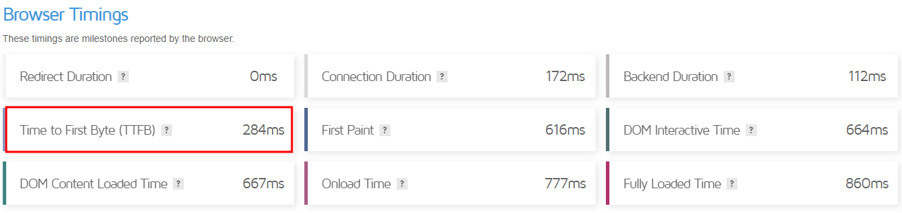
Like most competitors, this web hosting company offers a 99.9% uptime guarantee. It integrates user-friendly caching tools, LSCWP, and CDN to ensure good performance. As a result, it delivered a score of 284 ms of TTFB, as shown in the GTmetrix speed test result below.
GreenGeeks security features include Imunify360 integration and DDoS protection. In addition to the free daily backups, its Pro and higher-tier plans offer on-demand backup features. In case of an incident, you can request a backup restore over the ticket system.
This web hosting company lets users manage their WordPress hosting package using WP-CLI. Aside from that, it provides a staging environment and WordPress repair tools. On top of all, GreenGeeks’ Quick Launch Wizard helps ease your website management process.
GreenGeeks offers three WordPress plans – Lite, Pro, and Premium. The starter plan costs $2.95/month and lets users host one website and utilize up to 50 GB of storage. Opt for the other two plans if you wish to host unlimited websites and use unlimited storage.
Regarding customer care, GreenGeeks offers phone, live chat, and email ticket support. Or you can peruse its blog tutorials, webinars, and extensive knowledge base.
9. Liquid Web
Features From 15 GB of storage From 2 TB of bandwidth iThemes Security Pro and iThemes Sync integration Beaver Builder LitePlugin Performance Monitor An SSL certificate and migration services 30-day money-back guarantee Try Liquid Web WordPress hosting.
Starting Price: $7.60/month
Rating: 4.6/5
Liquid Web’s WordPress hosting is powered by Nexcess, its custom-built digital commerce cloud platform. Liquid Web also prefers cPanel for its users.
Liquid Web tops its competitors by offering an SLA-backed 100% uptime guarantee. In terms of performance, this best WordPress hosting company provides image compression tools combined with its custom configuration. Liquid Web’s GTmetrix test results showed a score of 206 ms of TTFB.
All their plans include iThemes Security Pro which provides increased login security, spam filtering, and vulnerability monitoring, available on all plans. This best WordPress host incorporates a plugin performance monitoring feature, ensuring protection from malicious plugins.
Its Beaver Builder Lite integration, on the other hand, lets users easily create websites using pre-made templates. Liquid Web also offers iThemes Sync for managing multiple WordPress sites.
Scalability is not an issue, as Liquid Web offers eight different WordPress hosting plans.
With its Spark starter plan at $7.60/month, users can host a single WordPress website and utilize 15 GB of storage and 2 TB of bandwidth. In terms of freebies, all plans include a free SSL certificate and migration services.
Liquid Web offers customer support over the phone, live chat, and email ticketing system. Other extensive resources include case studies, a knowledge base, a content hub, and blog tutorials. On a side note, Liquid Web is only available in the US and Europe.
10. Kinsta
Features 99.9% uptime guarantee From 10 GB of SSD storage From 25,000 visits/month Adminer integration An SSL certificate, CDN integration, migrations 30-day money-back guarantee Try Kinsta WordPress hosting.
Starting Price: $35/month
Rating: 4.2/5
Kinsta specializes in managed WordPress cloud-based hosting services, ensuring excellent WordPress site performance.
Kinsta offers an SLA-backed uptime guarantee of 99.9%. Regarding TTFB, Kinsta delivered a score of 171 ms on GTmetrix. Some of its performance optimization tools include CDN and PHP workers. Additionally, you can activate Redis Cache for $100/month per website.
To boost its system security, Kinsta employs DDoS protection, anti-malware, and HTTP/3, among other features. The web hosting company runs automatic backups every one and six hours. Moreover, users can install external backup add-ons.
All of Kinsta’s best WordPress hosting plans come with staging tools. It also includes Adminer, a database management tool, to help website owners edit or run SQL queries easily.
Kinsta’s custom control panel, MyKinsta, incorporates a minimalist design for easier navigation. Users can view their WordPress hosting account information on the dashboard, including resource usage and data transfer.
Kinsta offers 10 different WordPress hosting plans or a custom one based on your requirements.
Its most basic plan, Starter, costs $35/month and allows for a single website under one WordPress installation. It comes with 10 GB of SSD storage, bandwidth equal to 25,000 visits, 2 PHP workers, and 100 GB of CDN.
Kinsta’s 24/7 tech support is available via live chat, WhatsApp, and email tickets. You can also opt for blog tutorials, its own knowledge base, and Kinsta Academy.
11. Flywheel
Features 99.9% uptime guarantee From 5 GB of SSD storage From 20 GB of bandwidth Quick CDN integration FlyCache custom caching tool A free SSL certificate and migration Multiple data centers worldwide 60-day money-back guarantee Try Flywheel WordPress hosting.
Starting Price: $13/month
Rating: 4.2/5 (G2 Review)
Flywheel provides managed WordPress hosting in four WordPress packages – Tiny, Starter, Freelance, and Agency. So whether you’re working on personal or professional projects, this WordPress host might have the right solution for you.
Flywheel’s WordPress hosting services integrate Fastly CDN and FlyCache. It lets users choose from its multiple data centers, including the US, Canada, and Australia. Thanks to the performance boosters, Flywheel’s speed test result on GTmetrix showed a score of 127 ms of TTFB.
In terms of server reliability, Flywheel guarantees 99.9% uptime. The web hosting company implements several security features, like plugin security alerts and a free SSL certificate. It performs nightly backups and incorporates an auto-healing feature for preventive measures.
Streamline your WordPress web design process with 10 pre-included StudioPress premium WordPress themes. All of Flywheel’s WordPress plans come with Genesis Framework, letting web developers and designers tinker with the site’s functionality.
Flywheel’s custom dashboard is easy to navigate. Therefore beginners can easily perform their day-to-day hosting management tasks. The Add-Ons menu contains one-click installers for third-party apps, including one for integrating Google Analytics.
Flywheel’s managed WordPress plans start at $13/month.
The Tiny plan has 5 GB of storage and 20 GB of bandwidth. It includes several freebies, including a SSL certificate and migration services. Regarding WordPress installation, Tiny and Starter plans allow for a single website, Freelance up to 10, and Agency up to 30.
With four WordPress hosting plans available, you don’t need to worry about scalability. Flywheel also has an option for a custom-tailored plan if its clients’ WordPress sites outgrow the Agency plan.
If you need any help, you can contact Flywheel’s customer support via live chat and email. Unlock the nine-to-five phone support and dedicated account manager by upgrading to Agency and Custom plans.
12. Cloudways
Features From 25 GB of SSD storage From 1 TB of bandwidth Cloudflare Enterprise Automated backups Free site migration and SSL certificate 3-day free trial 30-day money-back guarantee Try Cloudways WordPress hosting.
Starting Price: $11/month
Rating: 4.4/5
Cloudways offers managed WordPress web hosting services within the cloud environment. Users can choose from three cloud service providers – DigitalOcean, Amazon Web Service (AWS), and Google Cloud.
Its systems are available to customers 24/7. For more information, check Cloudways’ system status to see its performance statistics. Regarding server speed, Cloudways delivers a 755 ms of TTFB score on GTmetrix.
This provider safeguards its hosting infrastructure with a dedicated firewall, regular security patching, Cloudflare Enterprise, and 24/7 real-time server monitoring. Automatic healing and backups are also available, and you can set the preferred time interval for the latter.
Regarding WordPress optimization, Cloudways supports WP-CLI and lets you create a staging environment. You can also activate WordPress DDoS protection, starting at $4.99/month.
Cloudways has its own custom control panel. The graphical user interface enables beginners to set up and manage their cloud servers without writing a single line of code.
Cloudways’ DigitalOcean starter plan costs $11/month. This plan lets you utilize up to 25 GB of SSD storage and 1 TB bandwidth.
Scalability shouldn’t be an issue, as Cloudways offers 11 packages on its Standard WordPress hosting on DigitalOcean. Storage space ranges from 25 to 3840 GB, and the bandwidth allocation ranges from 1 to 12 TB per month.
Contact Cloudways’ support team through live chat or the ticketing system for further assistance. You may also want to use its extensive library of information, including blog tutorials, a knowledge base, eBooks, case studies, and the Facebook users group.
What to Consider When Choosing a WordPress Hosting Provider
Here are several factors to consider to get the best WordPress hosting services for your project:
Type of hosting. Generally, WordPress hosting is shared hosting optimized for the CMS. Many web hosting companies offer dedicated WordPress hosting on a VPS or cloud environment. Depending on your site’s requirements, choose your hosting type carefully to help your WordPress site thrive.
Uptime. To ensure 24/7 availability, choose the best WordPress hosting company with reliable servers. It should offer at least a 99.9% uptime guarantee so your website is accessible to visitors at all times.
Speed and performance. The fastest WordPress hosting providers should offer a positive user experience and helps improve your ranking on the search results.
Security. Your chosen hosting company should have strong security measures to safeguard your website from hacking attempts and other cyber security threats. Some essential security features include a firewall, DDoS protection, and anti-malware.
Customer support. At some point, you may need assistance to resolve any website or hosting-related issues. Therefore, choosing a provider offering a reliable and responsive 24/7 support team is essential.
Price. The cost of your hosting plan should be reasonable and within your budget. When researching a web host’s pricing, some factors include introductory fees, renewal rates, free trials, and a money-back guarantee.
Scalability: As your website grows, it will need more server resources to ensure great performance and maintain an excellent user experience. Thus, easy scalability should be on your priority list when choosing the best WordPress hosting plan.
Backup and restore options. Your web host should offer regular, automated backups as a preventive security measure. This feature lets website owners save a copy of their site data to restore their WordPress sites in case of any issues.
Control panel and user interface. An easy-to-use control panel, as cPanel alternatives, eases your website and hosting account management.
WordPress optimization features. Web hosts often include website speed accelerators, caching tools, and a staging area. Such features help WordPress sites grow in the best possible environment.
Reputation and user reviews, Research the hosting provider’s reputation and read user reviews on sites like Trustpilot and G2 to understand their reliability and customer satisfaction.
Roundup of the Best WordPress Hosting Providers
Let’s recap the 12 best WordPress hosting providers of 2023.
WordPress Hosting Providers
Starting Price
Key Features
Link to Website
$2.99/month
Extensive WordPress optimization tools WordPress AI Tools & autoupdates Powerful hPanel and Hostinger WordPress plugin Globally-distributed data centers Free Domain & free lifetime SSL
Choosing the best hosting service for WordPress is easier if you know what to look for. Several factors that should be on your checklist include WordPress-specific features, server uptime, loading speed, security measures, and pricing.
User-friendliness is also just as important. If this is your first time building a website, pick a provider offering a custom-built control panel for easier hosting management. Finally, choose a provider whose pricing is within your budget.
Our top picks include Hostinger and SiteGround. Both providers offer excellent WordPress hosting prices and solutions without compromising quality and important features:
Hostinger – offers feature-packed WordPress optimization tools, custom-built hPanel, and a free lifetime SSL certificate.
SiteGround – unmetered traffic, SuperCacher caching tools, and daily backups.
Hopefully, this article has been helpful. If you have any further questions, leave us a comment.
WordPress Hosting FAQ
This section answers some of the most commonly asked questions about WordPress hosting.
What Is WordPress Hosting?
A WordPress hosting service offers an optimized environment for the content management system (CMS). Website owners can choose between managed and unmanaged WordPress hosting services, depending on their experience.
With managed WordPress hosting, your web host will take care of the maintenance and administrative aspects of the service, including performing important updates and security tasks.
With unmanaged WordPress hosting, users are responsible for their site’s performance and safety but have more control over their website configuration.
What Are the Different Types of WordPress Hosting?
WordPress hosting can be based on several hosting infrastructures, including shared, cloud, or VPS. It can also use a dedicated server. DreamHost is one of the few providers that offers dedicated WordPress hosting.
What Factors to Consider When Choosing a WordPress Hosting Provider?
To get the best WordPress hosting solution for your project, consider its ease of use, server reliability, security measures, price, customer support, and user reviews.
Study WordPress-focused features, such as staging tools, WP-CLI, and one-click WordPress installation along with third-party app features.
How Important Is Website Speed and Performance for a WordPress Website?
Consequently, website owners should track and optimize their WordPress website speed to generate more traffic, newsletter subscribers, and overall sales.
How Much Should I Pay For WordPress Hosting?
Our findings show WordPress hosting can cost as little as $1.99 or more than $1,000/month for large-scale websites. However, always choose one that fits your budget to avoid paying for resources your site doesn’t need.
Regarding the total cost of building a WordPress website, the price range falls between $30 and $400. This depends on your chosen WordPress plan and third-party integrations.
What Kind of Customer Support Should I Expect From Dedicated WordPress Hosting?
Phone calls, live chat, and email tickets are popular communication channels. You can also look into a web host’s other options, including blog tutorials, video tutorials, a community forum, and a knowledge base.
What Security Measures Should I Look For Regarding WordPress Hosting?
Must-haves include an SSL certificate, DDoS protection, anti-malware, and a firewall. You should also opt for a WordPress host with a dedicated backup and restore policy to prevent data loss.
Can I Upgrade or Downgrade My WordPress Hosting Plan?
You should be able to scale your WordPress plan easily and at anytime. However, this process highly depends on the provider. Contact its customer service for more information regarding this question.
What Backup and Restore Options Are Available With WordPress Hosting?
Backup and restore options highly depend on your chosen provider. Generally, WordPress hosting plans offer automated or scheduled backups, which can initiate daily, weekly, or monthly.
In terms of restore options, WordPress hosting providers often provide a one-click restore button. Sometimes, they may also have a dedicated auto-healing feature.
What Kind of Control Panel and User Interface Should I Expect With WordPress Hosting?
More often than not, a web host has an easy-to-use custom control panel to help clients manage their hosting accounts. Still, some providers offer other control panel options, including the popular cPanel.
What Kind of Optimizations Do WordPress Hosting Providers Offer for WordPress Websites?
Some of the best hosting sites for WordPress often include custom-built caching tools, options for image compression, and CDN integration to ensure optimal performance. Some providers also collaborate with third-party performance optimization plugins like JetPack and LSCWP.
How Do I Migrate an Existing WordPress Website to a New Web Hosting Provider?
Usually, you can utilize your new provider’s free migration services by submitting a request ticket during the setup process. If such a service is unavailable, your hosting provider might have a free migration tool accessible from the hosting control panel.
How Important Are Hosting Provider’s Reputation and User Reviews?
A hosting provider’s reputation and user reviews are key indicators regarding service quality. Customer satisfaction represents how well a company’s product or service meets its expectations. Therefore, don’t forget to read through users’ reviews on review sites like Trustpilot or G2.
What Kind of Uptime Guarantee Should I Expect From a WordPress Hosting Provider?
The industry benchmark for server uptime guarantee is 99.9%. The higher the percentage, the higher a website’s availability throughout the year.
How Can I Ensure My Website Is Optimized for Search Engines With My Chosen WordPress Hosting Provider?
The two critical indicators include fast page load time and responsive website design. Also, if your chosen WordPress web hosting provider offers dedicated SEO tools, it’s a good sign that you’re going with the right choice.
As a WordPress agency, you’re well aware of the challenges of creating stunning websites that fulfill the unique requirements of your clients. In general, the process of building a website can be time-consuming and complex. Fortunately, you don’t have to worry about that! Because Stackable makes the whole website creation process a breeze.
According to W3Techs, WordPress is now powering an impressive 43.2% of all websites, which is up from 39.5% in 2021. It means that every 2 out of 5 websites use WordPress.
With the increasing popularity of WordPress, it becomes crucial for WordPress agencies to employ tools that enhance their web design projects. And without a doubt, Stackable rises to this challenge by offering an extensive array of features and benefits that optimize the creation of websites.
In this article, we’ll delve into the core functionalities of Stackable, exploring how it can revolutionize your workflow and propel your agency’s success in creating visually impressive and highly functional websites faster and more efficiently. So, without further ado, let’s get started.
Stackable: Empowering WordPress Agencies to Create Exceptional Websites
For a WordPress development agency, creating highly customizable and functional websites is imperative, as every client has their own unique requirements. That’s where Stackable plays a crucial role. Unlike other WordPress plugins and themes, Stackable offers a lightweight, feature-packed, and highly customizable solution that can completely change how you build websites.
Furthermore, with its broad library of pre-designed WordPress custom blocks, design options, and performance optimizations, Stackable has quickly become an indispensable tool for WordPress agencies, developers, and WordPress experts.
To showcase the versatility of Stackable, let’s take a look at some examples of websites that you can design with Stackable in various industries and styles:
Portfolio Website: You can build an impressive dynamic portfolio website that exhibits your projects and tells your story, helping you leave a lasting impression on prospective clients and collaborators.
Blog Website: A stylish blog with engaging, interactive elements that encourage user engagement
Business Website: A professional-looking corporate website that showcases the company’s expertise and services
Brand Website: A custom-built brand-focused website that captures the essence of your brand and leaves a lasting impression on your audience.
10 Ways Stackable Can Benefit WordPress Agencies in Building Stunning Websites
Stackable is much more than just a collection of WordPress Blocks. It is a complete companion to the WordPress editor (Gutenberg Editor) that provides a wide range of components and tools to help you with every aspect of web design. Below, we will discuss each feature in detail and how it can benefit WordPress agencies and developers in building highly customized and stunning websites quickly.
#1: Stackable Blocks: The Building Blocks of Your WordPress Website
With Stackable, you get a diverse variety of WordPress blocks that are fully functional and provide a robust foundation for any website. These blocks cover several functionalities and are compatible with the WordPress block editor, Gutenberg, and other WordPress block plugins. This ensures seamless integration with your existing setup and allows WordPress professionals and WordPress service providers to easily build highly custom websites.
Essential blocks like Advanced Heading, Button, and Columns/Container allow for creative typography, stylish buttons, and complex layouts. Special blocks such as Accordion, Social Buttons, and Card offer unique functionalities to enhance interactivity and information presentation. Additionally, section blocks such as Blockquote, Call to Action, and Hero enable you to create impactful sections that catch your visitors’ attention.
By leveraging Stackable’s versatile blocks, you have the flexibility to build captivating websites that align with your vision and exceed your client’s expectations.
#2: Stackable Design Library: The Source of Your Inspiration
In website design, inspiration plays a crucial role in creating visually captivating and engaging websites. That’s where Stackable’s design library shines. By offering a wide selection of UI kits, over 400 pre-made block designs, wireframes, and separators, Stackable offers a treasure trove of pre-designed templates to ignite your creative spark.
Imagine having access to a wide range of beautifully crafted designs, ready to be customized and tailored to your preferences and needs. Whether you’re a WordPress agency or an expert in the field, the design library serves as a constant source of inspiration, helping you overcome creative blocks and streamline your workflow.
The design library covers a spectrum of styles and caters to diverse industries, ensuring that you can find the perfect design elements for your projects. Stackable’s design library has everything from sleek and modern designs to elegant and minimalist layouts.
#3: Stackable Design Options: A Toolkit to Unleash Your Creativity
To fine-tune your web creations and elevate your page-building experience, you can choose from a wide variety of design features. With both basic and advanced design options, you can create unique and visually appealing websites intended to meet the individual preferences of your clients.
Some of the most powerful and unique design options include:
Block Layouts: Choose from various layout options for each WordPress block.
Flexible Icons: Add and customize icons to enhance your content.
Copy-Paste Styles: Quickly apply styles across different blocks.
Global Settings: Set consistent styles across your entire website.
The intuitive interface makes it easy to apply these design options and create truly bespoke websites.
#4: Stackable Web Performance: Optimizing Speed and Quality of Your Website
One of the main concerns for web designers is the performance of the websites they create, and in the case of WordPress agencies, this can either make or break a project. Fortunately, Stackable addresses this issue by offering a lightweight and fast plugin that does not compromise speed or quality.
By using minimal code, loading assets on demand, and utilizing SVG icons, Stackable ensures optimal web performance. This is particularly important when working with the Gutenberg Editor and WordPress block editor, as it allows you to build websites that load quickly and provide a seamless user experience.
Moreover, Stackable focuses on improving SEO and user experience by reducing page load time and increasing accessibility. Therefore, the websites you build with Stackable will look great, perform well in search engine rankings, and engage users effectively.
#5: Stackable Dynamic Content: Give Your Website A Personal Touch
Customization is key to website building, and Stackable offers a whole new level of customization. It enables you to create dynamic websites using its blocks in combination with dynamic sources, conditional displays, custom fields, and query loops. This powerful feature allows you to tailor the content of your website based on specific conditions or data sources.
For WordPress developers and agencies working with clients in various industries, the ability to incorporate dynamic content is invaluable. Whether you need to display the latest posts with metadata, integrate with custom fields from tools like Advanced Custom Fields (ACF) or JetEngine, or create custom post loops, Stackable has the tools to make it happen seamlessly within the WordPress block editor.
#6: Stackable Hover Styles and Animations: Elevate Engagement on Your Site
To truly engage visitors and make your websites stand out, you cannot ignore the importance of interactivity and motion. To make it easier for you, Stackable offers various hover effects and animations that can enhance your designs and provide a more immersive experience for website visitors.
You can leverage these hover styles and animations to add visual flair and draw attention to specific elements on their websites. With Stackable, you can easily apply and customize these effects, ensuring that your websites leave a lasting impression on visitors.
#7: Stackable Blog Post Block: Make Your Content Stand Out
Blogging is an integral part of many websites, and Stackable understands how important it is to present blog posts effectively. With its Blog Post Blocks, you can create visually captivating and engaging blog layouts, making your content stand out. You can choose from a variety of block layouts, such as Default, List, Image Card, Horizontal, and more. On top of that, it offers you the flexibility to present your latest blog articles in a style that suits your website’s aesthetic.
Additionally, not only can you showcase your latest blog posts, but you can also highlight different portfolio categories and feature-specific articles. The block offers comprehensive styling options, including content arrangement, displaying specific posts or categories, featured images, meta information, category tags, titles, excerpts, etc.
Therefore, whether you’re running a personal blog, a professional website, or an online magazine, the Stackable Blog Post Block empowers you to make your content shine and leave a lasting impression on your audience.
#8: Stackable Agency Tools: Transforming Client Ideas Into Reality
When it comes to running a successful WordPress agency, effectively managing projects, protecting designs, and ensuring seamless collaboration are essential. Stackable recognizes the importance of these aspects and offers a suite of agency tools designed to turn your client’s vision into reality.
With features like premium support, role management, and block CSS customizers, Stackable helps you safeguard your work, save time and money, and ensure smooth collaboration within your team.
#9: Stackable Integrations: Expand Your Website’s Functionality
To further enhance the functionality and compatibility of Stackable, the plugin integrates with other popular plugins and services. Some of the most useful integrations include:
JetEngine: Empower your WordPress website with advanced data management capabilities and unlock the potential of the dynamic content display via Stackable’s cutting-edge, dynamic functionality!
Google Fonts: Create beautiful and unique website typography and preview fonts before applying them to your pages.
Toolset: Create custom post types and fields with Toolset and display them with Stackable blocks.
Meta Box: Add custom fields and meta boxes to your posts and pages with Meta Box and display them with Stackable blocks. You can create dynamic and flexible content with Meta Box and Stackable.
WPML: With free WPML integration, you can create multilingual websites effortlessly, which offers a comprehensive solution for translating your entire site and seamlessly switching between languages.
Blocksy: Build beautiful websites with Blocksy’s theme and use Stackable blocks to add more functionality and style. You can create impressive websites with Blocksy and Stackable.
These integrations are designed to enhance your WordPress development projects and provide you with a comprehensive toolkit to deliver exceptional websites to your clients.
#10: Stackable Support, Community & Updates: Supporting Your Success in WordPress
When you choose Stackable for your website-building journey, you can count on their support that won’t disappoint you. Their premium customer support provides personalized assistance through live chat and email, so any inquiries or technical concerns get addressed promptly.
But it doesn’t stop there. Joining the Stackable community connects you with a network of like-minded WordPress enthusiasts and experts. Collaborate, exchange ideas, and gain insights from a vibrant community that fosters inspiration, growth, and continuous learning. Moreover, they prioritize keeping Stackable up to date with regular plugin updates. Thus, you always get the latest features, performance improvements, and compatibility improvements to stay ahead of the competition.
With Stackable, you not only get an all-in-one website-building solution, but also a comprehensive support system, a thriving community, and ongoing updates that are designed to help you succeed.
To Sum It Up
As a WordPress service provider, it is crucial to fulfill the unique needs of each client. The problem is, building websites can be time-consuming and complicated, leaving you feeling overwhelmed and frustrated.
But don’t worry! With Stackable, you can create visually impressive and highly functional websites without any hassle. It is exclusively designed for WordPress agencies like yours and solves your challenges by providing a feature-rich, lightweight, and highly customizable solution.So, don’t let website building be a headache any longer. Give Stackable a try today! Revolutionize your workflow and empower your agency to create visually impressive websites effortlessly.
When it comes to engaging and captivating website visitors, the layout and presentation of the content is as crucial as the content itself. There are now many ways to present information—one of them being a carousel.
Carousels are very versatile because it can be utilized in different use cases, like storytelling, presenting a gallery, or highlighting featured content. With this in mind, Stackable brings to you our new Carousel block—a dynamic and highly customizable tool to showcase content on your website through sliders and carousels.
In this article, we will introduce you to the power-packed features of the Carousel block and what you can create with it.
What is a Carousel or Slider?
A carousel, often synonymous with a slider, allows you to display multiple pieces of content (such as images, text, videos) in a rotating or sliding format. It saves space, keeps the design uncluttered, and enables the audience to interact with or consume content in an engaging manner.
Stackable’s Carousel Block
We’ve made creating carousels and sliders very effortless and easy. With the Carousel block, you don’t need any coding knowledge or separate slider plugins. Here’s what makes Stackable’s Carousel block a great asset for any web creator:
What are the features of the Carousel block?
Customizable
You can add literally any block inside the Carousel block. Whether it is text, images, videos, buttons, or a combination of these elements. Simply add a block by clicking the plus button like in the video below:
If you want to add more blocks, just select the Inner Column and click on the inserter.
Autoplay and Looping
Stackable’s Carousel block has an autoplay toggle that will slide content automatically after a set interval. This is so that you can display the different slides without requiring any interaction. When the autoplay toggle is turned on, it also automatically loops the carousel so that when the carousel reaches the last slide, it loops back to the first.
You will find this setting by navigating to Layout tab > Layout Panel.
Transition Effects
You can set what type of carousel you will be displaying on your page with the Carousel Type controls.
Here’s what it looks like when the carousel is set to Slide.
And with the slide option, you can also set the carousel to show one or more slides at a time.
On the other hand, here is an example of a carousel with the Fade option selected.
User Control
You can opt to add some controls so that website visitors have the ability to manually navigate through a carousel. You can even further customize how the dots look like in the Inspector.
Responsiveness
The Carousel block can be made responsive to adapt to different screen sizes and devices. On smaller screens, the carousel may resize or show fewer items at once.
How to Create a Slider or Carousel using Stackable’s Carousel Block
To get started, simply add the Carousel block to where you want your slider to appear. From there, you can start adding slides, customizing content, and styling the appearance and animations.
Here’s an example of a Carousel block:
We’ll teach you how easy it is to recreate this slider using the Stackable Carousel block. Below is a sample homepage for a yoga studio. We’ll add a carousel as its hero section and we’ll walk you through how to create it.
First add the Carousel block. Heading over to the Layout tab > Layout Panel, we’ve adjusted this to have one column for now and set the Block and Content Widths to Align Full.
Moving on to the content inside the carousel, we’re adding a Columns block. We’ve selected the 50 / 50 option for this, however, in the Layout tab > Layout panel, we’re adjusting the widths to be 40 / 60 to allot space for our image. Selecting the right inner column, we’ve headed to the Advanced tab > Position panel and set the Right position to 100. Selecting the inner column on the left, we stayed in the Advanced tab > Position panel and set the Z-index to 2 so that it will appear on top of the right column. Going further, we’ve set the left position to 100.
Now let’s add content to our columns inside the first slide of the Carousel block. Inside the right inner column, we’ve added the image and set the height to 600. We’ve also added a beige overlay. Inside the left inner column, we’re adding a heading and a button.
For the button, we headed to the Style tab > Styles panel and selected the Ghost option. We set a custom color for the text and the border. We’ve also changed the font to Hind and changed the transform to Uppercase.
Finally, we just need to change the alignment of the left inner column so it’s centered vertically. Select the Inner Column block, and in the Layout tab > Layout Panel, select Center for the Column Alignment.
Going back to the Carousel block, we navigated to the Layout tab > Layout panel. For the Slides control, we made sure the Clone button was selected and changed the slide number to 3. This was done so that the new slides will clone what we’ve added in the first slide. This makes it so much easier and faster to reproduce similar content.
Now all that’s left to do is to change up the content of each of the slides, such as the heading texts, button texts, and the images.
To finish up, let’s make some finishing touches for our carousel. We’ll leave the Autoplay toggle turned on and the speed as it is so that our carousel plays automatically when users visit this website.
Moving on to the Style tab, we toggled the arrows off and finally, customized the dots to make it cohesive with the rest of the website motif.
Once that’s done, save your draft (or publish) and preview how your Carousel block looks like! Wasn’t that easy?
Conclusion
The Carousel is a great way to showcase content on your website. Thanks to Stackable’s Carousel block, you have a powerful and customizable tool for creating engaging web content. With its ease of use, versatile content options, and customizable features, it’s a fantastic asset for any web designer or content creator using WordPress. Slide into an exciting new way to present your content with the Stackable Carousel block!


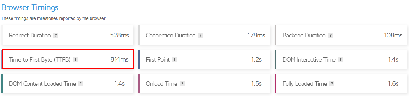