Email Message Patterns are an excellent way to view messages sent through your Divi Contact Forms. You have full control over the layout design and content, so you get the exact information you want in the way you want it. In this post, we’ll see how to create a Message Pattern in your Divi Contact Form Module and explain how to use it.
What is a Message Pattern?
The Message Pattern is a template for the email message. It specifies how the message looks and what information it includes when you receive it in email. It can include text that you specify and the content of any of the fields in the form. The Message Pattern is not required, but it is helpful. Simply leave it blank for the default pattern.
Why Use a Message Pattern?
Utilizing a message pattern is a great way to streamline your workflow. You’ll have the exact information you want in the layout you want.
Where to Find the Email Message Pattern
To find the email Message Pattern field, open the Contact form Module by clicking the dark gray gear icon that appears on hover. For this example, I’m using the Contact page from the free Home Baker Layout Pack that’s available within Divi.

Next, scroll down to the section labeled Email. Here, you’ll find two fields. The first is Email Address. This is the address of the message that will be sent. The second field is called Message Pattern. Enter your pattern into this field.

When a message is sent to the email address that you’ve imputed into the Email Address field, it normally includes only the content in the Message field. For example, I’ll send this message:

The result is an email with who it’s from, as normal, but the body of the content only shows the message itself.

How to Create a Message Pattern
We can adjust the content of the email by creating a Message Pattern. You can add text and specify the fields you want to include. To include a field, add two percent symbols to both sides of the field’s ID. For example, to include the field with the ID-name, use %%name%%. We’ll see how to find the Field ID in the next section.
You can create a template with text, spaces, and the form content. Add your text around the field names and include spaces for the fields. For example, I am %%name%% and my message is %%message%%.
When I add this Message Pattern to the example from above, we get a different email. This pattern includes text, field IDs, and extra spaces.
Here is the message from %%name%%, email %%email%%.
Message: %%message%%

The result is an email with more information and a layout that makes more sense. It’s the same information that was submitted in the form in the section above, but now it shows more of the information and places it in a layout that’s easy to read, which is the layout I created with the Message Pattern.

How to Add New Fields
Each field in the Contact Form Module is a submodule with its own settings. To create a new field, go to the Contact Form Module’s content tab and click Add New Field under all the form’s submodules.

Text
Under Text, enter the Field ID and the Title. The Field ID is the label you’ll use to create the Message Pattern. This is a unique ID and should only use English characters with no special characters or spaces. The Title field can be used to define the content. It doesn’t have to be a unique title or match the Field ID, but it is best if it’s unique to make it easier to understand.

Next, scroll down to options and select the Field Type. Choose any settings you want for the field. Click the green check at the bottom or return arrow at the top to return to the regular Contact Form Module settings.

Finally, add the new field to the Message Pattern with any text you want to include. Close the module and save your settings.

How to Test the Message Pattern
Finally, test your Message Pattern to ensure it works how you want. Simply fill out the form yourself and go to the email address you used for the email field to view the Message Pattern.

You’ll receive the message in your email inbox so you can know if you like the design or not.

Creating a Well-Designed Message Pattern
The Message Pattern should be constructed in a way that you get the most out of it. This is for your use, so design it the way you need to see it.
Be sure to use whitespace to make the email easier to read and use. The Message Pattern includes all spaces that you add to the pattern. You can use spaces to create the exact layout you want.
Restaurant Reservation Message Pattern Example
Let’s see an example of a Message Pattern for a restaurant reservation. For this example, I’m using the landing page from the free Poke Restaurant Layout Pack that’s available within Divi. I’ll replace the reservation button with a new Contact Form Module. We’ll keep the form simple for this example.
Here’s how the layout looks before adding the Contact Form Module.

Change the Title Text
First, edit the Title Text to show “Make a Reservation.†Highlight the portion of text you don’t want and click the Delete key.

Delete Row
Next, delete the Row with the buttons. We’ll use the style of the left button, but we don’t need these buttons.

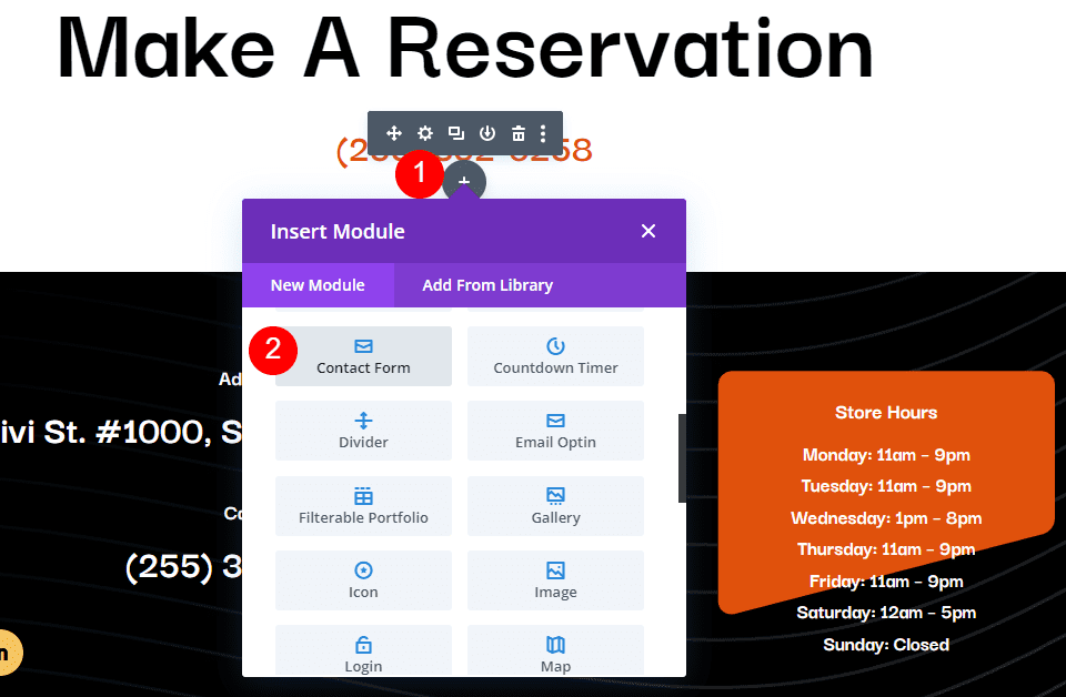
Add a Contact Form Module
Next, add a Contact Form Module under the phone number Text Module.
Add New Fields
Now, remove the Message Field and add a new Field by clicking Add New Field.

Change the Field ID to Phone, the Title to Phone Number, and use Input Field as the Type. For Allowed Symbols, select Numbers Only. Close the submodule.
- Field ID: Phone
- Title: Phone Number
- Type: Input Field
- Allowed Symbols: Numbers Only

Add another Field, change the Field ID to Guests, the Title to Number of Guests, and use Input Field as the Type. For Allowed Symbols, select Numbers Only. Close the submodule.
- Field ID: Guests
- Title: Number of Guests
- Type: Input Field
- Allowed Symbols: Numbers Only

Add another Field and change the Field ID to Day, the Title to Day of Visit, and use Select Dropdown as the Type. Enter the name of each day for the options. Close the submodule.
- Field ID: Day
- Title: Day of Visit
- Type: Select Dropdown
- Options: add days

Add another Field and change the Field ID to Time and the Title to Time of Visit. Select Radio Buttons for the Type. For the Options, add the possible times. Close the submodule.
- Field ID: Time
- Title: Time of Visit
- Type: Radio Buttons
- Options: possible times

Text
Now, we’ll adjust the form. Under Text in the Content tab, change the Submit Button text to Book a Table.
- Submit Button: Book a Table

Email
Next, scroll down to Email and enter the address where you want to receive the email in the Email Address field. Also, create the Message Pattern. I’ll create a pattern that provides the name first, skip a line, and then show the day, time, and number of guests. After this, it will skip a line, show a heading for the contact information and then list the information.
The Message Pattern looks like this (complete with spaces):
Reservation for %%name%%
Day: %%day%%
Time: %%time%%
Number of Guests: %%guests%%
Contact Information
%%email%%
%%phone%%

Spam Protection
Scroll down to Spam Protection and disable it.

Fields
Now, let’s style the module. First, go to Fields in the Design tab. Change the Background color to rgba(255,255,255,0) and the Text Color to black.
- Background Color: rgba(255,255,255,0)
- Text Color: #000000

For the Fields Padding, add 13px for the Top and Bottom and 30px to the Left and Right. Change the Font to Darker Grotesque and set the Weight to Medium.
- Fields Padding: 13px Top and Bottom, 30px Left and Right
- Font: Darker Grotesque
- Weight: Medium

Change the Size to 24px for desktops, 18px for tablets, and 14px for phones. Set the Line Height to 1.4em.
- Size: 24px desktop, 18px tablet, 14px phone
- Line Height: 1.4em

Button
Next, scroll down to Button and select Enable Custom Styles for Button. Change the Text Size to 17px, the Text Color to black, and the Background to #f6c85d.
- Enable Custom Styles for Button
- Text Size: 17px
- Text Color: #000000
- Background: #f6c85d

Set the Border Color to #f6c85d and the Button Letter Spacing to 0.16em. Change the Font to Darker Grotesque, the Weight to Ultra Bold, and the Style to TT.
- Border Color: #f6c85d
- Button Letter Spacing: 0.16em
- Font: Darker Grotesque
- Weight: Ultra Bold
- Style: TT

Change the Button Padding to 12px for the Top and Bottom and 20px for the Left and Right.
- Button Padding: 12px Top and Bottom, 20px Left and Right

Sizing
Next, scroll down to Sizing, change the Width to 60%, and set the Module Alignment to Center.
- Width: 60%
- Module Alignment: Center

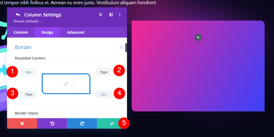
Border
Finally, scroll down to Border. Add 5px to the Rounded Corners, 2px to the Border Width, and make the Border black. Close the module, save your settings, and test your form.
- Inputs Rounded Corners: 5px
- Border Width: 2px
- Color: #000000

Message Pattern Results
Here’s how our message looks in the form and in the email that I received.
Message in the Form

Message in the Email

Ending Thoughts
That’s our look at how to create a message pattern in your Divi Contact Form Module. Creating Message Patterns is easy to do with Divi’s Contact Form Module, and they’re great for organizing the information within the emails themselves. Following a few simple steps is all you need to create your own email Message Patterns.
We want to hear from you. Have you created a message pattern in your Divi Contact Form Module? Let us know about your experience in the comments.
The post How to Create a Message Pattern in Your Divi Contact Form Module appeared first on Elegant Themes Blog.


