EDITS.WS

Tag: Divi modules

  • How to Add Google Maps to Your Divi Website

    Google Maps is a software service that allows users to present maps to their audience. It’s faster than embedded maps and, if you’ve integrated it with Divi, it’s easier to use. The Divi Builder includes two Map Modules that make presenting Google Maps a simple process. In this post, we’ll see how to add Google Maps to your website using the Google Maps API Key and the Divi Map Module.

    Let’s get started!

    Preview

    First, let’s look at what we’ll build in this post. I’ll add a Map Module to a current Divi layout and style it with elements from the layout.

    Google Maps Desktop

    Google Maps Desktop

    Google Maps Phone

    Google Maps Phone

    How Google Maps and APIs Work

    While it’s possible to simply embed a Google Map into a Divi page or template, the Google Maps API gives developers more control. Maps that use the Google Maps API load faster and you can apply custom colors, create custom markers, and more.

    To prevent unauthorized access, the Google Maps Platform utilizes API keys. Obtaining and using a Google Maps API is simple. To create a key, go to the Google Maps Platform Credentials page and select or create a project. This project will be used to contain your Google Maps API, so be sure to give it a name that’s easy to understand.

    How Google Maps and APIs Work

    Next, click Create Credentials at the top of the page and select API Key from the menu. The Credentials link won’t appear until you have a project selected.

    How Google Maps and APIs Work

    Next, you’ll see a modal with your API Key. You can copy your API Key and close the modal. You can also restrict the key. This keeps others from using it. I recommend restricting the API Key to prevent unauthorized use. Click Edit API Key.

    How Google Maps and APIs Work

    Under API Restrictions, click Restrict Key, choose which key to restrict, and save it. Copy the key in the upper right corner of the page. You can now paste the API key into Divi.

    How Google Maps and APIs Work

    How to Integrate Google Maps in Divi

    To integrate your Google Maps API Key into Divi, go to Divi > Theme Options in the WordPress dashboard. In the General tab, you’ll see a field labeled Google API Key. Paste the key into the field and save the settings.

    How to Integrate Google Maps in Divi

    Google Maps is now integrated into Divi, and you can add a Google Map to your Divi page or template. Your Map Modules automatically access the key, so you won’t need to add it again. You will be able to replace the key for each module if you want.

    How to Add a Google Map to Your Page or Template

    You can add the Google Map to your Divi pages and templates in several ways. The best option with the most features is to use the Map Modules. Divi has two Map Modules to choose from and the process of adding the map is the same. Both include map pins and styling features.

    Since we’ve added the API to Divi’s Theme Options, the Map Modules already contain your Google Maps API. All we need to do is add an address and the pins we want.

    How to Add a Google Map to Your Page or Template

    The process is simple. Enter the address you want to show in the center of the map and select Find. The map will fill in.

    How to Add a Google Map to Your Page or Template

    Let’s add a map to a page to see how it works.

    Regular Map Module vs the Fullwidth Map Module

    We can use the regular Map Module or the Fullwidth Map Module. The work is the same. Both look amazing and the one you choose just depends on the design you want. The regular Map Module lets you style the background and easily add other modules to the Row.

    The Fullwidth Map Module uses the entire width. It’s shown here with regular sections above and below it.

    How to Add Google Maps to Your Divi Page

    Now, let’s see how to add a Google Map to a page or template. The work is the same for both pages and templates. I’ll create a page using the Contact page from the free Photography Studio Layout Pack that’s available within Divi.

    For reference, here’s the original page. I’ll add a new section for the map between the two sections using design cues from the layout pack.

    How to Add Google Maps to Your Divi Page

    Add a Regular Section and Row

    First, add a Regular Section between the two sections. This is where we’ll add the map.

    Add a Regular Section and Row

    Open the Section’s settings, go to Background, and change the Background Color to #f6f5ee. Close the settings.

    • Background Color: #f6f5ee

    Add a Regular Section and Row

    Next, add a single-column Row to the Section.

    Add a Regular Section and Row

    Add a Text Module

    Next, we’ll add a Text Module to create a title for the map.

    Add a Text Module

    Content

    Change the Content-type to Heading 4 and add the title to the body content area.

    • Content-Type: Heading 4
    • Body: Location

    Add a Text Module

    Heading Text

    Next, click on the Design tab and scroll down to Heading Text. Choose Heading Level 4 and select Inter for the Font. Set the Weight to Bold and the Style to TT.

    • Heading Level: H4
    • Font: Inter
    • Weight: Bold
    • Style: TT

    Add a Text Module

    Change the Font Color to #ff5a17, the Size to 14px, the Letter Spacing to 1px, and the Line Height to 1.4em. This is it for the title. We can now close this module.

    • Color: #ff5a17
    • Size: 14px
    • Letter Spacing: 1px
    • Line Height: 1.4em

    Add a Text Module

    Add a Map Module

    Now it’s time to add a Map Module to our layout. Add the module in the Row under the Text Module. In my case, the icon to add a module appears under the Row icon. There’s an easy way around this. Simply right-click (for Windows users, control-click for Mac) and select Go To Layer. This opens a Layers View that’s easy to navigate and use.

    Add a Map Module

    Open the Section, Row, and Column to see the Text Module. Click the plus icon next to the Text Module to add a new module.

    Add a Map Module

    This opens the standard module modal where you can select your modules. Add the Map Module as normal and close the Layers view. The Map Module appears under the Text Module just as we wanted.

    Add a Map Module

    You’ll see the Google Maps API Key already entered and ready to use. Next, enter the address you want to show in the Map Center Address field. Click the Find button to tell the module to search the map for this address. If you do need to use a different API Key than what you’ve entered as the default key in the Divi Theme Options, select Change API Key.

    • Map Center Address: the address of the location you want to display

    Add a Map Module

    The module will search for the location and display it on the map. If there’s an error, return to the Google Maps Platform to see any issues with your API Key.

    Add a Map Module

    Border

    Next, go to the Design tab and scroll down to Border. Change the Width to 2px and set the Color to black. Close the module and save your settings.

    • Width: 2px
    • Color: #000000

    Add a Map Module

    Results

    This was a simple design, but it works well with the layout.

    Google Maps Desktop

    Google Maps Desktop

    Google Maps Phone

    Google Maps Phone

    Ending Thoughts

    That’s our look at how to add Google Maps to your Divi website. The Google Maps API Key is easy to add to Divi. Once the API Key is added to Divi, every Map Module automatically accesses the key. You can even change the API Key on a per-module basis if you want. All you’ll ever need to do is add the address you want your Map Module to display. It loads faster than embedding, provides lots of styling options, and you can show any number of maps in your Divi pages and templates.

    We want to hear from you. Have you added the Google Maps API to your Divi website? Let us know about your experience in the comments.

    The post How to Add Google Maps to Your Divi Website appeared first on Elegant Themes Blog.

  • How to Create Matching Portfolio & Projects with Divi

    If you are a creative or run a service-based business, you may want to create a portfolio website to showcase your experience and display your projects. Having an online portfolio can help you be discovered by potential clients and can establish your credibility. You can use project pages to demonstrate your process and the ideas behind your work, helping visitors imagine what it might be like to work with you.

    In this tutorial, we will show you how to create a matching portfolio and project page with Divi. We will use dynamic content for the design of the portfolio page so that you can quickly and easily add new projects to your portfolio without having to design a project page each time. We’ll highlight using the powerful Divi Filterable Portfolio Module as well!

    Let’s get started!

    Sneak Peek

    Here is a preview of what we will design

    Portfolio Page

    Divi Matching Portfolio and Projects Portfolio Page Final Design

    Divi Matching Portfolio and Projects Portfolio Mobile Final Design

    Project Page

    Divi Matching Portfolio and Projects Project Page Final Design

    Divi Matching Portfolio and Projects Project Page Mobile Final Design

    What You Need to Get Started

    Before we begin, install and activate the Divi Theme and make sure you have the latest version of Divi on your website.

    Now, you are ready to start!

    How to Create Matching Portfolio & Projects with Divi

    Set Up Advanced Custom Fields Plugin

    For this design, we are going to be using dynamic content to create a template for our project pages. By using dynamic content in a template, you can create and update fully-designed project pages by filling out the custom fields associated with the project. You can use the built-in custom fields function in WordPress to do this, but it has some limitations. For this design we want multiple photos to dynamically populate, so we are going to use the Advanced Custom Fields Plugin to accomplish this. This plugin is free on the WordPress plugin directory and allows us to add powerful custom fields to the project pages.

    From the WordPress dashboard, navigate to the Plugins settings and click Add New. Then search for the Advanced Custom Fields Plugin, install, and activate.

    Divi Matching Portfolio and Projects Advanced Custom Fields

    Add Custom Fields

    Once the plugin has been installed and activated, open the Advanced Custom Fields settings and add a new Field Group. Add a title, then set the location rules and set the field group as active.

    • Title: Project
    • Location Rules: Show this field group if Post Type is equal to Project
    • Active: Yes

    Divi Matching Portfolio and Projects Edit Field Group

    Next, add the custom fields by clicking the blue Add Field button. For this tutorial, we will only modify the field label and type for each field. The first field will be the client name.

    • Field Label: Client Name
    • Field Type: Text

    Divi Matching Portfolio and Projects Add Field

    Next, add the following fields.

    • Field Label: Project Year
    • Field Type: Number
    • Field Label: Deliverables
    • Field Type: Text
    • Field Label: Project Description
    • Field Type: Text Area
    • Field Label: Image 1
    • Field Type: Image
    • Field Label: Image 2
    • Field Type: Image
    • Field Label: About Text
    • Field Type: Text Area
    • Field Label: Image 3
    • Field Type: Image
    • Field Label: Image 4
    • Field Type: Image
    • Field Label: Testimonial Text
    • Field Type: Text Area
    • Field Label: Testimonial Name
    • Field Type: Text
    • Field Label: Testimonial Job
    • Field Type: Text
    • Field Label: Image 5
    • Field Type: Image

    Divi Matching Portfolio and Projects All Fields

    Once you publish and save the custom fields, add a new project or edit an existing one. You should see the custom fields toward the bottom of the editing page. For this portfolio and project layout, fill out each of the custom fields and upload a featured image to the project. If you want to add a filterable portfolio, make sure the posts are categorized as well.

    Design Portfolio Page

    Now let’s get started with designing our portfolio page. We’ll start with a premade landing page and add a filterable portfolio module to it.

    Start With a Premade Layout

    Let’s start by using a premade layout from the Divi library. For this design, we will use the Print Designer Landing Page from the Print Designer Layout Pack.

    Add a new page to your website and give it a title, then select the option to Use Divi Builder.

    Divi Matching Portfolio and Projects Use Builder

    We will use a premade layout from the Divi library for this example, so select Browse Layouts.

    Divi Matching Portfolio and Projects Premade Layout

    Search for and select the Print Designer Landing Page.

    Divi Matching Portfolio and Projects Search Layout

    Select Use This Layout to add the layout to your page.

    Divi Matching Portfolio and Projects Use Layout

    Now we are ready to build our design.

    Add the Filterable Portfolio Module

    Add a new regular section below the image of the desk, above the orange “My Latest Prints” section.

    Divi Matching Portfolio and Projects New Regular Section

    Add a single row.

    Divi Matching Portfolio and Projects Insert Row

    Then, add the filterable portfolio module to the row.

    Divi Matching Portfolio and Projects Portfolio Module

    Open the section settings and add a background color.

    • Background: #eae8de

    Divi Matching Portfolio and Projects Background Color

    Next, open the filterable portfolio module settings. Under Content, set the post count to 6.

    • Post Count: 6

    Divi Matching Portfolio and Projects Post Count

    Under Elements, disable the title and categories.

    • Show Title: No
    • Show Categories: No
    • Show Pagination: Yes

    Divi Matching Portfolio and Projects Show Pagination

    Then, move to the design tab and open the Layout settings. Select the Grid layout.

    • Layout: Grid

    Divi Matching Portfolio and Projects Grid Layout

    Under Overlay, customize the options as follows:

    • Zoom Icon Color: #FFFFFF
    • Hover Overlay Color: rgba(10,10,10,0.25)
    • Hover Icon: Plus Icon in Circle

    Divi Matching Portfolio and Projects Hover Overlay

    Next, add an image box shadow.

    • Image Box Shadow: Below

    Divi Matching Portfolio and Projects Box Shadow

    Now modify the filter criteria font settings.

    • Filter Criteria Font: Inter
    • Filter Criteria Font Weight: Light
    • Filter Criteria Text Color: #000000

    Divi Matching Portfolio and Projects Filter Criteria Text

    Finally, modify the pagination font settings.

    • Pagination Font: Inter
    • Pagination Font Weight: Light
    • Pagination Text Color: #000000

    Divi Matching Portfolio and Projects Pagination Text

    We want the active portfolio filter and the active page color to be a different color than the rest of the text. Move over to the advanced tab and add the following CSS.

    Under the Active Portfolio Filter CSS section add the following:

    color: #C89A5A !important;

    Divi Matching Portfolio and Projects Custom CSS

    Finally, add the following to the Pagination Active Page CSS:

    color: #C89A5A !important;

    Divi Matching Portfolio and Projects Custom CSS 2

    Portfolio Page Final Design

    Now here is the final design for the portfolio section.

    Divi Matching Portfolio and Projects Portfolio Section Final Design

    Divi Matching Portfolio and Projects Portfolio Section Mobile Final Design

    Design Project Template

    Use the Theme Builder

    Now let’s create the template for our project pages. To do this, we will use Divi’s theme builder. Open the WordPress dashboard and navigate to the Theme Builder. Then select Add a New Template.

    Divi Matching Portfolio and Projects Theme Builder

    Next, set the template to apply to all project pages.

    Divi Matching Portfolio and Projects Template Settings

    Click “Add Custom Body”, then select “Build Custom Body”.

    Divi Matching Portfolio and Projects Custom Body

    Header Design

    First, add a fullwidth section to the page.

    Divi Matching Portfolio and Projects FW Section

    Then, add a fullwidth header module.

    Divi Matching Portfolio and Projects FW Header Module

    Open the header settings. We want the title of this page to dynamically populate based on the title of the project. Next to Title, click the dynamic content icon.

    Divi Matching Portfolio and Projects Use Dynamic Content

    Then, set the Title to “Posts/Archive Title.” Now the title will dynamically populate.

    Divi Matching Portfolio and Projects Select-Dynamic-Content

    Remove the text from the Button #1 and Body sections and remove the background color.

    Divi Matching Portfolio and Projects Background-Color-1

    Next, we want to add a dynamic background image. Move to the background image tab and click the dynamic content icon. Set the background image to “Featured Image”. This way, the featured image for the project post will appear at the top of our project page.

    Divi Matching Portfolio and Projects Background Image

    Move over to the design tab and open the layout settings. Set the alignment to centered and make the header fullscreen.

    Divi Matching Portfolio and Projects Alignment

    Then, modify the title font settings.

    • Title Font: Inter
    • Title Font Weight: Bold
    • Title Text Color: #FFFFFF

    Divi Matching Portfolio and Projects Title Font

    Use the responsive settings to set different text sizes for different screen sizes. Additionally, set the line height.

    • Title Text Size on Desktop: 90px
    • Title Text Size on Tablet: 60px
    • Title Text Size on Mobile: 40px
    • Title Line Height: 1.1em

    Divi Matching Portfolio and Projects Header Title Text Size

    Under the Overlay settings, add an overlay.

    • Background Overlay Color: rgba(0,0,0,0.33)

    Divi Matching Portfolio and Projects Background Overlay

    Now move the fullwidth section to the top of the page.

    Divi Matching Portfolio and Projects Move Section

    Project Description Design

    Open the section settings for the empty regular section on the page and set a background color.

    • Background: #dfdcd2

    Divi Matching Portfolio and Projects Section Background

    Then add a row with two columns.

    Divi Matching Portfolio and Projects Row Layout

    Add a text module to the column on the left.

    Divi Matching Portfolio and Projects Add Text Module

    Replace the body content with dynamic content. For this module, we will add the Project Year.

    Divi Matching Portfolio and Projects Add Project Year Dynamic

    Move to the design tab and open the Text font settings. Customize the font as follows.

    • Text Font: Inter
    • Text Font Weight: Light
    • Text Text Color: #000000

    Divi Matching Portfolio and Projects Year Text

    Next, set the text size and line height. Use the responsive options to set a smaller text size on tablet and mobile.

    • Text Text Size Desktop: 24px
    • Text Text Size Tablet: 20px
    • Text Text Size Mobile: 18px
    • Text Line Height: 1em

    Divi Matching Portfolio and Projects Year Text Size

    Finally, move to the Spacing section and add a bottom margin.

    • Margin Bottom: 10px

    Divi Matching Portfolio and Projects Margin Bottom

    Now duplicate the Project Year text module.

    Divi Matching Portfolio and Projects Duplicate Module

    Open the duplicated module settings and replace the Project Year dynamic content with the Client Name dynamic content.

    Divi Matching Portfolio and Projects Client Name

    Repeat the same steps and duplicate the Client Name text module. Then, replace the Client Name dynamic content with the Deliverables dynamic content.

    Divi Matching Portfolio and Projects Body Deliverables

    Next, add a new text module below the Deliverables module.

    Divi Matching Portfolio and Projects Insert Text Module

    Replace the content with the Project Description dynamic content.

    Divi Matching Portfolio and Projects Description

    Open the Text options under the Design tab and customize the font:

    • Text Font: Inter
    • Text Font Weight: Light
    • Text Color: #000000

    Divi Matching Portfolio and Projects Text Font

    Then set the text size and line height. Once again, use the responsive options to set different text sizes for different screens.

    • Text Size Desktop: 17px
    • Text Size Tablet: 16px
    • Text Size Mobile: 14px
    • Text Line Height: 1.8em

    Divi Matching Portfolio and Projects Text Size
    Finally, add an image module to the right column.

    Divi Matching Portfolio and Projects Image Module

    The image will also be dynamically populated. Select the dynamic content icon and select Image 1 from our custom fields.

    Divi Matching Portfolio and Projects Image 1

    About Section Design

    Now let’s move on to the About section. Add a new regular section to the page.

    Divi Matching Portfolio and Projects Regular Section

    Open the section settings and add a background color.

    • Background: #eae8de

    Divi Matching Portfolio and Projects Set Background

    Add a row with two columns.

    Divi Matching Portfolio and Projects Insert Row Layout

    Next, add an image to the left column.

    Divi Matching Portfolio and Projects Add Image

    Select the dynamic content icon and select Image 2.

    Divi Matching Portfolio and Projects Dynamic Image 2

    Next, add a text module to the right column.

    Divi Matching Portfolio and Projects Text Module New

    Add the body text.

    • Heading 2: “About”

    Divi Matching Portfolio and Projects About Text

    Under the design tab, modify the heading text styles.

    • Heading 2 Font: Inter
    • Heading 2 Font Weight: Light
    • Heading 2 Text Color: #000000

    Divi Matching Portfolio and Projects Text Settings

    Next, modify the text size using the responsive options, and add the line height.

    • Heading 2 Text Size Desktop: 60px
    • Heading 2 Text Size Tablet: 36px
    • Heading 2 Text Size Mobile: 30px
    • Heading 2 Line Height: 1.2em

    Divi Matching Portfolio and Projects Heading Size

    Finally, open the Sizing settings and remove the bottom margin.

    • Margin-Bottom: 0px

    Divi Matching Portfolio and Projects Margin

    Duplicate the Project Description text module from the section above, then drag it to below the About text module.

    Divi Matching Portfolio and Projects Duplicate and Move

    Open the duplicated module settings and replace the dynamic content with the About Text.

    Divi Matching Portfolio and Projects About Text

    Images 3 and 4

    Add a new row with two columns to the page.

    Divi Matching Portfolio and Projects New Row 2 Columns

    Then, add an image module to the left column.

    Divi Matching Portfolio and Projects Insert Image Module

    Using the dynamic content settings, set this image module to the Image 3 custom field.

    Divi Matching Portfolio and Projects Image 3 Dynamic

    Under the Sizing settings in the Design tab, enable Force Fullwidth.

    • Force Fullwidth: Yes

    Divi Matching Portfolio and Projects Image Fullwidth 3

    Repeat these steps in the right column and add an image module. Use the dynamic content settings to set this image to Image 4.

    Divi Matching Portfolio and Projects Image 4 Dynamic

    Once again, enable Force Fullwidth in the Sizing settings.

    Divi Matching Portfolio and Projects Image Fullwidth 4

    Next, open the row settings and open the Sizing settings under the Design tab. Customize the sizing settings as follows:

    • Use Custom Gutter Width: Yes
    • Gutter Width: 1
    • Width: 100%
    • Max Width: 100vw

    Divi Matching Portfolio and Projects Row Settings

    Testimonial Layout

    Add a new row with a single column to the page.

    Divi Matching Portfolio and Projects New Row

    Then, add the testimonial module.

    Divi Matching Portfolio and Projects Add Testimonial Module

    We will use dynamic content in this module as well. Open the testimonial module setting and add the following dynamic content to the fields.

    • Author: Testimonial Name Dynamic Content
    • Job Title: Testimonial Job Dynamic Content
    • Company: Client Name Dynamic Content
    • Body: Testimonial Text Dynamic Content

    Divi Matching Portfolio and Projects Testimonial Content

    Delete the testimonial image.

    Divi Matching Portfolio and Projects Remove Image

    Move to the design tab and customize the quote icon.

    • Quote Icon Color: #000000
    • Quote Icon Background Color: rgba(255,255,255,0)

    Divi Matching Portfolio and Projects Quote Icon

    Next, modify the body font.

    • Body Font: Inter
    • Body Font Weight: Light
    • Body Text Color: #000000

    Divi Matching Portfolio and Projects Body Font Testimonial

    Customize the body text size using responsive options and adjust the body line height.

    • Body Text Size Desktop: 17px
    • Body Text Size Tablet: 16px
    • Body Text Size Mobile: 14px
    • Body Line Height: 1.8em

    Divi Matching Portfolio and Projects Body Text Size Line Height

    Next, customize the author text settings.

    • Author Font: Inter
    • Author Font Weight: Bold
    • Author Text Size Desktop: 17px
    • Author Text Size Tablet: 16px
    • Author Text Size Mobile: 14px

    Divi Matching Portfolio and Projects Author Font

    Then modify the font settings for the position text.

    • Position Font: Inter
    • Position Font Weight: Light
    • Position Text Size Desktop: 17px
    • Position Text Size Tablet: 16px
    • Position Text Size Mobile: 14px

    Divi Matching Portfolio and Projects Position Font

    Customize the company font settings as well.

    • Company Font: Inter
    • Company Font Weight: Light
    • Company Text Size Desktop: 17px
    • Company Text Size Tablet: 16px
    • Company Text Size Mobile: 14px

    Divi Matching Portfolio and Projects Company Font

    Finally, add a box shadow to the testimonial module.

    • Box Shadow: Below

    Divi Matching Portfolio and Projects Box Shadow

    Fullwidth Image

    Add a fullwidth section to the page.

    Divi Matching Portfolio and Projects Fullwidth Section

    Then, add a fullwidth image module.

    Divi Matching Portfolio and Projects Fullwidth Image Module

    Using the dynamic content settings, set this image module to Image 5.

    Divi Matching Portfolio and Projects Dynamic Image 5

    Call to Action Sections

    Now our dynamic content has been laid out. There are a couple of call-to-action sections that we will copy and modify from the portfolio page. In a different tab, open the portfolio page in the visual builder, then scroll to the bottom of the page.

    Copy the “Custom Designs & Commissions” section.

    Divi Matching Portfolio and Projects Copy Section

    Move back to the project page template and paste the “Custom Designs & Commissions” section below the existing content.

    Divi Matching Portfolio and Projects Paste Section

    Open the section settings and change the background color.

    • Background: #333333

    Divi Matching Portfolio and Projects Background Color

    Open the settings for the “Custom Designs & Commissions” text module and change the Heading 2 text color.

    • Heading 2 Text Color: #FFFFFF

    Divi Matching Portfolio and Projects Change Heading Color

    Then, open the module settings for the body text and change the text color.

    • Text Text Color: #FFFFFF

    Divi Matching Portfolio and Projects Change Text Color

    Next, move back to the portfolio page. Copy the “Free Matting on Orders of 4 or More Prints” section.

    Divi Matching Portfolio and Projects Copy Section 2

    Then, paste the “Free Matting” section to the bottom of the Project template page.

    Divi Matching Portfolio and Projects Paste Section 2

    Open the Call To Action module settings and change the text.

    • Title: Shop My Latest Prints
    • Button: Shop Now

    Divi Matching Portfolio and Projects Modify Section Text

    Open the row settings, then open the Column 2 settings.

    Divi Matching Portfolio and Projects Column 2 Settings

    Change the background color.

    • Background: #ff804f

    Divi Matching Portfolio and Projects Column 2 Background

    Then, add a background image. This image of abstract lines should be in your media library as long as you used the print designer landing page layout pack to design the portfolio page.

    • Background Image: Print-designer-10.png

    Divi Matching Portfolio and Projects Add Background Image

    Footer Section

    We will also copy the footer section from the portfolio page to use on the project template. Move to the tab with the portfolio page and copy the “Subscribe for Drop Updates” footer section.

    Divi Matching Portfolio and Projects Copy Footer

    Then finally, paste the footer section to the bottom of the project template page.

    Divi Matching Portfolio and Projects Paste Footer

    Project Page Final Design

    Here is the completed design for the project page. The template is applied to one of the projects and is populated with dynamic content.

    Divi Matching Portfolio and Projects Project Page Final Design

    Divi Matching Portfolio and Projects Project Page Mobile Final Design

    Final Result

    Now let’s take a look at our matching portfolio and project pages.

    Portfolio Page

    Divi Matching Portfolio and Projects Portfolio Page Final Design

    Divi Matching Portfolio and Projects Portfolio Mobile Final Design

    Project Page

    Divi Matching Portfolio and Projects Project Page Final Design

    Divi Matching Portfolio and Projects Project Page Mobile Final Design

    Final Thoughts

    By using dynamic content in your designs, you can easily create templates that allow you to quickly add new pages and content to your website without having to design the page layout each time. This works great for portfolio and project content, but you can use the same principles to create any kind of page template you would like! For another portfolio tutorial, check out this article to learn how to create a scrollable portfolio navigation list. Do you use dynamic content or templates on your website? We would love to hear from you in the comments!

    The post How to Create Matching Portfolio & Projects with Divi appeared first on Elegant Themes Blog.

  • How to Set Up Your Divi Contact Form

    A contact form is a great feature to add to a website. As a business owner, you could use a contact form to allow potential customers to send a message. As an influencer, setting up a contact form on a website can open doors for brand deals. A contact form has a variety of uses from collecting information from website visitors to allowing viewers to connect. Of course, inside Divi, you can find a customizable Contact Form Module that you can use for the websites you build.

    Let us go through several things to consider as you embark on setting up a contact form in Divi. We will be using the Contact Page Layout from within the Print Designer Layout Pack.

    Adding Your Fields: Let’s Get Organized

    There isn’t a one-size-fits-all solution when it comes to setting up a contact form in Divi. Nevertheless, you do need to have an idea of what the purpose of your form will be. The types of fields that you’ll use within the Divi Contact Form Module will assist you in ensuring that you are collecting the relevant data from your website visitors. The Divi Contact Form Module comes equipped with six (6) field types that you can use within your form.

    The Divi Contact Form Module Fields

    Input Field: The input field is one of the most common form fields that you will use in your form. It allows users to enter short answers to questions. An example of an input field could be “First Name”.

    Email Field: A pretty self-explanatory field, the email field allows you to collect an email address within your form. You may need to add this field to your form if you intend to reach out to the user who submitted the form.

    Text Area: Similar to the input field, the text area field allows users to input in text. However, the text area field allows them to write quite a bit more than within an input field. An example of when you might use a text area field might be if you are looking to collect information about a project that a client may want to send to you.

    Checkboxes: Checkboxes allow users to make multiple selections from a list of options that you provide. You could use a checkbox field if you needed a custom field to select several different flavors for the cake they will be ordering through your contact form.

    Radio Buttons: Like a checkbox, a radio button provides users with a variety of choices to make a selection from. Unlike checkboxes, a radio button allows users to make only one selection out of the options that you have provided for them.

    Select Dropdown: A dropdown field allows website users to make a selection from a select list of options. Though checkboxes, radio buttons, and dropdowns all provide users with the option of selecting from a list of items, their uses will depend on the question that you are asking as well as the answer you are hoping to receive from them.

    Field options for the Divi Contact Form Module

    Planning Your Form Offline

    Now that you know a little bit about the different types of fields that can be used within the Divi contact form module, it’s time to plan out what your form fields will be. You can use something as simple as pen and paper, or even a Google Doc to first determine the purpose of your form. From your purpose, you’ll be able to plan out what the necessary fields would be for you to add to your form. After that, you’ll need to select the appropriate field for that question.

    As an example, you wouldn’t use the text area field to simply collect the name on a form. Similarly, you wouldn’t use the dropdown field to collect someone’s email address. Careful planning with your form will set you up for success when building your website. This will also create a good user experience for potential website viewers.

    Deciding Which Fields We Want To Make Mandatory

    After you’ve decided on the fields that you’d like to add to your form, consider the fields users must fill in to submit your form. Why would you want to make a field mandatory you ask? Let’s go back to our contact form plan that we created with pen and paper. If we are an influencer, we would want to have the name of the person who is reaching out to us. We would want to make the name field mandatory so that we can properly address the person who is sending us a potential brand deal.

    Alternatively, we may want to make the email address field mandatory as well. This will allow you  to reach back out to this person. However, we may want to make the telephone field optional, in case they have an international number or we don’t want to get too personal and intrusive. In this case, you’d make the name fields and the email address fields mandatory in your form to ensure that you can properly communicate with the person once they have filled out and submitted their form.

    Setting up mandatory fields within the Divi Contact Form Module

    Setting up Our Email Address

    We now know what fields we’ll be using within our form and we know which fields we need to make mandatory so that we can collect the relevant information from users. Next up, we need to set up our email address. By default, all form entries from a Divi contact form will be emailed to the email address that you input within the email section under the content tab. It’s important to have an email address that you’ll easily have access to to collect the entries from this form. You would enter in said email address within the content tab of the contact form module. You can add multiple email addresses to the email field by separating them with a comma.

    Setting up the email address to receive submissions from the Divi Contact Form Module

    Creating a Message Pattern

    Next, you want to be able to properly read the content of the form submission that was just sent to you. To do this, you’ll need to keep track of the field ID that you used for each of the form fields that you created. You can easily find the field ID of each form field by editing the form field. The message pattern textbox allows you to control the content of the email that you receive as the website owner. Using the field ID, you can craft a clear and coherent message to yourself.

    Creating a message patten while setting up the Divi Contact Form Module

    Security: How To Prevent Spam

    For as long as can be remembered, spam has been a problem on the internet, and your website may get its fair share. However, there are spam protection services available that can help make your life a bit easier. The Divi Contact Form Module is able to integrate into reCaptcha. reCaptcha is an internet service that protects forms and websites from pesky spammers. You can connect your account to the form module. Usually, a small arrow will appear on the frontend of your site to show that your site is protected.

    Spam protection while setting up the Divi Contact Form Module

    Adding a Success Message

    After the form has been submitted, there are several other factors to bear in mind. Firstly, You can decide to have a success message briefly shown to those who have successfully submitted the form. You can determine this message by filling out the success message field within the text dropdown in the content tab. Alternatively, you can enable the redirect URL switch to have the user sent to an entirely different page all together. The choice is yours. Please bear in mind however the overall purpose and use of your form.

    Setting up a success message and post submit processes for the Divi Contact Form Module

    Making Sure the Design Matches Your Website

    By default, your Divi contact form will come with a white background and will inherit the button style that has been set for it via the Customize tab under Appearance > Customize. However, you shouldn’t let that stop you from having a rad contact form!

    Some of the ways that you can make your contact form stand out include:

    • Adding a border: Adding a colored border to your form fields can add interest.  This can in turn encourage more people to fill out your form. If you’re using your form to collect leads, product orders, etc. This is a great thing!
    • Changing the focus color: You can change the focus color of your form fields. When someone clicks into a field, it will now have a different styling. This is another way to build interest in your form.
    • Playing with the length of the field
    • Adding hover effects to the submit button: It is recommended to style all buttons across your website based on their use and importance. This also applies to your contact forms’ submit button! Don’t neglect to style this field. You can even go a step further and add some hover and animation effects to it!

    At the end of the day, it is ideal that you should customize and style your contact form to match the rest of the branding of your website.

    If you’d like, you can add a title to your form. This will take on the default heading styling of your website. However, you can use the design tab within the contact form module to style this differently. It’s always a good idea to maintain your branding on the various modules throughout your website. You can also consider changing the wording of the submit button to something other than the word submit.

    Ending Thoughts on Setting up Your Divi Contact Form

    Having a contact form on your website can greatly encourage your users to interact with you. From taking orders to collecting feedback, your contact form provides a means for communication between you and your site visitors By styling it, correcting, securing it, and making it simple for you to collect information, using the Divi contact form module on your site today can help you have a better website, blog and online store.

    The post How to Set Up Your Divi Contact Form appeared first on Elegant Themes Blog.

  • 5 Ways to Style the Avatar in Divi’s Comments Module

    The comments section of your blog posts — or pages — in WordPress allows you to have meaningful discussions with users and readers of your site. There was a time when the comments section of our favorite websites was a place to connect with one another. With the slow demise of some social media platforms, many are turning back to creating blogs. With this in mind, we can use this opportunity to beautify our comments section.

    In today’s tutorial, we’re focusing on styling the comment avatar in Divi. However, let’s take a look at some of the other elements of Divi’s Comments Module that we can style.

    Elements of Divi’s Comments Module

    Divi’s Comments Module has quite some elements. One can use the module to both showcase comments and submit comments. The module also shows how many comments have been submitted, along with the name and photo of the comment submitter. Here’s a look at the various elements of the module:

    A breakdown of the Divi Comments Module and its various components

    In order, here’s what each numbered section corresponds to:

    1. Name of the comment author
    2. The comment itself
    3. The avatar of the comment author
    4. Metadata of the comment (date, time posted etc.)
    5. Reply button
    6. Submit a comment form

    Within the Design Tab of the Comments Module, you can see that we have many options that we can use interchangeably to style the various aspects of the module.

    Settings within the Comments Module Design Tab

    Styling the Comment Avatar in Divi

    Within the Comments Module settings, we’ll be spending most of our time in the Design and Advanced tab. We will be using the built-in features to lay the framework for styling the comment avatar in Divi. Afterward, we will use a few snippets of CSS to bring our vision to life. For this tutorial, we will be using freebies that are available in the Divi Resources section of our blog. When it comes to styling any aspect of your site, it’s imperative to draw inspiration from the design that you’ve created. This helps there to be cohesion in your work and causes you to build stronger brand awareness with your audience.

    You can see how we plan on doing this through the examples below:

    First Example: Divi Stone Factory

    Divi Stone Factory Blog Layout with Comments Avatar Styled

    Second Example: Divi Consultant

    Divi Consultant Blog Layout with Comments Avatar Styled

    Third Example: Home Care

    Divi Home Care Blog Layout with Comments Avatar Styled

    Fourth Example: Divi NGO

    Divi NGO Blog Layout with Comments Avatar Styled

    Fifth Example: Divi Data Science

    Divi Data Science Blog Layout with Comments Avatar Styled

    For each of these examples, we pull inspiration from assets and designs that are already within the layout template. By doing this we ensure that as we are styling the comment avatar in Divi, we are still speaking to the overall design of our chosen layout.

    Let’s jump into the first example!

    Styling the Comment Avatar in Divi ft. Divi Stone Factory

    Firstly, you will need to follow the instructions in this blog post to download and install the Blog Post Template for the Divi Stone Factory Layout Pack.

    Identifying Inspiration Before Styling the Comment Avatar in Divi

    A major key in this tutorial is to become familiar with drawing inspiration from a design and applying that to the styling throughout a layout. In our case, we’ll be taking inspiration from the way that the featured image is styled. Let’s bring the same idea to our Comments Avatar.

    Divi Stone Factory comment avatar design inspiration from featured image styling

    Open Comments Module Settings

    Once your layout is installed, scroll down to the Comments module and open the settings.

    Entering the comments module settings menu

    Add Border to Avatar Image

    Navigate to the Design tab. Click on the Image tab. Scroll down to Image Border Styles and select the first icon for All Borders. Next, add an Image Border Width of 10px and an Image Border Color of #FFFFFF. We also want to keep the Image Border Style at Solid.

    Adding a border to the comments avatar

    Image Settings:

    • Image Border Styles: All borders
    • Image Border Width: 10px
    • Image Border Color: #FFFFFF
    • Image Border Style: Solid

    Add Image Box Shadow

    Add an Image Box Shadow to your avatar. Adjust the Horizontal and Vertical Position to -10px.  Next, make the Shadow Color #000000.

    Avatar box shadow settings

    Image Box Settings:

    • Image Box Shadow: Shadow #4
    • Box Shadow Horizontal Position: -10px
    • Box Shadow Vertical Position: -10px
    • Shadow Color: #000000

    Add Custom CSS

    Taking a look at our avatar as it stands now, it slightly overlaps the comment body. We’re also missing a thinner border around the image. We’re going to add this in with CSS in the Advanced tab of the Comments settings modal.

    Finishing touches for comment avatar

    Navigate to the Advanced tab within the Comments Module settings. Add the following snippets of CSS to the Comment Meta, Comment Content, and Comment Avatar

    Custom CSS

    Comment Meta:

    margin-left: 15px;
    

    Comment Content:

    margin-left: 15px;
    

    Comment Avatar:

    border: 1px solid #000000;
    

    Custom CSS for the Stone Factory Comment Module's Avatar

    A left margin is added to the comment content and meta so that the added border to the avatar doesn’t cover the comment text and meta information. We add another border to the comment avatar to replicate the design that was found with the featured image.

    With all that said, let’s move on to example number two with the Divi Consultant Layout Pack!

    Example Two: Styling the Comment Avatar in Divi with the Divi Consultant Blog Post Template

    For our second example, we’ll be taking our inspiration for the comment avatar from a design element that is used within this layout pack.

    Design inspiration within the Divi Consultant Layout Pack

    Changing Avatar Shape with CSS Borders

    Firstly, we’re going to scroll down to the Comments Module and enter into the settings menu. Secondly, we’re going to navigate to the Design tab. Within the Design tab, let’s click on the Image tab to start making our border changes. Firstly, let’s make Rounded Corners on our avatar with a value of 55px. This will make our avatar a circle. Next, we’ll add a 2px, solid border in black.

    Adding rounded corners to make our avatar a circle

    Image Settings:

    • Image Rounded Corners: 55px, all corners, linked
    • Image Border Styles: All borders
    • Image Border Width: 2px
    • Image Border Color: #000000

    Adding an Accent to Our Avatar

    Now, we’re going to add a cute blue accent to our avatar. We will be using the Box Shadow setting to create a circle that’ll appear behind each avatar. Notice how this calls back to the inspiration that we took from the image used within the header. To do this, we’ll keep on scrolling through the Image tab till we get to the Image Box Shadow. Here, we’re going to select the first option, which is a soft glow. However, we’re going to adjust the settings to turn this into a circle!

    Adding an accent to our avatar by using Box Shadow settings

    Box Shadow Settings:

    • Image Box Shadow: Shadow #1
    • Box Shadow Horizontal Position: -30px
    • Box Shadow Vertical Position: -30px
    • Box Shadow Blur Strength: 0px
    • Box Shadow Spread Strength: -28px
    • Shadow Color: #3093fb

    Luckily, in this example, there was no need to use any custom CSS! Our avatar was styled completely using settings found natively within the Divi Builder.

    Divi Home Care: Our Third Example of Styling the Avatar within the Divi Comments Module

    In our third example, we’ll be using the Divi Home Care Blog Post Layout. Looking at the call-to-action section within this layout, let’s imitate the orange and yellow boxes for our comments avatar.

    Divi Home Care design inspiration for our avatar

    Shaping Our Comments Avatar with Rounded Corners

    The use of rounded corners will give our avatar an interesting shape. However, we will only apply rounded corners to the top left and top right corners. Both of these will be receiving a radius of 25px. The bottom right and bottom left corners will remain untouched with a radius of 0px. Make sure that you have unchecked the link icon within the border-radius box. This will allow us to have different settings for each corner of our image.

    Adjusting rounded corners to create unique shapes for our avatar

    Image Border Settings:

    • Image Rounded Corners: 25 px 25px 0px 0px (clockwise, unlinked)
    • Image Border Styles: All borders

    Adding a Border

    Now, we’re going to add a border. This will call to the Email Optin module in the header of this Blog Post Template.

    Styling the avatar's border

    Let’s notice something. After we’ve added our border settings, the border now overlaps over the comment body as well as the comment author and meta information. We’re going to rectify this by using a few lines of CSS within the Advanced tab of the module.

    Adding custom CSS to make comment readiable

    Custom CSS

    Comment Meta:

    margin-left: 15px;
    

    Comment Content:

    margin-left: 15px;
    

    These two simple lines of code help to add some breathing room around our avatar image… while also allowing us to read the comments clearly!

    Styling the Comment Avatar in Divi ft. Divi NGO

    For our fourth example, we’ll be using the Divi NGO Blog Post Template. Notice the styling of the avatar’s profile photo. This is what we’ll be emulating for the avatar within our Comment Module.

    Pulling inspiration for our tutorial from elements within the layout pack

    Adding Rounded Corners to Our Avatar

    Similar to some of our previous examples, we’ll be employing the use of Divi’s Rounded Corner features to style our avatar. In our case, we’ll be making all the corners of this avatar 20px.

    Creating rounded corners for our Divi NGO comments avatar

    Image Settings:

    • Image Rounded Corners: 20px (all corners, linked)

    Adding a Box Shadow

    The second part of this styling is to add a solid, opaque box shadow behind our avatar. We’ll be using the same color as the author’s photo, to keep our branding seamless throughout this template. We’ll be using the fourth box shadow option, and using the default Divi settings for this shadow.

    Adding our box shadow settings to our avatar

    Box Shadow Settings:

    • Image Box Shadow: Shadow #4
    • Box Shadow Horizontal Position: 10px
    • Box Shadow Vertical Position: 10px
    • Box Shadow Blur Strength: 0px
    • Box Shadow Spread Strength: 0px
    • Shadow Color: #347362

    Due to the positioning of the shadow, we won’t be needing any custom CSS on this example either.

    Final Example: Divi Data Science Blog Layout

    Our fifth and last example of styling the comment avatar in Divi will be using the Divi Data Science Blog Layout Pack. As in previous examples, we’ll be drawing our inspiration from the styling of the featured image within this layout pack.

    Featured image inspiration for our Comments avatar

    Therefore, we know that we’ll be adding a thick white border and some box shadow to our Comment avatar.

    Adding a Border to our Comment Avatar

    This avatar will remain a square, however, we will be adding a border to it. Let’s go ahead and scroll down to the Image tab, and add a white border to our image.

    Adding a border to the comment avatar

    Image Border Settings:

    • Image Border Styles: All borders
    • Image Border Width: 10px
    • Image Border Color: #000000
    • Image Border Style: Solid

    Adding Shadow to Our Avatar

    In this tutorial also, we’ll be using the default Divi Box Shadow setting to add a shadow to our Comment avatar. We’ll be using Box Shadow option 3.

    Using the default box shadow settings

    Box Shadow Settings:

    • Image Box Shadow: Shadow #3
    • Box Shadow Horizontal Position: 0px
    • Box Shadow Vertical Position: 12px
    • Box Shadow Blur Strength: 18px
    • Box Shadow Spread Strength: -6px
    • Shadow Color: rgba(0,0,0,0.3)

    To prevent our newly styled avatar from covering up our comment information, we’re going to add a few lines of CSS to clean our design up.

    Cleaning up the Comment avatar with custom CSS

    Custom CSS:

    Comment Body:

    margin-top: 50px;
    

    Comment Meta:

    margin-left: 15px;
    

    Comment Content:

    margin-left: 15px;
    

    Bringing it All Together

    The comment avatar is a small piece of a module that can be customized deeply with CSS and Divi’s native tools. Don’t forget to look to your design to draw inspiration from. Through this inspiration, endless designs can be created that speak for your brand!

    The post 5 Ways to Style the Avatar in Divi’s Comments Module appeared first on Elegant Themes Blog.

  • 3 Eye-Catching Gradients You Can Apply to Your Fullwidth Header Module with Divi’s Gradient Builder

    Divi’s Fullwidth Header Module makes it easy to build dynamic header sections for your website without having to add multiple modules for each component. With the Fullwidth Header Module, you can add and customize the look of your text, images, background, spacing, and more — all from one module. When used in combination with Divi’s built-in background gradient settings, you can create eye-catching designs to promote your business or service.

    In this tutorial, we will show you how to create three unique fullwidth header layouts with gradient backgrounds.

    Let’s get started!

    Sneak Peek

    Here is a preview of what we will design.

    Gradient 1

    Divi Fullwidth Header Gradient Background Layout 1 Final Design

    Divi Fullwidth Header Gradient Background Layout 1 Final Design Mobile

    Gradient 2

    Divi Fullwidth Header Gradient Background Layout 2 Final Design

    Divi Fullwidth Header Gradient Background Layout 2 Final Design Mobile

    Gradient 3

    Divi Fullwidth Header Gradient Background Layout 3 Final Design

    Divi Fullwidth Header Gradient Background Layout 3 Final Design Mobile

    What You Need to Get Started

    Before we begin, install and activate the Divi Theme and make sure you have the latest version of Divi on your website.

    Now, you are ready to start!

    Let’s Get Started!

    Gradient 1

    Create a New Page with a Premade Layout

    Let’s start by using a premade layout from the Divi library. For this design, we will use the Food Recipes Home Page from the Food Recipes Layout Pack.

    Add a new page to your website and give it a title, then select the option to Use Divi Builder.

    Divi Fullwidth Header Gradient Background Layout 1 Use Builder

    We will use a premade layout from the Divi library for this example, so select Browse Layouts.

    Divi Fullwidth Header Gradient Background Layout 1 Browse Layouts

    Search for and select the Food Recipes Home Page layout.

    Divi Fullwidth Header Gradient Background Layout 1 Search Layout

    Select Use This Layout to add the layout to your page.

    Divi Fullwidth Header Gradient Background Layout 1 Use Layout

    Now we are ready to build our design.

    Recreate the Hero Section Using the Fullwidth Header Module

    First, we are going to start by recreating the hero section at the top of this layout using a Fullwidth Header Module. Add a new fullwidth section to the page, right below the current hero section.

    Divi Fullwidth Header Gradient Background Layout 1 Add Fullwidth Section

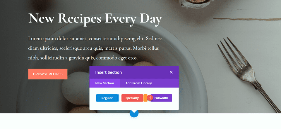
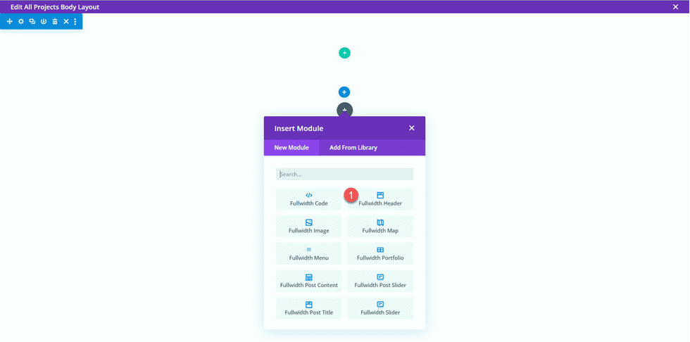
    Next, add a Fullwidth Header Module to the fullwidth section.

    Divi Fullwidth Header Gradient Background Layout 1 Fullwidth Header Module

    Now that our header module is in place, let’s update the header content in the Text section of the Content tab.

    • Title: New Recipes Every Day
    • Button #1: Browse Recipes
    • Button #2: Download the Cookbook

    Divi Fullwidth Header Gradient Background Layout 1 Content

    • Text: Lorem ipsum dolor sit amet, consectetur adipiscing elit. Sed nec diam ultricies, scelerisque arcu quis, mattis purus. Morbi tellus nibh, sollicitudin a gravida quis, commodo eget eros.

    Divi Fullwidth Header Gradient Background Layout 1 Body

    Under Background, remove the default background color and add the background image.

    Divi Fullwidth Header Gradient Background Layout 1 Background Image

    Move to the design tab and open the title text settings. Customize the settings as follows:

    • Title Font: Cormorant Garamond
    • Title Weight: Bold

    Divi Fullwidth Header Gradient Background Layout 1 Title Font

    Next, set the title text size and line height.

    • Title Text Size: 64px
    • Title Line Height on Desktop: 1.5em

    Divi Fullwidth Header Gradient Background Layout 1 Title Size

    To optimize the design for mobile devices, we need to decrease the size of the title line height on mobile. Select the responsive settings, then set the mobile line height.

    • Title Line Height on Mobile: 1em

    Divi Fullwidth Header Gradient Background Layout 1 Mobile Line Height

    Now let’s customize the body font options. Here are the settings:

    • Body Font: Cormorant Garamond
    • Body Font Weight: Medium

    Divi Fullwidth Header Gradient Background Layout 1 Body Font

    • Body Text Size: 24px
    • Body Line Height: 1.8em

    Divi Fullwidth Header Gradient Background Layout 1 Line Height

    Customize Button Styles

    Next, open the button one settings. Enable custom styles, then set the text size.

    • Use Custom Styles for Button One: Yes
    • Button One Text Size: 14px

    Divi Fullwidth Header Gradient Background Layout 1 Button Styles

    Add a background color to the button.

    • Button One Background: #FF7864

    Divi Fullwidth Header Gradient Background Layout 1 Button Background

    Customize the button border settings:

    • Button One Border Width: 8px
    • Button One Border Color: #FF7864
    • Button One Border Radius: 0px

    Divi Fullwidth Header Gradient Background Layout 1 Button Border

    Next, customize the font and disable the button icon.

    • Button One Font: Montserrat
    • Button One Font Weight: Medium
    • Button One Font Style: TT (Capitalized)
    • Show Button One Icon: No

    Divi Fullwidth Header Gradient Background Layout 1 Button Font

    Next, we will customize button two. The design is mostly the same as button one but with different colors. To skip some repetitive steps, let’s copy the button one styles to button two, then customize the design from there.

    First, right-click on the button one settings and copy the button one styles.

    Divi Fullwidth Header Gradient Background Layout 1 Button Styles

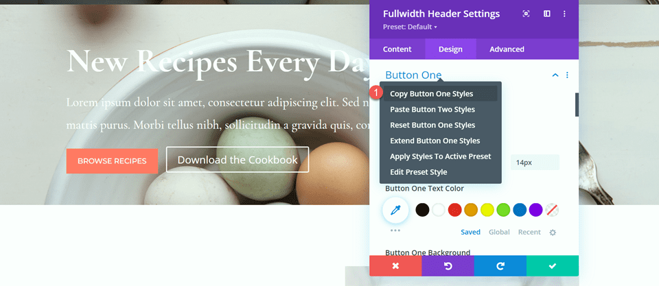
    Next, right-click on the button two settings and paste the button one styles.

    Divi Fullwidth Header Gradient Background Layout 1 Paste Styles

    Change the text color and background color for button two.

    • Button Two Text Color: #726D64
    • Button Two Background: #CBDBD2

    Divi Fullwidth Header Gradient Background Layout 1 Button 2 Background

    Change the button two border color as well.

    • Button Two Border Color: #CBDBD2

    Divi Fullwidth Header Gradient Background Layout 1 Button 2 Border Color

    Now that our buttons are complete, open the spacing settings and set the top and bottom padding.

    • Padding-Top: 10%
    • Padding-Bottom: 10%

    Divi Fullwidth Header Gradient Background Layout 1 Padding

    Finally, open the Custom CSS settings under the advanced tab. Select the responsive settings because we will only add the custom CSS for the desktop design. Add custom CSS to the Body CSS section.

    padding-right: 40%;

    Divi Fullwidth Header Gradient Background Layout 1 Body CSS

    Add the Gradient to the Fullwidth Header Module

    Now our fullwidth header design is complete and we can add the gradient. Navigate back to the content tab and open the background settings. Select the gradient tab and add the gradient as follows:

    • 0%: rgba(116,170,159,0.42)
    • 1%: rgba(79,127,108,0.35)

    Divi Fullwidth Header Gradient Background Layout 1 Background Gradient

    Next, customize the gradient settings:

    • Gradient Type: Elliptical
    • Gradient Position: Bottom Right
    • Repeat Gradient: Yes
    • Place Gradient Above Background Image: Yes

    Divi Fullwidth Header Gradient Background Layout 1 Gradient Settings

    Finally, delete the old header section from the original layout.

    Divi Fullwidth Header Gradient Background Layout 1 Delete Section

    Final Design

    Here is the final design for our first gradient header. As you can see, the repeated gradient with the subtle transparent colors creates an interesting background for this header section without overpowering the background image.

    Divi Fullwidth Header Gradient Background Layout 1 Full Design

    Divi Fullwidth Header Gradient Background Layout 1 Final Design Mobile

    Gradient 2

    Create a New Page with a Premade Layout

    For our next design, we will use the Nutritionist Landing Page from the Nutritionist Layout Pack.

    Add a new page to your website and give it a title, then select the option to Use Divi Builder.

    Divi Fullwidth Header Gradient Background Layout 2 Use Builder

    Since we are using a premade layout from the Divi Library, select Browse Layouts.

    Divi Fullwidth Header Gradient Background Layout 2 Browse Layouts

    Search for and select the Nutritionist Landing Page layout.

    Divi Fullwidth Header Gradient Background Layout 2 Find Layout

    Select Use This Layout to add the layout to your page.

    Divi Fullwidth Header Gradient Background Layout 2 Use Layout

    Now we are ready to build our design.

    Recreate the Hero Section Using the Fullwidth Header Module

    We are going to be recreating the existing hero section using the Fullwidth Header Module. Start by adding a fullwidth section to the page, below the existing hero section.

    Divi Fullwidth Header Gradient Background Layout 2 Fullwidth

    Next, add the Fullwidth Header Module to the section.

    Divi Fullwidth Header Gradient Background Layout 2 Add Module

    Under the content tab, add the text for the module as follows:

    • Title: Nutritionist
    • Subtitle: Specialized Food Coaching
    • Button #1: Get Started For Free
    • Button #2: Contact Me

    You can also remove the body text at this step, although we remove it later on in the tutorial.

    Divi Fullwidth Header Gradient Background Layout 2 Content

    Open the image settings. Set the logo image to the “Established 1990” image and set the header image to the graphic of the leaves.

    Divi Fullwidth Header Gradient Background Layout 2 Header Images

    Next, move to the Design tab. Set the text and logo alignment to center.

    • Text & Logo Alignment: Center

    Divi Fullwidth Header Gradient Background Layout 2 Alignment

    Customize the Title font as follows:

    • Title Font: Merriweather
    • Title Font Style: TT (Capitalized)

    Divi Fullwidth Header Gradient Background Layout 2 Title Font

    To optimize the design for tablet and mobile, we will use the responsive settings to add different title text sizes.

    • Title Text Size – Desktop: 70px
    • Title Text Size – Tablet: 50px
    • Title Text Size – Mobile: 30px

    Divi Fullwidth Header Gradient Background Layout 2 Title Text Size

    Next, set the title letter spacing and line height.

    • Title Letter Spacing: 5px
    • Title Line Height: 1.4em

    Divi Fullwidth Header Gradient Background Layout 2 Spacing Line Height

    Open the subtitle settings and customize the font.

    • Subtitle Font: Montserrat
    • Subtitle Font Weight: Medium
    • Subtitle Font Style: TT (Capitalized)

    Divi Fullwidth Header Gradient Background Layout 2 Subtitle Settings

    We will also set responsive text sizes for the subtitle. The sizes are as follows:

    • Subtitle Text Size – Desktop and Tablet: 18px
    • Subtitle Text Size – Mobile: 12px

    Additionally, set the subtitle letter spacing and line height.

    • Subtitle Letter Spacing; 5px
    • Subtitle Line Height: 1.5em

    Divi Fullwidth Header Gradient Background Layout 2 Subtitle Sizing

    Customize Button Styles

    Move on to the Button One settings. Enable custom styles and set the text size.

    • Use Custom Styles for Button One: Yes
    • Button One Text Size: 13px

    Divi Fullwidth Header Gradient Background Layout 2 Button One

    Add a background color.

    • Color 1 Background: #15C39A

    Divi Fullwidth Header Gradient Background Layout 2 Button Background

    Next, set the border width and radius, and the letter spacing.

    • Button One Border Width: 0px
    • Button One Border Radius: 100px
    • Button One Letter Spacing: 2px

    Divi Fullwidth Header Gradient Background Layout 2 Button Border

    Modify the font settings as follows:

    • Button One Font: Montserrat
    • Button One Font Weight: Medium
    • Button One Font Style: TT (Capitalized)
    • Show Button One Icon: No

    Divi Fullwidth Header Gradient Background Layout 2 Button Font

    Finally, add padding to the button.

    • Button One Padding–Top: 16px
    • Button One Padding–Bottom: 16px
    • Button One Padding–Left: 30px
    • Button One Padding–Right: 30px

    Divi Fullwidth Header Gradient Background Layout 2 Button Padding

    The styles for Button Two are largely the same as Button One, so we will copy the Button One Styles to Button Two and then make a small change to the colors.

    First, right-click on the Button One settings and copy the styles.

    Divi Fullwidth Header Gradient Background Layout 2 Copy Styles

    Then, right-click on the Button Two settings and paste the Button One styles.

    Divi Fullwidth Header Gradient Background Layout 2 Paste Styles

    Change the Button Two background.

    • Button Two Background: #BAB66F

    Divi Fullwidth Header Gradient Background Layout 2 Button 2 Background

    Next, navigate to the Spacing settings and set the padding as follows:

    • Padding-Top: 10%
    • Padding-Bottom: 0px

    Divi Fullwidth Header Gradient Background Layout 2 Spacing

    open the Animation section under the Design tab and set the module to fade.

    • Animation Style: Fade

    Divi Fullwidth Header Gradient Background Layout 2 Animation

    Add the Gradient to the Fullwidth Header Module

    Move to the content tab and open the background settings. First, remove the existing background color.

    Divi Fullwidth Header Gradient Background Layout 2 Remove Background Color

    Next, add the background image.

    Divi Fullwidth Header Gradient Background Layout 2 Background Image

    Move to the gradient tab and add the background gradient.

    • 35%: #FFC77F
    • 56%: #F2D57D
    • 90%: rgba(247,242,145,0.88)

    Divi Fullwidth Header Gradient Background Layout 2 Gradient

    Set the Gradient Type and Gradient Position.

    • Gradient Type: Circular
    • Gradient Position: Top

    Divi Fullwidth Header Gradient Background Layout 2 Gradient Type Position

    Remove the body text if you haven’t already.

    Divi Fullwidth Header Gradient Background Layout 2 Remove Body

    Finally, delete the original hero section above.

    Divi Fullwidth Header Gradient Background Layout 2 Delete Layout

    Custom CSS

    Now all of our basic settings are in place, but we need to go in with some custom CSS to complete the design and modify some of the header images. Move over to the Advanced tab and open the Custom CSS section.

    First, let’s customize the header image CSS. We will use responsive options to set different CSS for different device sizes. These settings will move the center leaf image up and behind the header text and also adjusts the size and margins. Add the following custom CSS to the desktop settings.

    transform: translateY(-22em);
    width: 25%;
    z-index: -1;
    position: relative;
    margin-bottom: -8em;
    

    Divi Fullwidth Header Gradient Background Layout 2 Header Image CSS

    Next, add the following custom CSS to the tablet settings of the header image section.

    transform: translateY(-22em);
    width: 40%;
    z-index: -1;
    position: relative;
    margin-bottom: -8em;
    

    Divi Fullwidth Header Gradient Background Layout 2 Custom CSS Tablet

    Finally, add the following custom CSS to the mobile settings of the header image section.

    transform: translateY(-24em);
    width: 75%;
    z-index: -1;
    position: relative;
    margin-bottom: -8em;
    

    Divi Fullwidth Header Gradient Background Layout 2 Header Image Mobile CSS

    We will also add custom CSS to the logo section. These settings will be responsive as well.

    First, add the following custom CSS to the desktop settings of the logo section.

    width: 40%;

    Divi Fullwidth Header Gradient Background Layout 2 Logo CSS

    Next, add the following custom CSS to the tablet settings of the logo section.

    width: 60%;

    Divi Fullwidth Header Gradient Background Layout 2 Logo Tablet CSS

    Then add the following custom CSS to the mobile settings of the logo section.

    width: 60%;

    Divi Fullwidth Header Gradient Background Layout 2 Logo Mobile CSS

    Finally, add the following custom CSS to the subtitle section.

    padding-bottom: 30px;

    Divi Fullwidth Header Gradient Background Layout 2 Subtitle CSS

    For the last step in this design, we need to add the rounded bottom divider. Open the fullwidth section settings and navigate to the design tab. Open the Dividers settings and add a bottom divider.

    • Dividers: Bottom
    • Divider Style: Curved
    • Divider Color: #FFFFFF

    Divi Fullwidth Header Gradient Background Layout 2 Divider Style

    Final Design

    And here is the final design for this header section.

    Divi Fullwidth Header Gradient Background Layout 2 Full Design

    Divi Fullwidth Header Gradient Background Layout 2 Final Design Mobile

    Gradient 3

    Create a New Page with a Premade Layout

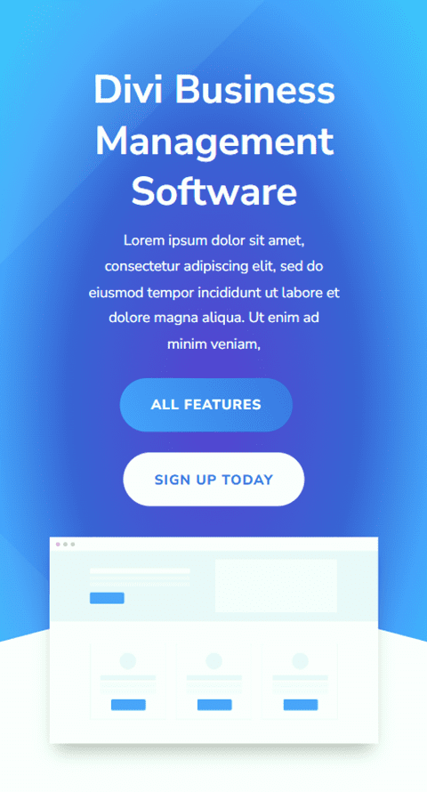
    For our final gradient header design, we will use the SaaS Landing Page layout from the SaaS Layout Pack.

    Add a new page to your website and give it a title, then select the option to Use Divi Builder.

    Divi Fullwidth Header Gradient Background Layout 3 Use Builder

    We are using a premade layout from the Divi library, so select Browse Layouts.

    Divi Fullwidth Header Gradient Background Layout 3 Browse Layouts

    Search for and select the SaaS Landing Page layout.

    Divi Fullwidth Header Gradient Background Layout 3 Find Layout

    Select Use This Layout to add the layout to your page.

    Divi Fullwidth Header Gradient Background Layout 3 Use layout

    Now we are ready to build our design.

    Recreate the Hero Section Using the Fullwidth Header Module

    First, add a fullwidth section below the existing header section.

    Divi Fullwidth Header Gradient Background Layout 3 Fullwidth Section

    Select and add the Fullwidth Header Module to the section.

    Divi Fullwidth Header Gradient Background Layout 3 Add Module

    Open the module settings and add the following text:

    • Title: Divi Business Management Software
    • Button #1: All Features
    • Button #2: Sign Up Today
    • Body: Lorem ipsum dolor sit amet, consectetur adipiscing elit, sed do eiusmod tempor incididunt ut labore et dolore magna aliqua. Ut enim ad minim veniam,

    Divi Fullwidth Header Gradient Background Layout 3 Content Settings

    Under the images section, add the header image.

    Divi Fullwidth Header Gradient Background Layout 3 Header Image

    We will come back to the content tab to add our background later. For now, delete the original header section above.

    Divi Fullwidth Header Gradient Background Layout 3 Delete Section

    Open the fullwidth header settings and navigate to the design tab. First, center the text and logo alignment.

    • Text & Logo Alignment: Center

    Divi Fullwidth Header Gradient Background Layout 3 Text Logo Alignment

    Open the image settings and add a box shadow to the header image.

    • Image Box Shadow: Bottom

    Divi Fullwidth Header Gradient Background Layout 3 Box Shadow

    Next, open the title text settings and customize the font.

    • Title Font: Nunito Sans
    • Title Font Weight: Bold
    • Title Text Alignment: Center

    Divi Fullwidth Header Gradient Background Layout 3 Title Font

    Change the color, size, and line height as well.

    • Title Text Color: #FFFFFF
    • Title Text Size: 45px
    • Title Line Height: 1.3em

    Divi Fullwidth Header Gradient Background Layout 3 Title Text Settings

    We want a smaller font size on mobile devices, so select the responsive settings for the Title Text Size option and add a different font size.

    • Title Text Size – Mobile: 38px

    Divi Fullwidth Header Gradient Background Layout 3 Mobile Text Size

    Move on to the Body Text section and customize the font as follows:

    • Body Font: Nunito Sans
    • Body Text Color: #FFFFFF

    Divi Fullwidth Header Gradient Background Layout 3 Body Font Color

    Set the Body Line Height.

    • Body Line Height: 1.8em

    Divi Fullwidth Header Gradient Background Layout 3 Line Height

    Customize Button Styles

    Next, let’s customize Button One. Enable custom styles then change the text size and color.

    • Use Custom Styles for Button One: Yes
    • Button One Text Size: 13px
    • Button One Text Color: #FFFFFF

    Divi Fullwidth Header Gradient Background Layout 3 Button Styles

    This button will have a gradient background. Add the gradient as follows:

    • 0%: #3d72e7
    • 100%: #53a0fe
    • Gradient Direction: 243deg

    Divi Fullwidth Header Gradient Background Layout 3 Button Gradient

    Next, change the button border settings.

    • Button One Border Width: 0px
    • Button One Border Radius: 26px
    • Button One Letter Spacing: 1px

    Divi Fullwidth Header Gradient Background Layout 3 Button Border

    Change the button font settings.

    • Button One Font: Nunito Sans
    • Button One Font Weight: Ultra Bold
    • Button One Font Style: TT (Capitalized)
    • Show Button Icon: No

    Divi Fullwidth Header Gradient Background Layout 3 Button Font

    Finally, add button padding.

    • Button One Padding-Top: 15px
    • Button One Padding-Bottom: 15px
    • Button One Padding-Left: 30px
    • Button One Padding-Right: 30px

    Divi Fullwidth Header Gradient Background Layout 3 Button Padding

    Once again, the Button Two design is very similar to the Button One design, just with different colors. We’ll skip the repetitive design steps by copying the Button One styles. To do so, simply right-click on the Button One setting and copy the Button One styles.

    Divi Fullwidth Header Gradient Background Layout 3 Copy Button

    Then, right-click on the Button Two settings and paste the Button One styles.

    Divi Fullwidth Header Gradient Background Layout 3 Paste Button Styles

    Now change the Button Two Text Color and background color.

    • Button Two Text Color: #4078ea
    • Background Color: #FFFFFF

    Divi Fullwidth Header Gradient Background Layout 3 Button Color Background

    Move to the Spacing section and add some top padding.

    • Padding-Top: 8%

    Divi Fullwidth Header Gradient Background Layout 3 Padding Top

    Next, navigate to the Animation settings and set the animation style as follows:

    • Animation Style: Zoom
    • Animation Direction: Up

    Divi Fullwidth Header Gradient Background Layout 3 Animation

    Finally, change the animation intensity and starting opacity.

    • Animation Intensity: 8%
    • Animation Starting Opacity: 100%

    Divi Fullwidth Header Gradient Background Layout 3 Animation Settings

    Add the Gradient to the Fullwidth Header Module

    Now that the basic design is complete, we can add our background gradient. Move over to the Content tab and open the Background settings. Our background will consist of a combination of a gradient, an image, and a mask. First, add the background gradient.

    • 22%: #5b40d1
    • 50%: #4161d4
    • 73%: #53a0fd
    • 100%: #4bc4fc
    • Gradient Type: Elliptical
    • Gradient Position: Center

    Divi Fullwidth Header Gradient Background Layout 3 Gradient Settings

    Next, add the background image. We will use the same background image that was used for the original header design. You should see this in your media library with the title geometric-bg-overlay-01.jpg. Use the overlay setting to blend the image with the gradient background.

    • Background Image Blend: Overlay

    Divi Fullwidth Header Gradient Background Layout 3 Background Image

    Now add the background mask.

    • Mask: Caret
    • Mask Color: #FFFFFF
    • Mask Transform: Horizontal
    • Mask Transform: Rotate
    • Mask Transform: Invert
    • Mask Aspect Ratio: Landscape
    • Mask Size: Stretch to Fill

    Divi Fullwidth Header Gradient Background Layout 3 Background Mask

    Next, use the responsive settings to customize the background mask for tablet and mobile devices. Let’s start with the tablet design.

    • Mask Aspect Ratio: Portrait
    • Mask Size: Custom Size
    • Mask Width: 100%
    • Mask Height: 60%
    • Mask Position: Bottom Center
    • Mask Vertical Offset: 140%

    Divi Fullwidth Header Gradient Background Layout 3 Tablet Mask

    Finally, modify the mobile design.

    • Mask Aspect Ratio: Portrait
    • Mask Size: Custom Size
    • Mask Width: 100%
    • Mask Height: 60%
    • Mask Position: Bottom Center
    • Mask Vertical Offset: 110%

    Divi Fullwidth Header Gradient Background Layout 3 Tablet Mobile

    Final Design

    Here is the final design for this section.

    Divi Fullwidth Header Gradient Background Layout 3 Final Design Full

    Divi Fullwidth Header Gradient Background Layout 3 Final Design Mobile

    Final Result

    Now let’s take a look at all three of our gradient header modules.

    Gradient 1

    Divi Fullwidth Header Gradient Background Layout 1 Final Design

    Divi Fullwidth Header Gradient Background Layout 1 Final Design Mobile

    Gradient 2

    Divi Fullwidth Header Gradient Background Layout 2 Final Design

    Divi Fullwidth Header Gradient Background Layout 2 Final Design Mobile

    Gradient 3

    Divi Fullwidth Header Gradient Background Layout 3 Final Design

    Divi Fullwidth Header Gradient Background Layout 3 Final Design Mobile

    Final Thoughts

    The Fullwidth Header Module is easy to customize and offers a lot of flexibility when it comes to the look and layout of your header design. When combined with unique design elements like gradients, you can create a truly stand-out design to bring your website visitors’ attention to the services that you offer. For 5 more creative Fullwidth Header tutorials, check out this article. Do you utilize the Fullwidth Header Module on your Divi website? Let us know in the comments!

    The post 3 Eye-Catching Gradients You Can Apply to Your Fullwidth Header Module with Divi’s Gradient Builder appeared first on Elegant Themes Blog.

  • How to Create a Scroll Container for Your Divi Comments Module

    The comments section of a blog post allows readers to engage with others. It also allows users to be able to create conversations with people who are ingesting your comment. For those special posts that drum up a lot of noise, the comments section can get pretty hectic! You may want to find a way to make a long comments section easier to navigate. Consider creating scrollable comments in Divi!

    By creating a scroll container for your Divi Comments Module, you can minimize the amount of scrolling readers of your blog need to undergo. Thus, they have a better experience with your site. It’s important to consider factors of user experience when you are building your site, and by adding a scrollable comment in Divi you’re making your readers have an easier time enjoying your site which is always a good thing.

    Why Comments Are a Good Thing

    Before we head into the tutorial, let’s take a quick look at comments in general. In Divi, we have a Comments Module. This module allows users of your site to leave a comment on a page or post. The module also allows people to read past comments that have been left behind on a post by other readers of your site. When a post is engaging, it can encourage people to want to leave their thoughts, opinions, and questions with the author (a.k.a you) under the post. This is an example of what that looks like from the Elegant Themes blog:

    A sample of the Elegant Themes comments section

    This is the comments section on the 3 Best Voice Search Plugins for WordPress post on our blog. In it, you can see that several readers have left feedback, thanks, and more. The post’s author has also taken the time to respond to readers. This kind of engagement is good for your blog and website because it shows that you are providing value to you readers. In addition, it helps you build a stronger bond with those who use and visit your site. Now that we’ve seen comments in the wild, let’s see how we can manage the comments section in our own blog posts using Divi’s Comments Module.

    Scrollable Comments in Divi: An Overview

    For this tutorial, we’ll be using the Blog Post Template from Divi’s Software Layout Pack. Here’s a quick overview of the template:

    The Software Blog Post Template... Very long!

    Notice how there are a few comments on this post? We can make this part of our blog page easier to navigate by adding a vertical scrollbar. For this tutorial, we’ll be adding a vertical scrollbar to the row that is holding the Comment Module. Then, we’ll use a little bit of CSS to style said scrollbar so it looks different than the main scrollbar for the page. Ready? Let’s get into it!

    Scrollable Comments in Divi: The Tutorial

    Before we get started on creating scrollable comments in Divi with the Comments Module, you’re going to need to install the Software Blog Post Template. Follow the instructions within that blog post to install your Blog Post Template.

    Enter the Comments Row Settings

    Once your template is installed and edited to your satisfaction, we’re going to enter into the row that is holding the Comments Module. Scroll down to the section that contains the Comments Module. Hover over the row (green outline), and click on the gear icon. This will open up the settings module for the row.

    Enter the row settings

    Set Row Max Height

    Before we begin styling or activating the scrolling, we need to adjust the max height for the row. To do this, we click on the Design tab. Next, we click on the Sizing tab. We then enter a Max Height of 550px to the Max Height option.

    Adding max height to row

    Enter Row Advanced Settings

    After setting the max height of the row, we’re going to click on the Advanced tab within the modal box. It is here that the scrolling magic happens! Take note of the Vertical Overflow option which is further down the Advanced tab. We’ll be coming back to that soon.

    Enter the Advanced tab within the row settings modal box

    Activate the Vertical Scrollbar with Vertical Overflow

    Scroll down util you arrive at Vertical Overflow. Click on the dropdown and select Scroll.

    Activate vertical scrollbars by setting the Vertical Overflow to Scroll

    While we have our vertical scrollbar, we can spruce it up a bit with some almighty CSS and padding.

    Adding Padding to Prevent Overlap

    To prevent our newly added scrollbar from overlapping with our buttons within our comments section, we’re going to add some padding to the right and left-hand sides of our row. To do this, navigate to the Design tab of the Row Settings modal. Next, scroll down to Spacing. Click the link icon between the Left and Right Padding text boxes. We’re going to add a padding of 55px to each side of the row.

    Adding padding to row to prevent scrollbar from overlapping over Comments Module

    Since we’ve added some breathing space to our scrollbar, let’s now make it pretty with some custom CSS.

    Add a CSS ID to the Row

    Moving back to the Advanced tab of the row, scroll to the top. Add your CSS ID – for this tutorial, we’ll be using scrollie – that we’ll be calling within the Custom CSS section in the Body Template Settings.

    Add CSS ID to row to prepare for styling scrollable comments in Divi

    Add Custom CSS to Style Scrollbars

    Now, we’ll be entering into the Custom CSS for our Blog Post Template. This will ensure that our CSS will be active on each blog post within our website as this template is applied to All Blog Posts within the Divi Theme Builder. To enter the Custom CSS setting for our body template, click on the three dots within the purple button in the bottom center of the builder. Next, select the gear icon.

    Entering page settings for Custom CSS

    Add Custom CSS to Style Scrollable Comments in Divi

    We want to style the scrollbar for our scroll container to differentiate it’s use from the main scrollbars of our browsers window. To do this, we’ll be using some CSS. Once you are within the Body Template Settings, select the Advanced Tab. Next, scroll down to the Custom CSS tab.

    Entering the Advanced section of the Body Page Template

    Once we’re in the Custom CSS section of the Body Page Template, copy and paste the following CSS code:

    /* Custom Scrollbar CSS */
    /* Firefox */
    #scrollie {
    scrollbar-width: auto;
    scrollbar-color: #000000 #ffffff;
    }
    
    /* Chrome, Edge, and Safari */
    #scrollie::-webkit-scrollbar {
    width: 16px;
    }
    
    #scrollie::-webkit-scrollbar-track {
    background: #ffffff;
    }
    
    #scrollie::-webkit-scrollbar-thumb {
    background-color: #000000;
    border-radius: 0px;
    border: 3px solid #ffffff;
    }
    

    Custom CSS for scrollable comments in Divi

    If you used a different CSS ID, ensure that you’ve updated the code snippet within your website to reflect this. You can edit the CSS or add to it to style your borders in a way that matches your brand and website. In our case, we went with a flat design to match the styling of the Divi Software Layout Pack.

    Save Your Blog Post Template

    Once you’re happy with your CSS edits, remember to save your Blog Page Template. Click on the green Save button on the bottom right-hand side of the bottom menu within the Divi Theme Builder.

    Save your work!

    Once your settings are saved, visit your newly updated comments section on your blog!

    Styled scrollable comments in Divi

    Scrollable Comments in Divi: The Conclusion

    Creating a scroll container for Your Divi Comments Module helps your users to have a better experience with your comments section. User engagement is an important factor to nurture within your blog. By making your Comments Module scrollable, you are providing ease of use for your readers when they come to enjoy your various blog posts.

    The post How to Create a Scroll Container for Your Divi Comments Module appeared first on Elegant Themes Blog.

  • How to Balance the Primary & Secondary Buttons in Your Divi Fullwidth Header Module

    The Divi Fullwidth Header module makes it easy to add beautiful hero sections to your website. The module comes with two buttons, a title text, subtitle text, body text, a logo, and an image, making the customization options endless.

    In today’s post, we’re going to demonstrate how to re-create hero sections using the Divi Fullwidth Header. We’ll start our design by using 3 premade layout packs and design our sections with a focus on balancing the primary and secondary buttons. We want the primary button to stand out, as it’s our main call to action while keeping the secondary button visible and accessible without overtaking the primary button.

    Design Principles of Primary and Secondary Buttons

    Primary buttons and secondary buttons help guide your website visitors towards certain actions. Primary buttons are typically the most common or desired action and secondary buttons are a less common action. This helps guide visitors to where they want to go.

    To accomplish this, primary buttons should stand out visually and secondary buttons should not stand out as much. That means primary buttons should be more distinctive and have more visual weight so that it attracts more attention.

    Now that we have an understanding of how primary and secondary buttons work, let’s get to the tutorial!

    Design Preview

    Here’s a look at the three fullwidth headers we will be designing today.

    UX Fullwidth Header

    Divi Retirement Center Fullwidth Header

    Financial Planning Fullwidth Header

    Download the Layouts for FREE

    To lay your hands on the designs from this tutorial, you will first need to download it using the button below. To gain access to the download you will need to subscribe to our newsletter by using the form below. As a new subscriber, you will receive even more Divi goodness and a free Divi Layout pack every Monday! If you’re already on the list, simply enter your email address below and click download. You will not be “resubscribed” or receive extra emails.

    To import the header template to your Divi Library, do the following:

    1. Navigate to the Divi Theme Builder.
    2. Click the Import button at the top right of the page.
    3. In the portability popup, select the import tab
    4. Choose the download file from your computer (make sure to unzip the file first and use the JSON file).
    5. Then click the import button.

    Once done, the section layout will be available in the Divi Builder.

    Let’s get to the tutorial, shall we?

    What You Need to Get Started

    To get started, you will need to do the following:

    1. Install Divi on your WordPress website.
    2. Add a Page and give it a title.
    3. Enable the Visual Builder

    Ux Fullwidth Header Design Steps

    Now that we have our page set up, let’s start with the fullwidth header for a UX landing page.

    Setting Up Our Page

    Before we can begin styling, we’ll need to load the free UX premade layout pack from the Divi Library. When you enable the Visual Builder you’ll see three options pop-up, select Choose A Premade Layout.

    Load Layout Pack

    To do load the UX layout pack onto your page:

    1. In the “Premade Layouts” tab use the search function to find the UX layout pack.
    2. Once you’ve found it click on it. This will bring up the layout details and pages available.
    3. Click on the landing page design, then click “Use This Layout”.

    We’ll be recreating the top section of the layout as a fullwidth header module.

    Delete First Section

    Since we are going to recreate the first section using the Fullwidth Header module instead, we’ll need to delete this section. Hover over the section and click the trash icon.

    Add Fullwidth Section

    Before we can add the fullwidth header, we need to add a fullwidth section.

    Click the “+” arrow to bring up the Divi sections and then click “fullwidth”. This will automatically bring up the Divi Fullwidth Module library.

    Add Fullwidth Header

    Inside the Divi Fullwidth Module Library, click “Fullwidth Header”.

    Adding  Content

    Before we begin styling the module, let’s add the content needed for this module.

    Add Text Content

    Underneath the Text tab, add the following content:

    1. Title: Improve Your UX Design Knowledge
    2. Subtitle: UX Design Course
    3. Button #1: Course Overview
    4. Button #2: Learn More
    5. Body: Placeholder text

    Add Images

    Now that we have our text content in place, we need to add two images to our design.

    1. In the Images tab, add the logo image (the stars) and the header image (the photo of the person holding a phone).

    Change Background Color

    In the Background tab, configure this setting:

    1. Background Color: #131517

    Styling The Fullwidth Header

    Now that we have our content set up, let’s add some styling to it via the Design tab.

    Scroll Down Icon

    Let’s add the scroll down icon, the downward arrow.

    1. This design uses a scroll down icon, so toggle this option to yes.
    2. Select the downward arrow icon and then set the icon color to white.

    Image

    Let’s add curves to our images by rounding the corners.

    In the image tab, configure the following settings:

    1. Image Rounded Corners: Click the chainlink button to unlink the corners, then type 1000px in the bottom left and bottom right input boxes. This will round the bottom left and bottom right corners of our images.

    Title Text

    Here let’s style the title text for this module. In the Title Text tab, configure these settings:

    1. Title font: PT Sans
    2. Title Font Weight: Bold
    3. Title Text Size: 5rem
    4. Title Line Height: 1.2em

    Body Text

    This is where we style the body text of this module. In the Body Text tab, configure these settings:

    1. Body Font: Mukta
    2. Body Text Size: 18px

    Subtitle Text

    This is where we style the subtitle text for this module. In the Subtitle Text tab, configure these settings:

    1. Subtitle Font: Mukta
    2. Subtitle Font Weight: Bold
    3. Subtitle Font Style: Uppercase
    4. Subtitle Text Color: #13d678
    5. Subtitle Letter Spacing: 3px

    Button One

    This is where we can set custom styles for button one, the primary button. In the Button One tab, configure these settings:

    1. Use Custom Styles For Button One: Yes
    2. Button One Color: #ffffff
    3. Button One Background: #13d678
    4. Button One Border Width: 0px
    5. Button One Border Radius: 100px
    6. Button One Font: Mukta
    7. Button One Font Weight: Bold
    8. Show Button One Icon: Yes
    9. Button One Icon: Right Arrow
    10. Only Show Icon On Hover For Button One: No

    Button Two

    Now let’s style the secondary button, the second button. In the Button Two tab, configure these settings:

    1. Use Custom Styles For Button One: Yes
    2. Button One Color: #ffffff
    3. Button One Background: #303030
    4. Button One Border Width: 0px
    5. Button One Border Radius: 100px
    6. Button One Font: Mukta
    7. Button One Font Weight: Bold
    8. Show Button One Icon: Yes
    9. Button One Icon: Right Arrow
    10. Only Show Icon On Hover For Button One: Yes

    Add Button Links

    Don’t forget to add links to your buttons! In the Link tab, configure the following settings:

    1. Button #1 Link URL: Paste the URL for button one here.
    2. Button #2 Link URL: Paste the URL for button two here.

    Save Your Design

    Now that we have our fully designed Fullwidth Header, make sure to save your design!

    1. Click the green arrow at the bottom right of the module window.
    2. Then click the save icon on the Divi toolbar to save your page design.
    3. Exit the Visual Builder.

    Have Fun Experimenting

    The ways to style the Divi Fullwidth Header module are endless. Taking advantage of the primary button and secondary button can help direct your visitors to the page you want them to view or take the action (like submit an inquiry) you want them to take.

    Let’s take a look at two other Fullwidth Header examples that have a primary button that stands out.

    Divi Retirement Center Fullwidth Header

    Button Styles

    Let’s look at the unique styles for the primary and secondary buttons.

    Button One

    In the Button One Tab, configure the following settings:

    1. Use Custom Styles For Button One: Yes
    2. Button One Text Size: 14px
    3. Button One Color: #ffffff
    4. Button One Background: #0a0a0a
    5. Button One Border Width: 0px
    6. Button One Border Radius: 10px
    7. Button One Font Weight: Bold

    Button Two

    In the Button Two Tab, configure the following settings:

    1. Use Custom Styles For Button One: Yes
    2. Button One Text Size: 14px
    3. Button One Color: #ffffff
    4. Button One Background: #0a0a0a
    5. Button One Border Width: 0px
    6. Button One Border Radius: 10px
    7. Button One Font Weight: Bold

    And there you have it! Two unique buttons, one that stands out, and one that takes the second seat.

    Financial Planning Fullwidth Header

    Button Styles

    Let’s look at the unique styles for the primary and secondary buttons.

    Button One

    In the Button One Tab, configure the following settings:

    1. Use Custom Styles For Button One: Yes
    2. Button One Text Size: 18px
    3. Button One Text Color: #ffffff
    4. Button One Background Color: #1b4ffe
    5. Button One Padding: 15px Top and Bottom; 25px Left and Right

    Button Two

    In the Button Two Tab, configure the following settings:

    1. Use Custom Styles For Button Two: Yes
    2. Button Two Text Color: #1b4ffe
    3. Button Two Background Color: Transparent
    4. Button Two Icon Color: #1b4ffe

    Final Thoughts

    The Divi Fullwidth Header makes it easy to create stunning hero sections on your website. Making strategic use of the primary and secondary buttons will improve your user experience and help website visitors take the actions they want to take. The customization options are endless with the Fullwidth Header so have fun experimenting!

    The post How to Balance the Primary & Secondary Buttons in Your Divi Fullwidth Header Module appeared first on Elegant Themes Blog.