WooCommerce is one of WordPress’ most beloved eCommerce plugins. To support this, Divi came out with several new Woo-centric modules that allow you greater control over designing your default WooCommerce pages. In today’s post, we will work through developing a WooCommerce cart timeline for Divi. For this timeline, we’ll be creating a visual representation of the user journey. We want to visually show the user how they move from shop to checkout.
Cart Page Template
Desktop View

Tablet and Mobile View

Checkout Page Template

Tablet and Mobile View

Download The Cart & Checkout Template for FREE
To lay your hands on the free cart & checkout template, you will first need to download them using the button below. To gain access to the download you will need to subscribe to our newsletter by using the form below. As a new subscriber, you will receive even more Divi goodness and a free Divi Layout pack every Monday! If you’re already on the list, simply enter your email address below and click download. You will not be “resubscribed†or receive extra emails.
How to Download & Install the Cart & Checkout Templates
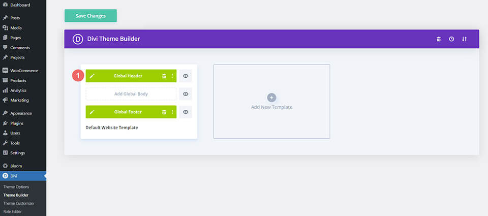
Go to Divi Theme Builder
To upload the template, navigate to the Divi Theme Builder in the backend of your WordPress website.

Upload Global Default Website Template
Then, in the top right corner, you’ll see an icon with two arrows. Click on the icon.

Navigate to the import tab, upload the JSON file which you were able to download in this post, and click on ‘Import Divi Theme Builder Templates.

Save Divi Theme Builder Changes
Once you’ve uploaded the file, you’ll notice a new cart, checkout, and shop template. Save the Divi Theme Builder changes as soon as you want the templates to be activated.

How to Create the WooCommerce Cart Timeline from Scratch
If you want a bit more of a challenge, the next part of our blog post will show you how to recreate the WooCommerce cart timeline for Divi. You can use the steps in this tutorial to customize your own cart timeline. Use it as inspiration for your next WooCommerce and Divi project! The WooCommerce cart timeline that we’ll be creating looks like this:
Cart Page

Checkout Page

This Woocommerce cart timeline for Divi is also mobile responsive. It stays as a horizontal timeline on mobile devices:

Now that we have a visual guide as to what we’ll be building, let’s get started!
Setup the Divi Theme Builder
We will be creating these templates to affect the cart and checkout pages of WooCommerce. As such, we begin our task in the Divi Theme Builder.
Create Cart Template
Click on the plus icon within the Add New Template card.

Next, select Build New Template.

After, you’ll be presented with a modal box of all the various assignments that you can attach to the new template that you’re creating. In our case, we’ll be creating a template for the cart page of our WooCommerce store. So, scroll down the modal box, and select Cart under the WooCommerce heading. Once, selected, click Create Template. When we do this, we are assigning the newly created template to the cart page.

Create Checkout Template
We will be going through the same steps to create the checkout template. Click on the plus icon within the Add New Template card.
Again, select Build New Template.
For the checkout page, we’ll need to scroll down the modal box, and select Checkout under the WooCommerce heading. Once, selected, click Create Template.
Save Templates and Assignments
Now that our cart and checkout templates have been created, we can save them. Click on the green Save Changes button at the top of the Divi Theme Builder.

Let’s Start Building the WooCommerce Cart Flow Timeline
Setting Up the Cart Page Template
Now the fun begins! We’re going to start creating our cart flow timeline for the cart page. To do this, we click on the Add Custom Body button within the Cart template that we just created.

Similar to when we create these templates and their assignments, we’re going to click on the Build Custom Body button that appears in the modal box.

Add a New Section and Row
Now that we’re in the Divi Builder, we’re going to add a new row. This row will have five columns.

Add Blurb Modules
Add three Blurb Modules to columns 1, 3, and 5 of your new row.

Here is the content for each Blurb Module that we will be using:
First Blurb (Column 1)
- Title: Shop
- Body: Leave empty
- Use Icon: Yes
- Icon: See screenshot below
- Module Link URL: /shop (Or your custom link to your shop page)
Second Blurb (Column 3)
- Title: Review
- Body: Leave empty
- Use Icon: Yes
- Icon: See screenshot below
- Module Link URL: /cart (Or your custom link to your cart page)
Third Blurb (Column 5)
- Title: Checkout
- Body: Leave empty
- Use Icon: Yes
- Icon: See screenshot below
- Module Link URL: /checkout (Or your custom link to your checkout page)
Now, our WooCommerce timeline will look like this at this point:

Adding Links to Blurbs
As we are creating templates for the cart and checkout page, we need our Blurb Modules to be easy to access no matter which pages customer land on. AÂ core feature of the WooCommerce timeline is that the end user – your customer – will be able to easily navigate between the various stages of the checkout process. To add the link to the default shop, cart, and checkout pages of our site, we will first enter the module settings of the first blurb, shop.

Once the module’s settings box appears, we’re going to scroll down to the Link heading. We’ll be adding the link to the Module Link URL box because this will ensure that irrespective of where your custom clicks – whether it’s the Blurb Title or the icon itself – they will be directed to the page that they need to navigate to.

We’ll be adding the links to the standard WooCommerce pages to each Blurb Module. If you have created custom links for these pages on your WooCommerce install, adjust the links accordingly. First, we begin with the Shop Blurb Module. For the Module Link URL, we enter /shop. This is the default URL for the shop page in WooCommerce. Remember, if you have changed this URL, enter your custom URL here instead.

Click the green checkmark button to save your changes. Next, we move to the Review Blurb Module. This module serves as the link to the cart page. Again, we navigate to the Link tab, and then we add the Module Link URL /cart, to the Module URL.

For the last Blurb Module, the Checkout Blurb Module, we will be linking to the default WooCommerce checkout page link which is /checkout.

Style Blurb Modules
Next, we will begin to style our added Blurb Modules. We will be using hover styles on the modules. This helps with the user experience (UX) of the WooCommerce cart timeline. We want the Blurb Module that represents the page that we are currently on to be a different color. And, we also want the icon to enlarge when we hover over it and change color.
Blurb Module Styling
- Icon Color: #eac989
- Hover Icon Color: #9fa2ce
- Text Alignment: Center

- Title Text:
- Title Heading Text: H4
- Title Font: Baskerville
- Title Font Weight: Bold
- Title Text Color: #354e7c

Transform:
- Transform Scale (Desktop): 100%
- Transform Scale (Hover): 115%

After we’ve set the design settings for the first Blurb Module, we’re going to extend them to the other Blurb Modules in our row.

We want to extend our styles only to Blurb Modules within our section. This is important to note especially if you are working on a page that already has content within.

Styling the Cart Blurb Module
To denote the different stages of the checkout process, we’re going to give a different icon color to the current stage that our user is on. For example, if they are on the cart page, we’ll change the color of the Blurb Module referencing the cart stage of the process.

Cart Page Blurb Module:
- Icon Color (Desktop): #f6c6c5
- Icon Color (Hover): #9fa2ce
Add Timeline Dividers
Once we have created and styled our Blurb Module, we will begin adding and styling our Divider Modules. We use the Divider Module in columns two and four of our row.

Style Timeline Dividers
Next, we will add our styling to our Divider Modules.
Divider Settings
Visibility:
Line:
- Line Color: #354e7c
- Line Style: Dotted
- Line Position: Vertically Centered
Sizing

Let’s use another really cool Divi feature to copy and paste the styles of this Divider Module to the other module within our row. First, we’re going to right-click on our completed Divider Module. Secondly, we’re going to click Copy Module Settings. Next, we right-click on the Divider Module that is currently unstyled. Finally, we click Paste Module Settings. Time saved is time earned!

Adding Custom CSS
This is what our WooCommerce cart timeline looks like presently:

To ensure that our Divider Modules are aligned correctly and to make our timeline module mobile-responsive, we’re going to add some CSS to our row.
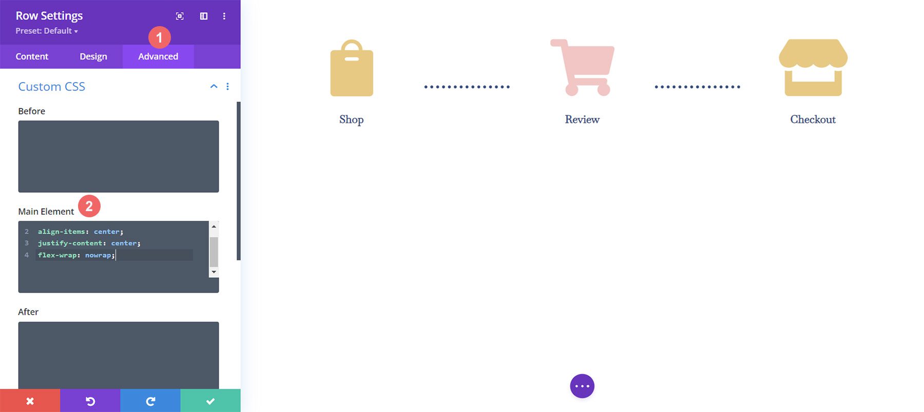
To add our Custom CSS, we first need to enter the Row Settings for our WooCommerce Cart Timeline. Next, we select the Advanced Tab. Finally, we will add the following CSS to the Main Element:
Custom CSS:
display:flex;
align-items: center;
justify-content: center;
flex-wrap: nowrap;
Once we’ve added this to the Row Settings, we click the green checkmark to save our settings.
Final Customization for Mobile Responsiveness
One amazing benefit of Divi is the fact that you can customize various elements quite deeply. We need to make one final edit to the last Blurb Module in the last column in our row. This change will help it look better on mobile and smaller screens. The fact that Divi allows us to get granular with our styling ensures that our work looks good for our clients as well as our own websites.

Notice how the last column, on mobile, is slightly lower than the other Blurb Modules. We’re going to change that! To do this, we’re going to enter the settings for the third and final module. Next, we’re going to go to Spacing > Margin. We’re going to leave the margin for the desktop view. However, we’re going to add a bottom margin of 15px for tablets.

Finally, we’re going to add a bottom margin of 21px for mobile devices.

Now, we have a truly mobile responsive Woocommerce cart timeline that we can use to guide users from shop to checkout.
Setting Up the Checkout Page
We have set the foundation for our WooCommerce cart flow timeline on our cart page. However, we need to complete our timeline by adding the work that we’ve done to our checkout page template. We’ll be using Divi’s OG feature, the Right-Click Menu to help make our process for the checkout page easier. Let’s get started!
Copy WooCommerce Cart Flow Timeline from Cart Page
We’ll be going back to the cart page. However, we won’t be entering into the Divi Builder for the body.

Right-click on the Custom Body of the cart template. Next, click on the Copy option from the right-click menu.

Now that we have copied the work that we did within the cart template, we will now paste this into the checkout template. To do this, we right-click on the Add Custom Body button within the checkout page template. Once you have done this, the menu will show the option to Paste. Click on Paste to copy the Custom Body from the cart page template to the checkout page template.

Now, you’ll see that both the cart and the checkout page templates have a custom body. This will help us save time on our web design process. Thanks, Divi 🙂 To save our changes within the checkout template, we’ll click the green Save Changes button at the top of the builder.

Update Checkout Page Template
Now that we’ve shaved some time off of our design process, let’s do the final edits to the checkout page to ensure that it works well with the rest of our project. First, click the pencil icon to edit the Custom Body of the checkout page template.

Style Checkout Icon
Let’s begin styling our checkout icon. Click on the gear icon which will open the Module Settings of the checkout icon.

Move to the Design tab of the Module Settings module. Click on the Image & Icon title. We will be editing the icon color. As such, click on the eyedropper icon and enter the hex code #f6c6c5. This will make the icon the pink color that we are using to denote the current page.

Update Cart Icon
We will need to go back and update the icon color of the cart icon. To do this, we’re going to go back to the module settings of the module. Next, we click the gear icon of the cart icon.

Again, we will move to the Design tab of the module settings. Next, under the Image & Icon title, click on the eyedropper tool. Next, add the hex code #eac989.Â

Remember to save your settings and all your hard work once you have exited the Divi Builder.

Putting it All Together
While we have focused this tutorial on building the cart timeline, there are other WooCommerce modules used to complete the template. For this tutorial, we used the FREE Divi Toy Store Layout Pack as the inspiration for the styling. Here are the other WooCommerce modules that you’ll need to add to each template page to complete your store.
Cart Page Template
- Woo Cart Products: This will display the WooCommerce cart
- Woo Cart Totals: Showcase the subtotal, taxes, and more with this module

Checkout Page Template
- Woo Notice Module: We use this module to show any errors, information or notices that relate to checking out
- Woo Checkout Billing: This module will color the billing details of your customers
- Woo Checkout Details: Unlike the cart totals, this module will show the actual product names, quantity, and more
- Woo Checkout Billing: To show available payment methods, we have this module added to the checkout page

In Conclusion
Having a cart timeline adds a visual representation of the process that your customers take on your store. With Divi, you have the power to customize and create an added piece to your WooCommerce store. Divi gives you the tools to be able to take what you’ve learned here to your own client and personal websites. I’d love to hear from you if you use this tutorial in the wild!
The post How to Design a WooCommerce Cart Flow Timeline for Your Divi appeared first on Elegant Themes Blog.


