Hey Divi Nation! Thanks for joining us for the next installment of our weekly Divi Design Initiative; where each week, we give away a brand new Layout Pack for Divi.
This time around, the design team has created a beautiful Saas Product Layout Pack that’ll help you get your next Saas Product website up and running in no time!
This layout pack includes:
– 8 Premade page layouts strategically designed for any Saas Product website (including a footer design)
– Original, royalty-free photos and graphics + customizable source file (see below)
– Plus, a large collection of pre-designed website elements that are customizable and reusable anywhere.
This layout pack is available right inside Divi for all Divi customers for FREE as the latest addition to our growing Divi library of hundreds of premade layout packs, thousands of page designs, and countless web design elements and resources.

Landing Page Design

Home Page Design

About Page Design

Features Page Design

Pricing Page Design

Documentation Page Design

Blog Page Design

Contact Page Design

Key Features
If you’re looking for a bold look for your Saas product website, then look no further than the Saas Product Layout Pack for Divi. With striking bright colors, eye-catching photos, and an interesting take on perspective, your potential clients will be captivated the second they land on your website.
Live Demos
Click the links below to see a live demo for each of the layouts included in the pack.
- Saas Product Landing Page (live demo)
- Saas Product Homepage (live demo)
- Saas Product About Page (live demo)
- Saas Product Features Page (live demo)
- Saas Product Pricing Page (live demo)
- Saas Product Documentation Page (live demo)
- Saas Product Blog Page (live demo)
- Saas Product Contact Page (live demo)
Access This Layout Right Now
Directly from Your Divi Builder
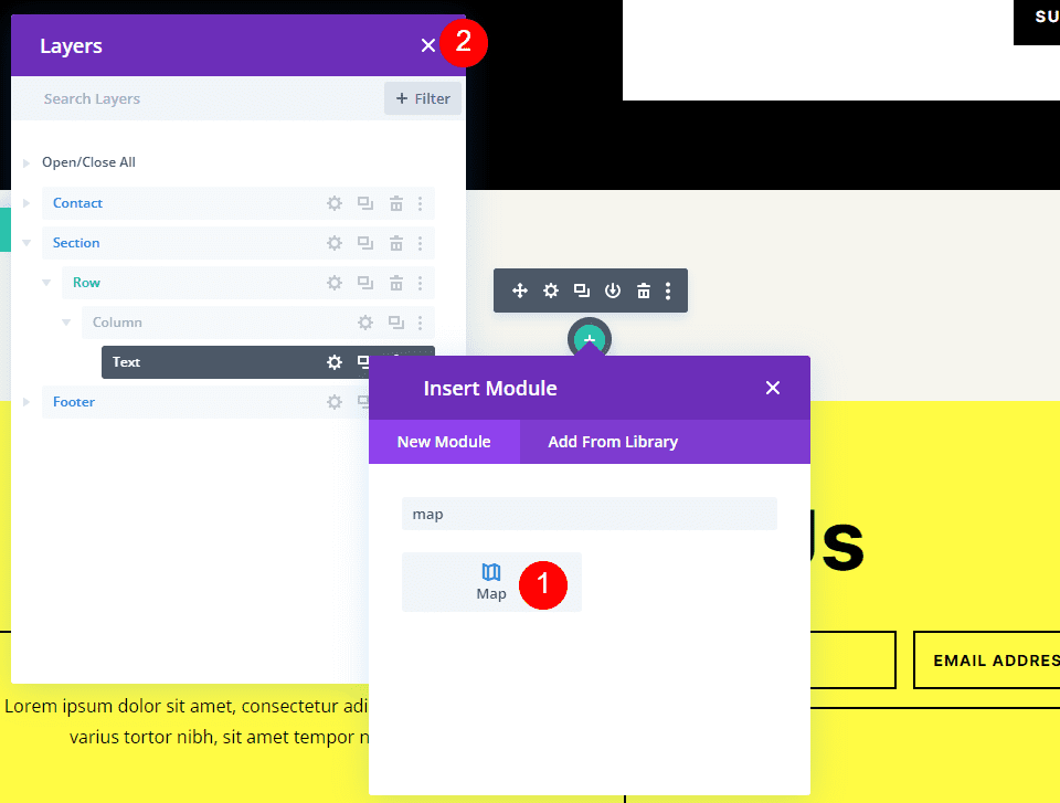
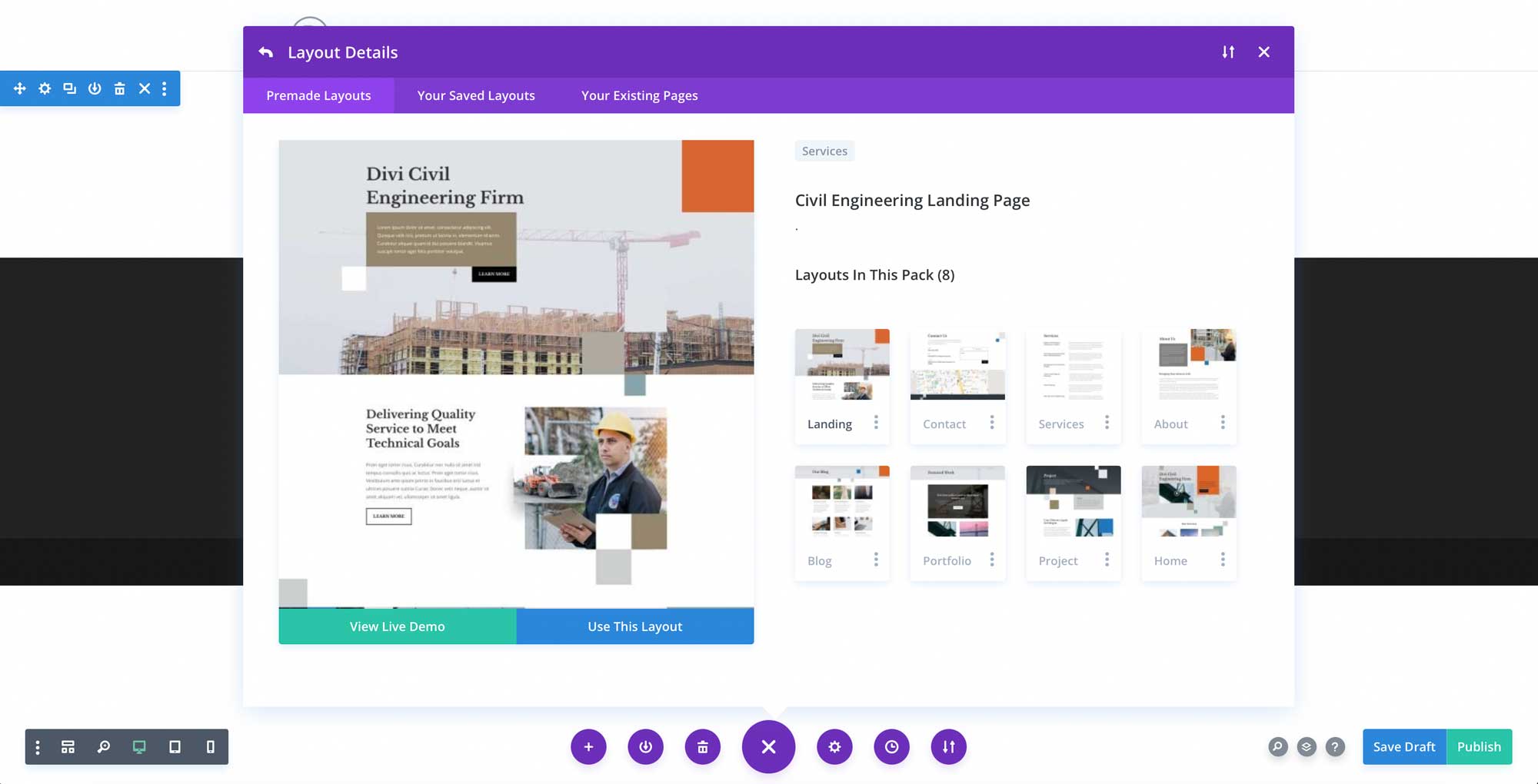
Since Version 3.0.99 of Divi, you can find and import any of the layouts included in this pack (along with ALL of Divi’s Premade Layout packs) directly from the Divi Builder. They are already waiting for you.
To access your new layout, simply activate the Visual Builder when editing a page and look for the “Load From Library” icon in the page settings bar (it looks like a plus symbol). Click this icon to launch the Load From Library popup. Under the Premade Layouts tab, you can easily find the new layout by scrolling through the list of layout packs. Once you find the Saas Product Layout Pack, click on it. You will see all the individual layouts included in the pack. Select the layout you want to use and then click the “Use This Layout” button.

For more, check out this video to learn how you can get this layout pack up and running today.
Subscribe To Our Youtube Channel
Authentication Required
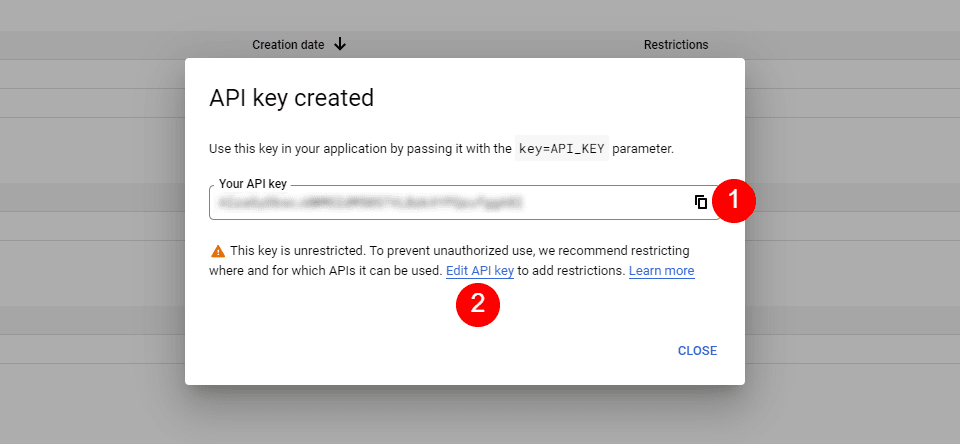
Before you can download Premade Layouts from the Divi Library you must authenticate your Elegant Themes Subscription. You can do this by navigating to Divi > Theme Options > Updates. There you can enter your username and API key and save changes.

You can find your API Key under your members area on the Elegant Themes site. After you enter the Username and API Key, you will gain immediate access to our library of hundreds of free layouts (including this one). If you haven’t done this, when you click to import a layout to your page, you will be prompted to enter your Elegant Themes Membership Username and API Key.
Use Layout Images for FREE with No Licensing Restrictions

The image assets included with these layouts (icons, illustrations, photos, etc.) have no licensing restrictions. This means you can use them in all of your commercial projects without having to worry about paying licensing fees or attributing the photographer. Use them in your commercial websites, sell them within your Divi child themes, include them in your own Divi layout packs or just use them on your blog. We know how challenging it can be to find good photos and how confusing and scary the licensing that governs those photos can be. We want to fix that problem for our users.
Download the Full Res Image Assets
New Layout Pack Every Week!
We hope you enjoy this layout pack. We look forward to hearing your opinions in the comment section below. Make sure you check out next week’s layout pack as well!
The post Get a Free Saas Product Layout Pack for Divi appeared first on Elegant Themes Blog.


