EDITS.WS

Tag: Divi Resources

  • Download a FREE Blog Post Template for Divi’s Toy Store Layout Pack

    Hey Divi Creators! Thanks for joining us for the next installment of our weekly Divi Design Initiative where each week, we give away brand new freebies. This time around we’re building upon the Toy Store Layout Pack with a brand new blog post template that matches the rest of the pack perfectly. Hope you enjoy it!

    divi layout

    Check Out The Toy Store
    Blog Layout Template Below

    Get it for free today!

    Desktop View

    Divi Toy Store Blog Layout desktop view

    Tablet and Mobile ViewDivi Toy Store Blog Layout tablet and mobile view

    Download The Blog Post Template For The Toy Store Layout Pack

    To lay your hands on the free Toy Store Blog Post Template, you will first need to download it using the button below. To gain access to the download you will need to subscribe to our newsletter by using the form below. As a new subscriber, you will receive even more Divi goodness and a free Divi Layout pack every Monday! If you’re already on the list, simply enter your email address below and click download. You will not be “resubscribed” or receive extra emails.

    How to Upload The Template

    Go to Divi Theme Builder

    To upload the template, navigate to the Divi Theme Builder in the backend of your WordPress website.

    Open Divi Theme Builder

    Upload Website Template

    Then, in the top right corner, you’ll see an icon with two arrows. Click on the icon.

    Import the template into the Divi Theme Builder

    Navigate to the import tab, upload the JSON file that you could download in this post, and click on ‘Import Divi Theme Builder Templates.

    Finish importing the template into the Divi Theme Builder

    Save Divi Theme Builder Changes

    Once you’ve uploaded the file, you’ll notice a new template with a new body area that has been assigned to All Posts. Save the Divi Theme Builder changes as soon as you want the template to be activated.

    Save Your Blog Post Template

    How to Modify The Template

    Open Toy Store Blog Layout Template

    To modify the template’s elements, start by opening the template.

    Inside the Body Layout Editor, you can edit the design on the front end using the Divi Builder just like you would with an average Divi page.

    Since this is a template that has been assigned to all posts for the site, there is a post content module that is necessary for displaying the post content. You will need to keep that module in place, but you can adjust the post content module’s design elements, which will design the post content that is displayed dynamically.

    Edit the Post Content Module to match your blog and overall website theme

    About the Toy Store Blog Layout

    This blog post template has a lot of dynamic elements that will work with your blog posts immediately. For example, the entire post header comprises dynamic elements including a featured image as the background, the post title, and the post metadata (date, categories and author). This content won’t need updating, but you can tweak the design of each of those elements if needed.

    Other dynamic elements include the following:

    • Post Title: A Text Module is used to show the title of the blog post.
    • Post Excerpt: We use another Text Module is show the first few sentences of the post.
    • Post Author Name: Displays the name of the blog post author. We use a Blurb Module with an image for this.
    • Post Published Date: Displays the date the blog post was published.
    • Post Category: Displays the category or categories that the blog post lives within.
    • Post Content Module: Displays the post content added when editing the post on the backend of WordPress.
    • Post Navigation: Provides previous and next buttons to read other posts within the category of the post.
    • Comments Module: A functional comment area for the post.
    • Post Slider Module: Displays the most recent posts that share the same category in the Blog Slider Module.
    • Blog Post Module: Displays the most recent posts that share the same category using the Blog Module.

    Here is a quick illustration that identifies the elements of the Toy Store blog layout template.

    Toy Store Blog Post Layout Overview

    New Freebies Every Week!

    We hope you’ve enjoyed the Toy Store Layout Pack and the blog post template freebie that goes along with it. We look forward to hearing your opinions in the comment section below. Make sure you check back next week for more freebies!

    The post Download a FREE Blog Post Template for Divi’s Toy Store Layout Pack appeared first on Elegant Themes Blog.

  • Get a FREE Horse Riding Layout Pack for Divi

    Hey Divi Nation! Thanks for joining us for the next installment of our weekly Divi Design Initiative; where each week, we give away a brand new Layout Pack for Divi.

    This time around, the design team has created a beautiful Horse Riding Layout Pack that’ll help you get your next horse riding business website up and running in no time!

    This layout pack includes:

    7 Premade page layouts strategically designed for any horse riding business website (including a footer design)
    – Original, royalty-free photos and graphics + customizable source file (see below)
    – Plus, a large collection of pre-designed website elements that are customizable and reusable anywhere.

    This layout pack is available right inside Divi for all Divi customers for FREE as the latest addition to our growing Divi library of hundreds of premade layout packs, thousands of page designs, and countless web design elements and resources.

    divi layout

    Check Out The Divi Horse Riding
    Layout Pack Below

    Get it for free today!

    horse riding layout

    Landing Page Design

    horse riding layout

    View The Live Layout Demo

    Home Page Design

    horse riding layout

    View The Live Layout Demo

    Classes Page Design

    horse riding layout

    View The Live Layout Demo

    Class Page Design

    horse riding layout

    View The Live Layout Demo

    Services Page Design

    horse riding layout

    View The Live Layout Demo

    About Page Design

    horse riding layout

    View The Live Layout Demo

    Contact Page Design

    horse riding layout

    View The Live Layout Demo

    Blog Page Design

    horse riding layout

    View The Live Layout Demo

    Key Features

    Are you looking to set up a website for your horse riding business? Make sure to check out the Horse Riding Layout Pack for Divi! This layout pack features beautiful (royalty-free) images, an elegant design style, and a brown color palette that matches the business type effortlessly!

    Live Demos

    Click the links below to see a live demo for each of the layouts included in the pack.

    1. Horse Riding Landing Page (live demo)
    2. Horse Riding Home Page (live demo)
    3. Horse Riding Classes Page (live demo)
    4. Horse Riding Class Page (live demo)
    5. Horse Riding Services Page (live demo)
    6. Horse Riding About Page (live demo)
    7. Horse Riding Contact Page (live demo)
    8. Horse Riding Blog Page (live demo)

    Access This Layout Right Now

    Directly from Your Divi Builder

    Since Version 3.0.99 of Divi, you can find and import any of the layouts included in this pack (along with ALL of Divi’s Premade Layout packs) directly from the Divi Builder. They are already waiting for you.

    To access your new layout, simply activate the Visual Builder when editing a page and look for the “Load From Library” icon in the page settings bar (it looks like a plus symbol). Click this icon to launch the Load From Library popup. Under the Premade Layouts tab, you can easily find the new layout by scrolling through the list of layout packs. Once you find the Horse Riding Layout Pack, click on it. You will see all the individual layouts included in the pack. Select the layout you want to use and then click the “Use This Layout” button.

    horse riding layout

    For more, check out this video to learn how you can get this layout pack up and running today.

    Subscribe To Our Youtube Channel

    Authentication Required

    Before you can download Premade Layouts from the Divi Library you must authenticate your Elegant Themes Subscription. You can do this by navigating to Divi > Theme Options > Updates. There you can enter your username and API key and save changes.

    Home Decor Layout Pack for Divi

    You can find your API Key under your members area on the Elegant Themes site. After you enter the Username and API Key, you will gain immediate access to our library of hundreds of free layouts (including this one). If you haven’t done this, when you click to import a layout to your page, you will be prompted to enter your Elegant Themes Membership Username and API Key.

    Use Layout Images for FREE with No Licensing Restrictions

    horse riding layout

    The image assets included with these layouts (icons, illustrations, photos, etc.) have no licensing restrictions. This means you can use them in all of your commercial projects without having to worry about paying licensing fees or attributing the photographer. Use them in your commercial websites, sell them within your Divi child themes, include them in your own Divi layout packs or just use them on your blog. We know how challenging it can be to find good photos and how confusing and scary the licensing that governs those photos can be. We want to fix that problem for our users.

    Download the Full Res Image Assets

    New Layout Pack Every Week!

    We hope you enjoy this layout pack. We look forward to hearing your opinions in the comment section below. Make sure you check out next week’s layout pack as well!

    The post Get a FREE Horse Riding Layout Pack for Divi appeared first on Elegant Themes Blog.

  • Divi Product Highlight: Divi Masonry Gallery

    Divi Masonry Gallery adds a new gallery module to the Divi Builder. With this plugin, you can build and customize masonry gallery layouts to display images on your website. You can filter images by categories, enable pagination, open images in lightbox displays, and more. The plugin also comes with design options allowing you to fully customize the design of the masonry gallery module. In this product highlight, we’ll take a look at Divi Masonry Gallery to help you decide if it’s the right product for you.

    Let’s get started!

    Installing Divi Masonry Gallery

    To install Divi Masonry Gallery, navigate to the Plugin page in the WordPress dashboard and Click Add New. Click Choose File, select the .ZIP plugin file from your computer, then click Install Now.

    Once the plugin is installed, click activate.

    Divi Masonry Gallery

    Once the plugin is activated, you will see the Divi Masonry Gallery module appear in the Divi Builder. Let’s take a look at the module settings.

    Content Settings

    Most of the key options are under the Gallery Settings section of the content tab. Here you can add your images and choose how they are displayed in the masonry gallery.

    Gallery Settings

    This is the masonry gallery in the normal gallery mode.

    Divi Masonry Gallery Normal Gallery

    You can also select minimized gallery mode, where you can set a limit to how many images are displayed. The text shown on the last image can be customized, and you can choose whether the last image opens a lightbox or opens a link.

    Divi Masonry Gallery Minimized Gallery

    The number of columns and the spacing between images can be adjusted. In the example pictured here, I set the gallery to 4 columns and increased the spacing.

    Divi Masonry Gallery Columns Spacing

    Here you can also choose to have images zoom in on hover, load in random order each time, and adjust the image size.

    Divi Masonry Gallery Image Zoom Random Order

    Image Onclick Actions

    You can set images to open in a lightbox, open a specified URL, or do nothing on click. If the lightbox option is selected, you can set the background color and choose how the title is displayed.

    Divi Masonry Gallery Lightbox Gallery

    Here is the lightbox on the front end.

    Divi Masonry Gallery Lightbox

    Links must be added in order of the images and separated by {{link}}. You can also set the link target.

    Divi Masonry Gallery Image Links

    Categories

    Divi Masonry Gallery adds a category field to each image in the media library. You can enable these categories to filter the gallery images.

    Divi Masonry Gallery Media Categories

    With the categories filter enabled, you can choose the included categories, show or hide the all categories button, and change the all categories button text.

    Divi Masonry Gallery Show Categories

    Pagination

    There are several types of pagination to choose from. Here is the numbers and next/prev pagination option. You can also select a load more option, or disable pagination altogether.

    Divi Masonry Gallery Pagination

    You can also specify the number of images displayed on each page, modify the button text, scroll to the top after pagination, and set a scroll to top offset.

    Divi Masonry Gallery Pagination

    Background

    Here you can set the background color for the masonry gallery module.

    Divi Masonry Gallery Background

    Design Settings

    In the design tab, you can further customize the look of the masonry gallery module.

    Overlay

    Here you can set an icon or the image title/caption to appear over the image on hover and set the overlay background color. With the overlay icon option selected, you can choose the icon and icon color.

    Divi Masonry Gallery Overlay Icon

    You can customize the font and colors if the overlay title/caption is selected. Additionally, you can select the overlay content animation, set the text alignment, letter spacing, and text shadow.

    Divi Masonry Gallery Overlay Content

    Image

    In the image settings, you can add a rounded corner and border to your gallery images.

    Divi Masonry Gallery Image

    Gallery Filter

    Here you can customize the design of the gallery filter. You can change the alignment, background, margin and padding, font, spacing, rounded corners, borders, and box shadows. You can also change each of these settings for the active filter button.

    Divi Masonry Gallery Gallery Filter

    Gallery Pagination

    The gallery pagination design options allow you to fully customize the look of the pagination. Much like the gallery filter settings, you can customize the alignment, background, margin and padding, font, spacing, border, and shadow styles for the active and regular pagination buttons.

    Divi Masonry Gallery Gallery Pagination

    Minimized Gallery Options

    The minimized gallery type displays an overlay over the last image. Here, you can customize the styling of the overlay. You can change the background color, font, alignment, text size, and text shadow.

    Divi Masonry Gallery Minimized Gallery Options

    Other Design Settings

    In addition to these module-specific design options, you can also customize all of the sizing, spacing, border, box shadow, filters, transform, and animation options.

    Divi Masonry Gallery Design Settings

    Divi Masonry Gallery Examples

    Example 1

    The first example gallery layout features four columns of images. The filters at the top can be used to sort images by category, and the pagination buttons can be used to view the next page of images.

    Divi Masonry Gallery Example 1

    Example 2

    This layout uses the minimized gallery layout. The last image can be set to open a lightbox or a new page where the rest of the gallery images are shown.

    Divi Masonry Gallery Example 2

    Example 3

    Finally, the third example features a normal gallery layout with 3 columns. On hover, an overlay appears, displaying the image title.

    Divi Masonry Gallery Example 3

    Purchase Divi Masonry Gallery

    Divi Masonry Gallery is available in the Divi Marketplace. It costs $25 for unlimited website usage and 1 year of support and updates. The price also includes a 30-day money-back guarantee.

    Purchase Divi Masonry Gallery

    Final Thoughts

    With the Divi Masonry Gallery plugin, you can easily create galleries to display images of all sizes in a beautiful, interactive, and fully-customizable masonry layout. The plugin is feature-rich. You can enable category filters, pagination, minimized galleries, image links, and lightbox popups. With extensive design options, you can customize each part of the masonry gallery module to your liking. If you are looking for a creative way to display images on your site with design options you can customize with Divi, Divi Masonry Gallery is a great option.

    We would love to hear from you! Have you tried Divi Masonry Gallery? Let us know what you think about it in the comments!

    The post Divi Product Highlight: Divi Masonry Gallery appeared first on Elegant Themes Blog.

  • Download a FREE Category Page Template for Divi’s Poke Restaurant Layout Pack

    Hey Divi Nation! Thanks for joining us for the next installment of our weekly Divi Design Initiative where each week, we give away brand new freebies. This time around we’re building upon the Poke Restaurant Layout Pack with a brand new Category Page Template that matches the rest of the pack perfectly. Hope you enjoy it!

    divi layout

    Check Out The Poke Restaurant
    Category Page Template Below

    Get it for free today!

    Desktop View

    Divi Poke Restaurant Category Page Layout Desktop

    Tablet and Mobile View

    Divi Poke Restaurant Category Page Layout Tablet and Mobile View

    Download The Category Page Template For The Poke Restaurant Layout Pack

    To lay your hands on the free Poke Restaurant Category Page Template, you will first need to download it using the button below. To gain access to the download you will need to subscribe to our newsletter by using the form below. As a new subscriber, you will receive even more Divi goodness and a free Divi Layout pack every Monday! If you’re already on the list, simply enter your email address below and click download. You will not be “resubscribed” or receive extra emails.

    How to Upload The Template

    Go to Divi Theme Builder

    To upload the template, navigate to the Divi Theme Builder in the backend of your WordPress website.

    Getting started with the Divi Conference Layout Pack

    Upload Website Template

    Then, in the top right corner, you’ll see an icon with two arrows. Click on the icon.

    Importing the Header and Footer Layout into the Divi Theme Buidler

    Navigate to the import tab, upload the JSON file that you could download in this post, and click on ‘Import Divi Theme Builder Templates’.

    Import settings for the header and footer layout pack

    Save Divi Theme Builder Changes

    Once you’ve uploaded the file, you’ll notice a new template with a new body area that has been assigned to All Category Pages. Save the Divi Theme Builder changes as soon as you want the template to be activated.

    Save the category page layout after importing it into the Divi Theme Builder

    How to Modify The Template

    Open Category Page Template Body Layout

    To modify the template’s elements, start by opening the template’s body layout.

    Begin the process for editing the Category Page Layout

    Inside the Body Layout Editor, you can edit the design on the front end using the Divi Builder just like you would with a normal Divi page.

    About the Divi Poke Restaurant Category Template

    This category page template has a few dynamic elements that will work automatically including:

    • Category Page Post/Archive Title: This will show the name of the category/archive.
    • Post Slider Module: This will cycle through the first three posts within the category/archive every 3.5 seconds.
    • Blog Module: This will display 6 blog posts in 3 columns within the selected category/archive. This module includes an offset of 3 posts to account for the posts within the Post Slider Module in the header.

    Here is a quick illustration that identifies the dynamic elements of the Poke Restaurant Category Page Template.

    Divi Poke Restaurant Category Page Layout Explainer

    Updating the Template’s Dynamic Elements

    Post Slider Module

    Posts for Current Page

    Since this is a template that has been assigned to all category pages for the site, there are going to be one or more blog modules that are set to display posts for the current page. This is how the template displays the posts dynamically for each category page. For this template, that will be the Post Slider Module and the Blog Module.

    Post Count

    When you install the Divi Poke Restaurant Category Layout, the Post Count for the Post Slider Module will be set to the number three. However, you can change this value to suit your needs.

    Editting the Post Slider Module in the Poke Restaurant Category Template

    Automatic Animation

    We also have set the speed of the Post Slider Module to 3,500 ms (milliseconds), which is also 3.5 seconds. However, you can change the speed of the transition within the Design tab of the Post Settings Module.

    Editing the automatic animation settings within the Post Slider Module

    Blog Module

    Post Offsets

    Similar to the Post Slider Module, the Blog Module will show the current posts for the selected category or archive. However, remember that if you have modified the number of posts that show up within your Post Slider Module, you will also need to update the Post Offset setting within this Blog Module so that there isn’t any repeated blog posts.

    Blog Post Count and Post Offset Settings within the Blog Module

    It is also recommended to keep the Post Count within a multiple of 6 (6, 12, 18 etc.).

    Updating the Template’s Static Elements

    Some elements on a category page template will need your immediate attention before using it live on your own website. These elements are called static because they will not update dynamically.

    Email Optin

    To allow the Email Optin Module to show up in your design, you’ll need to link an email account.

    Linking up a email marketing solution

    New Freebies Every Week!

    We hope you’ve enjoyed the Poke Restaurant Layout Pack and the Category Page Template freebie that goes along with it. We look forward to hearing your opinions in the comment section below. Make sure you check back next week for more freebies!

    The post Download a FREE Category Page Template for Divi’s Poke Restaurant Layout Pack appeared first on Elegant Themes Blog.

  • Get a Free Home Decor Layout Pack for Divi

    Hey Divi Nation! Thanks for joining us for the next installment of our weekly Divi Design Initiative; where each week, we give away a brand new Layout Pack for Divi.

    This time around, the design team has created a beautiful Home Decor Layout Pack that’ll help you get your next Home Decor website up and running in no time!

    This layout pack includes:

    7 Premade page layouts strategically designed for any Home Decor website (including a footer design)
    – Original, royalty-free photos and graphics + customizable source file (see below)
    – Plus, a large collection of pre-designed website elements that are customizable and reusable anywhere.

    This layout pack is available right inside Divi for all Divi customers for FREE as the latest addition to our growing Divi library of hundreds of premade layout packs, thousands of page designs, and countless web design elements and resources.

    divi layout

    Check Out The Divi Home Decor
    Layout Pack Below

    Get it for free today!

    Home Decor layout pack

    Landing Page Design

    Home Decor layout pack

    View The Live Layout Demo

    Home Page Design

    Home Decor Layout Pack for Divi

    View The Live Layout Demo

    Shop Page Design

    Home Decor Layout Pack for Divi

    View The Live Layout Demo

    Product Page Design

    Home Decor Layout Pack for Divi

    View The Live Layout Demo

    About Page Design

    Home Decor Layout Pack for Divi

    View The Live Layout Demo

    Blog Page Design

    Home Decor Layout Pack for Divi

    View The Live Layout Demo

    Contact Page Design

    Home Decor Layout Pack for Divi

    View The Live Layout Demo

    Key Features

    Are you looking for a sleek new vibe for your home decor website? The Home Decor Layout Pack for Divi has everything you need to showcase your products and services fabulously. Striking contrast and bold text accentuate product links, imagery, and CTA’s. The landing page features content sections to entice shoppers, including category blurbs, featured products, and a gallery.

    Live Demos

    Click the links below to see a live demo for each of the layouts included in the pack.

    1. Home Decor Landing Page (live demo)
    2. Home Decor Home Page (live demo)
    3. Home Decor Shop Page (live demo)
    4. Home Decor Product Page (live demo)
    5. Home Decor About Page (live demo)
    6. Home Decor Blog Page (live demo)
    7. Home Decor Contact Page (live demo)

    Access This Layout Right Now

    Directly from Your Divi Builder

    Since Version 3.0.99 of Divi, you can find and import any of the layouts included in this pack (along with ALL of Divi’s Premade Layout packs) directly from the Divi Builder. They are already waiting for you.

    To access your new layout, simply activate the Visual Builder when editing a page and look for the “Load From Library” icon in the page settings bar (it looks like a plus symbol). Click this icon to launch the Load From Library popup. Under the Premade Layouts tab, you can easily find the new layout by scrolling through the list of layout packs. Once you find the Home Decor Layout Pack, click on it. You will see all the individual layouts included in the pack. Select the layout you want to use and then click the “Use This Layout” button.

    Home Decor Layout Pack for Divi

    For more, check out this video to learn how you can get this layout pack up and running today.

    Subscribe To Our Youtube Channel

    Authentication Required

    Before you can download Premade Layouts from the Divi Library you must authenticate your Elegant Themes Subscription. You can do this by navigating to Divi > Theme Options > Updates. There you can enter your username and API key and save changes.

    Home Decor Layout Pack for Divi

    You can find your API Key under your members area on the Elegant Themes site. After you enter the Username and API Key, you will gain immediate access to our library of hundreds of free layouts (including this one). If you haven’t done this, when you click to import a layout to your page, you will be prompted to enter your Elegant Themes Membership Username and API Key.

    Use Layout Images for FREE with No Licensing Restrictions

    Home Decor Layout Pack for Divi

    The image assets included with these layouts (icons, illustrations, photos, etc.) have no licensing restrictions. This means you can use them in all of your commercial projects without having to worry about paying licensing fees or attributing the photographer. Use them in your commercial websites, sell them within your Divi child themes, include them in your own Divi layout packs or just use them on your blog. We know how challenging it can be to find good photos and how confusing and scary the licensing that governs those photos can be. We want to fix that problem for our users.

    Download the Full Res Image Assets

    New Layout Pack Every Week!

    We hope you enjoy this layout pack. We look forward to hearing your opinions in the comment section below. Make sure you check out next week’s layout pack as well!

    The post Get a Free Home Decor Layout Pack for Divi appeared first on Elegant Themes Blog.

  • Divi Plugin Highlight: DiviMenus

    DiviMenus is a third-party plugin for Divi. It’s a menu-builder that makes it easy to manually create new menus to use instead of the default WordPress menus. It’s now been updated with a new module to create mega menus, dropdowns using WordPress menus, and all sorts of new creative ways to navigate through your content. In this post, we’ll look at DiviMenus via the Divi Popup Picnic Layout Pack to help you decide if it’s the right product for your needs.

    What You Get with DiviMenus

    Before we dive into the module, let’s take a look at some things you can expect from the DiviMenus plugin.

    Features

    The DiviMenus plugin includes 2 different modules: “DiviMenus” and “DiviMenus Flex”. You can use the one that suits you the best and assign link types to your menu items.

    An example of this is being able to toggle entire Divi Sections as a Tabs module. This allows you to reveal any Layout stored in your Divi Library as a Popup or Mega Menu. You can also reveal a WordPress Menu stored in Appearance > Menus as a Collapsible Dropdown Menu. The features are advanced and completely customizable to your needs!

    DiviMenus tutorial

    Free Layouts

    DiviMenus also comes with a bunch of free layouts that you’re able to use when signing up. Let’s take a look at some examples.

    DiviMenus tutorial

    Example #1

    The first layout example highlights different marker colors on click. You can view the demo here.

    DiviMenus tutorial

    Example #2

    The second example lets you reveal any content by clicking on images displayed in a circular shape. View the live demo here.

    DiviMenus tutorial

    Example #3

    The last example lets you switch between Divi Sections by recreating a versatile Tab module. You can view the live demo here.

    DiviMenus tutorial

    DiviMenus Modules

    DiviMenus adds two modules to the Divi Builder. Firstly, is the original module called DiviMenus. Secondly, is a new module called DiviMenus Flex.

    DiviMenus

    DiviMenus

    DiviMenus includes submodules for each of the menu items. You can also adjust the menu’s shape, choose how it opens, choose the menu button type, adjust the title, choose icons, specify the URL, and more. The default is a hamburger icon within a gray circle. It can create menus that open on click or hover, menus that float in place, mega menus, and lots more.

    DiviMenus

    Submodule

    The submodule adds the items to the menu. I’ve added three menu items in the example below. Give each one a title, choose an icon, adjust how they work, and style them individually from the submodule’s settings. On the front end, these menu items show when the user clicks the hamburger icon. Additionally, you have the option to display the DiviMenu already open when the page loads and even hide the Menu Button.

    DiviMenus

    The Design tab gives you control over the colors, sizes, borders, spacing, etc. If you don’t use custom styles in the Design tab, the menu item will inherit the styles from the main module. In the example below, I’ve changed the background color, icon color, and icon size. I also added a border to the menu items and changed the color of the hamburger menu.

    DiviMenus

    DiviMenus Settings

    DiviMenu Shape sets the menu in a specific layout. Choose from horizontal, vertical layout, or circular. The default is horizontal. This example shows Vertical. You can also adjust its open state, display inline, equal the heights for opened and closed, and bring the menu to the front.

    DiviMenus

    The Circular option opens another menu where you can choose the menu items’ alignment. Choose from a full circle or a semicircle and choose its location. This example shows Semicircle – top. The items create a semicircle at the top of the menu icon.

    Divi Menus

    This example shows Semicircle – left. All the items circle the left half of the menu icon.

    DiviMenus

    Menu Button

    The Menu Button settings let you use an icon, image, or text for the menu button and set its position within the open menu. The default is an icon. You can also hide, disable, or display it on click or hover. This example shows an image. I’ve selected a Divi logo.

    DiviMenus

    This is Text. Enter any text you want into the field.

    DiviMenus

    Menu Button Title

    Menu Button Title adds a title to the menu icon. You can enter the text, choose when it displays, make it clickable, and hide it on phones.

    DiviMenus

    Menu Items

    The menu items can also be icons, images, or text. Icons are the default. This example shows an Image.

    DiviMenus

    Once you select Image, the image settings open in the submodules, allowing you to specify an image for each menu item.

    DiviMenus

    If you choose Text, each menu item displays the title you’ve given it.

    DiviMenus

    Menu Items Title

    You can also show the menu item titles along with the icons and images. Choose to display them on hover or always. You can also make them clickable and hide them on phones. This setting did work for me in the Divi Visual Builder.

    DiviMenus

    DiviMenus Design Settings

    The Design tab includes settings for the main menu and the menu items. Adjust the sizes, icon and text colors, background colors, border shapes, border colors, choose the text alignment, add padding, etc. For the text alignment, set the text at the top, bottom, right, or left of the menu item. I’ve adjusted many of these settings in the example below to match our layout pack better.

    DiviMenus

    You can also adjust the DiviMenu alignment and choose to justify the closed DiviMenu, which will move the hamburger icon when the menu is closed. For this example, I’ve justified the closed DiviMenu. The menu icon moves to the center when the menu is closed. If you choose an alignment option, the menu icon remains in that location when closed.

    DiviMenus

    Building Popups and Mega Menus with DiviMenus

    Each submodule contains a section for links. Here, you can specify the URL, how the URL opens, enable it as active, set it to close on click, and choose the link type.

    DiviMenus

    Link Type

    The link type allows us to create some interesting menus. This includes URL, Popup, and Show. URL opens the page you’ve entered as the URL.

    DiviMenus

    Popup Link Type

    The Popup link type lets you choose a layout from your Divi library to display when the menu item is selected. Have it show on hover, add a close icon, etc. I’ve chosen a layout called Contact Form to display on hover.

    DiviMenus

    When the user hovers over the menu item, the homepage layout displays as a popup. You can style the popup in the Design tab.

    Show Link Type

    Show provides settings to show or hide elements. It includes CSS options to bind the elements and is a little more complicated than the other settings. It’s a good setting to use because you can create submenus. You just have to know the CSS IDs of the elements you want to show. You can also add classes to the elements.

    DiviMenus

    DiviMenus Flex

    DiviMenus Flex is the newest module. It uses CSS flexbox and the new Sub Link Type to create mega menus and dropdown menus. It also works with WooCommerce and Easy Digital Downloads, and displays the number of items in the shopping cart. In this example, I’ve already added four menu items.

    DiviMenus

    Submodules

    The submodules create the menu items. Add a title, choose the content type, disable the click event, show the icon/image, and choose between hover and click options. It also includes link options to specify the URL and how it works, choose the link type to create popups and mega menus, or even show/hide any other element of your page content.

    DiviMenus

    DiviMenus Flex Settings

    The settings include direction and to show opened or closed. For the direction, select between horizontal and vertical. Horizontal is the default setting. I’ve selected Vertical in this example.

    DiviMenus

    The logo settings let you add a logo to the menu. You can make it clickable and add the URL.

    DiviMenus

    The menu button settings let you set the button’s position. Choose from first or last. You can also choose the content type. Select between icon, image, or text. Other options include hiding the button, disabling the button, and applying hover effects. Text provides a field where you can enter the text you want to display. I’ve added text and moved the button to last in this example.

    DiviMenus

    Text also includes an option to add an icon or an image to the button. Choose the icon or image, and the placement, add padding, hide the text on certain devices, hide the icon or image on certain devices, and apply hover options.

    DiviMenus

    Design Settings

    The Design settings include lots of new features. Set the horizontal and vertical alignment, make the menu items fullwidth, make the menu button fullwidth, and adjust the logo. The logo settings let you choose the logo placement, alignment, width, and absolute position. I’ve adjusted the fullwidth menu button and horizontal alignment settings for the example below.

    Adjust the colors, fonts, sizes, padding, position, and lots more. Adjust the menu button and menu items separately. The menu items follow the settings in the Design tab unless you’ve adjusted them in their submodules. For this example, I’ve added icons, and text to the menu items and then adjusted their background and font colors. I’ve adjusted the same settings for the button.

    DiviMenus

    Building Popups and Mega Menus with DiviMenus Flex

    The link options in the menu item submodules let us use DiviMenus Flex to build regular menus, add dropdown menus, create popups, and build mega menus. The Link Type option does this for us. If we choose URL, the default setting, the menu works as normal. Add the link, choose how it opens, choose its active state, and choose how it closes.

    DiviMenus

    Popup Link Type

    The popup link type lets you choose a layout from your Divi Library to use as a popup. If you choose to show the close icon, you’ll see an icon picker.

    DiviMenus

    The Design tab adds options to style the popup, allowing you to apply customizable entrance and exit animations to enhance its visual effects.

    Sub Link Type

    The Sub Link type is interesting. It lets you choose something to use as a dropdown menu. Choose from a WordPress menu or a Divi Library layout.

    DiviMenus

    If you choose a WordPress menu, you can select the menu from those you’ve created. You can enable to preview it in the Builder, use a custom display, choose how the menu behaves, make it collapsible, enable accordion, show a direction arrow, choose the icon, etc. This is great for creating custom menus that also use the standard WordPress menus. You’ll need to create a different menu for each one of the menu items where you want to display a WordPress menu.

    DiviMenus

    If you choose Divi Library, you can select the layout to display. This allows you to use Divi layouts as mega menus. To enhance your editing experience, you have the option to enable the “Preview in the Builder” feature. This allows you to view the selected Divi layout within the Divi Builder itself, providing a glimpse of how it will appear outside of the builder. It’s worth noting that certain styles may appear slightly different due to the specific elements within the layout. However, this preview feature serves as a helpful aid, and the final result will be accurately displayed on the frontend.

    DiviMenus tutorial

    Show Link Type

    DiviMenus Flex also includes the Show link type that will show elements based on the CSS IDs or CSS Class you’ve included. Toggle the visibility, keep it visible, show on hover, hide on button click, hide on page click, and choose the initial state on page load. For example, when clicking on a menu item, you can reveal a specific element with a unique CSS ID, or simultaneously reveal multiple elements on your page with the same CSS Class.

    DiviMenus

    Where to Purchase DiviMenus

    DiviMenus is available in the Divi Marketplace for $49. It includes unlimited usage and one year of support and updates and comes with a 30-day money-back guarantee.

    Ending Thoughts

    That’s our look at DiviMenus. This is a powerful menu builder. I’ve only scratched the surface of what DiviMenus can do. I like that it now includes two modules and adds a logo, the ability to use WordPress menus as submenus, and the ability to easily create mega menus with Divi layouts. I found it intuitive, and it includes all the style options to customize every element of the menu. If you’re interested in a powerful menu builder, DiviMenus is worth a look.

    We want to hear from you. Have you tried DiviMenus? Let us know what you think about it in the comments.

    The post Divi Plugin Highlight: DiviMenus appeared first on Elegant Themes Blog.

  • 5 Ways to Style Divi’s Circle Counter Module

    Showcase stats, skills, and more with Divi’s Circle Counter Module. Utilizing this module helps break up the monotony that can be present on pages that contain a lot of numerical data. The Circle Counter Module gives you a beautiful and visually-compelling way to display a single data point. Upon page load, the module has an eye-catching animation that showcases data in an exciting way. Say goodbye to boring tables on your web pages! In today’s blog post, we’ll learn how to style Divi’s Circle Counter Module, with the help of some of the free layout packs that come with Divi.

    Examples of How-to Style Divi’s Circle Counter Module

    We’ll use a variety of layout packs throughout this tutorial. Each layout pack is from a different sector. This will showcase that there are many instances where the Circle Counter Module can be put to use.

    Option One: Divi Streamer

    With this layout pack, we used the Circle Counter Module to showcase the demographic stats of the Divi Streamer.

    Style Divi's Circle Counter Module - Divi Streamer

    Style Two: Divi Chocolatier

    For a chocolatier, we used the modules to showcase the number of orders that had come into the business.

    Style Divi's Circle Counter Module - Divi Chocolatier

    Design Three: Divi Jewelry Designer

    In this case, we used the Circle Counter module to present information to the viewer.

    Style Divi's Circle Counter Module - Divi Jewelry Designer

    Look Four: Divi Hostel

    Measuring the “happiness quotient” among guests with an animated module just makes sense.

    Style Divi's Circle Counter Module - Divi Hostel

    Demo Five: Divi Toy Store

    We use Circle Modules here to promote a sale on an online store.

    Style Divi's Circle Counter Module - Divi Toy Store

    Preparing to Style Divi’s Circle Counter Module

    Before we begin to style Divi’s Circle Counter Module, we need to first create a separate section that will house these modules. Whether you are adding this section to a new page or an existing page, you will need to do the same preparation. Prior to styling, decide which data points you would like to showcase in the Circle Counter Module. Next, you will need to create a section for your modules. Thirdly, you will need to decide how many columns will be within the row. This is why you’ll need to know which data points will be populating the data for your Circle Counter Module. Your data points will influence the number of columns that you will be using. Once this is set up, you will then add your Circle Counter Module to each column.

    Creating Your Section

    First, click on the blue plus icon. This will add a new section to your page.

    Add a new section to your page.

    Selecting Your Columns

    Next, you will use the green plus icon to add a row with the number of columns that you’ll be using. Each column will hold one Circle Counter Module.

    Add a new row with columns to your page.

    Add Circle Counter Modules

    Once you have your columns created, click on the gray plus icon. This will open the Modules Modal. From here, select the Circle Counter Module.

    Add the Circle Counter Module

    For consistency, I would recommend styling one Circle Counter Module at a time. Then, use Divi’s right-click menu to duplicate each Circle Counter Module and modify the data point within.

    Now that we have the fundamentals down pat, let’s start styling the module.

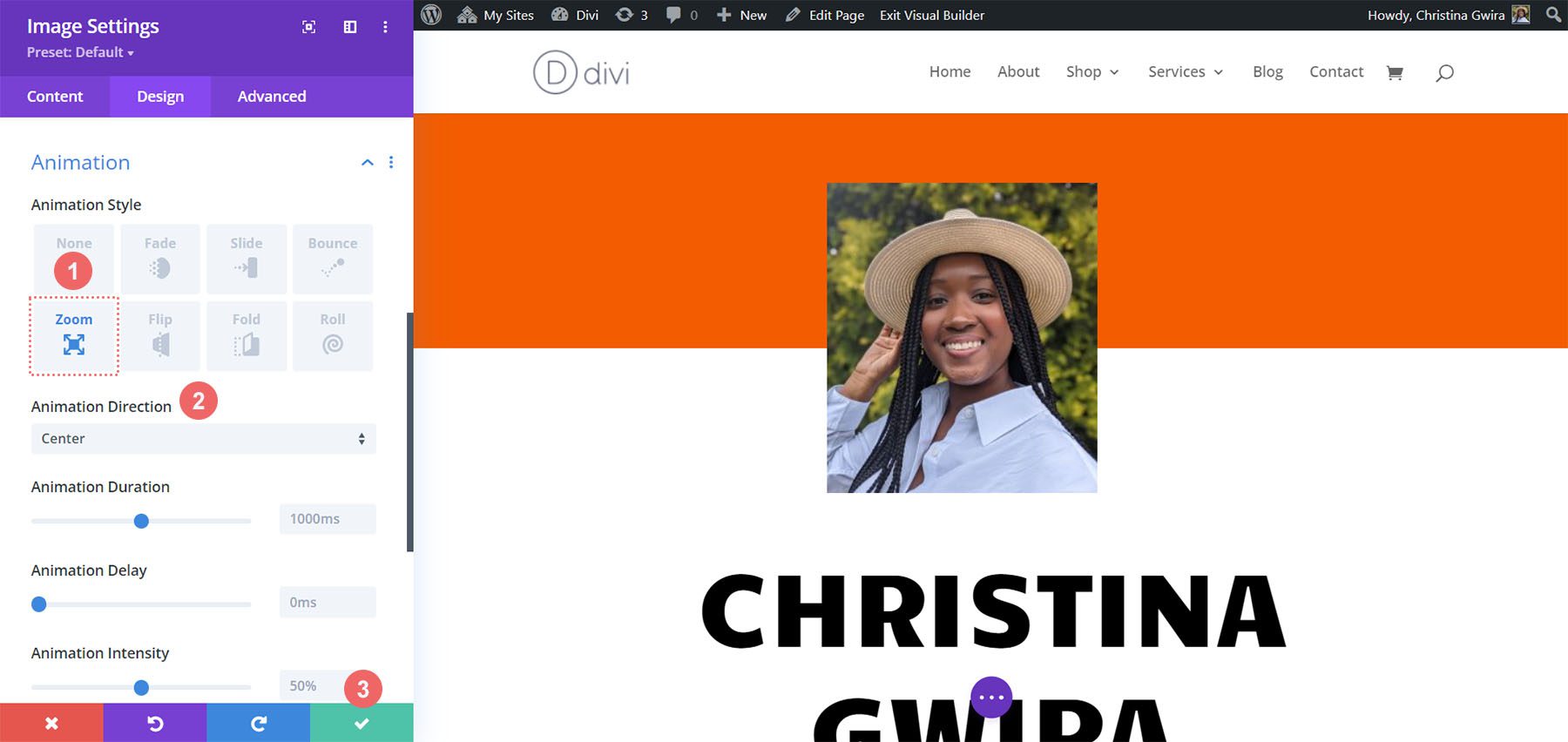
    Style One ft. the Divi Streamer Layout Pack

    You can follow this blog post to see which layout from the Divi Streamer Layout Pack suits your needs best. For this tutorial, we’re going to modify the About Section within the landing page layout.

    About section of the Divi Streamer Landing Page Layout

    Prepare the Section

    First, let’s delete the Number Counter Modules that are currently in this section. Hover over the module, and from the gray popout menu that appears, click the trash can icon.

    Remove Number Counter Modules

    Repeat this for the other Number Counter Module within the section.

    Add Circle Counter Module

    Next, click on the gray plus icon to add a Circle Counter Module to the first column of your row. Next, click on the Circle Counter icon to add one of the modules to the column.

    Adding the Circle Counter Module to the row

    Adding Your Content

    Once your first Circle Counter Module has been added, you’ll now need to enter your data point. In the Content tab of the module, enter a description for your data point. In our case, we’ll be showcasing a percentage of users who are from Toronto. So, we enter our text and the number 78 (without the percent sign!)

    Enter your content and data

    Style the Circle Counter Module

    We now will move to the Design tab. As our section is part of the Divi Streamer Layout Pack, we’ll use the font, text, and colors that are a part of the pack to influence the styling of our module.

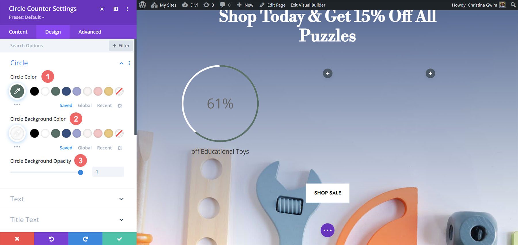
    Styling the Circle Graph

    Let’s start first by clicking on the Circle tab to decide on the colors used for the circle part of the module.

    Circle Design Settings:

    • Circle Color: #5200ff
    • Circle Background Color: #ffffff
    • Circle Background Opacity: 0.4

    The Design Tab Settings for the Circle Tab

    Styling the Title Text

    Following styling the circle graph, we’ll move on to the Title Text of the module. Click on the Title Text tab, then use the following settings to add some life to the title text of our Circle Counter Module.

    Title Text Settings:

    • Title Font: Poppins
    • Title Font Weight: Bold
    • Title Font Color: #ffffff

    Styling the Title Text for the Circle Counter Module

    Adding Style to the Number Text

    Last but not least, we’ll be fixing the numbers within the Circle Counter Module. For this, we click on the Number Text tab. Then, we’ll use the following settings to style. Notice, we pulled inspiration from the layout pack, but also the Number Counter Modules that were there before.

    Number Text Settings:

    • Number Font: Poppins
    • Number Font Weight: Bold
    • Number Text Color: #ffffff
    • Number Text Size: 72pt

    Circle Counter Number Text Settings

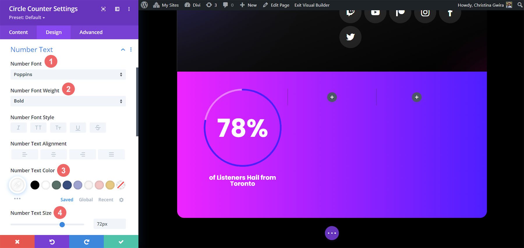
    Once you have ended these final edits, click on the green check mark at the bottom of the modal box. This will save your changes.

    Copy and Update Module

    With styling complete, we can now duplicate this module. We will modify it with our other data points and their corresponding titles. To do this, hover over the module. This will bring up the modules settings menu popup. Click the copy icon. Then, move the module to the other columns in your row.

    Duplicate Circle Counter on the Divi Streamer Page

    In our case, in addition to updating the title and the data for the module, we also changed the colors to match the layout pack.

    The finished Divi Streamer Circle Counter example

    Design Two with the Divi Chocolatier Layout Pack

    Follow the Divi Chocolatier Layout Pack blog post to find out how to install the layout onto your website. We’ll be modifying the events sections on the home page layout. Let’s add some Circle Counter Modules to show data on how many orders have been collected.

    The section we'll be replacing on the Divi Chocolatier home page layout

    Remove Current Content

    Firstly, we want to remove the current modules. While the Text and Image Modules here look great, they’re quite static. By using the Circle Counter Modules, we’ll add some excitement and animation to this section. Hover over each module and click the trash can icon. The icon will appear in the module settings popout menu.

    Remove old modules to prepare the row for the Circle Counter Modules

    We’ll end up with an empty 3-column row.

    The empty row in preparation for our new modules

    Update Titles

    You may also want to consider updating the text modules for the titles to something that is more aligned with the upcoming content for the section. To do so, hover over the text modules, and click on the gear icon to edit the module text.

    Edit title Text Modules

    Add Circle Modules

    Before we add our Circle Counter Modules, we’re going to change the column number for our row. Hover over the row, and click on the grid icon. This will bring a popup where we can select the number of columns we need. For this design, we’ll be visualizing four pieces of data. So, we’ll choose to add four columns to this row. Click on the four-column icon.

    Change column number for Circle Counter Modules

    Now, we’ll add the Circle Counter Modules to the first column by clicking on the gray plus sign icon. Then, when the module popup appears, we click on the Circle Counter icon to add our first Circle Counter Module.

    Add Circle Counter Module to the first column of the row

    Add Data to Circle Modules

    With our first module in place, we can begin to style and add content to it. Firstly, let’s add our title for this module. Next, we’ll add our data point.

    Add your data and content

    For this design, we’ll remove the percent sign that comes with the module by default. To do this, we click on the Elements tab. Next, we uncheck the toggle next to the Percent Sign option.

    Remove percent sign from Circle Counter Module

    Now, we can style this module.

    Styling the Circle Counter Module

    To begin, we switch to the Design tab of the module.

    Switch to the Design tab

    Adding Branding to the Circle Graph

    Next, we click on the Circle toggle to access the design settings for the circle graph aspect of the module. We’ll use the following settings to style it:

    Circle Design Settings:

    • Circle Color: #ff6a28
    • Circle Background Color: #000000
    • Circle Background Opacity: 0.3

    Circle Background Color Settings

    Stylizing the Title Text

    For the title text, we’ll use the following settings after clicking on the Title Text tab:

    Title Text Settings:

    • Title Font: Jost
    • Title Font Weight: Regular
    • Title Text Color: #000000

    Title Text Settings

    Designing the Number Text.

    We’re going to use the same font and color for the number text. However, we’re going to change the size. We have more room within the Circle Counter Module since we are not using the percent sign. We’ll use this to our advantage in our design. Click on the Number Text tab, and enter the following settings:

    Number Text Settings:

    • Number Font: Jost
    • Number Font Weight: Regular
    • Number Text Color: #000000
    • Number Text Size: 72px

    Number Text Settings

    Duplicate and Finish

    Now that we have our first Circle Counter Module designed, we can go ahead and duplicate it.

    Duplicate our Circle Counter Module

    We’ll move the duplicates into their own row, and update the content within to reveal our finished product.

    The Completed Divi Chocolatier Layout with Circle Counters

    Style Three with the Divi Jewelry Designer Layout Pack

    For this design, we used the Divi Jewelry Designer Layout Pack as our starting point. We wanted to add an educational section to the product page of this layout, and will be using the Circle Counter Module to showcase this information. We’ll convert the testimonial section at the bottom of the page into this.

    The testimonial section of the Divi Jewelry Designer Product Page Layout

    Remove Modules

    As with our previous work, we need to go in and delete the current modules within this section.

    Remove old modules from section

    Update Section and Row Design and Structure

    For this layout pack, we also want to change the section’s background to add some interest. Click on the gear icon within the blue settings menu of the section.

    Edit section settings

    First, let’s remove the background image. Click on the Background tab. Then, click on the image icon. Finally, click on the trash can icon to remove the background image.

    Removing the background image from the section

    We want to leave the background gradient and color. Now, let’s add a background pattern to the section. Click on the Background Pattern icon. Then, click the plus icon to add a Background Pattern.

    Add background pattern

    We’ll use the following background pattern.

    Selecting background pattern

    Click the green check icon to save your settings for the section. We’re now going to change the column count of our row. For this design, we’re going to have five columns for our Circle Counter Modules.

    Change column number to five columns

    Add Circle Module

    With the columns and sections created, click on the gray plus icon to add our Circle Counter Module.

    Add Circle Counter Module to the Jewelry Designer

    With the module added to the column, as before, we add in our content. We’ll use the percent sign in this design.

    Add content to the Circle Counter Module

    Style Your Circle Counters

    Now, we’re going to begin to style our counters.

    Stylizing the Circle Graph

    We first start with the circle portion of our counter. The following settings will be used:

    Circle Design Settings:

    • Circle Color: #000000
    • Circle Background Color: #ac8961
    • Circle Background Opacity: 0.5

    The Circle design of the Circle Counter Module


    Notice how we changed the background opacity for this design. We went with a similar beige color, but increased the opacity to add an air of luxury to our design.

    Adding Style to the Title Text

    For the title text, we’ll use the same font family that is used throughout the layout pack. You can find the settings by clicking on the Title Text tab. Below, find the settings that were used to style the title text:

    Title Text Settings:

    • Title Text Font: GFS Didot
    • Title Font Weight: Bold
    • Title Text Color: #000000

    Styling for the Divi Jewelry Designer Layout Pack

    Styling the Number Text

    For the number text, we’ll use a gold color to call back to the colors used within the branding of this layout pack. We click on the Number Text tab to enter the settings which we’ll use below:

    Number Text Styling:

    • Number Font: GFS Didot
    • Number Text Color: #ac8961 
    • Number Text Size: 48px

    Styling for the number in the Divi Jewelry Designer Layout Pack with Circle Counter Modules

    Saving and Duplicating Our Work

    Once we’ve entered in all these settings, we now click on the green check mark at the bottom of the settings box. This will save all our hard work. Now, we can duplicate the module, as we did in previous styles, and edit the content with the remaining data.

    The finished Circle Modules for the layout pack

    We also added some Text Modules in another row above our Circle Modules to add context to our data points.

    Onto the next design!

    Design Four ft. Divi Hostel

    We’ll use the Divi Hostel Layout Pack for our fourth design of this post. Specifically, we’ll modify the amenities section within the landing page template.

    Divi Hostel amenities section within the landing page template

    Remove Modules from the Section

    To prepare for our circle module, we need to remove the modules that are within the section.

    Remove old modules from the Divi Hostel page template

    We want to have four columns for our circle modules, so we’ll leave the row structure as it is.

     Add Circle Module

    Click on the gray plus icon to add the Circle Counter Module to the first column of the row.

    Add Circle Counter to your first column

    Add Content

    Once in the Content tab of the module settings, add in your title and data point.

    Add content to Circle Counter Module

    Start Designing the Circle Counter Module

    Switch to the Design tab to start styling your Circle Counter Module. We’ll start with the circle graph.

    Styling the Circle of the Circle Counter Module

    We’ll use the following settings to style the circle graph of the module:

    Circle Design Settings:

    • Circle Color: #008186
    • Circle Background Color: #d37643
    • Circle Background Opacity: 0.2

    Title Text Styling

    Next, we’ll move on to styling the Title Text of the module. We’ll use the following settings:

    Title Text Settings:

    • Title Text Font: Manrope
    • Title Font Weight: Ultra Bold
    • Title Text Color: #000000

    The Title Text settings for the Circle Counter Module ft. the Divi Hostel Layout Pack

    Number Text Styles

    Finally, we’ll style the number within our Circle Counter Module. The settings that we’ll use are here:

    Number Text Styling:

    • Number Font: Manrope
    • Number Font: Regular
    • Number Text Color: #d37643
    • Number Text Size: 54px

    Number font styling for the Circle Counter Module Divi Hostel

    Add Border and Padding

    Let’s add a border and some spacing to the module to add some interest to the Circle Counter Module. Within the Circle Counter Settings Design tab, click on the Border tab. There, here are the settings to use:

    Border Settings:

    • Borders: All borders
    • Border Width: 4px
    • Border Color: #008186
    • Border Style: Solid

    Adding a border to the Circle Counter Module

    As you can see, we need to add some padding to the module so that the borders don’t stick to the modules. First, we click on the Spacing tab. Next, we’ll use a 25px padding for all the sides.

    Adding spacing to the Circle Counter Module

    Duplicate and Update Your Module

    To save time, we’ll use the right-click menu to duplicate our finished work for the other columns. Right-click on the finished Circle Counter Module, and click the copy icon. Update the content as needed for your needs.

    Final look of the Circle Counter Modules

    Final Example: Divi Toy Store

    For our last example of styling Divi’s Circle Counter Module, we’ll use the Toy Store Layout Pack. We’ll be modifying the home layout within the pack, specifically, the call to action section at the bottom of the page.

    The default Divi Toy Store Footer

    Add Rows to Section

    Unlike our previous examples, we’ll add two rows to this section. This row will be where we’ll add our Circle Counter Modules. To add a new row, hover over the row, and click on the green plus icon. Do this twice.

    Adding two rows to the section

    Then, move the Button Module from the first to the third row. So, we’ll have three rows within this section now: the first row will hold the call-to-action, the section will remain empty (for now), and the third row will have the button.

    Setting up the section with three rows

    Change Column Structure and Add Module

    Now, let’s change the structure of the row that will house our Circle Counter Module. To do this, hover over the grid icon on the green row menu. Select the 3-column structure,we’ll add three modules to this row.

    Change column structure for the row

    In the first columns, we’re going to add the Circle Counter Module by clicking on the gray plus icon, then clicking the Circle Counter Module icon.

    Adding Circle Counter Module

    Add Content to Circle Counter Module

    Now, we’re going to add our content and data to our Circle Counter Module.

    Adding text to the Circle Counter Module

    Style the Circle Counter Module

    As with our previous examples, we move to the Design tab to style the title text, number text, and more. However, we’ll be doing something a little differently to round out this tutorial.

    Styling the Circle Counter

    We’ll start by styling our circle counter with the following settings:

    Circle Design Settings:

    • Circle Color: #557068
    • Circle Background Color: #ffffff
    • Circle Background Opacity: 1

    Styling Circle Graph Circle Counter Module

    Notice how we’re using no transparency for the circle’s background opacity. For this design, we’ll click on the Text tab, and select Light as the text color. This will make the title and the number will be white, or the color you’ve set as the light font color for the page.

    Text Design Settings:

    • Text Alignment: Center
    • Text Color: Light

    Setting text color

    Adding Style to the Title Text

    For the Title Text styling, we’ll use the same font used through the Divi Toy Store Layout Pack. Here are the settings to use:

    Title Text Settings:

    • Title Font: Libre Baskerville
    • Title Font Weight: Bold

    Title Text Settings for the Circle Counter Module

    Styling the Number Text

    For the number text, we’ll use the following settings:

    Number Text Settings:

    • Number Font: Libre Baskerville
    • Number Font Weight: Bold
    • Number Text Color: #ffffff
    • Number Text Size: 72px

    Number Text Settings for the Toy Store Layout Pack

    Adding Accents to Circle Counter Module

    To finish this tutorial, we’re going to go back to the Content tab. We’re then going to click on the Background tab for us to add some accents to our Circle Counter Module. We’re then going to move to the Background Mask icon.

    Background mask as an accent to the Circle Counter Module

    Styling the Background Mask for the Circle Counter Module

    For the Background Mask, we’ll use the following settings to add an accent to your Circle Counter Module

    Background Mask Settings:

    • Background Mask Design: Rock Stack
    • Mask Color: #eac989
    • Mask Transform: Rotate, Invert
    • Mask Aspect Ratio: Square

    Styling Background Masks as accents

    For the second module, we use the following settings:

    Background Mask Settings (Module 2):

    • Background Mask Design: Rock Stack
    • Mask Color: #354e7c
    • Mask Transform: Invert
    • Mask Aspect Ratio: Square

    Styling Background Masks as accents for the second module

    For the last module, these are the settings to use:

    Background Mask Settings (Module 3):

    • Background Mask Design: Rock Stack
    • Mask Color: #f6c6c5
    • Mask Transform: Flip Horizontal, Rotate, Invert
    • Mask Aspect Ratio: Square

    Styling Background Masks as accents for the last module

    With all the accents in place, this is what the final product looks like:

    Final look of the Circle Counter Modules with the Divi Toy Store

    Final Thoughts

    With some guidance and great data, you can change the way in which your users will interact with the content on your site. Using the Circle Counter Module helps to add some interest into your page while showcasing information about your product or service in an eye-catching way. We look forward to seeing you implement some of these tutorials on your site. If you are inspired, let us know in the comments section down below!

    The post 5 Ways to Style Divi’s Circle Counter Module appeared first on Elegant Themes Blog.

  • Get a Free Online Banking Layout Pack for Divi

    Hey Divi Nation! Thanks for joining us for the next installment of our weekly Divi Design Initiative; where each week, we give away a brand new Layout Pack for Divi.

    This time around, the design team has created a beautiful Online Banking Layout Pack that’ll help you get your next Online Banking website up and running in no time!

    This layout pack includes:

    6 Premade page layouts strategically designed for any Online Banking website (including a footer design)
    – Original, royalty-free photos and graphics + customizable source file (see below)
    – Plus, a large collection of pre-designed website elements that are customizable and reusable anywhere.

    This layout pack is available right inside Divi for all Divi customers for FREE as the latest addition to our growing Divi library of hundreds of premade layout packs, thousands of page designs, and countless web design elements and resources.

    divi layout

    Check Out The Divi Online Banking
    Layout Pack Below

    Get it for free today!

    Online Banking layout pack

    Landing Page Design

    Online Banking layout pack

    View The Live Layout Demo

    Home Page Design

    Online Banking Layout Pack for Divi

    View The Live Layout Demo

    Features Page Design

    Online Banking Layout Pack for Divi

    View The Live Layout Demo

    About Page Design

    Online Banking Layout Pack for Divi

    View The Live Layout Demo

    Blog Page Design

    Online Banking Layout Pack for Divi

    View The Live Layout Demo

    Contact Page Design

    Online Banking Layout Pack for Divi

    View The Live Layout Demo

    Key Features

    The Online Banking Layout Pack for Divi is a beautiful, user-friendly design that will grab the attention of potential customers. It provides slick animations that present your content in an engaging way. That, combined with bright colors and a convenient FAQ section, keeps your visitors engaged while building trust in your brand.

    Live Demos

    Click the links below to see a live demo for each of the layouts included in the pack.

    1. Online Banking Landing Page (live demo)
    2. Online Banking Home Page (live demo)
    3. Online Banking Features Page (live demo)
    4. Online Banking About Page (live demo)
    5. Online Banking Blog Page (live demo)
    6. Online Banking Contact Page (live demo)

    Access This Layout Right Now

    Directly from Your Divi Builder

    Since Version 3.0.99 of Divi, you can find and import any of the layouts included in this pack (along with ALL of Divi’s Premade Layout packs) directly from the Divi Builder. They are already waiting for you.

    To access your new layout, simply activate the Visual Builder when editing a page and look for the “Load From Library” icon in the page settings bar (it looks like a plus symbol). Click this icon to launch the Load From Library popup. Under the Premade Layouts tab, you can easily find the new layout by scrolling through the list of layout packs. Once you find the Online Banking Layout Pack, click on it. You will see all the individual layouts included in the pack. Select the layout you want to use and then click the “Use This Layout” button.

    Online Banking Layout Pack for Divi

    For more, check out this video to learn how you can get this layout pack up and running today.

    Subscribe To Our Youtube Channel

    Authentication Required

    Before you can download Premade Layouts from the Divi Library you must authenticate your Elegant Themes Subscription. You can do this by navigating to Divi > Theme Options > Updates. There you can enter your username and API key and save changes.

    Online Banking Layout Pack for Divi

    You can find your API Key under your members area on the Elegant Themes site. After you enter the Username and API Key, you will gain immediate access to our library of hundreds of free layouts (including this one). If you haven’t done this, when you click to import a layout to your page, you will be prompted to enter your Elegant Themes Membership Username and API Key.

    Use Layout Images for FREE with No Licensing Restrictions

    Online Banking Layout Pack for Divi

    The image assets included with these layouts (icons, illustrations, photos, etc.) have no licensing restrictions. This means you can use them in all of your commercial projects without having to worry about paying licensing fees or attributing the photographer. Use them in your commercial websites, sell them within your Divi child themes, include them in your own Divi layout packs or just use them on your blog. We know how challenging it can be to find good photos and how confusing and scary the licensing that governs those photos can be. We want to fix that problem for our users.

    Download the Full Res Image Assets

    New Layout Pack Every Week!

    We hope you enjoy this layout pack. We look forward to hearing your opinions in the comment section below. Make sure you check out next week’s layout pack as well!

    The post Get a Free Online Banking Layout Pack for Divi appeared first on Elegant Themes Blog.

  • Divi Product Highlight: Divi Pixel

    Divi Pixel is a third-party plugin for Divi that adds over 45 custom modules and more than 200 settings to extend the capabilities of Divi. These settings make it easy to create websites that stand out from the crowd. In this post, we’ll look at Divi Pixel and see what it can do to help you decide if it’s the right plugin for your needs.

    What to Expect from Divi Pixel

    Let’s start by taking a look at what you can expect from the Divi Pixel plugin, if you decide to purchase it.

    45+ Customizable Modules

    Divi Pixel adds a ton of new customizable modules to Divi. There’s a lot of variation in modules. It ranges from a before/after slider, to star rating, floating images, carousels, and more.

    Divi Pixel Product Highlight

    200+ Custom Options

    Divi pixel also provides you with a ton of custom options, more than 200 extra options to take your website to the next level! These custom options help you customize your Divi website even further. This goes from being able to upload SVG files, to creating a custom login page, customizing your header & navigation, and more.

    Divi Pixel Product Highlight

    & More

    The options and modules mentioned above aren’t the only ones that come with Divi Pixel. You can expect unique features dedicated to the Blog area and the mobile experience. There’s a also a layout injector included that lets you insert layouts wherever you want!

    Installing Divi Pixel

    Upload and activate Divi Pixel the same as any plugin. Go to the WordPress dashboard and select:

    1. Plugins
    2. Add New
    3. Upload Plugin
    4. Choose File
    5. Install Now

    Installing Divi Pixel

    Next, activate the plugin. Divi Pixel is now ready to use.

    Installing Divi Pixel

    Divi Pixel Settings Screen

    The settings are found in the dashboard under Divi > Divi Pixel. They include 7 tabs with detailed options.

    Divi Pixel Settings Screen

    The settings add features through CSS class IDs, options to enable, and modules added to the Divi Builder. The newest features are labeled. A few are marked as coming soon.

    We’ll look at the latest features and some interesting features in each tab. We’ll see many of the settings on the back and front end.

    Divi Pixel General Tab

    The General tab includes 25 settings that include general options, header and navigation options, and footer options.

    Particles Background

    The Particles Background displays a CSS class ID to add to the module or section you want to display the background. It includes two class IDs to choose from and you can adjust them in the customizer settings.

    Particles Background

    I’ve added the CSS ID to the section.

    Particles Background

    Here’s the background with the animated particles enabled.

    Particles Background

    Maintenance Mode

    Maintenance Mode sets your website to show that it’s coming soon or performing updates. Select any page to show as the maintenance mode page. A custom URL provides access to the site.

    Maintenance Mode

    Here’s the page I selected for my coming soon page. It now shows this page in place of my home page.

    Maintenance Mode

    Allow TTF, OTF, and WOFF Uploads

    Enabling this lets you upload more file types. These file types can now be uploaded the same as any regular file in your media library.

    Allow TTF, OTF, and WOFF Uploads

    Custom Header and Navigation Styles

    Custom Header and Navigation Styles includes hover animations, custom menu dropdown, CTA button, selecting the menu, button text and URL, CSS, a few mobile settings, and more.

    Custom Header and Navigation Styles

    Here’s the header on the front end. It has added a CTA button with a hover animation.

    Custom Header and Navigation Styles

    Footer Customizations

    Footer customizations add new features to the theme customizer.

    Footer Customizations

    The customizer adds the footer menu, bottom bar, and social icons. I’ve adjusted the menu and bottom bar in this example. You can also see the custom scroll bar in this image, which is added separately.

    Footer Customizations

    Divi Pixel Blog Tab

    The Blog tab adds 9 settings and lots of theme customizer options.

    Custom Archive Page Style

    The custom styles include 6 layouts. Choose from a single column with the image on top, a single column with the image on the left, a single column alternating, two columns with the image on top, three columns with the image on top, and alternating using smaller images. You can also apply these layouts to the Divi Blog Module with the CSS Class.

    Custom Archive Page Style

    Here’s the default setting. It adds styling to all the elements including a styled button. The images are wide. This also shows another setting that’s enabled by default called Add icons to meta text and the Read More button. It also adds the author box, post navigation, and related posts, which you’ll see on the posts themselves.

    Custom Archive Page Style

    Changing the layout is as simple as clicking the one you want and saving the changes. Here’s the 3-column layout. The images are tall. I’m hovering over the middle image in the example below to show the overlay.

    Custom Archive Page Style

    You can adjust all the styling with the theme customizer. It includes options for the categories, archives, buttons, sidebar, post navigation, author box, related articles, and comments. I’ve adjusted the title font and excerpt font in the example below. This example also shows the social icons added to the header.

    Custom Archive Page Style

    I’ve adjusted the fonts for the navigation, author box, and related posts. You can adjust all the elements independently. For the author box, I’ve adjusted the title font, body font, and image.

    Custom Archive Page Style

    Divi Pixel Social Media

    The Divi Pixel Social Media tab lets you add social media icons to the header. Choose which part of the header the icons are added to, and the social networks to add.

    Enable Divi Pixel Social Icons

    You can enable the social media icons to display in the header. This also includes options to control how they work on click, for mobile devices, etc.

    Enable Divi Pixel Social Icons

    The icons are placed in the secondary menu by default.

    Enable Divi Pixel Social Icons

    You can also adjust them in the theme customizer. Adjust the icon, background, hover, animation, shape, size, etc. I’ve added the social icons to the primary menu, adjusted the size of the icons, and the hover settings for the icon and background colors.

    Networks

    Select from 19 popular networks. Display them by adding your URL.

    Networks

    Divi Pixel Mobile Tab

    The mobile tab includes breakpoints, fixing the mobile header, hiding the search icon, changing the logo on mobile, etc. This gives you a lot of control over the mobile settings. You can upload any logo you want.

    Divi Pixel Mobile Tab

    Mobile Menu

    The mobile menu adds 9 settings that include options for the menus’ animation style. Choose from a slider, squeeze, spin, elastic, collapse, stand, spring, minus, and vortex. Simply click the one you want. It shows an animation on the settings screen to give you an idea of how it would work on the front end.

    Mobile Menu

    You can adjust all the styling for the hamburger icon in the theme customizer. Adjust the color, open color, background color, opened background color, border radius, padding, etc. In this example, it’s using a different logo, background color, and dropdown menu than the desktop version.

    Mobile Menu

    Collapse Submenu Items on Mobiles

    Choosing Collapse Submenu Items on Mobiles opens another new option- Remove Parent Menu Link. This prevents the parent menu links from opening.

    Collapse Submenu Items on Mobiles

    Divi Pixel Modules Tab

    The Module tab adds over 40 new modules to the Divi Builder. Some of these work with the new post types that are added by Divi Pixel and accessed in the WordPress dashboard. You can show or hide them all or enable the specific modules you want. We’ll look at a few of the Divi Modules.

    Divi Pixel Modules Tab

    Testimonials

    Testimonials adds a new post type where you can create the testimonials for the module to display. You can create them in the editor or get them from Facebook, Google, and WooCommerce. The editor includes fields for the title, content, image, name, company, website, and rating.

    Testimonials

    The module displays the testimonials and provides many options, including the number to display, testimonials to include or exclude, which elements to show or hide, popup settings, carousel settings, the review type, and more. All of the standard Divi design options are here as well.

    Testimonials

    Popup Maker

    The popup maker uses the Divi Builder to create the layouts. The editor also includes trigger settings, popup location options, and customization. This one isn’t a module, but you can show or hide it in the module settings. It’s added to any element with a CSS class ID.

    Popup Maker

    The trigger settings let you choose the trigger events, close options, etc.

    Popup Maker

    The location options include the user roles, site area, and posts that can show the popup. Choose post types, specific posts, and exceptions.

    Popup Maker

    The customization options let you choose the overlay background color, popup animation, position, blur, and more.

    Popup Maker

    FAQ with Schema Markup

    Divi Pixel’s FAQ module is built upon Google’s Structured Data principles. The FAQ builder uses the classic editor. You can create them like any content in the classic editor and add FAQ categories.

    FAQ

    Once you’ve built the FAQs, you can display them with the FAQ Module. Show all FAQs or exclude specific FAQs, display by categories, output structured data and HTML, etc. Style them in the design tab.

    FAQ

    Balloon

    The Balloon Module creates a balloon that is selected as a menu item. Add any content within the balloon and style it in the design tab.

    Content Toggle

    The Content Toggle Module is interesting. It lets you specify two layouts and provides a toggle so the user can switch between them. I’ve specified two layouts. The image below shows the first layout.

    Content Toggle

    Clicking the toggle changes to the second layout, as seen below.

    Content Toggle

    Info Circle

    The Info Circle Module is an interesting way to display information and content. It lets you add icons or images around a circle. Create as many sets of info as you want, choose icons and images for each one, and style them together or independently.

    Divi Pixel Layout Injector Tab

    The layout injector lets you select a Divi layout and place it in certain locations on the website. Place the layout before and after the navigation, footer, and after the blog and archive header. It can also build a 404 page.

    Divi Pixel Layout Injector Tab

    Divi Pixel Supplementary Files

    Divi Pixel also includes many demos you can import to get a head start on your layouts.

    Divi Pixel Supplementary Files

    Where to Purchase Divi Pixel

    Divi Pixel is available in the Divi Marketplace for $169. It includes unlimited website usage, a 30-day money-back guarantee, and 1 year of support and updates.

    Where to Purchase Divi Pixel

    Ending Thoughts

    That’s our look at Divi Pixel. There are a lot of features and modules in this plugin. I’ve only scratched the surface in this post. If you want to extend what you can do with Divi, Divi Pixel is a good place to start.

    We want to hear from you. Have you tried Divi Pixel? Let us know what you think about it in the comments.

    The post Divi Product Highlight: Divi Pixel appeared first on Elegant Themes Blog.

  • How to Use Divi’s Circle Counter Module to Showcase Your Skillset

    Although a traditional resume is timeless, consider creating an online resume website to showcase your skills as well. Especially if you’re searching for a job in the tech industry. In this tutorial, we’ll show you how to use Divi and the FREE Creative CV Layout Pack to create an online resume website design! We’ll focus on using the built-in Divi Circle Counter Module as well.

    Online Resume Website Design: Why is it Important?

    While dropping off a paper resume may work in some industries, in tech, that is a thing of the past. It is important to consider resources that will give your resume the boost it needs to get the job. At the very least, we want an interview! An online resume website creates a central place where recruiters, headhunters, and potential managers can learn more about you. Building a strong personal brand online allows your future employers to see the real you, in addition to what’s on your resume. Some pages that you can consider adding to your personal resume website include:

    • An About Page: Firstly, and more importantly, remember to craft a brand voice that is uniquely you. Don’t forget to brag about yourself!
    • An Online Resume: An online resume puts you in front of the companies looking at your job application. Additionally, search engines like Google and Bing can find it as well. The more eyes that see it, the more chances you have of finding your next opportunity!
    • A Testimonials Page: Showcasing praise and good work from prior (or current!) bosses and is great social proof.
    • A Portfolio/Gallery: If you have examples of your work, putting them into a portfolio adds dimension to your resume.
    • A Contact Page: A contact form and email address make it easy for people to get in touch with you, and give you that job!

    If this is all new to you, don’t worry! We’ll help you get started with designing your online resume website. At Divi, we created the FREE Creative CV Layout Pack that you can download. In this pack, we have page layouts for each of the pages listed above. Also, we’ll be using Divi’s animation features, as well as cool modules like the Circle Counter Module to showcase our various skill sets online.

    Let’s get started and get that tech bag!

    Starting Your Online Resume Website Design

    Download and Install the Layout Pack

    The first step to building our online resume website is downloading and installing the Creative CV Layout Pack. We have instructions on the process in this blog post. This tutorial will focus on upgrading the home layout of the pack with the Circle Counter Module. This is a native Divi module and is the perfect way to showcase your skill set. With clean lines, animation, and more, you can display your skills in a highly visual way, setting you and your resume apart.

    This is what the home layout looks like out of the box:

    The Creative CV Home Layout, the foundation of our online resume website design

    Though this layout is a good jumping-off point for our online resume website design, we will make it more personalized. Firstly, we will use Circle Counter Modules to animate the skills section. Then, we will add some animation to the other modules on the page. Finally, we’ll add some more visual interest to the page with the Icon Module.

    Updating the Skills Section

    Changing the Row Structure

    First, let’s remove the Text Modules that are currently in this section. Hover over each module, and click on the trash can icon in the Module Settings menu that appears.

    Remove Text Modules from the skills section in our online resume website design

    Secondly, change the structure of the row. Click on the grid icon within the row’s hover menu. Then, select the number of columns that match up with the number of skills you want to showcase. We went with 5 columns, so we clicked the icon for 5 columns.

    Change number of columns

    Styling the Row

    For each column within the row, we want to add a border. This is a callback to the borders that are used throughout the Creative CV Layout Pack. To do this, click on the gear icon to open the Row Settings modal box.

    Edit row settings to prepare for column styling

    Adding the Column Border

    Once in the Row Settings, click on the gear icon on the first column.

    Edit column for border styling

    This will open the Column Settings. Within the Column Settings, click on the Design tab. Next, click on the Border tab. We’ll add a thick, black, bottom border to each of the 5 columns in this row. Here are the settings to use:

    Bottom Border Settings:

    • Border Weight: 5px
    • Border Color: #000000
    • Border Style: Solid

    Styling the bottom column border

    Once your settings are inputted, click the green checkmark to save your column settings. Follow the steps for the remaining columns in the row. When that is complete, save the row.

    Integrating Circle Counter Module

    Now that our foundation is set, let’s add the first star of the show, the Circle Counter Module. Click on the gray plus icon in the first column. Select the Circle Counter icon to add the first module to the row.

    Add Circle Counter Module

    Adding Content

    We’re going to take inspiration from the branding of the Creative CV Layout Pack to style our newest addition. To start, add the skill that you want to showcase in the Title field under the Content tab. Next, add in the percentage that correlates to that skill. Remember, authenticity is key when building your personal brand and showing up online.

    Adding text content to Circle Counter Module in our online resume website design

    Styling the Circle

    Using the brand design of the Creative CV template as a guide, we move to the Design tab to start adding color to our Circle Counter Module. In the Design tab, we start by clicking the Circle tab. We use the following settings to style the circle part of our module:

    Circle Design Settings:

    • Circle Color: #fe5a25
    • Circle Background Color: #000000
    • Circle Background Opacity: 0.2

    Circle Counter circle design and branding

    Setting Up Title Text Styles

    Next, we move to style the title of our module by clicking on the Title Text tab. We will use the same font that is used throughout the layout: Candal. The settings for the Title Text styling is as follows:

    Title Text Design Settings:

    • Title Font: Candal
    • Title Text Color: #000000

    Title Text settings for the Creative CV layout

    Styling the Number Text

    The Number Text styling follows the same pattern as the Title Text. However, we use a larger font size. This draws attention to our skillsets displayed in the Circle Counter Module. Here are the settings for the Number Text that we access by clicking the Number Text tab:

    Number Text Settings:

    • Number Font: Candal
    • Number Text Color: #000000
    • Number Text Size: 46px

    Number Text Styling

    Add Animation

    The final touch to our Circle Counter Module is to add an entrance animation. Once our visual design is established, we can set up our motion design. With Divi, it’s easy to add micro animations to various modules used throughout your design. In our case, we’ll add a slide animation to our Circle Counter Modules. To do this, we first start by clicking on the Animation tab. Next, we click on the Slide Animation Style. Lastly, we click on the Up Animation Direction.

    Animation Settings:

    • Animation Style: Slide
    • Animation Direction: Up

    Circle Counter Animation Settings

    As you can see, there are quite a few settings available to further style the animation of this module. However, we want to keep our motion design simple and classic, so we will leave most settings at their default.

    Click on the green icon at the bottom of the Circle Counter Setting menu to save your settings.

    Duplicate and Edit

    Now that the first Circle Counter Module is complete, we can duplicate our work. This will allow us to save time and create continuity within our work. To do this, hover over the Circle Counter Module and click on the Duplicate icon. Next, on the newly duplicated module, click on the gear icon to enter the settings.

    Duplicate the Circle Counter Module

    Update the Content tab with your other skills and talents. However, leave the Design tab alone. After saving your work within that module, hover over the module again, and click and drag it to move it into the second column.

    Update and move circle counter module

    Repeat this until all your skills are within the columns of your row.

    Final Circle Counter Modules in the Creative CV Online Website Resume Design

    With our Circle Modules beautifully in place showing our skills, let’s add some excitement to the other modules on this page.

    Add Animation to Profile Photo

    At the top of our page, we have an Image Module. Here, upload a professional, bright, and crisp headshot of yourself. To do this, click on the gear icon after hovering over the module. Then, click on the Design tab for us to add an exciting animation to the photo.

    Upload professional headshot to online resume website design

    Once in the Design tab, click on the Animation tab. Like the Circle Counter Modules, we’ll keep our animations relatively simple. In this case, we’ll use a Zoom animation with the default settings to grab visitors’ attention to our website. Here are the settings that we use to apply a zoom animation to our image:

    Animation Settings:

    • Animation Style: Zoom
    • Animation Direction: Center

    Adding animation to the Image Module

    As we’re working through the online resume website design, remember to modify the static modules such as text to personalize the template to your needs.

    Add Blurb Modules

    Next on our hit list, we’ll replace the contact text with Blurb Modules. We do this for two reasons. The first is to add more color to the icon that is included within the module. Secondly, we can add a subtle animation to a single Blurb Module, as opposed to having several lines of text flying across the screen if we were to keep the section as is.

    To get started, we hover over each Text Module, click the trash can icon, and remove them from the section.

    Replace text modules within the

    Next, we click on the gray plus icon to add a Blurb Module to the first column. Like the Circle Counter Modules, we’ll duplicate the module once we have styled it.

    Add Blurb Module to the first column

    Next, we click on the Blurb Module icon.

    Click on the Blurb Icon

    Add Your Content

    We navigate to the Text tab and add our content. We’ll showcase our phone number, email address, and location. For this first module, we’ll be inputting our phone number details.

    Add content to blurb module

    Add Icon

    Next, we click on the Image & Icon tab. Once there, we select yes on the Use Icon toggle. We then use the search box to select a phone icon. This is the one we chose.

    Choosing the phone icon for the Blurb Mobile

    Style Icon

    Now we click and move to the Design tab to style our blurb. We use the following settings for the icon:

    Image & Icon Design Settings:

    • Icon Color: #fe5a26
    • Image/Icon Placement: Top
    • Image/Icon Width: 96px

    Styling Blurb Icon

    Set Text Alignment & Color

    Now, we click on the Text tab. We want to center-align our text and make the text throughout the module Dark. Therefore, we click the center icon, and then we click Dark from the Text Color dropdown.

    Setting text alignment and base color

    Style Title Text

    As with the Circle Counter Module, we’ll use the font throughout the layout pack. Clicking on the Title Text tab, the only setting we change is for the font family, which will be Candal.

    Styling the Title Font

    Body Text Styling

    For the Body Text, we’ll be using a different font. As such, we’ll have to add a few other tweaks to the settings to make the Blurb Module mimic the styling of the Text Modules that used to grace this section. Here are those settings:

    Body Text Settings:

    • Body Font: Montserrat
    • Body Font Weight: Regular
    • Body Text Size: 16px 

    Body Text Styling

    Add Animation

    To wrap up our design of the Blurb Module, we’re going to add an entry animation. Like the Image Module, we want this entrance to catch the eye. After clicking on the Animation tab, we click on the Bounce icon. We leave the Animation Direction, as well as the other settings, at their default options.

    Animation Settings:

    • Animation Style: Bounce

    Adding animation to the Blurb Module

    Duplicate Module

    After clicking on the green icon to save all our hard work, we will duplicate our Blurb Module.

    Duplicate Blurb Module

    After duplicating the module, go back to the content tab to update the Text and Image & Icon tabs to match your needs. While we used the Blurb Modules to showcase our phone, email, and location, you may want to use them to display other relevant things to your role or industry. Get creative!

    Contact Information Related Blurb Modules

    Adding the Final Touches to Your Online Resume Website Design

    Using one of the newest Divi native modules, the Icon Module, we will add a sprinkling of iconography to our digital resume. To do this, we will first scroll to the resume section of our page.

    Adding the Icon Module

    Then, we will click on the gray plus icon to add one Icon Module to the column. We want the icon to go at the start of each entry within our resume. Ideally, we also want the icon to be a general visual representation of the company or role.

    Adding Icon Module

    Then, using the search box, type in a term that resonates with the position this icon will represent on your resume.

    Searching for an icon within the Icon Module

    In our example, we used a color swatch to represent the role that color plays in UI, UX, and ultimately the work of a product designer.

    Styling the Icon

    We then click on the Design tab. We use the following settings to change the color and size of the icon:

    Icon Settings:

    • Icon Color: #fe5a26
    • Icon Size: 32px

    Icon Color Settings

    Our last design change will be to left align the Icon Module. To do that, click on the Alignment tab. Then, click on the left align icon. Finally, click on the green checkmark button at the foot of the settings window to lock in your icon settings.

    Change icon alignment

    With the Icon Module designed, we will now click and drag it to the top of our role title.

    Icon positioned over online resume

    For each entry in your resume, add an icon to represent the mentioned role. For this current resume, these are the icons chosen:

    Icons used within the online resume section

    Final Look

    With these subtle animations and additional modules like the Icon Module and the Circle Counter Module, we’ve been able to bring new life to the Creative CV home layout:

    The final look!

    If you’d like to take the layout a step further, you can also check out the FREE header, footer, and blog post template which can supplement the Creative CV Layout Pack as a whole. You can see the header and footer freebie in use above. Making your work public online can be a scary step in your job search journey. But with a tool like Divi in your arsenal, the pressure to build and maintain an online presence can be reduced. Having the right resources to create a visually appealing yet professional website requires balance and skill.

    Final Thoughts

    All in all, we’d love to hear your thoughts on your tech journey. If you’ve been looking to get into tech, would you consider making a website for your resume? If you’re not in tech, do you think a website like this could help you in your career? Let us know in the comments down below, and let’s get a conversation going.

    The post How to Use Divi’s Circle Counter Module to Showcase Your Skillset appeared first on Elegant Themes Blog.