Divi Mega Menu is a plugin for the Divi Builder that allows you to build Mega Menus for your website. With this tool, you can create complex mega menus with menu items, dynamic tabs, and any other Divi modules you desire. Divi Mega Menu harnesses the power of the Divi Builder, giving you complete control over the design of every element in your menu. In this plugin highlight, we will take a closer look at the Divi Mega Menu plugin to help you decide if it’s the right solution for your needs.
Let’s get started!
Installing Divi Mega Menu
Divi Mega Menu comes as a .ZIP plugin file. To install the plugin, open the plugin page in your WordPress dashboard and click Add New. Click Choose File, select the plugin file from your computer, then click Install Now.

Once the plugin is installed, click activate.

Before working with the Divi Mega Menu plugin, there are a few additional steps to take to ensure that the plugin works correctly on your website. First, the plugin author recommends disabling all other plugins, especially caching plugins, on your site during development. Additionally, you should remove any custom CSS that may conflict with the mega menu.

Next, navigate to Divi > Theme Options > Builder > Advanced and disable the Static CSS File Generation option.

Move over to the General tab, then select the Performance section. Disable the options related to dynamic JQuery, CSS, and Javascript.

Finally, flush your permalink structure by navigating to Settings > Permalinks and saving the settings twice.

With all of the setup out of the way, let’s take a look at the Mega Menu plugin.
Divi Mega Menu
Divi Mega Menu adds two new modules to the Divi Builder, the Mega Drop-Down module and the Mega Tabs module. It also adds two new pages to the WordPress dashboard – Mega Menu Settings, where you can modify the plugin options, and Mega Menu, where you can add and edit all your mega menus. Additionally, there are three layout packs that you can download from the plugin website to jumpstart your design.
Divi Mega Menu Builder
Add a New Mega Menu
The Mega Menu page, located under the Divi Engine section, is where you can create and modify your Mega Menus. Click Add New to get started.

Set a title for your mega menu, enter a custom identifier, and click Use The Divi Builder.

Now you can use the Divi Builder to create a unique layout for the mega menu. With the full capabilities of the Divi Builder at hand, you can create complex designs that include the Divi Mega Menu modules as well as the default Divi Builder modules.
Mega Menu Options
Below the Divi Builder, there are three sections with options to style and modify the Mega Menu.
Mega Menu Style
In the general style options, you can set the position to default or tooltip, change the tooltip direction, and choose if the menu is activated on hover or click. You can set the open and close hover delay time, enable close on scroll, and set the entrance animation and duration.

You can also set the menu to display full width or set a custom width. The menu relative position option allows you to set the menu dropdown relative to the menu item, and you can fine-tune the menu position from the left, the top, the top on scroll, and the top on mobile. Finally, you can disable the menu on mobile.

Mega Menu Triangle Style
In the Mega Menu Triangle Style settings, you can enable a triangle or underline above the mega menu and set the location, color, height, and positioning.

Mega Menu Close Icon Style
Here you can enable or disable the close icon, choose the icon that appears, set the icon color, and modify sizing and positioning options.
Mega Drop-Down Module
Let’s take a closer look at the Mega Drop-Down module. This module allows you to add a vertical menu module to your mega menu. In the content tab, you can select the menu you want to display, set the maximum menu width, and choose the direction from which the menu appears. You can also set the parent and back menu icons, set a module link, and change the background.

In the design tab, you can modify the icon colors and sizes, set the background color, border color, and padding for the parent menu and sub-menu items, customize the parent menu and sub-menu item text, and adjust the sizing, spacing, border, box-shadow, and other default design options.

The advanced tab features all of the typical options you would expect to find in a Divi module.
Designing a Mega Menu with the Mega Drop-Down Module
Now let’s design a mega menu section using the Mega Drop-Down module. This design will feature content from Divi’s City layout pack and will drop down under a “Services†menu item to feature some city services.
Section and Row Setup
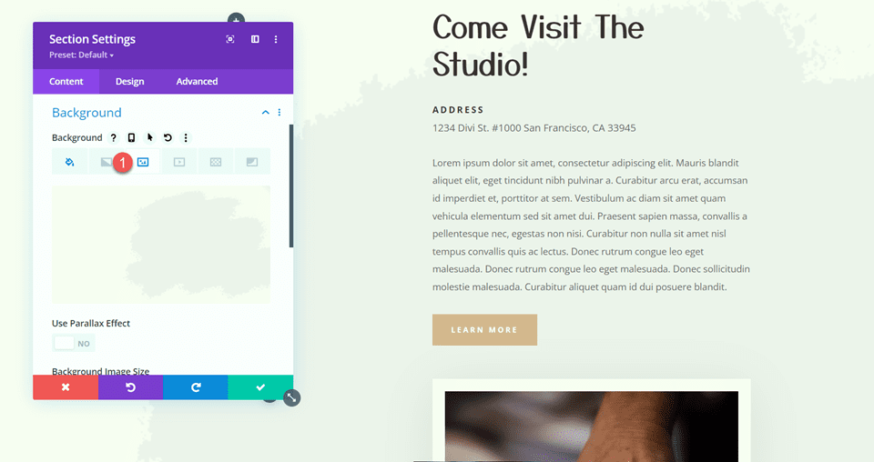
First, open the section settings and change the following options:
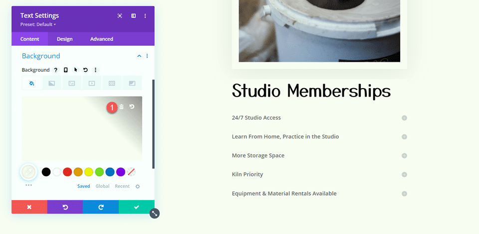
- Background: #000000
- Width: 100%
- Max-Width: 100%
- Padding-Top: 0px
- Padding-Bottom: 0px

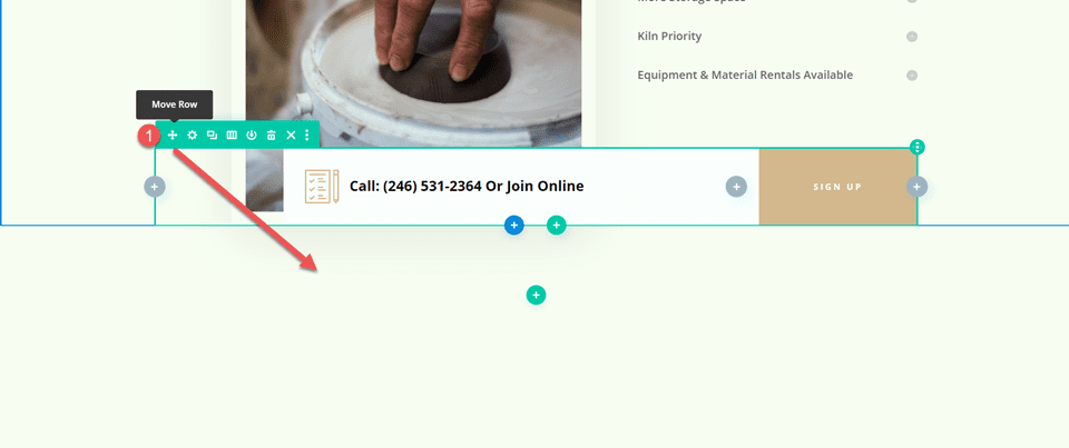
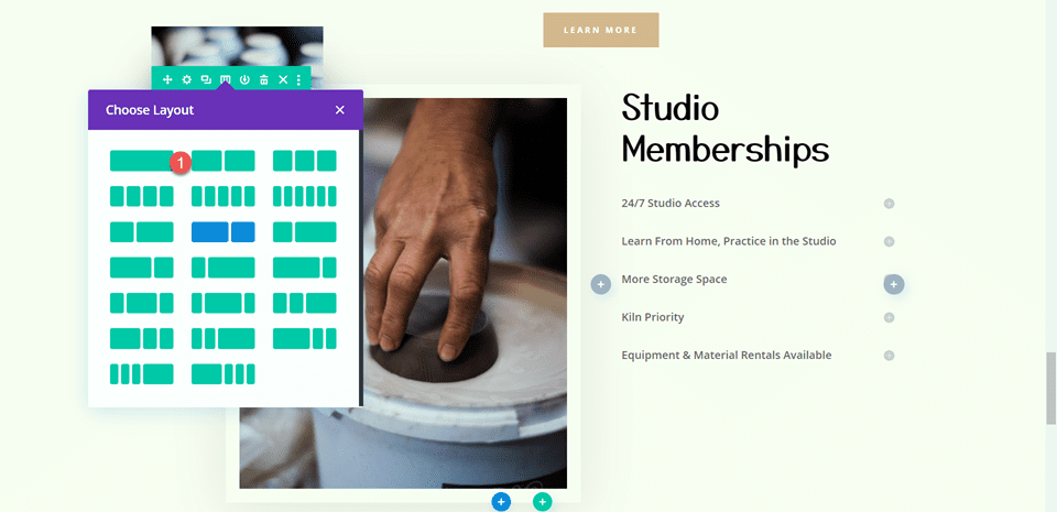
Next, add a row with five columns. Open the row settings and navigate to the Design tab, then change the spacing settings as follows:
- Equalize Column Heights: Yes
- Width: 100%
- Max Width: 100%

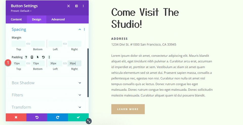
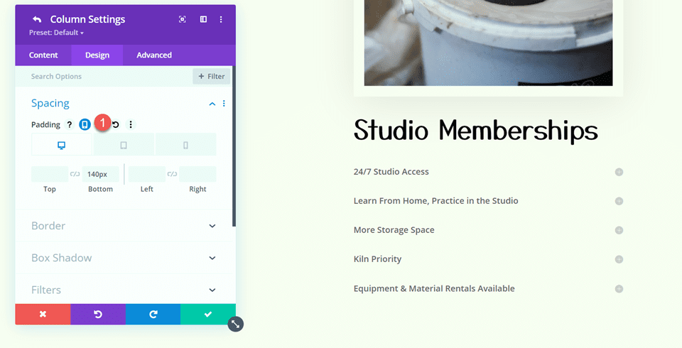
Modify the padding:
- Padding-Top: 0px
- Padding-Bottom: 0px
- Padding-Left: 30px

Finally, move to the Advanced tab and add the following custom CSS to the main element:
Â
align-items:center;
Â

Menu Title and Divider
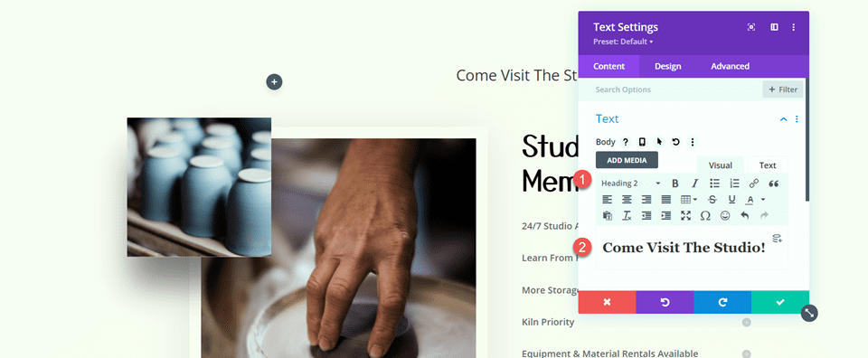
Add a text module to the first column and add the text “City Services†in H3. This will be the heading text for the menu.
Customize the styling as follows:
- H3 Font: Roboto Condensed
- H3 Font Weight: Bold
- H3 Text Color: #FFFFFF
- H3 Text Size: 27px
- Margin-Bottom: 0px

Add a divider module below the header text and modify the styles:
- Line Color: #b1040e
- Divider Weight: 3px
- Width: 40%
- Module Alignment: Left
- Margin-Bottom: 0px

Mega Drop-Down Module
Add the Mega Drop-Down Module to the first column, below the divider. In the content tab, select the menu you would like to display. Additionally, set the module background to transparent.

Move over to the design tab and open the parent menu items section. Modify the padding and border settings.
- Parent Menu Padding Top: 6px
- Parent Menu Padding Bottom: 6px
- Parent Menu Padding Left: 0px
- Parent Menu Border Color: Transparent

Next, modify the parent menu item text options.
- Parent Menu Item Font: Poppins
- Parent Menu Item Text Color: #FFFFFF
- Parent Menu item Text Size: 18px

Finally, add some bottom padding in the spacing settings.
- Padding-Bottom: 30px

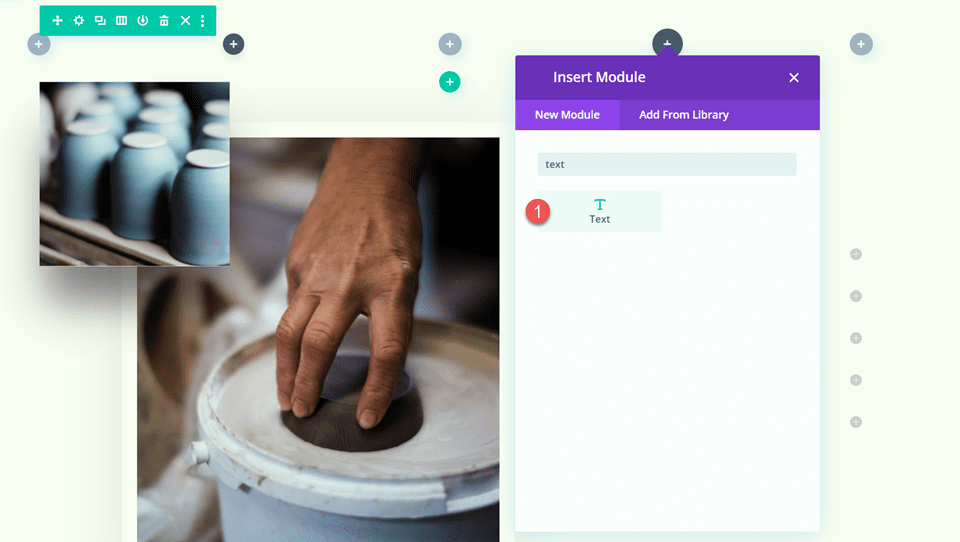
Blurb Modules
Add six blurb modules to the layout, two in each of the middle columns. Add a title and an image to each blurb and customize the styling in the design tab.

In the image and icon section, modify the following:
- Image/Icon Background Color: #FFFFFF
- Image/Icon Placement: Top
- Image/Icon Width: 60px
- Image/Icon Alignment: Center
- Image/Icon Rounded Corners: 100px
- Image/Icon Padding: 8px 8px 8px 8px
Next, modify the title text options.
- Title Font: Poppins
- Title Font Weight: Bold
- Title Text Alignment: Center
- Title Text Color: #FFFFFF
- Title Text Size: 20px

Finally, set the bottom margin to 30px.

Image Module
In the last column, add an image module and set the image.

In the design tab, modify the following settings:
- Show Space Below the Image: No

Modify the Mega Menu Style Settings
Now our layout is complete. Scroll down to the Mega Menu Style options and modify the following options:
- Full Width: Yes
- Entrance Menu Animation: Slide Down
- Adjust from Top: 30px

Final Result
Here is the final result of the mega menu with the Mega Drop-Down module.

Mega Tabs Module
Now let’s take a closer look at the Mega Tabs module. This module allows you to add tabbed content to your page, either in a dropdown mega menu or elsewhere in your design. The Mega Tabs module cannot be viewed in the visual builder, but you can use the wireframe view to build the section and preview the design on the live site.
In the content section of the module settings, you can add each of your tabs. Each tab has its own settings page where you can modify the styling for that tab, or you can modify the styles of all tabs together in the general module settings. Under the Tab Extras section, you can add links and images to each of your tabs.

In the design tab, you can modify the body and tab text styles as well as the sizing, spacing, border, box shadow, filter, transform, and animation options.

The advanced tab also contains the typical elements to further customize the design.
Designing a Mega Menu with the Mega Tabs Module
For this example, we are going to design a dropdown mega tab menu to go along with the City layout pack we are using. Add a row with a single column to the Mega Menu page, then add the Mega Tabs module.

Content Settings
In the Mega Tabs settings, add four new tabs. Add a title to each tab, then add a left-aligned image and some text to the body.

Back in the general module settings, open the Tab Extras section and add the tab images for each tab. Rearrange the images so that the order corresponds with the tab order above.

Next, set the module background to black.

Design Settings
Open the Body Text settings and modify the following:
- Body Font: Poppins
- Body Text Color: #FFFFFF
- Body Text Size: 16px

In the Tab Text options, change the following options:
- Active Tab Background Color: #FFFFFF
- Inactive Tab Background Color: #000000
- Active Tab Text Color: #000000
- Tab Text Color: #FFFFFF
- Tab Font: Poppins
- Tab Font Weight: Bold
- Tab Text Size: 20px

Modify the Mega Menu Style Settings
Now the layout is complete, scroll down to the Mega Menu Style options and change the following:
- Entrance Menu Animation: Slide Down
- Adjust from Top: 30px

Final Result
Here is the completed design of the Mega Tabs menu.

Divi Mega Menu Settings
The Mega Menu settings page is where you can control some of the options relating to the plugin. Here you can select the type of navigation you are using, set the header to be fixed, stop parent menu item click through, enable a background overlay, and change the plugin removal settings.

In the Mobile Settings tab, you can enable or disable the plugin on mobile, specify the mobile menu breakpoint, enable a fixed mobile menu, stop parent menu item click through, and specify a mobile menu ID.

Adding the Divi Mega Menu
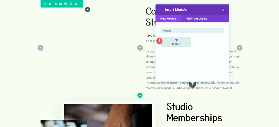
There are many ways to add a mega menu layout to your site. You can set it to appear in a menu, or you can assign it to a module in your layout, such as a button or icon, where it can appear on hover or click. Additionally, you can add the Mega Drop-Down module and the Mega Tabs module to any layout you build with Divi just like any other module, so you are not limited to creating drop-down menus – you can add them throughout your layout as you like.
Before adding the mega menu to your site, make sure the mega menu has a custom identifier set. Go ahead and copy the custom identifier as you will need this to add the mega menu to the site. Additionally, make sure the mega menu is set to published so that it appears on the front end of your site.

Adding a Mega Menu to a Menu Item
To add a mega menu layout to your menu, navigate to the Menus page under Appearance. Expand the item you want to set as the parent item for the mega menu, then paste the custom identifier you copied to the CSS Classes field. Here, I am adding the Mega Dropdown layout to the Services menu item and the Mega Tabs layout to the About menu item.

If you don’t see the CSS Classes field, click Screen Options at the top of the page and enable CSS Classes.

Here is what the Mega Dropdown layout looks like in the menu.

And here is the Mega Tab layout.

Adding a Mega Menu to a Module
To add a mega menu to a module, simply paste the custom identifier into the CSS Class field in the Advanced tab of the module. The mega menu layout will appear on hover or on click, depending on the settings you set. Here, I am adding the mega tabs layout to the “Plan a Visit†button.

On the front end, the mega menu appears on hover.

Using Divi Mega Menu Modules in a Layout
To add the Mega Drop-Down or Mega Tabs module directly to any layout, simply add a new module to the page and select the desired module.

Here is what it looks like on the front end.

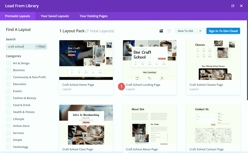
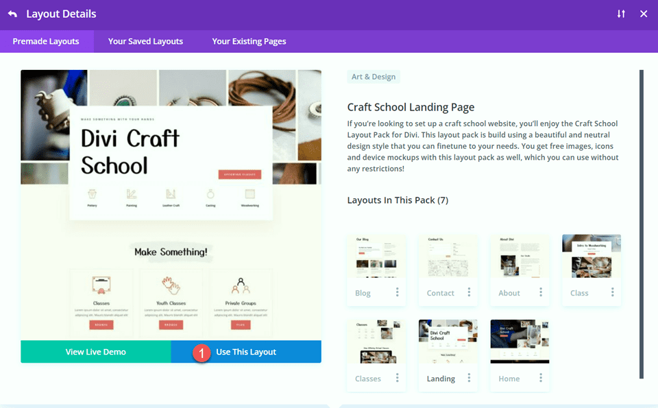
Divi MegaMenu Examples
Divi MegaMenu comes with access to three layout examples that have several interesting mega menu designs that you can use to jumpstart your design. Let’s take a look at the mega menu layouts that come with the Business layout pack.
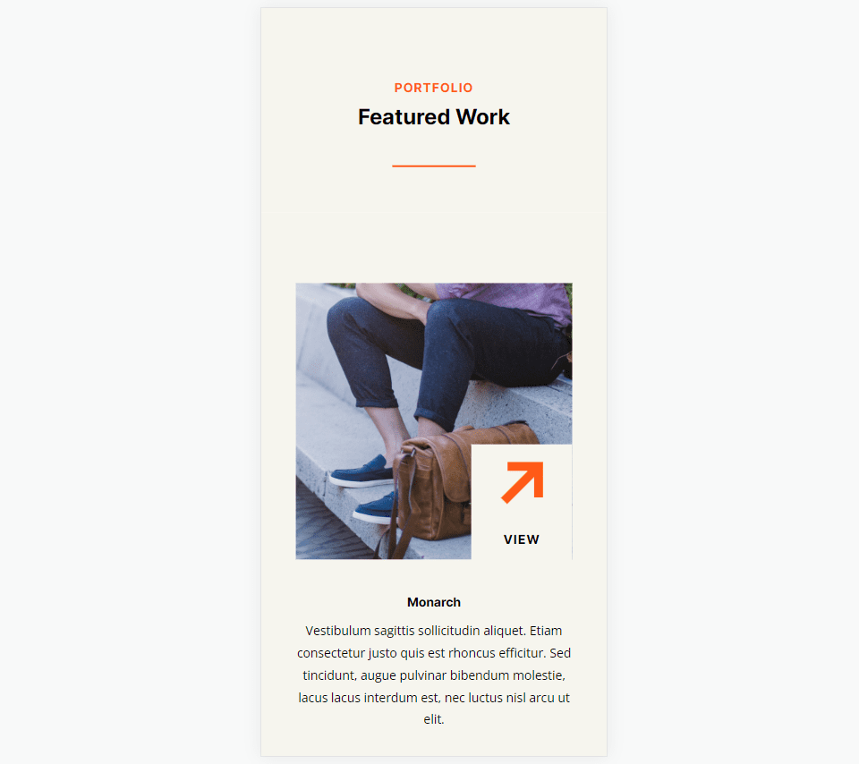
The 4 columns layout features two columns with an image, text, and a button, an empty column, and a large menu on the right.

The products layout is a simple, colorful menu layout that highlights different products.

This is the vertical tabs layout, which utilizes the Mega Tabs module.

The Mega Drop-Down layout features four columns of drop-down menu modules with sub-menu items.

The list layout features four columns with titles, dividers, and blurb modules that feature an icon.

The blog menu layout displays the latest post and a post slider.

The media layout has two gallery modules, an image, two video sliders, and two video modules.

Finally, the contact menu layout has some blurbs with contact information, a contact form, and a map module.

Purchase Divi Mega Menu
Divi Mega Menu is available in the Divi Marketplace. It costs $46 for unlimited website usage and one year of support and updates. The price also includes a 30-day money-back guarantee.

Final Thoughts
Divi Mega Menu adds some great functionality to the Divi Builder, allowing you to build creative and unique Mega Menu layouts with the full range of design options available in Divi. One of its advantages is the ability to incorporate native Divi modules into the Mega Menu layouts, resulting in drop-down menus that offer more than just menu items. Divi Mega Menu also makes it easy to add mega menus to the header, to a module, or directly to a layout, giving you lots of flexibility in the design and placement. If you are looking for a plugin that will allow you to easily build mega menus with complex features and layouts, Divi Mega Menu might be a great option for you.
We would love to hear from you! Have you tried Divi Mega Menu? Let us know what you think about it in the comments!
The post Divi Product Highlight: Divi Mega Menu appeared first on Elegant Themes Blog.


