EDITS.WS

Tag: Divi Tutorial

  • How to Expand Your Map Module on Scroll with Divi’s Scroll Effects

    Adding a map to your website is a great way to show your visitors where you or your business is located. With Divi‘s built-in settings, you have full creative control over the design of your map module and any surrounding design elements. Take your designs to another level by applying scroll effects to your module. With several different types of effects to choose from and settings to fine-tune the effect until you achieve exactly what you want, using scroll effects can help you add eye-catching movement to your website modules. In this post, we will show you how to enlarge your map module on scroll with Divi’s scroll effects.

    Let’s get started!

    Sneak Peek

    Here is a preview of what we will design.

    Layout 1

    Divi Enlarge Map On Scroll With Scroll Effects Layout 1 Final Design Mobile

    Layout 2

    Divi Enlarge Map On Scroll With Scroll Effects Layout 2 Final Design Mobile

    What You Need to Get Started

    Before we begin, install and activate the Divi Theme and make sure you have the latest version of Divi on your website.

    Now, you are ready to start!

    How to Enlarge Your Map Module on Scroll with Divi’s Scroll Effects

    Layout 1

    Create a New Page with a Premade Layout

    Let’s start by using a premade layout from the Divi library. For this design, we will use the Acai Bowl Landing Page from the Acai Bowl Layout Pack.

    Add a new page to your website and give it a title, then select the option to Use Divi Builder.

    Divi Enlarge Map On Scroll With Scroll Effects Use Builder

    We will use a premade layout from the Divi library for this example, so select Browse Layouts.

    Divi Enlarge Map On Scroll With Scroll Effects Find Layout

    Search for and select the Acai Bowl Landing Page.

    Divi Enlarge Map On Scroll With Scroll Effects Select Layout

    Select Use This Layout to add the layout to your page.

    Divi Enlarge Map On Scroll With Scroll Effects Use Layout

    Now we are ready to build our design.

    Add the Map Module

    We are going to add the map module to the “Come Visit Us” section on the landing page. Start by adding a new row with a single column.

    Divi Enlarge Map On Scroll With Scroll Effects Row

    Add the map module to the new row.

    Divi Enlarge Map On Scroll With Scroll Effects Add Map

    Add your Google API Key to enable the map if you haven’t already. Then, add a center address to the map. For this tutorial, the address will be San Fransisco, California.

    Divi Enlarge Map On Scroll With Scroll Effects Map API Address

    Next, add a new pin.

    Divi Enlarge Map On Scroll With Scroll Effects Add Pin

    Set the map pin address. Once again, we will set this to San Fransisco, California for this tutorial.

    Divi Enlarge Map On Scroll With Scroll Effects Address

    Design Settings

    Move to the Design tab and open the sizing settings. Set the Height.

    • Height: 300px

    Divi Enlarge Map On Scroll With Scroll Effects Height

    Next, open the border settings and add rounded corners to the map.

    • Rounded Corners: 22px

    Divi Enlarge Map On Scroll With Scroll Effects Rounded Corners

    Add the Scroll Effects

    Now the design of our map module is complete so that we can add the scroll effects. Move to the Advanced tab, then navigate to the Scroll Effects. Under Scroll Transform Effects, select the scaling up and down tab.

    Divi Enlarge Map On Scroll With Scroll Effects Scroll Effects

    Enable Scaling Up and Down. This will allow our map module to increase in size as you scroll down the page.

    Divi Enlarge Map On Scroll With Scroll Effects Enable Scaling

    Let’s fine-tune the scaling settings. Adjust the starting, mid, and ending scale. You can achieve a more subtle scale effect by keeping the numbers relatively close together. If there is a big difference between the numbers, you will achieve a more drastic scale effect.

    • Starting Scale: 80%
    • Mid Scale: 90%
    • Ending Scale: 100%

    Divi Enlarge Map On Scroll With Scroll Effects Scaling

    Finally, set the motion effect to trigger in the middle of the element.

    • Motion Effect Trigger: Middle of Element

    Divi Enlarge Map On Scroll With Scroll Effects Effect Trigger

    Final Design

    Here is the final design for our first layout.

    Divi Enlarge Map On Scroll With Scroll Effects Layout 1 Final Design Mobile

    Layout 2

    Create a New Page with a Premade Layout

    For the second layout, we will use the contact page layout from the same Acai Bowl Layout Pack. Let’s get started.

    Add a new page to your website and give it a title, then select the option to Use Divi Builder.

    Divi Enlarge Map On Scroll With Scroll Effects Layout 2 Use Builder

    We will use a premade layout from the Divi library for this example, so select Browse Layouts.

    Divi Enlarge Map On Scroll With Scroll Effects Layout 2 Use Builder

    Search for and select the Acai Bowl Contact Page.

    Divi Enlarge Map On Scroll With Scroll Effects Layout 2 Find Layout

    Select Use This Layout to add the layout to your page.

    Divi Enlarge Map On Scroll With Scroll Effects Layout 2 Use Layout

    Now we are ready to build our design.

    Modify Row Settings

    First, move the row containing the map module to the section above, below the addresses.

    Divi Enlarge Map On Scroll With Scroll Effects Layout 2 Move Map

    Then, modify the row layout to two columns.

    Divi Enlarge Map On Scroll With Scroll Effects Layout 2 Row

    Open the row settings, then open the column 1 settings.

    Divi Enlarge Map On Scroll With Scroll Effects Layout 2 Column Settings

    Add a background color.

    • Background: #442854

    Divi Enlarge Map On Scroll With Scroll Effects Layout 2 Background

    Finally, navigate to the design tab and open the border settings. Add rounded corners to the bottom left and right corners.

    • Rounded Corners – bottom left: 300px
    • Rounded Corners – bottom right: 300px

    Divi Enlarge Map On Scroll With Scroll Effects Layout 2 Rounded Corners

    Modify Section Settings

    Open the section settings for the section containing the map module. Navigate to the background settings, then add a background mask.

    • Background Mask: Corner Blob
    • Mask Color: #FFFFFF
    • Mask Transform: Vertical and Invert

    Divi Enlarge Map On Scroll With Scroll Effects Layout 2 Background Mask

    Add Image

    First, add an image module to the column next to the map module.
    Divi Enlarge Map On Scroll With Scroll Effects Layout 2 Image

    Then, add the transparent image of the acai bowl to the module. You should have this in your media library labeled as acai-bowl-34.png if you used the Acai Bowl landing page layout for Layout 1.

    Divi Enlarge Map On Scroll With Scroll Effects Layout 2 Add Image

    We want the image of the acai bowl to rotate as you scroll down the page. Move over to the Advanced tab, then open the Scroll Effects section. Select the Rotating tab and enable rotating.

    Divi Enlarge Map On Scroll With Scroll Effects Layout 2 Rotating

    Next, set the rotation.

    • Starting Rotation: 180
    • Mid Rotation: 90
    • Ending Rotation: 0

    Divi Enlarge Map On Scroll With Scroll Effects Layout 2 Set Rotating

    Map Design

    Now move over to the map module settings. Under the design tab, open the map settings. Enable the grayscale filter.

    • Use Greyscale Filter: Yes
    • Greyscale Filter Amount (%): 100

    Divi Enlarge Map On Scroll With Scroll Effects Layout 2 Greyscale

    Next, modify the height under the Sizing tab.

    • Height: 600px

    Divi Enlarge Map On Scroll With Scroll Effects Layout 2 Height

    Under the Spacing settings, add some margins.

    • Margin-Top: 5px
    • Margin-Bottom: 5px
    • Margin–Left: 5px
    • Margin-Right: 5px

    Divi Enlarge Map On Scroll With Scroll Effects Layout 2 Margin

    Then add rounded corners to the bottom left and right corners.

    • Rounded Corners – Bottom Left: 300px
    • Rounded Corners – Bottom Right: 300px

    Divi Enlarge Map On Scroll With Scroll Effects Layout 2 Border Rounded Corners
    Add Scroll Effects

    Now we can finally add the scroll effects to the map so that it enlarges on scroll. Open the Scroll Effects section under the Advanced tab. Then, select the scaling up and down tab and enable scaling up and down.

    Divi Enlarge Map On Scroll With Scroll Effects Layout 2 Scroll Effects

    Finally, customize the scales.

    • Starting Scale: 90%
    • Mid Scale: 95%
    • Ending Scale: 100%

    Divi Enlarge Map On Scroll With Scroll Effects Layout 2 Scaling

    Final Design

    Here is the final design for layout 2.

    Divi Enlarge Map On Scroll With Scroll Effects Layout 2 Final Design Mobile

    Final Result

    Now let’s take a look at both of our layouts in action.

    Layout 1

    Divi Enlarge Map On Scroll With Scroll Effects Layout 1 Final Design Mobile

    Layout 2

    Divi Enlarge Map On Scroll With Scroll Effects Layout 2 Final Design Mobile

    Final Thoughts

    By applying Divi’s scroll effects to the map module, you can achieve a unique effect as you scroll down the page and help your map stand out to website visitors. These effects can be applied to any other module on your website as well, so there is no limit to what you can achieve with some creativity! If you are interested in more tutorials related to the map module, check out this article for how to add a fixed map toggle to your Divi page template. And if you want some more design ideas using scroll effects, check out this tutorial for how to add scroll-animated icons to your section backgrounds. How have you applied Divi’s scroll effects to your website? Let us know in the comments!

    The post How to Expand Your Map Module on Scroll with Divi’s Scroll Effects appeared first on Elegant Themes Blog.

  • Using the Divi Fullwidth Map vs Map Module

    Adding a map to your website can make it easy for your website visitors to see where your business is located or to see where an event might be taking place. Divi comes with two built-in options to embed Google Maps to your page design: the fullwidth map module and the regular map module. With the fullwidth map module, you can add a big, eye-catching map that spans the width of your page. You can customize the look of the fullwidth map module using the fullwidth module settings, and it can be a great design element to add to your layout. You can add Divi’s regular map module to any regular section. The design options are endless as you can combine module, row, and section options to create unique layouts for your website.

    In this tutorial, we will show you how to create two different layouts using the fullwidth map module and the regular map module.

    Let’s get started!

    Sneak Peek

    Here is a preview of what we will design.

    Layout 1 – Fullwidth Map Module

    Divi Fullwidth Map VS Map Module Fullwidth Final Design


    Divi Fullwidth Map VS Map Module Fullwidth Final Design Mobile

    Layout 2 – Regular Map Module

    Divi Fullwidth Map VS Map Module Regular Final Design

    Divi Fullwidth Map VS Map Module Regular Final Design Mobile


    What You Need to Get Started

    Before we begin, install and activate the Divi Theme and make sure you have the latest version of Divi on your website.

    Now, you are ready to start!

    Using the Divi Fullwidth Map vs Map Module

    Create a New Page with a Premade Layout

    Let’s start by using a premade layout from the Divi library. For this design, we will use the Conference About Page from the Conference layout pack.

    Add a new page to your website and give it a title, then select the option to Use Divi Builder.

    Divi Fullwidth Map VS Map Module Use Builder

    We will use a premade layout from the Divi library for this example, so select Browse Layouts.

    Divi Fullwidth Map VS Map Module Browse Layouts

    Search for and select the Conference About Page layout.

    Divi Fullwidth Map VS Map Module Search

    Select Use This Layout to add the layout to your page.

    Divi Fullwidth Map VS Map Module Use Layout

    Now we are ready to build our design.

    Layout 1 – Fullwidth Map Module

    For our first layout, we will add the fullwidth map module to the footer, right above the black footer section with all of the links. Instead of adding this element to the page, we will use the theme builder in Divi’s settings to create a footer section for this page, then add the map. Let’s get started.

    First, right-click on the footer section or click the three dots in the section toolbar, then copy the section.

    Divi Fullwidth Map VS Map Module Copy Footer Section

    Then, delete the section from this page.

    Design the Footer Layout with the Theme Builder

    From the WordPress dashboard, navigate to the theme builder section within Divi’s settings. Click Add a New Template.

    Divi Fullwidth Map VS Map Module Add New Template

    For this design, I am only enabling the template for the page with our Conference About Page template.

    Divi Fullwidth Map VS Map Module Template Settings

    Next, click Add Custom Footer and select Build Custom Footer.

    Divi Fullwidth Map VS Map Module Build Custom Footer

    Now that your custom footer settings are open in the theme builder, paste the footer section you copied from the original layout.

    Divi Fullwidth Map VS Map Module Paste Section

    Add a new fullwidth section above the footer layout you pasted.

    Divi Fullwidth Map VS Map Module Insert Fullwidth

    Then, add the fullwidth map module.

    Divi Fullwidth Map VS Map Module Fullwidth Menu Module

    Fullwidth Map Module Settings

    Open the map module settings. If you haven’t already, add your Google API Key so that the map can be displayed. (Learn more about the Google Maps API Key requirement here.)

    Divi Fullwidth Map VS Map Module Google API Key

    We need to add a Map Center Address under the Map settings on the Content tab so that our map is positioned to display a specific location. We will center our map on San Fransisco, California for this layout.

    Divi Fullwidth Map VS Map Module Map Center Address

    We also want to add a pin to the map. Under the Content tab, click Add New Pin.

    Divi Fullwidth Map VS Map Module Add New Pin

    Enter the pin address.

    Divi Fullwidth Map VS Map Module Map Pin Address

    Finally, delete the empty section from the footer layout.

    Divi Fullwidth Map VS Map Module Delete Section

    Fullwidth Map Module Final Design

    Here is the final design with the fullwidth map module.

    Divi Fullwidth Map VS Map Module Fullwidth Final Design

    Divi Fullwidth Map VS Map Module Fullwidth Final Design Mobile


    Layout 2 – Regular Map Module

    For our second layout, we will be using the regular map module. Similar to the last design, we will incorporate it into the footer design using the theme builder settings. For this design, we will add a map to the “Where to Stay” section.

    Design the Footer Layout with the Theme Builder

    We’ll follow the same steps as the fullwidth map module layout to create a custom footer design in the theme builder. In a new tab, open the WordPress Dashboard and navigate to the theme builder section within Divi’s settings. You should have the original layout design open in another tab.

    Click Add a New Template.

    Divi Fullwidth Map VS Map Module Add New Template

    Once again, I am only enabling the template for the page with our Conference About Page template.

    Divi Fullwidth Map VS Map Module Template Settings

    Next, click Add Custom Footer and select Build Custom Footer.

    Divi Fullwidth Map VS Map Module Build Custom Footer

    Now that your custom footer settings are open in the theme builder, go back to the tab with the original layout and copy the “Where to Stay” section.

    Divi Fullwidth Map VS Map Module Copy Section

    Paste the “Where to Stay” section in the custom footer layout.

    Divi Fullwidth Map VS Map Module Paste Section

    Go back to the original layout and copy the footer section.

    Divi Fullwidth Map VS Map Module Copy Footer

    Then, paste the footer section below the “Where to Stay” section in the custom footer layout.

    Divi Fullwidth Map VS Map Module Regular Paste Footer

    Delete the “Where to Stay” section and the footer section from the original layout.

    Finally, delete the empty section from the custom footer layout.

    Divi Fullwidth Map VS Map Module Regular Delete Section

    Fullwidth Map Module Settings

    Add a map module below the “Where to Stay” body text.

    Divi Fullwidth Map VS Map Module Regular Map Module

    Then, open the map module settings. Once again, ensure you have added your Google API Key to the Map settings so the map can be displayed.

    Add a Map Center Address so that the map is positioned to a location. For this example, we will set it to San Fransisco, California.

    Divi Fullwidth Map VS Map Module Regular API Map Address

    Next, add a pin to the map.

    Divi Fullwidth Map VS Map Module Regular Add Pin

    Enter the pin address.

    Divi Fullwidth Map VS Map Module Regular Map Pin Address

    Regular Map Module Final Design

    Here is the final design with the regular map module.

    Divi Fullwidth Map VS Map Module Regular Final Design

    Divi Fullwidth Map VS Map Module Regular Final Design Mobile

    Final Result

    Now let’s take another look at our final designs together.

    Layout 1 – Fullwidth Map Module

    Divi Fullwidth Map VS Map Module Fullwidth Final Design


    Divi Fullwidth Map VS Map Module Fullwidth Final Design Mobile

    Layout 2 – Regular Map Module

    Divi Fullwidth Map VS Map Module Regular Final Design


    Divi Fullwidth Map VS Map Module Regular Final Design Mobile

    Final Thoughts

    The fullwidth map module and the regular map module are an easy way to add an eye-catching design element to your page, not to mention it provides valuable information to your website visitors. You can easily customize these sections using the various module, row, and section settings, and they can be combined with other design elements on the page to create dynamic layouts for your website. If you want to learn more about what the map modules can do, check out this tutorial to add a fixed map toggle to a page template.

    Do you use a fullwidth menu module or a regular menu module on your website? Or both? We’d love to hear from you in the comments!

    The post Using the Divi Fullwidth Map vs Map Module appeared first on Elegant Themes Blog.

  • How to Create a Message Pattern in Your Divi Contact Form Module

    Email Message Patterns are an excellent way to view messages sent through your Divi Contact Forms. You have full control over the layout design and content, so you get the exact information you want in the way you want it. In this post, we’ll see how to create a Message Pattern in your Divi Contact Form Module and explain how to use it.

    What is a Message Pattern?

    The Message Pattern is a template for the email message. It specifies how the message looks and what information it includes when you receive it in email. It can include text that you specify and the content of any of the fields in the form. The Message Pattern is not required, but it is helpful. Simply leave it blank for the default pattern.

    Why Use a Message Pattern?

    Utilizing a message pattern is a great way to streamline your workflow. You’ll have the exact information you want in the layout you want.

    Where to Find the Email Message Pattern

    To find the email Message Pattern field, open the Contact form Module by clicking the dark gray gear icon that appears on hover. For this example, I’m using the Contact page from the free Home Baker Layout Pack that’s available within Divi.

    Where to Find the Email Message Pattern

    Next, scroll down to the section labeled Email. Here, you’ll find two fields. The first is Email Address. This is the address of the message that will be sent. The second field is called Message Pattern. Enter your pattern into this field.

    Where to Find the Email Message Pattern

    When a message is sent to the email address that you’ve imputed into the Email Address field, it normally includes only the content in the Message field. For example, I’ll send this message:

    Where to Find the Email Message Pattern

    The result is an email with who it’s from, as normal, but the body of the content only shows the message itself.

    Where to Find the Email Message Pattern

    How to Create a Message Pattern

    We can adjust the content of the email by creating a Message Pattern. You can add text and specify the fields you want to include. To include a field, add two percent symbols to both sides of the field’s ID. For example, to include the field with the ID-name, use %%name%%. We’ll see how to find the Field ID in the next section.

    You can create a template with text, spaces, and the form content. Add your text around the field names and include spaces for the fields. For example, I am %%name%% and my message is %%message%%.

    When I add this Message Pattern to the example from above, we get a different email. This pattern includes text, field IDs, and extra spaces.

    Here is the message from %%name%%, email %%email%%.

    Message: %%message%%

    How to Create a Message Pattern

    The result is an email with more information and a layout that makes more sense. It’s the same information that was submitted in the form in the section above, but now it shows more of the information and places it in a layout that’s easy to read, which is the layout I created with the Message Pattern.

    How to Create a Message Pattern

    How to Add New Fields

    Each field in the Contact Form Module is a submodule with its own settings. To create a new field, go to the Contact Form Module’s content tab and click Add New Field under all the form’s submodules.

    How to Add New Fields

    Text

    Under Text, enter the Field ID and the Title. The Field ID is the label you’ll use to create the Message Pattern. This is a unique ID and should only use English characters with no special characters or spaces. The Title field can be used to define the content. It doesn’t have to be a unique title or match the Field ID, but it is best if it’s unique to make it easier to understand.

    How to Add New Fields

    Next, scroll down to options and select the Field Type. Choose any settings you want for the field. Click the green check at the bottom or return arrow at the top to return to the regular Contact Form Module settings.

    How to Add New Fields

    Finally, add the new field to the Message Pattern with any text you want to include. Close the module and save your settings.

    How to Add New Fields

    How to Test the Message Pattern

    Finally, test your Message Pattern to ensure it works how you want. Simply fill out the form yourself and go to the email address you used for the email field to view the Message Pattern.

    How to Test the Message Pattern

    You’ll receive the message in your email inbox so you can know if you like the design or not.

    How to Test the Message Pattern

    Creating a Well-Designed Message Pattern

    The Message Pattern should be constructed in a way that you get the most out of it. This is for your use, so design it the way you need to see it.

    Be sure to use whitespace to make the email easier to read and use. The Message Pattern includes all spaces that you add to the pattern. You can use spaces to create the exact layout you want.

    Restaurant Reservation Message Pattern Example

    Let’s see an example of a Message Pattern for a restaurant reservation. For this example, I’m using the landing page from the free Poke Restaurant Layout Pack that’s available within Divi. I’ll replace the reservation button with a new Contact Form Module. We’ll keep the form simple for this example.

    Here’s how the layout looks before adding the Contact Form Module.

    Restaurant Reservation Message Pattern Example

    Change the Title Text

    First, edit the Title Text to show “Make a Reservation.” Highlight the portion of text you don’t want and click the Delete key.

    Restaurant Reservation Message Pattern Example

    Delete Row

    Next, delete the Row with the buttons. We’ll use the style of the left button, but we don’t need these buttons.

    Restaurant Reservation Message Pattern Example

    Add a Contact Form Module

    Next, add a Contact Form Module under the phone number Text Module.

    Restaurant Reservation Message Pattern Example

    Add New Fields

    Now, remove the Message Field and add a new Field by clicking Add New Field.

    Restaurant Reservation Message Pattern Example

    Change the Field ID to Phone, the Title to Phone Number, and use Input Field as the Type. For Allowed Symbols, select Numbers Only. Close the submodule.

    • Field ID: Phone
    • Title: Phone Number
    • Type: Input Field
    • Allowed Symbols: Numbers Only

    Restaurant Reservation Message Pattern Example

    Add another Field, change the Field ID to Guests, the Title to Number of Guests, and use Input Field as the Type. For Allowed Symbols, select Numbers Only. Close the submodule.

    • Field ID: Guests
    • Title: Number of Guests
    • Type: Input Field
    • Allowed Symbols: Numbers Only

    Restaurant Reservation Message Pattern Example

    Add another Field and change the Field ID to Day, the Title to Day of Visit, and use Select Dropdown as the Type. Enter the name of each day for the options. Close the submodule.

    • Field ID: Day
    • Title: Day of Visit
    • Type: Select Dropdown
    • Options: add days

    Restaurant Reservation Message Pattern Example

    Add another Field and change the Field ID to Time and the Title to Time of Visit. Select Radio Buttons for the Type. For the Options, add the possible times. Close the submodule.

    • Field ID: Time
    • Title: Time of Visit
    • Type: Radio Buttons
    • Options: possible times

    Restaurant Reservation Message Pattern Example

    Text

    Now, we’ll adjust the form. Under Text in the Content tab, change the Submit Button text to Book a Table.

    • Submit Button: Book a Table

    Restaurant Reservation Message Pattern Example

    Email

    Next, scroll down to Email and enter the address where you want to receive the email in the Email Address field. Also, create the Message Pattern. I’ll create a pattern that provides the name first, skip a line, and then show the day, time, and number of guests. After this, it will skip a line, show a heading for the contact information and then list the information.

    The Message Pattern looks like this (complete with spaces):

    Reservation for %%name%%


    Day: %%day%%

    Time: %%time%%

    Number of Guests: %%guests%%


    Contact Information

    %%email%%

    %%phone%%

    Restaurant Reservation Message Pattern Example

    Spam Protection

    Scroll down to Spam Protection and disable it.

    • Use Basic Captcha: No

    Restaurant Reservation Message Pattern Example

    Fields

    Now, let’s style the module. First, go to Fields in the Design tab. Change the Background color to rgba(255,255,255,0) and the Text Color to black.

    • Background Color: rgba(255,255,255,0)
    • Text Color: #000000

    Restaurant Reservation Message Pattern Example

    For the Fields Padding, add 13px for the Top and Bottom and 30px to the Left and Right. Change the Font to Darker Grotesque and set the Weight to Medium.

    • Fields Padding: 13px Top and Bottom, 30px Left and Right
    • Font: Darker Grotesque
    • Weight: Medium

    Restaurant Reservation Message Pattern Example

    Change the Size to 24px for desktops, 18px for tablets, and 14px for phones. Set the Line Height to 1.4em.

    • Size: 24px desktop, 18px tablet, 14px phone
    • Line Height: 1.4em

    Restaurant Reservation Message Pattern Example

    Button

    Next, scroll down to Button and select Enable Custom Styles for Button. Change the Text Size to 17px, the Text Color to black, and the Background to #f6c85d.

    • Enable Custom Styles for Button
    • Text Size: 17px
    • Text Color: #000000
    • Background: #f6c85d

    Restaurant Reservation Message Pattern Example

    Set the Border Color to #f6c85d and the Button Letter Spacing to 0.16em. Change the Font to Darker Grotesque, the Weight to Ultra Bold, and the Style to TT.

    • Border Color: #f6c85d
    • Button Letter Spacing: 0.16em
    • Font: Darker Grotesque
    • Weight: Ultra Bold
    • Style: TT

    Restaurant Reservation Message Pattern Example

    Change the Button Padding to 12px for the Top and Bottom and 20px for the Left and Right.

    • Button Padding: 12px Top and Bottom, 20px Left and Right

    Restaurant Reservation Message Pattern Example

    Sizing

    Next, scroll down to Sizing, change the Width to 60%, and set the Module Alignment to Center.

    • Width: 60%
    • Module Alignment: Center

    Restaurant Reservation Message Pattern Example

    Border

    Finally, scroll down to Border. Add 5px to the Rounded Corners, 2px to the Border Width, and make the Border black. Close the module, save your settings, and test your form.

    • Inputs Rounded Corners: 5px
    • Border Width: 2px
    • Color: #000000

    Restaurant Reservation Message Pattern Example

    Message Pattern Results

    Here’s how our message looks in the form and in the email that I received.

    Message in the Form

    Message in the Form

    Message in the Email

    Message in the Email

    Ending Thoughts

    That’s our look at how to create a message pattern in your Divi Contact Form Module. Creating Message Patterns is easy to do with Divi’s Contact Form Module, and they’re great for organizing the information within the emails themselves. Following a few simple steps is all you need to create your own email Message Patterns.

    We want to hear from you. Have you created a message pattern in your Divi Contact Form Module? Let us know about your experience in the comments.

    The post How to Create a Message Pattern in Your Divi Contact Form Module appeared first on Elegant Themes Blog.

  • Divi Product Highlight: Ultimate Multipurpose Divi Webkit

    Ultimate Multipurpose Divi Webkit is an extensive compilation of Divi section and page layouts that can be used to build website layouts quickly. The product includes layouts for about sections, contact forms, pricing tables, timelines, tabs, FAQ sections, headers and footers, and much more. Each webkit in the collection is designed around a specific theme, such as digital agencies, gardening, and landscaping, fitness, and gym, among others. However, all layouts are adaptable and can be repurposed for any website you would like to build.

    By utilizing Divi’s design settings, you can have complete control over the look of the sections and customize the designs to your liking. In this product highlight, we’ll look at the layouts you get with the Ultimate Multipurpose Divi Webkit and help you decide if it’s the right product for your next web design project.

    Let’s get started!

    Installing Ultimate Multipurpose Divi Webkit

    Ultimate Multipurpose Divi Webkit comes as a .ZIP file containing Divi Library .json files. The layouts are organized by webkit, and you can choose to import all layouts of a certain type or select the individual layout you would like.

    Ultimate Multipurpose Divi Webkit File Structure

    To install the layouts, start by unzipping the .ZIP file in your file manager. Then, open your WordPress dashboard and navigate to the Divi Library page. Click Import & Export at the top, then select the import tab. Choose a .json layout pack file to import, then select Import Divi Builder Layouts.

    Ultimate Multipurpose Divi Webkit Import Layout

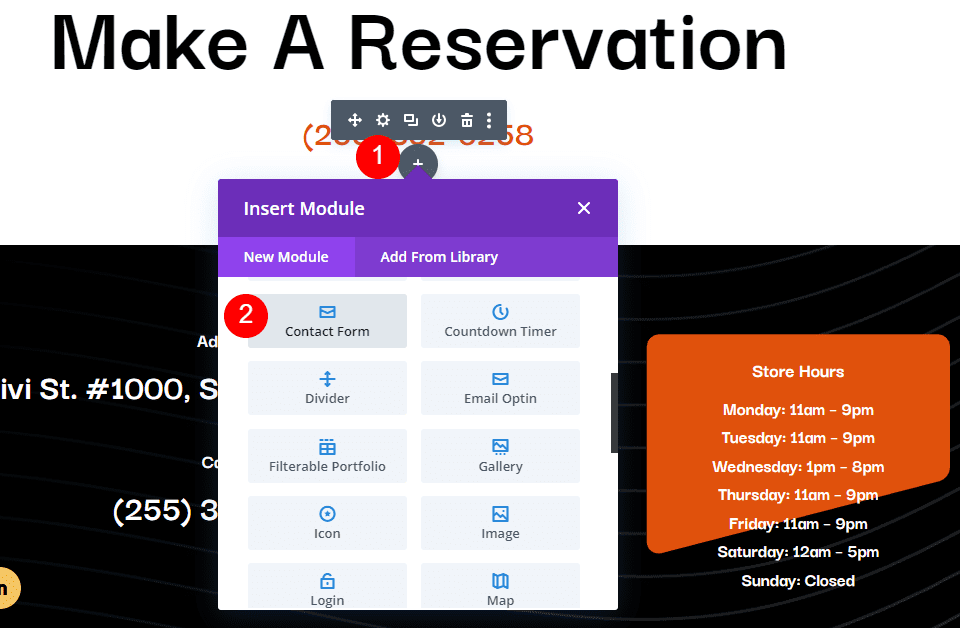
    Once the layout has been imported, open your page in the Divi Builder. Click the blue plus icon to add a new section, then select Add From Library.

    Ultimate Multipurpose Divi Webkit Add From Library

    Locate the layout you want to use, then click the Use This Section button to load the layout on your page.

    Ultimate Multipurpose Divi Webkit Use Section

    Ultimate Multipurpose Divi Webkit

    Ultimate Multipurpose Divi Webkit consists of webkits with different styles and website concepts. The Ultimate Multipurpose Divi Webkit currently comes with 7 different webkits and has plans to add more webkits each month. In total, you can expect 900+ section styles, 28 detail pages, and more than 22 elements.

    Section Layouts

    Each webkit comes with several layouts for each section you might need on your website. Let’s take a look at some of the section layouts.

    About Us

    The first About Us layout we’ll look at is About Us layout 2 from the finance and consulting webkit. This layout consists of two images, some text to introduce the company, a quote, and the founder’s name in a signature-style script font.

    Ultimate Multipurpose Divi Webkit About

    This is About Us layout 4 from the fitness gym webkit. It features an image clipped into a shape on the left and some text and blurb modules on the right.

    Ultimate Multipurpose Divi Webkit About

    About Us layout 3 from the garden and landscaping layout features three images in a collage-style layout with a number counter in the middle. There are a couple of text sections, two buttons, and some number counters that count up when the page loads.

    Ultimate Multipurpose Divi Webkit About

    Blog

    This is digital agency blog style 1. It has a simple and modern layout with card-style blocks displaying recent blog posts. The blog post date is highlighted on a red background at the top of the featured image.

    Ultimate Multipurpose Divi Webkit Blog

    This is blog style 7 from the wind and solar energy webkit. On hover, the image zooms in, the button changes to orange, and a box shadow appears behind the blog post.

    Ultimate Multipurpose Divi Webkit Blog

    Finally, this blog layout is style 3 from the fitness and gym webkit. On hover, the image zooms in, the block with the post date turns black, and the line under the Read More button turns black.

    Ultimate Multipurpose Divi Webkit Blog

    Contact Form/Info

    The first contact form/info layout comes from the finance and consulting webkit. This is contact/info style 1, featuring a contact form on the left on an image background and a FAQ section on the right.

    Ultimate Multipurpose Divi Webkit Contact

    This is contact layout 3 from the fitness and gym webkit. It features three square blurbs with a box shadow, each highlighting important contact information. The card shifts up on hover, and the red circle behind the icon expands.

    Ultimate Multipurpose Divi Webkit Contact

    Style 6 from the wind and solar energy webkit features a unique layout with a fullwidth map and the contact information and form on a card that overlays the bottom of the map.

    Ultimate Multipurpose Divi Webkit Contact

    Counter

    The counter module helps represent numerical data on your website with a count-up effect as the page loads. This first example comes from the garden and landscaping webkit. Style 2 features four number counters in a section with a rounded border.

    Ultimate Multipurpose Divi Webkit Counter

    Counter layout 1 from the fitness and gym webkit features four number counters and an image arranged in a grid.

    Ultimate Multipurpose Divi Webkit Counter

    Finally, counter style 5 from the finance and consulting webkit features three number counters with icons on a rounded orange background in the top left corner.

    Ultimate Multipurpose Divi Webkit Counter

    CTA

    CTA layout style 2 from the wind and solar webkit features header text that shifts left and right and changes color from white to green, creating a subtle but eye-catching effect.

    Ultimate Multipurpose Divi Webkit CTA

    Next is CTA layout 2 from the fitness and gym webkit, which highlights an informational video. The play button has an opaque circle that pulses out from the center, encouraging the user to press play.

    Ultimate Multipurpose Divi Webkit CTA

    Finally, CTA layout 2 from the finance and consulting layout features a large image on the left, some text modules, a contact button, and a phone number displayed in a blurb.

    Ultimate Multipurpose Divi Webkit CTA

    FAQ

    Moving along to the FAQ section layouts, let’s take a look at style 4 from the digital agency webkit. The layout has FAQ blurbs on the left, a collage of three images on the right, and a little square shape that fades in and out while rotating.

    Ultimate Multipurpose Divi Webkit FAQ

    FAQ layout 3 from the finance and consulting webkit features a large image on the left and heading text and FAQ modules on the right.

    Ultimate Multipurpose Divi Webkit FAQ

    FAQ layout 3 from the landscaping webkit features some text, the FAQ modules on the left, and a large image with a testimonial blurb on the right.

    Ultimate Multipurpose Divi Webkit FAQ

    Features

    The feature section is where you can highlight unique features or selling points for your services or products. Layout 3 from the wind and solar webkit features some text on the left, a button to play a video, and four blurbs on the right that highlight features.

    Ultimate Multipurpose Divi Webkit Features

    Layout 3 from the fitness gym webkit has two images with unique border styles on the left, with one blurb overlaying the large image highlighting the fees. On the left are some text and three blurbs that highlight features.

    Ultimate Multipurpose Divi Webkit Features

    This is style 2 from the finance and consulting webkit. It features two images, a number counter on the left, and some text, blurbs, and a button on the right.

    Ultimate Multipurpose Divi Webkit Features

    Gallery

    Gallery style 4 from the garden and landscaping webkit features a blur effect and icon on hover.

    Ultimate Multipurpose Divi Webkit Gallery

    Next, gallery layout 4 from the digital agency webkit has a red overlay that expands over the image on hover.

    Ultimate Multipurpose Divi Webkit Gallery

    Style 3 from the finance and consulting webkit features an interesting hover effect where the image pans over to the right, and a light overlay appears.

    Ultimate Multipurpose Divi Webkit Gallery

    Hero

    Hero section layout 10 for the wind and solar energy webkit features a bright orange layout with some text, a button, an image with a subtle floating animation, and a blurb highlighting the service starting price.

    Ultimate Multipurpose Divi Webkit Hero

    Style 3 in the garden and landscaping webkit features a large blurb with text and an image on a fullwidth image background.

    Ultimate Multipurpose Divi Webkit Hero

    Finally, hero style 3 from the digital agency webkit features a large image background, some text and a CTA button, and a section with three blurbs that reveal an image on hover.

    Ultimate Multipurpose Divi Webkit Hero

    Logo

    Logo section style 4 from the wind and solar energy webkit features a grid of logos that decrease in size and reveal color on hover.

    Ultimate Multipurpose Divi Webkit Logo

    This is logo section 4 from the fitness gym webkit. The logos are displayed in a fullwidth section on a red background.

    Ultimate Multipurpose Divi Webkit Logo

    Layout 3 from the finance and consulting layout has a text section at the top and inverts the logo and background colors on hover.

    Ultimate Multipurpose Divi Webkit Logo

    Newsletter

    This is newsletter sign-up section style 5 from the finance and consulting webkit. It features an image with a unique clip layout, some text, a divider, and a sign-up form.

    Ultimate Multipurpose Divi Webkit Newsletter

    Newsletter style 2 from the garden and landscaping layout features some text, an icon with a pulsing border effect, and a sign-up form on an image background.

    Ultimate Multipurpose Divi Webkit Newsletter

    Finally, newsletter layout style 3 from the fitness and gym webkit features a card with text and a sign-up form on a fullwidth image background.

    Ultimate Multipurpose Divi Webkit Newsletter

    Pricing

    Pricing section style 1 from the wind and solar energy webkit features three pricing tables with a small blurb at the top right highlighting a discount.

    Ultimate Multipurpose Divi Webkit Pricing

    Style 4 from the digital agency webkit also features three pricing blurbs. There is a text section at the top, the pricing information, a Buy Now button, and four blurbs to highlight features.

    Ultimate Multipurpose Divi Webkit Pricing

    Pricing section layout 3 from the garden and landscaping webkit highlights each pricing tier with an icon at the top. The gradient in the button shifts on hover.

    Ultimate Multipurpose Divi Webkit Pricing

    Projects

    The projects section layout 5 from the fitness webkit features some text at the top and the projects listed below with a hover effect that adds an overlay and sets the title background to black.

    Ultimate Multipurpose Divi Webkit Projects

    Next is project section layout 2 from the garden and landscaping webkit. It features some text and some project categories at the top. The project details are listed over the project image, which zooms in on hover.

    Ultimate Multipurpose Divi Webkit Projects

    Finally, project style 5 from the finance and consulting webkit features categories at the top and the project information and an icon on hover.

    Ultimate Multipurpose Divi Webkit Projects

    Service

    Service section 2 from the wind and solar energy webkit features three blurbs with an image and icon highlighting each service. On hover, a box shadow appears, and the icon background turns green.

    Ultimate Multipurpose Divi Webkit Services

    This is service layout 3 from the fitness webkit. It features three blurbs with large icons. On hover, the blurb border turns red, and an arrow icon and border appear at the bottom of the blurb.

    Ultimate Multipurpose Divi Webkit Services

    Service layout 2 from the finance webkit features four service blurbs with an icon, a circle shape, text, and a button. On hover, the colors invert, and the circle shape flips to add some visual interest.

    Ultimate Multipurpose Divi Webkit Services

    Slider

    Slider style 4 below is from the digital agency webkit. It features large red navigation icons and some underlines highlighting portions of the slider text.

    Ultimate Multipurpose Divi Webkit Slider

    Slider style 5 from the garden and landscaping webkit features two navigation arrows on the right. The slide features text and two buttons.

    Ultimate Multipurpose Divi Webkit Slider

    Slider 2 from the finance webkit has a split-style layout with text on the left on an orange background, and an image on the right.

    Ultimate Multipurpose Divi Webkit Slider

    Steps

    The steps section layout highlights steps of a process. This is layout 1 from the wind and solar energy webkit. It features some blurbs with an icon and a number behind each blurb representing the step.

    Ultimate Multipurpose Divi Webkit Steps

    This is style 3 from the fitness webkit, highlighting steps for training. The blurbs surround an image with a red box shadow.

    Ultimate Multipurpose Divi Webkit Steps

    Steps section layout 5 from the garden and landscaping webkit highlights each step on an image background. The number for each step is presented on a green circle that overlays the bottom of the image.

    Ultimate Multipurpose Divi Webkit Steps

    Tab

    Tab layout 6 from the wind and solar energy webkit features the tabs at the top and a tab content layout with an image on the left, some text and blurb modules on the right, along with the price and a CTA button.

    Ultimate Multipurpose Divi Webkit Tab

    Style 4 from the finance and consulting webkit features some large text in the tab content and three large tabs at the bottom you can use to switch the content.

    Ultimate Multipurpose Divi Webkit Tab

    This is tab style 5 from the fitness and gym webkit. It has four large tabs at the top with icons. Within each tab, you have some text, a couple of blurbs, a CTA button, and two images arranged together on the right.

    Ultimate Multipurpose Divi Webkit Tab

    Team

    This is team layout style 3 from the garden and landscaping webkit. It features four team members in a fullwidth layout. On hover, a green overlay appears over the image and reveals the team member information and social icons.

    Ultimate Multipurpose Divi Webkit Team

    Team layout 2 from the digital agency webkit features a team section with round icons and a dotted graphic that rotates on hover. The team member card also turns black on hover.

    Ultimate Multipurpose Divi Webkit Team

    Style 1 from the fitness and gym webkit features an image on the left and the team member information on the right. On hover, an overlay and icon appear over the image, and the divider line turns red.

    Ultimate Multipurpose Divi Webkit Team

    Testimonial

    Testimonial layout style 3 from the garden and landscaping webkit features three testimonial blurbs with a customer image, name, position, testimonial text, star rating, and quote icon.

    Ultimate Multipurpose Divi Webkit Testimonial

    Style 3 from the finance and consulting webkit features testimonial blurbs with a large icon, a title, and a star rating at the top. The customer information is below, outlined with a border.

    Ultimate Multipurpose Divi Webkit Testimonial

    Testimonial layout style 10 from the wind and solar energy webkit has a large testimonial slider on a fullwidth image background.

    Ultimate Multipurpose Divi Webkit Testimonial

    Timeline

    The timeline section layout can be used to highlight a history, tell a story, or demonstrate a process. This is style 3 from the agency webkit. It features an icon for each timeline object and a lien that connects each step.

    Ultimate Multipurpose Divi Webkit Timeline

    This is timeline layout 3 from the garden and landscaping webkit. This layout features a blurb with a date, heading, and text on one side, and an image on the other side.

    Ultimate Multipurpose Divi Webkit Timeline

    Timeline layout 2 from the fitness gym webkit is a vertical timeline with three steps. A line at the bottom connects each blurb, highlighted with a date.

    Ultimate Multipurpose Divi Webkit Timeline

    Header and Footer Layouts

    Ultimate Multipurpose Divi Webkit also comes with some layouts for the header and footer.

    Headers

    This is fitness header layout 1. It features a left-aligned logo, a right-aligned menu, and a CTA button. The secondary menu above features two blurbs with contact information, a menu, and social media icons.

    Ultimate Multipurpose Divi Webkit Header

    Agency webkit header layout 5 features a primary menu with a left-aligned logo and a right-aligned menu. On the very right is a blurb with a phone number. The secondary menu bar at the top features two blurbs with contact information and social media icons.

    Ultimate Multipurpose Divi Webkit Header

    Garden and Landscaping webkit header style 3 has three different menu bars. At the very top, the secondary menu bar has a menu and social media icons. The middle menu bar features a logo and three blurbs with contact information. Finally, the third menu bar has menu items and a CTA button.

    Ultimate Multipurpose Divi Webkit Header

    Footers

    The wind and solar webkit footer style 8 is a three-part footer layout. The first section features four columns with some menu items. Below this is a section with a newsletter sign-up form and social media links. The last section displays the copyright information and a menu.

    Ultimate Multipurpose Divi Webkit Footer

    Finance and consulting webkit footer style 2 features a large email sign-up form at the very top of the footer. The primary footer area features a logo, text, and social media icons, two columns of menu items, and a gallery. At the very bottom is the copyright information.

    Ultimate Multipurpose Divi Webkit Footer

    Gardening and landscaping webkit footer style 4 comes as a two-part footer layout. The primary footer section features a logo, some text, and social media icons. There is a column with menu items and another column with contact info. On the right side is a contact form on a green background. The copyright information is at the bottom.

    Ultimate Multipurpose Divi Webkit Footer

    Detail Page Layouts

    Each webkit included with the Ultimate Multipurpose Divi Webkit comes with a few detail page layouts. Let’s take a look at a few.

    Service Detail Page

    This is the service page layout from the fitness and gym webkit. It features a large image and some buttons on the left highlighting some services. Also on the left side is a download section with a button to download a brochure and a call-to-action blurb with an image background. In the main section of the page, there is some text content with some blurbs to highlight some of the copy. The our benefits section features an image and three blurbs, followed by an FAQ section.

    Ultimate Multipurpose Divi Webkit About Page

    Team Detail Page

    This team detail layout comes from the gardening and landscaping webkit. It highlights a single team member and features a card layout at the top with an image, contact information, social media icons, and a blurb over the image that highlights the years of experience. Below this section is some text, some graphs to represent skills, and blurb modules representing qualifications. Finally, there is a contact form at the bottom of the page.

    Ultimate Multipurpose Divi Webkit Team Page

    Blog Page

    This is the blog post layout from the finance and consulting webkit. Because it’s a blog layout, it should be imported through the Divi Theme Builder. The layout begins with a fullwidth image header with the blog post title. The blog post content is styled with orange accents. Below the post content are an author box and a comment section. The sidebar has a search module, categories, the latest posts, tags, and a CTA.

    Ultimate Multipurpose Divi Webkit Blog Page

    Project Page

    The project page layout should also be imported through the Divi Theme Builder. This layout is from the digital agency webkit. It has a fullwidth header image with the project title, followed by a large image. Below this are two sections for project details and a project overview, with two blurb modules with icons. Key information about the project is presented on the right, surrounded by a red border. Finally, other projects are presented at the bottom. On hover, the project title and category are revealed on a white background.

    Ultimate Multipurpose Divi Webkit Project Page

    Purchase Ultimate Multipurpose Divi Webkit

    Ultimate Multipurpose Divi Webkit is available in the Divi Marketplace. It costs $19 for unlimited website usage and lifetime updates. The price also includes a 30-day money-back guarantee.

    Ultimate Multipurpose Divi Webkit Purchase

    Final Thoughts

    Ultimate Multipurpose Divi Webkit comes with a ton of modern, engaging website section layouts that can help you easily and quickly build a great-looking website. All the layouts seem to be of high-quality design and mobile-friendly. The product appears to be regularly updated with new webkit collections, and several new webkits are planned for upcoming releases. If you are looking for a collection of Divi section layouts to help jumpstart your design process, this product might be a great option for you.

    We would love to hear from you! Have you tried Ultimate Multipurpose Divi Webkit? Let us know what you think about it in the comments!

    The post Divi Product Highlight: Ultimate Multipurpose Divi Webkit appeared first on Elegant Themes Blog.

  • Download a FREE Category Page Template for Divi’s Seafood Restaurant Layout Pack

    Hey Divi Nation! Thanks for joining us for the next installment of our weekly Divi Design Initiative where each week, we give away brand new freebies. This time around we’re building upon the Seafood Restaurant Layout Pack with a brand new Category Page Template that matches the rest of the pack perfectly. Hope you enjoy it!

    divi layout

    Check Out The Seafood Restaurant
    Category Page Template Below

    Get it for free today!

    Desktop View

    Divi Seafood Restaurant Category Page Template for desktop

    Tablet and Mobile View

    Divi Seafood Restaurant Category Page Template for tablet and mobile

    Download The Category Page Template For The Seafood Restaurant Layout Pack

    To lay your hands on the free Seafood Restaurant Category Page Template, you will first need to download it using the button below. To gain access to the download you will need to subscribe to our Divi Daily email list by using the form below. As a new subscriber, you will receive even more Divi goodness and a free Divi Layout pack every Monday! If you’re already on the list, simply enter your email address below and click download. You will not be “resubscribed” or receive extra emails.

    How to Upload The Template

    Go to Divi Theme Builder

    To upload the template, navigate to the Divi Theme Builder in the backend of your WordPress website.

    Open Divi Theme Builder

    Upload Website Template

    Then, in the top right corner, you’ll see an icon with two arrows. Click on the icon.

    Import the template into the Divi Theme Builder

    Navigate to the import tab, upload the JSON file that you could download in this post, and click on ‘Import Divi Theme Builder Templates’.

    Finish importing the template into the Divi Theme Builder

    Save Divi Theme Builder Changes

    Once you’ve uploaded the file, you’ll notice a new template with a new body area that has been assigned to All Category Pages. Save the Divi Theme Builder changes as soon as you want the template to be activated.

    Save the imported category pages layout file

    How to Modify The Template

    Open Category Page Template Body Layout

    To modify the template’s elements, start by opening the template’s body layout.

    Edit the category pages template

    Inside the Body Layout Editor, you can edit the design on the front end using the Divi Builder just like you would with a normal Divi page.

    About the Seafood Page Template for Your Categories and Archives

    This category page template has a few dynamic elements that will work automatically including:

    • Category Page Post/Archive Title: We use a Text Module with Dynamic Content activated to show the current category title.
    • Blog: The standard Blog Module to showcase the current six blog posts within the category. The module also has pagination enabled so that you can see more posts within the category.

    Here is a quick illustration that identifies the dynamic elements of the Seafood Restaurant Category Page Template.

    Divi Seafood Restaurant Category Page Template Overview

    Updating the Template’s Static Elements

    There is a static call-to-action section at the bottom of our Seafood Category Page Template that you’ll have to update to suit your website. You can link the button to your menu, your order form or even your contact page. The choice – as with all things Divi – is yours!

    Updating the static content within the Blog Post Template

    New Freebies Every Week!

    We hope you’ve enjoyed the Seafood Restaurant Layout Pack and the Category Page Template freebie that goes along with it. We look forward to hearing your opinions in the comment section below. Make sure you check back next week for more freebies!

    The post Download a FREE Category Page Template for Divi’s Seafood Restaurant Layout Pack appeared first on Elegant Themes Blog.

  • Divi Plugin Highlight: Table Maker

    Table Maker is a third-party module for the Divi Builder that does exactly what the title describes- it makes tables. This is a powerful module that simplifies making tables of any size. Add any type of content and style the table with the standard Divi settings as well as settings for each element. The latest version adds even more options. In this post, we’ll take a close look at Table Maker – alongside our Divi Home Remodeling Layout Pack – to help you decide if it’s the right product for your needs.

    Table Maker Module Settings

    A new Module is added to the Divi Builder called Table Maker. Add this module to your Divi layouts as you would any Divi Module. We are using the module to add a pricing table to the Service Page Layout of the Divi Home Renovation Layout Pack.

    Table Maker Module Settings

    The General tab includes submodules for each column. Add as many as you want by clicking Add New Column. It also includes settings for the title, description, columns, rows, making it responsive, adjusting how it scrolls, and adjusting the icons, buttons, and images. The submodules also include settings that override the module settings.

    Table Maker Column Submodule

    Clicking Add New Column creates a column submodule and opens its settings. Add as many columns as you want.

    Adding Content to Table Maker Cells

    Before we see the Table Maker’s settings, let’s see how to add cells and content. We can add lots of different types of content to the cells.

    Adding Content to Table Maker Cells

    Table Maker Column Content

    Within the column submodule, you’ll find the Rows field. This is an HTML editor. You can create the Rows just by entering the content for each row. Each row is numbered. The numbers correspond to a cell, so every numbered line is a new cell. To add content to a certain cell, just add that content to the line that’s numbered for that cell. This includes text, code, links, videos, or anything you want.

    Table Maker Column Content

    Style the Content with Markup

    If you’ve added text to the cells, you can markup the text with HTML. This means you can easily add bold, italics, paragraphs, breaks, headings, links, images, or even an entire layout. Just make sure all the HTML is on a single line.

    For example, I’ve added tags for H2 and bold to a few of the cells in this image.

    Adding HTML Markup

    Adding Escape Characters

    Since the Row editor is an HTML field, there are certain characters that we can’t usually use, such as the ampersand, quote, apostrophe, and great than and less than symbols. Fortunately, these characters can still be used within Table Maker’s fields. Table Maker uses special characters, called escape characters, to tell the cells to display those characters. To use them, add double curly brackets and the abbreviation for the character.

    For example, to show an ampersand, you’d enter {{amp}}, as I’ve done in row 4 in the example below.

    Adding Buttons

    Add a button by entering the button tag to the cell you want to display a button. Once you enter the tag for the button, you’ll see the default button. Add the text you want to display within the tags.

    Add Button to Divi Table Maker

    Customize the Button

    The button can be customized in the Content tab of the Table Maker module’s settings and the individual submodule’s settings. Add the button text, URL, link target, set the button width based on the text or the cell, and use custom styles.

    Customize table button

    Add an Icon to the Table

    Include an icon by entering the icon tag. You can include the icon’s name to display it or select an icon in the Content tab. You can also add as many icons as you want by adding more tags and the icon name within the tag. For example, to add a cross icon, add this code: <icon>cross_alt</icon>. I’ve also added this code to add a different icon: <icon>check_alt</icon>. You can find a full list of available icons on the Divi Table Maker website.

    Add icons to the column

    You can also choose to select a uniform icon choice. To do this, scroll down to Table Icons in the Content tab. Use the Content tab of the module to choose an icon that can be placed in all the cells. There is also the option to choose an icon specifically for that cell. You can also adjust the icon’s size and color, as I’ve done in the example below.

    Customize icons in Divi Table Maker

    Add an Image to the Table

    To add the images to the table, scroll down to Table Images in the Content tab. Add the images as a gallery from the media library. You can also select the image quality, proportion, scale, vertical alignment, and horizontal alignment. You can also access these settings for each cell in the submodules, so you can override the standard module settings.

    Adding table images with Divi Table Maker

    Display the Images

    Display the images by adding the image tag and the image number in the cell. For example, if you want the second cell of your column to display an image, enter the HTML image tag into that cell. Change the number to show a specific image based on the order that it appears in the gallery.

    Ordering table images in Divi Table Maker

    Shortcodes and iFrames

    You can also add shortcodes and iFrames to the cells. Simply paste them on the line for the cell you want. You won’t see a preview of the shortcode in the Divi Builder, but they do run on the website. Paste iFrames the same way as shortcodes. They do show a preview in the Divi Builder, but it might not show the same way that it will on the front end. They do show correctly on the front end.

    Using shortcodes and embed codes within the Divi Table Maker module

    Style the Content with CSS

    You can also style the content with inline CSS. This can be used to control the colors of the text, the size of the text, underline, etc. Simply add the inline CSS as you would in any WordPress content editor. For example, to make the first column heading text white, you can add this CSS:

    &lt;h2 style=&quot;color: white;&quot;&gt;&lt;/h2&gt;

    Adding inline CSS

    Customizing the Table Maker Cell Itself

    You can customize the cell itself using the cell tag and inline CSS. For example, this inline CSS would change the cell’s background:

    &lt;cell style=&quot;background: #0d232d;&quot;&gt;&lt;/cell&gt;

    For our example, we place the heading of the cell – which we had previously styled with inline CSS – within the cell tag.

    Inline CSS for the table cell

    Column Width

    Adjust the Max Width and Min Width of each column independently.

    Adjusting column minimum and maximum widths

    Table Title

    Table Title is a new feature. It’s disabled by default. Enable it and add a title in the field. You can also choose its position. Options include above the table, below the table, and hidden.

    Table Title Feature

    Table Description

    Table Description is another new feature. It’s also disabled by default. Enable it and add the description into the field. You can also choose its position from above, below, or hidden.

    Table description for Divi Table Maker

    Table Columns

    Adjust the Header Count, Footer Count, Max Width, and Min Width. The Header Count and Footer Count lets you choose the number of cells to use for each.

    Table Columsn within Divi Table Maker

    Table Rows

    Table Rows also has adjustments for the Header Count, Footer Count, Max Width, and Min Width. The Header Count and Footer Count lets you choose the number of cells to use for each.

    Table rows in Divi Table Maker

    Table Corners

    Table Corners is another new feature. It’s disabled by default. This lets you style the corner as part of the Row Header or Column Header. Table Corners works with Column Footer and Row Footer. If it’s enabled, you’ll have new settings in Table Corners to style them.

    Adding Content to Table Maker Cells

    Table Responsive

    The responsive features are interesting. You can set the breakpoint based on the device type and have it break by columns or rows. You can also display the cells as blocks or as an accordion. The latest update adds the breakpoints to desktops so you can create accordions on desktops if you want. Your visitors won’t see the full table layout if you use either blocks or accordion for the desktop. This example shows blocks.

    Divi Table Maker Responsive Settings

    This example shows the Accordion. I’ve opened the second accordion to show how the table looks.

    Mobile responsiveness and Divi Table Maker

    Table Scrolling

    Scrolling lets you display a larger table in the same space. You can also make the column and row headers sticky.

    Table Scrolling in Divi Table Maker

    Styling the Tabel Maker Table

    Table Maker has extensive styling options in the Design tab of the submodules and the main module. Adjust the colors, stripes, cells, text, header text, column headers, row headers, column footers, row footers, footer text, and all the standard Divi options. Style all the cells together or each cell independently. Let’s look at a few examples. I’ll describe the settings as we go.

    Table Maker Table Title

    If you have Table Title enabled, you’ll see design settings for the title. The settings include most of the standard text options for fonts, colors, alignment, etc. It adds spacing between the table and the title text. In the example below, I’ve changed the font to match the body font used within our layout pack, Raleway.

    Styling the Table Title

    Table Description

    If you have Table description enabled, you’ll see the design settings for the description text. Settings include most of the text options including size, fonts, wights, etc. It also adds spacing between the table and the description text. In this example, I’ve adjusted font and color to better match our layout pack.

    Table description styling

    Table Accordion

    If you have the Accordion option selected under Table Responsive, you’ll have design settings for the accordion. All accordions are closed by default. You can set a specific toggle to be open if you want. The Toggle Opened option lets you select which toggle to open by default. Set the icon alignment, change the size, choose an open icon, and choose a close icon.

    Styling the mobile responsive accordion

    Table Frame

    The Table Frame options let you add gaps or lines to the cells, choose a border type, change the border color, and change the line width. In this example, I’ve selected the lines style, and changed the color.

    Table frame styling

    Table Stripes

    Table Stripes places stripes behind the odd or even fields and can be horizontal or vertical. You can choose the field types that include the stripes and choose between odd and even rows. Stripes can now be a tint, a blended color (which includes the tint), or regular color options. The responsive size can go in a different direction, or you can disable them. Apply the stripes to the table body, column header, column footer, row header, and row footer individually.

    Table stripes styling

    Table Hover

    Table Hover is a new setting that highlights a row or column as you hover, so they can be horizontal or vertical. The responsive size can have a different direction or none. You can also adjust the color. Choose from tint, blended color, or solid color. In the example below, I’ve selected horizontal and color. I’m hovering over the second row.

    Table Hover styling settings

    Table Text

    Table Text includes all the standard text options and adds a wrap feature, giving you control over how the text behaves. In this example, I’ve set it to wrap, and changed the font family, text color, and font size.

    Styling the table text

    Table Cells

    The settings for Table Cells let you change the background color of the cells, set the text alignment for vertical and horizontal alignment, add padding, customize the border, and add a box shadow.

    Table cells styling

    Table Maker Column Header Text

    Originally, the row and column header text were wrapped in header and bold tags. This did cause problems with accessibility readers. Now, the setting is off by default. You can turn it back on if you have issues with older tables, but it’s better to leave it off and style the text with the settings provided by Divi Table Maker. For this example, I’ve made capitalized the titles, increased the line height, increased the font size and ensured that the inline styling has been removed.

    Column Header Cells

    Column Header Cells adjusts the background color of the heading cells. It includes the standard cell settings. I’ve adjusted the background color in this example.

    Column header cells styling

    Column Footer Text

    The Column Footer Text adjusts the text in the footer. It includes all the standard settings.

    Column footer text styling

    Column Footer Cells

    Column Footer Cells adjusts the cells for the footer. It includes all the standard settings. I’ve adjusted the background color, border color and border style, and border width in this example.

    Column footer cells styling

    Row Header Text

    Like the Column Header Text, Row Header Text also has the heading level disabled by default to improve accessibility. The row header is on the left. It also includes the standard font settings. In this example, I’ve added text wrap, changed the font family, updated the font style, and adjusted the text color and line height.

    Row header text styling

    Row Header Cells

    Row Header Cells controls the background of the cells used for the row’s header. In this example, I’ve adjusted the background color, plus both horizontal and vertical alignment.

    Row header cells

    Row Footer Text

    The Row Footer Text settings adjust the text for the row footer, which is on the right. In our example, the row footer holds the Book Now buttons. So the example of the row footer text would be in the very last cell of this table.

    Row footer text styling

    Row Footer Cells

    The Row Footer Cells settings control the cell used for the footer row. I’ve adjusted the background color, horizontal and vertical alignment.

    Row footer cells styling

    The Updated Layou with Finished Table

    This is the updated Service Page Layout with the fully styled Table Maker module, coupled with the FREE Header and Footer Template for the Home Remodeling Layout Pack.

    Purchase Table Maker

    Table Maker is available in the Divi Marketplace for $39. It includes a 30-day money-back guarantee and one year of support and updates.

    Purchase Table Maker

    Ending Thoughts

    That’s our look at Table Maker for Divi. This is a powerful table-making module. The latest update adds lots of new features. The new accessibility updates allow tables made with Table Maker to pass Google’s Lighthouse accessibility audit. You can make any size table and add just about anything to a cell with tags. Add HTML, CSS, shortcodes, iFrames, and more. Style the cells for the entire table at once or style them individually. The responsive tools make the tables look great on any device. If you’re interested in a powerful tool to create tables in Divi, Table Maker is a great choice.

    We want to hear from you. Have you tried Table Maker for your Divi website? Let us know what you think about it in the comments.

    The post Divi Plugin Highlight: Table Maker appeared first on Elegant Themes Blog.

  • How to Add Multiple Pins to Your Divi Map

    The Divi Map Module makes it easy to embed a Google Map to your Divi website. This is a great way to share your business location on a contact page, in a footer, or on an about page.

    In this post, we’re going to demonstrate how to add multiple location pins to your Divi map. This is a great feature if your business has multiple locations or you’re putting together a local guide to show off your favorite coffee shops, etc.

    Let’s dive in!

    What You Need to Get Started

    To get started, you will need to do the following:

    1. Install Divi on your WordPress website.
    2. Add a Page, give it a title, and publish it.
    3. Enable the Visual Builder.
    4. Create your Google API Key.

    Select Build From Scratch

    Once you click the “Use Divi Builder” button the page will reload using Divi’s drag and drop builder interface. Three options will pop up – Build From Scratch, Choose A Premade Layout, and Clone Existing Page. For today’s purposes, select “Build From Scratch”. This will give us a blank slate where we can build our designs.

    How to Add Multiple Pins to Your Divi Map

    Let’s get into the tutorial! Here’s how to add multiple location pins to your Divi Map.

    Add Your Google API Key

    Before we’ll be able to fully use the map module and its functionalities, you’ll need to add your Google API Key to your Theme Options.

    1. From your WordPress dashboard, go to Divi > Theme Options and paste your Google API Key.
    2. Click “Save Changes”.

    Add a Section and Row and the Map Module

    Navigate back to the page you just created and add a section and a one-column row to your page. Then load the module library and click Map. Once added, the module window will pop up with all the settings and functionalities available within the map module.

    Add a New Pin

    To add a new location pin, click “Add A New Pin”. This will bring up the settings for that new pin. In the Text tab, type in the title and a description text you want to be displayed here. In the Map tab, paste the address for the pin in the Map Pin Address input field and then click find.

    Choosing a Map Center Address

    Choosing a map center address determines how your map is oriented. This is helpful when you want to show multiple pins at once. Below, we have the map center address as San Diego, CA 92104, USA so that it shows all of our pins within that area.

    Divi multiple Google map pins

    Final Thoughts

    And there you have it! You can add as many pins to your map as you’d like. Adding pins to the map module is simple and easy and results in an interactive Google Map that is easy to use for your website visitors.

    The post How to Add Multiple Pins to Your Divi Map appeared first on Elegant Themes Blog.

  • Download a FREE Blog Post Template for Divi’s Home Remodeling Layout Pack

    Hey Divi Creators! Thanks for joining us for the next installment of our weekly Divi Design Initiative where each week, we give away brand new freebies. This time around we’re building upon the Home Remodeling Layout Pack with a brand new blog post template that matches the rest of the pack perfectly. Hope you enjoy it!

    divi layout

    Check Out The Home Remodeling
    Blog Template Below

    Get it for free today!

    Desktop View

    Divi Home Remodeling Blog Template for desktop

    Tablet/Mobile View

    Divi Home Remodeling Blog Template for tablet or mobile

    Download The Blog Post Template For The Home Remodeling Layout Pack

    To lay your hands on the free Home Remodeling Blog Post Template, you will first need to download it using the button below. To gain access to the download you will need to subscribe to our newsletter by using the form below. As a new subscriber, you will receive even more Divi goodness and a free Divi Layout pack every Monday! If you’re already on the list, simply enter your email address below and click download. You will not be “resubscribed” or receive extra emails.

    How to Upload The Home Remodeling Blog Template

    Go to Divi Theme Builder

    To upload the template, navigate to the Divi Theme Builder in the backend of your WordPress website.

    Getting started with the Divi Conference Layout Pack

    Upload Website Template

    Then, in the top right corner, you’ll see an icon with two arrows. Click on the icon.

    Importing the Header and Footer Layout into the Divi Theme Buidler

    Navigate to the import tab, upload the JSON file that you could download in this post, and click on ‘Import Divi Theme Builder Templates’.

    Import settings for the header and footer layout pack

    Save Divi Theme Builder Changes

    Once you’ve uploaded the file, you’ll notice a new template with a new body area that has been assigned to All Posts. Save the Divi Theme Builder changes as soon as you want the template to be activated.

    Save the imported blog post layout within the Divi Theme Builder

    How to Modify The Home Remodeling Blog Template

    Open Post Template

    To modify the template’s elements, start by opening the template.

    Begin editing the blog post body template within the Divi Builder

    Inside the Body Layout Editor, you can edit the design on the front end using the Divi Builder just like you would with a normal Divi page.

    Since this is a template that has been assigned to all posts for the site, there is a post content module that is necessary for displaying the post content. You will need to keep that module in place, but you can adjust the post content module’s design elements, which will design the post content that is displayed dynamically.

    Update the Post Content Module with styling from your brand or business

    About the Home Remodeling Blog Template

    This blog post template possesses many dynamic elements that will work with your blog posts immediately. For example, the entire post header is made up of dynamic elements and modules that will update automatically so you don’t have to do so for every blog post that you write. You can tweak the design of each of those elements if needed.

    The modules that are used to make up your home remodeling blog template include

    • Post Title Module: Used to show the post title and featured image
    • Blurb Module: Used to show multiple post meta elements such as the comment count, post author, post date and post categories
    • Post Content Module: We use this to show the content within the actual blog post itself
    • Post Navigation Module: Move from one blog post to another within the same category
    • Comment Module: Allow your users to interact with your blog posts
    • Blog Module: We use the Blog Module to show other posts within the same blog categories

    Here is a quick illustration that identifies the elements of the Home Remodeling blog post template.

    Divi Home Remodeling Blog Template overview

    New Freebies Every Week!

    We hope you’ve enjoyed the Home Remodeling Layout Pack and the blog post template freebie that goes along with it. We look forward to hearing your opinions in the comment section below. Make sure you check back next week for more freebies!

    The post Download a FREE Blog Post Template for Divi’s Home Remodeling Layout Pack appeared first on Elegant Themes Blog.

  • How to Include a Contact Form in Your Divi Footer

    Divi’s footer is a great place to add a contact form. Fortunately, this is easy to do with the Divi Theme Builder. Of course, we don’t want to just add it anywhere as there are a few things to keep in mind for usability. In this post, we’ll see how to include a contact form in your Divi footer. We’ll go through a couple of examples to help you get started.

    Let’s get started!

    Preview

    Desktop Divi Footer Contact Form Example One

    Desktop Divi Footer Contact Form Example One

    Phone Divi Footer Contact Form Example One

    Phone Divi Footer Contact Form Example One

    Desktop Divi Footer Contact Form Example Two

    Desktop Divi Footer Contact Form Example Two

    Phone Divi Footer Contact Form Example Two

    Phone Divi Footer Contact Form Example Two

    About the Contact Form in Your Divi Footer

    Why Include a Contact Form in Your Divi Footer?

    The footer is a location where visitors will look for specific information. This includes ways to contact you. Adding a contact form to the footer not only makes that contact information visual but also simplifies the process.

    Where to Add the Contact Form

    When choosing a location for the contact form, look at the other footer elements to see what would clash for attention.

    It’s best to place the contact form near other contact information, but you don’t want it fighting the email form. Placing two forms next to each other can confuse your visitors. Place the contact form in a different Row or Section from the email form. Add enough whitespace around the contact form so that it stands apart from the rest of the content.

    The example below is from the free Header and Footer Template for Divi’s Stone Factory Layout Pack. This is a great example of how to use a contact form in the footer. This layout includes a contact form and an email form. The contact form is placed with the contact information in a different Row from the links and email form. It’s also a different color than the email form and it’s labeled well, so visitors will know at a glance which form is which.

    Where to Add the Contact Form

    How to Include a Contact Form in Your Divi Footer

    The best way to add a contact form to your Divi footer is by building the footer in the Divi Theme Builder. A contact form can also be added to any existing footer. The process of adding the form is the same.

    Import Your Divi Footer Layout

    In the WordPress dashboard, go to Divi > Theme Builder. Select Add Global Footer if you don’t have a global footer, select Add New Template, or choose the footer template you want to add the contact form to. We’ll import a new footer. For this example, we’ll add a contact form to the Header & Footer for Divi’s Financial Services Layout Pack.

    Select the Portability icon in the upper right corner of the Theme Builder. Navigate to your header and footer template on your computer, select it, and click Import Divi Theme Builder Templates. Save your changes.

    Import Your Divi Footer Layout

    Next, select the Edit icon for the footer template. This will open the footer template in the builder where we’ll make our changes.

    Import Your Divi Footer Layout

    How to Add the Divi Footer Contact Form

    Next, we’ll add the contact form to the footer layout. First, we’ll need to make some adjustments to the layout’s design. We see the layout has two Sections. The top Section has a title to identify that it’s the contact information. This Section includes three types of contact information lined up horizontally.

    We’ll stack the contact information on the right, above the email subscription form. Then, we’ll place a Divi Contact Form Module on the left. This increases the size of this Section and balances the footer with a form on each side.

    How to Add the Divi Footer Contact Form

    Move the Contact Information

    First, drag and drop the Text Modules to the right column. Stack them to show Email on top, Office in the middle, and Phone on the bottom.

    Move the Contact Information

    Adjust the Row

    Next, adjust the Row to show two columns instead of three.

    Adjust the Row

    Add the Contact Form

    Finally, add a Contact Form Module to the left Column.

    Add the Contact Form

    We now have a contact form added to our Divi layout. The contact form balances well with the email form on the other side of the layout. Of course, it works but it won’t fit well with the layout’s design until we style it.

    Add the Contact Form

    How to Style the Divi Footer Contact Form

    Now, let’s see how to style the Divi Contact Form Module to match the layout. We’ll look at two examples, including the one we’ve already started. We’ll use design cues from the layout itself.

    Divi Footer Contact Form Example One

    For this one, we’ll style the form we added in the previous section.

    Text

    Open the Contact Form Module’s settings. Enter the text for the Title and Submit Button.

    • Title: Contact Us Today
    • Submit Button: Get in touch

    Divi Footer Contact Form Example One

    Fields

    Next, go to the Design tab. Change the Fields Background Color to #ffba52 and change the Fields Text Color to #0f1154. Leave the focus colors at their default settings. This allows them to use the same colors as the regular fields.

    • Background Color: #ffba52
    • Text Color: #0f1154

    Divi Footer Contact Form Example One

    Next, change the Fields Font to Montserrat. Set the Weight to Bold and the Size to 16px.

    • Font: Montserrat
    • Weight: Bold
    • Size: 16px

    Divi Footer Contact Form Example One

    Title Text

    Next, scroll down to Title Text. Choose H3 for the Heading Level. The title of this section uses H2, so selecting H3 will build the proper page structure. Select Montserrat for the Font. Select Bold for the Weight and change the Color to #1d4eff.

    • Heading Level: H3
    • Font: Montserrat
    • Weight: Bold
    • Color: #1d4eff

    Divi Footer Contact Form Example One

    Captcha Text

    Next, scroll down to Captcha Text. We’ll make changes to the Captcha Text in this setting, but we’ll also add some CSS to change the field color. Change the Font to Roboto, the Weight to Medium, and the Color to #1d4eff. We’ll add the CSS at the end.

    • Font: Roboto
    • Weight: Medium
    • Color: #1d4eff

    Divi Footer Contact Form Example One

    Button

    Next, scroll down to Button and enable Use Custom Styles for Button. Change the Font Size to 16px, the Font Color to white, and the Background Color to #1d4eff.

    • Use Custom Styles for Button: Yes
    • Size: 16px
    • Text Color: #ffffff
    • Background Color: #1d4eff

    Divi Footer Contact Form Example One

    Set the Border Width and Border Radius to 0px for both. Change the Font to Roboto and the Weight to Medium.

    • Border Radius: 0px
    • Border Width: 0px
    • Font: Roboto
    • Weight: Medium

    Divi Footer Contact Form Example One

    Next, scroll down to Button Padding. Enter 14px for the Top and Bottom Padding and 24px for the Left and Right Padding.

    • Padding: 14px Top and Bottom, 24px Left and Right

    Divi Footer Contact Form Example One

    Captcha Background

    Finally, go to the Advanced tab and scroll down to the Captcha Field. Enter the CSS below into the field. This gives the background a different color from the rest of the form, so users will know it’s different. Now, close the module and save your settings.

    • Captcha Field CSS:
      background-color:rgba(255,186,82,0.2)

    Divi Footer Contact Form Example One

    Divi Footer Contact Form Example Two

    Let’s look at another example. For this one, I’m using the global footer from the free Header & Footer for Divi’s Podcaster Layout Pack. We’ll replace the contact email with a contact form.

    Divi Footer Contact Form Example Two

    Delete Email Text Module

    First, delete the Contact Us and email Text Modules. We’ll replace the title with the one from the Contact Form Module.

    Divi Footer Contact Form Example Two

    Change Row Column Width

    Next, change the column layout to display two equal columns. This gives us more room for the contact form.

    Divi Footer Contact Form Example Two

    Adjust Column

    Next, we’ll change the Background of the column for the contact form. This gives us more control over the form’s design. Open the settings for the right column.

    Divi Footer Contact Form Example Two

    Scroll down to Background and select the Background Gradient tab. Set the first Gradient Stop’s Color to #f52791 and leave it at its position of 0%. Set the second Gradient Stop’s Color to #3742fb and leave its position at 100%. Change the Direction to 120deg.

    • First Gradient Stop: #f52791, 0%
    • Second Gradient Stop: #3742fb, 100%
    • Direction: 120deg

    Divi Footer Contact Form Example Two

    Next, go to the Design tab. Change the Top and Bottom Padding to 40px and the Left and Right Padding to 30px.

    • Padding: 40px Top and Bottom, 30px Left and Right.

    Divi Footer Contact Form Example Two

    Next, scroll down to Border and adjust the Rounded Corners. Set the Top Left to 0px, the top Right to 15px, the bottom Left to 15px, and the bottom right to 0px. Close the Column and Row settings.

    Rounded Corners:

    • Top Left: 0px
    • Top Right: 15px
    • Bottom Left: 15px
    • Bottom Right: 0px

    Divi Footer Contact Form Example Two

    Add a Contact Form Module

    Next, add a Contact Form Module in place of the Text Modules.

    Divi Footer Contact Form Example Two

    Contact form Content

    Add the Title content.

    • Title: Contact Us

    Divi Footer Contact Form Example Two

    Spam Protection

    Scroll down to Spam Protection and disable it.

    • Use Basic Captcha: No

    Divi Footer Contact Form Example Two

    Fields

    Go to the Design tab. Change the Fields Background Color to rgba(255,255,255,0.12) and change the Text Color to white.

    • Fields Background Color: rgba(255,255,255,0.12)
    • Fields Text Color: #ffffff

    Divi Footer Contact Form Example Two

    Change the Fields Font to Sarabun. Set the Weight to Bold, the Style to TT, and the Letter Spacing to 2px.

    • Fields Font: Sarabun
    • Weight: Bold
    • Style: TT
    • Letter Spacing: 2px

    Divi Footer Contact Form Example Two

    Title Text

    Next, scroll down to Title Text. Change the Title Font to Sarabun, the Weight to Bold, the Style to TT, and the Color to white.

    • Heading Level: H3
    • Fields Font: Sarabun
    • Weight: Bold
    • Style: TT
    • Color: #ffffff

    Divi Footer Contact Form Example Two

    Button

    Next, scroll down to Button and enable Use Custom Styles for Button. Change the Font Size to 14px, the Font Color to white, and the Background Color to black.

    • Use Custom Styles for Button: Yes
    • Size: 14px
    • Text Color: #ffffff
    • Background Color: #000000

    Divi Footer Contact Form Example Two

    Change the Border Width to 0px and Border Radius to 50px. Set the Letter Spacing to 2px, the Font to Sarabun, the Weight to Bold, and the Style to TT.

    • Border Width: 0px
    • Border Radius: 50px
    • Letter Spacing: 2px
    • Font: Sarabun
    • Weight: Bold
    • Style: TT

    Divi Footer Contact Form Example Two

    Next, scroll down to Button Padding. Enter 15px for the Top and Bottom Padding and 45px for the Left and Right Padding. Close the module and save your settings.

    • Padding: 15px Top and Bottom, 45px Left and Right

    Divi Footer Contact Form Example Two

    Results

    Desktop Divi Footer Contact Form Example One

    Desktop Divi Footer Contact Form Example One

    Phone Divi Footer Contact Form Example One

    Phone Divi Footer Contact Form Example One

    Desktop Divi Footer Contact Form Example Two

    Desktop Divi Footer Contact Form Example Two

    Phone Divi Footer Contact Form Example Two

    Phone Divi Footer Contact Form Example Two

    Ending Thoughts

    That’s our look at how to include a contact form in your Divi footer. The Divi Contact Form Module is simple to add to any Divi footer layout and it’s easy to style to match any Divi layout. Following a few design principles will ensure you get the most out of the footer’s space.

    We want to hear from you. Do you include a contact form in your Divi footer? Let us know in the comments.

    The post How to Include a Contact Form in Your Divi Footer appeared first on Elegant Themes Blog.

  • Molti – Divi Child Theme Overview

    Molti is a multi-purpose Divi child theme with over 15 pages, 6 headers, 6 footers, and over 50 element designs to create any type of website you need. It’s designed with service-based businesses in mind and includes multiple versions of the design elements to help you create your Divi website. In this post, we’ll take a look at Molti to help you decide if it’s the right Divi child theme for your needs.

    Installing Molti Divi Child Theme

    Molti installs differently than most Divi child themes I’ve used. It’s installed as a plugin. It installs fast and easily. First, upload and activate the plugin.

    Installing Molti Divi Child Theme

    Next, go to Molti Demo Importer in the WordPress dashboard. Select everything you want to import. I recommend leaving everything at their default. Lastly, click Begin site import.

    Installing Molti Divi Child Theme

    Wait for the import to complete. Once it’s finished, you can uninstall the plugin. That’s it.

    Installing Molti Divi Child Theme

    Molti child theme is now the active theme in your WordPress Themes directory. All the pages, templates, menus, and styling are now in place and ready for your content.

    Installing Molti Divi Child Theme

    Here’s the default homepage with menus and a mega menu. This is a demo page with screenshots of the other pages and information about the features. You’ll need to set the actual home page by going to Settings > Reading in the WordPress dashboard.

    Installing Molti Divi Child Theme

    Molti Divi Child Theme Pages

    The 15 pages include a home page, pricing, portfolio, services, about, blog, careers, contact, and more. Some of the pages are built with Divi Theme Builder templates, while most are available as a page. Let’s look closer at a few of the pages and elements.

    Molti Home Page

    The homepage includes 10 sections. They include the hero section, services, about, features, number counters, pricing, testimonials, and a blog. It has a light orange color scheme and dummy images. Each of the elements includes custom styling and animations. They look great. I especially like the blurbs and the blog section. This page is ideal for any type of business and is especially well-suited for a service business.

    Molti Divi Child Theme Pages

    Molti Contact Us Page

    The Contact Us page includes 4 sections with a hero section, contact information, a contact form, and an FAQ. It has lots of whitespace and many of the elements take the full width of the screen.

    Molti Divi Child Theme Pages

    Molti About Us Page

    The About Us page includes 8 sections. It includes a hero section with a CTA, a company history with a CTA, clients with logos, a team section that reveals information on hover, features with blurbs, testimonials, and a hiring section with a CTA.

    Molti Divi Child Theme Pages

    Molti Careers Page

    The careers page includes 4 sections. It includes the standard hero section with a CTA, a benefits section with blurbs, a location section with images, and job openings with blurbs that include a hover animation that covers the blurb with the button’s color.

    Molti Divi Child Theme Pages

    Molti Single Job Page

    The single job page includes 4 sections with the last section only revealed with the application button selected. The hero section shows the job title. The second section uses Text Modules to create buttons to switch between the job information and form. The largest section displays the job overview with Text Modules.

    Molti Divi Child Theme Pages

    Molti Services Page

    The services page contains 8 sections. They include the standard hero section, information with an alternating layout, popular features with blurbs, services with animated blurbs, company logos, testimonials with an interesting image mosaic layout, and benefits of choosing the company with tilted images.

    Molti Divi Child Theme Pages

    Molti Blog Page

    The blog page includes two sections. The first is a unique hero section with a blog search. Second is a blog section with a styled Blog Module that matches the blog on the home page. Blog posts are displayed as cards in three columns.

    Molti Divi Child Theme Pages

    Molti Portfolio Page

    The portfolio page includes 3 sections. The first is the hero section with a CTA to view all the projects. Next is the portfolio with a styled filter. Following this is a CTA.

    Molti Divi Child Theme Pages

    Molti Pricing Page

    The pricing page includes three sections. First is the pricing tables. This section uses CTA Modules, Text Modules, and Blurb Modules to create a unique price table design. A button changes the prices and blurbs to create a table with check marks. Next is the FAQ section. Lastly is a CTA banner.

    Molti Divi Child Theme Pages

    Molti Divi Child Theme Divi Theme Builder Templates

    Molti uses the Divi Theme Builder to create and assign 7 templates. Here’s a quick look at a few of them.

    Molti Divi Child Theme Divi Theme Builder Templates

    Molti Header

    The header includes a standard design for the menu, but then adds a hamburger menu to open a section of Blurb Modules.

    Molti Divi Child Theme Divi Theme Builder Templates

    In the Divi Theme Builder, the header displays two rows with the contact information in the top bar and the logo, menu, CTA, and custom hamburger icon in the second row. It includes a shadow effect to stand apart from the page.

    Molti Divi Child Theme Divi Theme Builder Templates

    The CTA opens to show the blurbs. They include hover effects and a button to see all the services. This is the desktop version.

    Molti Divi Child Theme Divi Theme Builder Templates

    Here’s the phone version. It only displays the regular menu with a hamburger menu icon. The menu shows a custom icon with collapsed submenus.

    Molti Divi Child Theme Divi Theme Builder Templates

    Molti Footer

    The footer includes two sections and four rows. The first section doesn’t contain rows. It’s used to create the divider. The second section contains four rows with lots of Text and Blurb Modules, an Image Module, and a Social Media Follow Module to create all the footer elements.

    Molti Divi Child Theme Divi Theme Builder Templates

    Here’s the desktop version of the footer. The modules create five columns with the email form taking a larger portion of the screen’s width.

    Molti Divi Child Theme Divi Theme Builder Templates

    The phone version places the email form in a single column and sets the links in two columns. All the elements in the bottom row stack in a single column.

    Molti Divi Child Theme Divi Theme Builder Templates

    Molti 404 Page

    The Molti 404 page is simple. It includes a single section with two columns. The first column displays an image, while the second column displays text and a button.

    Molti Divi Child Theme Divi Theme Builder Templates

    It still shows the header and footer on the front end, but you can disable them in the Divi Theme Builder if you want. Here’s the desktop version.

    Molti Divi Child Theme Divi Theme Builder Templates

    Here’s the phone version of the Molti 404 page.

    Molti Divi Child Theme Divi Theme Builder Templates

    Molti Posts

    The blog post layout is extensive. It includes four sections and includes an interesting title, content layout, tags, navigation, comments, newsletter form, and similar blog posts. Here’s the wireframe view.

    Molti Divi Child Theme Divi Theme Builder Templates

    Here’s how the post layout looks on a desktop. This is a clean design.

    Molti Divi Child Theme Divi Theme Builder Templates

    Here’s a portion of the layout for the phone view.

    Molti Divi Child Theme Divi Theme Builder Templates

    Molti Divi Child Theme Elements

    The Molti Divi child theme also includes lots of custom elements. They include a Blog Module, card designs, a content switch, team cards, and more. These elements are used within the pages and they’re available separately as Divi pages so you can easily use them in other pages, posts, and templates. Here’s a look at a few of them.

    Card Designs

    The page for card designs includes six types of cards. They include images, buttons, hover animations, and more. They’re designed to show team members, services, contact information, and CTA’s.

    Molti Divi Child Theme Divi Theme Builder Templates

    Content Switch

    Content switch elements change the content that’s displayed when they’re selected. They include two designs. The first changes the prices in the pricing table from monthly to yearly. The second switches blog posts from featured posts to recent posts.

    Molti Divi Child Theme Divi Theme Builder Templates

    Blog Module Designs

    Blog elements include three Blog Module designs. The first design places the posts in three columns and includes a styled meta and places the date over the image. The second design displays two posts with large images and the title and meta over the image. This one also includes overlays. The third design is similar to a magazine layout with multiple posts on a card and images on the left and the title on the right.

    Molti Divi Child Theme Divi Theme Builder Templates

    Where to Purchase Molti Divi Child Theme

    Molti Divi child theme is available in the Divi Marketplace for $25. It includes unlimited website usage, a 30-day money-back guarantee, and one year of support and updates.

    Where to Purchase Molti Divi Child Theme

    Ending Thoughts

    That’s our overview of the Molti Divi child theme. Molti is easy to use. Installation is the simplest I’ve seen. I was surprised at the design quality. It includes a lot more pages and elements than I expected for its price. The page designs are especially good for businesses with services. If you’re looking for high quality and low-cost business child theme for Divi with a clean and modern design, Molti is a great choice.

    We want to hear from you. Have you tried the Molti Divi child theme? Let us know what you think about it in the comments.

    The post Molti – Divi Child Theme Overview appeared first on Elegant Themes Blog.