EDITS.WS

Tag: Divi Tutorial

  • Download a FREE Blog Post Template for Divi’s Jewelry Designer Layout Pack

    Hey Divi Creators! Thanks for joining us for the next installment of our weekly Divi Design Initiative where each week, we give away brand new freebies. This time around we’re building upon the Jewelry Designer Layout Pack with a brand new blog post template that matches the rest of the pack perfectly. Hope you enjoy it!

    divi layout

    Check Out The Jewelry Designer
    Blog Post Template Below

    Get it for free today!

    Desktop View

    Jewelry Designer Blog Post Template

    Tablet/Mobile View

    Jewelry Designer Blog Post Template

    Download The Blog Post Template For The Jewelry Designer Layout Pack

    To lay your hands on the free Jewelry Designer Blog Post Template, you will first need to download it using the button below. To gain access to the download you will need to subscribe to our newsletter by using the form below. As a new subscriber, you will receive even more Divi goodness and a free Divi Layout pack every Monday! If you’re already on the list, simply enter your email address below and click download. You will not be “resubscribed” or receive extra emails.

    How to Upload The Template

    Go to Divi Theme Builder

    To upload the template, navigate to the Divi Theme Builder in the backend of your WordPress website.

    Getting started with the Divi Conference Layout Pack

    Upload Jewelry Designer Blog Layout Template

    Then, in the top right corner, you’ll see an icon with two arrows. Click on the icon.

    Importing the Header and Footer Layout into the Divi Theme Buidler

    Navigate to the import tab, upload the JSON file that you could download in this post, and click on ‘Import Divi Theme Builder Templates’.

    Import settings for the header and footer layout pack

    Save Divi Theme Builder Changes

    Once you’ve uploaded the file, you’ll notice a new template with a new body area that has been assigned to All Posts. Save the Divi Theme Builder changes as soon as you want the template to be activated.

    Save the imported blog post layout within the Divi Theme Builder

    How to Modify The Jewelry Designer Blog Layout

    Open Post Template

    To modify the template’s elements, start by opening the template.

    Begin editing the blog post body template within the Divi Builder

    Inside the Body Layout Editor, you can edit the design on the front end using the Divi Builder just like you would with a normal Divi page.

    We have assigned this template to all posts for the site, there is a post content module that is necessary for displaying the post content. You will need to keep that module in place, but you can adjust the post content module’s design elements, which will design the post content that is displayed dynamically.

    Edit or update the Post Content to suit your needs and branding

    About the Divi Jewelry Designer Blog Layout

    This blog post template has a number of dynamic elements that will work with your blog posts immediately. For example, the entire post header is made up of dynamic elements including a featured image, the post title, and some of the post metadata (date and author). This content won’t need updating, but you can tweak the design of each of those elements if needed. Here’s a quick illustration of the different modules and dynamic elements used within the Divi Jewelry Designer Blog Layout:

    An overview of the dynamic elements within the Divi Jewelry Design blog post template

    Dynamic Elements in the Divi Jewelry Designer Blog Layout

    1. Featured Image [Image Module]
    2. Post Publish Date [Text Module]
    3. Post Title [Text Module]
    4. Post Author [Text Module]
    5. Post Content [Post Content Module]
    6. Post Navigation [Post Navigation Module]
    7. Post Categories, Post Comment Count, Post Author and Post Publish Date [Multiple Blurb Modules]
    8. Comments [Comments Module]
    9. Related Posts [Blog Module]

    All of the modules listed above have and use Divi’s Dynamic Content feature. This means that they’ll automatically populate with the content referred within it.

    New Freebies Every Week!

    We hope you’ve enjoyed the Jewelry Designer Layout Pack and the blog post template freebie that goes along with it. We look forward to hearing your opinions in the comment section below. Make sure you check back next week for more freebies!

    The post Download a FREE Blog Post Template for Divi’s Jewelry Designer Layout Pack appeared first on Elegant Themes Blog.

  • How to Reveal a Hover Background Image in Your Divi Fullwidth Header Module

    Divi’s Fullwidth Header Module has lots of features that add interesting design elements to any Divi website. One example is the ability to reveal a background image when the user hovers over the module. This adds an extra level of detail that most users would not expect. This is easy to do with Divi.

    In this post, we’ll see how to reveal a hover background image in your Divi Fullwidth Header Module. We’ll also create a fullwidth header from scratch based on one of Divi’s free Layout Packs.

    Let’s get started.

    Preview

    First, let’s see a preview of what we’ll build in this post. Since hovering with a mouse isn’t an option for phones, I’ve included the design for phones when the user touches the background.

    Desktop Without Hover

    Desktop Without Hover

    Desktop With Hover

    Desktop With Hover

    Phone Without Hover

    Phone Without Hover

    Phone With Screen Tap

    Phone With Screen Tap

    Build the Hover Background Image Fullwidth Header

    First, let’s build the fullwidth header that we’ll use in the example. Open the Divi Theme Builder and click Add Global Header to build a new template. Choose Build a Global Header to build it from scratch.

    Build the Hover Background Image Fullwidth Header

    Next, add a Fullwidth Section and delete the Regular Section.

    Build the Hover Background Image Fullwidth Header

    Finally, add a Fullwidth Header Module to your new section.

    Build the Hover Background Image Fullwidth Header

    Now, we can create our hover revealed background and style the module. For this example, I’m using design cues from the hero section from the free Financial Services Landing Page that’s available within Divi.

    Create the Hover Background Image

    Before we style the module, let’s start with creating the hover reveal feature for the Fullwidth Header Module. Once we see how to create it and how it works, we’ll style the rest of the module to match our preview example.

    Hover Reveal Background Image

    The hover revealed background has two elements. The first is the background color that shows as normal. We could also use a gradient or image if we wanted. The second is the element that shows when the user hovers over the Fullwidth Header Module. In our case, this is an image, but we could just as easily use a background color or gradient.

    First, scroll down to Background. On the Background Color tab, change the Color to #f0f3fb.

    • Background Color: #f0f3fb

    Hover Reveal Background Imag

    Next, select the Hover State icon. This is a mouse cursor icon. Clicking it opens a set of tabs that allow us to choose between the regular and hover state settings. Select the Hover State tab to change to the hover options. Next, choose the Background Image tab and choose your background image. I’m using the background image from the Financial Services Layout Pack called financial-services-9.

    • Hover State Background Image: financial-services-9

    Hover Reveal Background Imag

    We now have an image that will reveal when the user hovers over the Fullwidth Header Module. All hover state options work in this way.

    Style the Hover Background Image Fullwidth Header Module

    Now that we have our hover background image in place, let’s style the rest of the module.

    Hover Background Image Content

    Let’s start with the content for the fields, body, and buttons. Add your Title, Subtitle, Button One, Button Two, and Body content.

    • Title: Plan Your Financial Future
    • Subtitle: Welcome to Divi
    • Button One: Get Started
    • Button Two: Get a Free Quote
    • Body Content: your content

    Hover Background Image Content

    Hover Background Image Layout

    Next, select the Design tab. Change Logo & Text Alignment to Centered.

    • Logo & Text Alignment: Centered

    Hover Background Image Layout

    Hover Background Image Scroll Down Icon

    Select Show Scroll Down Button. Select the third icon and change the Color to #1d4eff. Leave the Size at its default setting.

    • Show Scroll Down Button: Yes
    • Icon: 3rd
    • Color: #1d4eff

    Hover Background Image Scroll Down Icon

    Hover Background Image Title Text

    Next, scroll down to Title Text. Select H1 for the Heading Level. Choose Montserrat for the Font, set the Weight to bold, and change the Color to #0f1154.

    • Heading Level: H1
    • Font: Montserrat
    • Weight: Bold
    • Color: #0f1154

    Hover Background Image Title Text

    Change the Font Size to 125px for desktops, 40px for tablets, and 24px for phones. Set the Line Height to 110%. This gives us an oversized title that looks great on any screen size.

    • Size: 125px desktop, 40px tablet, 24px phone
    • Line Height: 110%

    Hover Background Image Title Text

    Hover Background Image Body Text

    Next, scroll to Body Text. Change the Font to Roboto, set the Weight to medium, and change the Color to #0f1154.

    • Font: Roboto
    • Weight: Medium
    • Color: #0f1154

    Hover Background Image Body Text

    Change the Font Size to 18px for desktops and tablets, and 14px for phones. Set the Line Height to 180%. This gives the body text plenty of breathing room.

    • Size: 18px desktop and tablet, 14px phone
    • Line Height: 180%

    Hover Background Image Body Text

    Hover Background Image Subtitle Text

    Next, scroll to Subtitle Text. Change the Font to Montserrat. Set the Weight to bold, change the Style to TT, and change the Color to #1d4eff.

    • Font: Montserrat
    • Weight: Bold
    • Style: TT
    • Color: #1d4eff

    Hover Background Image Subtitle Text

    Change the Font Size to 16px for desktops, 14px for tablets, and 12px for phones. Change the Line Spacing to 0.3em and the Line Height to 1.6em. This sets the subtitle apart from both the title and content without taking up much room.

    • Size: 16px desktop, 14px tablet, 12px phone
    • Letter Spacing: 0.3em
    • Line Height: 1.6em

    Hover Background Image Subtitle Text

    Hover Background Image Button One

    Next, scroll down to Button One and enable Use Custom Styles for Button One. Change the Text Size to 18px. Change the Text Color to white and the Background Color to #1d4eff.

    • Use Custom Styles for Button One: Yes
    • Text Size: 18px
    • Text Color: #ffffff
    • Background Color: #1d4eff

    Hover Background Image Button One

    Next, change the Border Width and Radius to 0px. Choose Roboto for the Font and set the Weight to Medium.

    • Width: 0px
    • Radius: 0px
    • Font: Roboto
    • Weight: Medium

    Hover Background Image Button One

    Scroll down to Button One Padding. Add 14px for the Top and Bottom Padding, and 24px for the Right and Left Padding.

    • Padding: 14px Top and Bottom, 24px Left and Right

    Hover Background Image Button One

    Hover Background Image Button Two

    Next, scroll down to Button Two and enable Use Custom Styles for Button Two. Most of these settings are the same as Button One. Change the Text Size to 18px, the Text Color to white, and the Background Color to #00c9c9.

    • Use Custom Styles for Button Two: Yes
    • Text Size: 18px
    • Text Color: #ffffff
    • Background Color: #00c9c9

    Hover Background Image Button Two

    Next, change the Border Width and Radius to 0px. Choose Roboto for the Font and set the Weight to Medium.

    • Width: 0px
    • Radius: 0px
    • Font: Roboto
    • Weight: Medium

    Hover Background Image Button Two

    Scroll down to Button Two Padding. Add 14px for the Top and Bottom Padding, and 24px for the Right and Left Padding.

    • Padding: 14px Top and Bottom, 24px Left and Right

    Hover Background Image Button Two

    Hover Background Image Spacing

    Next, scroll down to Spacing and add 100px Padding to the Top and Bottom. This increases the size of the fullwidth header without using the Fullscreen option in the Layout settings. In my examples, the fullwidth header leaves a little bit of space at the bottom of the screen where the next section shows. Of course, you could use the full-screen setting in place of the padding if you wanted.

    • Padding: 100px Top and Bottom

    Hover Background Image Spacing

    Hover Background Image Box Shadow

    Lastly, scroll down to Box Shadow and choose the 6th Box Shadow option. This gives the header a more unique look. Close the Fullwidth Header Module and save your settings.

    • Box Shadow: 6th

    Hover Background Image Box Shadow

    Results

    Desktop Without Hover

    Desktop Without Hover

    Desktop With Hover

    Desktop With Hover

    Phone Without Hover

    Phone Without Hover

    Phone With Screen Tap

    Phone With Screen Tap

    Ending Thoughts

    That’s our look at how to reveal a hover background image in your Divi Fullwidth Header Module. The hover state for background images is a simple setting, but it can have a huge impact on the site’s design. It’s a great way to get attention. You can take the design even further if you wanted to add Gradient Stops, overlays, change images, and more. I recommend playing around with the Divi Fullwidth Header Module’s hover background settings to see what you can create.

    We want to hear from you. Do you use a hover background image in your Divi Fullwidth Header Module? Let us know about it in the comments.

    The post How to Reveal a Hover Background Image in Your Divi Fullwidth Header Module appeared first on Elegant Themes Blog.

  • Divi Product Highlight: Header Layout Pack

    The header is one of the first elements to load for any Divi website you create. This means the header often makes the first impression anyone sees for a website, making header design a crucial part of every website. Fortunately, you don’t have to create your header from scratch. There are lots of header layouts in the Divi Marketplace to give you a head start. Header Layout Pack is one example. This is a set of over 80 custom headers that work for just about any type of website. In this post, we’ll look at Header Layout Pack to help you decide if it’s the right product for your needs.

    Upload Header Layout Pack

    Header Layout Pack includes two zipped files. The first is a single file that contains all 81 layouts. These layouts are uploaded together. The second is a supplementary file and includes six files. These are the categories of the header layouts. This allows you to upload just the layouts in a particular category, such as WooCommerce. This is also helpful if you have a file-size upload limit and can’t upload all the files at the same time.

    The process to upload the layouts is the same for all the files:

    1. Go to Divi
    2. Select Divi Library
    3. Click Import & Export
    4. Select the Import tab
    5. Click Choose File and navigate to the unzipped JSON files on your computer
    6. Click Import Divi Builder Layouts

    Upload Header Layout Pack

    Once the import completes, you’ll have 81 new items in your Divi Library (if you chose the main JSON file). They’re labeled and named according to their categories, so they’re easy to identify. These layouts are standard Divi Library layouts, so they can be used with any Divi layout for a page, post, or any layout in the Divi Theme Builder, and stored in Divi Cloud for use on any Divi website. We recommend using them in the Divi Theme Builder and assigning them to global or individual categories.

    Upload Header Layout Pack

    Header Layout Pack Examples

    Let’s look at a few header layouts from each of the six categories. In my examples, I’ll load each layout into the Divi Theme Builder. New layouts are often added to the Header Layout Pack. I’m selecting them at random, but I’ll focus on a mix of older and newer layouts. When viewing them in the Your Saved Layouts tab, you can select the categories or view all the layouts.

    Header Layout Pack Examples

    For my screenshots, I’m using the home page from the free Home Remodeling Layout Pack that’s available within Divi. We’ll look at the wireframe, desktop, and phone versions of the headers.

    Advanced Headers

    Firstly, here’s a look at Advanced Headers, which contains 30 layouts.

    Advanced Header V1

    The first Advanced Header includes a Menu Module, Button Module, and two Text Modules. It also includes a Code Module with CSS.

    Advanced Headers

    The header includes styled dropdown submenus. A quote CTA button stretches on hover.

    Advanced Headers

    While the menus in the desktop version open on hover, the CSS creates a custom mobile menu toggle with buttons that include arrows showing if the menu can be opened or collapsed.

    Advanced Header v1 - Mobile View

    Advanced Header V20

    The Advanced Header version 20 includes four Image Modules, three Blurb Modules, a Menu Module, and a Code Module.

    Advanced Headers

    The Image Modules can be used for logos. All Blurb Modules are clickable buttons for contact information, services, and a CTA to get a quote.

    Advanced Headers

    Mobile menu toggles are added to the phone version with CSS.

    Advanced Header v20 - Mobile View

    Advanced Header V30

    Advanced Header V30 includes three Text Modules, and Menu Module, and a Code Module.

    Advanced Headers

    The Desktop version displays a red top menu bar with a short message and a phone number in large text. A logo and menu are placed under this and include a dropdown submenu styled to match the top menu bar.

    Advanced Headers

    While the desktop version includes red highlights, the Phone Version removes the red background of the submenus and includes the CSS toggles.

    Advanced Header v30 - Mobile

    Fullscreen Overlay Headers

    Secondly, we’ll see Header Layout Pack’s Fullscreen Overlay Headers, which includes 3 layouts.

    Fullscreen Overlay Header V2

    Fullscreen Overlay V2 comes with lots of elements including text, images, buttons, blurbs, code, social media, a menu, etc.

    Fullscreen Overlay Headers

    It includes a hamburger menu icon with a hover animation. The CTA button widens on hover.

    Fullscreen Overlay Header v2 - Desktop

    The menu opens full screen when clicked and includes clickable submenus.

    Fullscreen Overlay Header v2 - Desktop, Open

    Here’s the phone version, which follows the same design.

    Fullscreen Overlay Header v2 - Mobile

    Fullscreen Overlay Header V3

    Fullscreen Overlay Header V3 utilizes similar modules as the previous layout but creates a different design for the full-screen overlay.

    Fullscreen Overlay Headers

    The desktop header includes the CTA and hamburger icon with hover animation.

    Fullscreen Overlay Header v3

    Its menu covers half the screen while an image takes the other half of the screen.

    Fullscreen Overlay Header v3 - Open

    The phone version follows the same design for the menu, but doesn’t include the image.

    Fullscreen Overlay Header v3 - Mobile

    Header with Slide-ins

    Thirdly, we’ll look at Header Layout Pack’s Header with Slide-ins, which includes three layouts.

    Header with Slide-ins V2

    Version 2 creates the slide-in with a Blurb Module, several Text Modules, a Menu Module, a Button Module, and code.

    Header with Slide-ins

    The slide-in menu displays the submenus under a message. At the bottom of the menu, you can find a CTA and an image.

    Slide In v2

    The phone version removes the image while keeping the menu design.

    Slide In v2 - Mobile

    Header with Slide-ins V3

    Version 3 includes Blurb Modules to create the slide-ins.

    Header with Slide-ins

    The desktop slide-in includes hover animation and displays text and icons. Each of the elements is clickable.

    Slide In v3 - Desktop

    The clickable elements for the phone slide-in menu are much larger than the desktop version, making them easy to use on mobile.

    Header with Slide-ins

    Simple Headers

    Fourthly, Simple Headers includes 30 layouts.

    Simple Headers V15

    Simple Headers version 15 has two Rows and includes a Social Media Module and several Blurb Modules.

    Simple Headers

    The desktop version includes a top bar with contact information. A logo is centered, and the menu includes submenus.

    Simple Headers

    The phone version adds the toggle buttons for the submenus.

    Simple Menu 15 - Mobile

    Simple Headers V22

    This one includes two Rows to create the header.

    Simple Headers

    The top bar displays a CTA with a hover animation, the logo in the center, and a phone number. Its menu includes styled submenus.

    Simple Headers

    The phone version displays the submenus with toggles created in the Code Module.

    Simple Menu 22 - Mobile

    Square Logos Headers

    Fifthly, the Square Logos Headers includes five layouts. They’re ideal if you have a logo that’s taller than most logos.

    Square Logos Headers V3

    This one was built with a Specialty Section to include a multi-column layout. The square logo is created with an Image Module in its own column.

    Square Logos Headers

    The desktop version includes a top bar with a search box and contact information. All menus are styled to match the top bar’s background.

    Square Logos Headers

    The phone version includes the submenu toggles created with CSS.

    Square Logo Menu v3 - Mobile

    Square Logos Headers V4

    Version 4 includes three columns to create the logo, menu, and CTAs.

    Square Logos Headers

    The desktop version displays the logo and phone number in the two outer columns. A center column includes two Rows. The top Row shows contact information and a CTA, while the bottom Row displays the menu with a background styled to match the icons and the button of the top Row.

    Square Logos Headers

    The phone version includes a large logo area. The submenus include the toggles created with CSS.

    Square Logo Menu v4 - Mobile

    Woo Headers

    Lastly, we’ll look at Header Layout Pack, which includes 10 WooCommerce headers.

    Woo Headers V3

    Our first Woo Header includes two Rows. The top Row includes a Text Module, while the second Row displays a Menu Module and several Icon Modules.

    Woo Headers

    The Text Module for the top Row creates a sales banner. Graphics include Person, Heart, and Cart icons that can link to the person’s account login, their favorites list, and their shopping cart.

    Woo Headers

    The phone version moves the icons above the hamburger menu. Like the others we’ve seen, this submenu includes toggles created with CSS.

    Woo Header v3 - Mobile

    Woo Headers V7

    Woo header version 7 was built with three Rows that include Blurb Modules to create interesting WooCommerce links.

    Woo Headers

    The desktop version shows a message and the Woo links in the top bar. A middle bar displays a logo and a WooCommerce product search. The menu bar includes social media buttons.

    Woo Headers

    This is the phone version, which places the social media icons under the hamburger menu icon. Everything is spaced well on the phone screen, and it even includes the WooCommerce links and the product search box.

    Woo Header v7 - Mobile

    Woo Headers V10

    Woo Header version 10 also includes three Rows. It includes a product search and uses a Text Module to create a banner.

    Woo Headers

    The desktop version displays a green sales banner at the top. The icons, button, and highlights match the green bar. The middle bar includes the WooCommerce icons, while the menu and search at placed at the bottom.

    Woo Headers

    Here’s the phone version, which places the search box under the hamburger menu. This one also includes the submenu toggles created with CSS.

    Woo Headers v10 - Mobile

    Purchase the Header Layout Pack

    Header Layout Pack is available in the Divi Marketplace for $15. It includes lifetime updates, unlimited website usage, and a 30-day money-back guarantee.

    Purchase Header Layout Pack

    Ending Thoughts

    That’s our look at Header Layout Pack. There are a lot of layouts in this header pack. They look elegant, have lots of design options, and they’re easy to use. Since the layouts were created by the same person, they share a commonality that I find makes them easier to use. The methods are standardized, so if you know how to customize one of the layouts you can customize the rest. If you’re interested in an extensive set of headers, Header Layout Pack is work considering.

    We want to hear from you. Have you tried Header Layout Pack for your Divi website? Let us know about your experience in the comments.

    The post Divi Product Highlight: Header Layout Pack appeared first on Elegant Themes Blog.

  • How to Design a WooCommerce Cart Flow Timeline for Your Divi

    WooCommerce is one of WordPress’ most beloved eCommerce plugins. To support this, Divi came out with several new Woo-centric modules that allow you greater control over designing your default WooCommerce pages. In today’s post, we will work through developing a WooCommerce cart timeline for Divi. For this timeline, we’ll be creating a visual representation of the user journey. We want to visually show the user how they move from shop to checkout.

    Cart Page Template

    Desktop View

    Divi Toy Store Cart with Cart Flow Timeline - Cart Template

    Tablet and Mobile View

    WooCommerce Cart Page Timeline Tablet and Mobile View

    Checkout Page Template

    Divi Toy Store Checkout Page with Cart Flow Timeline - Checkout Template

    Tablet and Mobile View

    Divi Toy Store Checkout Page in tablet and mobile

    Download The Cart & Checkout Template for FREE

    To lay your hands on the free cart & checkout template, you will first need to download them using the button below. To gain access to the download you will need to subscribe to our newsletter by using the form below. As a new subscriber, you will receive even more Divi goodness and a free Divi Layout pack every Monday! If you’re already on the list, simply enter your email address below and click download. You will not be “resubscribed” or receive extra emails.

    How to Download & Install the Cart & Checkout Templates

    Go to Divi Theme Builder

    To upload the template, navigate to the Divi Theme Builder in the backend of your WordPress website.

    Open Divi Theme Builder

    Upload Global Default Website Template

    Then, in the top right corner, you’ll see an icon with two arrows. Click on the icon.

    Import the template into the Divi Theme Builder

    Navigate to the import tab, upload the JSON file which you were able to download in this post, and click on ‘Import Divi Theme Builder Templates.

    Finish importing the template into the Divi Theme Builder

    Save Divi Theme Builder Changes

    Once you’ve uploaded the file, you’ll notice a new cart, checkout, and shop template. Save the Divi Theme Builder changes as soon as you want the templates to be activated.

    Save Theme Builder Changes for WooCommerce Templates

    How to Create the WooCommerce Cart Timeline from Scratch

    If you want a bit more of a challenge, the next part of our blog post will show you how to recreate the WooCommerce cart timeline for Divi. You can use the steps in this tutorial to customize your own cart timeline. Use it as inspiration for your next WooCommerce and Divi project! The WooCommerce cart timeline that we’ll be creating looks like this:

    Cart Page

    WooCommerce cart timeline on the cart page

    Checkout Page

    WooCommerce cart timeline on the checkout page

    This Woocommerce cart timeline for Divi is also mobile responsive. It stays as a horizontal timeline on mobile devices:

    WooCommerce timeline on mobile

    Now that we have a visual guide as to what we’ll be building, let’s get started!

    Setup the Divi Theme Builder

    We will be creating these templates to affect the cart and checkout pages of WooCommerce. As such, we begin our task in the Divi Theme Builder.

    Open Divi Theme Builder

    Create Cart Template

    Click on the plus icon within the Add New Template card.

    Create Cart Template

    Next, select Build New Template.

    Select Build New Template

    After, you’ll be presented with a modal box of all the various assignments that you can attach to the new template that you’re creating. In our case, we’ll be creating a template for the cart page of our WooCommerce store. So, scroll down the modal box, and select Cart under the WooCommerce heading. Once, selected, click Create Template. When we do this, we are assigning the newly created template to the cart page.

    Finish Create Cart Template

    Create Checkout Template

    We will be going through the same steps to create the checkout template. Click on the plus icon within the Add New Template card.

    Create Cart Template

    Again, select Build New Template.

    Select Build New Template

    For the checkout page, we’ll need to scroll down the modal box, and select Checkout under the WooCommerce heading. Once, selected, click Create Template.

    Save Templates and Assignments

    Now that our cart and checkout templates have been created, we can save them. Click on the green Save Changes button at the top of the Divi Theme Builder.

    Save Templates and Assignments

    Let’s Start Building the WooCommerce Cart Flow Timeline

    Setting Up the Cart Page Template

    Now the fun begins! We’re going to start creating our cart flow timeline for the cart page. To do this, we click on the Add Custom Body button within the Cart template that we just created.

    Add Body to Cart Page Template

    Similar to when we create these templates and their assignments, we’re going to click on the Build Custom Body button that appears in the modal box.

    Add Body to Cart Page Template

    Add a New Section and Row

    Now that we’re in the Divi Builder, we’re going to add a new row. This row will have five columns.

    Add a new row with five columns

    Add Blurb Modules

    Add three Blurb Modules to columns 1, 3, and 5 of your new row.

    Add Blurb Modules to columns

    Here is the content for each Blurb Module that we will be using:

    First Blurb (Column 1)

    • Title: Shop
    • Body: Leave empty
    • Use Icon: Yes
    • Icon: See screenshot below
    • Module Link URL: /shop (Or your custom link to your shop page)

    Second Blurb (Column 3)

    • Title: Review
    • Body: Leave empty
    • Use Icon: Yes
    • Icon: See screenshot below
    • Module Link URL: /cart (Or your custom link to your cart page)

    Third Blurb (Column 5)

    • Title: Checkout
    • Body: Leave empty
    • Use Icon: Yes
    • Icon: See screenshot below
    • Module Link URL: /checkout (Or your custom link to your checkout page)

    Now, our WooCommerce timeline will look like this at this point:

    The WooCommerce cart timeline without styling

    Adding Links to Blurbs

    As we are creating templates for the cart and checkout page, we need our Blurb Modules to be easy to access no matter which pages customer land on. A core feature of the WooCommerce timeline is that the end user – your customer – will be able to easily navigate between the various stages of the checkout process. To add the link to the default shop, cart, and checkout pages of our site, we will first enter the module settings of the first blurb, shop.

    Adding Links to Shop Blurb

    Once the module’s settings box appears, we’re going to scroll down to the Link heading. We’ll be adding the link to the Module Link URL box because this will ensure that irrespective of where your custom clicks – whether it’s the Blurb Title or the icon itself – they will be directed to the page that they need to navigate to.

    Add links to the Blurb Modules in the checkout timeline process

    We’ll be adding the links to the standard WooCommerce pages to each Blurb Module. If you have created custom links for these pages on your WooCommerce install, adjust the links accordingly. First, we begin with the Shop Blurb Module. For the Module Link URL, we enter /shop. This is the default URL for the shop page in WooCommerce. Remember, if you have changed this URL, enter your custom URL here instead.

    Add /shop link to link to the default WooCommerce Shop page link

    Click the green checkmark button to save your changes. Next, we move to the Review Blurb Module. This module serves as the link to the cart page. Again, we navigate to the Link tab, and then we add the Module Link URL /cart, to the Module URL.

    Add link to Cart Blurb Module

    For the last Blurb Module, the Checkout Blurb Module, we will be linking to the default WooCommerce checkout page link which is /checkout.

    Add link to the WooCommerce standard Checkout Page link

    Style Blurb Modules

    Next, we will begin to style our added Blurb Modules. We will be using hover styles on the modules. This helps with the user experience (UX) of the WooCommerce cart timeline. We want the Blurb Module that represents the page that we are currently on to be a different color. And, we also want the icon to enlarge when we hover over it and change color.

    Blurb Module Styling

    • Icon Color: #eac989
    • Hover Icon Color: #9fa2ce
    • Text Alignment: Center

    Blurb Icon Color

    • Title Text:
      • Title Heading Text: H4
      • Title Font: Baskerville
      • Title Font Weight: Bold
      • Title Text Color: #354e7c

    Blurb title text styling

    Transform:

    • Transform Scale (Desktop): 100%
    • Transform Scale (Hover): 115%

    Blurb Transform Settings

    After we’ve set the design settings for the first Blurb Module, we’re going to extend them to the other Blurb Modules in our row.

    Extending Blurb Module styling to all the blurbs in our section

    We want to extend our styles only to Blurb Modules within our section. This is important to note especially if you are working on a page that already has content within.

    Extending Blurb Module styling to all the blurbs in our section

    Styling the Cart Blurb Module

    To denote the different stages of the checkout process, we’re going to give a different icon color to the current stage that our user is on. For example, if they are on the cart page, we’ll change the color of the Blurb Module referencing the cart stage of the process.

    Updating current page Blurb Module color

    Cart Page Blurb Module:

    • Icon Color (Desktop): #f6c6c5
    • Icon Color (Hover): #9fa2ce

    Add Timeline Dividers

    Once we have created and styled our Blurb Module, we will begin adding and styling our Divider Modules. We use the Divider Module in columns two and four of our row.

    Add dividers to WooCommerce cart timeline

    Style Timeline Dividers

    Next, we will add our styling to our Divider Modules.

    Divider Settings

    Visibility:

    • Show Divider: Yes

    Line:

    • Line Color: #354e7c
    • Line Style: Dotted
    • Line Position: Vertically Centered

    Sizing

    • Divider Weight: 5px

    Settings for the Divider Modules

    Let’s use another really cool Divi feature to copy and paste the styles of this Divider Module to the other module within our row. First, we’re going to right-click on our completed Divider Module. Secondly, we’re going to click Copy Module Settings. Next, we right-click on the Divider Module that is currently unstyled. Finally, we click Paste Module Settings. Time saved is time earned!

    Copy and paste module styles for the Divider Modules

    Adding Custom CSS

    This is what our WooCommerce cart timeline looks like presently:

    WooCommerce Cart Checkout Timeline

    To ensure that our Divider Modules are aligned correctly and to make our timeline module mobile-responsive, we’re going to add some CSS to our row.

    WooCommerce Cart Timeline row with custom CSS

    To add our Custom CSS, we first need to enter the Row Settings for our WooCommerce Cart Timeline. Next, we select the Advanced Tab. Finally, we will add the following CSS to the Main Element:

    Custom CSS:

    display:flex;
    align-items: center;
    justify-content: center;
    flex-wrap: nowrap;
    

    Once we’ve added this to the Row Settings, we click the green checkmark to save our settings.

    Final Customization for Mobile Responsiveness

    One amazing benefit of Divi is the fact that you can customize various elements quite deeply. We need to make one final edit to the last Blurb Module in the last column in our row. This change will help it look better on mobile and smaller screens. The fact that Divi allows us to get granular with our styling ensures that our work looks good for our clients as well as our own websites.

    Editing padding, margin and CSS for columns

    Notice how the last column, on mobile, is slightly lower than the other Blurb Modules. We’re going to change that! To do this, we’re going to enter the settings for the third and final module. Next, we’re going to go to Spacing > Margin. We’re going to leave the margin for the desktop view. However, we’re going to add a bottom margin of 15px for tablets.

    Add a bottom margin to your Blurb Module

    Finally, we’re going to add a bottom margin of 21px for mobile devices.

    Add a bottom margin to your Blurb Module for mobile devices

    Now, we have a truly mobile responsive Woocommerce cart timeline that we can use to guide users from shop to checkout.

    Setting Up the Checkout Page

    We have set the foundation for our WooCommerce cart flow timeline on our cart page. However, we need to complete our timeline by adding the work that we’ve done to our checkout page template. We’ll be using Divi’s OG feature, the Right-Click Menu to help make our process for the checkout page easier. Let’s get started!

    Copy WooCommerce Cart Flow Timeline from Cart Page

    We’ll be going back to the cart page. However, we won’t be entering into the Divi Builder for the body.

    Prepare the cart body for the checkout page

    Right-click on the Custom Body of the cart template. Next, click on the Copy option from the right-click menu.

    Right click, copy the body template from the cart template, to the checkout template

    Now that we have copied the work that we did within the cart template, we will now paste this into the checkout template. To do this, we right-click on the Add Custom Body button within the checkout page template. Once you have done this, the menu will show the option to Paste. Click on Paste to copy the Custom Body from the cart page template to the checkout page template.

    Right click to paste the body content of the cart template

    Now, you’ll see that both the cart and the checkout page templates have a custom body. This will help us save time on our web design process. Thanks, Divi 🙂 To save our changes within the checkout template, we’ll click the green Save Changes button at the top of the builder.

    Save changes for the body template of the checkout page

    Update Checkout Page Template

    Now that we’ve shaved some time off of our design process, let’s do the final edits to the checkout page to ensure that it works well with the rest of our project. First, click the pencil icon to edit the Custom Body of the checkout page template.

    Edit checkout custom body module

    Style Checkout Icon

    Let’s begin styling our checkout icon. Click on the gear icon which will open the Module Settings of the checkout icon.

    Edit checkout icon

    Move to the Design tab of the Module Settings module. Click on the Image & Icon title. We will be editing the icon color. As such, click on the eyedropper icon and enter the hex code #f6c6c5. This will make the icon the pink color that we are using to denote the current page.

    Update checkout icon color

    Update Cart Icon

    We will need to go back and update the icon color of the cart icon. To do this, we’re going to go back to the module settings of the module. Next, we click the gear icon of the cart icon.

    Update the cart icon color on the checkout page template

    Again, we will move to the Design tab of the module settings. Next, under the Image & Icon title, click on the eyedropper tool. Next, add the hex code #eac989. 

    Updated cart icon color on the checkout page template

    Remember to save your settings and all your hard work once you have exited the Divi Builder.

    Save all changes

    Putting it All Together

    While we have focused this tutorial on building the cart timeline, there are other WooCommerce modules used to complete the template. For this tutorial, we used the FREE Divi Toy Store Layout Pack as the inspiration for the styling. Here are the other WooCommerce modules that you’ll need to add to each template page to complete your store.

    Cart Page Template

    • Woo Cart Products: This will display the WooCommerce cart
    • Woo Cart Totals: Showcase the subtotal, taxes, and more with this module

    Overview of the cart pages with the other Woo modules

    Checkout Page Template

    • Woo Notice Module: We use this module to show any errors, information or notices that relate to checking out
    • Woo Checkout Billing: This module will color the billing details of your customers
    • Woo Checkout Details: Unlike the cart totals, this module will show the actual product names, quantity, and more
    • Woo Checkout Billing: To show available payment methods, we have this module added to the checkout page

    Overview of the checkout pages with the other Woo modules

    In Conclusion

    Having a cart timeline adds a visual representation of the process that your customers take on your store. With Divi, you have the power to customize and create an added piece to your WooCommerce store. Divi gives you the tools to be able to take what you’ve learned here to your own client and personal websites. I’d love to hear from you if you use this tutorial in the wild!

    The post How to Design a WooCommerce Cart Flow Timeline for Your Divi appeared first on Elegant Themes Blog.

  • Divi Plugin Highlight: Divi Accordions Plus

    Divi Accordions Plus is a third-party module for the Divi Builder that adds a new accordion builder. Use multiple Divi Accordions Plus Modules together on a single page and they work as a single accordion, so when one opens another one closes. Style the accordions together or individually, display icons and images, and lots more. In this post, we’ll look at Divi Accordions Plus, see what it can do, and see how easy it is to use to help you decide if it’s the right product for your needs. We’ll use the Poke Restaurant About Page Layout as a backdrop for this tutorial. So if you haven’t downloaded it already, you can grab it now with your Divi membership.

    Divi Accordions Plus Module

    Divi Accordions Plus adds a new module to the Divi Builder. Simply add the module anywhere you want within your Divi layouts.

    Adding Accordions Plus to layout

    Accordion Submodules

    The submodules create individual accordions. Add as many as you want by clicking Add New Item. You can also clone them, rearrange them, and delete them. They follow the settings in the main module, but they have specific content and design settings you’ll need to use.

    Add new item

    Content

    Add a title, subtitle (which you can disable if you want), and body content. These are the main elements of the accordions.

    Accordion content

    Item State

    Item State sets the open or closed state of the accordions when the page loads. It’s off by default, so the accordions are closed. I didn’t open the accordion in this example. It opened automatically when I enabled Item State.

    Accordion active state

    Divi Accordions Plus Accordion Submodules Design Settings

    The Design tab for the submodules controls the settings for that one accordion. You can customize them in the main module’s settings if you want them to look the same, but you’ll still need to use these settings to choose the images and icons. Let’s look at the settings that are unique to the submodule.

    Left Icon

    Left Icon controls the graphical element that appears on the left of the accordion. Enable or disable it, have it rotate on open, choose an icon or an image, and style it with the standard Divi tools. An image or icon such as a logo works great on the left. In this example, I selected an image and enabled Rotate Left Icon (Open Toggle), so the image rotated when I opened the accordion.

    Activating the left icon

    For this example, I’ve adjusted the background and icon color.

    Left icon styling

    Right Icon

    Right Icon controls the graphical element that appears on the right of the accordion. Enable or disable it, have it rotate on open, choose an icon or an image, and style it with the standard Divi tools. An icon that indicates the open or closed state of the accordion works great on the right.

    Adding the right icon

    In this example, I’ve selected a different icon, changed the icon color, the background color, and added a styled border.

    Right icon styling

    Divi Accordions Plus Content Settings

    The Content tab includes the basic Divi settings and a couple of settings that are specific to Divi Accordions Plus.

    Speed

    Speed controls how fast the toggles open and close. It’s set in milliseconds.

    Setting the accordion's toggle speed

    Mode

    Mode changes the way the accordions work.

    Accordion Mode

    Accordion Mode lets you choose between multiple active toggles and a single active toggle. Multiple Active Toggles leave all the toggles open until the user closes them. The example below shows Multiple Active Toggles.

    An example of multiple active toggles

    Single Active Toggles only allows for one open toggle at a time. It closes the open toggle when the user selects a new toggle. This example shows Single Active Toggles.

    Single active toggle mode, the standard mode of how accordions function

    Global Accordion Mode

    Global Accordion Mode is a new interesting feature. It allows for a single open toggle regardless of the number of Divi Accordion Plus Modules on the page. Enable Global Accordion Mode within every Divi Accordions Plus module on the page where you want to use the Global Accordion Mode. Any modules that do not have this mode enabled will not be affected by the mode. This is especially great for creating multi-column accordions in the same Row.

    In the example below, I’ve added another Divi Accordions Plus module and enabled Global Accordion Mode for both. When I open an accordion in one of the modules, the open accordion in the other module closes.

    Global toggle

    Divi Accordions Plus Design Settings

    The Design settings control the default styles for all the accordions. These settings are overwritten by the individual submodule settings.

    Header

    Header controls the background color, the open toggle background color, spacing, borders, and box shadow. In this example, I’ve changed the background colors for the open and closed toggle.

    Item header background colors

    Left Icon

    Left Icon controls the icon color, icon open toggle color, background color, open toggle background color, spacing, border, and box shadow for the entire accordion module. If you want to have uniformity in styling, it’s best to set up the colors of the icon here, and then individually select your icon for each toggle in the accordion. In this example, I’ve added and styled a border around the icons to make it more seamless with the background color.

    Styling the left icon

    Right Icon

    Right Icon controls the icon color, icon open toggle color, background color, open toggle background color, spacing, border, and box shadow. In the example, I’ve adjusted the open toggle colors, the border, and changed the icon color on open toggle.

    Styling the right icon

    Title

    Title controls the title background color, open toggle background color, spacing, border, and box shadow.

    Setting the title background color

    Body

    Body controls the item body, spacing, border, and box shadow. I’ve adjusted the border in this example.

    Accordion body styling

    Header Text

    Header Text controls the open toggle text and allows you to control the title and subtitle independently from the same menu. It includes all the standard text controls. I’ve adjusted the colors of the titles and subtitles, changed the title font size, and set it to bold in the example below.

    Header text styling

    Body Headings

    Body Headings includes all the standard text controls for the body headings that you’ve specified in the content area. In the example below, I’ve added both an H2 and H3 heading tag to the body content. I changed the font weights and color for both the headings within the body content.

    Body headings styling

    Body Text

    Body Text includes all the standard text controls for the body text in the content area. In this example, I’ve changed the font, made it italic, changed the color, and changed the font size.

    Body text styling

    Final Demo with Divi Poke Restaurant

    This is what the final accordion looks like within the About Us Page Layout for the Divi Poke Restaurant Layout Pack.

    Final result with header, footer and page layout

    Divi Accordions Plus Demos

    Divi Accordions Plus comes with seven demos to get you started.

    Demo 1

    The first demo includes a multi-column accordion with multi-colored icons. The accordions have a single border, and the content is bordered on all sides.

    Divi Accordions Plus Demos

    Demo 2

    Our second demo presents the accordion in a single column with blue highlights and box shadows. The icons have blue backgrounds.

    Divi Accordions Plus Demos

    Demo 3

    Our third demo uses a two-column layout and utilizes different colors for each of the accordions.

    Divi Accordions Plus Demos

    Demo 4

    The fourth demo uses a single-column accordion with warm colors and light borders.

    Divi Accordions Plus Demos

    Demo 5

    Demo five uses red titles and icons and includes tan backgrounds for the body and green backgrounds for the headers. The accordions are placed in two columns.

    Divi Accordions Plus Demos

    Demo 6

    The sixth demo uses light blue header backgrounds with a darker blue for the title text and icon background for the open accordion.

    Divi Accordions Plus Demos

    Demo 7

    Demo seven displays each of the accordion’s elements independently with box shadows for each element.

    Divi Accordions Plus Demos

    Purchase Divi Accordions Plus

    Divi Accordions Plus is available in the Divi Marketplace for $19. It includes unlimited usage, a 30-day money-back guarantee, and one year of support and updates.

    Ending Thoughts

    That’s our look at Divi Accordions Plus. This is a simple module, but it includes a lot of features for accordions. I especially like that it works with multiple modules on the same page. I found the settings intuitive and every setting I wanted to adjust was there. If you’re interested in a powerful accordion builder that’s easy to use, Divi Accordions Plus is worth a look.

    We want to hear from you. Have you tried Divi Accordions Plus? Let us know what you think about it in the comments.

    The post Divi Plugin Highlight: Divi Accordions Plus appeared first on Elegant Themes Blog.

  • How to Use Invisible Dividers to Create Space Between Divi Modules

    Divi’s Divider Module is unique among the modules available within the Divi Builder. It works to serve multiple purposes. Not only does it provide a styled line to add an interesting division between modules, but it’s also used to add whitespace. Many Divi layouts use invisible Divider Modules to create space within the layout. In this post, we’ll see how to use invisible Dividers to create space between Divi modules.

    Why Create Space with Invisible Dividers?

    Invisible dividers are a great way to add whitespace to your layouts. Without whitespace, a layout can become cluttered and visually unappealing. Elements can be easily ignored if they’re too close to other elements. They won’t stand apart, making CTAs go unnoticed.

    Whitespace can help focus attention on certain areas of the screen. When an element has lots of whitespace around it, it stands out. This is especially important for buttons, descriptions, blurbs, or anything you want your visitors to interact with. Whitespace even improves readability, so content is easier to consume.

    Divider Module Settings

    Divider Modules can create vertical and horizontal space in several ways. The amount of space the module takes can be adjusted with Sizing, Margin, and Padding. The result is essentially the same and each of the methods can be used in combination if you need to fine-tune the spacing.

    Divider Module Show Visibility

    The module can show or not show the divider. This allows us to use the module just of space if we want. The size of the space the module takes is different from the visible and invisible divider.

    To make the divider invisible, go to its Content tab. The first section is Visibility. This is enabled by default. Here’s the setting with Visibility enabled. I’ve given the Row a tan background to help visualize the Divider Module.

    Divider Module Show Visibility

    Simply disable it. The divider won’t show, and you can now use the module to add spacing within the Divi layout. All that shows now is the tan background for the Row.

    Divider Module Show Visibility

    Invisible Divider Combined with Sizing

    Like many Divi modules, the Divider Module includes several adjustments to control the size of the module. The first is the Sizing settings. When the Divi Module is set to not show the divider, the Sizing settings Only show:

    • Width
    • Max Width
    • Min Height
    • Height
    • Max Height

    The example below shows the invisible Divider Module. I’ve added a blue background to the module, so it stands out.

    Invisible Divider Combined with Sizing

    Adjusting Height is a great way to control the spacing for the invisible Divider Module. The example below shows a Divider Module with 220px of Height.

    Invisible Divider Combined with Sizing

    Invisible Divider Module Combined with Spacing

    Margin and Padding can also be used to add spacing for the invisible Divider Module. They work the same as with any Divi module.

    This example shows the invisible Divider module with no Height adjustment. I’ve added 50px Top and Bottom Margin. The module still shows the blue background as its normal size, but there’s more margin around the module, as you can tell by the tan background of the Row.

    Invisible Divider Module Combined with Spacing

    This example adds 50px Top and Bottom Padding. The Row is the same size, but the module now takes up more of the Row. The result is essentially the same, so you can try both and see which works best for each situation.

    Invisible Divider Module Combined with Spacing

    This example shows both with 50px Top and Bottom Margin and Padding. The module now takes more of the area. You can use one or the other, but this does help you fine-tune the spacing if there are any issues.

    Invisible Divider Module Combined with Spacing

    Invisble Dividers Examples

    We’ll create two examples from the same layout pack. our examples will add whitespace to give the content some focus or help with alignment. For the examples, I’ll use the landing page and the home page from the free Flower Farm Layout Pack that’s available within Divi. We’ll use a variety of adjustments to see how they work.

    Invisible Dividers Example One

    For our first example, we’ll add space between two Text Modules and a Button Module just so they take up more space in their area. We’ll use two invisible Divider Modules.

    This example uses the Landing Page from the Flower Farm Layout Pack. I’ll add whitespace to the CTA in the Service Section. For reference, here’s a look at this section before adding the invisible Divider Modules.

    Invisible Divider Example One

    First Divider

    Place a Divider Module under the first Text Module.

    Invisible Divider Example One

    Set the module’s Visibility to not show the divider.

    • Show Divider: No

    Invisible Divider Example One

    Select the Design Tab and change the Height to 120px for desktops. Set the Height for tablets and phones to Auto. Close the module’s settings.

    • Height: 120px (desktop), Auto (tablet and phone)

    Invisible Divider Example One

    Second Divider

    Next, place the second Divider Module above the Button Module.

    Invisible Divider Example One

    Set the module’s Visibility to not show the divider.

    • Show Divider: No

    Invisible Divider Example One

    Select the Design tab and scroll down to Spacing. Enter 10% for the Top and Bottom Margin for desktops. Set tablets and phones to Auto. Close the module and save your settings.

    • Margin: 10% Top and Bottom, Auto tablet and phone

    Invisible Divider Example One

    Invisible Dividers Example Two

    For our second example, we’ll use the Call-to-Action section from the layout. This section has a three-column row with a title and button on the left, an image in the middle, and a description on the right. The content for the left and right columns starts at the top of the Row. We’ll use three Divider Modules to add whitespace and center the content. The difference will be minor, but it will have a visual impact on the layout.

    This one uses the Home Page from the Flower Farm Layout Pack. For reference, here’s a look at this section before adding the invisible Divider Modules.

    Invisible Divider Example Two

    First Divider

    Place a Divider Module above the first Text Module in the left column. You might need to drag the Divider Module above the first Text Module after it’s added.

    Invisible Divider Example Two

    Set the module’s Visibility to not show the divider. Close the module’s settings.

    • Show Divider: No

    Invisible Divider Example Two

    Select the Design tab and change the Height to 102px for desktops. Set the Height for tablets and phones to auto. Close the module’s settings.

    • Height (desktop): 102px
    • Height (tablet, phone): Auto

    Invisible Divider Example Two

    Second Divider

    Place the second Divider Module under the Button Module in the left column. At first, it will seem that this one isn’t needed since won’t affect the desktop version, but it will have an impact on tablets and phones.

    Invisible Divider Example Two

    Set the module’s Visibility to not show the divider.

    • Show Divider: No

    Invisible Divider Example Two

    Select the Design Tab. Scroll down to Spacing and add 5px to the Top and Bottom Padding. Close the module’s settings.

    • Padding: 5px Top, 5px Bottom

    Invisible Divider Example Two

    Third Divider

    Finally, place the third Divider Module over the first Text Module in the right column. You might need to drag it into place.

    Invisible Divider Example Two

    Set the module’s Visibility to not show the divider.

    • Show Divider: No

    Invisible Divider Example Two

    Select the Design Tab and change the Height to 194px. Set the Height for tablets to 50px and phones to 40px. Close the module’s settings.

    • Height: 194px (desktop), 50px (tablet), 40px (phone)

    Invisible Divider Example Two

    Invisible Dividers Results

    Desktop Invisible Dividers Example One

    Desktop Invisible Divider Example One

    Phone Invisible Dividers Example One

    Phone Invisible Divider Example One

    Desktop Invisible Dividers Example Two

    Desktop Invisible Divider Example Two

    Phone Invisible Dividers Example Two

    Phone Invisible Divider Example Two

    Ending Thoughts

    That’s or look at how to use invisible dividers to create space between Divi modules. Whitespace is great for highlighting certain elements and improving the readability of a website. The Divider Module provides several options for adding space including Sizing and Spacing, and you can adjust Margin, Padding, or both. You can use any or all of the settings in any combination you want to get the results you need.

    We want to hear from you. Do you use invisible Divider Modules to add whitespace to your Divi layouts? Let us know about your experience in the comments.

    The post How to Use Invisible Dividers to Create Space Between Divi Modules appeared first on Elegant Themes Blog.

  • How to Add Google Maps to Your Divi Website

    Google Maps is a software service that allows users to present maps to their audience. It’s faster than embedded maps and, if you’ve integrated it with Divi, it’s easier to use. The Divi Builder includes two Map Modules that make presenting Google Maps a simple process. In this post, we’ll see how to add Google Maps to your website using the Google Maps API Key and the Divi Map Module.

    Let’s get started!

    Preview

    First, let’s look at what we’ll build in this post. I’ll add a Map Module to a current Divi layout and style it with elements from the layout.

    Google Maps Desktop

    Google Maps Desktop

    Google Maps Phone

    Google Maps Phone

    How Google Maps and APIs Work

    While it’s possible to simply embed a Google Map into a Divi page or template, the Google Maps API gives developers more control. Maps that use the Google Maps API load faster and you can apply custom colors, create custom markers, and more.

    To prevent unauthorized access, the Google Maps Platform utilizes API keys. Obtaining and using a Google Maps API is simple. To create a key, go to the Google Maps Platform Credentials page and select or create a project. This project will be used to contain your Google Maps API, so be sure to give it a name that’s easy to understand.

    How Google Maps and APIs Work

    Next, click Create Credentials at the top of the page and select API Key from the menu. The Credentials link won’t appear until you have a project selected.

    How Google Maps and APIs Work

    Next, you’ll see a modal with your API Key. You can copy your API Key and close the modal. You can also restrict the key. This keeps others from using it. I recommend restricting the API Key to prevent unauthorized use. Click Edit API Key.

    How Google Maps and APIs Work

    Under API Restrictions, click Restrict Key, choose which key to restrict, and save it. Copy the key in the upper right corner of the page. You can now paste the API key into Divi.

    How Google Maps and APIs Work

    How to Integrate Google Maps in Divi

    To integrate your Google Maps API Key into Divi, go to Divi > Theme Options in the WordPress dashboard. In the General tab, you’ll see a field labeled Google API Key. Paste the key into the field and save the settings.

    How to Integrate Google Maps in Divi

    Google Maps is now integrated into Divi, and you can add a Google Map to your Divi page or template. Your Map Modules automatically access the key, so you won’t need to add it again. You will be able to replace the key for each module if you want.

    How to Add a Google Map to Your Page or Template

    You can add the Google Map to your Divi pages and templates in several ways. The best option with the most features is to use the Map Modules. Divi has two Map Modules to choose from and the process of adding the map is the same. Both include map pins and styling features.

    Since we’ve added the API to Divi’s Theme Options, the Map Modules already contain your Google Maps API. All we need to do is add an address and the pins we want.

    How to Add a Google Map to Your Page or Template

    The process is simple. Enter the address you want to show in the center of the map and select Find. The map will fill in.

    How to Add a Google Map to Your Page or Template

    Let’s add a map to a page to see how it works.

    Regular Map Module vs the Fullwidth Map Module

    We can use the regular Map Module or the Fullwidth Map Module. The work is the same. Both look amazing and the one you choose just depends on the design you want. The regular Map Module lets you style the background and easily add other modules to the Row.

    The Fullwidth Map Module uses the entire width. It’s shown here with regular sections above and below it.

    How to Add Google Maps to Your Divi Page

    Now, let’s see how to add a Google Map to a page or template. The work is the same for both pages and templates. I’ll create a page using the Contact page from the free Photography Studio Layout Pack that’s available within Divi.

    For reference, here’s the original page. I’ll add a new section for the map between the two sections using design cues from the layout pack.

    How to Add Google Maps to Your Divi Page

    Add a Regular Section and Row

    First, add a Regular Section between the two sections. This is where we’ll add the map.

    Add a Regular Section and Row

    Open the Section’s settings, go to Background, and change the Background Color to #f6f5ee. Close the settings.

    • Background Color: #f6f5ee

    Add a Regular Section and Row

    Next, add a single-column Row to the Section.

    Add a Regular Section and Row

    Add a Text Module

    Next, we’ll add a Text Module to create a title for the map.

    Add a Text Module

    Content

    Change the Content-type to Heading 4 and add the title to the body content area.

    • Content-Type: Heading 4
    • Body: Location

    Add a Text Module

    Heading Text

    Next, click on the Design tab and scroll down to Heading Text. Choose Heading Level 4 and select Inter for the Font. Set the Weight to Bold and the Style to TT.

    • Heading Level: H4
    • Font: Inter
    • Weight: Bold
    • Style: TT

    Add a Text Module

    Change the Font Color to #ff5a17, the Size to 14px, the Letter Spacing to 1px, and the Line Height to 1.4em. This is it for the title. We can now close this module.

    • Color: #ff5a17
    • Size: 14px
    • Letter Spacing: 1px
    • Line Height: 1.4em

    Add a Text Module

    Add a Map Module

    Now it’s time to add a Map Module to our layout. Add the module in the Row under the Text Module. In my case, the icon to add a module appears under the Row icon. There’s an easy way around this. Simply right-click (for Windows users, control-click for Mac) and select Go To Layer. This opens a Layers View that’s easy to navigate and use.

    Add a Map Module

    Open the Section, Row, and Column to see the Text Module. Click the plus icon next to the Text Module to add a new module.

    Add a Map Module

    This opens the standard module modal where you can select your modules. Add the Map Module as normal and close the Layers view. The Map Module appears under the Text Module just as we wanted.

    Add a Map Module

    You’ll see the Google Maps API Key already entered and ready to use. Next, enter the address you want to show in the Map Center Address field. Click the Find button to tell the module to search the map for this address. If you do need to use a different API Key than what you’ve entered as the default key in the Divi Theme Options, select Change API Key.

    • Map Center Address: the address of the location you want to display

    Add a Map Module

    The module will search for the location and display it on the map. If there’s an error, return to the Google Maps Platform to see any issues with your API Key.

    Add a Map Module

    Border

    Next, go to the Design tab and scroll down to Border. Change the Width to 2px and set the Color to black. Close the module and save your settings.

    • Width: 2px
    • Color: #000000

    Add a Map Module

    Results

    This was a simple design, but it works well with the layout.

    Google Maps Desktop

    Google Maps Desktop

    Google Maps Phone

    Google Maps Phone

    Ending Thoughts

    That’s our look at how to add Google Maps to your Divi website. The Google Maps API Key is easy to add to Divi. Once the API Key is added to Divi, every Map Module automatically accesses the key. You can even change the API Key on a per-module basis if you want. All you’ll ever need to do is add the address you want your Map Module to display. It loads faster than embedding, provides lots of styling options, and you can show any number of maps in your Divi pages and templates.

    We want to hear from you. Have you added the Google Maps API to your Divi website? Let us know about your experience in the comments.

    The post How to Add Google Maps to Your Divi Website appeared first on Elegant Themes Blog.

  • Divi Product Highlight: DiviWP Header Sections Pack

    DiviWP Header Sections is a layout pack of 20 header modules you can use on your Divi website. It is built with the Divi builder and can be completely customized using Divi’s module options. In this product highlight, we’ll take a look at each one of the header designs and help you decide if this product is right for you.

    Let’s get started!

    Installing Divi WP Header Sections

    After purchasing the DiviWP Header Sections Pack on the Divi Marketplace, extract the ZIP file containing the header section JSON files. Then, open the Divi theme builder settings in the WordPress dashboard. Click Add New Template, then Build New Template. In the template settings, select the pages you want the header to appear on. For this tutorial, I am adding the header to a specific page.

    Divi Product Highlight: DiviWP Header Sections Pack Install

    Next, click Add Custom Header and select Build Custom Header. The header layout page will open up in the Divi builder.

    Divi Product Highlight: DiviWP Header Sections Pack Install

    To import a header layout, simply drag and drop the JSON file onto the page or use the portability function to import the layout.

    Divi Product Highlight: DiviWP Header Sections Pack Install

    Select Import Divi Builder Layout to finish importing the layout. Now the header section should appear on the page.

    Divi Product Highlight: DiviWP Header Sections Pack Install

    DiviWP Header Sections Pack

    The DiviWP Header Sections Pack comes with 20 different header layouts. Each of the layouts has a sticky and non-sticky version and is fully responsive. You can easily customize the design of each layout because it is built with the Divi Builder. Let’s take a look at each header layout now.

    Header Layout 1

    The first header layout in the pack is a right-aligned menu module with a logo on the left and shopping and search icons on the very right. It uses fade-in drop-down menu transitions for the desktop and fade-in mobile menu transitions for tablet and mobile.

    Divi Product Highlight DiviWP Header Sections Pack Layout 1 Desktop

    Divi Product Highlight DiviWP Header Sections Pack Layout 1 Tablet

    Divi Product Highlight DiviWP Header Sections Pack Layout 1 Mobile

    Header Layout 2

    Header Layout 2 is very similar to Layout 1, but the menu height is taller.

    Divi Product Highlight DiviWP Header Sections Pack Layout 2 Desktop

    Divi Product Highlight DiviWP Header Sections Pack Layout 2 Tablet

    Divi Product Highlight DiviWP Header Sections Pack Layout 2 Mobile

    Header Layout 3

    The third layout style features a split menu with a button on the very right.

    Divi Product Highlight DiviWP Header Sections Pack Layout 3 Desktop

    Divi Product Highlight DiviWP Header Sections Pack Layout 3 Tablet

    Divi Product Highlight DiviWP Header Sections Pack Layout 3 Mobile

    To achieve this design, you will need to add a custom CSS class to some of the menu items. In the WordPress dashboard, navigate to Appearance > Menus. At the top of the page, open the Screen Options and enable CSS Classes.

    Divi Product Highlight DiviWP Header Sections Pack Layout 3 Enable CSS

    Then, open the menu item you would like to display as a button and add the CSS class diviwp-menu-button.

    Divi Product Highlight DiviWP Header Sections Pack Layout 3 CSS button

    Next, add the CSS class diviwp-menu-right-align to the menu item you would like to align to the right. Anything to the right of this item will be aligned to the right of the header, and everything to the left of this item will be center-aligned.

    Divi Product Highlight DiviWP Header Sections Pack Layout 3 CSS

    Header Layout 4

    Header Layout 4 is similar to Layout 3, except with slide-in mobile menu transitions and fade-in drop-down transitions for tablet and mobile sub-menus. Additionally, the parent menu item for the sub-menu is not linked.

    Divi Product Highlight DiviWP Header Sections Pack Layout 4 Desktop

    Divi Product Highlight DiviWP Header Sections Pack Layout 4 Tablet

    Divi Product Highlight DiviWP Header Sections Pack Layout 4 Mobile

    I used Header Layout 4 to demonstrate a mega menu layout. To achieve this design, first follow the instructions to create a mega menu. Be sure to enter the CSS class mega-menu on the parent item. Each of the header sections in the DiviWP Header Sections Pack supports mega menus.

    Divi Product Highlight DiviWP Header Sections Pack Layout 4 Mega Menu CSS

    Header Layout 5

    Layout 5 is a right-aligned header with a dark background. It features fade-in mobile menu transitions.

    Divi Product Highlight DiviWP Header Sections Pack Layout 5 Desktop

    Divi Product Highlight DiviWP Header Sections Pack Layout 5 Tablet

    Divi Product Highlight DiviWP Header Sections Pack Layout 5 Mobile

    Header Layout 6

    Header Layout 6 also features a dark background section. The sub-menu also has a dark background style.

    Divi Product Highlight DiviWP Header Sections Pack Layout 6 Desktop

    Divi Product Highlight DiviWP Header Sections Pack Layout 6 Tablet

    Divi Product Highlight DiviWP Header Sections Pack Layout 6 Mobile

    Header Layout 7

    Layout 7 has a light background and has a 3/4 – 1/4 row column layout with the button on the right. The button also appears alongside the hamburger menu icon on tablet and mobile.

    Divi Product Highlight DiviWP Header Sections Pack Layout 7 Desktop

    Divi Product Highlight DiviWP Header Sections Pack Layout 7 Tablet

    Header Layout 8

    Layout 8 features social media icons on the right. On mobile and tablet devices, social media icons appear alongside the hamburger menu icon. The header also uses fade-in drop-down transitions for the tablet and mobile sub-menus.

    Divi Product Highlight DiviWP Header Sections Pack Layout 8 Desktop

    Divi Product Highlight DiviWP Header Sections Pack Layout 8 Tablet

    Divi Product Highlight DiviWP Header Sections Pack Layout 8 Mobile

    Header Layout 9

    Header Layout 9 has a dark top row with blurb modules for contact information and social media follow icons. The main menu is the same as Header Layout 1.

    Divi Product Highlight DiviWP Header Sections Pack Layout 9 Desktop

    Divi Product Highlight DiviWP Header Sections Pack Layout 9 Tablet

    Divi Product Highlight DiviWP Header Sections Pack Layout 9 Mobile

    Header Layout 10

    Header Layout 10 has a top row with a menu module and a social media follow module, allowing you to add additional menu items or links to the top menu bar. Again, the main menu is the same as Header Layout 1.

    Divi Product Highlight DiviWP Header Sections Pack Layout 10 Desktop

    Divi Product Highlight DiviWP Header Sections Pack Layout 10 Tablet

    Divi Product Highlight DiviWP Header Sections Pack Layout 10 Mobile

    Header Layout 11

    The top row of Header Layout 11 features a blurb module, social media follow icons, and a button. Again, the main menu is the same as Header Layout 1.

    Divi Product Highlight DiviWP Header Sections Pack Layout 11 Desktop

    Divi Product Highlight DiviWP Header Sections Pack Layout 11 Tablet

    Divi Product Highlight DiviWP Header Sections Pack Layout 11 Mobile

    Header Layout 12

    Header Layout 12 places social media icons on the left side of the top row and two blurb modules on the right. Once again, the layout for the main menu is the same as Header Layout 1.

    Divi Product Highlight DiviWP Header Sections Pack Layout 12 Desktop

    Divi Product Highlight DiviWP Header Sections Pack Layout 12 Tablet

    Divi Product Highlight DiviWP Header Sections Pack Layout 12 Mobile

    Header Layout 13

    Header Layout 13 features a blurb module, a menu, social media icons, and a button on the top menu. It also comes with a 2-column mega menu layout for desktop with an optional button at the bottom. To achieve this design, you will first need to create a menu with a parent menu item, two sub-menu items for the two columns (labeled Col 1 and Col 2 in the screenshot below), and the menu items below.

    Divi Product Highlight DiviWP Header Sections Pack Layout 13 Desktop

    Divi Product Highlight DiviWP Header Sections Pack Layout 13 Tablet

    Divi Product Highlight DiviWP Header Sections Pack Layout 13 Mobile

    First, add the CSS Class mega-menu two-column to the parent item.

    Divi Product Highlight DiviWP Header Sections Pack Layout 13 Mega Menu CSS

    Then add the CSS Class diviwp-menu-col-1 to the first column menu item, and diviwp-menu-col-2 to the second column menu item.

    Divi Product Highlight DiviWP Header Sections Pack Layout 13 Column CSS

    Finally, add the CSS Class fullwidth to the button menu item.

    Divi Product Highlight DiviWP Header Sections Pack Layout 13 Button CSS

    Header Layout 14

    Header Layout 14 is a 3-column mega menu variation of Layout 13. For this layout, follow the steps for Header Layout 13 and add another column.

    Divi Product Highlight DiviWP Header Sections Pack Layout 14 Desktop

    Divi Product Highlight DiviWP Header Sections Pack Layout 14 Tablet

    Divi Product Highlight DiviWP Header Sections Pack Layout 14 Mobile

    To the third column item, add the following CSS Class: diviwp-menu-col-3

    Divi Product Highlight DiviWP Header Sections Pack Layout 14 Column 3 CSS

    Finally, add the CSS class mega-menu three-column to the parent item.

    Divi Product Highlight DiviWP Header Sections Pack Layout 14 Mega Menu 3 Column

    Header Layout 15

    Layout 15 features two blurb icons on the top menu bar. The primary menu has a light background and is the same as Layout 1.

    Divi Product Highlight DiviWP Header Sections Pack Layout 15 Desktop

    Divi Product Highlight DiviWP Header Sections Pack Layout 15 Tablet

    Divi Product Highlight DiviWP Header Sections Pack Layout 15 Mobile

    Header Layout 16

    Header Layout 16 is mostly the same as Header Layout 15, except the blurb icons are on the left side of the top menu bar.

    Divi Product Highlight DiviWP Header Sections Pack Layout 16 Desktop

    Divi Product Highlight DiviWP Header Sections Pack Layout 16 Tablet

    Divi Product Highlight DiviWP Header Sections Pack Layout 16 Mobile

    Header Layout 17

    Layout 17 features two blurbs on the left side of the top menu bar and social media icons with a round white background on the right side of the top menu bar.

    Divi Product Highlight DiviWP Header Sections Pack Layout 17 Desktop

    Divi Product Highlight DiviWP Header Sections Pack Layout 17 Tablet

    Divi Product Highlight DiviWP Header Sections Pack Layout 17 Mobile

    Header Layout 18

    Layout 18 is a slight variation of Layout 17. In this design, the social media icons are on the left and the blurbs are on the right side of the top menu bar.

    Divi Product Highlight DiviWP Header Sections Pack Layout 18 Desktop

    Divi Product Highlight DiviWP Header Sections Pack Layout 18 Tablet

    Divi Product Highlight DiviWP Header Sections Pack Layout 18 Mobile

    Header Layout 19

    Layout 19 features the blurb icons on the left and the social media icons on the right, as well as a button on the very right.

    Divi Product Highlight DiviWP Header Sections Pack Layout 19 Desktop

    Divi Product Highlight DiviWP Header Sections Pack Layout 19 Tablet

    Divi Product Highlight DiviWP Header Sections Pack Layout 19 Mobile

    Header Layout 20

    The final layout, Layout 20, is a variation of Layout 19. In this design, the blurb icons are on the left and the button icon is on the right. The social media icons are on the very right.

    Divi Product Highlight DiviWP Header Sections Pack Layout 20 Desktop

    Divi Product Highlight DiviWP Header Sections Pack Layout 20 Tablet

    Divi Product Highlight DiviWP Header Sections Pack Layout 20 Mobile

    Customizing the DiviWP Header Sections Pack

    The DiviWP Header Sections Pack is completely customizable since it is built with the Divi Builder. You can easily change any of the colors, fonts, text, and icons just like you would customize any other Divi module. There is also extensive support and documentation for the DiviWP Header Sections Pack so that you can further customize the look of your header.

    Purchase the DiviWP Header Sections Pack

    The DiviWP Header Sections Pack is available in the Divi Marketplace. It costs $19 for unlimited website usage and lifetime support and updates. The price also includes a 30-day money-back guarantee.

    Final Thoughts

    The DiviWP Header Sections Pack comes with 20 premade header sections that can be completely customized to fit the design of your website. If you want to view a live demo of the different headers, you can do so here. This pack could be very useful if you don’t want to spend the time to create a custom header for your website but want to have a unique design for your header beyond the default Divi layouts.

    We would love to hear from you! Have you tried DiviWP Header Sections Pack? Let us know what you think about it in the comments!

    The post Divi Product Highlight: DiviWP Header Sections Pack appeared first on Elegant Themes Blog.

  • How to Create Matching Portfolio & Projects with Divi

    If you are a creative or run a service-based business, you may want to create a portfolio website to showcase your experience and display your projects. Having an online portfolio can help you be discovered by potential clients and can establish your credibility. You can use project pages to demonstrate your process and the ideas behind your work, helping visitors imagine what it might be like to work with you.

    In this tutorial, we will show you how to create a matching portfolio and project page with Divi. We will use dynamic content for the design of the portfolio page so that you can quickly and easily add new projects to your portfolio without having to design a project page each time. We’ll highlight using the powerful Divi Filterable Portfolio Module as well!

    Let’s get started!

    Sneak Peek

    Here is a preview of what we will design

    Portfolio Page

    Divi Matching Portfolio and Projects Portfolio Page Final Design

    Divi Matching Portfolio and Projects Portfolio Mobile Final Design

    Project Page

    Divi Matching Portfolio and Projects Project Page Final Design

    Divi Matching Portfolio and Projects Project Page Mobile Final Design

    What You Need to Get Started

    Before we begin, install and activate the Divi Theme and make sure you have the latest version of Divi on your website.

    Now, you are ready to start!

    How to Create Matching Portfolio & Projects with Divi

    Set Up Advanced Custom Fields Plugin

    For this design, we are going to be using dynamic content to create a template for our project pages. By using dynamic content in a template, you can create and update fully-designed project pages by filling out the custom fields associated with the project. You can use the built-in custom fields function in WordPress to do this, but it has some limitations. For this design we want multiple photos to dynamically populate, so we are going to use the Advanced Custom Fields Plugin to accomplish this. This plugin is free on the WordPress plugin directory and allows us to add powerful custom fields to the project pages.

    From the WordPress dashboard, navigate to the Plugins settings and click Add New. Then search for the Advanced Custom Fields Plugin, install, and activate.

    Divi Matching Portfolio and Projects Advanced Custom Fields

    Add Custom Fields

    Once the plugin has been installed and activated, open the Advanced Custom Fields settings and add a new Field Group. Add a title, then set the location rules and set the field group as active.

    • Title: Project
    • Location Rules: Show this field group if Post Type is equal to Project
    • Active: Yes

    Divi Matching Portfolio and Projects Edit Field Group

    Next, add the custom fields by clicking the blue Add Field button. For this tutorial, we will only modify the field label and type for each field. The first field will be the client name.

    • Field Label: Client Name
    • Field Type: Text

    Divi Matching Portfolio and Projects Add Field

    Next, add the following fields.

    • Field Label: Project Year
    • Field Type: Number
    • Field Label: Deliverables
    • Field Type: Text
    • Field Label: Project Description
    • Field Type: Text Area
    • Field Label: Image 1
    • Field Type: Image
    • Field Label: Image 2
    • Field Type: Image
    • Field Label: About Text
    • Field Type: Text Area
    • Field Label: Image 3
    • Field Type: Image
    • Field Label: Image 4
    • Field Type: Image
    • Field Label: Testimonial Text
    • Field Type: Text Area
    • Field Label: Testimonial Name
    • Field Type: Text
    • Field Label: Testimonial Job
    • Field Type: Text
    • Field Label: Image 5
    • Field Type: Image

    Divi Matching Portfolio and Projects All Fields

    Once you publish and save the custom fields, add a new project or edit an existing one. You should see the custom fields toward the bottom of the editing page. For this portfolio and project layout, fill out each of the custom fields and upload a featured image to the project. If you want to add a filterable portfolio, make sure the posts are categorized as well.

    Design Portfolio Page

    Now let’s get started with designing our portfolio page. We’ll start with a premade landing page and add a filterable portfolio module to it.

    Start With a Premade Layout

    Let’s start by using a premade layout from the Divi library. For this design, we will use the Print Designer Landing Page from the Print Designer Layout Pack.

    Add a new page to your website and give it a title, then select the option to Use Divi Builder.

    Divi Matching Portfolio and Projects Use Builder

    We will use a premade layout from the Divi library for this example, so select Browse Layouts.

    Divi Matching Portfolio and Projects Premade Layout

    Search for and select the Print Designer Landing Page.

    Divi Matching Portfolio and Projects Search Layout

    Select Use This Layout to add the layout to your page.

    Divi Matching Portfolio and Projects Use Layout

    Now we are ready to build our design.

    Add the Filterable Portfolio Module

    Add a new regular section below the image of the desk, above the orange “My Latest Prints” section.

    Divi Matching Portfolio and Projects New Regular Section

    Add a single row.

    Divi Matching Portfolio and Projects Insert Row

    Then, add the filterable portfolio module to the row.

    Divi Matching Portfolio and Projects Portfolio Module

    Open the section settings and add a background color.

    • Background: #eae8de

    Divi Matching Portfolio and Projects Background Color

    Next, open the filterable portfolio module settings. Under Content, set the post count to 6.

    • Post Count: 6

    Divi Matching Portfolio and Projects Post Count

    Under Elements, disable the title and categories.

    • Show Title: No
    • Show Categories: No
    • Show Pagination: Yes

    Divi Matching Portfolio and Projects Show Pagination

    Then, move to the design tab and open the Layout settings. Select the Grid layout.

    • Layout: Grid

    Divi Matching Portfolio and Projects Grid Layout

    Under Overlay, customize the options as follows:

    • Zoom Icon Color: #FFFFFF
    • Hover Overlay Color: rgba(10,10,10,0.25)
    • Hover Icon: Plus Icon in Circle

    Divi Matching Portfolio and Projects Hover Overlay

    Next, add an image box shadow.

    • Image Box Shadow: Below

    Divi Matching Portfolio and Projects Box Shadow

    Now modify the filter criteria font settings.

    • Filter Criteria Font: Inter
    • Filter Criteria Font Weight: Light
    • Filter Criteria Text Color: #000000

    Divi Matching Portfolio and Projects Filter Criteria Text

    Finally, modify the pagination font settings.

    • Pagination Font: Inter
    • Pagination Font Weight: Light
    • Pagination Text Color: #000000

    Divi Matching Portfolio and Projects Pagination Text

    We want the active portfolio filter and the active page color to be a different color than the rest of the text. Move over to the advanced tab and add the following CSS.

    Under the Active Portfolio Filter CSS section add the following:

    color: #C89A5A !important;

    Divi Matching Portfolio and Projects Custom CSS

    Finally, add the following to the Pagination Active Page CSS:

    color: #C89A5A !important;

    Divi Matching Portfolio and Projects Custom CSS 2

    Portfolio Page Final Design

    Now here is the final design for the portfolio section.

    Divi Matching Portfolio and Projects Portfolio Section Final Design

    Divi Matching Portfolio and Projects Portfolio Section Mobile Final Design

    Design Project Template

    Use the Theme Builder

    Now let’s create the template for our project pages. To do this, we will use Divi’s theme builder. Open the WordPress dashboard and navigate to the Theme Builder. Then select Add a New Template.

    Divi Matching Portfolio and Projects Theme Builder

    Next, set the template to apply to all project pages.

    Divi Matching Portfolio and Projects Template Settings

    Click “Add Custom Body”, then select “Build Custom Body”.

    Divi Matching Portfolio and Projects Custom Body

    Header Design

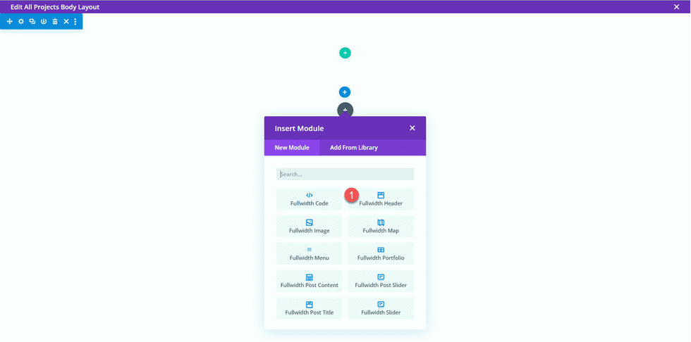
    First, add a fullwidth section to the page.

    Divi Matching Portfolio and Projects FW Section

    Then, add a fullwidth header module.

    Divi Matching Portfolio and Projects FW Header Module

    Open the header settings. We want the title of this page to dynamically populate based on the title of the project. Next to Title, click the dynamic content icon.

    Divi Matching Portfolio and Projects Use Dynamic Content

    Then, set the Title to “Posts/Archive Title.” Now the title will dynamically populate.

    Divi Matching Portfolio and Projects Select-Dynamic-Content

    Remove the text from the Button #1 and Body sections and remove the background color.

    Divi Matching Portfolio and Projects Background-Color-1

    Next, we want to add a dynamic background image. Move to the background image tab and click the dynamic content icon. Set the background image to “Featured Image”. This way, the featured image for the project post will appear at the top of our project page.

    Divi Matching Portfolio and Projects Background Image

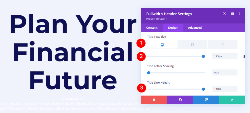
    Move over to the design tab and open the layout settings. Set the alignment to centered and make the header fullscreen.

    Divi Matching Portfolio and Projects Alignment

    Then, modify the title font settings.

    • Title Font: Inter
    • Title Font Weight: Bold
    • Title Text Color: #FFFFFF

    Divi Matching Portfolio and Projects Title Font

    Use the responsive settings to set different text sizes for different screen sizes. Additionally, set the line height.

    • Title Text Size on Desktop: 90px
    • Title Text Size on Tablet: 60px
    • Title Text Size on Mobile: 40px
    • Title Line Height: 1.1em

    Divi Matching Portfolio and Projects Header Title Text Size

    Under the Overlay settings, add an overlay.

    • Background Overlay Color: rgba(0,0,0,0.33)

    Divi Matching Portfolio and Projects Background Overlay

    Now move the fullwidth section to the top of the page.

    Divi Matching Portfolio and Projects Move Section

    Project Description Design

    Open the section settings for the empty regular section on the page and set a background color.

    • Background: #dfdcd2

    Divi Matching Portfolio and Projects Section Background

    Then add a row with two columns.

    Divi Matching Portfolio and Projects Row Layout

    Add a text module to the column on the left.

    Divi Matching Portfolio and Projects Add Text Module

    Replace the body content with dynamic content. For this module, we will add the Project Year.

    Divi Matching Portfolio and Projects Add Project Year Dynamic

    Move to the design tab and open the Text font settings. Customize the font as follows.

    • Text Font: Inter
    • Text Font Weight: Light
    • Text Text Color: #000000

    Divi Matching Portfolio and Projects Year Text

    Next, set the text size and line height. Use the responsive options to set a smaller text size on tablet and mobile.

    • Text Text Size Desktop: 24px
    • Text Text Size Tablet: 20px
    • Text Text Size Mobile: 18px
    • Text Line Height: 1em

    Divi Matching Portfolio and Projects Year Text Size

    Finally, move to the Spacing section and add a bottom margin.

    • Margin Bottom: 10px

    Divi Matching Portfolio and Projects Margin Bottom

    Now duplicate the Project Year text module.

    Divi Matching Portfolio and Projects Duplicate Module

    Open the duplicated module settings and replace the Project Year dynamic content with the Client Name dynamic content.

    Divi Matching Portfolio and Projects Client Name

    Repeat the same steps and duplicate the Client Name text module. Then, replace the Client Name dynamic content with the Deliverables dynamic content.

    Divi Matching Portfolio and Projects Body Deliverables

    Next, add a new text module below the Deliverables module.

    Divi Matching Portfolio and Projects Insert Text Module

    Replace the content with the Project Description dynamic content.

    Divi Matching Portfolio and Projects Description

    Open the Text options under the Design tab and customize the font:

    • Text Font: Inter
    • Text Font Weight: Light
    • Text Color: #000000

    Divi Matching Portfolio and Projects Text Font

    Then set the text size and line height. Once again, use the responsive options to set different text sizes for different screens.

    • Text Size Desktop: 17px
    • Text Size Tablet: 16px
    • Text Size Mobile: 14px
    • Text Line Height: 1.8em

    Divi Matching Portfolio and Projects Text Size
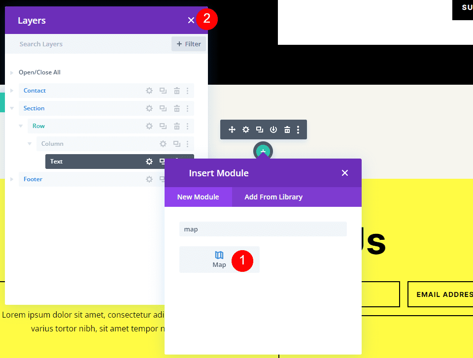
    Finally, add an image module to the right column.

    Divi Matching Portfolio and Projects Image Module

    The image will also be dynamically populated. Select the dynamic content icon and select Image 1 from our custom fields.

    Divi Matching Portfolio and Projects Image 1

    About Section Design

    Now let’s move on to the About section. Add a new regular section to the page.

    Divi Matching Portfolio and Projects Regular Section

    Open the section settings and add a background color.

    • Background: #eae8de

    Divi Matching Portfolio and Projects Set Background

    Add a row with two columns.

    Divi Matching Portfolio and Projects Insert Row Layout

    Next, add an image to the left column.

    Divi Matching Portfolio and Projects Add Image

    Select the dynamic content icon and select Image 2.

    Divi Matching Portfolio and Projects Dynamic Image 2

    Next, add a text module to the right column.

    Divi Matching Portfolio and Projects Text Module New

    Add the body text.

    • Heading 2: “About”

    Divi Matching Portfolio and Projects About Text

    Under the design tab, modify the heading text styles.

    • Heading 2 Font: Inter
    • Heading 2 Font Weight: Light
    • Heading 2 Text Color: #000000

    Divi Matching Portfolio and Projects Text Settings

    Next, modify the text size using the responsive options, and add the line height.

    • Heading 2 Text Size Desktop: 60px
    • Heading 2 Text Size Tablet: 36px
    • Heading 2 Text Size Mobile: 30px
    • Heading 2 Line Height: 1.2em

    Divi Matching Portfolio and Projects Heading Size

    Finally, open the Sizing settings and remove the bottom margin.

    • Margin-Bottom: 0px

    Divi Matching Portfolio and Projects Margin

    Duplicate the Project Description text module from the section above, then drag it to below the About text module.

    Divi Matching Portfolio and Projects Duplicate and Move

    Open the duplicated module settings and replace the dynamic content with the About Text.

    Divi Matching Portfolio and Projects About Text

    Images 3 and 4

    Add a new row with two columns to the page.

    Divi Matching Portfolio and Projects New Row 2 Columns

    Then, add an image module to the left column.

    Divi Matching Portfolio and Projects Insert Image Module

    Using the dynamic content settings, set this image module to the Image 3 custom field.

    Divi Matching Portfolio and Projects Image 3 Dynamic

    Under the Sizing settings in the Design tab, enable Force Fullwidth.

    • Force Fullwidth: Yes

    Divi Matching Portfolio and Projects Image Fullwidth 3

    Repeat these steps in the right column and add an image module. Use the dynamic content settings to set this image to Image 4.

    Divi Matching Portfolio and Projects Image 4 Dynamic

    Once again, enable Force Fullwidth in the Sizing settings.

    Divi Matching Portfolio and Projects Image Fullwidth 4

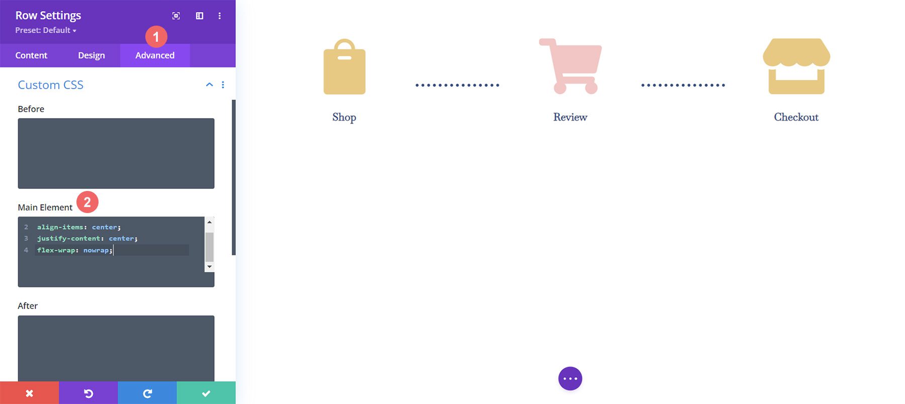
    Next, open the row settings and open the Sizing settings under the Design tab. Customize the sizing settings as follows:

    • Use Custom Gutter Width: Yes
    • Gutter Width: 1
    • Width: 100%
    • Max Width: 100vw

    Divi Matching Portfolio and Projects Row Settings

    Testimonial Layout

    Add a new row with a single column to the page.

    Divi Matching Portfolio and Projects New Row

    Then, add the testimonial module.

    Divi Matching Portfolio and Projects Add Testimonial Module

    We will use dynamic content in this module as well. Open the testimonial module setting and add the following dynamic content to the fields.

    • Author: Testimonial Name Dynamic Content
    • Job Title: Testimonial Job Dynamic Content
    • Company: Client Name Dynamic Content
    • Body: Testimonial Text Dynamic Content

    Divi Matching Portfolio and Projects Testimonial Content

    Delete the testimonial image.

    Divi Matching Portfolio and Projects Remove Image

    Move to the design tab and customize the quote icon.

    • Quote Icon Color: #000000
    • Quote Icon Background Color: rgba(255,255,255,0)

    Divi Matching Portfolio and Projects Quote Icon

    Next, modify the body font.

    • Body Font: Inter
    • Body Font Weight: Light
    • Body Text Color: #000000

    Divi Matching Portfolio and Projects Body Font Testimonial

    Customize the body text size using responsive options and adjust the body line height.

    • Body Text Size Desktop: 17px
    • Body Text Size Tablet: 16px
    • Body Text Size Mobile: 14px
    • Body Line Height: 1.8em

    Divi Matching Portfolio and Projects Body Text Size Line Height

    Next, customize the author text settings.

    • Author Font: Inter
    • Author Font Weight: Bold
    • Author Text Size Desktop: 17px
    • Author Text Size Tablet: 16px
    • Author Text Size Mobile: 14px

    Divi Matching Portfolio and Projects Author Font

    Then modify the font settings for the position text.

    • Position Font: Inter
    • Position Font Weight: Light
    • Position Text Size Desktop: 17px
    • Position Text Size Tablet: 16px
    • Position Text Size Mobile: 14px

    Divi Matching Portfolio and Projects Position Font

    Customize the company font settings as well.

    • Company Font: Inter
    • Company Font Weight: Light
    • Company Text Size Desktop: 17px
    • Company Text Size Tablet: 16px
    • Company Text Size Mobile: 14px

    Divi Matching Portfolio and Projects Company Font

    Finally, add a box shadow to the testimonial module.

    • Box Shadow: Below

    Divi Matching Portfolio and Projects Box Shadow

    Fullwidth Image

    Add a fullwidth section to the page.

    Divi Matching Portfolio and Projects Fullwidth Section

    Then, add a fullwidth image module.

    Divi Matching Portfolio and Projects Fullwidth Image Module

    Using the dynamic content settings, set this image module to Image 5.

    Divi Matching Portfolio and Projects Dynamic Image 5

    Call to Action Sections

    Now our dynamic content has been laid out. There are a couple of call-to-action sections that we will copy and modify from the portfolio page. In a different tab, open the portfolio page in the visual builder, then scroll to the bottom of the page.

    Copy the “Custom Designs & Commissions” section.

    Divi Matching Portfolio and Projects Copy Section

    Move back to the project page template and paste the “Custom Designs & Commissions” section below the existing content.

    Divi Matching Portfolio and Projects Paste Section

    Open the section settings and change the background color.

    • Background: #333333

    Divi Matching Portfolio and Projects Background Color

    Open the settings for the “Custom Designs & Commissions” text module and change the Heading 2 text color.

    • Heading 2 Text Color: #FFFFFF

    Divi Matching Portfolio and Projects Change Heading Color

    Then, open the module settings for the body text and change the text color.

    • Text Text Color: #FFFFFF

    Divi Matching Portfolio and Projects Change Text Color

    Next, move back to the portfolio page. Copy the “Free Matting on Orders of 4 or More Prints” section.

    Divi Matching Portfolio and Projects Copy Section 2

    Then, paste the “Free Matting” section to the bottom of the Project template page.

    Divi Matching Portfolio and Projects Paste Section 2

    Open the Call To Action module settings and change the text.

    • Title: Shop My Latest Prints
    • Button: Shop Now

    Divi Matching Portfolio and Projects Modify Section Text

    Open the row settings, then open the Column 2 settings.

    Divi Matching Portfolio and Projects Column 2 Settings

    Change the background color.

    • Background: #ff804f

    Divi Matching Portfolio and Projects Column 2 Background

    Then, add a background image. This image of abstract lines should be in your media library as long as you used the print designer landing page layout pack to design the portfolio page.

    • Background Image: Print-designer-10.png

    Divi Matching Portfolio and Projects Add Background Image

    Footer Section

    We will also copy the footer section from the portfolio page to use on the project template. Move to the tab with the portfolio page and copy the “Subscribe for Drop Updates” footer section.

    Divi Matching Portfolio and Projects Copy Footer

    Then finally, paste the footer section to the bottom of the project template page.

    Divi Matching Portfolio and Projects Paste Footer

    Project Page Final Design

    Here is the completed design for the project page. The template is applied to one of the projects and is populated with dynamic content.

    Divi Matching Portfolio and Projects Project Page Final Design

    Divi Matching Portfolio and Projects Project Page Mobile Final Design

    Final Result

    Now let’s take a look at our matching portfolio and project pages.

    Portfolio Page

    Divi Matching Portfolio and Projects Portfolio Page Final Design

    Divi Matching Portfolio and Projects Portfolio Mobile Final Design

    Project Page

    Divi Matching Portfolio and Projects Project Page Final Design

    Divi Matching Portfolio and Projects Project Page Mobile Final Design

    Final Thoughts

    By using dynamic content in your designs, you can easily create templates that allow you to quickly add new pages and content to your website without having to design the page layout each time. This works great for portfolio and project content, but you can use the same principles to create any kind of page template you would like! For another portfolio tutorial, check out this article to learn how to create a scrollable portfolio navigation list. Do you use dynamic content or templates on your website? We would love to hear from you in the comments!

    The post How to Create Matching Portfolio & Projects with Divi appeared first on Elegant Themes Blog.

  • Divi SEO Agency Theme – Divi Child Theme Overview

    The Divi SEO Agency Theme features 30+ prebuilt pages, ideal for an SEO agency or a web service provider website you want to build using Divi. The site consists of dynamic pages full of eye-catching motion and comes with variations of several pages, giving you some flexibility with your website design. In this post, we’ll take a look at the Divi SEO Agency theme to help you decide if it’s the right Divi child theme for you.

    Let’s get started!

    Installing Divi SEO Agency Theme

    To install the Divi SEO Agency Theme, open your WordPress Dashboard and navigate to the add new themes page. Click Upload Theme, upload the ZIP file containing the child theme, and click import. Once installed, activate the theme.

    Divi SEO Agency Theme Divi Child Theme Overview Install-2

    Once the child theme is installed and activated, you will see a new menu item in your Dashboard called “Imports Demo Data”. Click the Easy Demo Import tab and import the demo content. Once the import is complete, you are all set to begin replacing the demo content with your own.

    Divi SEO Agency Theme Divi Child Theme Overview Install-1

    Divi SEO Agency Theme

    The Divi SEO Agency theme consists of 30+ pages. Let’s take a look at each page, starting with the home page, which has four variations.

    Divi SEO Agency Theme Home V1

    Divi SEO Agency Theme Home V1 Header and Introduction

    The header features a large image that moves up and down on the page. The geometric shapes in the background of this section also move. On the right side are the header text and a call-to-action button. Below there are four blurb sections with an icon, a title, some text, and a link to read more. These modules move up on hover.

    Divi SEO Agency Theme Divi Child Theme Overview Home V1 Header

    Divi SEO Agency Theme Home V1 About

    The next few sections are where you can introduce your services. The first section features a couple of paragraphs of about text and an image that floats up and down. Next are three blurbs with an icon featuring three different services. These sections also move up on hover and the geometric shapes in the background move while you are on the page. The third section features six blurbs with icons where you can introduce your services. The image in the middle moves up and down.

    Divi SEO Agency Theme Divi Child Theme Overview Home V1-7

    Divi SEO Agency Theme Home V1 Lead Magnet

    Next is a lead magnet section where visitors can submit their website and email address to receive an SEO check.

    Divi SEO Agency Theme Divi Child Theme Overview Home-V1-6

    Divi SEO Agency Theme Home V1 Benefits

    This section is where you can outline the benefits for your customer to use your services. It uses a moving image on the left and bar graphs on the right.

    Divi SEO Agency Theme Divi Child Theme Overview Home-V1-5

    Divi SEO Agency Theme Home V1 Social Proof

    This section features company logos for social proof.

    Divi SEO Agency Theme Divi Child Theme Overview Home V1-4

    Divi SEO Agency Theme Home V1 Team

    Divi SEO Agency Theme Divi Child Theme Overview Home V1-3

    In this section, you can feature your team members. On hover, the blue and orange circles around the profile photo rotate. This section features social media icons for each team member.

    Divi SEO Agency Theme Home V1 Testimonials

    Divi SEO Agency Theme Divi Child Theme Overview Home V1-2

    This section features a slider with client testimonials. The blue circle over this section moves as you are on the page.

    Divi SEO Agency Theme Home V1 Latest News

    This is the final section on the home page and it features the latest blog posts. The blog category is listed over the featured image and there is a read more link to bring readers to the full post.

    Divi SEO Agency Theme Divi Child Theme Overview Home V1-1

    Divi SEO Agency Theme Home V2

    The second version of the home page features a large header with some text and buttons with moving geometric shapes. Then there is the list of company logos and a list of three features highlighted below. Following this is a number counter which counts up as the page loads. Next is a section highlighting benefits, with 4 numbered blurbs.

    Divi SEO Agency Theme Divi Child Theme Overview Home V2-1

    These two sections continue to introduce the services. In the first section, you have six blurbs with icons and some description text. On hover, the background turns white. In the second section you have five tabs with a description, a read more link, and an image under each tab. This page also has the same team section and recent news section as was found on Home V1.

    Divi SEO Agency Theme Divi Child Theme Overview Home V2-2

    Divi SEO Agency Theme Home V3

    The third version of the home page has a floating menu bar and a large graphic background with text on the left. The main header image floats up and down and the geometric shapes move while you are on the page. Below are three blurbs highlighting some features.

    Divi SEO Agency Theme Divi Child Theme Overview Home V3-2

    This page also has a pricing table with the cost, features, and a button to choose the plan. In addition to the unique features we covered, this page also has the SEO check lead magnet, company logos, benefits with numbered blurbs, benefits with progress bars, and latest news sections we saw on other pages.

    Divi SEO Agency Theme Divi Child Theme Overview Home V3-1

    Divi SEO Agency Theme Home V4

    The fourth version of the home page is all on a darker background. The header has some text and a button on the left with a moving image on the right. Below is a number counter. The about section features three text sections connected with the dotted heart icon.

    Divi SEO Agency Theme Divi Child Theme Overview Home V4-2

    Another unique section for home version 4 is the “we deliver success” section. There is some introductory text with a dynamic moving image. Below are round number counters representing percentages relevant to the services the company provides. Aside from these unique sections, home version 4 features company logos, blurbs with icons, an SEO check lead magnet, team members, and recent posts.

    Divi SEO Agency Theme Divi Child Theme Overview Home V4-1

    Divi SEO Agency Theme Landing Page

    The landing page features a dynamic header with moving elements, feature blurbs with icons, and placeholders for images that link to inner pages. This page also features several sections with text, images, and call-to-action buttons where you can describe your services and unique features.

    Divi SEO Agency Theme Divi Child Theme Overview Landing-1

    Divi SEO Agency Theme Coming Soon Page

    The coming soon page features a countdown timer and some text. There is also an email sign-up form and social media icons.

    Divi SEO Agency Theme Divi Child Theme Overview Coming Soon

    Divi SEO Agency Theme About Us Page

    The about us page features many of the same sections found on the home pages. It starts with a dynamic header with moving geometric shapes. The following section has some about text and a number counter. The page also features team members, testimonials, and company logos.

    Divi SEO Agency Theme Divi Child Theme Overview About Us

    Divi SEO Agency Theme Our Team Page

    This page starts with a dynamic header and a section with some about text, an image, and number counters. Then follows the company logos and the team members section. Finally, there is a contact form at the bottom and some numbered blurbs featuring company benefits.

    Divi SEO Agency Theme Divi Child Theme Overview Our Team

    Divi SEO Agency Theme Single Team Page

    This page features a single team member. It has a profile card at the top with the name, title, social media icons, photo, and other relevant information. Below is a longer bio section with personal info, press and awards, professional info, and a contact form.

    Divi SEO Agency Theme Divi Child Theme Overview Single Team

    Divi SEO Agency Theme Our Process Page

    The our process page features a timeline with an orange dot that moves as you scroll. As the orange dot moves past each step, the icon gets covered with an orange border. Also on this page is the SEO check lead magnet, some features highlighted in a blurb with an icon and description text, and a section introducing services with three tabs.

    Divi SEO Agency Theme Divi Child Theme Overview Our Process

    Divi SEO Agency Theme Pricing Tables Page

    The pricing tables page features two different pricing tables. The first layout has two pricing cards at an angle. When you hover over the card it comes to the front and straightens out. The second version is what was on the home page version 3.

    Divi SEO Agency Theme Divi Child Theme Overview Pricing

    Divi SEO Agency Theme FAQ Page

    The FAQ page begins with some blurbs with icons, then features a call-to-action section with a button. Then there are the FAQ questions listed under a toggle.

    Divi SEO Agency Theme Divi Child Theme Overview FAQ

    Divi SEO Agency Theme Headers

    The headers page features three header styles that can be used on the website. The first header style features the address, phone, email, and social media information at the top. The menu bar is on a white background and features the logo, menu items, search icon, and another icon that reveals a sidebar with contact information.

    The second header style also features the address, phone and email, and social media information at the top. It also features the logo, menu items, search icon, and sidebar icon with contact information.

    Finally, the third header style has a dark blue background for the top bar. It features social media icons, the phone number, and email address. The main menu bar features the logo and menu items on a red background.

    Divi SEO Agency Theme Divi Child Theme Overview Header 1

    This is the sidebar that appears when you select the icon with the four rounded squares on Header V1 and V2.

    Divi SEO Agency Theme Divi Child Theme Overview Header 2

    Divi SEO Agency Theme Footers Page

    The footers page features the footer variations available for the theme. Footer 1 features the phone and email information as well as a newsletter sign-up form. Below is some about text with social media links, quick links to pages, a useful services section linking to other pages, and a latest news section featuring a couple of recent posts.

    Footer 2 features the logo and about text with social media icons below. Additionally, there are some quick links and a useful services section. The final column features contact information. Below this is a newsletter sign up form and copyright information.

    Footer 3 features a red background with a headline and a call-to-action button. Below this is some about text and social media icons, contact information, useful links, and latest news. At the bottom of the footer you have the terms of use, privacy policy, and copyright information.

    Divi SEO Agency Theme Divi Child Theme Overview Footer

    Divi SEO Agency Theme Services V1

    The services page features blurbs with icons and a short description of the services. The next section features a large image, some text, and two icons highlighting some features. There is also a pricing table and number counters on this page, as well as a bar graph counter.

    Divi SEO Agency Theme Divi Child Theme Overview Services V1

    Divi SEO Agency Theme Services V2

    The second version of the services page starts with some tabs with large icons. Each tab has text and an image explaining the service. Next, there is the SEO check lead magnet and company logos, followed by a section with blurbs. The geometric shapes on these blurbs move as you are on the page. The page ends with a form to sign up for free SEO analysis, some about text with checkmarks, and a number counter.

    Divi SEO Agency Theme Divi Child Theme Overview Services V2

    Divi SEO Agency Theme Services V3

    The third services page layout begins with a some text alongside an image. Below this there are some blurbs with icons on the left and some tabs with service details on the right. Following this are numbered feature highlights with icons. The blue circle around these icons move as you hover. Also on this page is the SEO check lead magnet, a bar graph counter, and company logos.

    Divi SEO Agency Theme Divi Child Theme Overview Services V3

    Divi SEO Agency Theme Services List Page

    This page is where you can list all of your services. It is designed with an image on one side an text on the other describing the service, as well as a button to go to the full dedicated services page. Below this are two SEO check lead magnet forms, company logos, and a number counter.

    Divi SEO Agency Theme Divi Child Theme Overview Services List

    Divi SEO Agency Theme Single Service Page

    The single service page is a dedicated page for each service. It features a large image at the top, description text, a bar graph counter, blurbs with icons, tabs with service descriptions, and a team members section. On the left there is a sidebar with links to other service pages, blurbs highlighting phone and email support, and a form for the SEO check lead magnet.

    Divi SEO Agency Theme Divi Child Theme Overview Single Service

    Divi SEO Agency Theme Portfolio Page

    The portfolio page features two layouts, one with large featured images and a title and category that appear on hover. The second layout is similar to the first but features a category filter at the top.

    Divi SEO Agency Theme Divi Child Theme Overview Portfolio

    There are two variations of this page, one with two columns and one with three columns.

    Divi SEO Agency Theme Divi Child Theme Overview Portfolio 2

    Divi SEO Agency Theme Divi Child Theme Overview Portfolio 3

    Divi SEO Agency Theme Portfolio Category

    The portfolio category features the relevant projects. When you hover over the featured image you can see the title and category.

    Divi SEO Agency Theme Divi Child Theme Overview Portfolio Category

    Divi SEO Agency Theme Portfolio Project Page

    The portfolio project page features a large image, icons to represent some project details, and text and images to review the project. The page ends with related projects and a comment section.

    Divi SEO Agency Theme Divi Child Theme Overview Portfolio Project

    Divi SEO Agency Theme Blog Page

    The blog page features a grid layout with recent posts. There is also a two-column and four-column version of this page.

    Divi SEO Agency Theme Divi Child Theme Overview Blog Grid

    Divi SEO Agency Theme Blog Listing Page

    The blog listing page features recent posts with a preview and featured image. On the right, you have a search bar, recent posts, categories, a calendar, and recent comments.

    Divi SEO Agency Theme Divi Child Theme Overview Blog Listing

    Divi SEO Agency Theme Blog Grid 2 Columns with Sidebar Page

    This layout uses the grid layout for recent posts and features the sidebar that is on the blog listing page as well.

    Divi SEO Agency Theme Divi Child Theme Overview Blog Grid Sidebar

    Divi SEO Agency Theme Single Post Page

    This page features a single post with a sidebar. The page ends with latest posts and a comment section.

    Divi SEO Agency Theme Divi Child Theme Overview Single Post

    Divi SEO Agency Theme Single Category Page

    The single category page features a single blog category. It uses a 3 column grid layout.

    Divi SEO Agency Theme Divi Child Theme Overview Single Category

    Divi SEO Agency Theme Contact Page

    The contact page features the contact information next to an image, a contact form, and a map.

    Divi SEO Agency Theme Divi Child Theme Overview Contact

    Where to Purchase the Divi SEO Agency Theme

    The Divi SEO Agency Theme is available in the Divi Marketplace. It costs $39.99 for unlimited website usage and lifetime support and updates. The price also includes a 30-day money-back guarantee.

    Divi SEO Agency Theme Tutorial

    Final Thoughts

    The Divi SEO Agency Child Theme is modern, clean, and full of dynamic layouts to capture your website visitor’s attention and convert new customers. It is perfect for SEO agencies, software companies, and web service providers, but can be customized to fit many different types of websites. If you are looking for a modern and dynamic website with lots of graphics and movement, this could be a great option for you.

    We would love to hear from you! Have you tried the Divi SEO Agency theme? Let us know what you think about it in the comments!

    The post Divi SEO Agency Theme – Divi Child Theme Overview appeared first on Elegant Themes Blog.