EDITS.WS

Tag: Divi Tutorial

  • Using Basic Captcha vs ReCaptcha in Divi’s Contact Form Module

    Do you have a contact form on your website? If so, you may have noticed spam messages being submitted through your form. Captcha is a great solution to prevent unwanted spam messages from being submitted. The purpose of Captcha is to ensure that the visitor filling out your contact form is actually human and not a computer program. There are many different types of Captcha tests. Some of the most common methods of Captcha tests require users to type in the letters and numbers they see in a distorted image. They also let you calculate a simple math equation, or select images containing a certain object, like a bicycle or stop sign. More recent and advanced methods of Captcha protection work behind the scenes to verify the user is not a bot, giving legitimate users a seamless experience while blocking the bots.

    Divi’s Contact Form Module comes with two different types of Captcha protection for your website: Basic Captcha and ReCaptcha. In this post, we will discuss the differences between Divi’s Basic Captcha and ReCaptcha and go over some pros and cons so that you can better understand when to use these options on your website.

    Let’s get started!

    Using Basic Captcha vs ReCaptcha in Divi’s Contact Form Module

    What is Captcha, And Does my Contact Form Need it?

    First, let’s get a better understanding of what Captcha is and why you should include it in your contact form. Captcha stands for “Completely Automated Turing Test to Tell Computers and Humans Apart.” As the name describes, it is a challenge-response test that can be implemented on your contact form to test whether you are a computer or a human. If you pass the Captcha test, it assumes you are human and allows you to submit the form. If you do not pass the test, Captcha assumes you are a computer and does not allow you to submit the form in order to prevent spam messages from being sent.

    It is a good idea to enable captcha spam protection on your contact form module, as it greatly reduces the number of spam messages you will receive, and helps keep your website safe and secure. Not to mention, if you have lots of spam messages in your inbox, it can be easy to miss legitimate inquiries sent from your website visitors! Divi offers two built-in options to add Captcha to your contact form, Basic Captcha and ReCaptcha. Let’s take a closer look at these two methods and some of their key differences.

    Using Basic Captcha in Divi’s Contact Form Module

    Divi’s basic Captcha is a simple math equation that users are required to solve before they can submit the form. It is very easy to add the basic Captcha requirement to your contact form module and it does not require any additional setup.

    Add the Basic Captcha Requirement

    First, open the contact form module settings. Under the Content tab, navigate to the Spam Protection section. Set Use Basic Captcha to “Yes”.

    • Use Basic Captcha: Yes

    Divi Basic Captcha Contact Form Use Basic Captcha

    Now basic Captcha is enabled for your contact form and users will be required to solve the math equation before submitting the form.

    Divi Basic Captcha Contact Form

    If the user submits an incorrect answer, they will see an error message at the top of the form.

    Divi Basic Captcha Contact Form Error

    Use Cases for Basic Captcha

    Using Divi’s built-in Basic Captcha is a great way to reduce the number of spam submissions you get through your contact form. The setup is as easy as clicking a button, and it does not require you to sign up for an external service. However, Basic Captcha can cause issues with accessibility since it relies on the user having to calculate a math problem, and there is a risk that bots will get past this form since it is simpler and uses less robust methods to detect if the user is a human or a bot.

    While Basic Captcha is a great option for a quick and easy solution to the spam messages you might get through the contact form, there are some drawbacks, especially when compared to the more advanced Captcha options available. If you are interested in a more robust option to prevent spam messages, read on to learn about ReCaptcha!

    Using ReCaptcha for Divi’s Contact Form Module

    Google ReCaptcha is the other spam protection option built into Divi. Unlike other Captcha options you may have seen, ReCaptcha runs completely in the background while the user is on your page. Based on the user’s activity, ReCaptcha generates a score between 0-1, with 0 being very likely a bot and 1 being very likely a human. When you set up ReCaptcha you set a minimum score threshold that determines whether a user will be allowed to submit the contact form or not. The default threshold score is 0.5, so any user below a score of 0.5 (likely a bot) will be blocked. The great thing about ReCaptcha is that your legitimate website visitors will not have to go through a test to decipher letters and numbers or calculate equations in order to submit the form. All they need to do is fill out the contact form and click submit!

    Generating the ReCaptcha Site Key and Secret Key

    In order to add the ReCaptcha requirement to your contact form, we will first need to generate a ReCaptcha v3 Site Key and Secret Key. This requires a Google account.

    First, sign in to the ReCaptcha Admin Console with your Google account and click the plus button to add a new site.

    Divi Basic Captcha vs ReCaptcha Contact Form Add ReCaptcha Site

    Add a label, select the option for ReCaptcha v3, then add your website domain.

    Divi ReCaptcha Contact Form Register

    If needed, add email addresses to the owner section and accept the terms of service. If you would like to receive alert emails, check the “Send alerts to owners” checkbox. Then click submit.

    Divi ReCaptcha Contact Form Register

    On the next page, you will be able to copy the site key and secret key. We will use this when adding ReCaptcha to the contact form.

    Divi ReCaptcha Contact Form Site Key Secret Key

    Add the ReCaptcha Requirement

    Once your site has been registered with ReCaptcha and the site key and secret key have been generated, we can add the ReCaptcha requirement to the contact form.

    Under the Content tab, in the contact form module settings, navigate to the Spam Protection section. Set Use A Spam Protection Service to “Yes”. Then click “Add”.

    Divi ReCaptcha Contact Form Setup

    Enter a name for your account (or leave it at Default), then enter your site key and secret key and click submit.

    Divi ReCaptcha Contact Form Settings

    Finally, you can adjust your minimum score threshold if you want. We will leave ours at 0.5, which is the default. You can always come back and adjust this threshold based on your analytics.

    Divi ReCaptcha Contact Form Minimum Score

    Now your form is protected with ReCaptcha! Legitimate users will not be required to go through any sort of test, and they will just see a small and unobtrusive ReCaptcha banner at the bottom right corner of the screen.

    Use Cases for ReCaptcha

    Of the two built-in Captcha options that comes with Divi’s contact form module, the ReCaptcha option is the most robust and advanced. It is also the most user-friendly option, allowing your site visitors to fill out the contact form without having to do math or decipher letters, which can be confusing and cause frustration. Even though it involves a few more steps than the Basic Captcha option, it may be worth setting up in order to have seamless protection for your contact form and improve your user experience.

    Final Thoughts

    Adding a Captcha requirement to your form is a good practice to follow on your website in order to prevent bots from sending in submissions. Divi’s contact form module comes with two built-in options that make it easy to implement these security measures. Basic Captcha is an easy way to add Captcha protection to your Divi contact form and blocks users who cannot solve the math requirement. ReCaptcha provides a better user experience by running seamlessly in the background. This makes the form easier to fill out and reduces errors, meaning fewer frustrated users abandoning their attempts at contact. Both options are effective in reducing the spam that comes through your contact form, and Divi makes it easy to use whichever option fits your needs best.

    Do you use Basic Captcha or ReCaptcha in your contact form? We would love to hear about your experience. Let us know in the comments!

    The post Using Basic Captcha vs ReCaptcha in Divi’s Contact Form Module appeared first on Elegant Themes Blog.

  • EMPIRE – Divi Child Theme Overview

    The Empire Child Theme is a Woocommerce-based eCommerce website theme for online stores. It uses Divi as its main theme. The design is clean and modern with beautiful typography and impactful images. The child theme comes with 10+ pages and 3 dark mode pages. In this post, we’ll take a look at the Empire Divi child theme to help you decide if it’s the right Divi child theme for you.

    Let’s get started!

    Installing Empire Divi Child Theme

    Installing the Empire Divi Child Theme is simple and straightforward. First, upload the theme to your WordPress website, then activate the theme.

    Empire Divi Child Theme Add Theme

    Once the theme is activated, you will see a new tab in your WordPress dashboard called “Empire Demo Content Importer”. Select the Easy Demo Import tab and start the import. This will automatically import the layouts to your website and install the recommended plugins.

    Empire Divi Child Theme Import Options

    Empire Divi Child Theme Pages

    Empire comes with 10+ layouts and 3 dark mode layouts. We’ll go through each page and discuss the designs.

    Empire Divi Child Theme Homepage

    Let’s take a look at the Empire Divi child theme homepage layout. The homepage includes a header, CTA sections, videos, images, number counters, and much more. Throughout the page, there are loading animations, hover effects, and parallax image effects to achieve an eye-catching, engaging website design. Let’s take a look at each section on the home page.

    Empire Divi Child Theme Home Layout

    Hero

    The hero section is the first component on the home page. It features some text and a button. The logo and menu are at the top of this section, and the menu is sticky at the top as you scroll down the page.

    Empire Divi Child Theme Home Hero

    CTA Section

    This call to action section has a title and some text content below. It also has a button to prompt users to action.

    Empire Divi Child Theme Home

    Services

    This section features text on the left side and an image on the right. The text on the left is formatted to fit the theme so all you need to do is replace it with your own content. There is a quote section to highlight some text as well. This section also has two buttons.

    Empire Divi Child Theme Home

    Video

    The video section has a purple overlay when you hover over it, highlighting the video in a unique way. There is an image background to this section as well.

    Empire Divi Child Theme Home

    CTA Section

    Another call to action here, with some stylized text on an image background and a button below.

    Features

    The features section has two versions: a light and a dark version. These sections can be used to show off your services or offerings, and highlight what makes your business unique. Below this section, there are four number counter modules that count as you scroll to the section.

    Empire Divi Child Theme Home

    CTA with Video Background

    This section is a call to action with a video background and a dark overlay. It is an eye-catching design to draw your website visitor’s attention.

    Empire Divi Child Theme Home

    Image Layout

    The next section is a simple grid image layout with some text and a button in the top left corner.

    Empire Divi Child Theme Home

    Text and Video

    In this section, there is some featured text with a repeating background video below.

    Empire Divi Child Theme Home

    Image Hover Reveal

    This is one of the more unique sections in the Empire Divi child theme. There are many images in a grid layout. When you hover over any of the images, text appears with an animation delay with an overlay background.

    Empire Divi Child Theme Home

    Video Layouts

    Here are three more video section layouts. The first section has a full-width video preview. When you hover over the video, there is a purple overlay.

    Empire Divi Child Theme Home

    The second video section includes some text on the left side as well as a button. When you hover over the video, there is a purple overlay.

    Empire Divi Child Theme Home

    The third video section is on an image background with a dark overlay and has space for some text below. Like the others, this one also has a purple overlay on hover.

    Empire Divi Child Theme Home

    Testimonials

    There are two designs for a testimonial section, one light and one dark. Both are testimonial sliders so that you can showcase multiple testimonials.

    Empire Divi Child Theme Home

    This is another simple text and image section with a fullwidth parallax image above. There is also a button below the text in this section.

    Empire Divi Child Theme Home

    CTA Section

    Here is another CTA section. It features two images, one of them with a purple overlay and some text, and a button.

    Empire Divi Child Theme Home

    Blurbs

    This section features a large image and six blurbs with an icon and some text. You can use this section to highlight some of your features or offerings.

    Empire Divi Child Theme Home

    CTA Section

    Another CTA section, featuring a heading and a button. The background image has a parallax effect.

    Empire Divi Child Theme Home

    Video and Text

    Here you have a background video that plays automatically as well as some text.

    Empire Divi Child Theme Home

    Image and Text

    Here are some more layouts with text, images, and buttons. The section below has an image background with an overlay.

    Empire Divi Child Theme Home

    Empire Divi Child Theme Home

    Store

    The store layout section includes a section for some featured products with a button to go to the store. There are images that link to product categories, as well as some more featured products below. Finally, there is a section to display customer reviews.

    Empire Divi Child Theme Home Store

    Blog

    The blog section has some recent posts displayed with a link to view the full blog. Each post also has a featured image.

    Empire Divi Child Theme Home Page Variations

    Empire comes with a couple of homepage variations. There is a dark mode, which has darker backgrounds for most of the sections.

    Empire Divi Child Theme Home Dark

    There is also a homepage variation with a video header. The rest of the content on this page is variations of the layouts we covered above.

    Empire Divi Child Theme Home Video Header

    The other homepage variation features a split header with a transparent overlay on the right side with the header text and a button. Like the other variation, the rest of the layouts on this page are variations of the layouts already covered.

    Empire Divi Child Theme Split Header

    Empire Divi Child Theme Interior Page

    The interior page is one of the premade layouts that comes with the Empire Divi child theme. It features a header with an image background, a section for text with some buttons, a couple of CTA sections, a testimonial section, and some images which are used as buttons to guide the user to another page.

    Empire Divi Child Theme Interior

    Empire Divi Child Theme Services Page

    The services page is set up so that you can highlight your service offerings with little blurbs.

    Empire Divi Child Theme Services

    The page includes some text, a services display with icons, CTAs, and a pricing table.

    The services page also has a dark mode variation, pictured above.

    Empire Divi Child Theme Services Dark

    Empire Divi Child Theme Team Page

    The team page features large images for all of your team members. For each team member, their name and title are listed and there is space for a short bio. Below, their email address and social media links are listed.

    Empire Divi Child Theme Team

    Also on this page is a section to highlight any open roles you might have.

    Empire Divi Child Theme Job Board

    Empire Divi Child Theme Contact Page

    The contact page is fairly simple, with a short blurb of text and a contact form, as well as information for help and support and the address.

    Empire Divi Child Theme Contact

    There is a dark mode version of the contact page as well.

    Empire Divi Child Theme Contact Dark

    Empire Divi Child Theme Blog Page

    The blog page for this theme is very simple, with a large image showcasing the featured image, and the post title, date, and excerpt below.

    Empire Divi Child Theme Blog

    Empire Divi Child Theme Blog Post

    The blog post page is also a simple design, with the featured image set at the very top with the menu bar as well as the title, author, and date listed over the image.

    Empire Divi Child Theme Blog Post

    Empire Divi Child Theme Shop

    Empire is an eCommerce-focused theme that uses WooCommerce. The shop page features an image header, some featured products, a link to open a shop category, and reviews.

    Empire Divi Child Theme Shop

    Empire Divi Child Theme Product Page

    The product page has an image header with the product title and subtitle. Then you have your product, with photos on the left-hand side. On hover, you can zoom in to see the product photos up close. On the right side is the product information including the product name, price, description, size, color, and a button to add to the cart.

    Empire Divi Child Theme Product

    Below this section, there are some modules where you can display additional photos, descriptions, information about the measurements and materials, features, and reviews. At the bottom of the page, you can find related products.

    Empire Divi Child Theme Product Features

    When you add a product to your cart, the shopping cart sidebar appears where you can see the products in your cart, see your total cost, and choose to open the cart, go to checkout, or continue shopping. While this window is open, the rest of the website is faded with a black overlay.

    Empire Divi Child Theme Pop Out Cart

    Empire Divi Child Theme Cart Page

    The cart page is fairly standard and lists the content of the cart, a place to enter a coupon code, the cart total, and a button to proceed to checkout. Contact information is listed on the right side.

    Empire Divi Child Theme Cart

    Empire Divi Child Theme Header

    The header for the Empire Divi child theme is built with the WordPress menu customizer. The menu consists of a logo on the left, menu items with some drop-down options, and a call to action button on the right.

    Empire Divi Child Theme Header

    Empire Divi Child Theme Footer

    The footer for the Empire Divi child theme is built with the Divi Theme Builder.

    Empire Divi Child Theme Footer Layout

    The footer consists of a logo and a text area for a short description. It also includes a section for social media icons, copyright information, and links to legal pages. In the middle, there is a menu section, and on the right, there is the contact information and a call-to-action button.

    Empire Divi Child Theme Footer

    Empire Divi Child Theme Video Tutorials

    The Empire Divi child theme also comes with a page of 13 video tutorials. This is a very helpful resource so that you can learn how to further customize the child theme.

    Empire Divi Child Theme Video Tutorials

    Where to Purchase the Empire Divi Child Theme

    The Empire Divi child theme is available in the Divi Marketplace for $59. It includes unlimited website usage and one year of support and updates.

    Empire Divi Child Theme Purchase

    Final Thoughts

    The Empire Divi Child Theme is a great child theme to use if you need an eCommerce website with lots of content layout options for you to use. It has a simple but elegant design and uses different motion effects throughout the site to draw your attention and highlight content on the page. The installation is quick and easy, so the only setup required is to replace the content with your own and set up your WooCommerce shop. Overall, I would recommend this theme for anyone who wants to set up an eCommerce website with Divi without having to design the website from scratch.

    We would love to hear from you! Have you tried the Empire Divi Child Theme? Let us know what you think about it in the comments!

    The post EMPIRE – Divi Child Theme Overview appeared first on Elegant Themes Blog.

  • How to Balance the Primary & Secondary Buttons in Your Divi Fullwidth Header Module

    The Divi Fullwidth Header module makes it easy to add beautiful hero sections to your website. The module comes with two buttons, a title text, subtitle text, body text, a logo, and an image, making the customization options endless.

    In today’s post, we’re going to demonstrate how to re-create hero sections using the Divi Fullwidth Header. We’ll start our design by using 3 premade layout packs and design our sections with a focus on balancing the primary and secondary buttons. We want the primary button to stand out, as it’s our main call to action while keeping the secondary button visible and accessible without overtaking the primary button.

    Design Principles of Primary and Secondary Buttons

    Primary buttons and secondary buttons help guide your website visitors towards certain actions. Primary buttons are typically the most common or desired action and secondary buttons are a less common action. This helps guide visitors to where they want to go.

    To accomplish this, primary buttons should stand out visually and secondary buttons should not stand out as much. That means primary buttons should be more distinctive and have more visual weight so that it attracts more attention.

    Now that we have an understanding of how primary and secondary buttons work, let’s get to the tutorial!

    Design Preview

    Here’s a look at the three fullwidth headers we will be designing today.

    UX Fullwidth Header

    Divi Retirement Center Fullwidth Header

    Financial Planning Fullwidth Header

    Download the Layouts for FREE

    To lay your hands on the designs from this tutorial, you will first need to download it using the button below. To gain access to the download you will need to subscribe to our newsletter by using the form below. As a new subscriber, you will receive even more Divi goodness and a free Divi Layout pack every Monday! If you’re already on the list, simply enter your email address below and click download. You will not be “resubscribed” or receive extra emails.

    To import the header template to your Divi Library, do the following:

    1. Navigate to the Divi Theme Builder.
    2. Click the Import button at the top right of the page.
    3. In the portability popup, select the import tab
    4. Choose the download file from your computer (make sure to unzip the file first and use the JSON file).
    5. Then click the import button.

    Once done, the section layout will be available in the Divi Builder.

    Let’s get to the tutorial, shall we?

    What You Need to Get Started

    To get started, you will need to do the following:

    1. Install Divi on your WordPress website.
    2. Add a Page and give it a title.
    3. Enable the Visual Builder

    Ux Fullwidth Header Design Steps

    Now that we have our page set up, let’s start with the fullwidth header for a UX landing page.

    Setting Up Our Page

    Before we can begin styling, we’ll need to load the free UX premade layout pack from the Divi Library. When you enable the Visual Builder you’ll see three options pop-up, select Choose A Premade Layout.

    Load Layout Pack

    To do load the UX layout pack onto your page:

    1. In the “Premade Layouts” tab use the search function to find the UX layout pack.
    2. Once you’ve found it click on it. This will bring up the layout details and pages available.
    3. Click on the landing page design, then click “Use This Layout”.

    We’ll be recreating the top section of the layout as a fullwidth header module.

    Delete First Section

    Since we are going to recreate the first section using the Fullwidth Header module instead, we’ll need to delete this section. Hover over the section and click the trash icon.

    Add Fullwidth Section

    Before we can add the fullwidth header, we need to add a fullwidth section.

    Click the “+” arrow to bring up the Divi sections and then click “fullwidth”. This will automatically bring up the Divi Fullwidth Module library.

    Add Fullwidth Header

    Inside the Divi Fullwidth Module Library, click “Fullwidth Header”.

    Adding  Content

    Before we begin styling the module, let’s add the content needed for this module.

    Add Text Content

    Underneath the Text tab, add the following content:

    1. Title: Improve Your UX Design Knowledge
    2. Subtitle: UX Design Course
    3. Button #1: Course Overview
    4. Button #2: Learn More
    5. Body: Placeholder text

    Add Images

    Now that we have our text content in place, we need to add two images to our design.

    1. In the Images tab, add the logo image (the stars) and the header image (the photo of the person holding a phone).

    Change Background Color

    In the Background tab, configure this setting:

    1. Background Color: #131517

    Styling The Fullwidth Header

    Now that we have our content set up, let’s add some styling to it via the Design tab.

    Scroll Down Icon

    Let’s add the scroll down icon, the downward arrow.

    1. This design uses a scroll down icon, so toggle this option to yes.
    2. Select the downward arrow icon and then set the icon color to white.

    Image

    Let’s add curves to our images by rounding the corners.

    In the image tab, configure the following settings:

    1. Image Rounded Corners: Click the chainlink button to unlink the corners, then type 1000px in the bottom left and bottom right input boxes. This will round the bottom left and bottom right corners of our images.

    Title Text

    Here let’s style the title text for this module. In the Title Text tab, configure these settings:

    1. Title font: PT Sans
    2. Title Font Weight: Bold
    3. Title Text Size: 5rem
    4. Title Line Height: 1.2em

    Body Text

    This is where we style the body text of this module. In the Body Text tab, configure these settings:

    1. Body Font: Mukta
    2. Body Text Size: 18px

    Subtitle Text

    This is where we style the subtitle text for this module. In the Subtitle Text tab, configure these settings:

    1. Subtitle Font: Mukta
    2. Subtitle Font Weight: Bold
    3. Subtitle Font Style: Uppercase
    4. Subtitle Text Color: #13d678
    5. Subtitle Letter Spacing: 3px

    Button One

    This is where we can set custom styles for button one, the primary button. In the Button One tab, configure these settings:

    1. Use Custom Styles For Button One: Yes
    2. Button One Color: #ffffff
    3. Button One Background: #13d678
    4. Button One Border Width: 0px
    5. Button One Border Radius: 100px
    6. Button One Font: Mukta
    7. Button One Font Weight: Bold
    8. Show Button One Icon: Yes
    9. Button One Icon: Right Arrow
    10. Only Show Icon On Hover For Button One: No

    Button Two

    Now let’s style the secondary button, the second button. In the Button Two tab, configure these settings:

    1. Use Custom Styles For Button One: Yes
    2. Button One Color: #ffffff
    3. Button One Background: #303030
    4. Button One Border Width: 0px
    5. Button One Border Radius: 100px
    6. Button One Font: Mukta
    7. Button One Font Weight: Bold
    8. Show Button One Icon: Yes
    9. Button One Icon: Right Arrow
    10. Only Show Icon On Hover For Button One: Yes

    Add Button Links

    Don’t forget to add links to your buttons! In the Link tab, configure the following settings:

    1. Button #1 Link URL: Paste the URL for button one here.
    2. Button #2 Link URL: Paste the URL for button two here.

    Save Your Design

    Now that we have our fully designed Fullwidth Header, make sure to save your design!

    1. Click the green arrow at the bottom right of the module window.
    2. Then click the save icon on the Divi toolbar to save your page design.
    3. Exit the Visual Builder.

    Have Fun Experimenting

    The ways to style the Divi Fullwidth Header module are endless. Taking advantage of the primary button and secondary button can help direct your visitors to the page you want them to view or take the action (like submit an inquiry) you want them to take.

    Let’s take a look at two other Fullwidth Header examples that have a primary button that stands out.

    Divi Retirement Center Fullwidth Header

    Button Styles

    Let’s look at the unique styles for the primary and secondary buttons.

    Button One

    In the Button One Tab, configure the following settings:

    1. Use Custom Styles For Button One: Yes
    2. Button One Text Size: 14px
    3. Button One Color: #ffffff
    4. Button One Background: #0a0a0a
    5. Button One Border Width: 0px
    6. Button One Border Radius: 10px
    7. Button One Font Weight: Bold

    Button Two

    In the Button Two Tab, configure the following settings:

    1. Use Custom Styles For Button One: Yes
    2. Button One Text Size: 14px
    3. Button One Color: #ffffff
    4. Button One Background: #0a0a0a
    5. Button One Border Width: 0px
    6. Button One Border Radius: 10px
    7. Button One Font Weight: Bold

    And there you have it! Two unique buttons, one that stands out, and one that takes the second seat.

    Financial Planning Fullwidth Header

    Button Styles

    Let’s look at the unique styles for the primary and secondary buttons.

    Button One

    In the Button One Tab, configure the following settings:

    1. Use Custom Styles For Button One: Yes
    2. Button One Text Size: 18px
    3. Button One Text Color: #ffffff
    4. Button One Background Color: #1b4ffe
    5. Button One Padding: 15px Top and Bottom; 25px Left and Right

    Button Two

    In the Button Two Tab, configure the following settings:

    1. Use Custom Styles For Button Two: Yes
    2. Button Two Text Color: #1b4ffe
    3. Button Two Background Color: Transparent
    4. Button Two Icon Color: #1b4ffe

    Final Thoughts

    The Divi Fullwidth Header makes it easy to create stunning hero sections on your website. Making strategic use of the primary and secondary buttons will improve your user experience and help website visitors take the actions they want to take. The customization options are endless with the Fullwidth Header so have fun experimenting!

    The post How to Balance the Primary & Secondary Buttons in Your Divi Fullwidth Header Module appeared first on Elegant Themes Blog.

  • Divi Plugin Highlight: Homepage 25 Divi Layout Pack

    Homepage 25 Divi Layout Pack is a layout pack with 25 different homepage layouts that work with the Divi builder. The layout packs are built with different types of businesses in mind, but all layout packs can be completely customized and are flexible enough to fit whatever type of site you need to design. In this post, we’ll take a look at all of the layouts that come with this layout pack to help you decide if this is the right product for you.

    Let’s get started!

    Installing Homepage 25 Divi Layout Pack

    Homepage 25 Divi Layout Pack comes as a ZIP file containing Divi Builder .json files. To install the slider layouts, start by unzipping the file. Then, open your page in the Divi Builder.

    Click the portability option at the bottom of the page and select the import tab. Select the .json file for your desired homepage layout and begin importing the layout. Once the layout has been imported, all you need to do is replace the content with your own and you’re done!

    Homepage 25 Divi Layout Pack

    Let’s take a look at each of the 25 layouts you get with the Homepage 25 Divi Layout Pack.

    Architect Layout

    The architect layout starts with a large header image with text, followed by an about us section with links to read more and an informational video. Next is a list of services and a list of projects, which both feature some hover effects. There is a why choose us section with skill bars, and then a list of logos. The footer for the page is kept simple, with address, phone, email, and social media information listed. The page also uses lots of slide-in effects for the content on the page.

    Divi Product Highlight Homepage 25 Divi Layout Pack Architect

    Auto Repair Layout

    The auto repair layout has a large header image with a white border and text alongside a CTA button. The about us section features some round images and some text next to checkmarks that have a subtle hover effect. Next is the services section. Each service has an image and title, and there is a hover effect for each card in this section. Next under the “our works section” is a gallery with images you can click on to view full-screen. Finally is the contact section with address, phone, and email information as well as a footer bar with some links and copyright information.

    Divi Product Highlight Homepage 25 Divi Layout Pack Auto Repair

    Beauty Salon Layout

    The beauty salon layout features an elegant layout with lots of loading animations. The page begins with a large header with a CTA with the address, email, and phone information listed conveniently below. Following this is the services section, with some introductory text and a list of services over images that have a hover darken effect. There is a button to view pricing information and a 25% off offer with a button to view. Below this, there are two customer reviews and a list of logos. Finally, there is a reservation form and the footer features social media links.

    Divi Product Highlight Homepage 25 Divi Layout Pack Beauty Salon

    Business Layout 1

    Business Layout 1 begins with a header section with some text, a phone number, and a contact form overlaying a large photo background. There is an about us section with text, a photo and icon, and a CTA button. Next, the services section features three services with a description, a photo, and a CTA. There is a pricing table and a why choose us section with icons and CTA buttons. The layout also features a gallery section and a FAQ section. The footer features contact information and opening hours over a large image.

    Divi Product Highlight Homepage 25 Divi Layout Pack Business 1

    Business Layout 2

    Business Layout 2 has a header image with social media icons, text, a CTA button, and three blurb modules that concisely convey company information above the fold. The services section features three services with a photo, some text, and a CTA button. The about section has text and a CTA button on the left, with two photos on the right along with a number representing the years in business. There is a large gallery strip following this, as well as an FAQ section. The last section on the page is a contact form alongside contact information. This layout also features lots of loading animation throughout the design.

    Divi Product Highlight Homepage 25 Divi Layout Pack Business 2

    Business Layout 3

    The third business layout has a large header image with some text, a CTA button, and some blurb icons on the right. The about us section below features some text, a customer testimonial, and a photo. The services section has a similar design to Business Layout 2. There is a gallery section following this, as well as customer reviews and FAQs. The footer features contact information and opening hours as well as a contact form.

    Divi Product Highlight Homepage 25 Divi Layout Pack Business 3

    Business Layout 4

    Business Layout 4 has a simpler header with text and a blue banner below with text and a CTA button. The about section features text, an image, a CTA button, and a phone number. The services section displays each service with an image and a line of text. There is a why choose us section in this layout with blurb modules and a nice hover effect. Next is a pricing table and a gallery section, then some customer reviews. Finally, the last section features a contact form and social media icons.

    Divi Product Highlight Homepage 25 Divi Layout Pack Business 4

    Business Layout 5

    The fifth business layout has a simple header image with some text and a CTA button. The about section has an image on the left with a button over it, and about text on the right. The services section features three services with an image, a button, and some text. There is a pricing table, a why choose us section with blurb modules, a gallery, and a FAQ section. Finally, the page ends with some contact information. The page features several hover effects and animations throughout.

    Divi Product Highlight Homepage 25 Divi Layout Pack Business 5

    Business Layout 6

    Business Layout 6 begins with a large image header with text and a CTA button within a white border. The about section features some text, a CTA button, and two circular images. There are six cards listed in the services section, each with an image and some text. Following this is the gallery section, then customer reviews and FAQs. Finally, the contact information is listed at the bottom of the page.

    Divi Product Highlight Homepage 25 Divi Layout Pack Business 6

    Business Layout 7

    The seventh business layout has a large header with a CTA button and three blurb modules with an icon and contact information as well as open hours. The about section has text, a customer review, and a circular image. The services section spans the width of the screen, with each box containing text and a CTA button for more information about each service. The why choose us section features some text and arrows with hover effects, a round image, a CTA button, and a phone number. Then there is a pricing table, a gallery section, and FAQs. Finally, the page ends with a contact form alongside some contact information.

    Divi Product Highlight Homepage 25 Divi Layout Pack Business 7

    Business Layout 8

    This layout features a box over the large header image that contains some text and a CTA button. The about us section is simple as well, with a button over the large image and some text on the right. The services section features an icon over each image and has space for some text and a CTA button for each service. The pricing table features space for 4 different pricing plans and includes an icon for each plan as well as text and a CTA button. The why choose us section displays some blurb modules with large icons overlaying a background image. Finally, the page has a gallery section, a review section, an FAQ section, and ends with a contact form and social media links.

    Divi Product Highlight Homepage 25 Divi Layout Pack Business 8

    Business Layout 9

    Business Layout 9 features a simple header with text and a CTA button. The about us page features some text, a button, and an image on the right side. Next, the services section lists some text, a CTA button, and an image with an overlaid icon. There is also a pricing table and a why choose us section with blurb modules in this layout, followed by a gallery section, customer reviews, and FAQs. Lastly, the page ends with contact information and opening hours.

    Divi Product Highlight Homepage 25 Divi Layout Pack Business 9

    Business Layout 10

    Finally, the last business layout features a header image with the header text on a colored background. The about section has some text, a CTA button, and an image. The services section features three cards, one for each service, with text and a CTA button. The pricing table is the 4-tier pricing table we saw in Layout 8, followed by the why choose us section with blurb modules with icons. The layout also has a gallery section, customer reviews, and FAQs. And finally, the layout ends with some social media links and a contact form.

    Divi Product Highlight Homepage 25 Divi Layout Pack Business 10

    Dance Studio Layout

    The dance studio layout features a pink and grey color palette and uses engaging photography throughout the layout. The header features an icon and heading text on a pink background over a darkened image. The about section features text, a CTA button, and an image. There are three boxes below with an icon that list three dance styles. The dance course section is a collage-style section with images and cards with course information and a CTA button on them. The dance classes section features two cards with two sets of class information listed. Finally, there is a client review slider and the page ends with a contact form and contact information.

    Divi Product Highlight Homepage 25 Divi Layout Pack Dance Studio

    Fashion Store Layout

    The fashion store layout features a split-style header with text and a CTA button on the left side and an image on the right. Following this is a list of logos and large images that link to different shop pages. There are some logos and text below that represent different store services such as free shipping and customer support. Next is a recent products section that uses the Woo Products module that works with WooCommerce. There is another split image/text section promoting daily discounts with a CTA button, followed by testimonials and an email sign-up form to receive a discount.

    Divi Product Highlight Homepage 25 Divi Layout Pack Fashion Store

    Fitness Layout

    This layout uses a black, white, and green color scheme with dark images. The header features a large background image, some text, a CTA button, and social media links. The about section features text, a CTA button, and two images with some hover effects. The services section highlights three services with images, a CTA link, and some text. There is a section with information about the trainers, with some text and a CTA alongside a large image, followed by some number counters representing information about the gym. Next is a section featuring membership benefits, with some text and a CTA button. There is a fitness services section utilizing blurb modules with a large icon and description text. Then is a section for membership plans, with another large image alongside text and a CTA. Finally, there are three testimonials and the page finishes with a newsletter subscription form and contact information.

    Divi Product Highlight Homepage 25 Divi Layout Pack Fitness

    Furniture Shop Layout

    The furniture shop layout begins with a large image with header text and an arrow with a button to explore popular categories. Below is the categories section with large image cards linking to each category. There are some icons below this with shop feature such as free shipping and customer support. Following this is an introduction to a collection, with a large image and some description text. Next is the new products section, which uses the Woo Products module. Next is an image with some text advertising a discount, and then the discover more section with linked images to discounts and top-rated products. There is an email subscription form, and the page ends with blurb modules featuring contact information.

    Divi Product Highlight Homepage 25 Divi Layout Pack Furniture Shop

    Gardener Layout

    The gardener layout begins with a large image of flowers with social media icons, header text, and a CTA button. Overlaid are three blurb modules featuring three services. The about section features text and a CTA button on the left, with an icon and image on the right. Next is the why choose us section with arrows and text with a hover effect. The our works section features a gallery, and the page ends with a contact form and contact information listed.

    Divi Product Highlight Homepage 25 Divi Layout Pack Gardener

    Green Energy Layout

    The green energy layout begins with a large header image with header text, three checkmarks next to some company qualities, and a CTA button. The about us section has some text and a CTA button next to an image with a hover effect. Next, there are three cards representing three types of green energy. The services section features three services, each with an image, an icon, description text, and a button. There is a why to go green section that has a large image and a box with some text and a button. Following this is a how we work section with some icons on the right and description text on the left. There are some number counters below this representing relevant data. After this is a testimonial section on a large image background, then a why choose us section with a skill graph. Finally, the footer has social media icons, links to some internal pages, and copyright text.

    Divi Product Highlight Homepage 25 Divi Layout Pack Green Energy

    Gym Layout

    The gym layout uses a black, blue, and white color scheme with lots of loading animations. The header is a large image with header text and a button, and there are two additional buttons at the bottom of the header. Next is the services section, with description text, a CTA button, and an image for each service. The our trainers section features an image with text on the right, along with a CTA button. Below is information about the gym, classes, and online workouts. Then there is a section with a large image that features the fitness services, followed by another section with text to describe membership plans. The why choose us section has a skill bar graph, customer testimonials, and four number counter modules. This is followed by an FAQ section and a contact section with a contact form and contact information.

    Divi Product Highlight Homepage 25 Divi Layout Pack Gym

    Handyman Layout

    This layout features a header with heading text, a CTA button, and blurb modules with contact information. The about us section features text, a round image, and a customer testimonial. The services are presented on colored backgrounds with text and a CTA button. Next is the why choose us section, with arrows and text, a CTA button, a phone number, and a round image. The our works section is a gallery section, followed by a contact form, contact information, and a footer bar.

    Divi Product Highlight Homepage 25 Divi Layout Pack Handyman

    Interior Designer Dark Layout

    This is the dark version of the interior designer layout. The header features a large image with heading text and a CTA button. The about us section features an icon, text, and an image with a label over it. The our services section is laid over an image and also features an icon. The why choose us section displays some customer reviews, a CTA button, and an image. Following this is the our works section, which is a gallery module. The how we work section features three steps, each with a photo, description, and CTA button. Finally, there is contact information, a contact form, and a footer bar.

    Divi Product Highlight Homepage 25 Divi Layout Pack Interior Dark

    Interior Designer Light Layout

    And this is the light version of the interior designer layout. The layout is the exact same as the dark version, but the primary background color is light.

    Divi Product Highlight Homepage 25 Divi Layout Pack Interior Light

    Photography Layout

    The photography layout uses a black and white color scheme and black and white filters on the photos. There is a large header image with text and social media icons, followed by some about text. There are four photos that represent and link to four different styles of photography and some additional text below this. The how we work section also has a large photo, text, and a CTA button. There is a featured works section with a CTA button and a gallery, and then the page ends with a contact form and contact information.

    Divi Product Highlight Homepage 25 Divi Layout Pack Photography

    Travel Agency Layout

    Our final layout is the travel agency layout. This layout features a large header image with headwear text and a CTA button. Overlaying the header is a newsletter subscription sign-up form. Following this is a list of icons, then some introduction text and three different cards with an image, text, and a button. Then there are three linked images that feature activities you could book, with some description text. The why choose us section has some text and then an image with a link and some more text. Next are some testimonial blurbs. Finally, the page ends with a button to a contact form and an image.

    Divi Product Highlight Homepage 25 Divi Layout Pack Travel Agency

    Purchase Homepage 25 Divi Layout Pack

    Homepage 25 Divi Layout Pack is available in the Divi Marketplace. It costs $19.99 for unlimited website usage and lifetime updates. The price also includes a 30-day money-back guarantee.

    Final Thoughts

    Homepage 25 provides several beautiful home page layouts for your next design project. Each layout is unique and is styled for a specific industry, but every design can be totally customized to fit whatever you need. Keep in mind that these home page layouts only contain the one page and all contain CTA links to various sub-pages, which you will have to design yourself. Nonetheless, if you are looking to get a head start on your next design project with a home page template, this product will surely help you out.

    We would love to hear from you! Have you tried Homepage 25 Divi Layout Pack? Let us know what you think about it in the comments!

    The post Divi Plugin Highlight: Homepage 25 Divi Layout Pack appeared first on Elegant Themes Blog.

  • How to Include a Scroll Down Button in Your Divi Fullwidth Header Module

    Divi’s Fullwidth Header Module includes a button that indicates to the user they can scroll down. Once they click it, they automatically get redirected to the next section. This is a simple button with several icons to choose from and its color and size are fully customizable. In this post, we’ll look at how to customize it and see four Scroll Down Buttons you can include in your Divi Fullwidth Header Module. We’ll also see how to style it with CSS for even more design options.

    Let’s get started!

    Scroll Down Buttons Preview

    First, let’s look at the designs we’ll create in this post.

    Desktop Scroll Down Buttons Example One

    Desktop Scroll Down Button Example One

    Phone Scroll Down Buttons Example One

    Desktop Scroll Down Button Example One

    Desktop Scroll Down Buttons Example Two

    Phone Scroll Down Buttons Example Two

    Desktop Scroll Down Buttons Example Three

    Phone Scroll Down Buttons Example Three

    Desktop Scroll Down Buttons Example Four

    Phone Scroll Down Buttons Example Four

    Scroll Down Buttons Fullwidth Header Design

    First, we’ll create our Fullwidth Header design. I’m building it from scratch using designs from the free Therapy Layout Pack that’s available within Divi. Create a new page and add a Fullwidth Header Module to a new fullwidth section.

    Fullwidth Header Design

    Fullwidth Section Divider

    We’ll add a Divider for this fullwidth header. Open the settings for the Fullwidth Section.

    Divi Scroll Down Button Fullwidth Header Module

    Next, scroll to Dividers. Click the Bottom tab and choose the 8th Divider Style. Set the Color to #e5e8f0 and enter 10vw for the Height. Close the section’s settings.

    • Dividers: Bottom
    • Divider Style: 8th style
    • Color: #e5e8f0
    • Height: 10vw

    Divi Scroll Down Button Fullwidth Header Module

    Fullwidth Header Text

    Next, open the Fullwidth Header Module and add your Title, Subtitle, and Button Text. Delete the dummy text for the Body Content and leave it empty.

    • Title: Start Your Journey to Feeling Better Today.
    • Subtitle: Name, licensed therapist
    • Button One Text: make an Appointment
    • Body Content: None

    Fullwidth Header Text

    Fullwidth Header Images

    Scroll down to Images and choose a wide Header Image. I’m choosing an image that comes with the Therapy Layout Pack. You can find the image by scrolling down that post and downloading the image assets.

    Fullwidth Header Images

    Fullwidth Header Background

    Scroll down to Background. Delete the Background Color and select the Gradient tab. Change the first Gradient Stop’s Color to #2e5b61 and set the position to 25%. Leave the second Gradient Stop at 100% and change the Color to rgba(46,91,97,0.5).

    • Gradient Stop One: #2e5b61, 25%
    • Gradient Stop Two: rgba(46,91,97,0.5), 100%

    Fullwidth Header Background

    Enable Place Gradient Above Background Image.

    • Place Gradient Above Background Image: Yes

    Fullwidth Header Background

    Fullwidth Header Background Image

    Next, select the Background Image tab and choose a full-screen image. I’m using another image from the Therapy Layout Pack.

    • Position: Top Center

    Fullwidth Header Background Image

    Fullwidth Header Layout

    Next, select the Design tab and enable Make Fullscreen.

    • Make Fullscreen: Yes

    Divi Scroll Down Button Fullwidth Header Module

    Fullwidth Header Scroll Down Icon

    Next, enable Show Scroll Down Button. We’ll style this button in our examples, so we’ll leave it in the default settings for now.

    • Show Scroll Down Button: Yes

    Fullwidth Header Scroll Down Icon

    Fullwidth Header Image

    Next, scroll to Image and change the Top Left Rounded Corners to 200px for desktops. Set the rest of the Rounded Corners to 0px. Change the Rounded Corners to 100px for tablets and phones.

    • Rounded Corners desktops: 200px Top Left, 0px all others
    • Rounded Corners tablets and phones: 200px Top Left, 0px all others

    Fullwidth Header Image

    Fullwidth Header Title Text

    Next, scroll to Title Text. Use H1 for the Heading Level. Choose Cormorant Garamond for the Title Font, set the Weight to Bold, and the Color to #e1ecea.

    • Heading Level: H1
    • Font: Cormorant Garamond
    • Weight: Bold
    • Color: #e1ecea

    Fullwidth Header Title Text

    Next, set the Size for all three screen sizes. Use 90px for desktops, 40px for tablets, and 24px for phones. Change the Line Height to 1.1em.

    • Size: 90px, 40px, 24px
    • Line Height: 1.1em

    Fullwidth Header Title Text

    Fullwidth Header Subtitle Text

    Next, scroll to Subtitle Text. Change the Font to Inter, the Weight to Bold, and the Color to #e1ecea.

    • Font: Inter
    • Weight: Bold
    • Color: #e1ecea

    Fullwidth Header Subtitle Text

    Set the Size to 22px for desktops, 20px for tablets, and 16px for phones. Change the Line Height to 1.6em.

    • Size: 22px, 20px, 16px
    • Line Height: 1.6em

    Fullwidth Header Subtitle Text

    Fullwidth Header Button

    Scroll down to the settings for Button One and enable Use Custom Styles for Button One. Change the Size to 14px, the Text Color to #2e5b61, and the Background Color to #e1ecea.

    • Use Custom Styles for Button One: Yes
    • Text Size: 14px
    • Text Color: #2e5b61
    • Button Background: #e1ecea

    Fullwidth Header Button

    Change the Border Width to 0px and the Border Radius to 50px. Use Inter for the Font and change the Weight to Semi Bold.

    • Border Width: 0px
    • Border Radius: 50px
    • Font: Inter
    • Weight: Semi Bold

    Fullwidth Header Button

    For the Button Padding, use 20px for the Top and Bottom and 40px for the Left and Right.

    • Padding: 20px Top and Bottom, 40px Left and Right

    Fullwidth Header Button

    Fullwidth Header Scroll Down Buttons Examples

    Now that we have our Fullwidth Header, let’s see how to style the Scroll Down Buttons. We’ll look at four examples with various combinations of icons, colors, and sizes.

    The Scroll Down Buttons include three settings. Each setting can be adjusted for each screen size independently. Settings include:

    • Icon selection – choose from 11 icons. They include various arrow designs with or without background including non-circled, circled, and solid.
    • Color – the standard Divi color selector.
    • Size – the standard Divi size adjustment.

    Fullwidth Header Scroll Down Button Examples

    It also includes a CSS field in the Advanced tab. We’ll use all these settings.

    Scroll Down Button Example One

    For our first example, we’ll use a non-circled icon without a background. Select the first icon, change the Color to #e1ecea, and change the Size to 66px for desktops, 60px for tablets, and 50px for phones.

    • Icon: 1st icon
    • Color: #e1ecea
    • Size: 66px for desktops, 60px for tablets, 50px for phones

    This creates a light green down arrow that works well with the rest of the design and stands out enough to inform the user.

    Scroll Down Button Example One

    Scroll Down Button Example Two

    For our second example, we’ll use a circled icon. Select the seventh icon and change the Color to #e8c553. We’ll set the icon larger for this one. Change the Size to 78px for desktops, 70px for tablets, and 60px for phones.

    • Icon: 7th icon
    • Color: #e8c553
    • Size: 78px for desktops, 70px for tablets, 60px for phones

    This color is a variation of the yellow in the layout pack, but it’s lighter which works better over the green background. The icon has sharp corners, but the circle matches the rounded design of the layout.

    Scroll Down Button Example Two

    Scroll Down Button Example Three

    For our third example, we’ll use an icon that’s circled and has a background. This colors the background and creates the icon with an opening that allows the background image of the website to show through. For the best results, we’ll need to pay close attention to the icon’s size and the color of the button’s background.

    Select the eighth icon and change its Color to #0e4951. Set the Size to 60px for desktops, 56pc for tablets, and 50px for phones.

    • Icon: 8th icon
    • Color: #0e4951
    • Size: 60px for desktops, 56px for tablets, 50px for phones

    The green is a darker shade of the green in the background. The darker shade stands out over the green and still matches the rest of the layout.

    Scroll Down Button Example Three

    Scroll Down Button Example Four

    What if you want to combine colors, so you have a background color behind the cutout icon? We can do this with CSS. For this example, we’ll use CSS to create a background shape behind the icon that will show through the cutout icon. The icon itself will use the standard settings.

    Select the eleventh icon and change the Color to #e1ecea. We’ll set the icon smaller for this one and create a large background shape. Change the Size to 50px for desktops, 40px for tablets, and 30px for phones.

    • Icon: 11th
    • Icon Color: #e1ecea
    • Size: 50px for desktops, 40px for tablets, 30px for phones

    Scroll Down Button Example Four

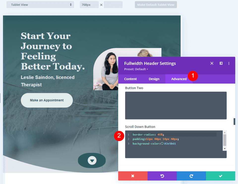
    Next, go to the Advanced tab and scroll down to the Scroll Down Button’s CSS field and enter this CSS:

    border-radius: 45%;
    padding:12px 40px 14px 40px;
    background-color:#2e5b61

    This CSS format adds padding to the Top, Right, Bottom, and Left. I’ve used this padding to create a background oval that goes well with the design of the header using design cues from the layout.

    Scroll Down Button Example Four

    Scroll Down Buttons Results

    Desktop Scroll Down Button Example One

    Desktop Scroll Down Button Example One

    Phone Scroll Down Button Example One

    Phone Scroll Down Button Example One

    Desktop Scroll Down Button Example Two

    Phone Scroll Down Button Example Two

    Desktop Scroll Down Button Example Three

    Phone Scroll Down Button Example Three

    Desktop Scroll Down Button Example Four

    Phone Scroll Down Button Example Four

    Ending Thoughts

    That’s our look at four Scroll Down Buttons you can include in your Divi Fullwidth Header Module. The scroll button includes several icons to choose from and you can style its color and size. Using the CSS field, you can style the button even further. The combinations of the button’s styling options and CSS give you lots of design possibilities with your Scroll Down Buttons.

    We want to hear from you. Do you style the Scroll Down Buttons in your Divi Fullwidth Header Module? Let us know in the comments.

    The post How to Include a Scroll Down Button in Your Divi Fullwidth Header Module appeared first on Elegant Themes Blog.

  • Divi Product Highlight: Slider Mega Pack

    Slider Mega Pack is a Divi layout pack with 50 slider layouts for your next web design project. The sliders are all built with Divi modules and can be easily customized with your own content and styles. In this product highlight, we’ll take a look at the layouts Slider Mega Pack has to offer and help you decide if it’s the right product for you.

    Let’s get started!

    Installing Slider Mega Pack

    Slider Mega Pack comes as a ZIP file containing Divi Builder .json files. To install the slider layouts, start by unzipping the file. Next, open your desired page in the Divi Builder.

    Divi Product Highlight Slider Mega Pack Install

    Click the portability option at the bottom of the page and select the import tab. Select the .json file for your desired slider layout and then begin importing the layout. Once the layout has been imported, all you need to do is replace the text and images and you’ll have a beautiful slider on your page!

    Divi Product Highlight Slider Mega Pack Install-32

    Slider Mega Pack Fullwidth Slider Layouts

    Slider Mega Pack comes with 32 fullwidth slider layouts. The fullwidth slider layouts are ideal for showcasing large images alongside some text and can be a great way to capture your visitor’s attention. It’s also a great way to share information or showcase some features of your service. All of these sliders have different layouts and designs, so you are sure to find a slider that will work for you! Let’s take a look at each of the 32 fullwidth slider layouts.

    Slider Mega Pack Layouts 1, 2

    The first slider layout is a text slider and features a photo background with a dark overlay over the left side of the photo. The text and the button change on each slide.

    The second slider layout is the same as the first layout, except the dark overlay and the text are on the right side.

    Divi Product Highlight Slider Mega Pack Slider Layout 2

    Slider Mega Pack Layout 3

    The third slider layout has a vignette effect on the image and features changing text and buttons in the middle. There are navigation dots at the bottom as well as previous and next buttons on each side.

    Divi Product Highlight Slider Mega Pack Slider Layout 3

    Slider Mega Pack Layout 4

    This slider features multiple images on a blurred background of the image, with navigation arrows on each side and navigation dots at the bottom.

    Divi Product Highlight Slider Mega Pack Slider Layout 4

    Slider Mega Pack Layout 5

    Slider layout 5 also features multiple images on a blurred background of the same image. It has navigation arrows to the bottom left as well as navigation dots on the right side.

    Divi Product Highlight Slider Mega Pack Slider Layout 5

    Slider Mega Pack Layout 6

    The sixth slider layout features changing text on a blurred transparent square over a parallax photo background. Navigation arrows to each side and navigation dots on the bottom.

    Divi Product Highlight Slider Mega Pack Slider Layout 6

    Slider Mega Pack Layout 7

    Layout 7 is similar to layout 6, with a parallax background and text slides. Navigation arrows are at the bottom left corner and the navigation dots are on the right side.

    Divi Product Highlight Slider Mega Pack Slider Layout 7

    Slider Mega Pack Layouts 8, 9, 10

    Slide layouts 8,9, and 10 feature text over multiple images that have a zoom-in effect. In these layouts, the navigation arrows are on each side and navigation dots are at the bottom of the slider. The text in Layout 8 is centered.

    The text in Layout 9 is left-aligned.

    Divi Product Highlight Slider Mega Pack Slider Layout 9

    And the text in Layout 10 is right-aligned.

    Divi Product Highlight Slider Mega Pack Slider Layout 10

    Slider Mega Pack Layouts 11, 12, 13

    Layouts 11, 12, and 13 feature a large image with text and a button on each slide, with navigation arrows to each side and navigation dots at the bottom. Layout 11 is center-aligned.

    Slider 12 is left-aligned.

    Divi Product Highlight Slider Mega Pack Slider Layout 12

    And slider 13 is right-aligned.

    Divi Product Highlight Slider Mega Pack Slider Layout 13

    Slider Mega Pack Layouts 14, 15, 16

    These layouts 14, 15, and 16 all have a greyscale effect on the photo and a parallax effect as you scroll. There is a bold underline over the header text. The text is center-aligned for layout 14.

    Slider 15 is right-aligned.

    Divi Product Highlight Slider Mega Pack Slider Layout 15

    And slider 16 is left-aligned.

    Divi Product Highlight Slider Mega Pack Slider Layout 16

    Slider Mega Pack Layouts 17, 18

    Layouts 17 and 18 feature a large image with slide text in a dark overlay box. For Layout 17, the text is on the left and the navigation is on the right.

    Divi Product Highlight Slider Mega Pack Slider Layout 17

    For layout 18, the navigation is on the left and the text is on the right.

    Divi Product Highlight Slider Mega Pack Slider Layout 18

    Slider Mega Pack Layouts 19, 20, 21

    Sliders 19, 20, and 21 all feature a greyscale photo overlay and have a zoom-in effect. There are no navigation buttons. Slider 19 is left-aligned.

    Divi Product Highlight Slider Mega Pack Slider Layout 19

    Slider 20 is right-aligned.

    And the text in slider 21 is centered.

    Divi Product Highlight Slider Mega Pack Slider Layout 21

    Slider Mega Pack Layouts 22, 23, 24

    These layouts are the same as the three above, except the photos have a zoom-out effect. Layout 22 has left-aligned text.

    Divi Product Highlight Slider Mega Pack Slider Layout 22

    Layout 23 has right-aligned text.

    Divi Product Highlight Slider Mega Pack Slider Layout 23

    And Layout 24 has centered text.

    Divi Product Highlight Slider Mega Pack Slider Layout 24

    Slider Mega Pack Layouts 25, 26

    Slider layouts 25 and 26 have a large image that zooms in and text over a dark overlay box. Layout 25 has the text aligned to the left and navigation icons on the right.

    Divi Product Highlight Slider Mega Pack Slider Layout 25

    Slider layout 26 has the text aligned to the right and the navigation icons on the left.

    Divi Product Highlight Slider Mega Pack Slider Layout 26

    Slider Mega Pack Layouts 27, 28

    The next two layouts are the same as the two above but the image zooms out instead. Slider layout 27 has text aligned to the right and navigation icons to the right.

    Divi Product Highlight Slider Mega Pack Slider Layout 27

    Layout 28 has navigation icons to the left, text to the right.

    Divi Product Highlight Slider Mega Pack Slider Layout 28

    Slider Mega Pack Layouts 29, 30

    These two sliders feature a large image that zooms in and a different style of navigation icons. Layout 29 features the text on the left and the navigation icons on the right.

    Divi Product Highlight Slider Mega Pack Slider Layout 29

    Layout 30 features the text on the right and the navigation icons on the left.

    Divi Product Highlight Slider Mega Pack Slider Layout 30

    Slider Mega Pack Layouts 31, 32

    These next layouts are the same as layouts 29 and 30 but the image zooms out. Layout 31 has text on the left and navigation on the right.

    Divi Product Highlight Slider Mega Pack Slider Layout 31

    Layout 32 has text on the right, navigation on the left.

    Divi Product Highlight Slider Mega Pack Slider Layout 32

    Slider Mega Pack Fullwidth Post Slider Layouts

    The Slider Mega Pack also comes with 18 post sliders. These sliders showcase posts from your blog and display the post information and a button to read the post. It uses the post’s featured image as the background image for the slide. You can select a category of posts to display, or simply display your most recent posts. Like the regular sliders above, all of the post sliders are completely customizable and come in a variety of layouts, alignments, and styles.

    Slider Mega Pack Layouts 33, 34

    These sliders use a greyscale image effect and a parallax effect. Text is on the left and navigation is on the right with layout 33.

    Navigation is on the left and text is on the right with layout 34.

    Divi Product Highlight Slider Mega Pack Slider Layout 34

    Slider Mega Pack Layouts 35, 36, 37

    Layouts 35, 36, and 37 feature a large featured image with navigation arrows on each side and navigation dots below. The image has a zoom-in effect. The text is centered in Layout 35.

    Divi Product Highlight Slider Mega Pack Slider Layout 35

    In this layout, the text is left-aligned.

    Divi Product Highlight Slider Mega Pack Slider Layout 36

    And in this layout the text is right-aligned.

    Divi Product Highlight Slider Mega Pack Slider Layout 37

    Slider Mega Pack Layouts 38, 39, 40

    These slider layouts are the same as the three layouts above, but the image zooms out instead. Layout 38 is centered.

    Layout 39 is left-aligned.

    Divi Product Highlight Slider Mega Pack Slider Layout 39

    And layout 40 is right-aligned.

    Divi Product Highlight Slider Mega Pack Slider Layout 40

    Slider Mega Pack Layouts 41, 42

    These layouts feature a parallax image with text on one side and navigation arrows on the other. For layout 41 the text is to the left.

    Divi Product Highlight Slider Mega Pack Slider Layout 41

    For layout 42 the text is to the right.

    Divi Product Highlight Slider Mega Pack Slider Layout 42

    Slider Mega Pack Layouts 43, 44

    Layouts 43 and 44 are similar to the layouts above but the image zooms in. In layout 43, the text is left-aligned.

    Divi Product Highlight Slider Mega Pack Slider Layout 43

    The text is right-aligned in layout 44.

    Divi Product Highlight Slider Mega Pack Slider Layout 44

    Slider Mega Pack Layouts 45, 46

    45 and 46 are again a similar design to the layouts above, but the image zooms out instead. 45 has left-aligned text.

    Divi Product Highlight Slider Mega Pack Slider Layout 45

    And layout 46 has right-aligned text.

    Divi Product Highlight Slider Mega Pack Slider Layout 46

    Slider Mega Pack Layout 47, 48

    Layouts 47 and 48 feature a dark overlay square for the post title and navigation arrows. The image zooms in. Layout 47 has the text on the left and arrows on the right.

    Divi Product Highlight Slider Mega Pack Slider Layout 47

    Layout 48 has the text on the right.

    Divi Product Highlight Slider Mega Pack Slider Layout 48

    Slider Mega Pack Layout 49, 50

    Finally, slider layouts 49 and 50 are similar to layouts 47 and 48, but the images zoom out. Layout 49 has the text on the left.

    Divi Product Highlight Slider Mega Pack Slider Layout 49

    And layout 50 has right-aligned text.

    Divi Product Highlight Slider Mega Pack Slider Layout 50

    Purchase Slider Mega Pack

    Slider Mega Pack is available in the Divi Marketplace. It costs $9.99 for unlimited website usage and lifetime updates. The price also includes a 30-day money-back guarantee.

    Final Thoughts

    Slider Mega Pack comes with 50 prebuilt slider layouts with beautiful transitions, effects, and navigation layouts that can be easily customized with the Divi Builder. If you are looking for some unique slider layouts that are customized beyond the standard Divi options, this product might be just right for you. We would love to hear from you! Have you tried Slider Mega Pack? Let us know what you think about it in the comments!

    The post Divi Product Highlight: Slider Mega Pack appeared first on Elegant Themes Blog.

  • Divi Product Highlight: Ultimate Divi Modules UI Bundle

    Ultimate Divi Modules UI Bundle is a third-party layout bundle for Divi. This bundle includes lots of pre-styled layouts, modules, and extras. This bundle is always growing and currently includes over 3600 styles and 35 layout packs. They’re Divi Library layouts, so they can be customized and used the same as any Divi layout — including being added to your Divi Cloud! In this post, we’ll look at some of the new additions to the Ultimate Divi Modules UI Bundle to help you decide if this Divi product is right for you.

    Let’s get started.

    Uploading Ultimate Divi Modules UI Bundle Layouts

    Ultimate Divi Modules UI Bundle Layouts are provided as JSON files with 10 layouts per file. Upload them to your Divi Library as normal by going to Divi > Divi Library in the WordPress dashboard. Select Import & Export, choose the Import tab of the modal that opens, navigate to and select your JSON file, and click Import Divi Builder Layouts. You can then use the layouts the same way as any Divi layout including the Divi Theme Builder and Divi Cloud.

    Uploading Ultimate Divi Modules UI Bundle Layouts

    Ultimate Divi Modules UI Bundle Page Layouts

    Ultimate Divi Modules UI Bundle now has over 82 modules, 3600 styles, and 35 complete website layout packs. The bundle has added over 1600 styles and 24 layouts since last October. In the following sections, we’ll look at some of the new additions.

    Blog Layouts

    Ultimate Divi Modules UI Bundle has 50 blog layouts. They include the blog and code modules for CSS and JS code. The example below shows layouts 41 and 42. Both add the publish date over the blog image. Layout 41 places the title and author name over the image while layout 42 places them under the image. A line separates the title and author name.

    Ultimate Divi Modules UI Bundle Page Layouts

    Blog layout 47 includes an interesting design with the meta and content overlapping the image.

    Ultimate Divi Modules UI Bundle Page Layouts

    Blog layout 50 places the blog posts in a single column. The date sits over the featured image and the content includes a dark blue background.

    Ultimate Divi Modules UI Bundle Page Layouts

    Content Ticker

    The bundle includes 15 content tickers created with text modules, content sliders, and styled with CSS. The example below shows styles 11 through 13. The title sits on one side and includes a darker background. The sliders create the tickers and include a lighter background and navigation styled to match the title.

    Ultimate Divi Modules UI Bundle Page Layouts

    Portfolio Modules

    The bundle includes 50 portfolio modules. They add interesting overlays with animations to the featured images. This example shows Portfolio Module 41. Its overlay has a dark blue background with white text and a light blue divider line.

    Ultimate Divi Modules UI Bundle Page Layouts

    This example shows style 43. Its overlay includes a white background with a parallelogram shape. The text is dark and light blue.

    Ultimate Divi Modules UI Bundle Page Layouts

    Ultimate Divi Modules UI Bundle WooCommerce

    The bundle adds lots of WooCommerce layouts including footers, widgets, tickers, and more. This is the Woo Category Block style 8. It includes multiple Woo Product Modules in a unique layout. It has a gray overlay that changes the text to white.

    Ultimate Divi Modules UI Bundle Page Layouts

    Style 10 adds text to the product’s image. An overlay with a blue background and white text.

    Ultimate Divi Modules UI Bundle Page Layouts

    Ultimate Divi Modules UI Bundle Layout Packs

    Ultimate Divi Modules UI Bundle also includes layout packs to build complete websites. Import a single page or the enter layout pack at once. Most have between 13-15 page layouts. We’ll look at the home page for a few of the new layouts as this will show many of the styled modules.

    Content Writer Layout Pack

    The Content Writer Layout Pack includes 13 pages. The layouts include lots of styled modules, icons, animations, and more. It includes all the standard pages and adds a History page for information about the company and how they work.

    Ultimate Divi Modules UI Bundle Layout Packs

    This example shows the design of the Content Writer home page layout. It includes red highlights throughout. The unique Person Modules reveal the social icons on hover. The style of the Blog Module includes text that overlaps the featured image.

    Ultimate Divi Modules UI Bundle Layout Packs

    Divi Agency Layout Pack

    The Divi Agency Layout Pack also includes 13-page layouts. It includes the standard pages and adds a Careers page.

    Ultimate Divi Modules UI Bundle Layout Packs

    The home page includes lots of styled modules with animations for the buttons, sliding backgrounds for the services, social media icons and image color changes for the Person Modules, and overlays for the Portfolio Module.

    Ultimate Divi Modules UI Bundle Layout Packs

    Music Concert Layout Pack

    The Music Concert bundle was designed to create a website where bands can showcase their concerts. The layout pack includes 15 layouts. Several of the layouts are designed specifically for bands including a page to apply to be an artist. This also includes a blog layout page and a page with code.

    Ultimate Divi Modules UI Bundle Layout Packs

    The home page includes a slider for the latest events. The Person Modules display social icons on hover. Top events show in another slider. Blurbs display a faint number in the background.

    Ultimate Divi Modules UI Bundle Layout Packs

    Fashion Shop Layout Pack

    The Ultimate Divi Modules UI Bundle Fashion Shop layout bundle is one of several that was designed for use with WooCommerce. It comes with 44 layouts with a combination of pages and modules. They include sliders, shop grids, carousels, widgets, etc. Many of them include multiple module designs, making them ideal for creating unique shop and product pages.

    Layout Packs

    The home page displays a slider to several shop pages, numbered blurbs, shop CTAs with custom overlays, multiple product grids, a styled newsletter form, and lots more.

    Layout Packs

    Promotion Block Style V1 to V3

    Here’s a look at the promotion blocks. It includes three different designs. The first design places images in a grid with text and buttons over the images. It includes a styled overlay animation.

    Layout Packs

    The second design has a grid without space between the images. It doesn’t include an overlay, but it does add a CTA.

    Layout Packs

    The third layout adds another column to the grid with taller images on the outside and wider images in the middle.

    Ultimate Divi Modules UI Bundle Layout Packs

    Promotion Banner V1 to V3

    The layout pack also includes three full-width banners to promote sales and work as CTAs that point to the shop. The image below shows all three banners.

    Layout Packs

    Product Showcase

    The product showcase displays the WooCommerce product element on one side and a custom product element on the other in an alternating layout.

    Layout Packs

    Purchase Ultimate Divi Modules UI Bundle

    Ultimate Divi Modules UI Bundle is available in the Divi Marketplace. The regular price is $149 but might be discounted. It includes unlimited usage and lifetime updates.

    Purchase Ultimate Divi Modules UI Bundle

    Ending Thoughts

    That’s our look at the Ultimate Divi Modules UI Bundle. This bundle has lots of layouts and modules to help you get started on any type of website. This bundle includes many layouts, modules, and elements to give you a head start on your Divi website. We’ve only scratched the surface of what’s included in this layout bundle. There is a lot here for the money.

    We want to hear from you. Have you tried the Ultimate Divi Modules UI Bundle? Let us know what you think about it in the comments.

    The post Divi Product Highlight: Ultimate Divi Modules UI Bundle appeared first on Elegant Themes Blog.

  • Download a FREE Blog Post Template for Divi’s Conference Layout Pack

    Hey Divi Creators! Thanks for joining us for the next installment of our weekly Divi Design Initiative where each week, we give away brand new freebies. This time around we’re building upon the Divi Conference Layout Pack with a brand new blog post template that matches the rest of the pack perfectly. Hope you enjoy it!

    divi layout

    Check Out The Divi Conference Blog Post Template Below

    Get it for free today!

    Divi Conference Blog Post Template for Desktop

    Tablet and mobile view for the Divi Conference Blog layout

    Download The Blog Post Template For The Divi Conference Layout Pack

    To lay your hands on the free Divi Conference Blog Post Template, you will first need to download it using the button below. To gain access to the download you will need to subscribe to our newsletter by using the form below. As a new subscriber, you will receive even more Divi goodness and a free Divi Layout pack every Monday! If you’re already on the list, simply enter your email address below and click download. You will not be “resubscribed” or receive extra emails.

    How to Upload The Template

    Go to Divi Theme Builder

    To upload the template, navigate to the Divi Theme Builder in the backend of your WordPress website.

    Navigating to the Divi Theme Builder

    Upload Website Template

    Then, in the top right corner, you’ll see an icon with two arrows. Click on the icon.

    Opening the import export functionality of the Divi Theme Builder

    Navigate to the import tab, upload the JSON file that you could download in this post, and click on ‘Import Divi Theme Builder Templates’.

    Save Divi Theme Builder Changes

    Save the imported Divi Conference Blog Post Template within the Divi Builder

    Once you’ve uploaded the file, you’ll notice a new template with a new body area that has been assigned to All Posts. Save the Divi Theme Builder changes as soon as you want the template to be activated.

    How to Modify The Divi Conference Blog Layout

    Open Post Template

    To modify the template’s elements, start by opening the template.

    Edit the newly imported Divi Conference Blog Post Template

    Inside the Body Layout Editor, you can edit the design on the front end using the Divi Builder just like you would with a normal Divi page. Since this is a template that has been assigned to all posts for the site, there is a post content module that is necessary for displaying the post content. You will need to keep that module in place, but you can adjust the post content module’s design elements, which will design the post content that is displayed dynamically.

    Editing the post content module to match your site within the Blog Template

    About the Divi Conference Blog Layout

    This blog post template has a lot of dynamic elements that will work with your blog posts immediately. For example, the entire post header is made up of dynamic elements including a featured image as the background, the post title, and the post metadata (date, categories, author, and comment count). This content won’t need updating, but you can tweak the design of each of those elements if needed. Other dynamic elements include the following:

    • Related Posts Module(s) – displays the most recent posts that share the same category.
    • Post Content Module – displays the post content added when editing the post on the backend of WordPress.
    • Comments – a functional comment area for the post.
    • Post Navigation – provides previous and next buttons to the post.

    Here is a quick illustration that identifies the elements of the Divi Conference blog post template.

    Divi Conference Blog Post Layout element breakdown

    However, some elements on a post template will need your immediate attention before using it live on your own website. For this post template, you will need to update the icon module that acts as a back to blog button on top of the comments module.

    The back to blog page Icon Module

    Add Link to Icon Module

    The Icon Module can link back to your main blog page. To do this, you’ll need to add it’s link into the link section of the Icon Module.

    Setting up the link back to the main blog page within the Icon Module of the Divi Conference Blog Post Layout

    New Freebies Every Week!

    We hope you’ve enjoyed the Divi Conference Layout Pack and the blog post template freebie that goes along with it. We look forward to hearing your opinions in the comment section below. Make sure you check back next week for more freebies!

    The post Download a FREE Blog Post Template for Divi’s Conference Layout Pack appeared first on Elegant Themes Blog.

  • How to Combine Inline & Fullwidth Fields in Divi’s Contact Form Module

    The contact form is an important element to include on your website if you want to capture emails and convert your visitors into customers. The Divi Contact Form Module can be easily customized to create attractive and captivating contact forms for all types of websites. The module comes with two width options that can be applied to each field in the form: inline or full-width. In this tutorial, we will present four unique layout possibilities for your Divi contact form using inline and full-width fields.

    Let’s get started!

    Sneak Peek

    Here is a preview of what we will design.

    First Layout

    Divi Contact Form Layouts With Inline and Fullwidth Fields Layout 1 Final Design

    Divi Contact Form Layouts With Inline and Fullwidth Fields Layout 1 Final Design Mobile

    Second Layout

    Divi Contact Form Layouts With Inline and Fullwidth Fields Layout 2 Final Design

    Divi Contact Form Layouts With Inline and Fullwidth Fields Layout 2 Final Design Mobile

    Third Layout

    Divi Contact Form Layouts With Inline and Fullwidth Fields Layout 3 Final Design

    Divi Contact Form Layouts With Inline and Fullwidth Fields Layout 3 Final Design Mobile

    Fourth Layout

    Divi Contact Form Layouts With Inline and Fullwidth Fields Layout 4 Final Design

    Divi Contact Form Layouts With Inline and Fullwidth Fields Layout 4 Final Design Mobile

    What You Need to Get Started

    Before we begin, install and activate the Divi Theme and make sure you have the latest version of Divi on your website.

    Now, you are ready to start!

    4 Layout Possibilities for Your Divi Contact Form Using Inline & Fullwidth Fields

    Select the Premade Layout

    Each of the 4 designs are modified from the Shoe Repair Contact Page layout from the Shoe Repair Layout Pack, which you can find in the Divi library.

    Add a new page to your website and give it a title, then select the option to Use Divi Builder.

    Divi Contact Form Layouts With Inline and Fullwidth Fields Layout Use Builder

    We will use a premade layout from the Divi library for this example, so select Browse Layouts.

    Divi Contact Form Layouts With Inline and Fullwidth Fields Layout Browse Layout

    Search for and select the Shoe Repair Contact Page layout.

    Divi Contact Form Layouts With Inline and Fullwidth Fields Layout Find Layout

    Select Use This Layout to add the layout to your page.

    Divi Contact Form Layouts With Inline and Fullwidth Fields Layout Use Layout

    Now we are ready to build our designs.

    First Layout

    First, move the row containing the contact form module to the section above, right below the row with the blurb modules. Then you can delete the remaining empty section.

    Divi Contact Form Layouts With Inline and Fullwidth Fields Layout 1 Move Row

    Open the row settings and add padding to the left and right,

    • Padding-left: 15%
    • Padding-right: 15%

    Divi Contact Form Layouts With Inline and Fullwidth Fields Layout 1 Padding

    Select the responsive options and set the mobile padding.

    • Padding-left: 5%
    • Padding-right: 5%

    Divi Contact Form Layouts With Inline and Fullwidth Fields Layout 1 Responsive Spacing

    Modifying the Contact Form Layout with Inline and Fullwidth Fields

    For this layout, we will create two separate fields for first name and last name. Open the contact form module settings and change the field ID and Title for the Name field to First Name.

    Divi Contact Form Layouts With Inline and Fullwidth Fields Layout 1 Rename Field

    Add a new field below the First Name field. Set the field ID and Title to Last Name.

    Divi Contact Form Layouts With Inline and Fullwidth Fields Layout 1 Add Field

    In the last name field settings, open the Layout settings and set Make Fullwidth to No.

    • Fullwidth: No

    Divi Contact Form Layouts With Inline and Fullwidth Fields Layout 1 Make Inline

    Next, under the contact form settings switch the order of Subject and Phone so that Phone is listed before Subject.

    Divi Contact Form Layouts With Inline and Fullwidth Fields Layout 1 Field Order

    Open the subject field layout settings and make the field fullwidth.

    • Make Fullwidth: Yes

    Divi Contact Form Layouts With Inline and Fullwidth Fields Layout 1 Make Fullwidth

    Customizing the Contact Form Design

    Now let’s modify a few settings to complete the design. Navigate to the design tab of the contact form settings.

    First, change the button background color.

    • Button Background: #DBC2B3

    Divi Contact Form Layouts With Inline and Fullwidth Fields Layout 1 Button Background

    Add a top margin to the button.

    • Button margin- top: 10px

    Divi Contact Form Layouts With Inline and Fullwidth Fields Layout 1 Button Margin

    Finally, navigate to the Border settings and add rounded corners to the inputs.

    • Inputs rounded corners: 30px

    Divi Contact Form Layouts With Inline and Fullwidth Fields Layout 1 Rounded Corners

    Final Design

    Here is the final design on desktop and mobile.

    Divi Contact Form Layouts With Inline and Fullwidth Fields Layout 1 Final Design

    Divi Contact Form Layouts With Inline and Fullwidth Fields Layout 1 Final Design Mobile

    Second Layout

    For our second design, we will move the blurb modules to the left side of the page and have the contact form on the right side of the page. Move the blurb modules to one column.

    Divi Contact Form Layouts With Inline and Fullwidth Fields Layout 2

    Change the row layout.

    Divi Contact Form Layouts With Inline and Fullwidth Fields Layout 2 Row Layout

    Open the row design settings and turn off Use Custom Gutter Width.

    • Use Custom Gutter Width: No

    Divi Contact Form Layouts With Inline and Fullwidth Fields Layout 2 Custom Gutter Width

    Add some code to the Main Element Custom CSS in order to vertically align the blurb modules and the contact form.

    align-items:center;

    Divi Contact Form Layouts With Inline and Fullwidth Fields Layout 2 Main Element CSS

    Now we need to remove the thin border between the columns. Open the row settings, then open the settings for column 1. Under the Design tab, navigate to the border settings and remove the border.

    • Right border width: 0px

    Divi Contact Form Layouts With Inline and Fullwidth Fields Layout 2 Right Border

    Next, open the settings for column 2 and repeat the steps to remove the border.

    • Right border width: 0px

    Divi Contact Form Layouts With Inline and Fullwidth Fields Layout 2 Right Border Width

    Set the “Contact Us” text to be centered.

    Divi Contact Form Layouts With Inline and Fullwidth Fields Layout 2 Text Alignment

    Move the contact form to the right column. Delete the empty remaining section.

    Divi Contact Form Layouts With Inline and Fullwidth Fields Layout 2 Move Contact Form

    Modifying the Contact Form Layout with Inline and Fullwidth Fields

    This layout will also have two separate fields for first name and last name. Open the contact form module settings and change the field ID and Title for the Name field to First Name.

    Divi Contact Form Layouts With Inline and Fullwidth Fields Layout 2 Field ID and Title

    Add a new field below the First Name field. Set the field ID and Title to Last Name.

    Divi Contact Form Layouts With Inline and Fullwidth Fields Layout 2 Field ID

    In the last name field settings, open the Layout settings and set Make Fullwidth to No.

    • Fullwidth: No

    Divi Contact Form Layouts With Inline and Fullwidth Fields Layout 2 No Fullwidth

    Change the order of the phone and subject fields so that phone comes before subject.

    Divi Contact Form Layouts With Inline and Fullwidth Fields Layout 2 Reorder Fields

    Open the field settings for Email, Phone, and Subject, and set the layout to fullwidth.

    • Make Fullwidth: Yes

    Divi Contact Form Layouts With Inline and Fullwidth Fields Layout 2 Make Fullwidth

    Customizing the Contact Form Design

    Open the row settings, then open the column 2 settings. Set the background color.

    • Background: #DBC2B3

    Divi Contact Form Layouts With Inline and Fullwidth Fields Layout 2 Add Background

    Within the column 2 settings, navigate to the design tab and add some padding.

    • Padding-top: 50px
    • Padding-bottom: 50px
    • Padding-left: 50px
    • Padding-right: 50px

    Divi Contact Form Layouts With Inline and Fullwidth Fields Layout 2 Add Padding

    Select the mobile icon to modify the responsive settings. Set the padding for mobile.

    • Padding-top: 30px
    • Padding-bottom: 30px
    • Padding-left: 30px
    • Padding-right: 30px

    Divi Contact Form Layouts With Inline and Fullwidth Fields Layout 2 Add Responsive Padding

    Then add a box shadow to the column.

    Divi Contact Form Layouts With Inline and Fullwidth Fields Layout 2 Box Shadow

    Finally, open the contact form settings and change the field text color.

    • Fields text color: #000000

    Divi Contact Form Layouts With Inline and Fullwidth Fields Layout 2 Field Text Color

    Final Design

    Here is the final design for the second layout.

    Divi Contact Form Layouts With Inline and Fullwidth Fields Layout 2 Final Design

    Divi Contact Form Layouts With Inline and Fullwidth Fields Layout 2 Final Design Mobile

    Third Layout

    For the third layout, we will have the contact form on the left and the blurb modules on the right. Let’s get started by changing the column structure of the row containing the blurb modules.

    Divi Contact Form Layouts With Inline and Fullwidth Fields Layout 3 Choose Layout

    Move the address module to the right column.

    Divi Contact Form Layouts With Inline and Fullwidth Fields Layout 3 Move Address

    Next, move the Contact Us text module to the left column, then delete the remaining empty row.

    Divi Contact Form Layouts With Inline and Fullwidth Fields Layout 3 Move Text

    Move the contact form to the left column, below the Contact Us text module. Delete the remaining empty section.

    Divi Contact Form Layouts With Inline and Fullwidth Fields Layout 3 Move Module

    Open the row design settings and turn off Use Custom Gutter Width.

    • Use Custom Gutter Width: No

    Divi Contact Form Layouts With Inline and Fullwidth Fields Layout 3 No Custom Gutter Width

    Add some code to the Main Element Custom CSS in order to vertically align the blurb modules and the contact form.

    align-items:center;

    Divi Contact Form Layouts With Inline and Fullwidth Fields Layout 3 Custom CSS

    Open the row settings, then open the settings for column 1. Under the Design tab, navigate to the border settings and remove the border. Repeat the steps to remove the border from column 2.

    • Right border width: 0px

    Divi Contact Form Layouts With Inline and Fullwidth Fields Layout 3 Border Width

    Modifying the Contact Form Layout

    We will leave the field widths as-is for the third design, however, open the contact form settings and switch the order of the phone number and subject field so that the phone comes first.

    Divi Contact Form Layouts With Inline and Fullwidth Fields Layout 3 Reorder Fields

    Final Design

    Here is the final design for the third layout.

    Divi Contact Form Layouts With Inline and Fullwidth Fields Layout 3 Final Design

    Divi Contact Form Layouts With Inline and Fullwidth Fields Layout 3 Final Design Mobile

    Fourth Layout

    For the fourth and final layout, the contact form will be on the left and the blurb modules on the right. Once again, we will start by changing the column structure of the row containing the blurb modules.

    Divi Contact Form Layouts With Inline and Fullwidth Fields Layout 4 Choose Layout

    Move the address module to the right column.

    Divi Contact Form Layouts With Inline and Fullwidth Fields Layout 4 Move Module

    Move the contact form to the left column. Delete the remaining empty section.

    Divi Contact Form Layouts With Inline and Fullwidth Fields Layout 4 Move Form

    Open the row design settings and turn off Use Custom Gutter Width.

    • Use Custom Gutter Width: No

    Divi Contact Form Layouts With Inline and Fullwidth Fields Layout 4 Custom Gutter

    Add some code to the Main Element Custom CSS in order to vertically align the blurb modules and the contact form.

    align-items:center;

    Open the row settings, then open the settings for column 1. Under the Design tab, navigate to the border settings and remove the border.

    • Right border width: 0px

    Divi Contact Form Layouts With Inline and Fullwidth Fields Layout 4 Border Width

    Next, open the settings for column 2 and repeat the steps to remove the border.

    • Right border width: 0px

    Divi Contact Form Layouts With Inline and Fullwidth Fields Layout 4 Border Width 2

    Open the text module settings for the Contact Us text and center the text.

    • Text Alignment: Center

    Divi Contact Form Layouts With Inline and Fullwidth Fields Layout 4 Text Alignment

    Modifying the Contact Form Layout with Inline and Fullwidth Fields

    For this design, all of our fields will be fullwidth. Open the contact form settings, then open the settings for each field. Under the design tab, select Layout and set Make Fullwidth to Yes.

    Divi Contact Form Layouts With Inline and Fullwidth Fields Layout 4 Make Fullwidth

    Once you make each field fullwidth, the form should look something like this.

    Divi Contact Form Layouts With Inline and Fullwidth Fields Layout 4 Fullwidth

    Now, change the field ID and Title for the Name field to First Name.

    Divi Contact Form Layouts With Inline and Fullwidth Fields Layout 4 Field ID

    Add a new field below the First Name field. Set the field ID and Title to Last Name.

    Divi Contact Form Layouts With Inline and Fullwidth Fields Layout 4 Last Name Field

    Change the order of the phone and subject fields so that phone comes before the subject.

    Divi Contact Form Layouts With Inline and Fullwidth Fields Layout 4 Field Order

    Customizing the Contact Form Design

    In the contact form design settings, set the Fields Text Color to black.

    • Fields Text Color: #000000

    Divi Contact Form Layouts With Inline and Fullwidth Fields Layout 4 Text Color

    Open the section settings and add a background color.

    • Background: #DBC2B3

    Divi Contact Form Layouts With Inline and Fullwidth Fields Layout 4 Add Background

    Finally, add a background mask.

    • Background Mask: Arch
    • Mask Transform: Horizontal

    Divi Contact Form Layouts With Inline and Fullwidth Fields Layout 4 Add Background Mask

    To make the background mask work better on mobile, let’s use the responsive settings.

    Divi Contact Form Layouts With Inline and Fullwidth Fields Layout 4 Responsive Background Mask

    • Mask Transform on Mobile: Horizontal and Rotate

    Divi Contact Form Layouts With Inline and Fullwidth Fields Layout 4 Responsive Mask Transform

    Final Design

    Here is the final design for the fourth layout.

    Divi Contact Form Layouts With Inline and Fullwidth Fields Layout 4 Final Design

    Divi Contact Form Layouts With Inline and Fullwidth Fields Layout 4 Final Design Mobile

    Final Result

    Let’s take a look at all of our final designs once again.

    First Layout

    Divi Contact Form Layouts With Inline and Fullwidth Fields Layout 1 Final Design

    Divi Contact Form Layouts With Inline and Fullwidth Fields Layout 1 Final Design Mobile

    Second Layout

    Divi Contact Form Layouts With Inline and Fullwidth Fields Layout 2 Final Design

    Divi Contact Form Layouts With Inline and Fullwidth Fields Layout 2 Final Design Mobile

    Third Layout

    Divi Contact Form Layouts With Inline and Fullwidth Fields Layout 3 Final Design

    Divi Contact Form Layouts With Inline and Fullwidth Fields Layout 3 Final Design Mobile

    Fourth Layout

    Divi Contact Form Layouts With Inline and Fullwidth Fields Layout 4 Final Design

    Divi Contact Form Layouts With Inline and Fullwidth Fields Layout 4 Final Design Mobile

    Final Thoughts

    Having a great-looking contact form can increase your conversions and allows your visitors to connect directly with you. As we have demonstrated through this article, you can use the inline and fullwidth field options to create different looks and layouts for your form, and Divi’s built-in design options allow you to create unique and attractive designs to help the form stand out. To learn more about the different ways you can style the contact form module, check out this tutorial for creating a full-screen responsive form with zoom-in scroll animation, and this tutorial for 5 more unique styling options. How have you styled your contact form module? We would love to hear from you in the comments!

    The post How to Combine Inline & Fullwidth Fields in Divi’s Contact Form Module appeared first on Elegant Themes Blog.

  • How to Style Your Fullwidth Header Module’s Background

    Divi’s Fullwidth Header module makes it easy to design a stunning hero section for your website in just minutes. A hero section is the very first section of your website that your visitors will see, so you’ll want it to be branded, informative, and compelling. Thankfully, the Divi Fullwidth Header comes packed with content options: header text, subtitle text, body text, two images, and two buttons. We’ll be utilizing all of these elements in our fullwidth headers today.

    In this post, we’re going to demonstrate 3 ways to design your fullwidth header’s background with eye-catching designs. Ready to get started? Let’s dive in!

    Design Preview

    Let’s take a look at the 3 fullwidth headers we’ll be designing today.

    Divi Bushcraft Community

    The first design uses Divi’s background image options to create a textured background that is unique and on-brand for the Bushcraft Community.

    Mrs. Nicole’s 2nd Grade

    This second design uses a background image and background gradient to create a clean, modern, and fresh welcome header for Mrs. Nicole’s 2nd-grade class.

    Realtor Header

    The third design utilizes a background image, background gradient, and background pattern, all combined to create an elevated yet subtle design for a realtor’s home page.

    Download the Layouts for FREE

    To lay your hands on the designs from this tutorial, you will first need to download it using the button below. To gain access to the download you will need to subscribe to our newsletter by using the form below. As a new subscriber, you will receive even more Divi goodness and a free Divi Layout pack every Monday! If you’re already on the list, simply enter your email address below and click download. You will not be “resubscribed” or receive extra emails.

    To import the header template to your Divi Library, do the following:

    1. Navigate to the Divi Theme Builder.
    2. Click the Import button at the top right of the page.
    3. In the portability popup, select the import tab
    4. Choose the download file from your computer (make sure to unzip the file first and use the JSON file).
    5. Then click the import button.

    Once done, the section layout will be available in the Divi Builder.

    Let’s get to the tutorial, shall we?

    What You Need to Get Started

    To get started, you will need to do the following:

    1. Install Divi on your WordPress website.
    2. Add a Page, give it a title, and publish it.
    3. Enable the Visual Builder.

    Setting Up Our Page

    Once you click the “Use Divi Builder” button the page will reload using Divi’s drag and drop builder interface. Three options will pop up and for today’s purposes select “Build From Scratch” so that we have a blank slate where we can build our fullwidth headers.

    How to Design the Divi Bushcraft Community Fullwidth Header

    Add a Fulldwith Section and Fullwidth Header

    First, we’ll need to add a fullwidth section to our page. Click on the “+” icon to bring up the section options and then click “Fullwidth”. This will load the fullwidth module library where you can select “Fullwidth Header” from the options. This will load the fullwidth header module to your page.

    Add The Content

    Now we’re going to add our module content in the Text tab. Configure the following settings:

    1. Header Text: Divi Bushcraft Community
    2. Subtitle Text: Divi Bushcraft
    3. Button #1: Join Today
    4. Button #2: Learn More
    5. Body Text: At vero eos et accusamus et iusto odio dignissimos ducimus qui blanditiis praesentium voluptatum deleniti atque corrupti quos dolores et quas molestias excepturi sint occaecati cupiditate non provident.

    Style the Background

    This design utilizes a background image from the free Divi Bushcraft pre-made layout pack. You can get all of the images from that layout pack in this post. Simply scroll all the way to the bottom of the post and click to download the high-res images.

    Add Background Image

    Once you have the photos, add a background image.

    1. Click the third icon, the image icon.
    2. Click “Add Background Image”. This will bring up the media library where you can upload a new photo or select a photo from your media library.
    3. The set the Background Image Blend Mode to Overlay.
    4. Click the first icon, the paint bucket icon, and set a background color of: rgba(10,10,10,0.3)

    Choose the Layout

    Underneath the Design settings, in the Layout tab, select center alignment. Toggle the “Make Fullscreen” option to “yes”.

    Style Title Text

    Style the Title Text by configuring these settings:

    1. Title Heading Level: H1
    2. Title Font: Josefin Sans
    3. Title Font Weight: Bold
    4. Title Font Style: Uppercase
    5. Title Text Size: 7rem

    Style Body Text

    Style the body text by configuring these settings:

    1. Body Font: Josefin Sans
    2. Body Text Size: 20px

    Style Subtitle Text

    Style the subtitle text by configuring these settings:

    1. Subtitle Font: Josefin Sans
    2. Subtitle Font Weight: Semi Bold
    3. Subtitle Font Style: Uppercase
    4. Subtitle Letter Spacing: 3px
    5. Subtitle Line Height: 5em

    Style Button #1

    Now let’s style the buttons! For button one, configure these settings:

    1. Use Custom Styles For Button One: Yes
    2. Button One Text Size: 14px
    3. Button One Text Color: #666b4a
    4. Button One Background: #ead5a4
    5. Button One Border Width: 0px
    6. Button One Border Radius: 0px
    7. Button One Letter Spacing: 3px
    8. Button One Font Style: Uppercase
    9. Button One Padding: 15px top and bottom; 25px left and right.

    Style Button #2

    To style button #2, configure the following settings:

    1. Use Custom Styles For Button One: Yes
    2. Button One Text Size: 14px
    3. Button One Text Color: #ead5a4
    4. Button One Background: #666b4a
    5. Button One Border Width: 0px
    6. Button One Border Radius: 0px
    7. Button One Letter Spacing: 3px
    8. Button One Font Style: Uppercase
    9. Button One Padding: 15px top and bottom; 25px left and right.

    And, voila!  You have a beautifully styled fullwidth header with a textured background image with an overlay for the Divi Bushcraft Community.

    How to Design Mrs. Nicole’s Fullwidth Header

    Now let’s design a fullwidth header for Mrs. Nicole’s 2nd-grade class! This header uses a background image and gradient to create a fun and fresh design. Let’s get started!

    Add a new page, then add a Fullwidth Section and Fullwidth Header

    First, we’ll need to add a fullwidth section to our page. Click on the “+” icon to bring up the section options and then click “Fullwidth”. This will load the fullwidth module library where you can select “Fullwidth Header” from the options. This will load the fullwidth header module to your page.

    Add The Content

    Now we’re going to add our module content in the Text tab. Configure the following settings:

    1. Header Text: Welcome To Mrs. Nicole’s 2nd Grade Class
    2. Subtitle Text: Welcome
    3. Button #1: View Assignments
    4. Button #2: Contact Mrs. Nicole
    5. Body Text: Donec sollicitudin molestie malesuada. Nulla quis lorem ut libero malesuada feugiat.

    Style the Background

    This design uses images from the free Classroom pre-made layout pack. You can download the full-res images by scrolling to the bottom of this post.

    Style the background by configuring these settings:

    1. Click the second tab, the gradient icon.
    2. Set the gradient stops to: #ffffff at 40%, and transparent at 18%.
    3. Set the gradient direction to 219 degrees.
    4. Toggle “yes” for the Place Gradient Above Background Image.
    5. Click on the third icon, the image icon, and click “Add Background Image”.

    Choose the Layout

    Here is where we’re going to align the module content to the center and make it fullscreen.

    1. Text & Logo Alignment: Center
    2. Make Fullscreen: Yes

    Style the Title Text

    Style the title text by configuring these settings:

    1. Title Font: Candal
    2. Title Text Size: 4rem

    Style the Body Text

    Style the body text by configuring these settings:

    1. Body Font: Montserrat
    2. Body Text Color: #6d6d6d
    3. Body Text Size: 20px

    Style the Subtitle Text

    Style the subtitle text by configuring these settings:

    1. Subtitle Font Weight: Ultra Bold
    2. Subtitle font Style: Uppercase
    3. Subtitle Text Color: rgba(28,10,10,0.6)
    4. Subtitle Letter Spacing: 3px
    5. Subtitle Line Height: 3em

    Style Button #1

    Style button #1 by configuring these settings:

    1. Use Custom Styles For Button One: Yes
    2. Button One Text Size: 15px
    3. Button One Text Color: #ffffff
    4. Button One Background: #000000
    5. Button One Border Width: 0px
    6. Button One Border Radius: 0px
    7. Button One Letter Spacing: 3px
    8. Button One Font Weight: Ultra Bold
    9. Button One Font Style: Uppercase
    10. Button One Padding: 15px top and bottom; 25px left and right.

    Style Button #2

    Style button #2 by configuring these settings:

    1. Use Custom Styles For Button Two: Yes
    2. Button Two Text Size: 15px
    3. Button Two Text Color: #ffd078
    4. Button Two Background: transparent
    5. Button Two Border Width: 0px
    6. Button Two Border Radius: 0px
    7. Button Two Letter Spacing: 3px
    8. Button Two Font Weight: Ultra Bold
    9. Button Two Font Style: Uppercase
    10. Button Two Icon Color: #ffd078
    11. Only Show Icon On Hover For Button Two: No
    12. Button Two Padding: 15px top and bottom; 25px left and right.

    Sizing

    Set the content width to 70%.

    Voila! You now have a fully designed fullwidth header for Mrs. Nicole’s 2nd grade class.

    How to Design a Realtor’s Fullwidth Header

    Let’s design this elegant and modern fullwidth header for a realtor’s website. This section utilizes a background image, background gradient, AND a background pattern. Let’s get to work!

    Add a new page, then add a Fullwidth Section and Fullwidth Header

    First, we’ll need to add a fullwidth section to our page. Click on the “+” icon to bring up the section options and then click “Fullwidth”. This will load the fullwidth module library where you can select “Fullwidth Header” from the options. This will load the fullwidth header module to your page.

    Add Content

    First, let’s add the content needed for this module in the Text tab:

    1. Title: Let’s Find Your Dream Home
    2. Subtitle: Dave Merrit – Realtor
    3. Button #1 – Book A Free Consult
    4. Button #2 – Email Me
    5. Body Text: Sed ut perspiciatis unde omnis iste natus error sit voluptatem accusantium doloremque laudantium, totam rem aperiam, eaque ipsa quae ab illo inventore veritatis et quasi architecto.

    Style the Background

    Add a Gradient

    In the background tab, click the second icon, the gradient icon, and configure these settings:

    1. Gradient Stops: rgba(56,65,58,0.74) at 100% and #38413a at 70%
    2. Gradient Direction: 88deg
    3. Place Gradient Above Background Image: Yes

    Add Image

    Click the third icon, the image icon, and then click “Add Background Image” to upload your image. This demonstration uses images from the free Realtor pre-made layout pack. You can download the full-resolution images by scrolling to the bottom of this post.

    Add a Background Pattern

    Add a background pattern by configuring these settings:

    1. Select Tufted from the dropdown.
    2. Pattern Color: rgba(0,0,0,0.2)

    Choose the Layout

    Here is where we’re going to align the module content to the center and make it fullscreen.

    1. Text & Logo Alignment: Center
    2. Make Fullscreen: Yes

    Style the Title Text

    Style the title text by configuring these settings:

    1. Title Font: Merriweather
    2. title Text Size: 5rem

    Style the Body Text

    Style the body text by configuring these settings:

    1. Body Font: Open Sans
    2. Body Text Size: 16px
    3. Body Line Height: 2em

    Style the Subtitle Text

    Style the subtitle text by configuring these settings:

    1. Subtitle Font: Open Sans
    2. Subtitle Font Weight: Bold
    3. Subtitle Font Style: Uppercase
    4. Subtitle Text Color: #b4926b
    5. Subtitle Letter Spacing: 3px

    Style Button #1

    Style button #1 by configuring these settings:

    1. Use Custom Styles For Button One: Yes
    2. Button One Text Size: 18px
    3. Button One Background: #b4926b
    4. Button One Border Width: 0px
    5. Button One Border Radius: 0px
    6. Button One Padding: 10px top and bottom; 25px left and right.

    Style Button #2

    Style button #2 by configuring these settings:

    1. Use Custom Styles For Button Two: Yes
    2. Button Two Text Size: 18px
    3. Button Two Border Width: 1px
    4. Button Two Border Color: rgba(255,255,255,0.19)
    5. Button Two Border Radius: 0x
    6. Button Two Padding: 10px top and bottom; 25px left and right

    Voila! Now you have a beautiful fullwidth header for a realtor website.

    Final Thoughts

    The Divi Fullwidth Header is a fast and easy way to build a stunning website hero section for your website. Since website hero sections are so essential in making a great first impression, it’s important that your design is branded, eye-catching, and informative. With the Fullwidth Header, it’s easy to build a header that hits all of those goals within one module. Now that you’ve seen what’s possible with the Fullwidth Header, how will you design yours?

    The post How to Style Your Fullwidth Header Module’s Background appeared first on Elegant Themes Blog.